Blog

  • National numbers, January 9

    National numbers, January 9

    The national average case rate for the U.S. is twelve times the CDC’s benchmark for “high transmission” (100 new cases per 100,000). Chart via the January 6 Community Profile Report.

    In the past week (January 1 through 7), the U.S. reported about 4.1 million new cases, according to the CDC*. This amounts to:

    • An average of 586,000 new cases each day
    • 1,251 total new cases for every 100,000 Americans
    • One in 80 Americans testing positive for COVID-19
    • 86% more new cases than last week (December 25-31)

    Last week, America also saw:

    • 115,000 new COVID-19 patients admitted to hospitals (35 for every 100,000 people)
    • 8,700 new COVID-19 deaths (2.7 for every 100,000 people)
    • 95% of new cases are Omicron-caused (as of January 1)
    • An average of one million vaccinations per day (including booster shots; per Bloomberg)

    *Here at the COVID-19 Data Dispatch, we’re back to our regular schedule of national updates based on Friday data, as the CDC has resumed weekly reports following its holiday hiatus.

    Omicron continues to drive record cases across the U.S., as we move from tense holiday gatherings to extremely fractured schools and workplaces. This week, the CDC reported 4.1 million new cases—almost double last week’s number, and about 2.5 times the case peak reported during last winter’s surge.

    Put another way: 4.1 million cases amounts to about one in eighty Americans testing positive for COVID-19 in the past week. And that number doesn’t include the vast majority of rapid, at-home tests that continue to be in high demand across the country.

    At the same time, hospitalizations are increasing rapidly, with over 100,000 current COVID-19 patients now reported by the CDC. We appear to be on track to pass last year’s peak, 124,000 COVID-19 patients in beds nationwide.

    I’ve seen a lot of discussion in recent days about hospitalizations “with” COVID-19 versus hospitalizations “for” COVID-19. As Omicron is less severe and more transmissible than other variants, the argument goes, aren’t a lot of those 100,000 COVID-19 patients people who have mild or asymptomatic cases, but tested positive for COVID-19 upon going to the hospital for a different condition?

    While it’s true that some COVID-19 patients in hospitals are “incidental,” meaning their cases were caught during routine hospital screening, these cases can still have a major impact on the hospital system. Healthcare workers need to separate these patients from non-COVID patients, take extra care with their PPE, and utilize other resources. Plus, a lot of patients that, at first, appear to “incidentally” have COVID-19 may see the disease worsen their chronic conditions, such as diabetes or COPD.

    To better understand the strain on hospitals right now, I recommend reading Ed Yong’s latest feature in The Atlantic—which gets into the “with” versus “for” issue, hospital staffing challenges, and other problems.

    When it comes to hotspots: the Northeast continues to see the highest case rates. New Jersey and New York are leading the pack, both with over 2,400 new cases for every 100,000 residents reported in the last week according to the latest Community Profile Report. (Reminder: the CDC threshold for “high transmission” is 100 new cases per 100,000, so New York and New Jersey are at 24 times the rate of this benchmark.)

    Rhode Island, Puerto Rico, D.C., Delaware, Massachusetts, and Florida also have incredibly high case rates, over 1,800 per 100,000 in the last week. Meanwhile, cases are rising rapidly in a number of other Southern and Western states: Texas, the Carolinas, Utah, Arkansas, California, Oregon, and Mississippi have all reported more than 150% case increases in the past week.

    If you are able to work from home and avoid public spaces as much as possible, now is the time to do so. January is going to be rough.

  • Reader survey: What do you want to see in 2022?

    Reader survey: What do you want to see in 2022?

    Last January, as I relaunched the COVID-19 Data Dispatch on its own website, I also started a membership program. The membership, as I envisioned it, would allow readers to support my work while also getting access to an exclusive Slack server where they could network with each other and help shape the publication’s coverage.

    I quickly learned, however, that while some people were willing to support my work, the Slack server was not very popular. Those who have kept up memberships over the past year have mostly done so because they like the COVID-19 Data Dispatch and want to help me keep it free for everyone.

    This is awesome, obviously—and I’m very grateful to those donors, who have supported the CDD’s tech costs, payment for Intern Sarah Braner last spring, and a couple of guest articles. But in 2022, I would like to revamp readers’ options for donating in a way that aligns more closely with your interests.

    The survey will help me figure that out, as well as give me an overall sense of what you all would like to see from the COVID-19 Data Dispatch in 2022. It should take under five minutes to complete, and can be done on a computer or smartphone.

    //embed.typeform.com/next/embed.js

    If the embedded form above doesn’t work, you can fill out the survey at this link: https://form.typeform.com/to/Ilo69Uzx

    And if you’re interested in supporting the CDD, you can do so here:

  • FAQ: Testing and isolation in the time of Omicron

    FAQ: Testing and isolation in the time of Omicron

    After exposure to the coronavirus, someone may test negative on rapid antigen tests for multiple days before their viral load becomes high enough for such a test to detect their infection. Chart by Michael Mina, adapted by the Financial Times.

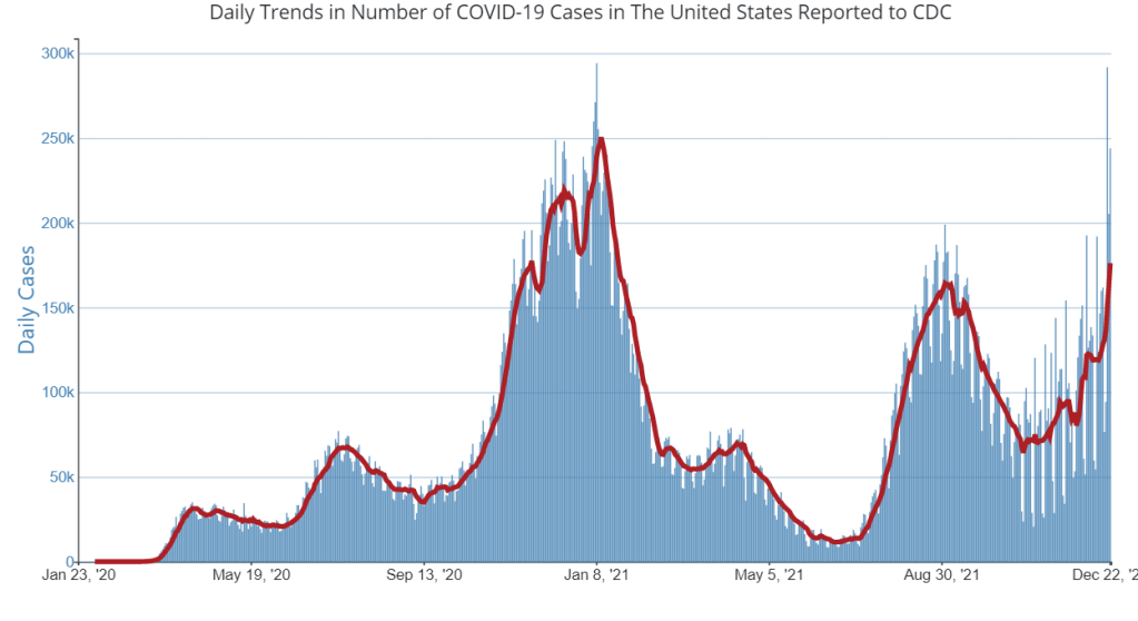
    As Omicron spreads rapidly through the U.S., this variant is driving record case numbers—and record demand for testing, including both PCR and rapid at-home tests. In other words, it feels harder than ever to get tested for COVID-19, largely because more people currently need a test due to recent exposure to the virus than at any other time during the pandemic.

    Also this week, the CDC changed its guidance for people infected with the coronavirus: rather than isolating for 10 days after a positive test, Americans are now advised to isolate for only five days, if they are asymptomatic. Then, for the following five days, people should wear a mask in all public settings. This guidance change has prompted further discussion (and general confusion) about who needs to get tested for COVID-19, when, and how.

    Here’s a brief FAQ, to help navigate this complicated testing-and-isolation landscape. In addition to the CDC guidance, it’s inspired by a recent question from a reader about testing and isolation following a positive PCR result in her family.

    What’s the difference between being infected and being contagious?

    As we think about interpreting COVID-19 test results in the Omicron era, it’s key to distinguish between being infected with the coronavirus and being actively contagious.

    • Infected: The virus is present in your body.
    • Contagious: The virus is present in your body at high enough levels that you can potentially spread it to other people.

    In a typical coronavirus infection, it takes a couple of days after you encounter the virus—i.e. breathe the same air as someone who was contagious—for the coronavirus to build up enough presence in your body that tests can begin detecting it. PCR tests can typically detect the virus within one to three days after an infection begins, while rapid tests may take longer.

    How do you use testing to tell if you’re infected and/or contagious?

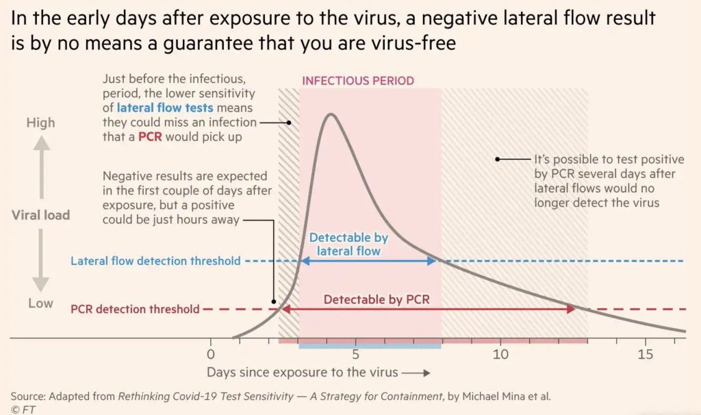
    Timing is extremely important with coronavirus tests, and has become even more so with Omicron. If you learn about a recent exposure to the virus, you don’t want to get tested immediately after that exposure, since the test would not pick up a potential infection yet. Say you had dinner with a friend on Wednesday, and they tell you on Thursday that they just tested positive; you should wait until Friday or Saturday to get tested with PCR, or until Saturday or Sunday to get tested with a rapid at-home test. (And ideally, you would avoid interacting with other people while you wait to get tested.)

    PCR tests can detect the virus within a couple of days of infection. Rapid tests, which are less precise, generally can’t detect the virus until it’s at high enough levels for someone to be contagious. This can take time—though Omicron may have shortened the window between infection and becoming contagious to just three days, according to some early studies. A new CDC study released this week provides additional evidence here.

    This chart, an adaptation of a figure by rapid test expert Michael Mina published in the Financial Times, shows how someone could potentially test negative on rapid tests for multiple days after a coronavirus exposure, even though they are infected:

    When this person tests positive on a rapid test, the result indicates that they’ve become contagious with the virus. Then, it’s possible that the person may continue testing positive on PCR tests after they stop testing positive with antigen tests, because they are no longer contagious but continue to carry enough virus genetic material that a PCR test can pick it up.

    How do you get ahold of rapid tests, in the first place?

    In order to use rapid tests to tell whether you’re contagious with the coronavirus, you need to get some rapid tests! Here are a couple of suggestions:

    • Order online from Walmart: If you look at this website right now, Walmart will probably say that Abbott BinaxNOW rapid tests are out of stock. But if you leave the page open and refresh often, you may be able to snag some rapid tests right after Walmart restocks (which happens roughly once a day, I think). I like ordering from Walmart because they’re cheaper than other BinaxNOW vendors and ship quickly, usually within a week.
    • Order online from iHealth Labs: iHealth Labs is one rapid test manufacturer that’s grown in popularity recently, as an alternative to BinaxNOW. You can order up to 10 packs (with two tests each) directly from the manufacturer, and report test results in an app. In my experience, though, iHealth Labs is slower to ship than other distributors; an order I placed on December 22 is due to arrive two weeks later, on January 5.
    • Use NowInStock to see availability: This website tracks rapid test availability at a number of websites, including CVS, Walgreens, Walmart, Amazon, and others. It’s helpful to see your options for a number of different tests, but bear in mind that tests sold by third-party vendors (like Amazon) may be less reliable than those sold directly by pharmacies.
    • Follow local news: A lot of city and state governments have recently started making rapid tests available to the public for free, from D.C. libraries to Connecticut towns. I recommend keeping an eye on local news and government websites in your area to look for similar initiatives—or, if your area isn’t making rapid tests available, call your local representative and ask that they do!

    Why did the CDC change its guidance for isolation?

    As I mentioned above, the CDC recently changed its guidance for people who test positive for the coronavirus. If someone has no symptoms five days after their positive test result, they can stop isolating from others—but they need to wear a mask in all public settings.

    According to the CDC, the new guidance is “motivated by science demonstrating that the majority of SARS-CoV-2 transmission occurs early in the course of illness, generally in the 1-2 days prior to onset of symptoms and the 2-3 days after.” In other words, the CDC is saying that people are generally contagious for a few days after their symptoms start. After that, they’re less likely to infect others, so isolation may be less necessary—and good mask-wearing may be sufficient to prevent further coronavirus spread.

    Many experts are attributing the guidance chance to economic needs: as Omicron causes flight cancellations, closed restaurants, and other business disruptions, a shorter isolation period can help people get back to work more quickly. The recent isolation change follows a similar guidance change the previous week, which said healthcare workers could shorten their isolation periods if their facilities were experiencing staffing shortages.

    What are experts saying about the new guidance?

    Much of the commentary is not positive. While the CDC said the new guidance is “motivated by science,” the agency has failed to cite specific studies backing it up—though some such studies exist, as Dr. Katelyn Jetelina discusses in this Your Local Epidemiologist post.

    Generally, it does seem that most people—particularly vaccinated people—are no longer contagious five days after their symptoms start. (Reminder: five days after symptoms start could be seven to nine days into the infection period, since it takes time for the virus to build up in your body and cause symptoms.) But this is by no means guaranteed for everyone, as each person infected with the coronavirus has a unique COVID-19 experience.

    As a result, many experts have said that the CDC should have required negative rapid tests for people to leave isolation after five days. A negative rapid test would indicate that someone is no longer contagious, the argument goes, and they can then go back into the world. In the U.K., two negative rapid test results are required to shorten isolation from ten to seven days.

    However, for everyone in the U.S. to be able to rapid test out of isolation, the country would need a far greater supply of those tests than we currently have available. This Twitter thread, by epidemiologist Matt Ferrari, explains the challenges posed by limited rapid testing:

    Ferrari argues that the CDC guidance makes sense, given the information and resources currently available in the U.S., as well as the fact that simpler rules are easier to follow. Still, I personally would say that, if you have the rapid tests available to test out of isolation, you should.

    More Omicron reporting

  • Omicron updates: ‘mild’ cases can still mean a nasty surge

    Omicron updates: ‘mild’ cases can still mean a nasty surge

    Image
    Data from South Africa and the U.K. suggest that Omicron patients are less likely to require intensive hospital care than those infected with previous variants. Chart posted on Twitter by Paul Mainwood.

    It’s now been over a month since Omicron arrived in the U.S., and the variant’s impact is clear: January is about to be nasty. Here are the major updates from this week:

    • Omicron continues to cause the majority of new cases in the U.S., but the CDC revised its estimates down this week. On Monday, the agency updated its variant proportions estimates; according to the new data, Omicron caused 59% of new cases in the U.S. in the week ending December 25. Notably, this was lower than the previous week’s estimate of 73%. As I explained in a Twitter thread, the CDC’s variant proportions data are estimates with very wide confidence intervals, based on sequencing data that are reported with a lag of multiple weeks. And the agency’s slow pace of updates means that its estimates are unlikely to match the actual variant situation in the U.S. anyway. Still, the CDC data do tell us that Omicron is causing the majority of U.S. cases right now, and that it became dominant over Delta in under one month.
    • Outdoor concerts in Puerto Rico were a superspreading event for Omicron. Puerto Rico has been a pandemic success story, with one of the highest vaccination rates in the nation. But the territory is currently reporting record COVID-19 cases thanks to Omicron, with an increase of over 5,000% in the space of two weeks. One reason for the increase: a series of concerts by the Puerto Rican rapper Bad Bunny, which have now been connected to at least 2,000 cases according to Puerto Rico’s Office of Epidemiology. The concerts took place in an outdoor stadium, and audience members had to be vaccinated and wear a mask to attend. The high number of cases connected to this event indicates Omicron’s high transmissibility, even in outdoor settings.
    • South Africa’s Omicron wave continues to decline, and London may be seeing a similar pattern. Omicron cases have now been decreasing in South Africa for more than two weeks, with a 30% decline from December 18 to 25. The country’s leaders recently lifted a curfew from midnight to 4 AM, though public gatherings are still restricted to 1,000 people indoors and 2,000 outdoors. A similar decline may be starting in London, another major Omicron hotspot—though holiday reporting delays and high testing demand make it hard to say for sure.

    • Continued evidence that Omicron cases are more likely to be mild. Data out of South Africa continue to show that patients infected with Omicron have a lower risk of severe symptoms than those infected in past waves. One study, published this week in JAMA, finds that the country’s fourth wave has impacted younger patients with “fewer comorbidities, fewer hospitalizations and respiratory diagnoses, and a decrease in severity and mortality.” As I’ve written before, this is likely thanks to South Africa’s high prevalence of immunity from past infections. But a growing number of lab studies are also showing that Omicron may have inherent biological qualities that make it more mild, including a reduced capacity to infect lung cells compared to past variants.
    • It is worth noting, however, that mild, in the clinical sense, means that your case does not require hospitalization. A patient could have a high fever, become bed-bound for days, and even face Long COVID symptoms while still fitting the “mild disease” classification, as Nsikan Akpan discusses in this Gothamist article about his own experience with Omicron. Reminder: we still have next-to-no data on how Omicron may impact the likelihood of Long COVID.
    • Studies continue to indicate that vaccines protect against severe disease from Omicron, though protection against infection is less robust. A new preprint posted this week finds that “most of your T cell responses from vaccination or previous infection still recognize Omicron,” explained study author Wendy Burgers in a Twitter thread. T cells are a type of immune system cell that participates in long-term response; their recognition of Omicron means that vaccinated people are still well-protected against severe disease. At the same time, a new study set to be published in Nature found that vaccinated people who’d received two doses had limited protection against infection, while people with three doses or multiple doses and a prior infection were better protected.
    • Antibodies made during an Omicron infection could provide protection against Delta. In Omicron hotspots, people who recently caught Delta have been readily infected by the new variant. But an Omicron infection may lead to anti-Delta antibodies in your immune system, according to a new preprint from South African scientists who tested blood samples from Omicron patients in the lab. “The researchers found, unsurprisingly, that the patients’ blood contained a high level of antibodies potent against Omicron,” explained Carl Zimmer in the New York Times. “But those antibodies proved effective against Delta, too.” If other studies back up this finding, it could mean that regions with Omicron waves will be protected from Delta resurgence.
    • Pediatric hospitalizations are rising as Omicron spreads, but the variant is not necessarily inherently worse for children. In New York City, one of America’s Omicron hotspots, pediatric hospitalizations increased four-fold from the beginning of December through last week, according to the New York State health department. State leaders are encouraging parents to get their kids vaccinated, as less than one-third of children in the five to 11 age group had received at least one dose as of December 24. As the New York Times points out, low vaccination rates for young kids, combined with the sheer number of cases caused by Omicron, are likely to blame for this increase—rather than some inherent quality of Omicron making it more severe for children.
    • The Omicron surge will be bad in the U.S., but it may boost nation-wide immunity for a few months afterwards. I highly recommend reading through this story by STAT’s Megan Molteni, which walks through several potential scenarios for the Omicron winter surge in the U.S. Some highlights: while South Africa’s short wave is promising, it might not translate to the U.S.; the country will be “in a viral blizzard nationwide” for the next few weeks; massive numbers of Americans will be infected (though their cases may be mild and go unreported); the whole world may be in a similar situation; and those huge case numbers could translate to a lot of immunity in the future. “The thing Omicron will do, because it’s going to infect 40% of the entire world in the next two months, is it will raise population-wide immunity for a while,” Chris Murray, director of IHME, told STAT.

    More variant reporting

  • National numbers, January 2

    National numbers, January 2

    While COVID-19 case numbers in many parts of the country have shot past last winter’s records, hospitalizations and deaths have remained relatively low. Chart via the New York Times, shared on Twitter by Benjamin Ryan.

    In the past week (December 24 through 30), the U.S. reported about 2.2 million new cases, according to the CDC.* This amounts to:

    • An average of 316,000 new cases each day
    • 674 total new cases for every 100,000 Americans
    • 79% more new cases than last week (December 17-23)

    Last week, America also saw:

    • 71,000 new COVID-19 patients admitted to hospitals (22 for every 100,000 people)
    • 7,700 new COVID-19 deaths (2.4 for every 100,000 people)
    • 59% of new cases are Omicron-caused (as of December 25)
    • An average of 1.3 million vaccinations per day (including booster shots; per Bloomberg)

    *This week’s update, like last week’s, is based on Thursday data (as of December 30) because the CDC has once again taken Friday through Sunday off.

    It’s difficult to interpret COVID-19 data in the wake of any major holiday, as public health officials and testing sites alike take well-deserved time off. The weeks after Christmas are particularly tricky: the numbers are just starting to recover from one holiday when New Year’s hits, causing another round of delays. This year, the CDC took three-day weekends over both Christmas and New Year’s.

    All of that said, we have enough data to say that cases are rising incredibly fast across the U.S. The country reported over 300,000 new cases a day this week—the highest seven-day average of the entire pandemic so far. Over 500,000 new cases were reported on Friday alone.

    New York City continues to be a major Omicron hotspot. Last week, I wrote that one in every 100 New Yorkers had tested positive within a seven-day period, according to NYC data; this week, that number is one in 50. NYC’s positivity rate is over 25%, indicating that one in every four PCR tests conducted in the city is returning a positive result—but also indicating that the city is not testing enough to actually identify all cases. City data don’t include rapid at-home tests, contributing to the data gap here.

    NYC’s case rate seems to be slowing down, suggesting that the city may soon follow South Africa in seeing an intense, yet short Omicron surge. But “growth is still growth,” as analyst Conor Kelly points out:

    Meanwhile, plenty of other places in the U.S. are facing rapid growth from Omicron. In Florida, cases increased by almost 1,000% in the last two weeks of December—bringing the state from the lowest per-capita case rate in the country to the fourth-highest. Several other Southern states have also seen cases more than double in the last week: Georgia, Alabama, Louisiana, California, Mississippi, Washington, and Maryland, among others.

    There is some good news in this surge, though: while COVID-19 cases surge to record highs, hospitalizations remain much lower than they were at this point last year. The CDC currently reports about 67,000 COVID-19 patients in hospitals nationwide, compared to a peak of over 120,000 in January 2021. Omicron hotspots like NYC and DC are similarly reporting hospitalization numbers that, while rising sharply, are not following cases as closely as they did last year. 

    COVID-19 experts call this phenomenon “decoupling”: thanks to vaccinations, treatments, and (possibly) some inherent biological qualities of Omicron, hospitalization increases no longer directly follow case increases. Still, a smaller percentage of cases requiring hospitalization can still mean a lot of hospitalizations, when case numbers are as high as they are right now. And hospitals, already facing dire staffing shortages, were in crisis mode before Omicron hit.

  • COVID source shout-out: The CDD book

    COVID source shout-out: The CDD book

    My girlfriend, Laura, is unbelievably good at gift-giving. Like, really, world-class every time, for everyone. But this year, she went above and beyond in her gift for me: she made the COVID-19 Data Dispatch into a book!

    The book is 464 pages, including most of my posts from the first year of this newsletter and blog project—spanning July 2020 through July 2021. It’s got everything from case charts, to complaints about the CDC, to pictures of Dr. Anthony Fauci. Laura works as a production editor and designer at a publishing house, and I will be forever honored that she spent even more hours in InDesign to make this for me.

    (Please note that this book is not commercially available, because we would need to clear a lot of copyright things with a lot of people. But if, for some reason, you would like a non-commercial copy, email me and we can figure something out!)

  • Featured sources, December 26

    • Holiday risk estimator: A group of data analysts at the Rockefeller Foundation’s Pandemic Prevention Institute put together this tool showing the risk of coronavirus exposure at an event or gathering, taking Omicron’s increased transmissibility into account. You can plug in your county and view your risk at 10, 20, and 30-person events, with adjustments for attendee vaccination and rapid testing. The tool will be updated daily through the end of December, according to analyst Kaitlyn Johnson, with potential further updates after that point.
    • State Reporting of Covid-19 Vaccine Breakthrough Infections: Another source from the Rockefeller Foundation: researchers from the Pandemic Tracking Collective evaluated every state’s reporting of COVID-19 breakthrough cases. The evaluations include both the data fields states report and how information is presented. Only three states (California, Colorado, and Utah) scored an A; nine states that don’t share breakthrough case data regularly scored an F.
    • POLITICO’s State Pandemic Scorecard: And another evaluation of how states fared, but much broader: POLITICO reporters compiled data about state outcomes during the COVID-19 pandemic, including health, economy, social well-being, and education. For each category, states are scored between zero and 100. “No state did well in every policy area,” the report finds; for example, some states that imposed more COVID-19 restrictions fared better on health but worse on economy and education.

  • The 21 best COVID-19 data stories of 2021

    The 21 best COVID-19 data stories of 2021

    As 2021 comes to a close, I want to dedicate this final issue of the year to all of the other science, health, and data journalists who have continued following COVID-19 in the last twelve months. It hasn’t been easy, as burnout dovetails with declining public interest in pandemic news; still, so many people have stuck with this beat and brought important issues to light.

    Here’s my list of the 21 best COVID-19 data stories of 2021. Disclaimer: this list is not comprehensive or objective—I selected these stories from my own readings of national and local outlets, combined with a couple of reader submissions. Still, I tried to include a variety of publications and story types, ranging from short news pieces to large investigative projects.

    If you’d like to check out my 2020 list, you can find it here.

    • The “Good” Metric Is Pretty Bad: Why It’s Hard to Count the People Who Have Recovered from COVID-19 (COVID Tracking Project, Jan. 13): This analysis post illuminates the issues behind tracking “recovered” COVID-19 patients, a metric that used to appear on many state dashboards. Amanda French and Quang Nguyen explore the inconsistent definitions that states use to track this metric—most COVID-19 metrics are inconsistent from one source to another, but “recovery” is particularly inconsistent—as well as how the metric excludes Long COVID patients. The post also explains why CTP removed many “recovered” values from its website.
    • As Covid vaccine rollout expands, Black Americans still left behind (KHN/NBC, Jan. 29): While vaccines became more widely available throughout the early months of 2021, the CDC’s data on which Americans were getting vaccinated remained extremely limited. In fact, the agency has never released demographic vaccination data at the state-by-state level. KHN reporters Hannah Recht and Lauren Weber filled that gap by compiling data from state dashboards, while also reporting on the vaccine gap between Black and white Americans.
    • As governor cherry-picked data, the pandemic took a toll on Florida Sunshine laws (Miami Herald, March 2): Throughout the pandemic, Florida has attracted attention—from Governor Ron DeSantis railing against mandates to the Florida Department of Health (FDOH) replacing its comprehensive COVID-19 dashboard with stripped-down weekly reports in June. This important Miami Herald article sheds light on FDOH’s reluctance to “release new data related to COVID-19 that contradicts the governor’s upbeat narrative,” hurting journalists’ and academics’ ability to hold the DeSantis administration accountable.
    • The uncounted: People who are homeless are invisible victims of Covid-19 (STAT News, March 11): Usha Lee McFarling, national science correspondent at STAT News, has spent the year reporting on equity issues connected to COVID-19 and other areas of medicine. In this story, she investigates the lack of COVID-19 deaths reported among homeless populations. According to McFarling, one attempt to track these deaths resulted in a count of under 400, even though homeless shelters are prime locations for outbreaks.
    • Why the Pandemic Experts Failed (The Atlantic, March 15): On March 7, the COVID Tracking Project updated its datasets for the last time. Shortly afterwards, founders Alexis Madrigal and Robinson Meyer wrote this story sharing lessons learned from a year of data collection, including the challenges of reporting COVID-19 data, the impact of America’s fractured public health systems, and what data can and can’t tell us. For more: check out the project’s analysis posts with further lessons and resources for using federal COVID-19 data.
    • 3.9 million years (Vox, March 17): Typically, when we think about the losses of COVID-19, we think of the number of deaths. But there’s another metric we can use, beautifully explored in this Vox article: years of potential life lost. As of January 31, 2021, the U.S. has recorded about 420,000 deaths, amounting to 3.9 million years lost. The article includes an illustration of this toll, as well as personal stories from the family members of those who died.
    • We Ran Tests on Every State’s COVID-19 Vaccine Website (The Markup, March 24): The Markup, a nonprofit newsroom that investigates big tech, is famous for its Blacklight tool, which scans websites for user-tracking technologies. In this story, The Markup ran that Blacklight tool on state websites built for users to make their vaccination appointments. The tool found that many sites had below-average privacy ratings and poor accessibility, likely contributing to the stress that many Americans felt in trying to book their vaccinations.
    • A Tiny Number of People Will Be Hospitalized Despite Being Vaccinated. We Have to Learn Why. (ProPublica, April 14): ProPublica’s Caroline Chen was writing about breakthrough infections before it was cool—or, before Delta hit the U.S. and these infections became common. This article clearly explains what breakthrough infections are, why they’re so rare (at the time), and why they need to be investigated anyway, as scientists hope to find patterns in the breakthrough cases that lead to severe disease. At the time, many states were doing a poor job of data collection; this is still true, many months later.
    • The First Billion Doses (Bloomberg, April 24): Since late 2020, a group of Bloomberg health and data journalists have run the most comprehensive dashboard on global COVID-19 vaccinations, including data from 184 countries and all U.S. states. It’s an immense undertaking, and has driven plenty of important reporting on vaccine rollouts nationally and globally—such as this story marking the first billion doses administered. The piece both celebrates this scientific achievement and highlights inequities: “Vaccine access so far has been determined by national wealth,” the story says.
    • COMIC: For my job, I check death tolls from COVID. Why am I numb to the numbers? (NPR, April 25): This comic, by one of the reporters behind NPR’s COVID-19 dashboard, resonated deeply with me. It explores why one death may feel like a tragedy, but 500,000 deaths may feel like a natural part of the world. The comic ends by emphasizing the importance of reading individual people’s stories and maintaining connection, to cope with all of the trauma and loss of the past two years.
    • Broken system can’t keep track of Native deaths (Indian Country Today, June 8): In this story, the Indigenous Investigative Collective explores how a “labyrinthian system of local, state, federal and tribal data-reporting systems” makes it difficult to accurately track how many Native Americans have died of COVID-19. As a result, the already-high official death toll is likely a significant undercount; and the problem goes beyond COVID-19 to other health issues.

    • New CDC dataset showing COVID vaccine-by-county numbers misses the entire state of Texas. Why? (Houston Chronicle, June 23): For a long time, there was a Texas-shaped hole in the CDC’s dataset of COVID-19 vaccinations by county. This article, by Houston Chronicle reporter Kirkland An, digs into the issue and explains: a unique state law in Texas restricts sharing of individual data, including the anonymized vaccination records that the CDC requested from states in order to calculate county-level vaccination rates. To me, this is a great example of a local reporter diving into an issue that their region is facing in a national dataset. (And the data issue has since been fixed!)
    • How Local Reporters in India Exposed the Pandemic’s True Death Toll (Global Investigative Journalism Network, June 28): This one is a bit meta: it’s an article about COVID-19 death investigations, carried out by journalists in India during the country’s severe spring 2021 surge. One reporter, Yogen Joshi, used counts of Hindu funeral rituals at a holy riverbed site to reveal that the true number of deaths in the state of Gujarat was much higher than the official record stated. Other journalists similarly investigated body counts and death certificates directly, showing how national data fell short.
    • Meet the people who warn the world about new covid variants (MIT Technology Review, July 26): MIT Technology Review’s Pandemic Technology Project has produced a number of important COVID-19 stories this year (including my own!), but this one is my personal favorite. Cat Ferguson profiled a group of scientists who created and contributed to the Pango system for tracking coronavirus variants, racing to name and classify new sequences as soon as they’re uploaded into the public domain. This article demonstrates the human toll of running such an important database, particularly when it’s led by PhD students and postdocs who never anticipated the scale their project would attain.
    • Inside America’s Covid-reporting breakdown (POLITICO, Aug. 15): At this point, most COVID-19 reporters are familiar with the challenges underlying our spotty pandemic numbers: public health agencies have long been underfunded, records are transmitted by fax and mail, data systems are inconsistent, workers are overwhelmed, etc. But few articles lay out the problems as clearly as this feature by POLITICO’s Erin Banco, who spoke to health officials in more than 20 states. The article also includes great data visualizations and graphics that illustrate the issues.
    • Ahead Of NYC School Reopening, 1,500 Classrooms Still Undergoing Ventilation Repairs (Gothamist/WNYC, Aug. 30): By mid-2020, there was a growing scientific consensus that the coronavirus spreads through the air, and ventilation is an important means of increasing COVID-19 safety. Yet businesses and news cycles alike failed to focus on ventilation well into 2021—so I was very excited to see Gothamist’s thorough investigation of air filtration in New York City schools. This article is part one in an extensive series, combining city records with expert insights on air quality standards.
    • How did a Kansas grandmother just become the first U.S. COVID death? Not even her family knew until this week (The Mercury News, Sept. 2): Sometimes, the best kind of data story is an investigation into one singular data point. This piece, published in Bay Area newspaper The Mercury News, tells the story of Lovell Brown, a senior in Leavenworth County, Kansas who is now the first recorded COVID-19 death in the U.S.—after her death certificate was amended in May 2021 to include the disease. While the exact reasons behind this death certificate update are unknown, the revision suggests that the coronavirus was spreading in the Kansas City area well before official data collection started.
    • The fight to manufacture COVID vaccines in lower-income countries (Nature, Sept. 15): As someone who has been writing about global health long before COVID-19 hit, Amy Maxmen is an expert on the global vaccination beat. This story lays out the immense gap between vaccine access in high-income countries and low-income countries, while also explaining a potential solution: many manufacturers in low- and middle-income countries are ready to produce COVID-19 vaccines, if only they could get ahold of the patents. I’ve come back to reread this piece several times in the past few months, as booster shot campaigns in the U.S. and elsewhere have further exacerbated vaccine inequity.
    • Opening Project conclusion: 11 lessons from the schools that safely reopened (COVID-19 Data Dispatch, Sept. 19): Yes, I snuck one of my own projects onto this list: the Opening Project, in which I identified and profiled five school communities that brought the majority of their students back to in-person learning by the end of the 2020-2021 school year while reporting fewer COVID-19 cases than the national average. For me, this project was a departure from past data journalism stories; instead of describing an overall trend with data, I focused on five outliers, investigating why they were successful. The project, which was funded with a grant from the Solutions Journalism Network, was republished at several education and science news outlets.
    • Covid response hampered by population data glitches (Financial Times, Oct. 11):  Vaccination rates—which show the percentage of a population that’s received at least one vaccine dose or been fully vaccinated—have been a key metric driving government COVID-19 responses in the past year. But when the population data underlying these calculations are inaccurate, this article by Oliver Barnes and John Burn-Murdoch explains, the vaccination rates can be way off. For example, some Miami, Florida ZIP codes have vaccination rates of over 200% among seniors, because snowbirds who don’t formally reside in the city got vaccinated there. (If you hit the Financial Times’ paywall, you can read my summary of the piece here.)
    • Uncounted: Inaccurate death certificates across the country hide the true toll of COVID-19 (Documenting COVID-19 & USA Today, Dec. 22): For months, the Documenting COVID-19 team has worked with several USA Today newsrooms to investigate unreported COVID-19 deaths. While the official COVID-19 death toll in the U.S. is about 800,000, experts suspect that up to 200,000 additional deaths from the disease have gone uncounted, due to a combination of undertrained coroners and medical examiners, a lack of standardization for identifying these deaths, under-testing, and other issues with death certificates. I was part of the team behind this investigation, which will continue with further stories in 2022; you can read more about the CDC data that drove much of our analysis here.

    Note: the featured image for this post is taken from the Uncounted project; it’s a visualization by Janie Haseman at USA TODAY.

  • Omicron updates: A major surge is underway in the U.S.

    Omicron updates: A major surge is underway in the U.S.

    Within a week, Omicron has jumped from causing an estimated 13% of new COVID-19 cases in the U.S. to 73% of new cases. Chart via the CDC.

    The majority of new COVID-19 cases in the U.S. are now caused by Omicron, and a massive surge is underway. But there’s good news: the variant continues to appear less likely to cause severe disease than past coronavirus strains, and South Africa’s wave may have already peaked.

    Here are the highlights of Omicron news this past week:

    • Omicron is now causing the majority of cases in the U.S. Last week, I wrote that the CDC’s estimates of new COVID-19 cases caused by different variants were providing a delayed, incorrect look at Omicron in the U.S. This past Monday, the ramifications of that delay were made clear: the CDC updated its estimates, showing that 73% of new cases in the week ending December 18 were caused by Omicron. (The agency’s previous estimate: 3% of new cases.) The agency also updated its estimates for prior weeks, to 13% in the week ending December 11 and 1% in the week ending December 4. It’s important to note that, as Trevor Bedford points out in this STAT News interview, these numbers are estimates generated by CDC algorithms. New sequencing data are always reported with a lag, and the true share of cases caused by Omicron is almost certainly even higher by now.
    • The Yankee Candle Index shows a major rise in COVID-19 cases. One of the most common COVID-19 symptoms is loss of smell. As a result, COVID-19 surges in the U.S. tend to correspond with increases in one-star reviews of Yankee Candles, in which reviewers complain that they can’t smell their candles—a phenomenon known as the Yankee Candle Index. And in the past few weeks, those one-star Yankee Candle reviews have shot up again, to higher levels than even last winter. This SFGATE article provides a nice summary of the situation.
    • In South Africa, Omicron cases continue to go down. COVID-19 case numbers in South Africa dropped by about 20% between December 15 and December 22, prior to any holiday reporting interference. Several South African scientists have said that the country appears to be “over the curve,” with similar case patterns observed in the Omicron hotspot of Gauteng. This news is puzzling for some researchers—and might be tied to insufficient testing and/or high numbers of mild and asymptomatic cases—but it still bodes well for Omicron outbreaks in other countries. London may be seeing the beginning of a case drop right now, as well.
    • It’s tough to say whether Omicron is more mild because of inherent biology or prior immunity. As the scientists studying Omicron in the lab continue to share their findings—and South Africa continues to see low numbers of cases requiring hospitalization—evidence is growing that Omicron seems to be less likely to cause severe disease than past variants. But scientists remain skeptical, as this recent piece in Science magazine explains. Some aspects of Omicron’s biology, like its reduced capacity to infect lung cells, may make it inherently less virulent. At the same time, vaccines and prior infections confer protection against severe disease, particularly in the form of T cells.
    • Omicron might be making people sick—and contagious—faster than past variants. Scientists call the gap between exposure to a virus and the beginning of symptoms the “incubation period.” For the original coronavirus, this period was five or six days, Katherine J. Wu writes in The Atlantic. For Omicron, it may be as short as three days. While it’s challenging to study incubation periods, Wu writes, early data indicate that Omicron makes people sick in less time than prior variants—thus shortening the time that we have to identify and stop infections. Her piece also discusses the implications that this shorter incubation period has for testing.

    • Oral swabs may be more accurate than nasal swabs in identifying Omicron infections. In the past few days, I’ve seen some discussion on Twitter about swabbing one’s throat in addition to one’s nose when rapid testing for a potential Omicron infection. One recent preprint from South Africa suggests that Omicron might cause more viral shedding in saliva and less in the nose than past variants, meaning tests that rely on samples from the throat could be more likely to catch Omicron infections than tests that rely on nasal swabs. If you’d like to try the saliva swab method yourself, this video from Public Health England is helpful.
    • Omicron protection from booster shots may be short-lived. In the latest Omicron briefing from the U.K. Health Security Agency, one finding stuck out: while booster shots provide additional protection against Omicron infection, this protection begins to wane several weeks after vaccination. “Updated vaccine effectiveness analysis shows mRNA boosters beginning to wane from one month (week 5-9) for Omicron, and as low as 30-50% effective from 10 weeks post-booster,” wrote Meaghan Kall in her Twitter thread summarizing the briefing. If you haven’t gotten your booster shot yet, definitely do so—the shots also increase protection from severe disease, and that doesn’t wane. But this finding suggests that Omicron-specific boosters may be needed in the coming months.
    • Antiviral pills for COVID-19 will soon be available, and they work against Omicron. This week, the FDA authorized two antiviral COVID-19 pills for emergency use in the U.S.: one pill made by Merck (about 30% effective against hospitalization and death in clinical trials), and the other made by Pfizer (about 90% effective). Both pills are designed to prevent severe disease in vulnerable adults, such as the immunocompromised, and both work well against Omicron infections—since they target pieces of the coronavirus outside of the heavily-mutated spike protein. While the pills require a positive COVID-19 test for prescription (a challenging task, as testing demand continues to increase), their authorization is still a source of hope as the variant spreads.
    • IHME predicts “enormous spread of Omicron,” but with most cases mild or asymptomatic. The Institute of Health Metrics and Evaluation (IHME) at the University of Washington has predicted that the U.S. could see 140 million new coronavirus infections between January and March 2022, with a peak of 2.8 million infections a day. That could amount to 60% of the U.S. getting infected, the IHME director told USA Today. Note, however, that the institute predicts infections, not reported cases; the modeling suggests that the vast majority of these cases will be mild or asymptomatic. This prediction is in line with estimates of existing COVID-19 immunity in the U.S.: for example, Trevor Bedford said that 80% to 90% of Americans currently have some degree of protection from vaccination or prior infection in the STAT News interview linked above.

    More variant reporting

  • National numbers, December 26

    National numbers, December 26

    The seven-day average for new COVID-19 cases in the U.S. on December 23 has passed the peak of the Delta surge. Chart via the CDC.

    In the past week (December 17 through 23), the U.S. reported about 1.2 million new cases, according to the CDC.* This amounts to:

    • An average of 176,000 new cases each day
    • 376 total new cases for every 100,000 Americans
    • 42% more new cases than last week (December 10-16)

    Last week, America also saw:

    • 55,000 new COVID-19 patients admitted to hospitals (17 for every 100,000 people)
    • 8,500 new COVID-19 deaths (2.6 for every 100,000 people)
    • 73% of new cases are Omicron-caused (as of December 18)
    • An average of 1.4 million vaccinations per day (including booster shots; per Bloomberg)

    *This week’s update is based on data as of Thursday, December 23; I typically utilize the CDC’s Friday updates, but the agency is not updating any data from Friday through Sunday this week due to the Christmas holiday.

    Last week, the Omicron surge had clearly arrived; this week, it’s picking up steam. Nationwide, the U.S. reported well over one million new cases this week—more than a 40% increase from last week. 244,000 cases were reported on Thursday alone, and the daily new case average is now higher than at any point during the Delta surge.

    Hospitalization and death numbers have yet to increase so sharply: the number of new COVID-19 patients admitted to hospitals this week is up less than 1%, and the number of new COVID-19 deaths is up by about 4%.

    But when Omicron reaches those Americans who are more vulnerable to COVID-19, they’ll arrive at hospitals already overwhelmed from Delta, the flu, and nearly two years of pandemic burnout. At the same time, Omicron’s incredible capacity to spread will likely cause staffing shortages for many hospitals, as workers get breakthrough cases. On Thursday, the CDC announced that healthcare workers who get sick may shorten their quarantines if their facilities are facing shortages.

    New York City continues to be a major Omicron hotspot: according to city data, one in every 100 New Yorkers has tested positive for COVID-19 in the last week. In Manhattan, the number is one in 60. And these numbers don’t include people who tested positive on rapid at-home tests and weren’t able to confirm it with PCR. The city’s test positivity rate is over 10%, indicating that a lot of cases are going unreported in official data.

    Washington, D.C. has also emerged as a Omicron hotspot this week, with an average of over 1,000 new cases reported daily in the week ending December 22. That’s more than three times higher than the city’s case record at any other point during the pandemic. Meanwhile, several states have seen their case rates more than double in the past week, according to the latest Community Profile Report: Hawaii, Florida, Louisiana, Georgia, and Maryland.

    As Omicron sweeps across the country—aided by holiday travel and gatherings—we are about to face the reporting delays that come with every holiday. Public health workers from local agencies to the CDC are taking time off, while testing sites close for Christmas and millions of rapid tests go unreported.

    Erin Kissane, co-founder of the COVID Tracking Project, wrote about holiday data issues in The Atlantic this week. Her piece concludes:

    In this information vacuum, some of us will tend toward caution and others toward risk. By the time Americans find out the results of our collective actions, the country will have weeks of new cases—an unknown proportion of which will turn into hospitalizations and deaths—baked in. In the meantime, the CDC’s COVID Data Tracker Weekly Review has wished us all a safe and happy holiday and gone on break until January 7, 2022.