- Post-Acute Sequelae of SARS-CoV-2 infections estimates and insights: Continuing with the Long COVID theme of this issue: I recently learned about this dashboard from the American Academy of Physical Medicine and Rehabilitation. It provides estimates of Long COVID cases in the U.S. based on case numbers from Johns Hopkins University and a model assuming that 30% of surviving COVID-19 cases will lead to long-term symptoms. The dashboard includes estimates of total Long COVID cases, cases over time, and cases by state.
- Disease severity among hospitalized patients (CDC): The CDC added a new page to its COVID-19 dashboard this week, providing data on the shares of COVID-19 patients in U.S. hospitals who require intensive care and ventilation, and who die while at the hospital. The data come from the CDC’s hospitalization surveillance network and other federal hospital sources.
- Vaccination dashboard annotations: This weekend, I updated my annotations page detailing how every U.S. state and several national sources track vaccinations. 39 states are now reporting some data on booster shots or third doses, I found, though most of them still aren’t providing demographic data reflecting the recipients of these additional doses.
Blog
-
Featured sources, January 16
-
Omicron updates: Possible peaks, viral loads, vaccines
Has Omicron peaked in NYC? It sure seems like it, according to city data; screenshot retrieved from NYC Health dashboard on January 16. These update posts are getting shorter as time goes on, but we’re still learning about this variant! A few news items from this week:
- Omicron is now causing almost 100% of new COVID-19 cases in the U.S. In the CDC’s latest variant proportions update, the agency estimated that 98% of new COVID-19 cases were caused by Omicron in the week ending January 8. The CDC also revised estimates for previous weeks, though the revisions were not as significant as they have been in the past—suggesting that the numbers are now fairly close to accurate, but will continue to be tweaked as more sequencing data come in.
- Major Northeast hotspots appear to be peaking. Last week, I wrote that New York City’s Omicron wave seemed to have reached its peak. The trend has continued into this week: the new case rate and test positivity rate have both fallen consistently since peaking on January 3. Similarly, in Boston, the Omicron levels detected in the city’s wastewater have declined steeply since early January. The daily case rate is also going down in Washington, D.C., and in the Northeast region overall. Still, hospitals are still overwhelmed throughout the region, and it’s unlikely that cases will go down as quickly or as decisively as they went up.
- New NYC report provides data on the city’s Omicron wave. Speaking of NYC: the city’s public health department recently put out a new report detailing the variant’s impact. The variant “has accounted for nearly all coronavirus samples sequenced in NYC” since Christmas, the report’s authors write. Also, while a smaller share of Omicron cases led to hospitalization compared to the Delta wave, more people have been hospitalized overall because of sheer case numbers. Unvaccinated New Yorkers, Black New Yorkers, and those over age 75 have been most likely to require hospitalization.
- Real-world study suggests rapid at-home tests work well at detecting Omicron. A new study from the University of California, San Francisco, released this week as a preprint, analyzed rapid antigen tests’ capacity to detect Omicron by comparing rapid test results to PCR test results. The results: antigen tests correctly identified 95% of cases with high viral loads and 98% of symptomatic cases. In about one-third of the cases identified through PCR, patients tested negative on antigen tests; but this is in line with the tests’ accuracy for other variants.
- Data from the NBA suggest Omicron’s viral load is pretty variable. Another new study posted as a preprint this week analyzed data from the National Basketball Association (NBA). The league’s regular testing policy allowed Harvard researchers to study viral loads in Omicron-positive patients, revealing that this variant had “lower peak viral load and more variable early viral growth durations than Delta,” according to one of the authors. In other words, some of the basketball players were highly contagious early into their Omicron infections, while others were less so; and the players had less virus in their bodies overall at the peak of their infections than in previous Delta infections. Also, a large number of the players were still contagious five days after they were diagnosed—which doesn’t bode well for the CDC’s new isolation guidance.
- More confirmation that vaccinated people are protected from severe disease from Omicron. Another new study, this one published in Nature through the journal’s advance preview system for COVID-19 reports, confirms previous research about T cell response to Omicron. T cells are a key part of the immune system’s long-term memory apparatus; they help protect against severe symptoms and death. The study found that, in patients who were fully vaccinated (or, to a lesser degree, had a previous infection), T cells could recognize Omicron and protect people against its worst impacts.
- Omicron adds urgency to the need to vaccinate the world—ideally, with mRNA vaccines. A report from advocacy groups PrEP4All and Partners In Health, written with scientists at Harvard, Columbia, and other institutions, found that 22 billion additional mRNA vaccine doses are needed to control the pandemic, now that Omicron has become the dominant variant in the world. The report specifies that mRNA vaccines are needed because other vaccine types are not capable of preventing Omicron infection, and likely are less effective against severe disease. “Future viral variants may become even more transmissible, immune evasive, and virulent than Delta or Omicron,” the report cautions.
More variant reporting
-
Hospitalization data lag behind the actual crisis
A record number of COVID-19 patients are now receiving care in U.S. hospitals, according to data from the Department of Health and Human Services (HHS). As of January 16, the agency reports that about 157,000 COVID-19 patients are currently hospitalized nationwide, and one in every five hospitalized Americans has been diagnosed with this disease.
The HHS also reports that about 78% of staffed hospital beds and 82% of ICU beds are currently occupied. These numbers, like the total COVID-19 patient figure, are higher than they have been at any other point during the pandemic.
Even so, reports from the doctors and other staff working in these hospitals—conveyed in the news and on social media—suggest that the HHS data don’t capture the current crisis. The federal data may be reported with delays and fail to capture the impact of staffing shortages, obscuring the fact that many regions and individual hospitals are currently operating at 100% capacity.
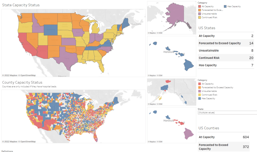
Dr. Jeremy Faust, an emergency physician at Brigham and Women’s Hospital and professor at Harvard Medical School, recently made this argument in Inside Medicine, his Bulletin newsletter. Last week, I shared Faust and colleagues’ circuit breaker dashboard, which extrapolates from both federal hospitalization figures and current case data to model hospital capacity in close-to-real-time. This week, Faust used that dashboard to show that the crisis inside hospitals is more dire than HHS numbers suggest.
He writes:
There seems to be a disconnect between the official data made available to the public and what’s happening on the ground. The reason for this is unacceptable delays in reporting. HHS and other agencies have always acknowledged that public reports on hospital capacity—for Covid-19 and all other conditions—actually reflect data that are 1-2 weeks old. But until now, such lags rarely mattered because most hospitals haven’t had to operate near or above 100% capacity routinely, even during the pandemic. Under normal circumstances, whether a hospital was 65% or 75% full does not make much of a difference, though as the numbers creep up, care can be compromised. And even in past moments when capacity was closer to 100%, a wave of Omicron-driven Covid-19 was not headed towards hospitals.
For example: on Monday, Faust wrote, his team’s circuit breaker dashboard showed that “every single county in Maryland appears to be over 100% capacity,” even though the HHS said that 87% of hospital beds were occupied in the state. Healthcare workers in Maryland backed up the claim that all counties were over 100% capacity, with personal accounts of higher-than-ever cases and hospitals going into crisis standards.
On Thursday, Faust shared an update: the circuit breaker dashboard, at that point, projected that hospitals in Arizona, California, Washington, and Wisconsin were approaching 100% capacity, if they weren’t at that point already. As of Saturday, California and Arizona are still projected to be at “at capacity,” according to the dashboard, while 14 other states ranging from Montana to South Carolina are “forecasted to exceed capacity” in coming days.
var divElement = document.getElementById(‘viz1642354079303’); var vizElement = divElement.getElementsByTagName(‘object’)[0]; if ( divElement.offsetWidth > 800 ) { vizElement.style.minWidth=’1087px’;vizElement.style.maxWidth=’100%’;vizElement.style.minHeight=’1736px’;vizElement.style.maxHeight=(divElement.offsetWidth*0.75)+’px’;} else if ( divElement.offsetWidth > 500 ) { vizElement.style.minWidth=’1087px’;vizElement.style.maxWidth=’100%’;vizElement.style.minHeight=’1736px’;vizElement.style.maxHeight=(divElement.offsetWidth*0.75)+’px’;} else { vizElement.style.width=’100%’;vizElement.style.height=’3027px’;} var scriptElement = document.createElement(‘script’); scriptElement.src = ‘https://public.tableau.com/javascripts/api/viz_v1.js’; vizElement.parentNode.insertBefore(scriptElement, vizElement);From Faust’s descriptions and the accounts of healthcare workers he quotes, it’s also evident that determining between hospitalizations “with” COVID-19 and hospitalizations “from” COVID-19 is not a useful way to spend time and resources right now. Even if some of the COVID-19 patients currently in U.S. hospitals “happened to test positive” while seeking treatment for some other condition, these patients are still contributing to the intense pressure our healthcare system is under right now.
Plus, as Ed Yong explains in a recent article in The Atlantic describing this false patient divide, COVID-19 can worsen other conditions that at first seem unrelated:
The problem with splitting people into these two rough categories is that a lot of patients, including those with chronic illnesses, don’t fit neatly into either. COVID isn’t just a respiratory disease; it also affects other organ systems. It can make a weak heart beat erratically, turn a manageable case of diabetes into a severe one, or weaken a frail person to the point where they fall and break something. “If you’re on the margin of coming into the hospital, COVID tips you over,” Vineet Arora, a hospitalist at the University of Chicago Medicine, told me. In such cases, COVID might not be listed as a reason for admission, but the patient wouldn’t have been admitted were it not for COVID.
In short: Omicron might be a milder variant at the individual level—thanks to a combination of the variant’s inherent biology and protection from vaccines and prior infections—but at a systemic level, it’s devastating. And rather than asking hospitals to split their patients into “with” versus “from” numbers, we should be giving them the staff, supplies, and other support they need to get through this crisis.
-

A new resource for journalists covering Long COVID

Screenshot of the source list, showing some of the main how-to info available. This week, a new resource that I’ve been working on for the past few months went live: a comprehensive source list including Long COVID patients and experts who are willing to talk to reporters. This source list project was a collaboration with Fiona Lowenstein, who’s a journalist, speaker, consultant, and founder of the Body Politic support group for Long COVID patients.
Here’s some info about the source list:
- It includes over 300 Long COVID sources from the U.S. and other countries, spanning all ages, race and ethnicity groups, and other demographics.
- It’s sorted into four categories: patients who identify as Long COVID experts and/or advocates; patients who aren’t experts but can speak to their own lived experience; other experts (scientists, clinicians, advocates, etc.); and related conditions and experiences.
- Patients and experts have identified topics about which they’d like to talk to journalists, including Long COVID research, patient care, policy, mental health, relationships, financial insecurity, and related conditions (such as ME/CFS and dysautonomia).
- The list is hosted on Notion, allowing users to search and filter for specific source needs.
- This project is ongoing, and we will be adding more sources on an ongoing basis. If you would like to be added or have other feedback, please email LongCovidSourceList@gmail.com!
To further explain the motivations for this project and provide some advice on how to use the source list, I did a Q&A with Fiona. Our conversation included the gaps in Long COVID news coverage, connecting the dots between Long COVID and other chronic conditions, recommendations for interviewing Long COVID patients, suggestions for covering this condition in year three of the pandemic, and much more. This interview has been lightly edited and condensed for clarity.
Betsy Ladyzhets: Why did you want to do this project? Why was it worth putting the time and effort into making this source list?
Fiona Lowenstein: I think there were two things. One was almost like a personal desire to have fewer media inquiries in my own inbox. I was receiving a lot of emails from journalists who were looking for very specific types of Long COVID sources. Part of that was because I started the support group Body Politic, and people were reaching out, asking me to post stuff in the group. Also, I have written a lot of stories on Long COVID and interviewed a lot of patients, and so people wanted help reaching more patients.
I knew that a lot of the support group leaders were very burnt out and kind-of exhausted, and that media requests are one of the biggest sources of, like, email stress. And I wanted to think about, is there a way to just ease this process for everyone? I was also noticing that journalists were getting frustrated with how long it was taking to get in touch with [Long COVID] sources, because so many of these groups are run by chronically ill people, and a lot of them are volunteers. They’re not always able to respond to an email in twelve hours.
Part of [the motivation] was also feeling like the news coverage of Long COVID, a lot of it focuses on the same people and the same stories. I’m someone that has been included in a lot of those articles, and at a certain point in time, I stopped doing press on my own experience, because I was like, this story is already out there. And I’m not sure it’s even reflective of the average experience of Long COVID, just because I had a lot of privilege that helped me get care and rest through my recovery.
So, I wanted to see more types of patients talked about, more patients who aren’t necessarily young and super healthy and fit before they got sick. Because that was very much the narrative for a long time. And that is sort-of an ableist narrative, to be emphasizing so strongly that so many of us were young and healthy, and we should care about our chronic illnesses because of that.
Also, I know that Long COVID coverage is going to have to go deeper and is already starting to go deeper in the coming year. Most news outlets have had at least one story explaining what Long COVID is. But we’re now at a point where we’re going to have to delve deeper into, like, what are the financial risks? What toll does [Long COVID] take on relationships? How are people navigating workplace accommodations? What about these specific symptom clusters that might morph over time? What about people who have additional diagnoses [of other chronic conditions] on top of having Long COVID?
And the last thing was, I want to connect the dots between Long COVID and other post-viral or infection-initiated chronic illnesses, like ME/CFS, dysautonomia, and other diagnoses that people with Long COVID have received. These are also diseases that have a lot in common, both in terms of symptoms and the way that they present but also in terms of social and political issues with regards to getting care, getting funded research, etc.
I think those of us who have had Long COVID and been involved or even been a fly on the wall in this advocacy work have seen how people with related chronic illnesses are not getting as much media attention. Even though they are really helping the Long COVID advocacy movement in a huge way, and helping patients on a day-to-day basis. So, that was why I wanted to include people with related conditions and experiences [on the source list], ideally, as well.
BL: Yeah, that makes sense. When we were starting to put together the Google forms [used to collect source’s information] and thinking about who we wanted to send them to, what were some of the things that you were considering?
FL: I was thinking a lot about the patient side of things. I wanted to connect with the leaders of the big [Long COVID] support groups, especially the private support groups, because the private support groups are a little more insular and more highly moderated. They’re the places where we can assume that a larger majority of the members actually have Long COVID. But the private support groups also have no way for journalists to kind-of see into those ecosystems. So, I wanted to connect with those support group leaders and have them share [the project within their groups]. I also did a lot of sharing on social media, because I’m followed by a lot of Long COVID patients and people living with the illness. And I messaged past sources, other people that I’ve talked to.
That being said, I was a little surprised—we got a lot of patient responses, but I think we could have gotten more. (Editor’s note: The list includes over 250 patients and 80 non-patient experts.) I know that there are more [Long COVID] people out there who want to tell their stories. But I think that, among the population of people with Long COVID who want to talk to the press, there are a lot of people who are just burnt out and tired of filling out forms. And there’s also a lot of distrust of the media. There was at least one support group that basically said, “We don’t want to participate in this because we don’t want our members’ information out there for reporters to access, we’ve had so many bad experiences with journalists.”
That was a tricky thing to navigate. To that end, something I’m hoping to do at some point is organize another media training with some of these support groups, to talk through, like, what are some of the issues that are coming up in the journalist-patient relationship? What are your rights as a source when you’re being interviewed? That sort of thing.
BL: Was there anything else that surprised you, when you were looking at the form responses? I know one thing that struck me when I was looking at them was, how many patients checked the box for experience with financial instability. I knew that was an issue, but it’s not something that a lot of articles have focused on so far.
FL: Yeah, that’s a really good point. I filled out the form, because I’ve had Long COVID, and I checked that off, too. I think that, in the Long COVID communities, [financial instability] is such a huge issue, and it’s being talked about constantly. Even for people like myself—I had a relative amount of financial privilege, I had savings that I could rely on after I got sick and couldn’t work. And I had my parents and my partner’s parents, they were able to contribute a little bit to our rent and our groceries and that sort of thing. But it’s still massively set back my finances. So, I think almost everyone has had that experience on some level.
I think one thing that surprised me was how many people had a diagnosis of another condition on top of Long COVID. It’s good, it’s heartening to see that people are getting diagnosed with things like dysautonomia, myalgic encephalomyelitis, and mast cell activation syndrome. I know that [these diagnoses are] happening a lot with the patient advocates that I know, but those are people who often have the highest levels of access to a clinician or a Long COVID clinic. But [the form responses] made me wonder if maybe also, there’s been so much information-sharing online and between patient groups that people are now able to diagnose themselves with this stuff—which is very common in chronic health communities because it can be so hard to get a diagnosis.
So, it was interesting seeing that so many people have checked off dysautonomia and these other things, because it made me feel like, okay, there actually is a pretty large group of people that are very aware of these other illnesses. I could not have told you what dysautonomia was, prior to getting COVID—even though I technically had a form of it, it turns out, before getting COVID. It seems indicative of the extent to which community information sharing has spread, and actually helps people figure out what they’re dealing with.
And those diagnoses are also really helpful for figuring out your symptom management techniques. Like, I learned rest and pacing from people in the ME community. So that’s a huge part of it, too: it’s having that community that you can look to, in addition to Long COVID. People who have been sicker for longer, and research has been going on for longer, and you can learn from [these other chronic illness patients].
BL: What recommendations do you have for people who are using the source list?
FL: There are a couple of kind-of broad stroke recommendations that we tried to account for in some of the questions we included on the list.
For example, one thing that I have said to colleagues and also publicly throughout the pandemic is: if you are a journalist reporting on Long COVID, you unfortunately have to have a pretty flexible schedule with your interviews, because this is an unpredictable illness. Someone could tell you, “Yeah, I’m available tomorrow at 2pm.” And then they could end up being really sick at that time. So, in the questions for patients, there’s a space where they can indicate how quickly they think, on average, they’ll respond to reporters. Hopefully that will help with this issue of, the urgency of tight deadlines, while trying to report on an issue in which people can’t always get back to you in a short timeframe.
Just be aware that these are people who, even though a lot of them may not be working, are dealing with a full schedule of managing their own health. It’s also important to know that there is distrust amongst this population, in terms of interacting with journalists and reporters. I’m not saying that exists with every single one COVID patient, and lots of people have had really good experiences talking to journalists.
But still, for that reason, it’s sometimes helpful, when you’re interviewing someone with Long COVID, to explain why you’re asking the questions you’re asking. For example, on the source list, we’ve included both people who have tested positive for COVID-19—via a PCR test or other diagnostic test—and people who have not tested positive. Some of those people who have not tested positive have a clinical diagnosis of COVID or Long COVID, while others do not. It’s important to understand the difference between those testing statuses and those diagnosis statuses. These statuses may have something to do with how intense the person’s acute symptoms were, but it has more to do with where the person was at the time that they sought the test, what time in the pandemic it was, and what sorts of privilege they might have or not have within the healthcare system in terms of accessing a test. Like, do they have a car and can they drive themselves to get a test?
That [testing status] question comes up a lot. And I think that journalists, when asking about just testing status, a helpful thing to do is explain why you’re asking. You could say, “I’m going to include people of all testing statuses in this article, because I understand that not everyone who has Long COVID was able to get a positive test for an acute COVID infection. But just for the purposes of accuracy, I need to ask, are you someone who had a positive COVID test or did you not have a COVID test? Because I need to include those details.”
Also, some people on the list have specified different methods of interview that they are comfortable with. But it never hurts to ask and double check [about interview method]. There are people who have really intense screen sensitivity and light sensitivity, and so emailing is going to be more difficult for them. Then, there are other people for whom a Zoom call or phone call is actually going to be more difficult, and they’d prefer texting, or emailing, or audio messages. I know a lot of times there is sort-of a reticence with journalists to use methods other than a Zoom call. But a lot of Long COVID patients have been communicating super effectively using nontraditional means for the entire pandemic. So, have a bit of trust in their ability to do that.
BL: Are there any other things that you want journalists to know about talking to Long COVID patients?
FL: There are a lot of things! One other thing to keep in mind is that everybody has a different level of expertise on Long COVID. A lot of times, I’ll seen articles—or I’ve even been in this position—there are people on our list who have identified themselves as experts on Long COVID, or patient advocates, outside of just their lived experience. Those are people who can, yeah, they might be able to speak to their lived experience, but they’re also going to be able to speak to, like, what they’re seeing in their support group or their experience, trying to advocate for policy change.
And I think it’s a shame when the stories about those advocates focus only on their own health issues. That happens a lot, just because I think journalists have a hard time finding people who are willing to talk about their own health issues. But be aware that there are a lot of people who have really a higher level of expertise than just, “This is what happened to me in my body,” people who have taken a lot of care and a lot of time to read the latest research on Long COVID and are in touch with doctors and scientists and policymakers. I think treating those people as experts on the subject is important.
On the flip side, not every Long COVID patient is going to be able to speak to those macro issues, and not every Long COVID patient has the same understanding of what’s happening in their body. There are also a ton of people—and these people probably are not on our list, unfortunately—people who have Long COVID and don’t know what it is, or don’t know that it’s called Long COVID. So, knowing that people’s understandings will vary from individual to individual is important as well, I think.
And don’t be afraid to interview people with related illnesses! Again, dysautonomia is an incredibly common diagnosis, it seems, for people with Long COVID. But I haven’t really seen many articles that are interviewing other people who have lived with dysautonomia for ten years, or scientists who are studying it, or that sort of thing.
BL: Yeah. How would you like to see the source get used?
FL: We had a media inquiry today [via LongCovidSourceList@gmail.com] that excited me because it was about a really hyper-specific local story. I would love to see more of that. Because I think Long COVID is an illness that does radicalize a lot of people, through getting sick and seeing like, “Oh, no one’s there to take care of me, and the government doesn’t care.” And a lot of people who are angry are organizing in their communities, or they’re even advocating on behalf of themselves.
I think, in the coming decade, we’re going to learn about more and more of these people who have been doing this [organizing] on the local level. Like, I know of many people who have organized really small support groups in their town or in their city. So, I’d love to see more hyperlocal coverage of how Long COVID is impacting individual communities. I’d also love to see more coverage of caregivers and people with loved ones who have Long COVID, and how folks are navigating those relationships. Because I think there are so many lessons we can learn about disability and chronic illness and relationships in general from those stories.
And obviously, I’d love to see more diverse sources. Near the beginning of the pandemic, there was a period of time where there were a lot of stories about health disparities. And we were talking a lot more about the impact of COVID on undocumented populations, or Black and Latinx and Indigenous populations in the US, or the people in rural areas or inner city areas.
We haven’t really seen a lot of that coverage for Long COVID. Part of that is because no one’s tracking it on a nationwide level, like we don’t have the case counts for Long COVID that we have for COVID infections. But there’s still stories to be done [on this issue]. You can go into a community and all you really need is one person, one source that has Long COVID in that community, to understand: How is that community grappling with this condition? Does that person know anybody else who knows what Long COVID is? Is that person educating everyone in their community on what Long COVID is? How did that person find care? Is there a hospital near them? Those are the stories I’d really like to see more.
Those stories, with an emphasis on those populations that were hit hardest at the beginning of the pandemic, and are still hard-hit. Like, I saw the other day that in Los Angeles, where I am, homeless populations have some of the highest rates of COVID infections. That would be a really interesting story and a really important story to look at, what does long-term care look like for those populations?
BL: You mentioned the fact that Long COVID cases are not tracked the way so many other COVID metrics are—which, as a data journalist, I definitely consider to be one of the biggest data gaps of the pandemic. Are there any other stories that you would want to see in that vein, or any other coverage areas you would like to see around Long COVID?
FL: Yeah. I think this idea would take kind of the right type of journalist, probably someone with a deep knowledge of chronic illness communities; it would be interesting to delve into what I was talking about before, in terms of these additional diagnoses that [Long COVID patients] have received and/or self-diagnosed themselves with.
I’m also very curious about how people get diagnosed with Long COVID, because it seems to be happening in a different way with everyone. There are the people like me, where I don’t have a clinical diagnosis of Long COVID—I don’t think I do, maybe my doctor put something on my chart—but like, I just have a COVID PCR test, and then I have records of going for care for these other related problems. And then I have an additional diagnosis of this kind-of dysautonomia-related thing.
We do now have an ICD code for Long COVID. But I’m not exactly sure that it’s being used in all situations. And like, if someone gets diagnosed with ME/CFS, are they getting diagnosed with both those ICD codes, or does one diagnosis overrule the other one? So, I think there’s a lot of interesting stuff there. You could also delve into how common it is to self-diagnose and what that looks like when you end up going to the doctor at some point later on. This [story] can be done in a variety of ways. People could also write guides on, “How do you get an accurate diagnosis?” And, “What does a diagnosis mean in terms of your insurance coverage, or your eligibility for disability benefits?”
I think [disability benefits are] another thing that is going to be huge. I get a lot of emails from people with Long COVID who have been denied long-term disability. One person I was speaking to was from a Republican state, and she was saying, like, “I’m from a state where the government shut down all the COVID-related social programs earlier than in other states. Why would I believe the caseworker in my state is going to take my Long COVID disability case seriously?”
I think that’s an interesting thing, too. COVID was highly politicized. Long COVID isn’t highly political in the exact same way simply because it’s not something that everybody knows about and is talking about. But there’s that question: if we know that COVID infections and COVID care can sometimes differ state to state based on the political leadership and what sort of funding has been put into healthcare systems, how does that look for Long COVID? What does that mean for people applying for disability benefits? Are people in blue states having an easier time getting approved for long-term disability? Does it not matter? That sort of thing.
BL: Yeah, that’s a good point. Those were all of my questions—is there anything else that you think is important for people to know about this project or about using the list?
FL: Well, I’m curious—I know that you were writing about Long COVID and looking for sources, but I’m kind of curious why you wanted to participate in this project and why it felt important to you?
BL: I think that, as I said a bit ago, I feel like this is a really important data gap. There’s this feedback loop where, we don’t have really solid numbers about Long COVID, and so people don’t know about it, and so that contributes to the lack of numbers, and then it sort-of spirals in that way. And this [project] seemed like a way to combat that situation, at least a little bit. And also, I like making resources for other journalists, it’s part of the reason why [the COVID-19 Data Dispatch] exists, basically. This project felt like an extension of that goal.
FL: Yeah, that makes a lot of sense. I think there is an enormous desire for those of us who followed Long COVID from the beginning to see it get its due in the media. And I think, now that we’re entering year three, and we’re hearing that Omicron is potentially more mild—it just feels like, when is it going to be the time that we fully turn our attention to this? In terms of gathering the data and, and writing about it.
-
National numbers, January 16

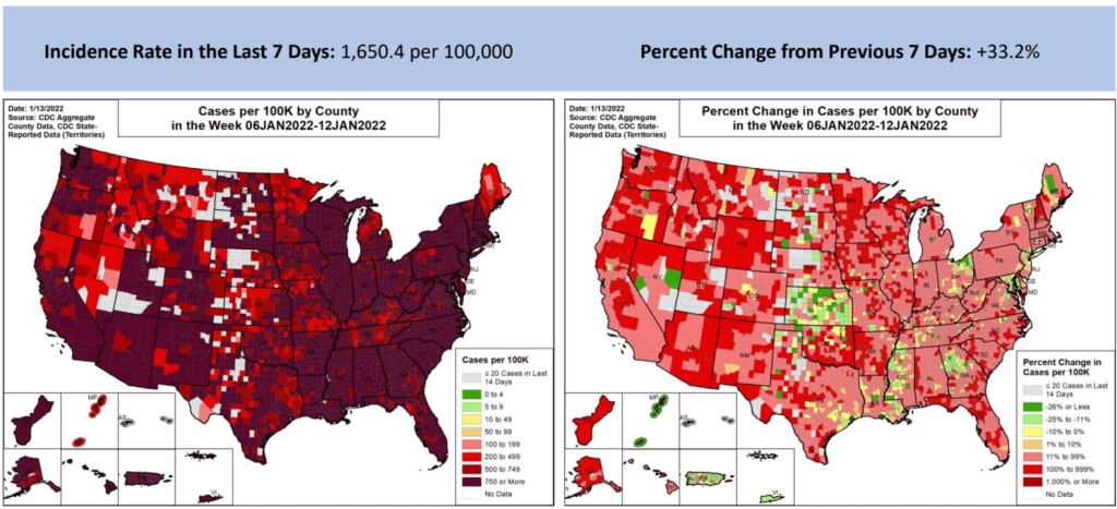
The entire country has extremely high COVID-19 transmission right now. Chart via the January 13 Community Profile Report. In the past week (January 8 through 14), the U.S. reported about 5.5 million new cases, according to the CDC. This amounts to:
- An average of 783,000 new cases each day
- 1,669 total new cases for every 100,000 Americans
- One in 60 Americans testing positive for COVID-19
- 33% more new cases than last week (January 1-7)
Last week, America also saw:
- 144,000 new COVID-19 patients admitted to hospitals (44 for every 100,000 people)
- 12,100 new COVID-19 deaths (3.7 for every 100,000 people)
- 98% of new cases are Omicron-caused (as of January 8)
- An average of 1.3 million vaccinations per day (per Bloomberg)
The U.S. once again broke COVID-19 records this week, reporting about 5.5 million new cases in total. Last winter, the highest number of cases reported in a single week was about 1.7 million; this past week, the country reported over one million cases just on Monday (though that number included backlogs from the prior weekend).
Last week, I wrote that one in eighty Americans had tested positive for COVID-19. This past week, that number is one in sixty—again, not including people who tested positive on rapid, at-home tests.
The U.S. also broke last winter’s hospitalization record this week: 157,000 patients are now hospitalized with COVID-19 across the country, according to the Department of Health and Human Services (HHS). Last winter’s record was about 125,000. But this number doesn’t capture the dire situations in ICUs, staff shortages, and other issues that hospitals are facing right now. (More on that later in the issue.)
Northeast states continue to report the highest case numbers: Rhode Island, New York, Massachusetts, New Jersey, Delaware, and Florida all reported over 2,000 new cases for every 100,000 people in the week ending January 12, according to the latest Community Profile Report. Some of the earliest Omicron hotspots appear to have peaked; in New York City, for example, the weekly case rate is back under 2,000 new cases per 100,000 in the week ending January 11, down from a height of 3,500 new cases per 100,000 on January 3.
But talking about specific state hotspots obscures from the fact that every single state is seeing insane COVID-19 numbers right now. Only four states reported fewer than 1,000 new cases per 100,000 last week—Wyoming, Montana, Idaho, and Maine—but their cases are climbing fast. Remember, the CDC threshold for high transmission is 100 new cases per 100,000.
Speaking of hotspots: I have a new story in FiveThirtyEight this week, explaining that the most important Omicron hotspots actually can’t be seen on case maps. Right now, we need to identify outbreaks among the people most vulnerable to severe disease and those most capable of shutting down society; but the deluge of cases right now makes it hard to see and protect those people.
Here’s the kicker of the piece:
Still, the toolkit for addressing omicron hot spots is the same as it has been throughout the pandemic, said [Julia Raifman, a professor of health law, policy and management at the Boston University School of Public Health]. New federal requirements for vaccinations, masks, testing and ventilation would help protect the people most vulnerable to severe symptoms while also reducing case numbers in settings that can shut down society.
“Federal guidance on mask mandates tomorrow would likely reduce deaths by tens of thousands,” Raifman said. “The perfect doesn’t need to be the enemy of the good, you don’t need every state to pass it. But you can put in place a mask policy during the surge, and it will reduce transmission and reduce the harms to health care workers and businesses.”
In other words: When you can’t pinpoint specific hot spots, you need broad measures that can impact everyone. That strategy was made harder on Thursday, as an Occupational Safety and Health Administration rule that would have required around 80 million workers to get vaccinated or comply with regular testing was blocked by the Supreme Court. Without this rule, low-income workers will continue to face heightened risk of COVID-19 infection — and their cases will continue to ripple out.
-
COVID source callout: JHU positivity rates
On Friday, a COVID-19 Data Dispatch reader asked for my help in interpreting a wildly high test positivity rate: 544% in Washington, D.C. The source of this rate, she said, was Johns Hopkins University (JHU)’s COVID-19 dashboard.
Test positivity rates seem simple; they’re calculated by dividing the number of positive tests over the total tests reported in a particular place, over a particular period of time. But these rates can be hard to calculate accurately because positive tests—a.k.a. COVID-19 cases—are often reported on a different time scale from all (positive and negative) tests.
If a health department is swamped with COVID-19 data—or if it’s coming off of a holiday break—it will prioritize analyzing and reporting the case numbers over other metrics, because case reporting is most important for public health measures like contact tracing. Similarly, some labs might send in positive test results before they send in negative test results. This can lead to something like 100 cases reported on a Monday, but the tests used to find those cases not getting reported until later in the week.
States and localities that calculate their own positivity rates have systems to account for these time differences, usually by matching up the dates that tests took place. But JHU doesn’t do this, because JHU test positivity rates come from automatic data scrapes and calculations with none of the backend timing information that you’d need to actually determine an accurate positivity rate.
In short, if you see a wildly high test positivity rate sourced from JHU’s dashboard, don’t trust it. Go look at the state, city, or county’s own COVID-19 data, or check the CDC dashboard instead.
Also: I’d like to write more about test positivity next week, since this is such a confusing metric right now. If you have questions on this topic, send them my way!
-
Featured sources, January 9
- COVID-19 Hospital Capacity Circuit Breaker Dashboard: This dashboard from emergency physician Dr. Jeremy Faust and colleagues shows which U.S. states and counties are operating at unsustainable levels, or are likely to get there in coming days. Faust further explains circuit breakers in this post: these are “short-term restrictions, regardless of vaccination status, designed to slow the spread of COVID-19” and help prevent hospitals from becoming overwhelmed. Dashboard data come from the CDC, HHS, and Johns Hopkins University.
- CDC Cruise Ship Color Status: Throughout the pandemic, cruise ships have been hotbeds for coronavirus spread. This is especially true right now, thanks to Omicron, and the CDC is investigating a number of outbreaks. The agency reports on all cruise ships that it’s monitoring for COVID-19, classifying them based on the number of cases reported among passengers and crew; as of January 7, the vast majority of ships have reported enough cases to meet the threshold for CDC investigation.
- Deaths and hospitalizations averted by vaccines: This December report from philanthropy foundation the Commonwealth Fund provides estimates on the severe COVID-19 cases prevented by the U.S. vaccination effort. Without vaccination, the report estimates, “there would have been approximately 1.1 million additional COVID-19 deaths and more than 10.3 million additional COVID-19 hospitalizations in the U.S. by November 2021.” (H/t Your Local Epidemiologist.)
-
Six more things, January 9

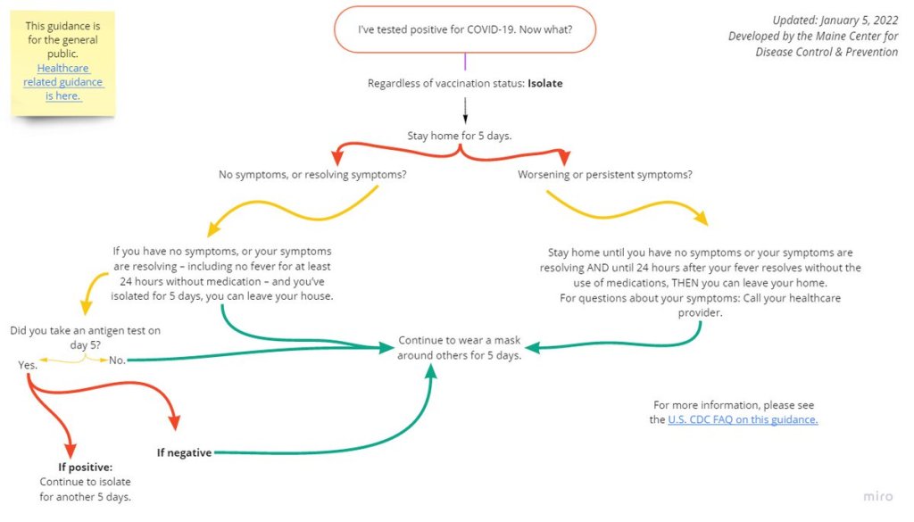
If you test positive for COVID-19, here’s what the CDC says you should do. Graphic via the Maine health agency. Here are six other COVID-19 news items from the past week that didn’t quite warrant full posts:
- The CDC made its COVID-19 isolation guidance even more confusing, somehow. On Tuesday, the CDC updated its isolation guidance again—and the new guidance is, kind-of a “dumpster fire,” as the headline on this article by The Atlantic’s Katherine J. Wu aptly puts it. The agency still isn’t requiring rapid tests to get out of isolation early, but it says you can test if you have one available. Also, wear a mask if you leave isolation after five days and avoid travel, restaurants, and other high-exposure activities. Wu’s article provides a good summary of the guidance (and criticism of that guidance), as does this Your Local Epidemiologist post from Dr. Katelyn Jetelina.
- New reporting recipe explains how to explore “uncounted” COVID-19 deaths with CDC data. Last week, I shared a new investigative story from my team at the Documenting COVID-19 project that dives into unreported COVID-19 deaths in the U.S. Up to 200,000 deaths may have gone unrecorded thanks to a lack of training, standardization, tests, and other issues with death reporting. This week, the team published a reporting recipe aimed to help other journalists do similar stories in their states, cities, and regions. If you have questions about the project or recipe, you can reach out to us at info@documentingcovid19.io.
- B.1.640.2, or the “IHU variant” from France, is not currently cause for concern. In the past few days, you might have seen headlines about a new variant called B.1.640.2 that was identified in France last November. The variant has a number of mutations, including some mutations that have also been identified in other highly-contagious variants, according to a recent preprint from French researchers. But it’s not currently a concern, say experts at the World Health Organization and elsewhere. This variant actually predates Omicron, and only 20 cases had been reported between early November and early January (compared to well over 100,000 Omicron cases in the same timespan). Omicron is the main variant we should be worrying about right now.
- “Flurona” means getting the flu and COVID-19 at the same time; it’s not a new mutant disease. Another buzzword you might’ve seen in headlines this week: “flurona,” a portmanteau of coronavirus and flu. Los Angeles and other places have recently reported cases in which a patient tests positive for both the flu and COVID-19 at the same time. While having two respiratory diseases at once is certainly unpleasant—and might lead to increased risk of severe symptoms—it’s not necessarily worth freaking out over. Roxanne Khamsi covered these potential coinfections in The Atlantic back in November 2021, writing: “Recent screening studies have found that 14 to 70 percent of those hospitalized with flu-like illness test positive for more than one viral pathogen.”
- Senators call for HHS to answer key questions about COVID-19 testing. This week, Senators Roy Blunt (Missouri) and Richard Burr (North Carolina) wrote to Health and Human Services (HHS) Secretary Xavier Becerra requesting information on COVID-19 test spending. The Senators note that over $82.6 billion has been “specifically appropriated for testing,” yet the U.S. continues to experience dire shortages and delays for both PCR and rapid tests. The letter includes questions about Biden’s initiative to distribute 500 million rapid tests for free; little information has been shared about the initiative so far.
- New meta-analysis estimates one in three COVID-19 patients have persistent symptoms for 12 weeks or more. In a meta-analysis, scientists compile results from a number of studies on the same topic in order to provide overall estimates for an important metric, like the risk of developing a particular condition. A new analysis from researchers at a Toronto hospital network and other co-authors examined the risk of Long COVID symptoms following a COVID-19 diagnosis, combining results from 81 studies. Their main findings: about 32% of patients had fatigue 12 weeks after their diagnosis, while 22% had cognitive impairment at 12 weeks; and the majority of those patients still had these symptoms at six months. (H/t Hannah Davis.)
Note: this title and format are inspired by Rob Meyer’s Weekly Planet newsletter.
-

Omicron updates: the surge is here, but peaks might be in sight
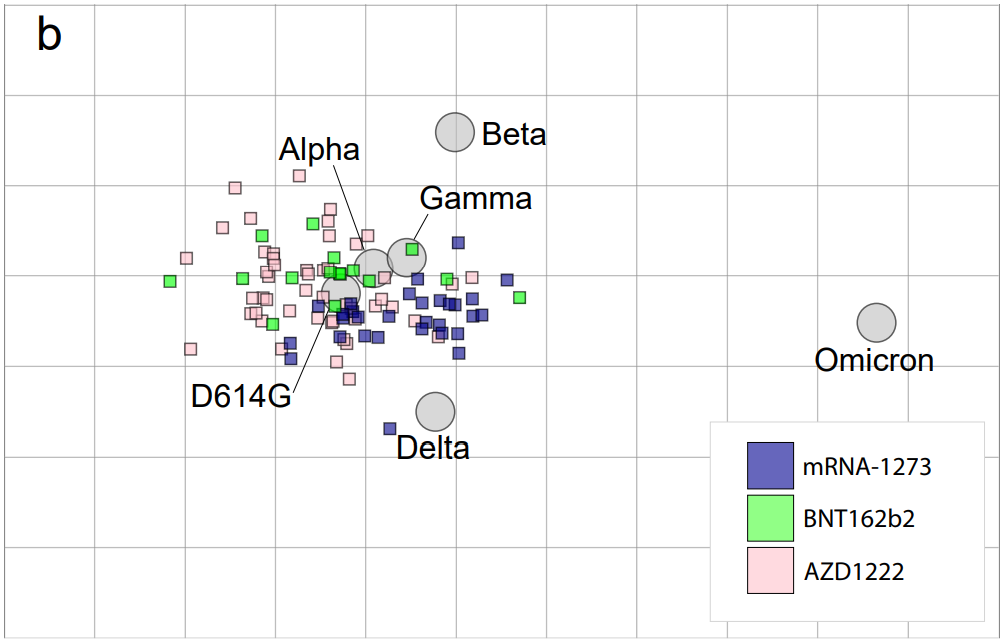
Antigenic drift posed by Omicron. Figure from Sanders et al., posted to Medrxiv on January 3. As the Omicron surge continues, we are still learning more about this variant. Here are the major updates from this week:
- Omicron is now causing more than 90% of new cases in the U.S. In the latest update of the CDC’s variant proportions estimates, the agency found that Omicron caused 95% of new COVID-19 cases nationwide in the week ending January 1. The CDC also revised estimates for previous weeks, bringing us to 77% Omicron for the week ending December 25 and 38% Omicron for the week ending December 18. While these estimates continue to be based on weeks-old data, it the CDC now has enough sequencing information to make Omicron estimates with lower confidence intervals than it did a few weeks ago—suggesting that these numbers are closer to reality than the estimates we saw in December.
- Omicron is causing the vast majority of cases in every state. Also included in the CDC’s variant proportions estimates: regional numbers. The latest figures estimate that, as of January 1, Omicron prevalence across the country ranges from 82% in the Northeast to 98% in New York/New Jersey and the Gulf states region (Texas, Louisiana, Arkansas, Oklahoma, and New Mexico). These numbers align with recent calculations from computational biologist Trevor Bedford based on sequences posed to the public repository GISAID. In short: Omicron is everywhere.
- Evidence that Omicron is less likely to cause severe symptoms continues to mount. A combination of real-world hospitalization and lab data continue to suggest that Omicron is less likely to cause severe COVID-19 symptoms than past coronavirus variants. The hospitalization data: in Omicron hotspots, hospitalization numbers are not rising at the same rate as case numbers, nor are the numbers of patients who require intensive care or ventilators. “Despite steep rises in cases and patients, the number on ventilators has barely risen,” wrote Financial Times data journalist John Burn-Murdoch in a recent thread about U.K. data.
- And the lab data: a growing number of studies show that Omicron is less capable of infecting patients’ lungs compared to past variants—meaning the worst respiratory symptoms are rarer. At the same time, people who catch Omicron after gaining immunity from vaccination and/or prior infection are protected against severe symptoms thanks to T cells and other aspects of immune system memory. Note that, however, we still don’t know about the risk of Long COVID following an Omicron case.
- Still: U.S. Hospitals are now incredibly overwhelmed with Omicron and Delta cases. In the U.S. so far, the “decoupling” phenomenon (in which hospitalizations and ICU admissions don’t rise as fast as cases) has been less visible than in other countries hit by Omicron. Several states have already set hospitalization and/or ICU records during the Omicron surge. This is likely because many parts of the U.S. have lower vaccination rates than other countries like the U.K. At the same time, accounts from hospital workers show the toll that this surge is taking: “Thankfully the Covid patients aren’t as sick. BUT there’s SO many of them,” wrote NYC ER doctor Dr. Craig Spencer in a recent Twitter thread.
- Omicron has more antigenic drift than any other variant. “Antigenic drift” is a virology term referring to the small mutations in virus genetic material that cause these viruses to change slowly over time. As I noted in early Omicron updates, this variant didn’t evolve out of Delta (as many experts were expecting) but rather showed up seemingly out of nowhere; it might have emerged from a part of the world with limited variant surveillance, an immunocompromised person, or even an animal host. We don’t know Omicron’s origin yet, but we now know that it is further apart, genetically speaking, from the original coronavirus than any other variant so far.
- London’s Omicron surge may have peaked. According to U.K. data, both case numbers and hospital admission numbers have slowed in their increases, the Washington Post reports. “For the moment, we can probably say London appears to be over the worst,” U.K. hospital executive Chris Hopson said last week. Other U.K. health officials are more skeptical though, according to the Post: while case numbers are falling for teenagers and younger adults, London is still reporting increasing cases among seniors.
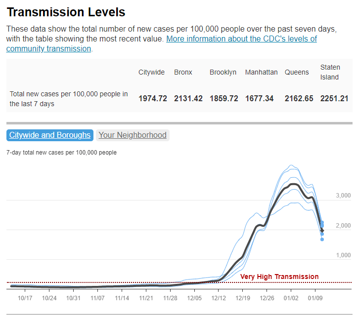
- New York City also might be on the verge of peaking. Another tentative peak report: data from NYC’s health department suggest that case numbers might be starting to fall in the city. The citywide seven-day average for new cases fell from 3,261 per 100,000 people on January 2 to 2,754 per 100,000 on January 4, and NYC’s positivity rate is also trending down. Reduced COVID-19 testing over New Years and other reporting uncertainties are likely playing a role here, but still—NYC cases jumped right back up after Christmas, but haven’t yet jumped up after New Years. I am cautiously optimistic!
- New research maps out South Africa’s intense Omicron wave. This recent study caught my eye when it was published in Nature this week through accelerated approval. Nearly 100 scientists in South Africa, Botswana, the U.S., Switzerland, the U.K., and other countries collaborated to analyze Omicron’s genetic makeup and the variant’s rapid spread through South Africa, including its ability to cause breakthrough cases and reinfect people who’ve previously had COVID-19. The paper is just one example of the immense collaboration that has taken place over the past month as scientists work to quickly understand this variant. Thank you, scientists!
More variant reporting
-
As Omicron hits schools, K-12 data void is wider than ever
Two years into the pandemic, you might think that, by now, schools would have figured out a strategy to continue teaching kids while keeping them safe from the coronavirus. Instead, the school situation is more chaotic than ever—thanks to Omicron combined with staff shortages, pandemic fatigue, and other ongoing issues.
Thousands of schools went online or closed entirely this week, likely more than in any other week since spring 2020. And yet: there is currently no national data source tracking COVID-19 cases in schools, and nine states fail to report any data on this crucial topic.
This week, I had a story published in education outlet The Hechinger Report about the challenges that schools faced in staying open during the fall 2021 semester. For the story, I returned to the five school communities that I profiled last summer during my Opening project to see how they fared in the fall.
The story identifies four major challenges:
- Quarantines: When a school or district faces a COVID-19 outbreak, contact tracing for all of the cases can quickly become incredibly time-consuming. This work “can be very burdensome for the school and the health department,” pediatrician Leah Rowland told me—especially when a school doesn’t have its own school nurse.
- Testing: Surveillance testing can help identify cases early, while test-to-stay programs can keep kids out of quarantine; in fact, the CDC recently endorsed test-to-stay, adding the strategy to its official schools guidance. But testing programs are costly and hard to set up; in absence of state-wide testing support, they tend to be implemented at larger and wealthier school districts.
- Staff shortages: Every single school leader and expert I spoke to for the story named staff shortages as a major challenge. “[Potential staff] can work at McDonald’s, and have a whole lot less stress and make more money than working as an instructional assistant for Garrett County Public Schools,” Alison Sweitzer, director of finance at this Maryland district, told me.
- Pandemic fatigue: In a lot of places around the U.S., schools are one of the only—if not the only—institution still enforcing COVID-19 policies, like masks and social distancing. This can drive up tension between parents and school staff; and school nurses, who act as public health experts within the school, often bear the brunt of the criticism. Robin Cogan, legislative co-chair for the New Jersey State School Nurses Association, told me that she’s never felt this exhausted, in 21 years of serving as a school nurse.
- Low vaccination rates: As of this week, about one in four children ages five to 11 has received at least one dose of a COVID-19 vaccine. This ranges wildly by state, though, with 57% of children in this age group vaccinated in Vermont compared to under 20% in much of the South. Vaccinated students and staff don’t have to quarantine when they’re exposed to a COVID-19 case, but despite this strong motivator, the school leaders I spoke to have not seen much enthusiasm for the shots.
I reported most of that Hechinger Report story before Omicron hit the U.S. But it’s clear to see how the new variant has exacerbated all of these challenges. As this super-contagious variant hits schools, cases are increasingly rapidly—leading to more quarantines and contact tracing pressures. School staff are getting sick, intensifying shortages. And the students and staff who are unvaccinated are the most vulnerable.
“Pediatric hospitalizations are at the highest rate compared to any prior point in the pandemic,” CDC Director Dr. Rochelle Walensky said at a press briefing on Friday. The CDC is investigating whether this increase reflects an inherent severity of Omicron in children or whether it’s simply the product of record-high cases everywhere. Either way, though, the data clearly show that vaccination is the best way to protect children from severe COVID-19. For children under age five, Dr. Walensky said, “it’s critically important that we surround them with people who are vaccinated to provide them protection.”
According to Burbio’s K-12 School Opening Tracker, 5,441 schools had disruptions in the week of January 2. Those disruptions include schools going online or canceling instruction entirely—anything caused by the pandemic, as opposed to by weather or some other reason. This is higher than any other week in the 2021-2022 school year by a long shot; the previous record was 2,846 disruptions in early November.
New York City has been one of the U.S.’s first Omicron hotspots, and the variant has had a massive impact on the city school system. Case rates shot up in December, with almost 5,000 new cases reported by the city Department of Education (DOE) in the week ending December 26. This number, as well as January DOE data, is likely a massive undercount, though, because of the sheer number of cases being reported within the city right now.
The PRESS NYC schools dashboard, which references DOE data, provides this caveat: “As we understand it, the Situation Room cannot keep up with cases coming in and many cases aren’t even making it into DOE data.”
Stories from inside the public school system suggest that kids are going into classrooms just to sit in study hall and, very likely, infect each other. One Reddit post from a NYC high school student described the case numbers at their school shooting up from six total cases in mid-December, to 100 on January 3, to over 200 by the end of this week. The majority of those cases weren’t yet reflected in DOE data, the student said.
Yet NYC’s new mayor, Eric Adams, seems determined to keep schools open at all costs.
Other districts have also had their fair share of conflict this week. In Chicago, teachers are on strike for safer in-person conditions. The situation has led to classes getting canceled entirely, as the school district locked striking teachers out of their online accounts—preventing them from teaching remotely. And in many other districts, including Seattle and Washington D.C., the start of the spring semester was delayed as the district sought to test all students, teachers, and staff before reopening.
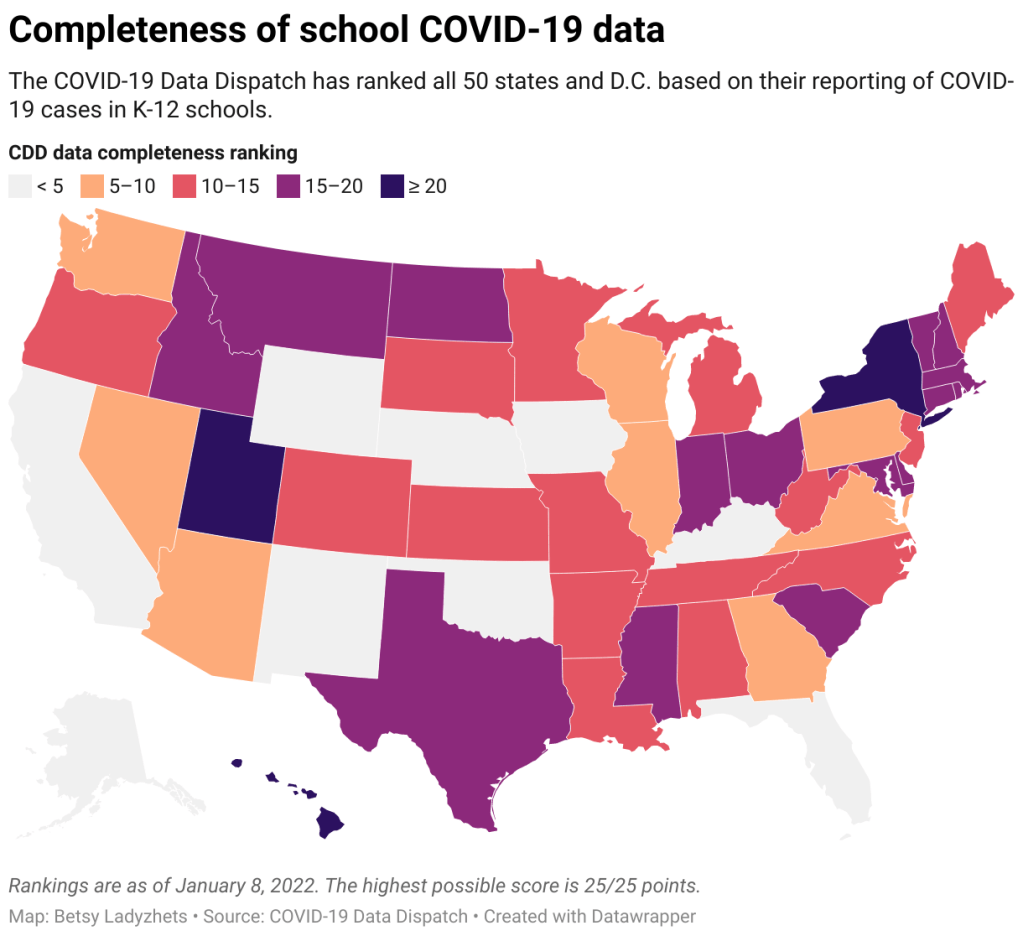
With all of this tension in mind, I set out yesterday to update my K-12 school data annotations for the first time in several months. These annotations reflect the availability of data on COVID-19 cases and related metrics in school buildings, by state and at the national level.
Here’s what I found:
- 31 states and D.C. are reporting data on COVID-19 cases in K-12 school settings. There’s a lot of variability in this reporting, though, from states like Connecticut, which reports a detailed breakdown of cases by school (including downloadable historical data), to states like Maine, which only reports cases in “active outbreaks.”
- 10 states are reporting what I categorize as “somewhat” cases in K-12 schools. This includes states like Arizona, which reports the number of schools with COVID-19 outbreaks by county (but no case numbers), and Illinois, which reports cases in school-aged children (but not cases that are school-specific).
- Nine states are not reporting any K-12 school data. These states are: Alaska, California, Florida, Iowa, Kentucky, Nebraska, New Mexico, Oklahoma, and Wyoming. Note, both Florida and Kentucky used to report school data, but have discontinued this reporting since last school year.
- New York continues to have the most complete school data, by my assessment, as it’s the only state to report both COVID-19 tests and school enrollment.
- Six states are now reporting in-person school enrollment, a key metric needed to analyze COVID-19 data: Connecticut, Delaware, Hawaii, New York, Texas, and Utah.
In short, while a lot of data on COVID-19 in schools are available from state public health departments, these data are wildly unstandardized and difficult to analyze holistically. See the annotations page for more details on your state.
Meanwhile: at this time, there is no national data source on COVID-19 cases in schools. The federal government has never reported these data; the best that our federal health agencies can do, apparently, is compile rarely-updated dashboards of school learning modes (i.e. which districts are in-person vs. remote). Last school year, a couple of research projects sprung up to compile information from state agencies and other sources; but as of now, those projects are all discontinued.
While a number of studies have demonstrated the effectiveness of common safety policies (masks, vaccinations, ventilation, etc.), many of the researchers who study school COVID-19 safety have to use small sample sizes, such as a single district or state. CDC researchers often rely on proxies like county case rates to analyze the impact of different policies. This research is a far cry from the work that we could do with a comprehensive, national dataset of COVID-19 cases in schools.
Without detailed data on COVID-19 in schools, it’s difficult to make good policy decisions. The data void leaves space for pundits on both sides of the aisle: some can argue that schools are safe and must remain open in-person no matter how high community cases get, while others can argue that schools are incredibly dangerous and must close.
The COVID-19 in schools data void is wider than ever right now, even though we need information desperately as Omicron spreads.
More K-12 reporting
