Blog

  • Answering reader questions: Encouraging policy changes

    Answering reader questions: Encouraging policy changes

    As of February 11, 98% of U.S. counties are seeing high COVID-19 transmission, according to the CDC. Chart from the CDC COVID-19 dashboard.

    In January, I invited readers to fill out a survey asking what you’d like to see from the COVID-19 Data Dispatch in 2022. Thank you to everyone who responded—your feedback gave me some great ideas for topics to focus on and new CDD-related initiatives to pursue this year!

    This week, though, I want to focus on a topic that multiple readers brought up in the survey: how individuals can impact COVID-19 policies. One reader asked, “What can I as an individual do to make better the lacking local, state, federal, and international societal responses to COVID-19?” Another reader asked, along the same lines, “What can I do to encourage policy changes that keep people safer?”

    These questions feel particularly pertinent this week, as leaders of several states loosen up on mask mandates and other COVID-19 safety measures. Governors in New Jersey, Connecticut, Delaware, Oregon, and Massachusetts have all announced that they’re ending mask mandates in public schools, and in some cases, in other public spaces. New York Governor Kathy Hochul is keeping the state’s K-12 school mask mandate in place for now, but ending a mandate for New York businesses.

    Policy changes like these go against long-standing guidance from the CDC. In summer 2021, the agency recommended that communities base their levels of COVID-19 safety measures on two primary metrics: new cases per 100,000 people in the last week, and the percent of PCR tests that returned positive results in the last week. A high case rate indicates a lot of COVID-19 in the community, while a high test positivity rate can indicate the community’s testing infrastructure is not picking up a large share of cases—both suggest that measures should be put in place to control the virus’ spread.

    At the time, this guidance was instituted as a response to the CDC’s preemptive recommendation that vaccinated people could go maskless. The agency said that counties seeing “high” or “substantial” transmission, according to the CDC’s metrics, should mandate masks for all, while counties with lower transmission could allow vaccinated people to go maskless. Gotta be honest: I do not know of a single state or county that’s actually following this guidance. Still, this combination of metrics is, I find, a useful and simple way to evaluate community spread.

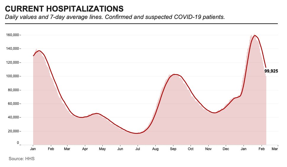
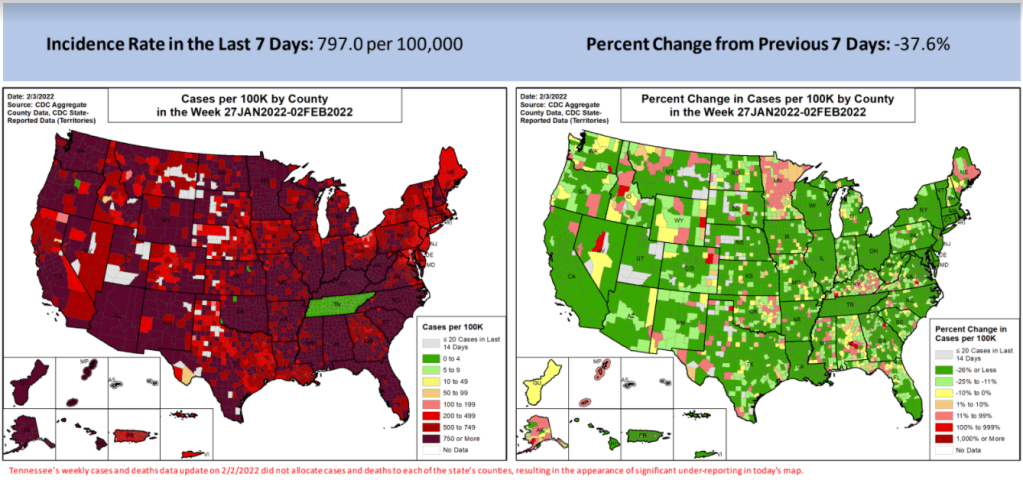
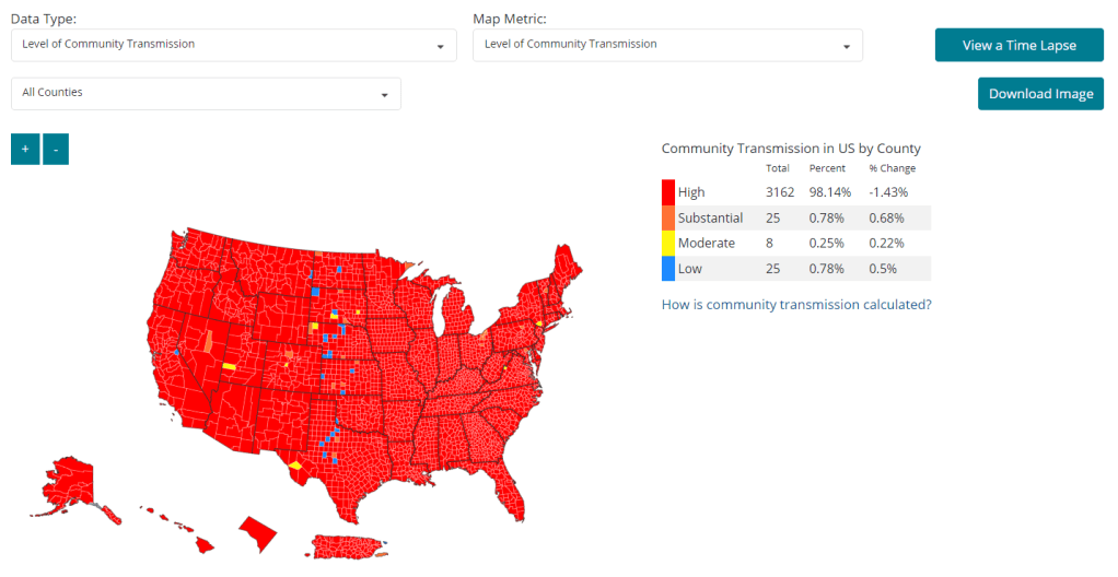
    As I’ve pointed out in recent National Numbers updates, even though case numbers in the U.S. have dropped significantly since the Omicron peak in January, they are still at very high levels across the country. You can see on the CDC’s dashboard that, as of this week, about 98% of counties fall into the “high transmission” category—with over 100 new cases per 100,000 people and test positivity over 10%. And beyond the case numbers: many hospitals are currently recovering from record Omicron surges, while over 2,000 Americans are dying of COVID-19 each day.

    According to the CDC’s own guidance, 98% of U.S. counties should have a mask mandate right now. But instead, among the small number of Democrat-led states that have retained mandates, safety measures are now being lifted. The CDC itself is having a hard time commenting on this situation, and is reportedly “considering updating its guidelines on the metrics states should use,” according to POLITICO.

    During this time of “opening” the small number of places that were not already fully open, what can individuals do to make their voices heard—or at least improve COVID-19 safety in their own communities? I have three suggestions:

    1. Call your political representatives and tell them how you feel.

    If your state, city, or other local region is considering lifting some COVID-19 safety measures, you have a representative whose job literally includes listening to your complaints about this issue—whether that’s a state assembly member or city councilor.

    You can use this website to find your national and state representatives, and many localities have their own equivalents (for example, this site for New York City). Once you’ve found the contact information for your representatives, call or email them to express your support for continued COVID-19 precautions. This document offers a couple of potential phone call and email scripts; it’s New York-specific, but can easily be translated to other states.

    In the last couple of years, conservative Americans have often been more politically active at the local level than more left-leaning Americans. Republicans often show up to school board meetings, call their representatives, and make their anger heard—sometimes supported by astroturfing campaigns. Anecdotal reports suggest that public health officials tend to hear more from community members who hate mandates than from those who actually want to see COVID-19 safety in their communities. You can push back against this trend.

    And if you want to do some additional phone-calling or emailing beyond political representatives, consider reaching out to your state or local public health department and offering some support! They can probably use it.

    2. Volunteer for local organizations helping to provide vaccinations, masks, tests, and other resources.

    About 80% of Americans ages five and up have received at least one COVID-19 vaccine dose, according to the CDC. This number may sound impressive, but’s more concerning when we look at the other side of the statistic: 20% of eligible Americans have not yet received at least one COVID-19 vaccine dose. Plus, among those Americans who have been fully vaccinated, more than half haven’t received a booster shot.

    A lot of unvaccinated Americans are conservatives whose minds are very hard to change, this is true. But many of them are low-income workers with intense schedules, lingering health concerns, and other barriers to actually getting the shots that are surmountable, health policy expert Julia Raifman told me for a FiveThirtyEight story last month.

    As a result, volunteer organizations around the country are still working to get their communities vaccinated and boosted. For example, Bed-Stuy Strong, a mutual aid group in my Brooklyn neighborhood, has hosted vaccination drives focused on local seniors and disseminated information on vaccinations and testing in the area.

    Look for an effort like this that you might be able to join in your community! Or, if nothing like this currently exists, reach out to a local organization—like a public school, library, community center, etc.—and see if they might want to host a vaccine drive. Your local public health department could likely provide the supplies.

    3. Educate your friends, family, and community members.

    Beyond political and volunteer efforts, you can increase COVID-19 safety in your community simply by spreading the word about tools like high-quality masks and rapid tests. It might seem obvious, at this point in the pandemic, that we should all be stocking up on KN95s and testing kits, but many people do not have access to these tools—or simply don’t know why they’re useful.

    You can send friends, family, and community members to websites like Project N95, which sells masks and other PPE, and Bona Fide Masks, a family business and leading KN95/N95 distributor. You can also tell them about antigen test distributors like iHealth Labs and Walmart, which are seeing fewer delays and supply crunches as the Omicron surge wanes.

    In addition, if you have the resources, you can buy these masks and rapid tests in bulk and give them out. I recently gave out a couple of KN95 masks to contractors who were sent to look at a water issue in my apartment building, because I had the masks to spare. It’s that easy!

    If you take any of these suggestions and see some impact, please email me (betsy@coviddatadispatch.com) and tell me about it!

    More on federal data

  • National numbers, February 13

    National numbers, February 13

    Current COVID-19 hospitalizations in the U.S. have fallen under 100,000 for the first time since the Omicron surge started. Chart by Conor Kelly, posted on Twitter on February 9.

    In the past week (February 5 through 11), the U.S. reported about 1.5 million new COVID-19 cases, according to the CDC. This amounts to:

    • An average of 215,000 new cases each day
    • 459 total new cases for every 100,000 Americans
    • One in 218 Americans testing positive for COVID-19
    • 43% fewer new cases than last week (January 29-February 4)

    Last week, America also saw:

    • 85,000 new COVID-19 patients admitted to hospitals (26 for every 100,000 people)
    • 16,000 new COVID-19 deaths (4.9 for every 100,000 people)
    • 100% of new cases are Omicron-caused (as of February 5)
    • An average of 300,000 vaccinations per day (per Bloomberg)

    COVID-19 cases continue to decline across the U.S. as the country comes out of its Omicron surge. Nationwide, the U.S. reported an average of 215,000 new cases a day last week—a drop of about 75% from the peak of the Omicron surge, when nearly 800,000 new cases were reported each day.

    Hospitalizations are also decreasing: this week, the number of confirmed and suspected COVID-19 patients in U.S. hospitals dropped under 100,000 for the first time since the surge started in December. Deaths are decreasing as well, but are still at high levels: over 2,000 Americans are dying of COVID-19 each day.

    All 50 states and the majority of counties continue to report case declines, according to the latest Community Profile Report. But case rates are still very high across the country, well above the CDC’s threshold for high transmission (more on this later in the issue).

    States with high case rates this week include Alaska, Kentucky, West Virginia, Montana, Mississippi, North Dakota, California, and Idaho; all reported over 700 new cases for every 100,000 residents in the week ending February 9.

    Omicron is still causing 100% of new cases in the country, according to CDC estimates. But the agency is now splitting its estimates into the original Omicron and its sister strain BA.2: BA.2 caused between 2% and 7% of new cases nationwide in the week ending February 5, the CDC says. In the coming weeks, we’ll see whether this strain—which is even more transmissible than original Omicron—has an impact on U.S. case numbers.

    New vaccination numbers have been fairly low for the past couple of weeks, with an average of under 300,000 shots given each day (including boosters). And the FDA is now delaying vaccine authorization for children under age 5: the agency has decided to wait for Pfizer to provide data on how well a three-dose series performs in this age group, after initially considering authorization based on data about two doses.

  • COVID source callout: Iowa ends COVID-19 dashboards

    On February 16, Iowa’s two COVID-19 dashboards—one dedicated to vaccination data, and one for other major metrics—will be decommissioned. The end of these dashboards follows the end of Iowa’s public health emergency declaration, on February 15.

    In a statement announcing the end of the public health emergency, Iowa Governor Kim Reynold assures residents that “the state health department will continue to review and analyze COVID-19 and other public health data daily.” Data reporting on COVID-19 will be more closely aligned to reporting on the flu and other respiratory diseases, she said. Even though COVID-19 is causing the death of more than 100 Iowa residents a week, according to CDC data.

    Iowa used to be the state with the most frequent COVID-19 data reporting, with a dashboard that updated multiple times an hour. In fact, I wrote an ode to its frequent updates here at the COVID-19 Data Dispatch, back in fall 2020. But now, Iowa joins Florida, Nebraska, and other states in ending its public health emergency and, consequently, severely downgrading the level of information that it’s providing to residents who are very much still living in a public health emergency.

    At least the state will continue providing regular updates to the CDC—those requirements haven’t changed.

  • Sources and updates, February 6

    • Vaccination data from dialysis facilities: A recent addition to the CDC’s COVID Data Tracker, this dataset reports vaccination coverage among patients and staff working in dedicated dialysis facilities, which offer treatment to patients with chronic kidney diseases—a group at high risk for severe COVID-19. The vaccine coverage rates for dialysis staff are new as of this week. Overall, about 74% of dialysis patients and 79% of staff are fully vaccinated, and smaller percentages are boosted, as of late January.
    • CDC report provides vaccination data by sexual orientation and gender identity: As health equity advocates have pushed for more demographic data describing who’s been vaccinated in the U.S., the focus is often on race and ethnicity data. But it’s also important to track vaccinations among the LGBTQ+ community, as these Americans are at higher risk for severe COVID-19 due to HIV, mental health issues, and other conditions common in this group. This new CDC report provides a snapshot of these important data, sourced from the National Immunization Survey. Notably, the report found that vaccine coverage was higher overall among gay and lesbian adults compared to straight adults—but lower among Black LGBTQ+ people across all identities.
    • Association of child masking with COVID-related childcare closures: A new paper published in JAMA Network Open this week provides additional evidence showing that mask requirements can help keep schools and childcare centers open. The paper found that childcare programs where children were masked were 14% less likely to close over the course of a year than programs without child masking. For more commentary on the paper, see Inside Medicine.

  • Omicron updates: The continued importance of vaccination

    Omicron updates: The continued importance of vaccination

    COVID-19 deaths during the Omicron wave have been much higher in the U.S. than in other similarly wealthy countries, according to a New York Times analysis.

    Just a few updates for this week:

    • Scientists are still learning about BA.2, the more-transmissible Omicron offshoot. There haven’t been many major updates about BA.2 since last week, when I wrote this FAQ post; but this STAT News article by Andrew Joseph provides a helpful summary of what we know so far. The article explains that BA.2 clearly has a transmission advantage over BA.1 (and has now become the dominant variant in a few countries), but BA.1 may have spread around the world due to chance and some well-placed superspreading events. Notably, the CDC is not yet splitting out its Omicron prevalence estimates into BA.1 and BA.2, so we don’t have a great sense of how much this sub-lineage is spreading in the U.S.
    • More data indicates immune system memory remains strong against Omicron. In previous Omicron update posts, I’ve noted that, while vaccinated people are more likely to have a breakthrough case with Omicron than with past variants, vaccination is still highly protective against severe symptoms. A new study published in Nature this week further affirms this protection; researchers found that 70% to 80% of T cell response to Omicron was retained in people who were vaccinated or tested positive on antibody tests, compared to past variants. (T cells are key pieces of immune system memory response.)
    • Similarly, more data backs up the importance of vaccination to protect against severe disease during the Omicron era. The CDC released more MMWR studies this week showing that fully vaccinated and boosted Americans were less likely to require hospitalization or intensive care during the Omicron surge compared to the unvaccinated. For example, in Los Angeles County, California, hospitalization rates among unvaccinated people were 23 times higher than rates among those fully vaccinated with a booster, and five times higher than those vaccinated without a booster.

    • Omicron is too transmissible for school testing programs to keep up. I’ve previously reported on the challenges of K-12 COVID-19 testing programs, including the difficulty of setting up public health logistics, getting enough tests, and increasing polarization of testing. During the Omicron surge, these challenges have been magnified—to the point that some states, including Utah, Vermont, and Massachusetts, have suspended testing programs, POLITICO reported this week. I hope to see some of these programs resume after the surge is over.
    • The U.S.’s death toll during the Omicron surge has been far higher than in similarly wealthy nations. A new analysis from the New York Times compares the death toll in the U.S. from December 2021 through January 2022, adjusted for population, to death tolls in peer wealthy nations like Germany, Canada, Australia, and Japan. The comparison is striking: “the share of Americans who have been killed by the coronavirus is at least 63 percent higher than in any of these other large, wealthy nations,” the NYT reports. This difference is largely because the U.S. is less vaccinated than these other countries, particularly when it comes to booster shots and vaccinations among seniors.
    • Globally, cases during the Omicron surge surpassed all of 2020. “In the 10 weeks since Omicron was discovered, there have been 90 million COVID-19 cases reported — more than in all of 2020,” said Tedros Adhanom Ghebreyesus, Director-General of the World Health Organization, at a press conference last week. In a Twitter thread reporting from the press conference, STAT’s Helen Branswell noted that the WHO is concerned about countries “opening up” and lifting COVID-19 restrictions before their case numbers are actually low enough to warrant these measures.

    More variant reporting

  • The CDC is finally publishing wastewater data—but only ten states are well-represented

    The CDC is finally publishing wastewater data—but only ten states are well-represented

    This week, the CDC added wastewater tracking to its COVID-19 data dashboard. Wastewater has been an important COVID-tracking tool throughout the pandemic, but it gained more public interest in recent months as Omicron’s rapid spread showed the utility of this early warning system. While the CDC’s new wastewater tracker offers a decent picture of national COVID-19 trends, it’s basically useless for local data in the majority of states.

    Wastewater, as you might guess from the name, is water that returns to the public utility system after it’s been used for some everyday purpose: flushing a toilet, bathing, washing dishes, and so forth. In wastewater surveillance, scientists identify a collection point in the sewer system—either beneath a specific building or at a water treatment plant that handles sewage from a number of buildings. The scientists regularly collect wastewater samples from that designated point and test these samples for COVID-19 levels.

    When someone is infected with the coronavirus, they are likely to shed its genetic material in their waste. This genetic signal shows up in wastewater regardless of people’s symptoms, so a wastewater sample may return a positive result for the coronavirus earlier than other screening tools like rapid antigen tests. And, because wastewater samples are typically collected from public sewer networks, this type of surveillance provides information for an entire community—there’s no bias based on who’s able to get a PCR or rapid test.

    Scientists and organizations who utilize wastewater testing consider it an early warning system: trends in wastewater often precede trends in reported COVID-19 cases. For example, the coronavirus RNA levels identified in Boston’s wastewater shot up rapidly before Boston’s actual Omicron case numbers did, then also went down before case numbers did. Similarly, Missouri’s wastewater surveillance system—which includes genetic sequencing for variants—identified Delta cases last summer weeks before PCR testing did.

    Wastewater surveillance is also a popular strategy for colleges and universities, which can set up collecting sites directly underneath student dormitories. Barnard College, where I went to undergrad, is one school that’s employed this strategy. At one point in the fall 2021 semester, the college instructed students living in the Plimpton residence hall (where I lived as a sophomore!) to get individual PCR COVID-19 tests because the wastewater surveillance program had found signals of the virus under their dorm.

    Screenshot of the CDC’s new wastewater dashboard, retrieved on February 6.

    The CDC has been coordinating wastewater surveillance efforts since September 2020, Dr. Amy Kirby, team lead for the National Wastewater Surveillance System, said during a CDC media briefing on Friday. “What started as a grassroots effort by academic researchers and wastewater utilities has quickly become a nationwide surveillance system with more than 34,000 samples collected representing approximately 53 million Americans,” Kirby said.

    It’s a little unclear why it took the CDC so long to set up a dashboard with this wastewater data when surveillance efforts have been underway for a year and a half. Still, many researchers and reporters are glad to see the agency finally publishing this useful information. The dashboard represents wastewater collection sites as colored dots: blue dots indicate that coronavirus RNA levels have dropped at this site in the last two weeks; yellow, orange, and red dots indicate RNA levels have risen; and gray dots indicate no recent data. You can download data from a dropdown beneath the dashboard and on the CDC’s data portal site.

    “More than 400 testing sites around the country have already begun their wastewater surveillance efforts,” Kirby said at the media briefing. But she failed to mention that, out of these sites—the actual total is 471, according to the CDC dashboard—more than 200 are located in just three states: Missouri, Ohio, and Wisconsin. Missouri, with 80 sites, has a long-established system to monitor wastewater, through a collaboration between state agencies and the University of Missouri. Ohio has 71 sites of its own, while Wisconsin has 61.

    After these Midwest wastewater powerhouses, other states with a relatively high number of collection sites include North Carolina with 38, Texas with 35, New York with 32, Utah with 31, Virginia with 29, Colorado with 21, and California with 17. No other state has more than 10 wastewater collection sites, and 18 states do not have any wastewater collection sites at all.

    So, the CDC dashboard is pretty useful if you live in one of these ten states with a high number of collection sites. Otherwise, you just have to… wait for more sites in your area to get added to the dashboard, I guess? (Kirby did say during the media briefing that several hundred more collection sites are in development.) Even within the states that are doing a lot of wastewater surveillance, though, reporting is uneven at more local levels; for instance, many New York sites are concentrated in New York City and surrounding suburbs.

    In this way, biased wastewater surveillance coverage in the U.S. echoes biased genetic sequencing coverage, an issue I’ve written about many times before. (See the genetic surveillance section of this post, for example.) Some states, like California, New York, and others with high-tech laboratories set up for sequencing, have identified variants for a much higher share of their COVID-19 cases than states with fewer resources.

    The CDC gives wastewater treatment plants, local health departments, and research laboratories the ability to join its national surveillance network. But again, this is much easier for institutions in some places than others. Consider the resources available for wastewater sampling in New York City compared to in rural parts of the Midwest and South.

    In addition, for places that do have robust wastewater surveillance systems, there are some caveats to the data, the CDC expert told reporters. Data may be hard to interpret “in communities with minimal or no sewer infrastructure and in communities with transient populations, such as areas with high tourism,” she said. “Additionally, wastewater surveillance cannot be used to determine whether a community is free from infections.”

    If you’re looking for more wastewater data beyond the CDC tracker, here are two sources to check out:

    • Biobot’s Nationwide Wastewater Monitoring Network, which I included in last week’s Featured Sources: This wastewater epidemiology company collects samples from water treatment facilities across the country; their dashboard includes both estimates of coronavirus levels in the U.S. overall and estimates for specific counties in which data are collected. Biobot’s data are available for download on Github. (Interestingly, it seems that some of the counties included in Biobot’s dashboard are not currently included in the CDC’s dashboard; I’ll be curious to see if that changes in the coming weeks.)
    • COVIDPoops19 dashboard: This dashboard, run by researchers at the University of California Merced, provides a global summary of wastewater surveillance efforts. It includes over 3,300 wastewater collection sites tied to universities, public health agencies, and other institutions; click on individual sites to see links to dashboards, align with related news articles and scientific papers.

    More federal data

  • National numbers, February 6

    National numbers, February 6

    COVID-19 cases are now on the decline almost everywhere in the U.S. (right), though they are still incredibly high throughout the country (left). Note that Tennessee appears (incorrectly) green on the left because of a data error. Chart from the February 3 Community Profile Report.

    In the past week (January 29 through February 4), the U.S. reported about 2.6 million new cases, according to the CDC. This amounts to:

    • An average of 378,000 new cases each day
    • 806 total new cases for every 100,000 Americans
    • One in 124 Americans testing positive for COVID-19
    • 38% fewer new cases than last week (January 22-28)

    Last week, America also saw:

    • 112,000 new COVID-19 patients admitted to hospitals (34 for every 100,000 people)
    • 17,000 new COVID-19 deaths (5.1 for every 100,000 people)
    • 100% of new cases are Omicron-caused (as of January 29)
    • An average of 300,000 vaccinations per day (per Bloomberg)

    Nationwide, new COVID-19 case numbers have decreased for the third week in a row. The country reported an average of 378,000 new cases each day last week—about half the daily case number reported at the peak of the Omicron surge three weeks ago.

    Hospitalizations are also decreasing, with the HHS reporting about 115,000 inpatient beds used for COVID-19 patients as of February 5—down from a peak of over 150,000. Still, hospitals across the country continue to be overwhelmed as they deal with staffing shortages and limited drugs that work against Omicron compared to past variants.

    National COVID-19 deaths passed 900,000 this week, according to the New York Times and other trackers. More than 2,000 Americans are dying of COVID-19 every day, and this trend is likely to continue as the Omicron surge wanes; as always, patterns in death data follow patterns in case data by several weeks.

    New case rates are dropping in all 50 states and almost all territories, according to the latest Community Profile Report. States with the highest case rates this week include Alaska, North Dakota, Washington, West Virginia, Wyoming, and Tennessee: all reported at or above 1,200 new cases for every 100,000 people in the week ending February 2.

    Remember, even though cases are going down, many parts of the country are still seeing far higher numbers than they did in previous surges. Even in New York City, now about a month past the peak of its Omicron surge, the city health department reported about 220 new cases for every 100,000 people last week—more than double the CDC threshold for high transmission. It’s important that we remain cautious until the numbers are truly low.

    As Omicron continues to spread—and as the U.S. reported record cases in children this past January—Pfizer has announced it plans to ask the FDA to authorize its vaccine for children under age 5. The problem is: Pfizer’s clinical trial data have, so far, demonstrated that a two-dose vaccine series with a very small dosage is effective in the youngest kids (6 months to 2 years), but not in kids ages 2 to 5. COVID-19 experts are split on this rather complicated situation; you can find more details at Your Local Epidemiologist and at STAT News.

  • COVID source callout: CDC’s weekly data review emails

    I am a big fan of the CDC’s COVID Data Tracker Weekly Review newsletter, in which the agency sends key COVID-19 statistics, interpretations of the data, and other updates to my inbox every Friday afternoon (unless the data team is taking a holiday break). I use the emails regularly for my own National Numbers updates, and I find them helpful for flagging new CDC studies I may have missed.

    However, I couldn’t help but notice that the writers of these Weekly Review newsletters are getting a bit… uncreative with their subject lines:

    Last week’s email was titled, “Are You Up to Date?”, reminding readers to get their booster shots if they’re eligible. This week’s email got the remix of that title: “Stay Up to Date.”

    CDC newsletter writers, if you’re reading this: I am available to spruce up your weekly review subject lines and, based on my track record with the COVID-19 Data Dispatch, I bet I could improve your open rates. Hit me up.

  • Featured sources, January 30

    • KFF updates COVID-19 vaccine monitor: The Kaiser Family Foundation released a new report in its COVID-19 vaccine polling project this week, marking over a year since the U.S.’s vaccine rollout began. Notable updates from this report include: people are worried about Omicron’s impact on the economy and healthcare system, less worried about its impact on them personally; vaccine uptake “inched up in January” with more people getting their first doses; and gaps in booster shot uptake echo early gaps in vaccine uptake, with white Americans getting boosted at higher rates than Black and Hispanic Americans.
    • New version of the COVID-19 circuit breaker dashboard: A few weeks ago, I shared a dashboard from emergency physician Dr. Jeremy Faust and colleagues that estimates which U.S. states and counties are facing hospitals operating at unsustainable levels. The dashboard has now been updated, with help from Kristen Panthagani, Benjy Renton, Bill Hanage, and others; this new version includes hospital capacity and related metrics over time for states and counties, estimates of open beds, ICU-specific data, and more.
    • Biobot’s Nationwide Wastewater Monitoring Network: If you’re looking to monitor COVID-19 levels in U.S. wastewater, Biobot’s dashboard is a great source. The wastewater epidemiology company collects samples from water treatment facilities across the country; their dashboard includes both estimates of coronavirus levels in the U.S. overall and estimates for specific counties in which data are collected. The data are available for download on Github. (H/t Data Is Plural.)
    • Prisoners released in 2020, DOJ: A new report from the U.S. Department of Justice includes data on state and federal prisons during the COVID-19 pandemic. The number of inmates in these facilities declined about 15% from the end of 2019 to the end of 2020, according to this report. A large cause for this decline was overall disruption in the court system, not compassionate releases due to the pandemic: there was a 40% decrease in prison admissions from 2019 to 2020.
    • Companies requiring COVID-19 vaccinations: ChannelE2E, a news site covering the IT industry, has compiled this comprehensive list of major companies requiring their employees to get vaccinated. The list includes about 50 companies, and is regularly updated with links to news sources discussing policy changes. (H/t Al Tompkins’ COVID-19 newsletter.)

  • Three more things, January 30

    A couple of additional news items for this week:

    • Two House Democrats called on the CDC to release more Long COVID data. This week, Rep. Ayanna Pressley (from Massachusetts) and Rep. Don Beyer (from Virginia) sent the CDC a letter insisting that the agency report estimates of Long COVID infection numbers, including demographic breakdowns by race, gender, and age. “Collecting and publishing robust, disaggregated demographic data will help us better understand this illness and ensure that we are targeting lifesaving resources to those who need them most,” said Rep. Pressley in a statement to the Washington Post. While studies that may, theoretically, help provide such data are in the works via the National Institutes of Health’s RECOVER consortium, the consortium has yet to release any results. Long COVID continues to represent one of the biggest COVID-19 data gaps in the U.S.
    • We don’t know yet whether cannabis can treat COVID-19, despite promising early studies. Recent studies have shown that CBD, along with other products containing marijuana and hemp, has some capacity to block coronavirus spread in the body in lab-grown cells and in mice. The studies were quickly turned into sensationalist headlines, even though it’s too early to say whether these products could actually be used to treat COVID-19. An excellent STAT News article by Nicholas Florko and Andrew Joseph describes the studies and their limitations, as well as how these early reports of COVID-19 treatment potential are “adding to the FDA’s existing CBD headache” when it comes to regulating these products.
    • Have you received your free at-home rapid tests from the USPS yet? Last week, I described the federal government’s effort to distribute at-home rapid tests to Americans free of charge, along with the equity issues that have come with this initiative so far. This week, I saw some reports on social media indicating that people have started receiving their tests! Have you gotten your tests yet? If you have, I would love to hear from you—in absence of formal data from the USPS, maybe we can do some informal data collection on test shipping times within the COVID-19 Data Dispatch community.

    Note: this title and format are inspired by Rob Meyer’s Weekly Planet newsletter.