Blog

  • Why the CDC changed its masking guidance, and which metrics to follow right now

    Why the CDC changed its masking guidance, and which metrics to follow right now

    Under the new CDC guidance, about 70% of Americans live in counties where they can go unmasked in public. Chart via CDC.gov.

    This past Friday, the CDC announced a major shift to its guidance for determining COVID-19 safety measures based on county-level community metrics. The new guidance is intended to replace COVID-19 thresholds that the agency developed last summer, during the Delta wave; here, the CDC is promoting a shift from using cases and test positivity for local decision-making to using metrics tied directly to the healthcare system.

    This shift away from cases isn’t new: state health departments have been moving in this direction recently, as I wrote last week. Similarly, the CDC’s recommendation for when Americans should feel safe in taking off their masks aligns with recent guidance changes from state leaders.

    The new guidance is essentially a lot more lenient when it comes to mask removal. Overnight, the U.S. goes from under 5% of counties in “low” or “moderate” transmission (under the old guidance) to over 60% of counties, representing 70% of the population, in a “low” or “medium” COVID-19 community level.

    This shift will embolden more states, local health departments, and individual organizations to lift safety measures and change how they track COVID-19. In this post, I’ll unpack why I believe the CDC made certain choices with this new guidance, what critiques I’m seeing from public health experts, and some recommendations for thinking about your COVID-19 risk during this highly confusing pandemic era.

    Rationale for the CDC’s new guidance

    With this new framework, the CDC is essentially telling Americans to watch hospitalization numbers—not case numbers—as the most important metric to inform how hard COVID-19 is hitting their community. One piece of their logic is, I suspect, that case numbers are less reliable in this pandemic era than they have been since March 2020.

    That lack of reliability largely stems from the rise of at-home rapid antigen tests, which gained popularity during the Omicron surge and are now largely unconstrained by supply issues. (For example: iHealth Labs, one major at-home test provider, now allows shoppers to buy up to 50 test kits per person, up from a limit of 10 during Omicron’s peak.)

    Unlike PCR test results, which are systematically processed in labs and reported to public health agencies, at-home test results typically do not travel beyond a patient’s trash can. And while a few local jurisdictions (like D.C.) have given residents options to self-report their antigen tests, the majority have opted not to take on this challenge. As a result, current case numbers for almost everywhere in the U.S. are not very reflective of actual infections in the community.

    In previous pandemic eras, researchers could use PCR test positivity as an indicator of how reliable case numbers might be for a particular jurisdiction: higher test positivity usually means that more cases are going unreported. But in the era of widespread rapid tests, test positivity is also less reliable, because rapid tests aren’t accounted for in the test positivity calculations either.

    Case numbers do still have some utility, because people who have COVID-19 symptoms or need a test result to travel will continue seeking out PCR tests. The CDC guidance reflects this by keeping cases as one factor of its COVID-19 community level calculation. But cases are no longer the star of the show here.

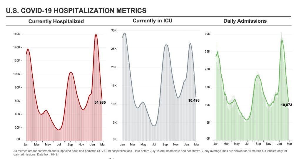
    Instead, the CDC is focusing on hospitalizations: specifically, new COVID-19 admissions per 100,000 people and the share of inpatient beds occupied by COVID-19 patients. New hospital admissions are a more reliable—and more timely—metric than the total number of patients hospitalized with COVID-19, because admissions reflect only the people coming in with symptoms that recently started, not the people who have been hospitalized for days or weeks.

    The share of inpatient beds occupied by COVID-19 patients, meanwhile, reflects the strain that this disease is currently putting on a hospital system. The CDC is choosing to include all COVID-19 patients here, not only those who are hospitalized for COVID-specific symptoms (the correct choice, in my view). Agency director Dr. Rochelle Walensky gave a good explanation for this at a media briefing on Friday:

    We are considering anybody in a hospital bed with COVID, regardless of the reason for admission, and the reason that we landed there is multifold. First, many jurisdictions can’t differentiate, so that was important for us to recognize and realize. Second, whether or not a patient is admitted with COVID or for COVID, they increase the hospital capacity and they’re resource intensive. They require an isolation bed. They require PPE. They probably require a higher staff ratio. And so they are more resource intensive and they do take a COVID bed potentially from someone else.

    Interestingly, as well, as we have less and less COVID in certain communities, the amount of people who are coming into the hospital with COVID will necessarily decrease. We will not have as many people walking around asymptomatically because there will just be less disease out there. So increasingly, as we have less disease in the community, we anticipate that more of the people who are coming into the hospital are going to be coming in because of COVID.

    And then finally, as we have even less disease in the community, we anticipate that not every hospital is going to screen every patient for COVID as they walk in the door, especially if we have less and less disease in the community. And when that happens, we won’t actually be able to differentiate. In fact, people who are coming in, who are tested will necessarily be coming in for COVID. So for all of those reasons, comprehensively, we decided to stay with anybody coming in with a COVID diagnosis.

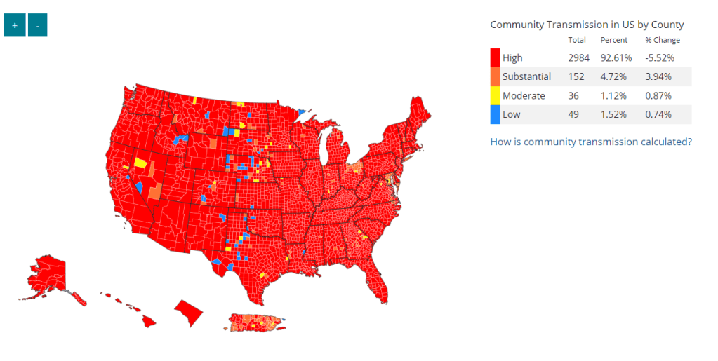
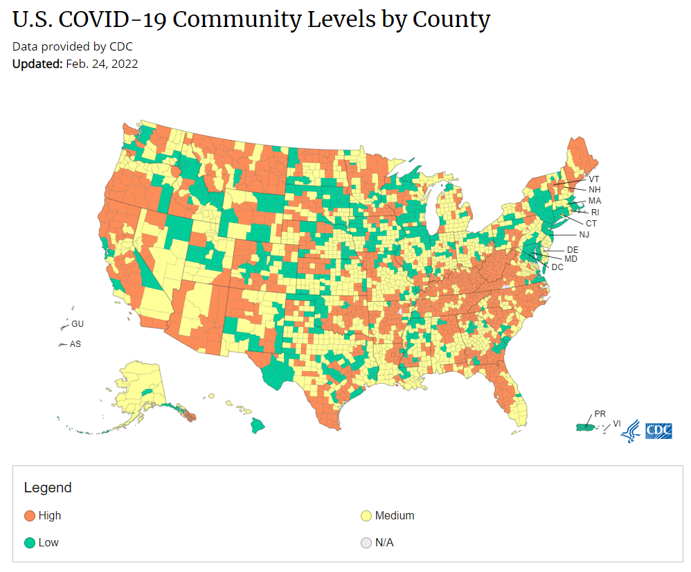
    Also, a note on wastewater: I’ve seen some commentators express surprise that the CDC didn’t include wastewater in its new guidance, as this sewage surveillance can be a useful leading indicator for COVID-19 that’s more reliable than cases. The problem here is, wastewater surveillance is not available in much of the countryjust look at all the empty space on this map. To use wastewater for decisionmaking, a county or state needs to have enough wastewater collection sites actually collecting these data, and most states are not there yet.

    Critiques of the new guidance

    While hospitalizations are a more reliable COVID-19 metric than cases, especially in our rapid testing era, they come with a few major issues. First, hospitalizations are a lagging indicator, meaning that they start to rise a couple of weeks after a new surge has started. If we rely on hospitalizations as a signal to put mask requirements or other safety measures in place, those changes will come weeks delayed.

    As Boston University epidemiologist Dr. Ellie Murray put it in a recent Twitter thread: “Using lagging indicators like hospitalizations could be okay for turning *off* precautions IF we are sure that no new surge has begun. But that means we need leading indicators, like infection surveillance to guide turning *on* precautions.”

    Another issue with relying heavily on this lagging indicator is, new COVID-19 safety measures may come too late to protect essential workers, children in schools, and others who face high risk of coronavirus exposure. “These high exposure populations get COVID first and most,” writes health policy expert Julia Raifman.

    In other words, by the time case and hospitalization rates are high enough for a community to institute new safety measures under this new CDC guidance, those high-risk people are likely to be the ones already in the hospital. Raifman points to data from the U.S. Census’ Household Pulse Survey, showing that low-income workers were most likely to miss work for COVID-19 throughout last year.

    Beyond this lagging indicator issue, another challenge with relying on hospitalizations is that, for many Americans, the hospitals that they might go to if they come down with severe COVID-19 are not located in their county. Plenty of counties, particularly in rural areas, don’t have hospitals! To deal with this, the CDC is actually using regional hospitalization figures, compiling statistics from multiple counties that rely on the same healthcare facilities.

    University of South Florida epidemiologist Jason Salemi lays out this calculation in an excellent Twitter thread, linked below. While it makes sense that the CDC would need to use regional instead of local figures here, the agency is being pretty misleading by labeling this new guidance as county-level metrics when really, the metrics are not that localized.

    There are more equity concerns embedded in the new CDC guidance as well. For counties with “low” or “medium” community COVID-19 levels, the CDC recommends that most Americans do not need to wear masks in public. But people who are immunocompromised or at high risk for severe disease should “talk to a healthcare provider” about the potential need to wear a mask indoors, stock up on rapid tests, or consider COVID-19 treatments.

    For one thing, telling people, “talk to your doctor” is not a great public health strategy when one in four Americans do not have a primary care physician, and one in ten do not even have health insurance! For another thing, one-way masking among immunocompromised and otherwise high-risk people is also not a great strategy, because masks protect the people around a mask-wearer more than they protect the mask-wearer themselves. (I recommend this recent Slate piece on one-way masking for more on this topic.)

    It is also pretty unclear how the CDC landed on a case threshold for “low transmission” that is much higher in this new guidance than in the old guidance, as Dr. Katelyn Jetelina points out in a recent Your Local Epidemiologist post. If anything, honestly, I would expect that the CDC needs to lower its case threshold, given that current case numbers are not accounting for millions of rapid tests done across the country.

    Finally, the new CDC guidance completely fails to account for Long COVID. Of course, it would be very difficult for the CDC to do this, since the U.S. basically isn’t tracking Long COVID in any comprehensive way. Still, overly focusing this new guidance on hospitalizations essentially ignores the fact that a “mild” COVID-19 case which does not lead to hospitalization can still cause major, long-term damage.

    Which metrics you should follow right now

    Here are my recommendations of COVID-19 metrics to watch in your area as you navigate risk in this confusing pandemic era.

    • Both the old and new CDC thresholds. While the CDC pushes its new guidance with a brand-new page on CDC.gov, community transmission metrics calculated under the old guidance are still available on the CDC’s COVID-19 dashboard. If you’re not feeling comfortable taking off your mask in public and want to wait until transmission is seriously low in your area, you can look at the old thresholds; though keep in mind that case data are seriously unreliable these days, for the reasons I explained above.
    • Remember that masks are useful beyond COVID-19. Not a metric, but an additional note about thinking through risk: masks reduce risk of infection for a lot of respiratory diseases! We had a record-low flu season last winter and many Americans have avoided colds for much of the pandemic, thanks in part to masking. Helen Branswell has a great article in STAT News that unpacks this further.
    • Wastewater data, if available to you. As I mentioned above, wastewater surveillance data are not available in much of the country. But if you live somewhere that this surveillance is happening, I highly recommend keeping an eye on those trends to watch for early warnings of future surges. You can look at the CDC dashboard or Biobot’s dashboard to see if your county is reporting wastewater data.
    • Vaccination levels. It makes sense that vaccination was not included in the CDC guidance, because vaccinated people can still spread highly contagious variants like Omicron. Still, more highly-vaccinated counties—particularly those with high vaccination rates for seniors—are likely to have less burden on their healthcare systems when a surge arises, so knowing the vaccination rate in your county can still be useful when thinking about your risk tolerance.
    • Rapid test availability. This is a bit more anecdotal rather than an actual data source, but: looking at rapid test availability in your local pharmacies may be another way to get a sense of community transmission in your area. Right now, these tests are easy to find in many places as case numbers drop; if finding these tests becomes more competitive again, it could be a signal that more people are getting sick or having exposures.

    As always, if you have any questions or topics that you’d like me to tackle in this area, please reach out.

    More federal data

  • National numbers, February 27

    National numbers, February 27

    COVID-19 metrics are dropping across the board. Chart via Conor Kelly, posted on Twitter on February 23.

    In the past week (February 19 through 25), the U.S. reported about 526,000 new COVID-19 cases, according to the CDC. This amounts to:

    • An average of 75,000 new cases each day
    • 160 total new cases for every 100,000 Americans
    • 38% fewer new cases than last week (February 12-18)

    Last week, America also saw:

    • 42,000 new COVID-19 patients admitted to hospitals (13 for every 100,000 people)
    • 12,000 new COVID-19 deaths (3.6 for every 100,000 people)
    • 100% of new cases are Omicron-caused (as of February 19)
    • An average of 200,000 vaccinations per day (per Bloomberg)

    The U.S. is now on week six of falling COVID-19 case numbers nationwide. New cases fell 38% from last week to this week, and are down 87% from one month ago. This is also the first week that the country has reported a daily new case average under 100,000 since early December.

    Hospitalizations also continue to fall, with about 30% fewer new COVID-19 patients entering U.S. hospitals this week compared to last week. And death numbers have also begun to come down—though they are still high, with over 1,500 people dying of COVID-19 each day.

    Case numbers are falling in every single U.S. state; five states and D.C. reported fewer than 100 new cases for every 100,000 residents in the past week, according to the latest Community Profile Report: Washington, Nebraska, Maryland, Nevada, and Ohio. Last week, Maryland was the first state to report case numbers below the CDC’s old high transmission threshold. (The new threshold is higher, which I’ll get into later this issue.)

    To quote prolific COVID-19 data commentator (and my former COVID Tracking Project colleague) Conor Kelly, whose chart is featured above: “There’s not all that much interesting to report on with COVID data right now. Things are getting better fast everywhere. It’s just a question of how long it continues.”

    That continuation depends largely on variants. As the Omicron surge recedes, how long will we see these decreases (or a plateau at low numbers) before a new variant drives another surge? 

    One key factor here is BA.2, the Omicron sub-lineage that has been slowly gaining ground in the U.S. over the past month as it is more transmissible than original Omicron. And I do mean slowly: according to CDC estimates, BA.2 went from causing an estimated 2% of new cases in the week ending February 12 to 4% in the week ending February 19. It seems to be having a limited impact on the country’s case decrease right now, but we’ll see if that changes in the coming weeks.

    Meanwhile, America’s vaccination campaign is stalling. According to the Associated Press: “The average number of Americans getting their first shot is down to about 90,000 a day, the lowest point since the first few days of the U.S. vaccination campaign, in December 2020.” More investment into reaching people who remain unvaccinated (and unboosted) is necessary if we want to be prepared for potential future surges.

  • Featured sources, February 20

    • COVID-19 drug order and inventory info: Rob Relyea has produced three interactive maps that show state-by-state availability for COVID-19 drugs: one for Sotrovimab, the one widely used monoclonal antibody treatment (out of three available in the U.S.) that is still effective against Omicron; one for Paxlovid, the highly effective Pfizer pill; and one for Evusheld, a monoclonal antibody drug that works preemptively for COVID-19, reducing COVID-19 risk for immunocompromised people. Click on a state to see drug provider locations and drug supplies.
    • (Updated) Vaccine Breakthrough Reporting Scorecard: A couple of months ago, I shared a scorecard from the Rockefeller Foundation and former COVID Tracking Project researchers that grades state reporting of breakthrough COVID-19 cases. This scorecard was recently updated. According to the Pandemic Prevention Institute’s twitter, as of this update: “46 states are now regularly reporting some breakthrough data. Currently, 5 states get an A, up from 4 states in January.”
    • Updated Long COVID source list: Journalists covering Long COVID can use this public database, compiled by myself and Fiona Lowenstein, to find patients, scientists, and advocates who are interested in talking to reporters for their stories. The database was published in January, but I recently updated it by adding a few new sources to the list. Read more about the resource here!

  • Five more things, February 20

    A few additional news items from this week:

    • Omicron has caused more U.S. COVID-19 deaths than Delta. Despite numerous headlines proclaiming the Omicron variant to be “milder” than previous versions of the coronavirus, this variant infected such a high number of Americans that it still caused more deaths than previous waves, a new analysis by the New York Times shows. Between the end of November and this past week, the U.S. has reported over 30 million new COVID-19 cases and over 154,000 new deaths, the NYT found, compared to 11 million cases and 132,000 deaths from August 1 through October 31 (a period covering the worst of the Delta surge).
    • 124 countries are not on target to meet COVID-19 vaccination targets. The World Health Organization (WHO) set a target for all countries worldwide to have 70% of their populations fully vaccinated by mid-2022. As we approach the deadline, analysts at Our World in Data estimated how many countries have already met or are on track to meet the goal. They found: 124 countries are not on track to fully vaccinate 70% of their populations, including the U.S., Russia, Bangladesh, Egypt, Ethiopia, and other large nations.
    • Anime NYC was not an omicron superspreader event, CDC says. In early December, the Minnesota health department sounded the alarm about a Minnesotan whose COVID-19 case had been identified as Omicron—and who had recently traveled to New York City for the Anime NYC convention. The CDC investigated possible Omicron spread at this event, both by contact tracing the Minnesota case and by searching public health databases for cases connected to the event. Researchers found that this convention was not a superspreader for Omicron, despite what many feared; safety measures at the event likely played a role in preventing transmission, as did the convention’s timing at the very beginning of NYC’s Omicron wave. I covered the new findings for Science News.
    • Americans with lower socioeconomic status have more COVID-19 risk, new paper shows. Researchers at Brookings used large public databases to investigate the relationship between socioeconomic status and the risk of COVID-19 infections or death from the disease. Their paper, published this month in The ANNALS of the American Academy of Political and Social Science, found that education and income are major drivers of COVID-19 risk, as are race and ethnicity. The researchers also found that: “ socioeconomic status is not related to preventative behavior like mask use but is related to occupation-related exposure, which puts lower-socioeconomic-status households at risk.” 
    • The federal government has failed to disclose how much taxpayers are spending for “free” COVID-19 tests. One month into the Biden administration’s distribution of free at-home COVID-19 tests to Americans who request them, millions have received those tests. But the government has not shared how much it spent for the tests, making it difficult for journalists and researchers to determine how much taxpayer money was paid for each testing kit. “The reluctance to share pricing details flies against basic notions of cost control and accountability,” writes KHN reporter Christine Spolar in an article about this issue. The government has also failed to share details about who requested these free tests or when they were delivered, making it difficult to evaluate how equitable this distribution has been.

    Note: this title and format are inspired by Rob Meyer’s Weekly Planet newsletter.

  • As COVID-19 precautions are lifted, who remains vulnerable?

    As COVID-19 precautions are lifted, who remains vulnerable?

    Hispanic, Black, and Native Americans are less likely to have received their booster shots than white Americans, according to CDC data.

    As more states and other institutions lift COVID-19 safety measures, the shift has sparked a conversation about who remains most vulnerable to COVID-19 during this period. I wanted to highlight a few of these vulnerable groups:

    • Seniors who remain unvaccinated or unboosted: “No other basic fact of life matters as dramatically as age for COVID,” writes Sarah Zhang in The Atlantic this week. Zhang’s story argues that the U.S. has not actually pushed to vaccinate elderly Americans with the same focus that other wealthy nations have. More than 10% of Americans over age 65 are not fully vaccinated and about one-third of those seniors who are fully vaccinated have not received their booster shots, according to CDC data. These seniors face higher COVID-19 risk than younger adults who are entirely unvaccinated, Zhang writes.
    • People of color who remain unvaccinated or unboosted: Zhang’s article inspired me to also look at recent vaccination trends by race and ethnicity. Black, Hispanic, and Native Americans have been at higher risk for COVID-19 throughout the pandemic, as their minority identities often coincide with lower socioeconomic status. According to CDC data, booster shot trends are similar to the vaccination trends we saw in early 2021: while 55% of eligible white Americans have received their booster shots, that number is below 50% for Black, Hispanic, and Native Americans. It’s lowest for Hispanic or Latino Americans: only 39% of those eligible have received a booster shot, as of February 19.
    • Immunocompromised people: If you haven’t yet read Ed Yong’s latest feature, about how America’s pandemic response has left immunocompromised people behind, drop everything and read it today. About 3% of U.S. adults take immunosuppressive drugs, while others live with diseases like AIDS that impact their immune systems. “In the past, immunocompromised people lived with their higher risk of infection, but COVID represents a new threat that, for many, has further jeopardized their ability to be part of the world,” Yong writes. Several other articles this week have also highlighted the challenges immunocompromised Americans face at this point in the pandemic.
    • Pregnant people: According to CDC data, about 68% of pregnant people ages 18 to 49 are fully vaccinated, as of February 12. That leaves almost one-third of pregnant Americans who are not fully vaccinated. Studies have found that pregnant people infected with the coronavirus are at higher risk for complications during their pregnancies and other severe outcomes. Plus, a new CDC study released this week found that a parent’s vaccination while pregnant greatly reduces an infant’s risk of being hospitalized for COVID-19, as antibodies produced by vaccination may be transferred from parent to child.
    • Children under age five: Of course, I have to mention the one group of Americans that is still not yet eligible for vaccination: children under age five. As parents of these kids have dealt with a confusing back-and-forth from Pfizer and the FDA on when vaccines might be available, many are facing high stress levels and remaining cautious even while schools and other institutions reduce safety measures.

    More vaccination data

  • States treating COVID-19 as “endemic” is leading to shifts in data collection and reporting

    States treating COVID-19 as “endemic” is leading to shifts in data collection and reporting

    Screenshot from the California SMARTER plan. This week, California became the first state to officially shift to an endemic strategy for dealing with COVID-19.

    Last week, I discussed the recent trend in states ending mask requirements in public schools, businesses, and other settings, by providing readers with some suggestions for encouraging safety during this push to “open everything” (that wasn’t already open). This week, more states are dropping safety measures; for example, Washington governor Jay Inslee announced that the state’s indoor mask mandate will end on March 21, though this change is also contingent on a low level of COVID-19 hospital admissions.

    At the same time, some states are also making major shifts in the ways they collect and report COVID-19 data. State public health departments are essentially moving to monitor COVID-19 more like the way they monitor the flu: as a disease that can pose a serious public health threat and deserves some attention, but does not entirely dictate how people live their lives.

    You may have seen this shift discussed as a movement to treat COVID-19 as “endemic.” An endemic disease, from an epidemiologist’s standpoint, is one that’s controlled at an acceptable level—it hasn’t been completely eradicated, but the levels of cases, hospitalizations, and deaths are generally deemed as levels that can continue without major public health measures. For more on the topic, I recommend this post from epidemiologist Ellie Murray (whom I’ve quoted on this topic before).

    We can argue—and many COVID-19 experts on Twitter are arguing—about whether this is the appropriate time to shift into endemic mode. Still, regardless of individual opinions, state public health departments are starting to make this shift, and I think it’s worthwhile to discuss how they’re doing it, particularly when it comes to data.

    Here’s a brief roundup of four states that are shifting their COVID-19 data collection and reporting.

    California

    California made headlines this week for being the first state to officially shift into “endemic” policy for dealing with COVID-19. State officials have drafted a plan called “SMARTER”—which stands for Shots, Masks, Awareness, Readiness, Testing, Education, and Rx (treatment). I took a look at the plan, which reporters from NBC Bay Area kindly shared publicly on DocumentCloud.

    Here are a few data-related highlights:

    • State officials will “focus on hospital numbers” to gauge how California should react to potential new variants that may be more infectious or more capable of causing severe disease.
    • Unlike some other states, California is maintaining testing capacity going forward, including an expansion of community testing sites and ongoing procurement of at-home antigen tests for public schools, long-term care facilities, and other institutions.
    • Throughout the pandemic, California has invested in genomic sequencing for COVID-19 cases, as well as a statewide modeling tool that compiles several different forecasts. These surveillance tools will be further expanded to respond to COVID-19 and other infectious disease outbreaks.
    • California also intends to “build a robust, regionally based wastewater surveillance and genome sequencing network” that can provide early warnings about new outbreaks.
    • The plan includes a focus on equity: California leaders will monitor testing, cases, and other metrics in minority communities so that resources can be provided to address disparities if needed.

    Missouri

    Missouri started its shift to “endemic” in December, as the governor declared an end to the state’s public health emergency around COVID-19—even though cases were at their highest-ever level in the state. Now, the Missouri health department is preparing to change its data reporting accordingly, my colleague Derek Kravitz and I reported in the Missouri Independent this week. (The Independent, a nonprofit newsroom focused on Missouri’s state government, is a long-time collaborator of the Documenting COVID-19 project, where I work part-time.)

    Here are the planned data changes highlighted in our story:

    Case investigations and contact tracing, where local health departments’ staffers reach out to people exposed to the virus in workplace or other public settings, will cease, unless a new, more transmissive or deadly variant emerges;

    Daily reports on COVID-19 cases and deaths by the state health department will be replaced by aggregate weekly reports. In some cases, metro health departments, including those in St. Louis and Springfield, will likely continue collecting and disseminating daily reports but the state will stop its reporting;

    Positivity rates will be phased out, as they are already difficult to interpret, with many Americans having switched from PCR tests to at-home antigen tests. Most people don’t report their results to local health departments. Missouri officials in January said they were prepared to be a “trend setter” in eliminating positivity rate reporting.

    Hospitalization data will become even more important, with state health officials hoping to make reporting more timely;

    Wastewater surveillance will become a more relied-on data point for public health officials, as a way to spot COVID-19 early in its life cycle and identify potential hot spots. Missouri is a leader in wastewater surveillance, as the state has the highest number of collection sites reported on a new CDC dashboard.

    Iowa

    A couple of weeks ago, I called out the state of Iowa for decommissioning its two COVID-19 dashboards, one dedicated to vaccination data and one for other major metrics. (I’m still bummed out about this, to be honest! Iowa had one of my favorite/most chaotic dashboards to check as a COVID Tracking Project data entry volunteer.)

    The change actually occurred this week: the old link to Iowa’s vaccination dashboard now goes to a 404 page, and all Iowa COVID-19 data are now consolidated in a single “COVID-19 reporting” page on the overall Iowa health department website.

    Here’s a bit more information on Iowa’s data shift, from a press release by the state’s governor:

    • Rather than reporting daily COVID-19 case numbers, vaccinations, and other data, Iowa is now providing weekly updates. The new, pared-down dashboard includes positive tests and death numbers over time, case and vaccination rates by county, and some demographic data.
    • For more frequent COVID-19 reporting, the Iowa dashboard now directs residents to federal data sources. Iowa is still reporting daily to the federal government, as all states are required to do.
    • The state health department “will continue to review and analyze COVID-19 and other public health data daily,” Governor Kim Reynolds said. But some teams focused on the COVID-19 response will return to pre-pandemic responsibilities.
    • This reporting change is intended to align with “existing reporting standards for other respiratory viruses,” Gov. Reynolds said.
    • Iowa is focusing on at-home tests with a program called “Test Iowa at Home,” in which residents can request to have a test kit sent to their homes for free. (It was unclear to me, from browsing the website, whether these are rapid antigen tests or PCR tests.)  The state health department processes these tests and collects data from the program.

    South Carolina

    A Tweet from South Carolina data expert Philip Nelson alerted me to this one: not only is South Carolina shifting from daily to weekly data reports, the state is essentially ending all reporting of COVID-19 cases. This is paired with a gradual shutdown of testing sites in the state.

    Here’s more info on South Carolina’s shift, based on a press release from the state health department:

    • South Carolina’s health department will stop reporting daily COVID-19 case counts on March 15.
    • The agency will continue to report COVID-19 hospitalizations and deaths as important indicators of disease severity, but these will switch to a weekly update schedule rather than daily.
    • The shift away from case reporting aligns with a greater focus on rapid at-home tests, which South Carolina’s health department says are “not reportable.” (While it’s true that the vast majority of rapid at-home test results are not reported, some jurisdictions, like D.C., allow residents to self-report their results!)
    • South Carolina’s health department is planning to gradually shut down almost all public PCR testing sites in the state throughout the month of March. According to the department, these sites have seen “a significant decrease in demand” due to increased availability for rapid tests.
    • The department is also discouraging regular testing for asymptomatic South Carolina residents, saying that individuals who are currently symptomatic or have a close contact who tested positive should be prioritized.

    More news on this topic

    • The CDC continues adding wastewater collection sites to its new dashboard. Two weeks ago, I wrote that only ten states had ten or more sites included on the dashboard; since then, three additional states have crossed that threshold: Illinois, Washington, and West Virginia. But the dashboard is still empty for the majority of states, indicating a lack of this important surveillance tool in much of the country.
    • For an upcoming story, I recently interviewed Lauren Ancel Meyers, a modeling expert at the University of Texas at Austin and lead author on this fascinating paper about using hospital admissions and mobility data for pandemic surveillance. Meyers has considered cases to be a messy indicator throughout the pandemic, she told me. She finds hospital admissions to be more useful, as this metric will directly show how many people are seeking healthcare due to their COVID-19 symptoms.
    • Another interesting paper, published in Nature this week, describes the use of machine learning models to drive COVID-19 testing at a university. The models could “predict which students were at elevated risk and should be tested,” the researchers write; students tested because of the models tended to be tested more quickly and were more likely to test positive than those identified through manual contact tracing or general surveillance. Such modeling could be used to augment the type of random sampling that Natalie Dean described in a recent article, shared in last week’s issue.

    Are there any other states shifting their data reporting for an endemic COVID-19 state that I’ve missed? Email me or comment below and let me know!

    More on state data

  • National numbers, February 20

    National numbers, February 20

    The majority of U.S. counties are still seeing high transmission, according to the CDC, but a few places like Maryland and New York City are starting to fall below this threshold.

    In the past week (February 12 through 18), the U.S. reported about 850,000 new COVID-19 cases, according to the CDC. This amounts to:

    • An average of 122,000 new cases each day
    • 259 total new cases for every 100,000 Americans
    • 43% fewer new cases than last week (February 5-11)

    Last week, America also saw:

    • 60,000 new COVID-19 patients admitted to hospitals (18 for every 100,000 people)
    • 14,000 new COVID-19 deaths (4.3 for every 100,000 people)
    • 100% of new cases are Omicron-caused (as of February 12)
    • An average of 200,000 vaccinations per day (per Bloomberg)

    New COVID-19 cases continue to drop in the U.S. as the country slowly comes down from its Omicron wave. This week, the country reported a total of 850,000 new cases, according to the CDC; it’s the first week under one million new cases have been reported since early December, though we are still seeing over 100,000 new cases a day.

    Hospitalizations are also going down, with the Department of Health and Human Services reporting about 65,000 beds in use for confirmed and suspected COVID-19 patients as of Saturday. The hospital circuit breaker dashboard (by Jeremy Faust et al.) shows that the vast majority of U.S. hospitals have capacity, as of this week. Still, over 2,000 Americans continue to die of COVID-19 each day.

    At the state level, we continue to see case decreases across the country. The one exception is Maine: this state saw a 350% increase in cases from last week to this week, according to the February 17 Community Profile Report. However, local reports suggest that a number of the new cases reported this week were backlogged—meaning the cases occurred weeks ago and were belatedly added to state tallies.

    After over a month of falling case numbers nationwide, some parts of the country are finally dropping below the CDC’s high transmission threshold (100 new cases for every 100,000 residents reported in a week). Maryland is the first state to do this, with 92 new cases for every 100,000 residents reported in the week ending February 17.

    New York City, where I live, also fell below the high transmission threshold this week, with 83 new cases for every 100,000 residents reported in the week ending February 15, according to city data. Both New York City and Maryland were early Omicron hotspots and have reported falling case numbers since early January.

    While Omicron overall continues to cause 100% of new COVID-19 cases in the country, BA.2, the slightly-more-transmissible sister lineage, is starting to gain ground. The CDC estimates that BA.2 caused 3.9% of new cases in the week ending February 12, compared to 1.5% of new cases in the previous week. As BA.2 continues replacing original Omicron, we’ll see if this subvariant has an impact on the U.S.’s downward case trends.

  • Shout-out: Provincetown’s COVID-19 policies

    This past week, my girlfriend and I had a very unseasonal beach vacation in Provincetown, an LGBTQ+ community that sits on the very edge of Cape Cod, Massachusetts. You might remember the town for its Delta outbreak last summer: hundreds of vaccinated visitors and residents got infected during a popular partying week.

    Of course, the town was much quieter in February than it had been last July. But I was glad to see that Provincetown currently has a mask mandate for indoor businesses and vaccination requirement for indoor dining, instated in late December. The town has also distributed free rapid tests to residents.

    Thank you for a lovely week, Provincetown!

  • Sources and updates, February 13

    • Biden administration is reportedly shifting hospital reporting on COVID-19 patients: During the Omicron surge, there’s been a push among some COVID-19 experts (and in the media) to separately report patients who are admitted to hospitals because of their COVID-19 symptoms from patients who are admitted to hospitals for some other reason, but then test positive later. This push, also called the “with” versus “for” issue, has reached the White House, according to a recent report from POLITICO. The Biden administration now wants all hospitals to separate out their COVID-19 numbers in this way, to get a better picture of severe disease caused by the virus. Such a shift may be tricky for hospitals to follow, however, in part because a lot of people who appear to be incidental, “with COVID-19” patients actually had rare symptoms or chronic conditions exacerbated by the virus. “You need a panel of experts to review the cases” and judge this issue, expert Eric Topol told POLITICO.
    • Long-term cardiovascular outcomes of COVID-19: A new paper from researchers at the Department of Veterans Affairs (VA), published this week in Nature Medicine, sheds light on potential long-term COVID-19 impacts for the heart. The researchers used national health records databases from the VA to study over 150,000 COVID-19 patients—a much larger study size than most Long COVID research in the U.S. The paper found that, after their first month of infection, COVID-19 patients are at increased risk for a variety of cardiovascular issues, including heart inflammation and heart failure. Outside scientists commenting on the paper in Science magazine said that the findings clearly demonstrate that COVID-19 has grave long-term risks for heart health.

  • Omicron updates: BA.2, vaccine effectiveness, and more

    Omicron updates: BA.2, vaccine effectiveness, and more

    As of February 5, the CDC is now including BA.2 in its variant prevalence estimates. Screenshot from the CDC dashboard.

    A few Omicron-related news items for this week:

    • The CDC added BA.2 to its variant prevalence estimates. As I mentioned in today’s National Numbers post, the CDC is now splitting out its estimates of Omicron prevalence in the U.S. into original Omicron, also called B.1.1.529 or BA.1, and BA.2—a sister strain that’s capable of spreading faster than original Omicron. BA.2 has become the dominant variant in some parts of Europe and Asia, but seems to be present in the U.S. in fairly low numbers so far: the CDC estimates it caused about 3.6% of new cases nationwide in the week ending February 5, with a 95% confidence interval of 1.8% to 6.8%. The remainder of new cases last week were caused by original Omicron.
    • CDC describes its expanded genomic surveillance efforts in an MMWR study released this week. Between June 2021 and January 2022, the agency has extended its ability to monitor new variants spreading in the U.S., incorporating public repositories like GISAID into CDC data collection and developing modeling techniques that can produce more timely estimates of variant prevalence. (Remember: all variant data are weeks old, so the CDC uses modeling to predict the present.) According to the MMWR study, genomic sequencing capacity in the U.S. tripled from early 2021 to the second half of the year.
    • Vaccine effectiveness from a booster shot wanes several months after vaccination. In another MMWR study released this week, the CDC reports on mRNA vaccine effectiveness after two and three doses, based on data from a hospital network including hundreds of thousands of patients in 10 states. During the U.S.’s Omicron surge, researchers found, vaccine effectiveness against COVID-19 hospitalization was 91% two months after a third dose—but declined to 78% four months afterward. It’s unclear whether this declining effectiveness is a direct result of Omicron getting past the vaccine’s defenses, or whether we’d see similar declines with other variants. Also, the CDC’s findings are not stratified by age or other factors that make people more vulnerable to severe COVID-19.
    • Updated monoclonal antibody treatment from Eli Lilly gets FDA authorization. During the Omicron surge, one challenge for healthcare providers has been that, out of three monoclonal antibody treatments authorized by the FDA, only one retained effectiveness against this variant. (Monoclonal antibody treatments provide a boost to the immune system for vulnerable patients.) This week, however, the FDA authorized an updated version of Eli Lilly’s treatment that does work against Omicron, including against the BA.2 lineage. The federal government has purchased 600,000 courses of this new treatment.
    • More data released on South Africa’s mild Omicron wave. A new paper published in JAMA this week, from researchers at a healthcare provider in South Africa, compares COVID-19 hospitalizations during the Omicron surge to past surges. Among patients who visited the 49 hospitals in this provider’s network, about 41% of those who went to an emergency department with a positive COVID-19 test were admitted to the hospital during the Omicron surge—compared to almost 70% during South Africa’s prior surges. The paper provides additional evidence that Omicron is less likely to cause severe COVID-19 than past variants, though this likelihood is tied in part to high levels of vaccination and past infection in South Africa and other countries.
    • Omicron has been identified in white-tailed deer. New York City was an early Omicron hotspot in the U.S.; and the variant has been passed onto white-tailed deer in Staten Island, according to a new preprint posted this week (and not yet peer-reviewed). Scientists have previously identified coronavirus infections in 13 states, but finding Omicron is particularly concerning for researchers. “The circulation of the virus in deer provides opportunities for it to adapt and evolve,” Vivek Kapur, a veterinary microbiologist who was involved in the Staten Island study, told the New York Times. 

    More variant reporting