Blog

  • All the U.S.’s COVID-19 metrics are flawed

    All the U.S.’s COVID-19 metrics are flawed

    This week, I had a big retrospective story published at FiveThirtyEight: I looked back at the major metrics that the U.S. has used to track COVID-19 over the past two years—and how our country’s fractured public health system hindered our use of each one.

    The story is split into seven sections, which I will briefly summarize here:

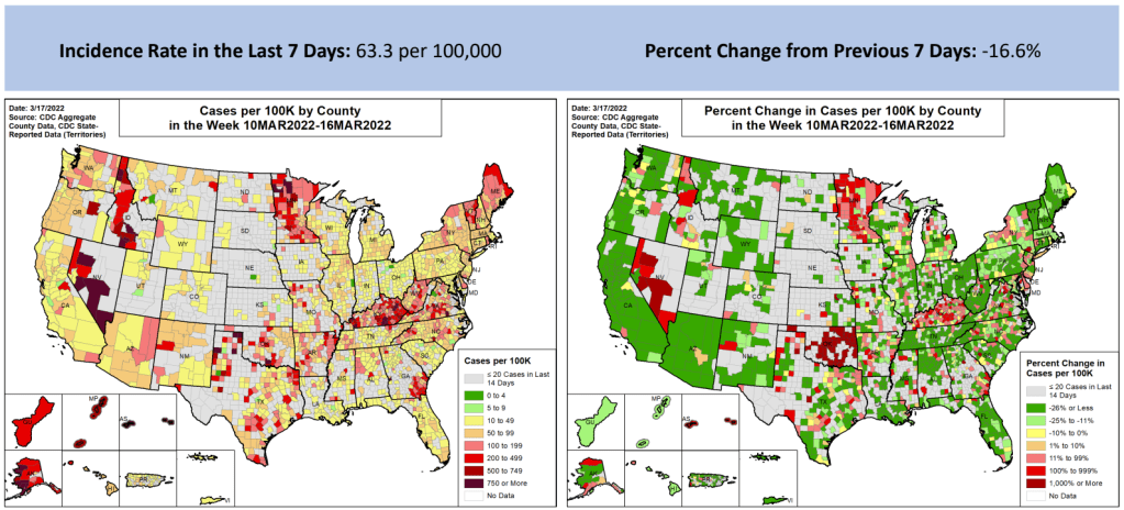
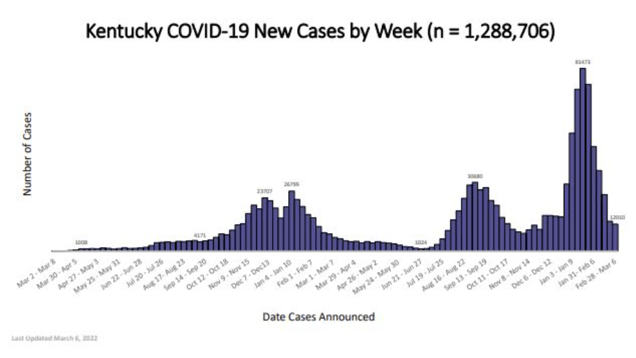
    • Case counts, January to March 2020: Early on in the pandemic, the U.S. had a very limited picture of COVID-19 cases due to our very limited testing: after rejecting a test made by the WHO, the CDC made its own test—which turned out to have contamination issues, further slowing down U.S. testing. In early March 2020, for example, the majority of cases in NYC were identified in hospitals, suggesting that official counts greatly underestimated the actual numbers of people infected.
    • Tests administered, March to September 2020: Test availability improved after the first wave of cases, with organizations like the COVID Tracking Project keeping a close eye on the numbers. But there were a lot of challenges with the testing data (like different units across different states) and access issues for Americans with lower socioeconomic status.
    • Hospitalizations, October to December 2020: By late 2020, many researchers and journalists were considering hospitalizations to be a more reliable COVID-19 metric than cases. But it took a long time for hospitalization data to become reliable on a national scale, as the HHS launched a new tracking system in the summer and then took months to work out kinks in this system.
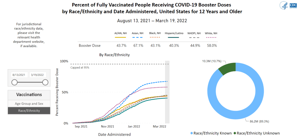
    • Vaccinations, January to June 2021: When the vaccination campaign started in late 2020, it was “tempting to forget about all other COVID-19 metrics,” I wrote in the story. But the U.S.’s fractured system for tracking vaccinations made it difficult to analyze how close different parts of the country were to prospective “herd immunity,” and distracted from other public health interventions that we still needed even as people got vaccinated.
    • Breakthrough cases, July to November 2021: The Delta surge caused widespread infections in people who had been vaccinated, but the CDC—along with many state public health agencies—was not properly equipped to track these breakthrough cases. This challenge contributed to a lack of good U.S. data on vaccine effectiveness, which in turn contributed to confusion around the need for booster shots.
    • Hospitalizations (again), December to January 2022: The Omicron surge introduced a need for more nuance in hospitalization data, as many experts asked whether COVID-19 patients admitted with Omicron were actually hospitalized for their COVID-19 symptoms or for other reasons. Nuanced data can be useful in analyzing a variant’s severity; but all COVID-related hospitalizations cause strain on the healthcare system regardless of their cause.
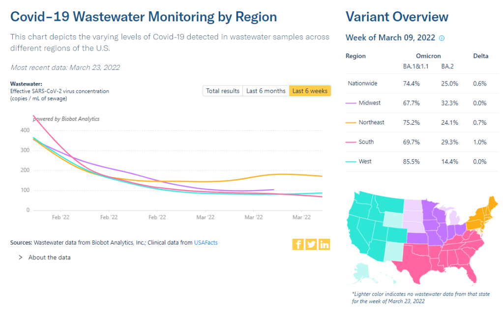
    • New kinds of data going forward: In our post-Omicron world, a lot of public health agencies are shifting their data strategies to treat COVID-19 more like the flu: less tracking of individual cases, and more reliance on hospitalization data, along with newer sources like wastewater. At this point in the pandemic, we should be fortifying data systems “for future preparedness,” I wrote, rather than letting the systems we built up during the pandemic fall to the wayside.

    I did a lot of reporting for this piece, including interviews with some of the U.S.’s foremost COVID-19 data experts and communicators. As long as the piece is, there were a lot of metrics (and issues with these metrics) that came up in these interviews that I wasn’t able to include in the final story—so I wanted to share some bonus material from my reporting here.

    Long COVID:

    As I’ve discussed in previous issues, the U.S. has done a terrible job of collecting data on Long COVID. The NIH estimates that this condition follows a significant share of coronavirus infections (between 10% and 30%), but we have limited information on its true prevalence, risk factors, and strategies for recovery.

    Here’s Dr. Eric Topol, the prolific COVID-19 commentator and director of the Scripps Research Translational Institute, discussing this data problem:

    [Long COVID has] been given very low priority, very little awareness and recognition. And we have very little data to show for it, because it hasn’t been taken seriously. But it’s a very serious matter.

    We should have, early on, gotten at least a registry of people —a large sample, hundreds of thousands of people prospectively assessed, like is being done elsewhere [in the U.K. and other countries]. So that we could learn from them: how long the symptoms lasted, what are the symptoms, what are the triggers, what can be done to avoid it, the role of vaccines, the role of boosters, all this stuff. But we have nothing like that.

    The NIH’s RECOVER initiative may answer some of these questions, but it will take months—if not years—for the U.S. to actually collect the comprehensive data on Long COVID that we should have started gathering when the condition first began gaining attention in 2020.

    Demographic data:

    In the testing section of the story, I mention that the U.S. doesn’t provide much demographic data describing who’s getting tested for COVID-19. There is actually a little-known provision in the CARES Act that requires COVID-19 testing providers to collect certain demographic data from all people who seek tests. But the provision is not enforced, and any data that are collected on this subject aren’t making it to most state COVID-19 dashboards, much less to the CDC’s public data dashboard.

    Here’s Dr. Ellie Murray, an epidemiologist at the Boston University School of Public Health, discussing why this is an issue:

    We don’t collect reason for seeking a test. We don’t collect age, race, ethnicity, occupation of people who seek a test. Those kinds of things could provide us with some really valuable information about who is getting tested, when, and why—that could help us figure out, what are the essential occupations where people are having a lot of exposures and therefore needing to get a lot of tests? Or are there occupations where we’re seeing a lot of people end up in hospital, who have those occupations, but they’re not getting tests, because actually, the test sites are nowhere near where they need to work, or they don’t have the time to get there before they close.

    And so we don’t really know who is getting tested, and that, I think, is a bigger problem, than whether the numbers that are being tested tell us anything about the trajectory of COVID. Because we have case data, and hospitalization data, and death data to tell us about the trajectory. And the testing could really tell us more about exposure, and concern, and access—if we collected some more of this data around who is getting tested and why.

    Test positivity:

    Speaking of testing: another metric that I didn’t get into much in the story was test positivity. Test positivity—or, the share of COVID-19 tests that return a positive result—has been used from the CDC to local school districts as a key metric to determine safety levels. (For more on this metric, check out my FAQ post from this past January.)

    But even when it’s calculated correctly, test positivity faces the same challenges as case data: namely, bias in who’s getting tested. Here’s Lauren Ancel Meyers, director of the University of Texas at Austin’s COVID-19 Modeling Consortium, explaining this:

    Test positivity is just as fraught [as cases]. It’s just as difficult, because you need to know the numerator and the denominator—what’s influencing the numerator and the denominator? Who is going to get tested, who has access to tests? … It used to be, at the very beginning [of the pandemic], nobody could get a test who wanted a test. And now, today, everybody has a test in their medicine cabinet, and they don’t get reported when they test. It’s different issues that have ebbed and flowed throughout this period.

    Often, if you’re a good data analyst or a modeler, and you have all the information, you can handle those kinds of biases. But the problem is, we don’t know the biases from day to day. And so even though there are statistical tools to deal with incomplete bias, without knowing what those biases are, it’s very hard to do reliable inference, and really hard to understand what’s actually going on.

    Genetic surveillance:

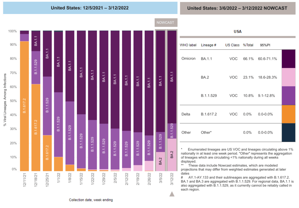
    Also related to testing: genetic surveillance for coronavirus variants of concern. Genetic surveillance is important because it can help identify new variants that may be more transmissible or more likely to evade protection from vaccines. It can additionally help track the qualities of concerning variants once they are identified (if variant data is linked to hospitalization data, vaccination data, and other metrics—which is not really happening in the U.S. right now.)

    Our current genetic surveillance systems have a lot of gaps. Here’s Leo Wolansky, from the Rockefeller Foundation’s Pandemic Prevention Institute (PPI), discussing how his organization seeks to address these challenges:

    [We’re trying to understand] where our blind spots are, and the bias that we might experience with a lot of health system reporting. One of the things that PPI has been doing is identifying centers of excellence in different parts of the world that can improve the sequencing of new cases in underrepresented countries. And so for example, we’ve provided quite a bit of support to the folks in South Africa that ultimately rang the alarm on Omicron.

    We’re also doing this by actually trying to systematically assess countries’ capacity for this type of genomic surveillance. So thinking about, how many tests have been recorded? What’s that test positivity rate? Do we have confidence in the basic surveillance system of the country? And then, do we also see enough sequences, as well as sequencing facility data, to demonstrate that this country can sequence and just isn’t doing enough—or cannot sequence because it needs foundational investment in things like laboratories and devices. We’ve been mapping this capacity just to make sure that we understand where we should be investing as a global community.

    The Pandemic Prevention Institute is taking a global perspective in thinking about data gaps. But these gaps also exist within the U.S., as is clear when one looks at the differences in published coronavirus sequences from state to state. Some states, like Wyoming, Vermont, and Colorado, have sequenced more than 10% of their cumulative cases, according to the CDC. Others, like Oklahoma, Iowa, and South Dakota, have sequenced fewer than 3%. These states need additional investment in order to thoroughly monitor coronavirus transmission among their residents.

    Cohort studies:

    In a cohort study, researchers follow a group of patients over time in order to collect long-term data on specific health conditions and/or the outside factors that influence them. The U.S. has set up a few cohort studies for COVID-19, but they haven’t been designed or utilized in a way that has actually provided much useful data—unlike cohort studies in some other countries. (The U.K., for example, has several ongoing cohort studies collecting information on COVID-19 symptoms, infections in schools, seroprevalence, and more.)

    Here’s Dr. Ellie Murray explaining the lost potential of these studies in the U.S.:

    There are a number of existing cohort studies that have been asked or who asked to pivot to collecting COVID information and therefore collecting long-term COVID information on their cohorts. But there doesn’t seem to be any kind of system to [determine], what are the questions we need answered about COVID from these kinds of studies? And how do we link up people who can answer those questions with the data that we’re collecting here, and making sure we’re collecting the right data? And if this study is going to answer these questions, and this one is going to answer those questions—or, here’s how we standardize those two cohorts so that we can pull them together into one big COVID cohort.

    And so, we end up in this situation where, we don’t know what percent of people get Long COVID, even though we’ve been doing this for over two years. We don’t even really know, what are all the different symptoms that you can get from COVID? … There are all these questions that we could be sort-of systematically working our way through, getting answers and using them to inform our planning and our response. [In addition to having] standardized questions, you also need a centralized question, instead of just whatever question occurs to someone who happens to have the funding to do it.

    Excess deaths:

    Excess deaths measure the deaths that occur in a certain region, over a certain period of time, above the number of deaths that researchers expect to see in that region and time period based on modeling from past years’ data. Excess deaths are the COVID-19 metric with the longest lag time: it takes weeks from initial infection for someone to die of the disease, and can take weeks further for a death certificate to be incorporated into the public health system.

    Once that death information is available, however, it can be used to show the true toll of the pandemic—analyzing not just direct COVID-19 deaths, but also those related to isolation, financial burden, and other indirect issues—as well as who has been hit the hardest.

    Here’s Cecile Viboud, a staff scientist at the NIH who studies infectious disease mortality, discussing this metric:

    We’ve been using the excess death approach for a long time. It comes from flu research, basically starting in 1875 in the U.K. And it was used quite a lot during the 1918 pandemic. It can be especially good in examining historical records where you don’t have lab confirmation—there was no testing ability back in those days…

    So, I think it’s kind of natural to use it for a pandemic like COVID-19. Very early on, you could see how useful this method was, because there was so little testing done. In March and April 2020, you see substantial excess, even when you don’t see lab-confirmed deaths. There’s a disconnect there between the official stats, and then the excess mortality… [We can also study] the direct effect of COVID-19 versus the indirect effect of the pandemic, like how much interventions affected suicide, opioids, death, accidents, etc. The excess approach is also a good method to look at that.

    Viboud also noted that excess deaths can be useful to compare different parts of the U.S. based on their COVID-19 safety measures. For example, one can analyze excess deaths in counties with low vaccination rates compared to those with high vaccination rates. This approach can identify the pandemic’s impact even when official death counts are low—an issue that the Documenting COVID-19 project has covered in-depth.

    Again, you can read the full FiveThirtyEight story here!

    More federal data

  • National numbers, March 27

    National numbers, March 27

    The Northeast has seen a small uptick in coronavirus levels in its wastewater in recent weeks, followed by a plateau. Chart via Biobot Analytics.

    In the past week (March 19 through 25), the U.S. reported about 190,000 new COVID-19 cases, according to the CDC. This amounts to:

    • An average of 27,000 new cases each day
    • 58 total new cases for every 100,000 Americans
    • 5% fewer new cases than last week (March 12-18)

    In the past week, the U.S. also reported about 13,000 new COVID-19 patients admitted to hospitals. This amounts to:

    • An average of 1,800 new admissions each day
    • 3.9 total admissions for every 100,000 Americans
    • 21% fewer new admissions than last week

    Additionally, the U.S. reported:

    • 5,200 new COVID-19 deaths (1.6 for every 100,000 people)
    • 100% of new cases are Omicron-caused; 35% BA.2-caused (as of March 19)
    • An average of 100,000 vaccinations per day (per Bloomberg)

    New COVID-19 case numbers for the U.S. overall are still decreasing, according to the CDC’s data. But the drop from the previous week’s cases to this week’s cases (about 5%) is lower than any week-over-week change since Omicron peaked in January, suggesting that we’re heading for a plateau—if not a new increase.

    Last week, I discussed a potential new surge in the U.S. driven by the Omicron sublineage BA.2, which is more transmissible than the version of Omicron we faced a couple of months ago. BA.2 caused about 35% of new COVID-19 cases nationwide in the week ending March 19, according to CDC estimates, up from 22% in the prior week.

    As BA.2 slowly outcompetes the other Omicron sublineages in the U.S., we also continue to see case upticks in some parts of the country. States that reported case increases in the last week include Arkansas, Kentucky, Maine, New York, Colorado, Massachusetts, and Vermont, according to the March 24 Community Profile Report. (Arkansas and Kentucky reported week-over-week increases above 25%, while the other states here reported increases above 10%.)

    Wastewater data align somewhat with these case increases. Biobot’s tracker shows a slight uptick (followed by a plateau) in coronavirus levels in the Northeast’s wastewater, at a regional level, along with plateaus in other parts of the country. And about 40% of sites in the CDC’s national wastewater network have reported increases over the last two weeks—though the CDC’s data are difficult to interpret, as this tracker doesn’t provide context on actual wastewater levels at each site.

    To be clear, it’s good news that we aren’t seeing major case increases yet, just some small upticks. At the same time, numbers of newly hospitalized COVID-19 patients and deaths are dropping to levels not seen since last summer; this week, about 750 people died of the disease each day, according to the CDC—the first time this number has been under 1,000 in several months.

    In a recent TIME article, several experts suggested that vaccines plus lingering immunity from the Omicron wave in December and January may protect the U.S. from a major surge with BA.2. Still, with safety measures dropping across the country, in the event that we do see a major new surge (from BA.2 or otherwise), we won’t be prepared to curb virus transmission in a meaningful way.

  • COVID source callout: Still no state-by-state data on vaccinations by race/ethnicity

    COVID source callout: Still no state-by-state data on vaccinations by race/ethnicity

    This week, the CDC added a new feature to the vaccination section of its COVID-19 dashboard: you can now look at demographic vaccination trends at the state level, not just nationally and regionally.

    But there’s a catch: the state-by-state demographic trends only include age and sex data. Vaccination trends by race and ethnicity are still only available at the national level; in fact, when you click on “Race/Ethnicity” on the booster shots section of this dashboard, the CDC directs you to “please visit the relevant health department website” for more local data.

    For state-level race and ethnicity data, the CDC directs users to state public health agencies. Screenshot taken on March 20.

    It is now over a year into the U.S.’s vaccine rollout, and the CDC is still failing to publicly share data on vaccinations by state and race/ethnicity. I actually wrote a callout post about this in March 2021, and nothing has changed since then!

    This is a major issue because such data are needed to examine equity in the vaccine rollout. While it’s possible to compile data from the states that report vaccinations by race and ethnicity themselves, major inconsistencies in state reporting practices make these data hard to standardize. Why isn’t the CDC doing this? Or, if the CDC is doing this, why aren’t the data public?

  • Sources and updates, March 20

    Data sources and data-related updates for this week:

    • APM Research Lab relaunches Color of Coronavirus tracker: From April 2020 to March 2021, the American Public Media (APM) Research Lab compiled state-level data on COVID-19 deaths by race and ethnicity, in order to present a picture of which U.S. populations were most hard-hit by the pandemic. The project relaunched this week, now utilizing CDC mortality statistics instead of compiling data from states. One major finding from the updated data: “Indigenous Americans have the highest crude COVID-19 mortality rates nationwide—about 2.8 times as high as the rate for Asians, who have the lowest crude rates.”
    • CDC might take back hospital data reporting responsibilities from HHS: As longtime readers may remember, back in summer 2020, the Department of Health and Human Services (HHS) developed a new data system for hospitals to report COVID-19 patient numbers and other related metrics. At the time, the HHS was taking over responsibility for these data from the CDC; this inspired some political posturing and concerns about data quality, though the eventual HHS dataset turned out to be very comprehensive and useful. (This original data switch was the subject of my very first CDD issue, and I followed the HHS data system closely throughout 2020.) Now, Bloomberg reports, the CDC wants to take back hospital data reporting from the HHS. More political posturing and data quality concerns are, it seems, inevitable—this time tied to the CDC’s challenges in modernizing its data systems.
    • Hospitalizations among young children, by race/ethnicity during Omicron surge: Two MMWR studies that caught my attention this week: one examined hospitalization rates among young children, ages 0 to 4, between March 2020 and February 2022. This study found that COVID-19 hospitalization rates among children in this age range were five times higher at the peak of the Omicron surge compared to the Delta surge. The second report examined hospitalizations by race and ethnicity, finding that, during Omicron’s peak, hospitalization rates among Black adults were nearly four times higher than rates among white adults. Both reports clearly demonstrate who is still vulnerable to COVID-19 as the U.S. abandons safety measures.
    • Pfizer and Moderna both seeking EUAs for additional booster shots: POLITICO reported this week that first Pfizer, then Moderna have requested Emergency Use Authorization for fourth doses of their COVID-19 vaccines. Pfizer’s request is specifically for people age 65 and over, while Moderna’s is for all adults. Notably, Pfizer’s request is based on data from Israel suggesting that immunity from an initial booster wanes after several months—just as Pfizer’s initial case for boosters in the fall was also based on Israeli data.
    • Global COVID-related deaths may be three times higher than official records: Throughout the pandemic, researchers have used excess mortality (i.e. the deaths occurring in a given region and time period above what’s expected) to determine the true toll of COVID-19. A new study, published this week in The Lancet, took this approach for 191 countries and territories from January 2020 to December 2021. The researchers estimate that about 18 million people died worldwide due to the pandemic—including not just direct COVID-19 deaths but also others caused by COVID-related disruptions. That’s three times higher than the 6 million COVID-19 deaths that have been officially reported in this time period.

  • Idaho’s hospitals as a case study of decentralized healthcare

    Idaho’s hospitals as a case study of decentralized healthcare

    In last week’s issue, I mentioned that I am thinking more about preparedness: how the U.S. can improve our capacity to respond to public health threats, future COVID-19 surges and beyond. This mindset shift was brought on, in part, by a recent story I worked on at the Documenting COVID-19 project: examining the vulnerabilities in Idaho’s hospitals as a case study of the U.S.’s decentralized healthcare system.

    Last summer and fall, Idaho was completely overrun by the Delta variant. State leaders implemented crisis standards of care, a practice allowing hospitals to conserve their limited resources when they are becoming overwhelmed. All hospitals in Idaho were in crisis standards for weeks, with the northern Panhandle region remaining in this crisis mode for over 100 days.

    During this time, Idaho hospitals sent out 6,300 patient transfers in the span of four months. With Audrey Dutton, my reporting partner at the Idaho Capital Sun (a nonprofit newsroom covering Idaho state government), I analyzed data from the Idaho health department that showed where these patients were transferred, as well as how the crisis period compared to previous months.

    This map shows all patient transfers out of Idaho hospitals between April and November 2021. Chart by Betsy Ladyzhets, published in the Idaho Capital Sun and MuckRock.

    Here are the major findings from our story (borrowing some text from my Twitter thread, linked above):

    • More than one in three transfers went to hospitals in neighboring states, with the highest numbers going to eastern Washington.
    • Transfers went as far as Seattle, Salt Lake City, San Francisco, Billings, and even Phoenix. Many of these trips required air ambulances, due to Idaho’s mountainous geography.
    • These transfers strained Washington hospitals. Dr. Dave Chen, chief medical officer at MultiCare Deaconess Hospital in Spokane—one Washington hospital that took on a lot of Idaho patients—told me that smaller, rural facilities in his area are all “competing for the same beds and resources,” whether these facilities are based in Washington or Idaho.
    • Workers at facilities in the northern Idaho region, which remained in crisis standards for over 100 days, described doubling patients up in ambulances, traveling for hours to find free beds, and taking EMS staff away from their normal duties for long trips.
    • Idaho is particularly vulnerable to transfer challenges: it has a lot of small rural hospitals without many ICU beds or specialized equipment, combined with geography that often requires an air ambulance rather than driving.

    This story has implications beyond Idaho, as it shows the impact of America’s fractured health system. In our system, when hospitals in one state are in crisis, they cannot easily communicate with other hospitals that might be able to help them out—whether “communicating” means calling up hospital administrators to ask about free beds or sharing data about patient numbers and resources.

    This is not just a COVID-19 problem. Consider what happens when a wildfire, hurricane, or other natural disaster hits. When hospitals in one area become overwhelmed, they should be able to easily reach out to other facilities—but our system makes this incredibly difficult.

    One potential solution to this issue may be centralized transfer centers, which field calls from hospitals that need to send out their patients. Washington started such a transfer center during the pandemic, to great success: Dr. Steve Mitchell, who helps run the center, told me that it facilitated more than 3,500 patient transfers, mostly between summer 2021 and early 2022.

    But there’s a kicker: Washington’s transfer center is funded by the state health department, and therefore it can only answer calls from Washington hospitals. If an Idaho hospital wants to transfer a patient into Washington, it has to call various Washington hospitals directly until finding a bed for that patient—a much more time- and resource-intensive process.

    Look at how siloed our current system is! This is ridiculous! Clearly, we need transfer centers with regional—or even national—reach, coordinated by a national health agency. We also need more data sharing between hospitals, and better communication between facilities and EMS providers.

    Again, you can read the full Idaho story here, and check out my underlying data analysis here.

  • A BA.2 surge is approaching: Here’s what you should know about this variant

    A BA.2 surge is approaching: Here’s what you should know about this variant

    BA.2 caused about one in four U.S. COVID-19 cases in the week ending March 12, according to CDC estimates.

    Two years into the pandemic, we now know some basic truisms about the coronavirus. For example: outdoor events are always safer than indoor events; older age is the most significant risk factor for severe symptoms; hospitalization trends typically follow case trends by a couple of weeks; and whenever Europe has a new surge, the U.S. is likely to also see a surge in the next month or so.

    That last truism is particularly relevant right now, because Europe is experiencing a new surge. Cases are increasing in the U.K., Germany, the Netherlands, and many other countries. The new surge is likely due to European leaders’ decisions to end all COVID-19 safety measures in their countries, combined with the rise of Omicron sublineage BA.2.

    As BA.2 prevalence increases here in the U.S.—and our leaders also end safety measures—we seem poised to follow in Europe’s footsteps once again. But a BA.2 surge is likely to look different from the intense Omicron surge that we experienced in December and January, in part because of leftover immunity from that Omicron surge.

    Let’s go over what we know about BA.2, and what might happen in the next few weeks.

    What is BA.2?

    It’s important to note that this isn’t a new variant, at least not compared to the original Omicron strain. As I noted in a FAQ post about this strain back in January, South African scientists who originally characterized Omicron in November 2021 identified three sub-lineages: BA.1, BA.2, and BA.3.

    BA.1 spread rapidly through the world, driving the surge that we experienced here in the U.S. in December through February. But BA.2, it turns out, is actually more transmissible than BA.1—allowing it to now outcompete that strain and contribute to case increases in countries that already faced major BA.1 surges.

    How does BA.2 differ from BA.1, or original Omicron?

    The main difference between these two strains is that BA.2 is more contagious: scientists estimate that BA.2 is about 30% more transmissible than other Omicron strains, if not more. (Note that this is a smaller difference than Omicron’s advantage over Delta and other earlier variants.)

    In a recent report, the U.K. Health Security Agency estimated that someone infected with BA.2 would infect about 13.6% of their households and 5.3% of contacts outside of their households, compared to 10.7% of households and 4.2% outside contacts for other Omicron strains. The modest difference between these rates demonstrates why BA.2 is not outcompeting other Omicron strains as quickly as Omicron outcompeted Delta a couple of months ago.

    Another notable feature of BA.2 is that, unlike BA.1, it can’t be identified with a PCR test. BA.1 has a mutation called S drop-out, which causes a special signal in PCR test results, allowing the variant to be flagged without sequencing; BA.2 doesn’t have this mutation. To be clear, a PCR test will still return a positive result for someone who is infected with BA.2—it’ll just take an additional sequencing step to identify that they have this particular strain.

    Finally, one major challenge during the Omicron BA.1 surge has been that two of the three monoclonal antibody treatments used in the U.S. did not work well for people infected with Omicron. BA.2 may exacerbate this challenge, as some studies have suggested that the third treatment—called sotrovimab—continued working against BA.1, but may not hold up against BA.2. Luckily though, Eli Lilly (which developed one of the treatments that failed for BA.1) has produced an updated monoclonal antibody cocktail that does work for both Omicron strains.

    How is BA.2 similar to BA.1, or original Omicron?

    Two major pieces of good news here: 1) our existing COVID-19 vaccines work similarly well against BA.2 as they do against BA.1, and 2) prior infection with BA.1 seems to be protective against infection with BA.2.

    Essentially, studies are showing that the two strains are close enough in their genetic profiles that antibodies from a BA.1 infection will provide some immunity against a BA.2 infection. And the same thing goes for vaccination, at least when it comes to protection against severe disease. A recent CDC study showed that, even during the Omicron surge, COVID-19 patients who had received three vaccine doses were far less likely to require mechanical ventilation or die from the disease than those who weren’t vaccinated.

    There’s a flip side to this, though: for both BA.1 and BA.2, prior infection with a previous variant is not very protective against an Omicron infection. CDC seroprevalence data suggest that between 40% and 45% of Americans got infected with BA.1 during the winter surge; this means the remaining 55% to 60% of the population is susceptible to BA.2. Vaccines protect against severe disease and death from BA.2, but they don’t protect against BA.2 infection to the degree that they did against past variants.

    BA.2 and BA.1 are also similar in their severity. Both strains are less likely to cause severe disease than Delta; BA.1 had a 59% lower risk of hospital admission and 69% lower risk of death than Delta in the U.K., according to a new paper published this week in the Lancet.

    It’s important to remember, however, that Delta was actually more severe than other variants that preceded it. As a result, “Omicron is about as mild/severe as early 2020 SARSCoV2,” wrote computational biologist Francois Balloux in his Twitter thread (referring to both BA.1 and BA.2).

    What are the warning signs for a BA.2 surge in the U.S.?

    First of all, many U.S. experts consider case increases in Europe to be an early indicator of increases in the U.S. As I said at the top of the post, Europe is seeing a surge right now, and many of the countries reporting case increases have estimated over 50% of their cases are caused by BA.2.

    In the U.S., our BA.2 levels are lower: the CDC’s most recent estimates suggested that BA.2 was causing about 23% of new cases nationwide as of March 12. If BA.2 continues growing at the same rate we’ve seen in recent weeks, we have one or two more weeks before this variant hits 50% prevalence in the U.S.

    “The tipping point seems to be right around 50%,” Keri Althoff, an epidemiologist at Johns Hopkins Bloomberg School of Public Health, told CNN. “That’s when we really start to see that variant flex its power in the population” as far as showing its severity.

    At the same time, several Asian countries are also seeing major BA.2 surges at the moment. For example, Hong Kong was able to deal with early Omicron cases earlier in the winter, former COVID Tracking Project lead Erin Kissane pointed out in her Calm Covid newsletter; but now, the territory is facing a terrible BA.2 wave, driving what is now the world’s highest case fatality rate.

    Here in the U.S., we’re also seeing warning signals in the form of rising coronavirus levels in wastewater. (Wastewater is considered an early indicator for surges, because coronavirus material often shows up in sewer systems before people begin to experience symptoms or get tested.) About one-third of sewershed collection sites in the CDC’s wastewater monitoring network are reporting increased virus prevalence in the two-week period ending March 15.

    The CDC wastewater data must be interpreted cautiously, however, as this surveillance network is biased towards states like Missouri and Ohio, which have over 50 collection sites included in the national network. 12 states still do not have any collection sites in the network at all, while 23 states have fewer than 10. This recent Bloomberg article includes more context on interpreting wastewater data.

    New York City is one place that’s reporting increased viral levels in wastewater, at the same time as the city health department reports that case numbers have plateaued—or may even be ticking up. An excellent time to loosen all mask and vaccination requirements, am I right?

    What might a BA.2 surge in the U.S. look like?

    Between the warning signals from Europe and the newly-lax safety measures throughout the U.S., it seems very likely that we will see a BA.2 surge in the coming weeks. The bigger question, though, is this surge’s severity: to what extent will it cause severe disease and death?

    As I mentioned above, estimates suggest that about 40% to 45% of Americans have some Omicron antibodies from an infection earlier in the winter. At the same time, about 65% of the population is fully vaccinated and 45% of those fully vaccinated have received a booster shot, according to the CDC.

    That’s a lot of people who are protected against severe COVID-19 symptoms, if they get infected with BA.2. But the U.S. has lower vaccination coverage than other countries, particularly when it comes to boosters. For example, in the U.K., 86% of eligible people are fully vaccinated and 67% are boosted, according to CNN. These lower vaccination rates contributed to the U.S.’s high mortality rate during the Omicron surge compared to other wealthy countries.

    While the vaccines offer great protection, the U.S. appears to have given up on many other COVID-19 safety measures, like masks, social distancing, and limits on in-person gatherings. Without reinstating some of these measures, we would essentially be left without any tools to slow down the spread of BA.2; and even if some states and cities put safety measures in place, they’ll likely face more pushback now than they did in earlier surges.

    To quote from Kissane’s newsletter:

    In practical terms, with work and school happening in-person and without high-filtration (or any) masks or serious ventilation requirements in the US and most of Europe, governments in North America and Europe have made increased covid exposure essentially mandatory for most citizens.

    I want to emphasize that for most vaccinated people, this increased risk probably won’t be a huge deal even if BA.2 causes a new case surge—they’ve either already racked up enough immunity to fight off BA.2 or they’ll be sick for a week.

    One big caveat to this, though: we don’t have great data yet on how Omicron (or BA.2 specifically) might contribute to Long COVID rates; collecting data on this condition is very challenging and takes a lot of time. Studies suggest that vaccination reduces an individual’s risk of long-term symptoms if they get infected, but it does not eliminate this risk.

    What can you do to prepare for this potential surge?

    Here are a few things that I’m doing to prepare for a potential BA.2 surge in the coming weeks:

    • Promoting vaccination—particularly booster shots—to family members and friends.
    • Stocking up on good-quality masks (i.e. N95s and KN95s) and rapid tests. (Reminder, order a new round of free tests from covidtests.gov if you haven’t yet!)
    • Researching my options for COVID-19 treatments (antiviral pills and monoclonal antibodies) in the event that I get infected.
    • Getting tested frequently, particularly before attending indoor events (such as gathering with a few other friends, or going out to a movie theater.)
    • Watching wastewater and case trends in my area, and preparing to cut down on riskier behaviors if(/when) cases start rising.

    As always, if you have any COVID-19 questions (about BA.2 or otherwise) that you’d like me to address, please reach out.

    More variant reporting

  • National numbers, March 20

    National numbers, March 20

    COVID-19 case rates are still going down across the country, but it’s unclear how long this lull between surges will last. Chart via the March 17 Community Profile Report.

    In the past week (March 12 through 18), the U.S. reported about 210,000 new COVID-19 cases, according to the CDC. This amounts to:

    • An average of 30,000 new cases each day
    • 64 total new cases for every 100,000 Americans
    • 17% fewer new cases than last week (March 5-11)

    In the past week, the U.S. also reported about 16,000 new COVID-19 patients admitted to hospitals. This amounts to:

    • An average of 2,300 new admissions each day
    • 4.9 total admissions for every 100,000 Americans
    • 27% fewer new admissions than last week

    Additionally, the U.S. reported:

    • 7,400 new COVID-19 deaths (2.2 for every 100,000 people)
    • 100% of new cases are Omicron-caused; 23% BA.2-caused (as of March 12)
    • An average of 100,000 vaccinations per day (per Bloomberg)

    National COVID-19 case numbers are still falling, as we reach two months since the peak of the Omicron surge. The U.S. reported about 30,000 new cases each day last week, according to the CDC; that’s the lowest this number has been since last summer.

    Hospitalization and death numbers are also still falling. The CDC reports that only 2,300 new COVID-19 patients were admitted to U.S. hospitals each day last week, compared to almost ten times that number at Omicron’s peak. Hospital systems in all 50 states and D.C. are currently labeled as “having capacity” on the Circuit Breaker Dashboard.

    While this is all good news, it’s unclear how long this lull in cases will last. BA.2, the Omicron sister strain, is slowly outcompeting the original variant thanks to its even-more-transmissible capabilities: it’s gone from causing about 2% of new COVID-19 cases nationwide in the week ending February 12 to causing 23% of new cases in the week ending March 12, according to CDC estimates.

    This strain is wreaking havoc in Asia and Europe, and U.S. experts are concerned that we may see a new surge in the coming weeks. Wastewater data may also suggest an oncoming surge, as a growing number of sewershed collection sites are reporting increases in their coronavirus levels. (More on this later in the issue.)

    At the state level, a few places are beginning to see case increases: Washington, D.C., New York, Kentucky, Rhode Island, and Illinois all reported modest increases this week, according to the March 17 Community Profile Report. D.C. had the highest case increase, 20% more cases than the previous week. Some of these locations were also the first to be hit in the Omicron surge last December.

    U.S. leaders should be taking advantage of this lull between surges to improve our preparedness: distribute masks and rapid tests, expand surveillance systems, and—most importantly—encourage people to get vaccinated so that they are protected when case rates rise again. Yet instead, Republicans in Congress are refusing to provide more public health funding, and the rate of Americans getting their first vaccine doses is lower than it has been since December 2020.

  • COVID source callout: Kentucky

    COVID source callout: Kentucky

    While updating my vaccine data annotations yesterday, I noticed that Kentucky has made some changes to its COVID-19 data reporting. Kentucky’s state health department has switched from daily to weekly updates, following a common trend in state reporting over the past few weeks.

    But this state also downgraded its vaccination data: it has, as far as I can tell, stopped publishing a report of vaccinations by race, ethnicity, and other demographic categories (previously posted once a week). And Kentucky’s new COVID-19 dashboard includes a “Weekly Surveillance Data” tab with, truly, some of the lowest-quality data visualizations I have seen throughout the entire course of the pandemic.

    Kentucky, what is going on with this image quality?

    Like, you can’t even read these numbers! Admittedly, the dashboard links out to a PDF report with better-quality visualizations, but it’s still a far cry from interactive or downloadable data. Two years into the pandemic, states are still struggling with reporting their numbers in an accessible manner.

  • Sources and updates, March 13

    A couple of data sources, and a few data-related news items:

    • COVID-19 vaccine data annotations: Yesterday, I updated my annotations page on U.S. vaccination data sources for the first time in a few weeks. The page lists both national dashboards and vaccine data pages from all 50 state public health agencies, including notes on what each source offers. Going through the dashboards yesterday, I was struck by how many states are now offering data on booster shots (43, by my count), as well as how counts of doses distributed in a state, once a major feature of these dashboards, have become less useful now that the U.S. has ample vaccine supplies.
    • Order more free rapid tests from the federal government: The COVIDtests.gov site is now open for additional orders of free rapid at-home tests, as part of the federal program that launched in mid-January. Each household can now order two sets of four tests. I ordered a set of tests last Monday, and received them on Thursday—much faster than the initial round of this program!
    • Scientists are investigating combinations of Delta and Omicron: You might have seen some recent headlines about “Deltacron,” a portmanteau of the two variants of concern. When a very unlucky person gets infected with both Delta and Omicron at the same time, the variants can combine and form a new strain with genetic elements of both lineages. Scientists have recently identified a small number of “Deltacron” cases in France, Denmark, the Netherlands, and the U.S.; it’s not cause for major concern at this time, but is under study to determine if this combined strain might have any transmission or severity advantages. The Guardian has a good explainer on the subject.
    • New studies on masks, vaccines for kids: This week, the CDC MMWR published a new study on masking in K-12 schools; the researchers found that Arkansas school districts with a universal mask requirement in the fall 2021 semester had 23% lower cases than schools that did not have a requirement. The journal also published a new study on vaccinations in children ages 5 to 11; this study found that, within three months of COVID-19 vaccines becoming available for this age group, 92% of kids ages 5 to 11 lived within 5 miles of a vaccine provider. However, vaccination coverage in this age group is low, suggesting the need for more targeted communication to families with young kids.
    • NIH starts new trial on allergic reactions to vaccines: The National Institutes of Health (NIH) recently announced a new clinical trial to understand “rare but potentially serious systemic allergic reactions” to the COVID-19 vaccines. The trial will include up to 100 people between the ages of 16 and 69 who had allergic reactions to their first vaccine doses; the NIH will provide second doses under heavily monitored conditions and study how these patients respond.
    • How to better recruit for COVID-19 trials: Speaking of clinical trials, a new preprint posted this week to medRxiv outlines a potential strategy for better studying effectiveness and potential rare side effects of COVID-19 treatments. The preprint authors propose targeting recruitment to people who are high-risk for coronavirus infection, so that studies may collect data on a statistically significant number of cases more quickly.
    • COVID-19 at the Tokyo Olympics: Another study that caught my eye this week: researchers from Tokyo described the results of intensive surveillance testing for athletes who competed in the 2021 Tokyo Olympics and Paralympics. In total, among over one million PCR tests conducted before and during the Olympic games, just 299 returned positive results—a positivity rate of 0.03%.
    • COVID-19 on Capitol Hill: Reporters at The Hill analyzed data on COVID-19 test results among House and Senate lawmakers, finding that more than one-quarter have tested positive since the pandemic began. The highest case numbers occurred in January 2022 during the Omicron wave, aligning with the U.S. overall. (Though I imagine many legislators travel and socialize indoors more than the average American.)

  • Why Utah’s innovative school COVID-19 testing program failed

    Why Utah’s innovative school COVID-19 testing program failed

    In fall 2021, testing events at Utah public schools failed to decrease coronavirus transmission.

    My latest story with the Documenting COVID-19 project is an investigation into Utah’s school COVID-19 testing program, in collaboration with the Salt Lake Tribune.

    As longtime readers know, I have done a lot of reporting on school COVID-19 testing programs. I find these efforts to routinely test K-12 students fascinating, in part because of the unique potential for collaboration between school districts, health departments, and other community institutions—and also because of the immense challenges that arise when schools are asked to become health providers in a way we never would’ve considered before the pandemic.

    Utah’s program caught my eye last year when I was reporting a story for Science News on the hurdles schools faced in setting up COVID-19 testing. This state was an early pioneer of Test to Stay, a strategy in which students must test negative to attend school after a potential exposure rather than going through a (potentially unnecessary) quarantine.

    In Utah’s version of Test to Stay, once 1% of students tested positive for the virus, the entire school would go through a testing event. Students who tested negative could keep attending school without interruption, while those who tested positive (or those who refused to participate) could quarantine. The Utah health department tested out this program in the 2020-2021 school year, and it was so successful that a CDC MMWR boasted it had “saved over 100,000 days of in-person instruction.”

    After that successful test, Utah’s state legislature codified the program into law for the 2021-2022 school year. But Test to Stay crashed and burned this past fall, even before the Omicron variant overwhelmed Utah’s test supplies.

    Here’s why the program failed, according to our investigation:

    • When putting Test to Stay into law, the Utah state legislature doubled the threshold for school cases that would trigger a testing event, from 1% to 2% of the student body. (Or from 15 to 30 students at smaller schools with under 1,500 students.) This higher threshold allowed COVID-19 to spread more widely before testing events took place, leading to higher case numbers when students were finally tested.
    • Utah’s lawmakers also banned schools from requiring masks in fall 2021, leading to more transmission. Experts said the original program was intended to be paired with masks and other safety measures; it was not able to stand on its own.
    • In the 2020-2021 school year, Test to Stay was paired with a second program called Test to Play: mandatory testing every two weeks for students on sports teams and in other extracurriculars. Without this regular testing in fall 2021, Utah schools had less capacity to identify school cases outside of voluntary and symptomatic tests—so it took longer for schools to reach the Test to Stay threshold.
    • The Utah health department allowed individual schools and districts to request rapid tests for additional surveillance testing. Some administrators requested thousands of tests and made them regularly available to students and staff; others were entirely uninterested and did not encourage testing at their schools.
    • Testing in schools has become increasingly polarized in recent months, like all other COVID-19 safety measures. One school administrator told me that he faced some vocal parents who felt “that their rights were being trampled on” by the testing program. Without high numbers of students opting in to get tested, testing programs are inherently less successful.

    Even though the CDC endorsed Test to Stay as part of its official school COVID-19 guidance last December—citing Utah’s program as a key example—its future in the state is now uncertain. State lawmakers paused the program during the Omicron surge in January and have yet to revive it. At the same time, lawmakers have made it even harder for Utah schools to make their own decisions around safety measures.

    What school districts and health departments should actually be doing, experts told me, is stock up on rapid tests now so that they’re ready to do mass testing in future surges. It’s unlikely that the Omicron wave will be our last, much as some Utah Republicans might want to pretend that’s the case.

    You can read my full story at MuckRock’s site here (in a slightly longer version) or at the Salt Lake Tribune here (in a slightly shorter version). And the documents underlying this investigation are available on the Documenting COVID-19 site here.

    More K-12 reporting