While updating my vaccine data annotations yesterday, I noticed that Kentucky has made some changes to its COVID-19 data reporting. Kentucky’s state health department has switched from daily to weekly updates, following a common trend in state reporting over the past few weeks.
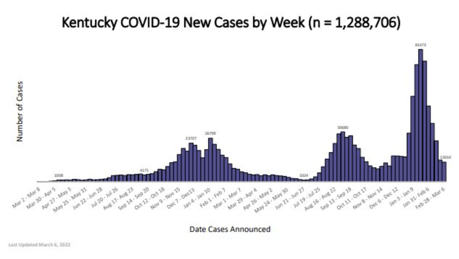
But this state also downgraded its vaccination data: it has, as far as I can tell, stopped publishing a report of vaccinations by race, ethnicity, and other demographic categories (previously posted once a week). And Kentucky’s new COVID-19 dashboard includes a “Weekly Surveillance Data” tab with, truly, some of the lowest-quality data visualizations I have seen throughout the entire course of the pandemic.
Like, you can’t even read these numbers! Admittedly, the dashboard links out to a PDF report with better-quality visualizations, but it’s still a far cry from interactive or downloadable data. Two years into the pandemic, states are still struggling with reporting their numbers in an accessible manner.

Leave a comment