Editor’s note, November 27: Check out my new publication: The Sick Times, a new nonprofit news site chronicling the Long Covid crisis.
After more than three years, 165 weekly newsletters, and a lot of number-crunching, this is the last issue of the COVID-19 Data Dispatch. I am bidding farewell to this publication, with immense gratitude to everyone who has supported it. But this isn’t the last newsletter you’ll get from me about COVID-19 research and data; more on that below.
I’m ending the COVID-19 Data Dispatch for three reasons. First, there is simply less day-to-day COVID-19 data news these days than there was early in the pandemic. When I started writing this publication in summer 2020, there was a constant stream of data issues to explain, new resources coming online, confusing trends, and more. The stream has slowed a lot in the last year, especially after the federal public health emergency ended in May.
The COVID-19 pandemic certainly isn’t over, and COVID-19 is certainly still a significant health threat in the U.S. and all over the world. Millions of people continue to get this disease every week, of whom thousands go to the hospital, hundreds die, and many more are left with Long COVID. However, the specific focus area that I chose for this publication—data and surveillance—is no longer an active topic requiring dedicated coverage. Post-health emergency, U.S. data systems have settled into tracking COVID-19 with a similar lack of urgency to their tracking of other seasonal diseases, leaving me with less to write about on a weekly basis.
Second, writing a publication solo is a lot of work, and I’ve felt myself inching closer to burnout in recent months. I’ve primarily written the CDD on weekends, in my spare time from freelance projects. When I started this newsletter, the process worked well because CDD topics often lent themselves to later freelance articles and vice versa. These days, there’s less overlap, as media publications are less interested in COVID-19 news. While I’ve appreciated having this space to keep covering the topic, it has taken more time and energy to figure out what I’m writing from week to week. The weekly newsletter has felt less like a “passion project,” and more like a chore, which is always a red flag for me.
And the third reason is the most important: I’m getting ready to transition into a new publication. In the new publication, I will continue covering COVID-19—but with a new focus area. I’m also transitioning from a solo project to one with a team, which we hope will grow as the project receives donations and grant funding. I’m not sharing too many details here because this publication hasn’t been announced publicly yet, but you can expect to learn more about it soon.
Specifically: if you’re a COVID-19 Data Dispatch newsletter subscriber, expect an email from me in the coming days introducing my new publication. You’ll be welcome to unsubscribe from my emails if you aren’t interested in the new project; though I hope you’ll find that it will serve to help you navigate the continued pandemic just as the CDD has.
In the meantime, feel free to email me with any questions or concerns you have. And thank you for all the support over the last three years—for the comments, the questions, the donations, and the building of a small community that refuses to simply move on from the ongoing COVID-19 crisis. Thank you.
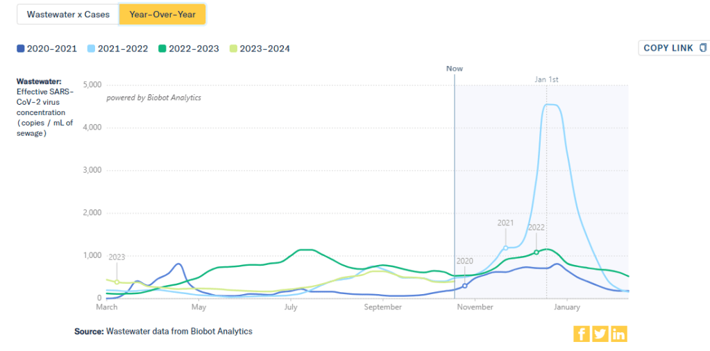
This chart from Biobot Analytics shows that current coronavirus levels in wastewater (the light green line) have followed a similar pattern to fall 2021 (light blue).
The U.S. is heading into our first winter since the end of the federal public health emergency for COVID-19. Those of us still following COVID-19 trends might need to change which data sources we use to track the disease this winter, and how we think about trends.
The pandemic certainly hasn’t ended: COVID-19 still leads to hundreds of hospitalizations and deaths each day, not to mention millions with Long COVID. Since the U.S. government ended its emergency response to this disease, we now have significantly less information—but not zero information—about how it’s spreading.
The CDC is no longer collecting case data, as it lost authority to require reporting from PCR testing labs.
Following the CDC’s lead, many state and local health departments have also stopped tracking COVID-19 cases.
The CDC is still tracking COVID-19 hospitalizations, though these data are more delayed and less comprehensive following the PHE’s end.
Death reporting is also more delayed and less comprehensive.
The CDC is using networks of testing labs and healthcare centers (like the National Respiratory and Enteric Virus Surveillance System) to estimate COVID-19 trends, similar to its strategies for tracking flu and RSV.
To track variants, the CDC is relying on a mix of continued PCR samples, wastewater testing, and travel surveillance.
In short, we lost a few of the primary data sources that people have used to follow COVID-19 over the last three years. But there’s still a lot of data available, primarily from wastewater surveillance, the CDC’s sentinel networks, and local health agencies.
Here are my tips for tracking COVID-19 this winter.
Look at multiple sources for your community.
Following COVID-19 in your city or state used to be easy: you could just look at case numbers. Now, with that metric unavailable in many places, I would recommend having two or three go-to data sources that you check in tandem. Don’t be certain about a trend (like a new surge) until you’ve seen it in multiple sources at once. These sources might be local wastewater pages, local health department pages, and regional trends from the CDC.
For example, when I want to check on COVID-19 spread in New York City (where I live), I look at:
It’s pretty universally acknowledged among epidemiologists and public health experts at this point in the pandemic that, without case data, wastewater surveillance is now our best way to spot new changes in COVID-19 spread. When a new surge occurs, coronavirus levels in wastewater tend to go up days or weeks before other metrics, like hospitalizations.
So, as you track COVID-19 for your community, I would highly recommend that one of your top sources is a wastewater surveillance dashboard.
In addition to local health dashboards, you might find an academic project near you that’s monitoring wastewater. Check the COVIDPoops19 dashboard for a more comprehensive repository of wastewater surveillance projects.
Test positivity is still helpful for trends.
Test positivity—the rate of COVID-19 tests that returned positive results—was a popular indicator early in the pandemic, with policy decisions like whether students could attend school in-person tied to this metric. While test positivity numbers are less available now, people are still getting tested for COVID-19: these tests mostly occur in healthcare settings among people who present with COVID-like symptoms or had recent exposures to the virus.
I still find test positivity to be a helpful metric for watching trends in COVID-19 spread. When the positivity rate goes up, more people are getting COVID-19; and when the rate goes over 10%, that’s a decent indicator that the disease is spreading in significant magnitudes.
Two places to find test positivity data:
The CDC’s COVID-19 trends page provides positivity data for the U.S. as a whole and HHS regions, based on one of the agency’s respiratory virus surveillance networks;
Acknowledge data delays, especially around holidays.
Many COVID-19 dashboards used to update on a daily basis. Now, we get weekly updates from most health agencies—and even less frequency in some places. With these update schedules, all data are inevitably delayed by at least a few days. So, when you look at a dashboard, it’s important to keep the update schedule in mind and ask yourself how a trend might have continued following the most recent data available.
Data delays become particularly prominent after holidays: remember, public health officials take days off just like the rest of us. Holiday reporting delays often lead to appearances of low COVID-19 during the immediate week of a holiday, followed by appearances of higher COVID-19 in the weeks after as cases (and other metrics) are retroactively reported. The weeks around Christmas and New Year’s are particularly bad, as most people take both of those holidays off.
Compare current trends to past surges and lulls.
With interpreting COVID-19 data, context is everything. Spread of the virus is usually either rising or falling; comparing current numbers to historical data can help you understand the magnitude of those recent patterns. Is your community seeing as much COVID-19 as it has at past times commonly recognized as surges? Or are you in more of a lull between waves?
One helpful tool that I often use for such context is a chart on Biobot’s COVID-19 dashboard that provides year-over-year comparisons between coronavirus levels in wastewater in the U.S. Right now, for example, you can see that current viral levels have followed a similar trendline to what we observed in the fall 2021 Delta surge (before Omicron appeared), but lower than this time last year (when different BA variants were spreading quickly).
The original Omicron surge in winter 2021-22 is often a popular point for these comparisons, as pundits love to assure us that a new variant won’t cause as intense a wave as we saw with Omicron’s first appearance. While this can be reassuring, I think it’s important to not just look at the highest peaks for comparison. The summer/fall of Delta in 2021 wasn’t a great time either, and we’re on track to repeat it right now even if no wildly competitive new variants appear.
Keep an eye on variants.
As we watch for a likely COVID-19 surge this winter, viral variants could have an impact on how much the virus is able to spread during our holiday travel and gatherings. You can keep an eye on variant development through a couple of CDC data pages:
Variant patterns from wastewater, which the CDC and local health departments track from select sewage testing sites (many state and local wastewater dashboards include these data as well);
Travel-based genomic surveillance, a CDC program in which international travelers can opt into PCR testing as they return to U.S. airports, contributing to the agency’s understanding of variants circulating globally.
If you have further data tracking questions or suggestions, please reach out via email or in the comments below.
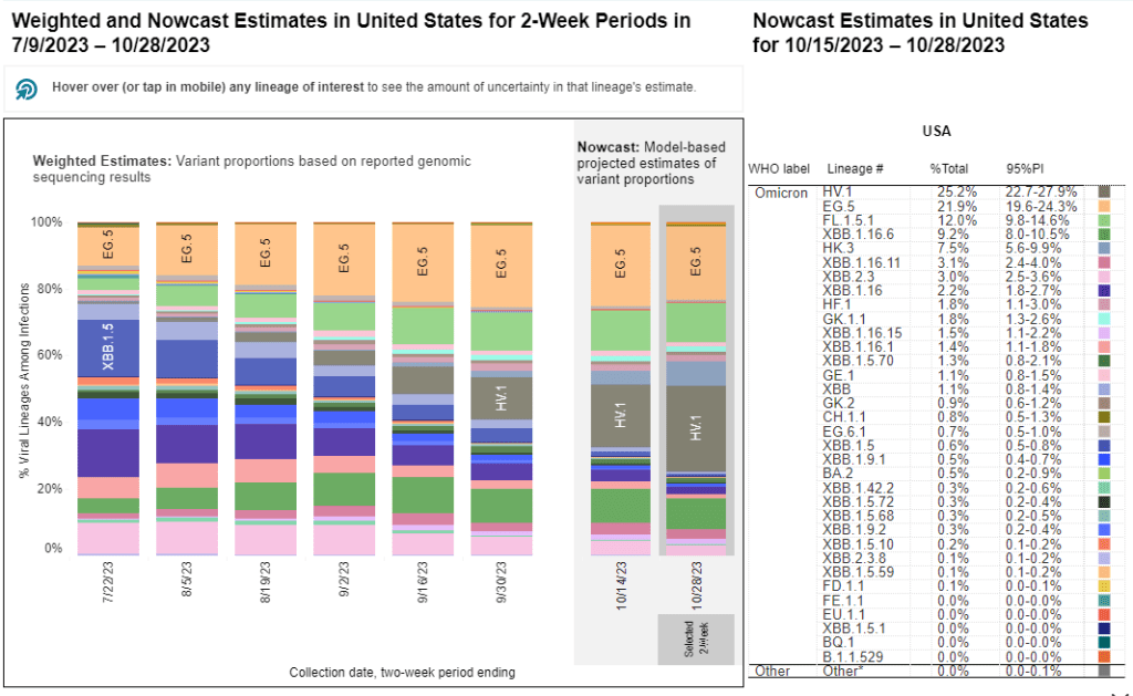
HV.1, a relative of the XBB.1.5 variant family, is the most prevalent variant in the U.S. right now, according to CDC estimates.
As winter approaches, pretty much every public health expert I follow is anticipating a COVID-19 surge. Experts anticipate that indoor gatherings and travel for the holiday season—with fewer COVID-19 precautions than we had earlier in the pandemic—will lead to more disease spread, just as these behaviors have historically contributed to more spread of flu and other common pathogens this time of year.
While it seems a surge is likely, the size and severity of that surge may depend in part on SARS-CoV-2 variants. Variants can evolve to more efficiently reinfect people who got COVID-19 recently or to evade our vaccines. These explosive variants can add fuel to the fire when people are already spending a lot of time indoors together with relatively few precautions, as we saw with the original Omicron in winter 2021-22.
As a result, experts are closely watching a few current variants that might lead to faster COVID-19 spread this winter. Here’s a review of what’s circulating right now, what to watch for in the coming weeks, and how our public health system is tracking the variants.
XBB.1.5 and relatives
Omicron XBB emerged in late 2022 when two different versions of BA.2, one of the first Omicron lineages, merged together in an evolutionary process called recombination. While the original XBB didn’t really take off globally, it started to mutate as it spread in the U.S., leading to XBB.1.5 in early 2023. See my FAQ post from January for more details.
XBB.1.5 has remained a dominant lineage in the U.S. and globally for much of this year. Scientists tracking variants have mostly identified new variants that descend from XBB.1.5, though you might not guess it from the naming schemes which often shorten names for convenience (for example, XBB.1.9.2.5 became EG.5). As a result, the FDA advised vaccine manufacturers to base their COVID-19 shots for this year on XBB.1.5.
EG.5 and FL.5.1
EG.5 and FL.5.1 are two of those XBB.1.5 relatives, descended from the XBB recombinant variant with enough evolutionary steps that virologists gave them these shorthand titles. These two variants are notable because they share a specific mutation, dubbed “FLip,” which helped the variants reinfect people more easily after prior infection or vaccination.
The CDC’s variant surveillance estimates suggest that EG.5 and FL.5.1 have been prominent—but not really dominant—variants in the U.S. this fall. In the CDC’s most recent update, the agency estimates that these variants caused 22% and 12% of cases respectively during the two weeks ending October 28. They don’t appear different enough from other XBB.1.5 relatives to really break through and cause a surge.
HV.1, descendant of EG.5
HV.1 evolved from EG.5, making it another XBB.1.5 relative. It’s the most common variant in the U.S. right now, with the CDC’s latest update estimating that it caused about one in four COVID-19 cases during the last two weeks. Like the other variants discussed above, HV.1 has a slight evolutionary advantage over its relatives; but it’s not significantly different enough to cause a huge surge right now.
There's a new COVID-19 variant predominant, @CDCgov is now estimating
HV.1, a descendant of EG.5 that's not too distantly related to those other XBB descendants
BA.2.86 got some attention when it emerged in August. This variant, unlike the others that have circulated in 2023, is not related to XBB.1.5. Instead, it takes us back in the coronavirus’ evolution, as it evolved directly from BA.2—a version of Omicron that spread widely back in early 2022. Scientists expressed concern about some worrying mutations in BA.2.86 and wondered if our vaccines, matched to XBB.1.5, might not work well against it.
Two months later, BA.2.86 hasn’t spread widely around the world as scientists worried that it might. It doesn’t appear to have a huge advantage over the XBB.1.5 descendants. While CDC surveillance has identified BA.2.86 across the U.S., it’s caused less than 1% of cases, according to the agency’s estimates.
JN.1, descendant of BA.2.86
But BA.2.86 could still indirectly cause some problems: this variant, like all the others, has been mutating. In the last couple of weeks, scientists have started to closely watch one BA.2.86 descendant called JN.1. JN.1 has picked up mutations that make it better at evading immunity from past infections or vaccinations, leading, of course, to faster spread.
JN.1 has shown up in many countries now, besides France and the UK, including the US, Iceland, Portugal, Belgium, Israel, Spain, Netherlands, Canada Germany, and Singapore. Other derivatives of BA.2.86 such as JN.2 and JN.3 are also being identified in multiple countries.
We won’t know for a few weeks as to whether JN.1 will be linked with a significant rise in COVID or how well our immune response from prior vaccinations, infection(s) and the XBB.1.5 new booster will keep us protected.
So, while BA.2.86 itself may be more benign than expected, JN.1 and its relatives are worth watching. Sequence data shared in the global repository GISAID suggest that this variant is spreading quickly globally, and may be contributing to increased spread in France in particular.
JN.1 growth is real.
New big data dump from France and other countries.
I think this solidifies things, this is quite fast. The trend in the last 4 weeks is so tight that it's messing with the confidence intervals!
As I described in my post about BA.2.86, the U.S. has a few ways of tracking variants. The CDC recently highlighted four key surveillance systems in a report about monitoring BA.2.86, published in the agency’s Morbidity and Mortality Weekly Report:
The national SARS-CoV-2 genomic surveillance program, in which the CDC and commercial partners anonymously select and sequence samples from people who had positive COVID-19 PCR tests;
The Traveler-based Genomic Surveillance program, in which international travelers returning to U.S. airports can voluntarily get PCR-tested in groups;
The National Wastewater Surveillance System, in which some public health labs sequence sewage samples that are part of the CDC’s wastewater surveillance program (with about 400 sewersheds participating in sequencing);
Digital public health surveillance, using coronavirus sequences that are shared on public, open-source platforms like GISAID.
CDC scientists use all four of these systems to keep track of variants circulating in the U.S. Sequencing wastewater samples is particularly important these days with fewer PCR tests available, I argued in a post last month.
Variants don’t happen in isolation
Sometimes, news reports about coronavirus variants cover the virus’ evolution as though it happens in isolation. Like the virus is just mutating in a vacuum, and would do so forever regardless of our human behavior.
But this isn’t accurate. The coronavirus mutates because we keep spreading it, with each infection creating an opportunity for new mutations to arise. If our public institutions really took measures to stop COVID-19 from spreading, it would also be much harder for the virus to keep evolving and evading us.
As variant expert J.P. Weiland pointed out on Twitter: “Timing is so important for impact. If it [JN.1] becomes dominant before the holidays, the wave will be quite a lot bigger than dominance in Jan.”
So, in case you need another motivator to keep up the COVID-19 precautions this holiday season: consider it doing your part to reduce viral evolution.
It’s now been a couple of weeks since updated COVID-19 vaccines became available in the U.S. At this point in prior COVID-19 vaccine rollouts, we would know a lot about who had received those vaccines: data would be available by state, for different age groups, and other demographic categories.
This time, though, the data are missing on a national scale. Following the end of the federal public health emergency in May, the CDC has lost its authority to collect vaccination data from all state and local health agencies that keep immunization records. As a result, the CDC is no longer providing comprehensive vaccination numbers on its COVID-19 dashboards.
But we still have some information about this year’s vaccination campaign, thanks to continued CDC efforts as well as reporting by other health agencies and research organizations. In fact, last week, the federal Department of Health and Human Services (HHS) told reporters that more than seven million Americans have received updated COVID-19 vaccines so far this fall.
HHS also said that about 14 million doses have been shipped to vaccination sites, primarily pharmacies. In addition, 710,000 vaccines for children have been ordered through a federal program that provides these shots.
Vaccine distribution numbers are slightly easier for the CDC and HHS to collect, as they can work directly with vaccine manufacturers. To understand how many people are getting the shots, though, is more challenging—requiring a mix of data from state and local agencies, surveys, and other surveillance mechanisms.
What changed with the PHE’s end:
Early in the pandemic, the CDC established data-sharing agreements with the health agencies that keep immunization records. This includes all states, territories, and a few large cities (such as New York City and Philadelphia) that have separate records systems from their states; you can see a full list of records systems here.
Through those agreements, the CDC collected vaccine administration numbers, standardized the data (as much as possible), and reported them on public dashboards. The CDC wasn’t able to collect as detailed demographic information as many health experts would’ve liked—for example, they never reported vaccinations by race and ethnicity below the national level. But the data were still useful for tracking who got vaccinated across the U.S.
These data-sharing agreements concluded with the end of the public health emergency (PHE) in May 2023. According to a CDC report published at that time, the CDC was able to extend agreements with some jurisdictions past the PHE’s end. Still, the report’s authors acknowledged that “future data might not be as complete” as during the emergency period. Even if 40 out of 50 states keep reporting, the remaining 10 represent data gaps.
Notably, the May report also claims that the CDC would continue to provide data on COVID-19 vaccination coverage on the CDC’s COVID-19 dashboard and a separate vaccination dashboard. But neither of those dashboards has been updated with any information from this fall’s vaccine campaign, as of this publication.
In addition to compiling data from state and local systems, the CDC has other mechanisms for tracking vaccinations. According to CBS News reporter Alexander Tin, CDC officials highlighted a couple during a briefing on October 4:
The National Immunization Survey, a phone survey conducted by CDC officials to estimate national vaccination coverage based on a representative sample of Americans. This survey is currently the CDC’s method for tracking flu vaccinations.
CDC’s Bridge Access and Vaccines for Children (VFC) programs, both of which buy vaccines to distribute to Americans who may not have health insurance or face other financial barriers to vaccination. The Bridge Access program was specifically set up for COVID-19 vaccines, while the VFC program covers other childhood vaccines.
Contact with vaccine manufacturers and distributors, i.e. the pharmaceutical companies that make the vaccines and the pharmacies and healthcare organizations that give them out. These companies share data with the CDC, offering insights into how many vaccines have been distributed to different locations; though the data may not be comprehensive if not all distributors are included (i.e. just big pharmacy chains, not smaller, independent stores).
Other places to look for vaccination data:
Outside of the CDC, there are a few other places where you can look for vaccination data. Here are a couple that I’m monitoring:
State and local public health agencies: Some agencies that track immunizations have their own dashboards, reporting on vaccinations in a specific state or locality. For example, New York City’s health department tracks COVID-19 vaccinations among city residents, although the agency hasn’t yet published data for this fall’s vaccines. I have a list of state vaccination dashboards here; this doesn’t currently represent data on the fall 2023 vaccines, but I aim to do that update in the coming weeks.
Outside surveys, such as KFF’s COVID-19 Vaccine Monitor: Like the CDC’s National Immunization Survey, other health organizations conduct surveys to track vaccinations. The Kaiser Family Foundation’s COVID-19 Vaccine Monitor is one well-known project, which has been doing regular surveys on COVID-19 vaccine uptake since December 2020.
Scientific reports answering specific vaccination questions: Public health researchers may use surveys, immunization records, or other data systems to study specific questions about vaccination, such as the impact that vaccination has on lowering a patient’s risk of severe disease. These studies are often published in the CDC’s Morbidity and Mortality Weekly Reportand other journals.
If you have other questions about vaccination data—or want to share a data source I didn’t mention here—please reach out: email me or leave a comment below.
Editor’s note, October 15: This article has been updated with comments from Verily.
This week, the CDC and life sciences company Verily announced that the agency awarded a five-year wastewater surveillance contract to Verily. The announcement marks a shift in the U.S. sewage monitoring landscape and will impact our public COVID-19 data, with short-term gaps and changing coverage in a couple of sources—but ultimate improvements in the long term.
First, some background:
In fall 2020, the CDC launched the National Wastewater Surveillance System (NWSS), a network of sewage testing sites around the country all reporting data to a central location. While some state and local health agencies quickly developed in-house systems for testing wastewater and reporting their data to NWSS, others lacked the resources (staff, lab capacity, data infrastructure, etc.) to start doing this new type of health surveillance.
As a result, the CDC began working with private testing companies to fill gaps in the NWSS network and expand surveillance more quickly across the country. The first contactor was a diagnostic company headquartered in Canada called LuminUltra. Then, last spring, the CDC awarded a contract to Biobot Analytics, a startup focused on wastewater surveillance. Biobot did a lot of work to extend the NWSS, helping bring the total CDC network up to nearly 1,400 sites; but the contractor switch initially led to a few weeks of missing data for about 150 sites covered by the CDC contract, as they transitioned from one set of testing protocols to another. (See my coverage at the time for more details.)
One advantage of Biobot working with the NWSS, if you’re someone who cares about public wastewater data, is that the company added data from many CDC contract sites to its COVID-19 wastewater dashboard, making that dashboard more comprehensive in its view of national COVID-19 patterns. You couldn’t view the CDC sites in Biobot’s county-level visualizations; those present data from other sites that have individual contracts with the company or are participating in the free Biobot Network program. But Biobot added CDC sites that opted into data-sharing to its national and regional visualizations, a company spokesperson told me last year.
What’s changing with the new contract:
Biobot’s contract with the CDC ended last month. The CDC’s new contract with Verily replaces it. Verily’s contract covers five years (as opposed to shorter periods for prior CDC wastewater testing contracts), and includes additions of more pathogens that may be tested through NWSS, in addition to SARS-CoV-2. These are both great improvements, adding to the surveillance system’s longevity and expanding its capacity beyond COVID-19—though additional federal funds will likely be needed past this contract.
However, in the short term, we will see data gaps on NWSS as contracted sites change over to Verily from Biobot. These testing sites may have to adjust how they collect samples, how they package and ship samples, and other logistical changes. The CDC NWSS dashboard already indicates a reporting dip in the last couple of weeks, coinciding with the contract change.
Meanwhile, Biobot will no longer have the same direct access to the CDC contract testing sites. While all the sites’ data will still be published publicly by the CDC, the Biobot-Verily switch will likely lead to changes in sample processing and analysis that make data from those sites no longer directly comparable with the hundreds of other sites covered by Biobot. My guess here is that Biobot may no longer be able to include the CDC contract sites in its national and regional visualizations.
I reached out to Biobot for comment about this shift, and haven’t heard back from them yet. I’ve also reached out to Verily asking about the contract changeover and any data-sharing plans they may have, and haven’t heard back there yet either. I will update this post with more details from the companies as I receive them.
How this new contract may impact major data sources:
CDC NWSS: Data from all sites participating in NWSS will continue to be available on the CDC’s dashboard, though the sites covered by the CDC’s national testing contract (previously with Biobot, now with Verily) may have missing data for a couple of weeks. NWSS continues to be the most comprehensive place to find wastewater data in the U.S., but unfortunately doesn’t share national or regional trends because it is compiling from many different testing programs with different methodologies.
Biobot Analytics: County-level data won’t change. National and regional data will still be available, but are likely to be less comprehensive pictures of wastewater trends across the U.S., if I’m right about Biobot no longer including CDC contract sites in those visualizations. Also worth noting, Biobot shifted its update schedule recently to once a week on Mondays (with a longer delay in data, but likely less retroactive updating).
WastewaterSCAN: No changes due to this contract switch, though WastewaterSCAN has been working with Verily for a while to test sewage samples from its network. This project also recently announced that it’s adding six more disease targets to its program: parainfluenza, rotavirus, adenovirus group F, enterovirus D68, Candida auris, and hepatitis A. See the statement from WastewaterSCAN below for more details.
In the long-term: The CDC’s new five-year contract will enable continued expansion of the NWSS, potentially with both more sites and more disease targets. I also expect public data offerings will continue to improve as scientists and public health officials learn more about how to interpret wastewater surveillance data.
Statement from WastewaterSCAN about the new contract
WastewaterSCAN was pleased to learn that the CDC selected Verily to support the National Wastewater Surveillance System (NWSS). As our lab partner, Verily has an important role managing sample collection logistics from wastewater treatment plants participating in the WastewaterSCAN network, processing samples, and supporting our research to advance the science of wastewater-based epidemiology.
WastewaterSCAN continues to demonstrate that wastewater monitoring can provide comprehensive, efficient, community-wide tracking of seasonal and emerging diseases. We recently added six disease targets to our program and are helping many communities prepare for the respiratory virus season with a public data dashboard to communicate what wastewater is telling us about the diseases circulating in our communities.
At this time, only data from our program will appear on WastewaterSCAN’s data dashboard. WastewaterSCAN will continue to make our methods public and to collaborate and share data with NWSS and contribute to its important, mission-critical work.
Statement from Verily, responding to COVID-19 Data Dispatch questions
CDD: Will the WastewaterSCAN dashboard start including data from wastewater testing sites included in the CDC contract, as they come online? Or is Verily planning to launch its own dashboard that will share data from those sites (perhaps in aggregate, national trends, similar to the current Biobot dashboard)?
Verily: WastewaterSCAN representatives have responded. On the question of sharing aggregated, national trends data from these sites: This is a CDC decision for the NWSS testing program.
CDD: Besides public dashboards, will there be alignment between WastewaterSCAN and Verily in how wastewater data are processed, analyzed, and interpreted?
Verily: There are many methods for analyzing the concentration of pathogens in wastewater. Verily offers several methods for wastewater analysis to its customers and ones chosen by the CDC NWSS and WastewaterSCAN programs differ primarily in what part of the wastewater is analyzed and how the pathogens are concentrated and extracted before measurement of pathogen concentrations. Beyond these initial steps, Verily’s lab processes all samples similarly.
The liquid fraction (of influent samples) will be concentrated and tested for the CDC NWSS program, similar to the approach previously used for NWSS contract testing.
The solid fraction of samples (from the primary clarifier or influent) has been shown to concentrate many pathogens and is tested for the WastewaterSCAN program.
Results from methods have shown agreement with case data in the literature. However, differences between the methods make them complementary to each other.
CDD: When the CDC previously switched contractors in spring 2022, some testing sites covered by the contract didn’t report to NWSS for several weeks while they transferred to a new process. What is Verily doing to help transition sites during the current switch?
Verily: Verily has an established system and team dedicated to onboarding new sites with the ability to rapidly initiate testing. This is informed by our previous experience providing logistics and lab services to over 200 sites in wastewater monitoring programs.
As we receive information from the CDC NWSS program about which sites will transition, we will get sites up and running as soon as possible. Our goal is to have up to 200 sites testing within the first four weeks of the contract.
With this past Monday’s announcement from the University of Oxford and the pharmaceutical company AstraZeneca, three COVID-19 vaccine candidates have now demonstrated clinical trial results which could land them Emergency Use Authorization from the Food & Drug Administration (EUA from the FDA, for short). Pfizer, the first vaccine manufacturer to release its trial results, applied for EUA on November 20. The FDA advisory committee will meet on December 10 to review this application, and vaccines could start shipping out as early as December 12.
These dates are incredibly exciting—December 12 is only three weeks away. But that first vaccine shipment will likely include 50 million doses, at most. Since two doses are required for a patient to be protected against COVID-19, this means up to 25 million people will be able to get vaccinated. That represents just 7.6% of the country’s population. So, who will get vaccinated first?
As per usual in America’s fractured pandemic response, the answer to this question will largely depend on state and local public health authorities. Still, national guidances and data on health disparity allow us to see who should get the vaccine first—and evaluate our local public health authorities when the doses start rolling out.
Earlier this week, the Advisory Committee on Immunization Practices (ACIP) released a report which aims to help local authorities make these decisions. The ACIP is a group of medical and public health experts affiliated with the Centers for Disease Control and Prevention (CDC), which develops recommendations on how vaccines should be used among U.S. residents. The committee has been considering COVID-19 vaccine ethics since April, through a Work Group which conducted literature reviews and presented its findings to the rest of the team.
The ACIP recommends that four ethical principles guide COVID-19 vaccine distribution:
Maximize benefits and minimize harms. The first people to get vaccinated should be those who, when they are healthy, are better able to protect the health of others in their community. This includes healthcare workers, other essential workers, and people with preexisting health conditions who would likely need to be hospitalized if they became sick with COVID-19.
Promote justice. Americans of all backgrounds and communities should have an equal opportunity to be vaccinated. The ACIP recommends that public health authorities work with external partners and community representatives to help make vaccines available (and attractive) to everyone—both when vaccine supply is limited and when everyone is able to get inoculated.
Mitigate health inequities. People of color, especially Black Americans, Native Americans, and Native Hawaiians/Pacific Islanders, have been disproportionately impacted by COVID-19 in the U.S. The legacy of systemic racism in this nation’s healthcare system and economy, as well as disparities in testing availability and care, have contributed to these inequitable outcomes. Vaccine distribution must directly address such inequities by prioritizing racial and ethnic minorities, low-income communities, rural communities, and other marginalized groups.
Promote transparency. All the decisions that public health authorities make about who gets the vaccine, when, and how must be communicated clearly to the public. Furthermore, communities should be invited to participate in the decision-making process whenever possible. This kind of transparency helps promote trust in both the vaccines and the people who administer them.
The ACIP’s recommendations are also laid out more practically in two tables at the end of the report. The first table poses essential questions for public health authorities to consider for each ethical principle, while the second applies these principles to four key groups who will be prioritized in the first round of vaccinations: healthcare workers, other essential workers, adults with high-risk medical conditions, and adults over the age of 65.
Dr. Uché Blackstock, the founder of Advancing Health Equity, critiqued the recommendations on Twitter for failing to specifically call out the role of systemic racism in shaping how COVID-19 has impacted Black communities. Still, these principles are a good start in providing us reporters and community members with a framework for watching how our public health authorities distribute vaccines.
The federal government will simply be sending vaccine doses to states based on their overall populations rather than taking the ACIP’s recommendations, according to NPR’s Pien Huang. So, it will be entirely up to states and more local public health departments to prioritize justice, equity, and transparency. What tools should public health departments use in order to apply these principles?
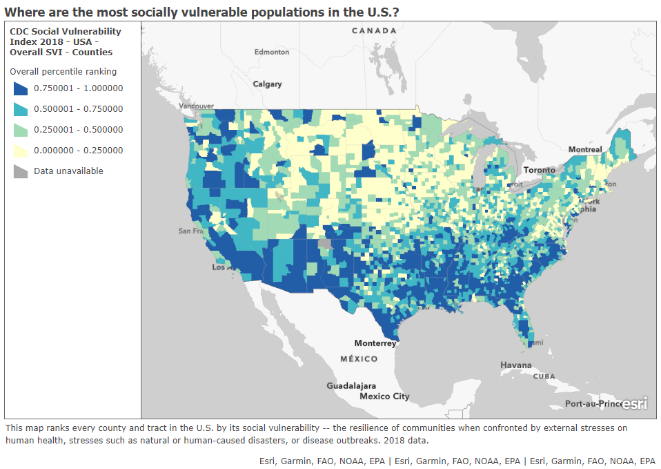
In a webinar last week on vaccine distribution, STAT News reporter Nicholas St. Fleur suggested turning to the CDC’s Social Vulnerability Index. Social vulnerability, as the CDC defines it, measures a community’s ability to recover from events that are hazardous to human health. These events can include tornados, chemical spills, and—of course—pandemics. CDC researchers have calculated the social vulnerability of every Census tract in the U.S. based on 15 social, economic, and environmental factors such as poverty, lack of vehicle access, and crowded housing.
The most recent update of this index was released in March 2020 based on analysis of 2018 Census data. Here’s what it looks like, mapped by Esri’s Urban Observatory:
The CDC’s Census tract-level Social Vulnerability Index, as mapped by Esri’s Urban Observatory. Communities colored in dark blue are more vulnerable to hazardous health events.
St. Fleur also recommends checking out how your state, city, or county defines essential workers, as these distinctions may vary from region to region. In New York, for example, essential workers include teachers, pharmacists, and grocery store workers. In Texas, essential workers include law enforcement and the Texas Forest Service. The Kaiser Family Foundation report which I featured in last week’s issue compiles links to draft COVID-19 vaccination plans for every state, some of which include these definitions.
I anticipate that vaccine distribution and reporting will continue to be a major topic for this newsletter in the coming months. Questions and topic suggestions are always welcome; you can drop me a line at betsyladyzhets@gmail.com, on Twitter, or in the comments.
In this final newsletter, I wanted to highlight one of my favorite sources for new research on COVID-19 and Long COVID (and one that published a new paper recently): the Patient-Led Research Collaborative (PLRC). PLRC is an independent research group including people with Long COVID and related chronic diseases, such as ME/CFS and POTS, who also have scientific research experience.
This organization has been a leader in Long COVID research since May 2020, when it published a study describing persistent symptoms among people who got COVID-19 earlier that spring. The group’s further papers have included comprehensive analyses of Long COVID symptoms and reviews of other research. In addition to running studies, the organization funds biomedical research, publishes patient-generated hypotheses for scientists, and advocates for better patient engagement in Long COVID research.
PLRC has regularly pushed the Long COVID field forward, with papers addressing under-studied topics like reproductive health and mental health. Their latest paper similarly provides data about working with Long COVID, an issue that is under-studied yet frequently discussed in the Long COVID community. The paper summarizes results from a survey of about 500 people with Long COVID describing the condition’s impact on their work.
From the survey results, the researchers found four primary themes: 1) people with Long COVID want to return to work, motivated by financial pressures and a sense of purpose for their jobs; 2) diverse, complex, and sometimes inconsistent Long COVID symptoms can interfere with work and other day-to-day tasks; 3) people face disbelief and stigma due to Long COVID; and 4) support from medical providers is important for returning to work. These findings align with stories I’ve heard from people with Long COVID whom I’ve interviewed for stories, as well as conversations I’ve read online.
We're happy to release a new patient-led paper on returning to work & episodic disability in #LongCovid!
— Patient-Led Research Collaborative (@patientled) November 9, 2023
If you’re looking to keep up with impactful Long COVID research, PLRC—along with the organization’s collaborators and projects it has funded—is an important group to follow.
New vaccination data from the CDC: The CDC has started publishing vaccination data reflecting how many Americans have received COVID-19, flu, and RSV shots in fall 2023. These numbers are estimates, based on the CDC’s National Immunization Survey, as the agency is no longer directly compiling COVID-19 vaccinations from state and local health agencies. (See this post from last month for more details.) According to the estimates, about 28% of American adults have received a 2023 flu shot, compared to 10% who have received a 2023 COVID-19 shot. The numbers reflect poor communication about and accessibility challenges with this year’s COVID-19 vaccines.
FDA approves a rapid COVID-19 test: Following the end of the federal public health emergency this spring, the FDA has advised companies that produce COVID-19 tests to submit their products for full approval, transitioning out of the emergency use authorizations that these tests received earlier in the pandemic. The FDA has now fully approved an at-home COVID-19 test: Flowflex’s rapid, antigen test. This is the second at-home test to receive approval, following a molecular test a few months ago. The Floxflex test “correctly identified 89.8% of positive and 99.3% of negative samples” from people with COVID-like respiratory symptoms, according to a study that the FDA reviewed for this approval.
WHO updates COVID-19 treatment guidance: This week, the World Health Organization updated its guidance on drugs and other treatment options for severe COVID-19 symptoms. A group of WHO experts has regularly reviewed the latest evidence and updated this guidance since fall 2020. The update includes guidelines on classifying COVID-19 patients based on their risk of potential hospitalization, recommendations for drugs such as nirmatrelvir and corticosteroids, and recommendations against other drugs such as invermectin and hydroxychloroquine. Clinicians can explore the guidance through an interactive tool that summarizes the expert group’s findings.
Gargling with salt water to reduce symptoms: Speaking of COVID-19 treatments: gargling with salt water may help people with milder COVID-19 symptoms recover more quickly, according to a new study presented at the American College of Allergy, Asthma and Immunology’s annual conference. The researchers compared COVID-19 outcomes among people who did and did not use salt water for 14 days while sick; those who used the treatment had lower risks of hospitalization and reported shorter periods of symptoms. This study has not yet been peer-reviewed and more research will be needed, but it’s still helpful evidence to back up salt water as a potential treatment (something I’ve personally seen recommended anecdotally in the last couple of years).
Allergies as potential Long COVID risk factors: Another study that caught my attention this week: researchers at the University of Magdeburg in Germany conducted a review of connections between allergies and Long COVID. The researchers compiled data from 13 past papers, including a total of about 10,000 study participants. Based on these studies, people who have asthma or rhinitis (i.e. runny nose, congestion, and similar symptoms, usually caused by seasonal allergies) are at higher risk for developing Long COVID after a COVID-19 case. The researchers note that this evidence is “very uncertain” and more investigation is needed; however, the study aligns with reports of people with Long COVID getting diagnosed with mast cell activation syndrome (or MCAS, an allergy-related condition).
Dropping childhood vaccination rates: One more notable study, from the CDC’s Morbidity and Mortality Weekly Report (MMWR): vaccination rates for common childhood vaccines are declining among American kindergarteners, according to CDC research. CDC scientists reviewed data reflecting the childhood vaccinations that are required by 49 states and D.C. for the 2022-23 school year, and compared those numbers to past years. Overall, 93% of kindergarteners had completed their state-required vaccinations last school year, down from 95% in the 2019-20 school year, while vaccine exemptions increased to 3%. In 10 states, more than 5% of kindergarteners had exemptions to their required vaccines—signifying increased risk of vaccine-preventable disease outbreaks in schools, according to the CDC.
Two quick updates about the CDC’s surveillance efforts for COVID-19 and other diseases:
The CDC has provided a short-term wastewater surveillance contract to Verily, the biotech company that’s affiliated with Google, so that data collection can continue at about 400 sewage testing sites while a longer-term contract is in dispute. This temporary measure will help keep up surveillance during the winter respiratory virus season, though Verily still has a lot of logistical work ahead to actually start testing at sites where another company, Biobot Analytics, was previously in charge. (Verily will need to contact the sites, send them equipment, set up sample collection procedures, etc.) The CDC’s National Wastewater Surveillance System is also working on an updated COVID-19 dashboard, according to POLITICO’s story about the short-term contract. For more context, see my coverage of the contract switch and POLITICO’s previous reporting.
The CDC is expanding its testing program for international travelers arriving at U.S. airports, in a three-month pilot program for the winter virus season. This program, called the Traveler-Based Genomic Surveillance program, has screened travelers for coronavirus variants over the last two years, primarily using PCR tests among travelers who volunteer for a nasal swab. This winter’s pilot program expands surveillance in two ways: adding about 30 testing targets (including flu, RSV, other common diseases, and markers of antimicrobial resistance), and adding wastewater testing at three airports. One airport, San Francisco’s international airport, was already providing samples from plane sewage. See my article in Science News for more details.
Biobot’s COVID-19 dashboard shows that coronavirus levels in wastewater have increased over the last two weeks.
During the most recent week of data available (October 22-28), the U.S. reported about 15,700 new COVID-19 patients admitted to hospitals, according to the CDC. This amounts to:
An average of 2,200 new admissions each day
4.8 total admissions for every 100,000 Americans
0.1% more new admissions than the prior week (October 15-21)
Additionally, the U.S. reported:
9% of tests in the CDC’s surveillance network came back positive
A 7% higher concentration of SARS-CoV-2 in wastewater than the prior week (as of November 1, per Biobot’s dashboard)
25% of new cases are caused by Omicron HV.1, 22% by EG.5, 17% by XBB.1.6, 12% by FL.1.5.1 (as of October 28)
Most of the numbers above are exactly copied from last week’s National Numbers post, as the CDC didn’t update its COVID-19 dashboard this week. Honestly, I have no idea why a single-day holiday (i.e. Veteran’s Day yesterday) might lead a national health agency to postpone its data updates for an entire week, but I’m sure this won’t be the last time it happens.
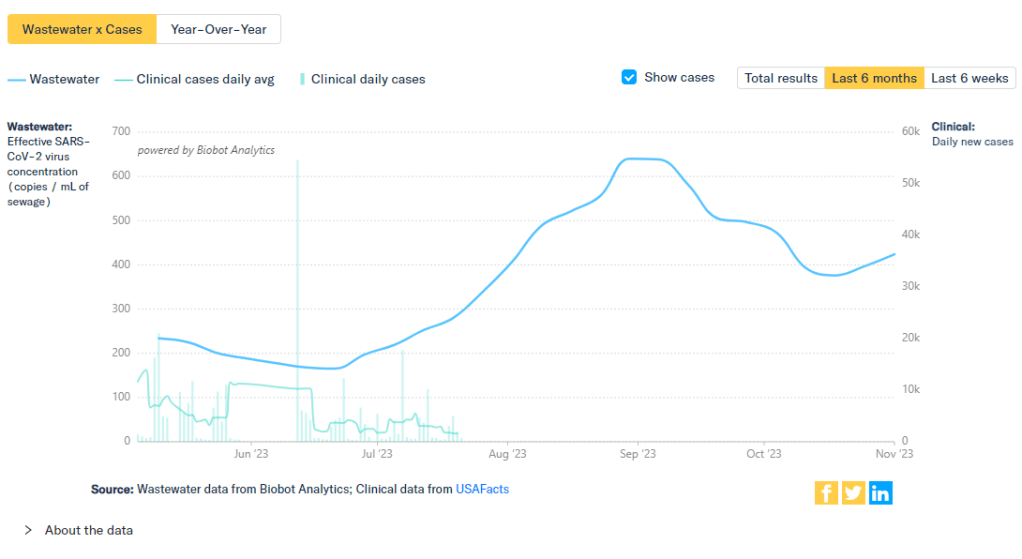
The new data we do have this week, mainly from wastewater dashboards, suggest that COVID-19 spread is increasing slightly along with other respiratory viruses. Data from Biobot and WastewaterSCAN show upticks in the last two weeks, following the declining spread from September through the end of October.
Biobot’s dashboard shows that the concentration of coronavirus in U.S. sewersheds has gone up about 13% on average nationally, from October 18 through November 1. Coronavirus levels are currently highest in the Midwest, with the West Coast and South showing signs of increasing spread while the Northeast is in a plateau.
WastewaterSCAN’s dashboard presents a similar picture: the Midwest currently has high coronavirus levels, according to WWSCAN’s thresholds, while the other regions have moderate levels. This dashboard shows rising COVID-19 transmission in the Midwest and South as well, with cities like Warren, Michigan, Lincoln, Nebraska, and Arkon, Ohio reporting significant increases in recent weeks.
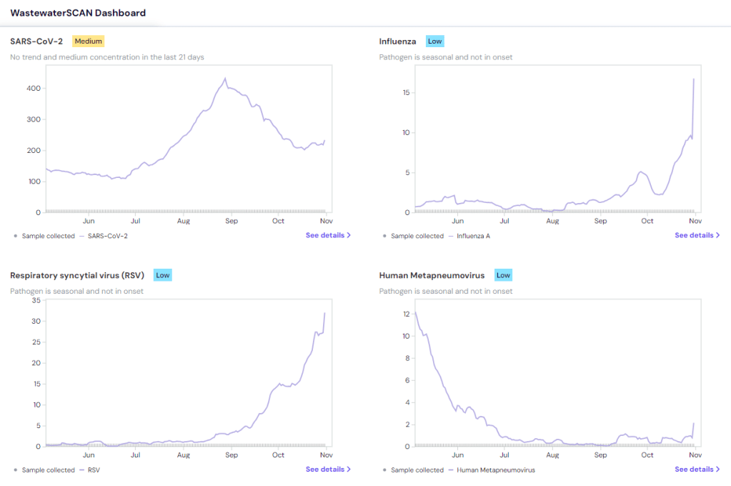
COVID-19 isn’t the only virus spreading a lot right now, according to WWSCAN and the CDC. The CDC said in its most recent flu surveillance report that this seasonal virus is increasing throughout the country, though it hasn’t yet reached typical flu season levels. This report was published over a week ago, on November 3, but it seems likely that the trend has continued this week.
Both wastewater surveillance and the CDC’s influenza-like activity surveillance, which tracks doctors’ visits for respiratory symptoms, suggest that the South is seeing increased spread of several viruses: COVID-19, flu, RSV, norovirus. Norovirus and RSV in particular are at high levels nationwide, according to WWSCAN.
Similar safety measures—masks, testing, improved ventilation, getting vaccinated—protect against many common diseases. Recent data from the CDC show that many people are, at least, getting vaccinated, though vaccination rates are currently much higher for flu than COVID-19 among both adults and children. (Public health agencies clearly have some work to do there.)
Last week, I shared an update about the Healthcare Infection Control Practices Advisory Committee (HICPAC), a group of advisors to the CDC that has been working on updated guidelines for limiting infectious disease spread in healthcare settings. The committee has faced criticism for failing to incorporate lessons from COVID-19 into its guidance, as well as for a lack of transparency in its operations.
The transparency issues continued this week, according to a press release by National Nurses United (NNU), a nurses union that’s been at the forefront of advocacy for better infection control guidelines. HICPAC only released a draft of its updated guidance on November 2, the day before it voted on the document. And it’s only giving the American public five days to review the document and provide feedback through public comments.
“HICPAC’s draft is permissive and weak and seeks not just to maintain existing practice — which has been shown to be inadequately protective — but even rolls back the use of some important measures, such as airborne infection isolation rooms,” said NNU president Zenei Triunfo-Cortez in a statement.
Despite calls to delay a vote on this document until hearing from healthcare workers and public health experts, HICPAC voted unanimously to finalize the guidance draft during its meeting this week. The vote indicates a lack of public transparency and a lack of consideration for relevant health expertise—which is troubling considering how influential this guidance is for setting standards in healthcare centers across the country.
For more details about HICPAC and instructions on making public comments, see this CDC webpage.
New respiratory virus dashboard for Europe: Residents of about 50 European countries can now follow respiratory virus trends for their nations on a new dashboard developed by the World Health Organization (WHO) and European Centre for Disease Prevention and Control (ECDC). The dashboard compiles data from patient visits to healthcare facilities, laboratory testing, and genetic sequencing of coronavirus variants, according to a press release by the ECDC. Viewers can find summary trends for influenza-like illness as well as specific trends for COVID-19, flu, and RSV. This dashboard is a great step forward for standardizing surveillance data across countries.
Medicaid unwinding update from KFF: This week, the Kaiser Family Foundation (KFF) published an update to its Medicaid Enrollment and Unwinding Tracker, which follows the Americans who lost their health insurance following the end of a Medicaid rule tied to the federal public health emergency for COVID-19. At least 10 million people have lost Medicaid coverage as of November 1, KFF reports, though the researchers acknowledge that this number is likely an undercount due to limited data. While disenrollment rates vary by state, overall, 71% of people who lost Medicaid coverage did so for “procedural reasons,” i.e. paperwork issues, according to KFF’s analysis.
New Long COVID prevalence estimates: In a new paper, published this week in PLOS ONE, researchers at Dartmouth and University College London estimate Long COVID prevalence in the U.S. based on six months of data from the U.S. Census and CDC’s Household Pulse Survey. (Longtime readers may remember that this survey is one of my personal favorite sources for Long COVID data.) About 14% of respondents surveyed between June and December 2022 reported that they had experienced Long COVID at some point, half of them during the time they were surveyed, the researchers found. Americans with less education and lower incomes were more likely to report Long COVID symptoms, and the condition was correlated with physical and mental difficulties such as trouble dressing and bathing.
Vaccine confidence falling in the U.S.: A new study from the Annenberg Public Policy Center at the University of Pennsylvania finds that vaccine confidence is declining for a variety of diseases, not just COVID-19. The researchers compared results from similar surveys conducted in October 2023 and in April 2021, both of which included about 1,600 people selected for a nationally representative sample. Confidence rates in COVID-19 vaccines dropped from 75% to 63%, while confidence rates that all vaccines approved in the U.S. are generally safe fell from 77% to 71%. At the same time, the researchers found that more survey respondents believed incorrect statements, such as that ivermectin was an effective treatment for COVID-19.
Reasons for masking in Japan: One more study that caught my attention this week, on a more positive note: a researcher at Osaka University examined Japanese use of masks for COVID-19. Among participants in the researcher’s online surveys, the majority reported still wearing masks in June 2023, even though COVID-19 guidelines in Japan became less strict earlier this year. Social norms in Japan contribute to this behavior, the survey found, as respondents reported that they continued to mask both to avoid infection and to appear “normal” in public spaces. The study provides data behind well-known social norms in Japan, while offering some hope to those of us “lone maskers” in places where the norms are quite different.
During the most recent week of data available (October 22-28), the U.S. reported about 15,700 new COVID-19 patients admitted to hospitals, according to the CDC. This amounts to:
An average of 2,200 new admissions each day
4.8 total admissions for every 100,000 Americans
0.1% more new admissions than the prior week (October 15-21)
Additionally, the U.S. reported:
9% of tests in the CDC’s surveillance network came back positive
A 6% higher concentration of SARS-CoV-2 in wastewater than the prior week (as of October 25, per Biobot’s dashboard)
25% of new cases are caused by Omicron HV.1, 22% by EG.5, 17% by XBB.1.6, 12% by FL.1.5.1 (as of October 28)
After an early-fall lull in COVID-19 transmission, there are now signs that the coronavirus is starting to spread more as we head into winter (or, respiratory virus season). This slight uptick is expected, but could still be prevented if we had better public health measures in place.
Wastewater surveillance data from both Biobot Analytics and WastewaterSCAN suggest that COVID-19 spread might be increasing again. Biobot’s dashboard shows a 6% increase in sewage coronavirus levels nationally between October 18 and October 25, the most recent week of data available.
WastewaterSCAN’s dashboard similarly shows a slight increase in coronavirus levels, as of October 30. Regional data from both sources suggest that the Northeast and Midwest are seeing more COVID-19 spread than other regions at the moment, though the South might catch up in the coming weeks.
As I’ve discussed over the last couple of weeks, we are currently working with limited wastewater surveillance data: 400 sewage testing sites, about one-quarter of the CDC’s wastewater network, are currently in limbo while government officials navigate a potential switch between testing contractors. (See last week’s National Numbers and my original coverage of the new contract.) Still, we have enough information to identify national trends from wastewater.
Along with the wastewater surveillance data, hospitalization data reported by the CDC show a very slight increase in COVID-19 patients as of October 28. Test positivity and emergency department visits have plateaued after declines over the course of October, as seen in both the CDC’s data and the Walgreens dashboard (which provides data from testing done at this pharmacy chain).
COVID-19 isn’t the only respiratory disease spreading right now. RSV transmission has picked up, according to the CDC’s surveillance: hospitalization rates for this disease have risen sharply over the last month. Similarly to last year, RSV appears to be reaching its peak earlier in the fall than health officials typically expect.
WastewaterSCAN’s data show RSV and flu spread ticking up, particularly in the South. This project’s data align with the CDC’s reports of influenza-like illness, which suggest southern states, Washington D.C., and Alaska now have moderate to high levels of people with flu-like symptoms, compared to low levels in the rest of the country.
While health experts are expecting a lot of respiratory virus spread this winter, these trends aren’t inevitable. All individual and collective measures towards public health—getting vaccinated, wearing masks, testing, prioritizing ventilation—help mitigate these diseases.
A couple of months ago, I wrote about the Healthcare Infection Control Practices Advisory Committee (HICPAC), a group of experts that’s been working on updating CDC guidance for infectious disease safety measures in healthcare settings. The committee’s work has come under scrutiny for failing to actually improve safety with lessons learned from COVID-19.
As outside health experts and advocates push HICPAC to consider improving mask standards, ventilation, and related guidance in healthcare settings, one group has led the advocacy effort: National Nurses United (NNU). This group is the largest nurses union in the U.S., with nearly 225,000 members and a lot of professional experience supporting better healthcare safety.
NNU’s organizing efforts around the HICPAC guidance have included a number of letters and petitions to the CDC, organizing speakers at the public comment sections of HICPAC meetings, and pushing for greater transparency around how the committee makes decisions. The nurses’ organization recently released documents summarizing meetings of HICPAC committee members working on the new infection control guidance, which it received through public records requests. The documents show how this group “has prioritized employer costs and profits over robust protections for health care workers and patients,” NNU says.
I’m writing about NNU’s efforts again now because HICPAC has another public meeting coming up this week, on November 2 and 3. If you’re interested in advocating for the committee to prioritize safety for workers and patients—not costs and profits—you can register to make a comment at the meeting. You can also sign onto a NNU petition asking the CDC to release the draft of HICPAC’s updated safety guidance.