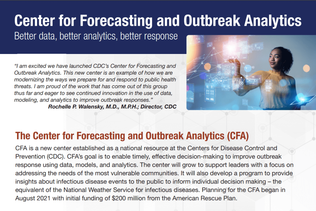
The CDC’s new Center for Forecasting and Outbreak Analytics (CFA) intends to modernize the country’s ability to predict disease outbreaks. Image via the CDC.
This week, the CDC introduced a new team focused on modeling infectious diseases, called the Center for Forecasting and Outbreak Analytics (or CFA). The agency aims to hire about 100 scientists and communicators for the center; they’ll currently focus on COVID-19, but will expand to other diseases in the future.
“We think of ourselves like the National Weather Service, but for infectious diseases,” Caitlin Rivers, the new center’s associate director for science, told the Washington Post.
This idea of forecasting infectious diseases like the weather was a major theme of an event that the White House hosted last Tuesday, timed with the introduction of the CDC’s new center. This event, a three-hour summit, featured speeches from the administration’s COVID-19 response leaders (Dr. Ashish Jha, Dr. Rochelle Walensky, etc.), as well as panels bringing together the scientists who have joined CFA so far, healthcare leaders, and public health workers from around the country.
I watched the event on a livestream, and kept a running Twitter thread of key points:
this morning, I'm watching the White House's summit on "strengthening the nation's early warning system for health threats" (aka pandemic preparedness). so far, a lot of talking about predicting infectious diseases like we predict the weather.
As discussed at the summit and on CFA’s new website, this center has three main functions:
Predict: A team of disease modelers, epidemiologists, and data scientists will establish methods for forecasting disease spread and severity, in collaboration with state and local leaders.
Inform: A team of science communicators will share information from the Predict team’s modeling efforts with public health officials and with the public, ensuring that this information is actionable.
Innovate: In addition to its in-house analysis and communication, CFA will fund research and development to drive better data collection and forecasting strategies.
According to the CDC, CFA has already awarded $26 million in funding to “academic institutions and federal partners” working on forecasting methods, as part of this “innovate” priority. Neither CFA’s website nor the summit provided any indication of what these institutions are or what they’re working on; I wrote to the CDC’s media team asking for more information, and have yet to hear back from them.
At last Tuesday’s summit, it was nice to hear health officials from the local to the federal levels describe COVID-19 data issues that I’ve been writing about for two years. These included: the need for more timely data on issues like new variants and vaccine effectiveness; the need for more demographic data that can inform health equity priorities; the need for more coordination (and standardization) between different state and local health agencies; and the need for actionable data that are communicated in a way people outside science and health settings can understand.
But for all this discussion of the problems with America’s current health data systems, the event included very little indication of potential solutions. For instance, as Bloomberg health editor Drew Armstrong pointed out, nobody mentioned that many of our problems would be solved with a national healthcare system, following the lead of the U.K.—whose data we’ve relied on throughout the pandemic.
Oddly enough, nobody has (as far as I've heard) said: "You know what would make a unified national health IT system a lot easier…" and then gestured across the Atlantic
Moreover, Tuesday’s event was very rushed: each panel was just half an hour long, with only a few minutes for each expert panelist to make their points and barely any time for questions. I would’ve loved to hear entire keynote speeches from people like Dr. Anne Zink, director of Alaska’s public health agency, and Dr. Loretta Christensen, chief medical officer for the Indian Health Service. But they were relegated to brief comments.
It almost felt like the Biden administration had taken a couple of hours in their schedule to appease the science and health experts who wanted to see some acknowledgment of the COVID-19 data issues—and then went right back to downplaying the pandemic. (Also not lost on me: this same day, administration officials were “weighing the political risks” of appealing the blocked travel mask mandate.)
… it remains to be seen how much any of the great panels and speeches today will translate to actual action, when so many US leaders apparently want to forget about COVID entirely.
I would love to be proven wrong, and to see this new CDC center usher in an era of standardized, actionable infectious disease data and modeling across the country. But right now, I’m not very optimistic.
COVID-19 levels in waste—or, from our poop—have become an increasingly popular data source in the last couple of months (in this newsletter and for many other reporters and commentators), as PCR testing sites close and at-home tests become the norm. Wastewater can provide us with early warnings of rising transmission, and it includes COVID-19 infections from people who can’t or don’t want to get a PCR test.
But wastewater surveillance is very uneven across the country, as I’ve noted before. A lot of local health agencies, research groups, and utility companies are now trying to expand their COVID-19 monitoring in wastewater, but they face a lot of barriers. My reporting suggests that we are many months (and a lot of federal investment) out from having a national wastewater surveillance system that can actually replace case data as a reliable source for COVID-19 trends and a driver for public health action.
Wastewater surveillance is highly sensitive to changes in a community’s coronavirus transmission levels, particularly when those levels are low, as has been the case across the U.S. in recent weeks.
Every wastewater collection site is different, with unique environmental and demographic factors – such as weather patterns or popularity with tourists – that must be accounted for.
While the CDC has led some coordinated efforts through the National Wastewater Surveillance System (NWSS), wastewater sampling techniques overall aren’t standardized across the country, leading to major differences in data quality.
Sparsely populated, rural communities are particularly challenging to monitor, as their small sizes lead to even more heightened sensitivity in wastewater.
Wastewater data is hard to communicate, especially when public health officials themselves aren’t sure how to use it. The CDC’s NWSS dashboard is a prime example.
As bonus material in today’s COVID-19 Data Dispatch, I wanted to share one of the interviews I did for the story, which provides a good case study of the benefits and challenges of COVID-19 surveillance in wastewater.
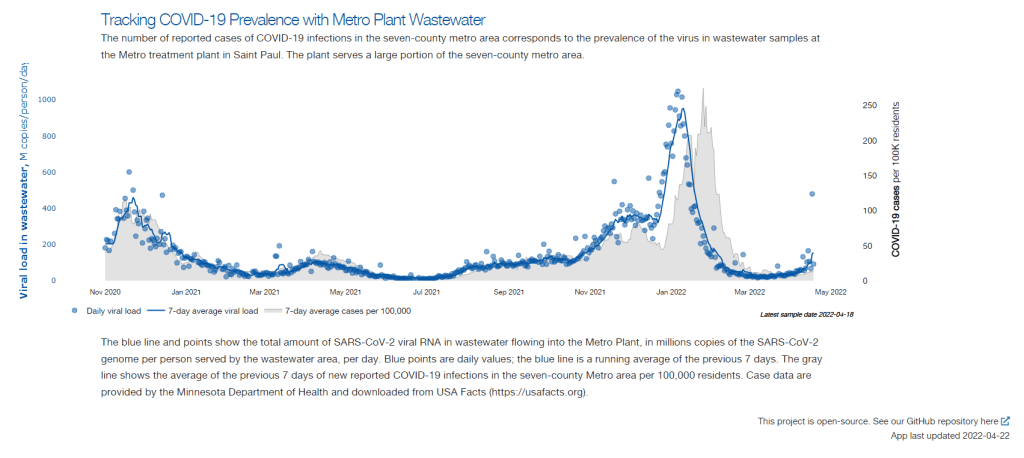
In this interview, I talked to Steve Balogh, a research scientist at the Metropolitan Council, a local agency in the Twin Cities, Minnesota metro area that manages the public water utility (along with public transportation and other services). Balogh and his colleagues started monitoring Twin Cities’ wastewater for COVID-19 in 2020, working with a research lab at the University of Minnesota.
Balogh gave me a detailed description of his team’s process for analyzing wastewater samples. Our conversation also touches on the learning curve that it takes to set up this surveillance, the differences between monitoring in urban and rural areas, and the dynamics at play when a wastewater plant suddenly becomes an important source for public health information. Later in the interview, Bonnie Kollodge, public relations manager at the Metropolitan Council, chimed in later to discuss the wastewater data’s media reception.
This interview has been lightly edited and condensed for clarity. Also, it’s worth noting that the interview was conducted in early April; since then, COVID-19 levels have started rising again in the Twin Cities metro area’s wastewater.
Betsy Ladyzhets: The first thing I wanted to ask about was, the backstory of sampling at the Metro Plant. I saw the dashboard goes back to November 2020, and I was wondering if that’s when you got started, and how that happened?
Steve Balogh: We actually started looking into it in April of 2020. And we contracted with Biobot at that time… But in May, their price went up, so we started looking for alternatives. Then, we started a partnership with people at the University of Minnesota Genomics Center, who know about measuring RNA in things.
At that point, we tried to figure out how to extract the RNA from our samples. They [University of Minnesota researchers] didn’t know anything about wastewater, but they knew everything about RNA. We know all about wastewater, but we don’t know anything about RNA. So it was a good match.
That summer, [the university researchers] started trying to do the extractions and it didn’t really work out so well… So we said, “Okay, we’re going to try this.” By September of 2020, we had built our own lab, and we were trying out our own extractions, based on what we were seeing in the literature, and all the preprints that were piling up. In October, basically we settled on [a sampling process] that worked. And by November 1, we were actually getting data.
BL: Yeah, that definitely aligns with what I’ve heard from some of the other scientists I’ve talked to who have worked on this, where it’s like, everybody was figuring [wastewater sampling methods] out on their own back in 2020.
SB: Yeah, it was on the fly. Papers were coming out daily, just about, with new ideas on how to do things. And we had, like, four different extraction methods that we wanted to look at, also looking at sludge, in addition to influent wastewater… Honestly, it was pretty much pure luck that we settled on [a method] that really, really worked.
We tried to get daily samples, and to put up numbers and see what [the data] looked like. And it actually did work—it actually tracked the reported caseload quite well. We figured, well, it must be working. We also did QA [quality assurance] in the lab, spiking the samples with known amounts of RNA, and trying to get that back. And all of that came back really well, too. So, we have a lot of confidence in our method.
BL: So that [QA] is like, you put in certain RNA, and then you check to make sure that it shows up in the sample?
SB: Exactly, yeah.
BL: What is your process for analyzing the samples and distinguishing those trends, like seeing how they match the case numbers?
SB: We do the extractions at our lab, with the samples from the Metro Plant. We take three milliliters of wastewater and we add 1.5 milliliters of something called Zymo DNA/RNA Shield, from a company in California called Zymo. That’s a buffer that stabilizes the RNA—it basically explodes whatever virus particles are in there, breaks them up, and then it stabilizes the RNA in the sample. So you can actually store those samples at room temperature for days, or maybe even weeks, because the RNA is stabilized.
Then, we put that treated sample through a two-step extraction process. The first step is, we put the whole thing into a Zymo III-P column, combined with 12 milliliters of pure ethanol, and run that through the column. This is a silica column, so the RNA in the sample binds to the silica. Then we wash it and elute that RNA in 200 microliters of water. And then we take that 200 microliters, and run it though the second stage, which is just a smaller silica column. The RNA that’s in that 200 microliters binds onto the smaller column, and then we wash it and elute that into 20 microliters.
Our total concentration is going from three milliliters of wastewater down to 20 microliters of pure water. That’s a concentration factor of 150. We figured that would work for pretty much most situations, and it’s turned out to be true.
Then, we store those samples at minus 80 degrees Celsius. Until we take them over weekly to the University of Minnesota, where they do droplet digital PCR, RT-PCR, to amplify and detect the RNA that’s in our samples. We started out just getting the total viral load back in November 2020. But then, in the early part of 2021 when Alpha showed up, we started doing variant analysis as well. We’re now also looking for specific mutations that distinguish the different variants of concern, like Alpha and Delta and Omicron.
BL: So, you take the samples every day, but then you bring them over [to the university] once a week, is that correct?
SB: That’s correct.
BL: When you’re getting that data, coming from the U of MN lab, what are you doing to interpret it? Or, in communicating the data on your dashboard, what are the considerations there?
SB: We work up the numbers and calculate a total load of the virus, or the particular variants, that’s coming into the plant. And then we basically put that up on the dashboard. There’s not a whole lot of interpretation or manipulation of the data—we’re simply importing the load, basically, of what we see coming into the plant. The load is the concentration that we’ve measured in the sample, times the total volume of wastewater coming into the plant.
We think that’s a sufficient normalization procedure for a large wastewater treatment plant. I know some groups are using other normalization techniques, but we think load is sufficient to tell us what’s happening out in our sewer shed.
BL: Yeah, that makes sense. I know this gets more complicated when you have smaller sites, but your sewer shed is serving a big population—
SB: Almost two million people. Yeah, it’s a big sewershed. If you had 50% of your population leaving during the day to go to work in the next community, that would be something that you might have to consider using other normalization techniques. But that just isn’t the case [in the Twin Cities]. We see a pretty steady signal here.
BL: Makes sense. Have you considered expanding to other sites? Or are is the plan to just stick with sampling at the main sewer ship location?
SB: We already have, actually. We operate nine different wastewater treatment plants in the seven-county metro area. And we’ve already expanded to three of those other sites, so we now have four total plants that we’re taking samples at and having them analyzed at the Genomic Center. It only started within the last month, so we don’t have quite the database to really start showing it on our dashboard yet. But when we do [have more data], our plan is to put that up [on the dashboard] as well.
BL: Do you have a sense of how much time it might take before you feel the data is useful enough to put on the dashboard?
SB: Part of the problem has been, all of these samples that we’re getting from these other plants, we’re just taking the entire sample over to the Genomics Center, and they’re doing the extractions. They’re using my extraction procedure, but they’re doing it in their lab. So, there was some learning curve for them to figure that out. And also to hire staff and come up to speed in terms of facility, and procedure, and people… Now, it’s been a few weeks, and I think they’re just about there [in getting a handle on the RNA extraction methods]. So, I think our data will start to shape up pretty quickly.
Another thing that may be keeping us, at this point, from showing the data is, nothing’s happening. We’re at this bottom [with low coronavirus levels in the wastewater] where everything just looks noisy, because nothing’s changing. But as soon as we start to go up, and if we get higher—the current position is just going to look like a flat line. But right now, people could look at it and say, “Well, that’s just junk.”
So, in that sense, we just don’t want to confuse matters and say, “Here’s a bunch of junk for you to look at. We want to put it into some context. And the context really is, when things start taking off, then you see, “Oh, it used to be very low. And now it’s very high.”
BL: That makes a lot of sense. Also, I hear you on the challenges of learning these methods. I was a biology major in school, and I worked in a lab, briefly, that did RNA extraction. And I remember how tricky it is, so I can envision the learning curve.
SB: Well, these are experts at the Genomics Center, they know what they’re doing. But I think even they have been surprised at how how robust the viral RNA is in wastewater. A lot of people at the beginning of this pandemic said, “You’ll never see it in wastewater. It’s RNA, RNA is very sensitive, it’ll break down.” But that just isn’t the case—the RNA is quite robust in wastewater, and the signal lasts for a long time. It has to last for many hours, for it to travel from the far end of our sewershed to get to us [at the treatment plant]. And then, even in the refrigerator, when you refrigerate just the raw sample, it’ll stay in a reasonable concentration without dropping too much for days.
BL: What has the reception to this work been from the public, the state health department, or from local media or other people who are using and watching the data?
SB: It’s been incredible. You can ask Bonnie more about it.
Bonnie Kollodge: It’s ginormous. I mean, it just has spread everywhere. I don’t even know the social spread, but I think somebody was tracking our impressions in print and online media… I think there were, like, 11 million impressions between January and the end of March. And we get lots of requests for Steve’s time, lots of requests for a daily accounting [of the data].
When we began this work, it really was out of public service—seeing that there’s a pandemic going on, and what can we do to help? That’s when they started developing this idea, then working with the Depratment of Health, which is really our state lead on this [COVID-19 response]. They came to rely heavily on our information, to compare it against what their test results were showing. Then, as people started to do home testing, that was a whole other factor. It was really wastewater that was taking the lead on showing what was happening with the virus and the variants…
Every week, we put an update online, and reporters go right to it, to determine how they’re gonna position [their COVID-19 updates]. Steve also provides, in addition to the data, a little narrative about what’s happening that helps reporters—some who are very conversant in data, but others who are not—it helps them it understand what we’re seeing.
BL: I can see how that would be helpful, especially if you’re releasing a week’s worth of data points at once. You sort-of have a mini trend to talk about.
BK: Yeah, and we send it to the governor’s office, and to the Health Department. They appreciate the transparency… They know what’s happening [with the virus], and can adapt.
BL: Right. And Bonnie, you mentioned something I wanted to ask more about, which is how the increased use of at-home tests and lower availability of PCR tests has increased the demand for wastewater data in the last few months, in particular. Now that you maybe have less reliable case data to compare against, has the thinking and interpreting the wastewater data shifted at all?
SB: I think we’ve actually had that statement from reporters. They’ve said, “We can’t trust the testing data anymore. And it’s going to be wastewater from here on out.”
BK: Just this week, there was a reporter who asked to get early results tomorrow. And he said, “This [wastewater data] is what I’m watching.” … The public has glommed on to this resource as a demonstration of what’s happening. And, like Steve said, it’s not a small sample. There are almost two million people served by this by this particular plant.
BL: From what I understand, part of what can be really helpful [with wastewater data] is when you have that longevity of data, as you all do. You have a year and a half of trends. And so when you see a new spike, it’s easier to compare to past numbers than for other parts of the country that are just starting their wastewater surveillance right now.
SB: Yeah. I think the other thing that has been really useful for our [state] department of health is, they’ve really appreciated the variant data that we have. That was really the first thing that got their attention… And we were giving them [variant] data ahead of time. The clinical tests were taking days or weeks to come back, and we could give them variant data the same week. So, that was the first thing that got our department of health here interested. But when they saw that we can track trends, they recognized that this has value at lower levels when testing goes away, basically.
BL: How would you want to see support from the federal government in expanding this wastewater work? Like you mentioned, getting it in more treatment plants, and any other resources that you feel would be helpful.
SB: Well, I think that’s underway, as we understand it, with the National Wastewater Surveillance System, NWSS. I think they’re funded through 2025, and I think the goal there is to basically sign up as many treatment plants as they can in the country.
Hopefully, that’s the beginning of something that is going to go beyond the pandemic, and give us a measure of community health in the future. Because wastewater is a community urine test, basically. It’s everybody contributing, and it can be useful for other pathogens and viruses in the future. So, yeah, [expanding that network] would be great. Let’s do it.
BL: Do you envision adding other viruses to the testing that you’re doing? Flu or RSV are ones that I’ve heard some folks are considering.
SB: Yeah, that would be something to do going forward for us. Though, it’s not clear how long we continue this work, just because these other projects are expanding, like the national project. And even our department of health here [in Minnesota] is talking about bringing this type of analysis into their own laboratory. Certainly going forward, long-term, that would be a goal for any work done here in Minnesota—to add those things to the menu of what we’re analyzing.
BL: Right. So you might be taking the samples to the Minnesota health department instead of the university, or something like that?
SB: Someday. Yeah, we just don’t know at this point.
BK: This is an evolving scinece. And this is not what we typically do—I mean, we do wastewater collection and treatment. So this [COVID-19 reporting] is a little outside of our regular parameters. But, like Steve and his superiors have been saying, this is an evolving science, so let’s see where this takes us, in terms of infectious disease.
It’s funny, when I go out and talk to people and say, “I work for the Met Council, and I help in communications with the wastewater analysis,” everybody knows what I’m talking about. It’s just so much out there. But I think that these things [testing for other diseases] are all being explored, and this has really opened up new possibilities.
SB: From the beginning, it’s just been a scramble. You don’t know what’s going to be coming. What I’m doing, a lot, is trying to get ourselves in a position so that, when the next variant of concern pops up, we have an assay that can measure it. There’s still a lot of unknowns about what’s going on, and everything’s new every day, just about.
Coronavirus levels in wastewater may be plateauing in the Northeast, while the remaining regions of the country catch up. Chart via Biobot, retrieved on April 24.
In the past week (April 16 through 22), the U.S. reported about 300,000 new COVID-19 cases, according to the CDC. This amounts to:
An average of 43,000 new cases each day
91 total new cases for every 100,000 Americans
35% more new cases than last week (April 9-15)
In the past week, the U.S. also reported about 11,000 new COVID-19 patients admitted to hospitals. This amounts to:
An average of 1,600 new admissions each day
3.4 total admissions for every 100,000 Americans
8% more new admissions than last week
Additionally, the U.S. reported:
2,600 new COVID-19 deaths (0.8 for every 100,000 people)
93% of new cases are Omicron BA.2-caused; 19% BA.2.12.1-caused (as of April 16)
An average of 100,000 vaccinations per day (per Bloomberg)
After weeks of me warning about it, a BA.2 surge is upon us. Nationwide, new COVID-19 cases have gone up for the third week in a row; we’ve seen a 68% increase since the last week of March.
And that’s just the reported cases: Americans may be doing about four times more at-home tests than they’re doing lab-based PCR tests, according to Mara Aspinall, a COVID-19 testing expert (who cowrites a testing-focused newsletter). The vast majority of these at-home tests are never reported to public health officials and don’t make it into our trends analysis.
But there are other metrics that similarly indicate a national rise in coronavirus transmission. Viral levels in wastewater are going up, according to both Biobot’s tracker and the CDC’s national monitoring system; the CDC’s COVID-19 data team noted in this Friday’s Weekly Review that “more than half of all sites reporting wastewater data are experiencing a modest increase in SARS-CoV-2 levels.” Some of these increases are going from very low to still low, but they’re still worth watching.
The U.S. is also reporting an increase in new COVID-19 patients admitted to hospitals: about 11,000 people this week, up from 10,000 last week. New hospitalizations lag behind cases slightly, but they are a more reliable metric, as anyone with symptoms severe enough to require hospitalization generally will seek care (so, underreporting is less of a concern.)
At the regional level, the Northeast is still seeing the highest case rates: leading jurisdictions include Vermont, Washington D.C., New York, Rhode Island, and Massachusetts, according to the April 21 Community Profile Report. The Northeast—particularly New York and New Jersey—is also a hotspot for the Omicron sub-subvariant, BA.2.12.1.
To borrow an analogy from my sister (an engineering student): the emergence of these new Omicron sublineages feels like when you’re trying to do a problem set that claims to have five problems, but then each problem has several sub-problems, and those sub-problems themselves have more sub-problems. In the coming weeks, we’ll see just how much more transmissible Omicron can get.
There’s some good news, though: cases in some parts of the Northeast might be plateauing. It’s hard to tell for sure because of the aforementioned unreliable data, but wastewater data for the region (as well as for individual cities like Boston) seem to be leveling off; we’ll see next week if this trend continues.
A Poor People’s Pandemic Report: This new report, compiled by the Poor People’s Campaign (a national activist group that advocates for low-income Americans) as well as U.N. economists and other researchers, shows the pandemic’s disproportionate impacts by income levels. Overall, people in poorer counties died of COVID-19 at nearly twice the rate of those in richer counties, the report found. On this dashboard, users can see the correlations of COVID-19 death rates with income, population density, and other factors. This article from the Guardian includes more context on the findings.
SARS-CoV-2 in Animals: I recently learned about this dashboard while working on an upcoming Documenting COVID-19 story: the U.S. Department of Agriculture (USDA) reports on COVID-19 cases in animals, identified through both PCR and antibody tests. In addition to the case numbers, the dashboard includes announcements of notable cases and recent research in this area. It’s important to note that these numbers are likely undercounts, because the U.S. doesn’t actively monitor animals for COVID-19, unlike some other countries.
The Role of Wastewater Data in Pandemic Management: This new report from the Rockefeller Foundation examines how state and local public health agencies are using wastewater surveillance. The foundation surveyed 12 state and 194 local agencies, many of which have been monitoring wastewater for a year or more; this report includes findings on the populations served by wastewater surveillance, data used to make pandemic management decisions, barriers that agencies face for expanding their surveillance, and more.
GAO report on Wastewater Surveillance: Speaking of wastewater, the U.S. Government Accountability Office (GAO) also released a report on the monitoring tool this week. The GAO report provides an overview of how wastewater surveillance works and its potential for providing early warnings of outbreaks, along with challenges faced by agencies seeking to start testing their wastewater. From the report’s highlights: “the lack of national coordination and standardized methods pose challenges to wider adoption.”
Protection from vaccination and previous infection: A new study, published in the CDC MMWR this week, assesses the benefits of COVID-19 vaccination for people who had a prior infection. During the Omicron surge, the study shows, people who had been previously infected and vaccinated were less likely to be hospitalized due to a COVID-19 reinfection, compared to those who weren’t vaccinated. Vaccine effectiveness against hospitalization was 35% for those who had two doses, and 69% for those who had received a booster.
Pfizer seeks booster shot for 5-11 year olds: This week, Pfizer announced that it’s asking the FDA to authorize a booster shot for children in the 5 to 11 age group. The company cited new data showing that kids who got a booster shot six months after their primary series experienced a significant increase in antibodies that protect against COVID-19. These data have yet to be published in a scientific report or vetted by experts, though. Also, still no news on Pfizer’s vaccine for younger children (which could also require three doses).
BA.2 levels are particularly high (93% prevalence) in the New York/New Jersey region, and new sublineages have recently been identified in New York. Chart via the CDC.
As though it’s not already confusing enough to distinguish between Omicron BA.1 and BA.2, more sublineages have popped up in recent weeks as Omicron continues to spread and mutate. Here are two that I’m watching, though they don’t seem to be major causes for concern at this time.
BA.2 sublineages in New York
Last week, the New York State Department of Health announced that it has identified new sub-variants of BA.2, called BA.2.12 and BA.2.12.1, through testing and sequencing. The BA.2 lineage overall accounts for the vast majority of cases in New York, and these two new strains are causing over 90% of new cases in the central part of the state.
These two sublineages seem to be spreading even faster than original BA.2 in New York, with a growth advantage of about 25%—perhaps explaining in part why the state is once again seeing higher case rates than other parts of the country. It’s unclear so far whether these BA.2 offshoots will have any impact on severity or vaccine effectiveness; the health department is looking into this.
Also worth noting: New York has a more robust variant surveillance system than a lot of other states. It’s very possible that Omicron is mutating elsewhere in the country, too; but those potential sublineages haven’t been identified yet.
The number of cases so far may seem to be insignificant compared with the steep Omicron peak of the winter, but “we’re essentially back at levels of case rates back to the Delta wave,” said Eli Rosenberg, deputy director for science at the New York State Department of Health. “This would have been a very significant wave already by last year’s standards.”
XE recombinant in the U.K. and other countries
This new offshoot hasn’t been identified in the U.S. yet, but it deserves some attention. Essentially, BA.1 and BA.2 have combined—likely in regions or even in individual people that are experiencing simultaneous infections of both strains—and formed what scientists call a “recombinant” variant, with some genetic material from both. The BA.1/BA.2 conglomerate has been labeled XE.
According to research so far, XE may have a slight growth advantage over BA.2. The World Health Organization (WHO) estimated that XE is about 10% more transmissible than BA.2, but further study is needed to confirm this number. Over 600 XE cases have been identified in the U.K., according to TIME, along with smaller numbers in India, Thailand, and other countries.
Scientists aren’t particularly concerned about XE at this point because it hasn’t been spreading rapidly and outcompeting other variants, like the original Omicron did in the winter. But agencies like the U.K.’s Health Security Agency and the WHO are monitoring for any worrying signals.
A study published in the CDC’s own journal indicated that about half of people infected with Omicron are still contagious 5-10 days after their isolation period starts. Chart via CDC MMWR.
Maybe it’s because I’m a twenty-something living in the Northeast, but: quite a few of my friends have gotten COVID-19 in the last couple of weeks. The number of messages and social media posts I’m seeing about positive rapid tests isn’t at the level it was during the Omicron surge, but it’s notable enough to inspire today’s review of the CDC’s isolation guidance.
Remember how, in December, the CDC changed its recommendations for people who’d tested positive for COVID-19 to isolating for only five days instead of ten? And a bunch of experts were like, “Wait a second, I’m not sure if that’s sound science?” Well, studies since this guidance was changed have shown that, actually, a lot of people with COVID-19 are still contagious after five days. Yet the CDC has not revised its guidance at all.
(Also, to make sure we’re clear on the terms: isolation means avoiding all other human beings because you know that you have a contagious disease and don’t want to infect others. Quarantine means avoiding other humans because you might have the disease, due to close contact with someone who does or another reason for suspicion.)
The current CDC guidance still says that, if you test positive: “Stay home for 5 days and isolate from others in your home.” Yet, in recent weeks, I’ve had a couple of friends ask me: “Hey, so it’s been five days, but… I’m not sure I’m ready to rejoin society. Should I take a rapid test or something?”
Yes. The answer is yes. Let’s unpack this.
Studies indicating contagiousness after five days
As this NPR article on isolating with Omicron points out, the CDC guidance was “largely based on data from prior variants.” At the time of this five-day recommendation, in late December, scientists were still learning about how Omicron compared to Delta, Alpha, and so on, particularly examining the mechanisms for its faster spread and lower severity.
But now, almost four months later, we know more about Omicron. This version of the coronavirus, research suggests, is more capable of multiplying in the upper respiratory tract than other variants. People infected with Omicron are able to spread the virus within a shorter time compared to past strains, and they are able to spread it for a higher number of days—even if their symptoms are mild.
One study that demonstrates this pattern is a preprint describing Omicron infections among National Basketball Association (NBA) players, compared to cases earlier in 2021. Researchers at Harvard’s and Yale’s public health schools, along with other collaborators, compared 97 Omicron cases to 107 Delta cases. NBA players are a great study subject for this type of research, because their association mandates frequent testing (including multiple tests over the course of a player’s infection).
The big finding: five days after their Omicron infections started, about half of the basketball players were still testing positive with a PCR test—and showing significant viral load, indicating contagiousness. 25% were still contagious on day six, and 13% were still contagious on day seven. These patients also saw less of a consistent pattern in the time it took to reach their peak contagiousness than the players infected with Delta.
From the NPR article:
“For some people with omicron, it happens very, very fast. They turn positive and then they hit their peak very quickly. For others, it takes many days” – up to eight or even 10 days after turning positive, says the study’s senior author, Dr. Yonatan Grad, an associate professor of immunology and infectious diseases at the Harvard T.H. Chan School of Public Health.
While this NBA study is a preprint, other research has backed up its findings. One study from Japan, shared as a “preliminary report” in January, found that people infected with Omicron had the highest levels of viral RNA—indicating their highest levels of contagiousness—between three and six days after their symptoms started. The researchers saw a “marked decrease” in viral RNA only after ten days.
Another preprint, from researchers at the University of Chicago (and antigen test proponent Michael Mina), examined Omicron infections among healthcare workers at the university medical center. Out of 309 rapid antigen tests performed on 260 healthcare workers, 134 (or about 43%) were positive results received five to ten days after these workers started experiencing symptoms.
The highest test positivity rate for these workers, according to the study, was “among HCW returning for their first test on day 6 (58%).” In other words, more than half of the workers were still infectious six days after their infection began, even though the CDC guidance would’ve allowed them to return to work.
Later in February, a study in the CDC’s Morbidity and Mortality Weekly Report (MMWR)—or, the CDC’s own journal—shared similar results. The report, authored by CDC researchers and practitioners at a healthcare system in rural Alaska, looked at antigen test results from hundreds of infections reported to this health system during the Omicron wave.
The main finding: between five and nine days after patients were diagnosed with COVID-19, 54% (396 out of 729 patients) tested positive on rapid antigen tests. “Antigen tests might be a useful tool to guide recommendations for isolation after SARS-CoV-2 infection,” the authors wrote.
News@CDCgov publishing its own results showing how POOR their own guidance is surrounding leaving isolation at 5 days w/out a negative rapid test
When starting isolation bc of symptoms:
65%-80% Rapid Ag test Pos at days 5-7 40% Pos through day 9!
Like past research, this study found that over half of patients (with both Omicron and Delta) were still contagious five days into their infections. About one-fourth were still contagious at day eight.
Guidance for people testing positive
All of the above studies suggest similar conclusions: about half of people infected with Omicron will still be contagious five days after their positive test results or the start of their symptoms, despite what the CDC’s guidance says. If you get infected with BA.2 in the coming surge, the best way to figure out whether you’re contagious after day five is by taking a rapid antigen test.
In fact, for the highest accuracy (and peace of mind), I’d recommend taking two antigen tests, two days in a row. If both are negative, then you’re probably good to return to society—but maybe don’t travel to visit an elderly relative just yet.
Seeing a lot of “rapid tests don’t work against BA.2” takes and it’s hard to see that as anything but one more capitulation.
Rapid tests are not perfect. However, they still do work & are arguably more important at this stage of the pandemic than they’ve ever been.
— Dr. Angela Rasmussen (@angie_rasmussen) April 12, 2022
This two-rapid-test guidance comes from the U.K. Health Security Agency, which recommended in December that Brits could isolate for seven days instead of ten if they tested negative on days six and seven of their isolation. (The U.K.’s guidance has since become more lenient, but this is still a good rule for reference—more based in science than the CDC’s guidance.)
What else should you do if you test positive? Here are a few recommendations that I’ve been giving friends and family:
Be prepared to isolate for a week or two, even if you may be able to leave isolation after a shorter period (with rapid tests).
After leaving isolation, wear a good mask (i.e. an N95 or KN95) in all public spaces.
There’s also the HHS Test to Treat program, which allows people to get tested for COVID-19 and receive treatment in one pharmacy visit. This program has faced a pretty uneven rollout so far, though.
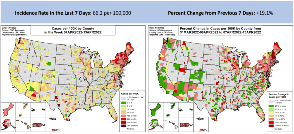
In the past week (April 9 through 15), the U.S. reported about 220,000 new COVID-19 cases, according to the CDC. This amounts to:
An average of 31,000 new cases each day
67 total new cases for every 100,000 Americans
19% more new cases than last week (April 2-8)
In the past week, the U.S. also reported about 10,000 new COVID-19 patients admitted to hospitals. This amounts to:
An average of 1,400 new admissions each day
3.1 total admissions for every 100,000 Americans
1% more new admissions than last week
Additionally, the U.S. reported:
2,900 new COVID-19 deaths (0.9 for every 100,000 people)
100% of new cases are Omicron-caused; 86% BA.2-caused (as of April 9)
An average of 100,000 vaccinations per day (per Bloomberg)
New COVID-19 cases in the U.S. have gone up for the second week in a row, and the increase was sharper this week. While the daily average of new cases (about 31,000) remains low compared to the Omicron surge, this trend is still concerning—especially when factoring in all the at-home rapid tests that are going unreported right now.
Wastewater trends suggest that cases will continue rising in the coming weeks. Biobot’s dashboard suggests a national increase (most pronounced in the Northeast region), while about 60% of sites in the CDC’s network have reported increasing coronavirus levels in the last two weeks.
Newly hospitalized COVID-19 patients, an indicator that’s typically behind cases but more reliable, is also showing a small increase as of this week. This will be an important metric to watch in the next few weeks: will BA.2 strain hospitals the same way that Omicron BA.1 did in December and January?
BA.2, it’s important to note, is now causing the vast majority of new COVID-19 cases in the U.S. The CDC’s latest estimates suggested that this sublineage made up 86% of cases in the week ending April 9. And some parts of the country may be seeing further mutation of BA.2—more on that later in the issue.
The Northeast continues to be a leader in this surge, as shown by both the wastewater trends and case data. According to the April 14 Community Profile Report, states with the highest case rates in the last week include: Vermont, Washington D.C., Rhode Island, New York, Massachusetts, Alaska, New Jersey, Maine, Connecticut, and New Hampshire.
All of these states are seeing high transmission, according to the CDC’s old guidance. But the new guidance places most counties in these states in low or medium “community levels;” largely because hospitalizations—which, again, are a lagging indicator—haven’t started rising yet.
This week, Philadelphia became the first major U.S. city to once again require masks in public indoor spaces, in response to rising cases and hospitalizations. I hope to see other cities and localities follow Philadelphia’s lead, but I know current attitudes make this unlikely.
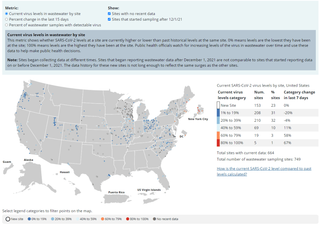
The CDC’s updated wastewater dashboard includes more metrics and more context for people seeking to understand wastewater trends in their area.
After the CDC released its National Wastewater Surveillance System (NWSS) dashboard in February, the agency faced some criticism from scientists, data reporters, and others who found this dashboard didn’t actually do a very good job of presenting wastewater data. The initial dashboard only included one metric, percent change in wastewater levels over the last 15 days; without more context, it was difficult to understand where a high percent change was actually cause for concern.
But the CDC has responded to its criticism! This past Friday, the agency updated its wastewater dashboard to include a lot more context. Among the changes:
You can now toggle between three metrics: the old percent change value, along with current virus levels in a site’s wastewater and the share of wastewater samples at a given site that tested positive for the coronavirus in the last 15 days.
Clicking on a specific site provides users with a mini-chart of wastewater levels at that collection spot over the last few weeks.
The dashboard lets you toggle on and off sites with no recent data and sites that started sampling during the Omicron wave.
Above and below the dashboard, the CDC has added more definitions and explanations to help users understand what they’re looking at.
On Friday evening, I posted on Twitter, asking wastewater and data viz experts to weigh in on the updated dashboard:
wastewater people and/or data viz people, what are your thoughts on the updated CDC NWSS dashboard? is it clearer to read and interpret now? cc @COVIDPoops19pic.twitter.com/xOoCWEVFdE
Responses were mostly positive, with researchers saying that they were glad to see the CDC respond to criticism and add more information to the dashboard. Still, there’s more the agency can do, such as adding the population sizes covered by each site and, maybe, moving away from percentage changes as such a central metric.
To quote Claire Duvallet, data scientist at Biobot: “I think collapsing all three metrics to have the same units, and to choose percentage as that unit, is very confusing. Percentage changes are already so 🤯 to think about, & percentage changes of categories of percentages is just too much for my brain.”
I *really* appreciate the rapid response to public feedback from CDC NWSS & am happy to see this update, and actually think that the metric of "how high are recent samples relative to all other measurements from this site?" is a useful way to interpret WW data. https://t.co/tOznP5e6Nr
Lessons learned from the non-superspreader Anime NYC convention: Last fall, one of the first Omicron cases detected in the U.S. was linked to the Anime NYC convention, a gathering of more than 50,000 fans. Many worried that the event had been a superspreader for this highly contagious variant, but an investigation from the CDC later found that, in fact, Omicron spread at the convention was minimal. My latest feature story for Science News unpacks what we can learn from this event about preventing infectious disease spread—not just COVID-19—at future large events. I am a big anime fan (and have actually attended previous iterations of Anime NYC!), so this was a very fun story for me; I hope you give it a read!
my latest @ScienceNews feature: despite Omicron's presence at the Anime NYC convention last fall, it turned out not to be a COVID-19 superspreader. what can we learn from Anime NYC about preventing disease spread at future large events? (1/5) https://t.co/MMzlyInTiypic.twitter.com/ZMOJ7EEvt9
States keep reducing their data reporting frequency: Last Sunday, I noted that Florida—one of the first states to shift from daily to weekly COVID-19 data updates—has now gone down to updating its data every other week. This is part of an increasing trend, writes Beth Blauer from the Johns Hopkins COVID-19 data team in a recent blog post. “As of March 30, only eight states and territories (AR, DE, MD, NJ, NY, PA, PR, and TX) report case data every day of the week,” Blauer says. And it seems unlikely that states will increase reporting frequencies again without a major change in public health funding or the state of the pandemic.
Biden administration announces Long COVID task force: This week, the Biden administration issued a memo addressing the millions of Americans living with Long COVID. The administration is creating a new, interagency task force, with the goal of developing a “national research action plan” on Long COVID, as well as a report laying out services and resources that can be directed to people experiencing this condition. It’s worth noting that recent estimates from the U.K. indicate 1.7 million people in that country (or one in every 37 residents) are living with Long COVID; current numbers in the U.S. are unknown due to data gaps, but are likely on a similar scale, if not higher.
Long COVID data just out from the ONS TL;DR -1.7 million people now living with long COVID (28 day definition) – that's 1 in 37 people in the commiunity -780,000 have had this for *more than a yr* -at least 334000 got this during the omicron wave (impact since Feb not felt yet)🧵
Study indicates continued utility for COVID-19 testing in schools: During the Omicron surge, testing programs in a lot of schools collapsed, simply because institutions didn’t have enough resources to handle all of the students and staff getting sick. The surge led some schools to consider whether school testing programs are worth continuing at all. But a new study, released last week in The Lancet, suggests that yes, surveillance testing can still reduce transmission—even when schools are dealing with highly contagious variants. (Note that this was a modeling study, not a real-world trial.)
Preprint shows interest in self-reporting antigen test results: Another interesting study released recently: researchers at the University of Massachusetts distributed three million free rapid, at-home antigen tests between April and October 2021, then studied how test recipients interacted with a digital app for ordering tests and logging results. About 8% of test recipients used the app, the researchers found; but more than 75% of those who used it did report their antigen test results to their state health agency. The results (which haven’t yet been peer-reviewed) suggest that, if institutions make it easy and accessible for people to self-report their test results, the reporting will happen.
Many readers may know that, since last fall, I’ve been working part-time at the Documenting COVID-19 project: a public records, data, and investigative project at Columbia University’s Brown Institute for Media Innovation and the public records site MuckRock.
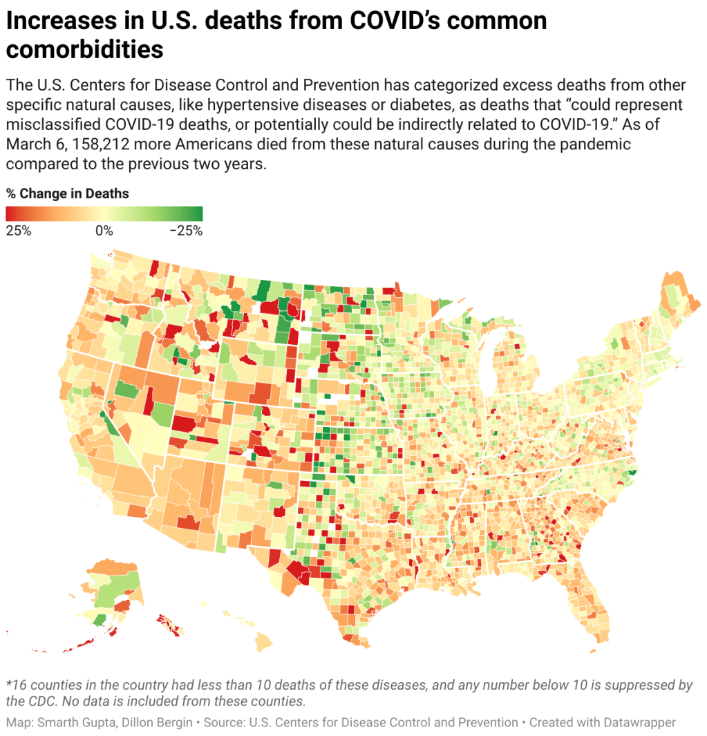
One major focus at Documenting COVID-19 is our Uncounted investigation, an effort to understand how COVID-19 deaths—and other deaths indirectly caused by the pandemic—have gone under-reported in the last two years. The CDC has reported nearly one million official COVID-19 deaths; but that figure doesn’t include over 300,000 deaths of natural causes that occurred over what researchers expected in 2020 and 2021.
These natural causes logged on Americans’ death certificates—such as diabetes, heart disease, and respiratory conditions—may have been linked to COVID-19. In fact, about 158,000 deaths during the pandemic were specifically linked to natural causes that the CDC considers potentially COVID-related. But the official records make it hard to say for sure.
In a story with USA TODAY published late last year, Documenting COVID-19 found massive gaps and inconsistencies in the U.S.’s death system, which likely contributed to these undercounts. These include: a lack of standardization for medical examiners and coroners’ offices, workers in these positions becoming overwhelmed during the pandemic, and failures in some cases to order COVID-19 tests for patients or push back when families insisted a death wasn’t COVID-related.
The data come from the CDC’s provisional mortality database; our team signed a data-use agreement with the agency so that we can use their API to gather data more quickly and efficiently than what’s possible with the CDC’s WONDER portal.
!function(){“use strict”;window.addEventListener(“message”,(function(e){if(void 0!==e.data[“datawrapper-height”]){var t=document.querySelectorAll(“iframe”);for(var a in e.data[“datawrapper-height”])for(var r=0;r<t.length;r++){if(t[r].contentWindow===e.source)t[r].style.height=e.data["datawrapper-height"][a]+"px"}}}))}();
All deaths by race and ethnicity, with age-adjusted rate, regardless of underlying cause of death;
Information to help contextualize the CDC data, including excess mortality numbers modeled by demographers at Boston University, vaccination rates, and a Department of Justice survey released in December of all medical examiner and coroner offices in the country.
And here are some other links related to Uncounted and the CDC’s mortality data:
If you’re a journalist who wants to use these data, the Documenting COVID-19 team is happy to help! If you have questions or want support, feel free to reach out to the team at covid@muckrock.com, or to me specifically at betsy@muckrock.com.