As cases rise in the U.S. and other parts of the world, Omicron subvariants are a continued culprit. Experts are watching closely to see if further mutations of the virus may become even more contagious, or may gain the ability to evade immunity from prior infections and vaccinations.
BA.4 and BA.5 in South Africa
When South African scientists sounded the alarm about Omicron in November, they identified three versions of the variant, called BA.1, BA.2, and BA.3. BA.1 first spread rapidly through South Africa and the rest of the world in December and January; BA.2 then outcompeted BA.1 to become the dominant strain globally.
Now, South African scientists are sounding the alarm again: this time about new Omicron lineages, dubbed BA.4 and BA.5. These two lineages have driven another new surge in the country, with both cases and hospital admissions rising sharply in recent weeks. The surge might be starting to slow, as of late this week, but it’s unclear if this trend will continue.
Sigal and his collaborators tested neutralizing antibodies—a commonly-studied aspect of immune system protection—from BA.1 against BA.4 and BA.5. They found that a BA.1 infection offered relatively limited protection against BA.4 and BA.5, especially if the person who had BA.1 was unvaccinated. “BA.4 and BA.5 have potential to result in a new infection wave,” the authors wrote.
This study is a preprint, not yet peer-reviewed. But it’s still a major warning sign for the U.S. and other countries: watch out for BA.4 and BA.5.
In New York and New Jersey, BA.2.12.1 is causing over 60% of new cases; it’s no coincidence that these states are also reporting some of the highest case and hospitalization rates in the country right now. New England, mid-Atlantic, South, and Midwest states are also seeing high proportions of BA.2.12.1.
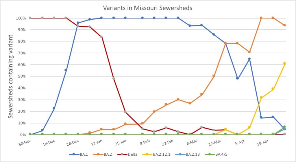
The CDC’s variant proportions estimates don’t yet include BA.4 and BA.5, but other reports suggest that these subvariants are already in the U.S. and starting to compete with our homegrown BA.2 lineages. Marc Johnson, a leading wastewater expert in Missouri, posted on Twitter yesterday that he’s seeing “a circus of Omicron sublineages” in his state, including BA.4 and BA.5.
So here is the latest Missouri sewershed data. It's a circus of Omicron sub-lineages. There are literally 5 strains competing against each other that each have a different residue at position 452. pic.twitter.com/T1CObdJdeD
Also worth noting: a new U.S. study (shared as a preprint last week) found that, actually, Omicron is not inherently less severe than other variants. In comparing hospitalization and mortality risks after accounting for vaccination and medical risk factors, the researchers behind this study found little difference between the Omicron wave and prior periods. While this study also has yet to be peer-reviewed, it doesn’t bode well for future Omicron-driven surges.
This week, many headlines declared that the U.S. has reached one million COVID-19 deaths. While a major milestone, this number is actually far below the full impact of the pandemic; looking at excess deaths and demographic breakdowns allows us to get closer.
NBC News was the first outlet to make this declaration, announcing that its internal COVID-19 tracker had hit the one million mark. Other trackers, including the CDC itself, have yet to formally reach this number, but major publications still jumped on the news cycle in anticipation of this milestone. (Various trackers tend to have close-but-differing COVID-19 counts due to differences in their methodologies; Sara Simon wrote about this on the COVID Tracking Project blog back when the official death toll was 200,000.)
But the recent articles about “one million deaths” fail to mention that the U.S. actually reached this milestone a long time ago. This is because the official count only includes the deaths formally logged as COVID-19, in which the disease was listed on a death certificate or diagnosed before a patient passed. Such a count fails to include deaths that were tied to COVID-19, but never proven with a positive test result, or deaths that were indirectly linked to the pandemic for a myriad of reasons.
We're at the point when different news outlets will say NOW is the point the US passes 1,000,000 COVID deaths based on their own calculations.
But in truth, we passed that point long ago because deaths have always been undercounted. 1/ https://t.co/m8NLvMxybV
To get closer to the pandemic’s true toll, demographers use a metric called excess deaths: the number of deaths that occurred in a given region and time period above what would be expected for that region and time period. Experts calculate that “expected death” number with statistical models based on patterns from previous years.
To give a more specific example: in the U.S., in the week ending January 22, 2022, CDC analysts estimated that 61,303 deaths would have occurred if there were no COVID-19 pandemic. But actually, a total of 85,179 deaths occurred in the country that week. The difference between the observed and expected values, 23,876, is the excess deaths for this week.
I selected the week ending January 22 as an example here because it has one of the highest excess death tolls of any week in the last two years. This week marked the peak of the Omicron surge, a variant that many U.S. leaders called “mild” and dismissed without instituting further safety measures.
During this week, the CDC reports 21,130 official COVID-19 deaths. That suggests most of the excess deaths in this week, the deaths which occurred over pre-pandemic expectations, were directly caused by the virus.
But what about the 2,746 deaths that weren’t? How many of these deaths were also caused by COVID-19, but in patients who were never able to access a PCR test? How many occurred in counties like Cape Girardeu, Missouri, where coroner Wavis Jordan claimed his office “doesn’t do COVID deaths” and refuses to put the disease on a death certificate without specific proof?
And how many deaths resulted from people being unable to access the healthcare they needed because hospitals were full of COVID-19 patients, or people dying in car accidents during an era of less road safety, or people dying of opioid overdoses brought on by increased stress and financial instability?
Answering these questions takes a lot of in-depth reporting, which I know well because the Documenting COVID-19 team has been doing our best to answer them through our (award-winning!) Uncounted investigation.
As we’ve found, every state—and in some cases, every county—has a unique system for investigating and reporting deaths, especially those linked to the pandemic. In some places, coroners or medical examiners are elected officials who face political pressure to report COVID-19 deaths in a particular way. In others, they face chronic underfunding and a lack of training, leaving them to work long hours in an attempt to produce accurate numbers.
You can see the resource difference when comparing officially-reported COVID-19 deaths to excess deaths by state or county. Some states, like those in New England, have COVID-19 death numbers that closely match or even exceed their excess death numbers; medical examiners in these states have centralized death reporting systems and a lot of resources for this process, reporting by my colleague Dillon Bergin showed.
Other states, like Alaska, Oregon, and West Virginia, have officially logged fewer than three in four excess deaths as COVID-19 deaths. Such a number may signal that a state is failing to properly identify all of its COVID-19 fatalities.
Excess deaths can also show how the pandemic continues to hit disadvantaged Americans harder. In 2020, COVID-19 death rates (i.e. deaths per 100,000 people) for Black, Indigenous, and Hispanic Americans were higher than the rates for White Americans; in 2021, some of these disparities actually got worse despite the broad availability of vaccines and other mitigation measures. Non-white groups also saw all-cause mortality (not just COVID-19 deaths) increase more from 2019 in both 2020 and 2021, compared to white Americans.
Please note, the chart below shows crude death rates, which don’t account for differences in age breakdowns between race and ethnicity groups. For example, crude death rates for white Americans tend to be higher because white people generally live longer than people of color in the U.S., and more seniors have died of COVID-19. You can see the difference that ade-adjustment makes in the CDC charts here.
Why is it important to acknowledge and investigate these excess deaths, going beyond the reported COVID-19 numbers? At an individual level, family members who lost loved ones to COVID-19 find that diagnosis important; they can access FEMA aid for funerals, and can receive acknowledgment of how this one death fits into the broader pandemic.
And at the county, state, and national levels, looking at excess deaths allows us to see a full picture of how COVID-19 has affected us. Experts say that inaccurate COVID-19 death numbers can create a negative feedback loop: if your community has a too-low toll, you may not realize the disease’s impact, and so you may be less likely to wear a mask or practice other safety precautions—contributing to more deaths going forward.
As a data journalist, sharing these statistics and charts is my way of acknowledging the one million deaths milestone, and all of the uncounted deaths that are not included in it. But this pales in comparison to actual stories shared by family members and friends of those who have died in the last two years.
To read these stories, I often turn to memorial projects like Missing Them (from THE CITY), which captures names and stories of over 2,000 New Yorkers who died from COVID-19. Social media accounts like FacesOfCOVID also share these stories. And if any COVID-19 Data dispatch readers would like to share a story of someone they lost to this disease, please email me at betsy@coviddatadispatch.com; I would be honored to share your words in next week’s issue.
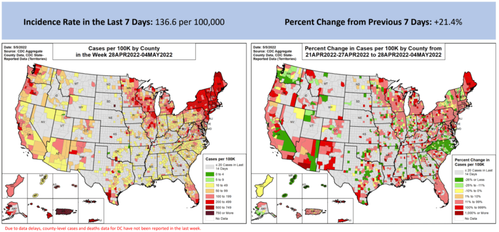
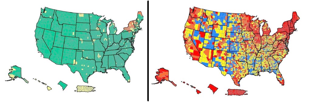
These maps from the May 5 Community Profile Report look pretty different from the CDC’s all-green “Community Levels” map, huh?
In the past week (April 30 through May 6), the U.S. reported about 450,000 new COVID-19 cases, according to the CDC. This amounts to:
An average of 65,000 new cases each day
138 total new cases for every 100,000 Americans
21% more new cases than last week (April 23-29)
In the past week, the U.S. also reported about 16,000 new COVID-19 patients admitted to hospitals. This amounts to:
An average of 2,200 new admissions each day
4.7 total admissions for every 100,000 Americans
17% more new admissions than last week
Additionally, the U.S. reported:
2,300 new COVID-19 deaths (0.7 for every 100,000 people)
98% of new cases are Omicron BA.2-caused; 37% BA.2.12.1-caused (as of April 30)
An average of 70,000 vaccinations per day (per Bloomberg)
New COVID-19 cases are still rising in the U.S., as the country continues to face the Omicron subvariant BA.2 and its offshoots. While at levels much lower than what we saw in December and January, daily new cases have more than doubled in the last month.
And, as I frequently note these days, case numbers are capturing a small fraction of actual COVID-19 infections, as PCR testing becomes less available and at-home rapid tests become more popular. Hospital admissions, a more reliable metric, have also shot up in recent weeks, with about 50% more COVID-19 patients admitted to U.S. hospitals last week than in the first week of April.
Wastewater data suggest that COVID-19 transmission nationwide may be increasing slightly or in a plateau, far from the kind of exponential increase we saw during the first Omicron surge. Biobot’s dashboard shows that coronavirus levels in wastewater in the Northeast, South, and Midwest continue to increase slightly, while in the West, virus levels have shifted back down in the most recent week of data.
The CDC’s wastewater dashboard similarly suggests that fewer parts of the country are seeing major coronavirus upticks than the national system reported a couple of weeks ago. But this dashboard is a bit incomplete at the moment, with hundreds of sites reporting no recent data, so I take that finding with a grain of salt.
Northeast states continue to report the highest case rates, according to the May 5 Community Profile Report. Maine, Rhode Island, Vermont, Massachusetts, Hawaii, New York, New Jersey, Illinois, New Hampshire, and Connecticut all reported more than 200 new cases for every 100,000 residents in the last week, passing the CDC threshold for a medium “Community Level” (or, under the agency’s old guidance, more than double the threshold for high transmission).
The map on the L is what CDC wants you to see. The map on the R is what you need to see. The map on the L says all but 13% of US is low risk. The map on the R says only 13% is low risk. Hosps have increased 20% over the last 2 weeks. Get boosted & wear a mask in crowded spaces. pic.twitter.com/cUDn8WMink
The BA.2 subvariant is now causing almost 100% of new COVID-19 cases in the country, according to CDC estimates, with the even-more-contagious BA.2.12.1 sub-subvariant causing about one in three of those cases. In the coming weeks, we’ll see how well protection from vaccines and recent Omicron BA.1 infections holds up against these more-transmissible versions of the virus.
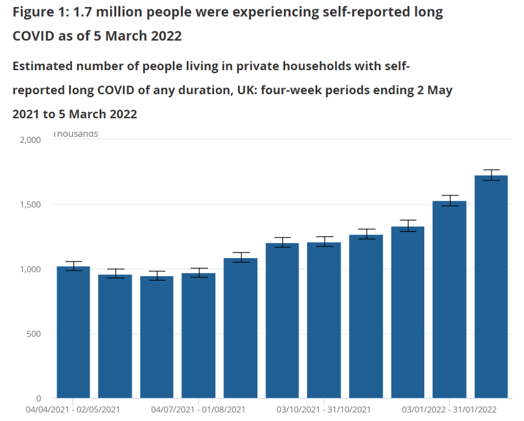
I spent a lot of time this weekend talking about the U.S.’s lack of Long COVID data, particularly our inability to answer such questions as, “How many Americans have Long COVID?” and, “What is the condition’s demographic breakdown?”
In comparison, I pointed other journalists to reports from the U.K.’s Office for National Statistics. This office regularly surveys Brits on their Long COVID experiences, asking a representative sample of the population whether they are experiencing any long-term COVID-19 symptoms.
The most recent report, published in early April, found that about 1.7 million people—or 2.7% of the U.K.—was “experiencing self-reported long COVID” (defined as symptoms persisting for four weeks or more after an initial infection). Imagine what the scale of Long COVID might be in the U.S.
Nursing Home Inspect (ProPublica): ProPublica recently published a major investigation into medical exemptions to COVID-19 vaccines among nursing home workers, finding that high numbers of workers are claiming these exemptions even though the actual, medical reasons causing someone to be ineligible for vaccination are fairly limiting. Along with the investigation, the newsroom added staff COVID-19 vaccination data to its Nursing Home Inspect database, which allows users to compare nursing homes based on negative inspection reports and other deficiencies.
Neighborhood Atlas: One source I learned about at the health journalists’ conference this weekend is the Neighborhood Atlas tool from researchers at the University of Wisconsin School of Medicine and Public Health. The atlas maps out metrics that put neighborhoods—i.e. Census block groups, a geographical level much more granular than counties—at a health disadvantage, including income, education, employment, and housing.
Access to hospital services for minority groups: Another source from the AHCJ conference: this February 2022 paper and corresponding dataset, measuring how far different minority communities across the country have to go to access hospital services. Over half of rural Native American communities are more than 30 miles from the closest intensive care unit, said Dr. Mary-Katherine McNatt in a talk introducing this source.
KFF’s State Health Facts: Also at the conference, Juliette Cubanski from the Kaiser Family Foundation (KFF) gave a presentation on the organization’s data tools and resources for journalists, focusing on Medicare data. One broadly useful KFF tool is the State Health Facts dashboard, which enables journalists and researchers to search through over 800 health indicators at the state level. These indicators are frequently updated with the most recent data.
Nursing home staffing reports: COVID-19 revealed how unprepared America’s nursing homes were for a health crisis. In a panel discussing this issue, Richard Mollot from the Long Term Care Community Coalition (a nonprofit that advocates for better long-term care) shared some data from his organization, highlighting drops in staffing during the pandemic that have not yet been recovered.
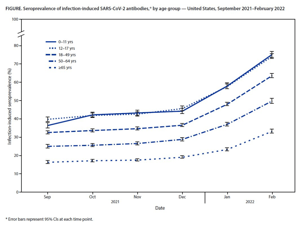
Almost 60% of Americans had antibodies from a prior COVID-19 case in February 2022, a CDC study found. This rate was even higher among young children and teenagers.
More than half of Americans have some antibodies from a recent coronavirus infection, according to a new CDC report. The study was published Tuesday in the CDC’s Morbidity and Mortality Weekly Report (MMWR), accompanied by a press conference and other fanfare. To me, this report (and its publicity) reflects the CDC’s current lack of urgency around addressing the pandemic and its continued impacts.
The CDC regularly surveys COVID-19 antibody levels among the U.S. population, a metric that scientists call seroprevalence. For these surveys, the agency works with commercial laboratories to measure antibody rates from a nationally representative sample of Americans, with updates provided about once a month. The survey specifically looks at a type of antibody that develops in response to infection, not vaccination.
This most recent iteration of the survey, providing data from February 2022, is particularly notable: the CDC estimates that 58% of Americans had this immune system indicator of a recent COVID-19 infection, immediately after the nation’s massive Omicron wave. Not all of these people got COVID-19 during the Omicron wave, though, since some of these antibodies stem from earlier infections.
Other notable findings include:
National seroprevalence increased from 34% in December 2021 to 58% in February 2022—the largest jump recorded in this survey—reflecting the Omicron wave’s impact.
Children and teenagers had the highest antibody levels. For the 12 to 17 age group, seroprevalence went from 46% in December 2021 to 74% in February 2022.
There are some major caveats to this study, though, including:
The imprecise nature of this antibody measurement. The type of antibody measured in this seroprevalence survey “stays positive for at least two years after infection,” CDC scientist Dr. Kristie Clarke said on the agency’s press call.
Antibodies wane at different rates and levels for different people, so it’s unclear to what extent this 58% finding actually reflects the share of Americans who have gotten COVID-19 since spring 2020.
Plus, some people infected by the coronavirus never seroconvert, meaning that they don’t develop antibodies at all (and thus wouldn’t show up in this study).
While we know that the COVID-19 antibodies identified in this study confer some protection against new infections, it’s unclear how long that protection lasts or how it might hold up against new variants.
To me, this study (and the CDC’s choice to promote it with one of the agency’s infrequent press calls) exemplifies the Biden administration’s COVID-19 response right now.
As I listened to the press call, the CDC’s interpretation of this study was clear: more than half of Americans have some protection against COVID-19 from a prior infection, and many of those people also have protection against vaccination. Much of that protection applies specifically to Omicron and will likely help us avoid a crisis from BA.2, so it gives the U.S. additional reason to relax safety measures, the CDC suggested.
(Worth noting: the CDC still recommends vaccination and booster shots for anyone who had a previous coronavirus infection, including children. But that message is not getting across right now, as evidenced by our low booster shot uptake.)
When you ask for more specifics on that “protection” from prior infections, though, the CDC isn’t able to provide much information. Again, we don’t know how long the protection lasts or how it holds up against other variants. And we have no idea how many people had mild or asymptomatic COVID-19 cases, then did not seroconvert.
The CDC’s press call also failed to mention Long COVID, which is a risk from any COVID-19 case—no matter how mild. Some Long COVID researchers have also suggested that lack of seroconversion, or even a prior infection in general, may increase a patient’s future risk for prolonged symptoms the next time they get infected.
And, of course, the CDC report also exemplifies our current lack of surveillance. How many of those Omicron infections between December and February were actually caught by PCR testing and reported to the CDC? A small fraction. At the press call. Dr. Clarke mentioned an upcoming CDC study that estimates how many infections go uncounted for every one reported case:
In the Omicron period, we found that over that time period, the infection to case ratio was the highest that it’s been, at over three estimated infections per reported case. And that varied by region, so depending on which US census region the estimates were, you know, the ratios were higher or lower.
Surely that ratio is getting even higher now. To me, this forthcoming study, combined with the seroprevalence report, is a reminder that the cases we see in our datasets and dashboards are a very incomplete picture of actual coronavirus transmission in the U.S. And yet the CDC is using this incomplete picture to suggest we all relax, take our masks off, and forget about the pandemic.
This weekend, I spoke on a panel at the Association of Health Care Journalists (AHCJ) annual conference, held in person in Austin, Texas. (Yes, the irony of my first air travel post-end of the mask mandate being a trip to a health journalism conference is not lost on me.)
My session focused on COVID-19 data, particularly the data gaps left by the federal government—which, longtime readers know, is a topic I’ve reported on extensively. We provided attendees with a tipsheet, sharing some source suggestions and tips for reporting on this topic.
Derek Kravitz, my editor and project lead of the Documenting COVID-19 project, moderated the session; Nsikan Akman, health and science editor at Gothamist/WNYC, was another panelist. Dr. Katelyn Jetelina, author of the incredible Your Local Epidemiologist newsletter, was scheduled to be a panelist as well, but unfortunately couldn’t make it to the conference last minute. (Her contributions are still reflected in our slides and tipsheet, though.)
During the session, we discussed a range of COVID-19 data topics, including:
The lack of standardization for COVID-19 data collection and reporting in the U.S., exacerbated by our decentralized healthcare and public health systems;
Discrepancies between New York State and New York City data, as an example of this lack of standardization (a specialty for Nsikan);
Challenges around (and some recommendations for) communicating COVID-19 data to audiences;
One of the most challenging aspects of reporting on the pandemic has been accessing reliable, accurate data about COVID-19 and its impact on Americans. The need for trustworthy, real-time data has caused a few journalism and nonprofit groups to create repositories to pull together data from varying sources.
A Thursday session at Health Journalism 2022 in Austin, “The quest for COVID-19 data: Where “official sources” fell short and journalism stepped in,” focused on these efforts and provided journalists with a wealth of resources for up-to-date data related to the pandemic.
Most high-income countries have national health care systems, so data collection and collation is far more straightforward than in the federalized U.S. health care system, where a mix of private and public payers are governed by national and differing state laws. Without a national registry or centralized healthcare system, it’s been harder to track statistics on COVID cases, hospitalizations, deaths, vaccinations, and other relevant numbers.
The tipsheet from this session includes links and blurbs to a few of the panel’s favorite COVID-19 data sources, including:
CDC mortality data, cleaned and sorted by Documenting COVID-19
HHS Community Profile Reports
MCH Strategic Data’s COVID-19 in schools dashboard
COVIDPoops19 dashboard
Historical wastewater data from CDC NWSS
Long COVID Source List
Health Equity Tracker
Open Government Data
And the tipsheet also includes a few tips for communicating COVID-19 data, supplemented with stories that provide useful examples. Here are the tips:
Explain where data come from and how they’re collected – using as little jargon as possible.
Be clear about uncertainties and caveats; what can’t the data tell you?
Share how data points, trends or study results can be translated into actionable information for readers.
Use questions from readers to guide reporting.
Look for differences in how state and municipalities track their COVID-19 data.
Look for ways that data collection methods (or the lack of clear methods) may hide health inequities.
Use visuals/multimedia to communicate the pandemic’s immense tolls.
Provide larger context about the reasons why COVID-19 data in the U.S. are often fractured and difficult to interpret.
On the left, the CDC’s current Community Levels indicate that 90% of the U.S. is in a “low risk” region. On the right, the CDC’s old Transmission Levels indicate that only 15% of the country is in a “low risk” region.
In the past week (April 23 through 29), the U.S. reported about 370,000 new COVID-19 cases, according to the CDC. This amounts to:
An average of 53,000 new cases each day
113 total new cases for every 100,000 Americans
25% more new cases than last week (April 16-22)
In the past week, the U.S. also reported about 13,000 new COVID-19 patients admitted to hospitals. This amounts to:
An average of 1,900 new admissions each day
4.0 total admissions for every 100,000 Americans
19% more new admissions than last week
Additionally, the U.S. reported:
2,300 new COVID-19 deaths (0.7 for every 100,000 people)
97% of new cases are Omicron BA.2-caused; 29% BA.2.12.1-caused (as of April 23)
An average of 80,000 vaccinations per day (per Bloomberg)
Nationwide, new COVID-19 cases have increased in the U.S. for the fourth week in a row. The daily case average has doubled since early April, and that’s just the cases that we’re reporting; with less PCR testing availability and more people using at-home tests, we have very limited visibility into this current uptick.
New hospital admissions, a more reliable metric than cases, have also continued to rise this week. U.S. hospitals reported about 13,200 COVID-19 patients admitted this week, up from under 10,000 in the first week of April.
Wastewater data similarly continue to indicate increased coronavirus spread. The Northeast is still in a high plateau, according to Biobot’s dashboard, while other parts of the country are reporting upticks.
This mirrors the reported case data: Northeast states Vermont, Rhode Island, New York, and Massachusetts reported the highest case rates in the week ending April 27, according to the latest Community Profile Report. But states in the South and West, such as North Carolina and Nebraska, reported the sharpest increases.
Almost one-third of new cases were caused by the BA.2.12.1 subvariant in the week ending April 23, according to the CDC’s latest estimates. This version of Omicron, first identified by the New York state health department, is even more transmissible than BA.2. It’s causing more than half of cases in the New York and New Jersey region, the CDC estimates.
Despite all of these concerning signals, the vast majority of the country seems unaware that we are in a new COVID-19 spike. Indeed, I’m writing this from the plane back to New York City, on which I’m one of few mask-wearers.
And I can’t really blame my fellow travelers for their lack of awareness: if you just look at the CDC’s Community Level map—as the agency recommends people do—you’d think that the whole country is in a green, low-risk zone. The agency’s old guidance, with more stringent, case-based thresholds, paints a very different picture.
Here are the 2 CDC COVID maps. The one on the left is the community level map which suggests 90% of the US has low risk. The map on the right of actual virus transmission levels shows a different story where only 15% of the country is low risk. pic.twitter.com/gf2NyF9OKf
The U.S. has “reached the choose-your-own-adventure stage of the pandemic,” as Maryn McKenna put it in a recent WIRED article. We’re taking “individual responsibility” to a whole new level.
For my recent wastewater data story, I’ve been looking at a lot of wastewater surveillance dashboards from different health agencies and research groups.
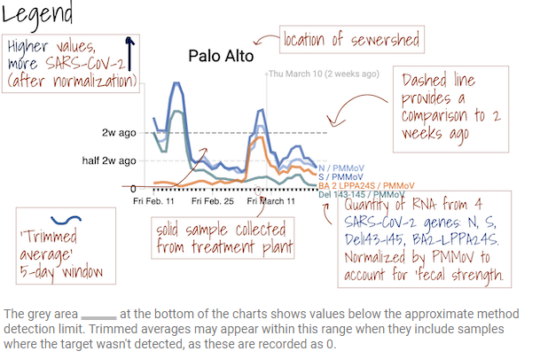
One of my favorites is from Sewer Coronavirus Alert Network (SCAN), a project based out of Stanford University. The project started with sewershed sites in California but is now expanding to other parts of the country, I learned from Marlene Wolfe, an environmental scientist at Emory University who works on the project (and whom I interviewed for the story).
The SCAN dashboard includes a detailed legend instructing users on how to view wastewater data.
I like this dashboard because it does a good job of explaining exactly what users are looking at. On the top of the page, you see a legend walking you through the charts that appear below, along with a map showing the regions covered by these sewersheds.
The charts themselves have built-in context for users seeking to interpret recent trends: you can see how current coronavirus levels compare to levels from two weeks ago. And you have the option to toggle between different timescales: four weeks, six weeks, 12 weeks, six months, a year, and all surveillance since fall 2020. Other parts of the dashboard allow users to look at data that have been smoothed and normalized, showing how interpretations of coronavirus levels in wastewater may change depending on the analysis method.
Hospitalizations of young children during Omicron: A major study released in the CDC’s Morbidity and Mortality Weekly Report (MMWR) this week describes hospitalization rates among children ages five to 11, focusing on the Omicron wave in December through February. Findings include: about nine in ten of the children hospitalized during this period were unvaccinated, and hospitalization rates were twice in high in unvaccinated children compared to vaccinated children, demonstrating the importance of vaccination in the five to 11 age group.
COVID-19 death rates by race and ethnicity: Another notable study published in MMWR this week: CDC researchers used provisional mortality data (based on death certificates) to study COVID-19 death rates among different racial and ethnic groups, comparing 2020 and 2021. Death rates for Hispanic, Black, and Native Americans were closer to the rates for white Americans in 2021 than they had been in 2020, the report found; this is likely tied to lower vaccination rates and, consequently, higher death rates in conservative and rural areas. For any reporters seeking to investigate these patterns in their regions, the Documenting COVID-19 project’s CDC mortality data repository includes county-level death data from the same source as this MMWR report.
New CMS data on hospital and nursing home ownership: Nursing homes and other long-term care facilities have been under increased scrutiny during the pandemic, as COVID-19 revealed major flaws in facilities’ ability to care for vulnerable seniors, A series of new datasets from the Centers of Medicare & Medicaid Services (CMS) aims to enable more scrutiny: the datasets include changes of ownership for skilled nursing facilitiesand for hospitals. CMS plans to update these datasets on a quarterly basis, according to a press release about the new data.
New funding for patient-led Long COVID research: The Patient-Led Research Collaborative (PLRC), a group of Long COVID patients that have produced leading research on their condition, announced this week that they’ve received $3 million in funding. This funding comes from Balvi, a fund for high-impact COVID-19 projects established by Ethereum co-creator Vitalik Buterin. PLRC announced that $2 million will go to start a pool of Long COVID research grants—to be awarded directly by patients—while the remaining $1 million will fund a series of PLRC-led studies. I look forward to reporting on the results of this research! (Also, related: this week, I updated the source list of Long COVID patients and experts willing to talk to reporters, which I compiled with Fiona Lowenstein.)
FDA authorizes breathalyzer for COVID-19: The latest new COVID-19 test is a breathalyzer: this machine, developed by Texas-based diagnostics company InspectIR, analyzes chemicals in a person’s breath to quickly detect compounds signifying a coronavirus infection. This test can deliver results in just three minutes—even faster than an antigen test—but it needs to be performed in a medical setting; InspectIR is working on a version that could be hand-held, like breathalyzers for alcohol. Impressive as the technology is, this data reporter is asking: how will those test results get reported to public health agencies?