Blog

  • The US still doesn’t have the data we need to make informed decisions on booster shots

    The US still doesn’t have the data we need to make informed decisions on booster shots

    How often will we see new variants like Omicron, that are incredibly different from other lineages that came before them? According to Trevor Bedford, it could be between 1.5 and 10.5 years.

    Last fall, I wrote—both in the COVID-19 Data Dispatch and for FiveThirtyEight—that the U.S. did not have the data we needed to make informed decisions about booster shots. Several months later, we still don’t have the data we need, as questions about a potential BA.2 wave and other future variants abound. Discussions at a recent FDA advisory committee meeting made these data gaps clear.

    Our country has a fractured public health system: every state health department has its own data systems for COVID-19 cases, vaccinations, and other metrics, and these data systems are often very difficult to link up with each other. This can make it difficult to answer questions about vaccine effectiveness, especially when you want to get specific about different age groups, preexisting conditions, or variants.

    To quote from my November FiveThirtyEight story:

    In the U.S., vaccine research is far more complicated. Rather than one singular, standardized system housing health care data, 50 different states have their own systems, along with hundreds of local health departments and thousands of hospitals. “In the U.S., everything is incredibly fragmented,” said Zoë McLaren, a health economist at the University of Maryland Baltimore County. “And so you get a very fragmented view of what’s going on in the country.”

    For example, a database on who’s tested positive in a particular city might not be connected to a database that would reveal which of those patients was vaccinated. And that database, in turn, is probably not connected to health records showing which patients have a history of diabetes, heart disease or other conditions that make people more vulnerable to COVID-19.

    Each database has its own data fields and definitions, making it difficult for researchers to integrate records from different sources. Even basic demographics such as age, sex, race and ethnicity may be logged differently from one database to the next, or they may simply be missing. The Centers for Disease Control and Prevention, for instance, is missing race and ethnicity information for 35 percent of COVID-19 cases as of Nov. 7.*

    *As of April 9, the CDC is still missing race and ethnicity information for 35% of COVID-19 cases.

    This past Wednesday, the FDA’s Vaccines and Related Biological Products Advisory Committee (VRBPAC) met to discuss the future of COVID-19 booster shots. Notably, this committee didn’t actually need to vote on anything, since the FDA and CDC had already authorized a second round of boosters for Americans over age 50 and immunocompromised people the week before. 

    When asked why the FDA hadn’t waited to hear from its advisory committee before making this authorization decision, vaccine regulator Peter Marks said that the agency had relied on data from the U.K. and Israel to demonstrate the need for more boosters—combined with concerns about a potential BA.2 wave. The FDA relied on data from the U.K. and Israel when making its booster decision in the fall, too; these countries, with centralized health systems and better-organized data, are much more equipped to track vaccine effectiveness than we are.

    With that authorization of second boosters for certain groups already a done deal, the VRBPAC meeting this past Wednesday focused more on the information we need to make future booster decisions. Should we expect annual COVID-19 shots, like we do for the flu? What about shots that are designed to combat specific variants? A lot of this is up in the air right now, the meeting discussion indicated.

    Also up in the air: will the FDA ever host a virtual VRBPAC meeting without intensive technical difficulties? The meeting had to pause for more than half an hour to sort out a livestream issue.

    Here are some vaccine data questions that came up on Wednesday, drawing from my own notes on the meeting and the STAT News liveblog:

    • How much does protection from a booster shot wane over time? We know that booster shots increase an individual’s protection from a coronavirus infection, symptoms, hospitalization, and other severe outcomes; CDC data presented during the VRBPAC meeting showed that, during the Omicron surge, Americans who were boosted were much more protected than those with fewer doses. But we don’t have a great sense of how long these different types of protection last.
    • How much does booster shot protection wane for different age groups? Waning immunity has been a bigger problem among seniors and immunocompromised people, leading to the FDA’s decision on fourth doses for these groups. But what about other age groups? What about people with other conditions that make them vulnerable to COVID-19, like diabetes or kidney disease? This is less clear.
    • To what degree is waning immunity caused by new variants as opposed to fewer antibodies over time? This has been a big question during the Delta and Omicron surges, and it can be hard to answer because of all the confounding variables involved. In the U.S., it’s difficult to link up vaccine data and case data; tacking on metrics like which variant someone was infected with or how long ago they were vaccinated often isn’t possible—or if it is possible, it’s very complicated. (The U.K. does a better job of this.)
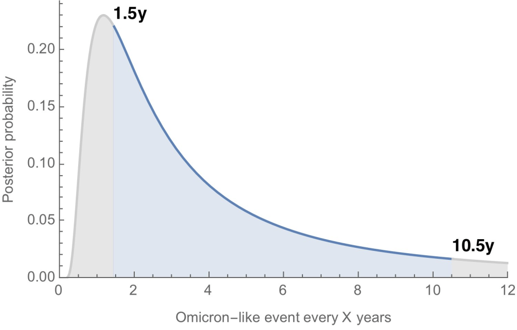
    • Where will the next variant of concern come from, and how much will it differ from past variants? Computational biologist Trevor Bedford gave a presentation to VRBPAC that attempted to answer this question. The short answer is, it’s hard to predict how often we’ll see new events like Omicron’s emergence, in which a new variant comes in that is extremely different from the variants that preceded it. Bedford’s analysis suggests that we could see “Omicron-like” events anywhere from every 1.5 years to every 10.5 years, and we should be prepared for anything on that spectrum. The coronavirus has evolved quite quickly in the last two years, Bedford said, and will likely continue to do so; though he expects some version of Omicron will be the main variant we’re dealing with for a while.
    • What will the seasonality of COVID-19 be? The global public health system has a well-established process for developing new flu vaccines, based on monitoring circulating flu strains in the lead-up to flu seasons in different parts of the world. Eventually, we will likely get to a similar place with COVID-19 (if annual vaccines become necessary! also an open question at the moment). But right now, the waxing and waning of surges caused by new variants and human behavior makes it difficult to identify the actual seasonality of COVID-19.
    • At what point do we say the vaccine isn’t working well enough? This question was asked by VRBPAC committee member Cody Meissner of Tufts University, during the discussion portion of the meeting. So far, the most common way to measure COVID-19 vaccine effectiveness in the lab is by testing antibodies generated by a vaccine against different forms of the coronavirus. But these studies don’t account for other parts of the immune system, like T cells, that garner more long-term protection than antibodies. We need a unified method for measuring vaccine effectiveness that takes different parts of the immune system into account, along with real-world data.
    • How might vaccine safety change over time? This question was brought up by Hayley Ganz of Stanford, another VRBPAC committee member. The CDC does have an extensive system for monitoring vaccine safety; data from that system should be readily available to the experts making booster shot decisions.

    Another thing I’m wondering about right now, personally, is how the U.S.’s shifting focus away from case data might make all of this more complicated. As public health agencies scale down case investigations and contact tracing—and more people test positive on at-home, rapid tests that are never reported to these agencies—we’re losing track of how many Americans are actually getting COVID-19. And breakthrough cases, which are more likely to be mild or asymptomatic, might also be more likely to go unreported.

    So, how does the U.S. public health system study vaccine effectiveness in a comprehensive way if we simply aren’t logging many of our cases? Programs such as randomized surveillance testing and cohort studies might help, but outside of a few articles and Twitter conversations, I’m not seeing much discussion of these solutions.

    Finally: a few friends and relatives over age 50 have asked me about when (or whether) to get another booster shot, given all of the uncertainties I laid out above. If you’re in the same position, here are a couple of resources that might help:

    More vaccine data

  • National numbers, April 10

    National numbers, April 10

    Coronavirus levels in wastewater are now rising in all regions of the country, according to Biobot. Screenshot taken on April 9.

    In the past week (April 2 through 8), the U.S. reported about 190,000 new COVID-19 cases, according to the CDC. This amounts to:

    • An average of 27,000 new cases each day
    • 57 total new cases for every 100,000 Americans
    • 5% more new cases than last week (March 26-April 1)

    In the past week, the U.S. also reported about 10,000 new COVID-19 patients admitted to hospitals. This amounts to:

    • An average of 1,400 new admissions each day
    • 3.0 total admissions for every 100,000 Americans
    • 10% fewer new admissions than last week

    Additionally, the U.S. reported:

    • 3,500 new COVID-19 deaths (1.1 for every 100,000 people)
    • 100% of new cases are Omicron-caused; 72% BA.2-caused (as of April 2)
    • An average of 100,000 vaccinations per day (per Bloomberg)

    After several weeks in a plateau, new COVID-19 cases in the U.S. are once again going up at the national level. The CDC reported an average of 27,000 new cases a day last week—less than one-tenth of what we saw during the Omicron surge, but still a notable uptick from the week prior.

    National numbers of newly hospitalized patients and COVID-19 deaths are both still trending down; this is unsurprising, as trends in hospitalizations and deaths typically follow cases by several weeks.

    Wastewater, a leading indicator, is showing pronounced increases both nationally and in all four major regions of the country, according to Biobot’s tracker. Similarly, more than half of the wastewater monitoring sites in the CDC’s network have shown increases in coronavirus levels over the last two weeks.

    That wastewater signal likely means that cases will keep going up in the next couple of weeks. BA.2 is a clear culprit for this: the more-contagious Omicron sublineage is now causing about three in four new COVID-19 cases in the U.S., according to the CDC’s latest estimates. BA.2’s dominance led the FDA to pull its emergency use authorization for Sotrovimab, a monoclonal antibody drug that works against Omicron BA.1—but not against BA.2,

    As we’ve seen for the last couple of weeks, the Northeast continues to be a leader in case increases. Jurisdictions with the highest cases per capita in the week ending April 6 are Alaska, Vermont, Rhode Island, Washington, D.C., New York, Massachusetts, New Jersey, and Maine. All reported more than 100 new cases for every 100,000 residents, per the latest Community Profile report.

    Under the CDC’s old community level guidance, all of these Northeast states (and Alaska) would be classified as seeing high transmission. But under the new, more lenient guidance, 99% of the country—including most counties in these states—are classified as “low” or “medium” community levels.

    These lenient levels don’t account for warnings in our wastewater, not to mention under-testing as PCR sites close and at-home tests go unreported. As Katherine Wu wrote in The Atlantic this week, the U.S. may be facing a new surge, but it’s harder to accurately track COVID-19 now than it has been since spring 2020. Don’t let the low numbers fool you into thinking all is well.

  • COVID source callout: Florida, again

    Last summer, Florida was one of the first states to decommission its daily COVID-19 dashboard and replace it with far-less-detailed weekly reports. Many other states have followed Florida’s lead in the last few months, making their reporting less frequent and cutting down on some metrics like cases and testing.

    But that’s not enough for Florida! The state recently switched from weekly COVID-19 reports to reports every other week—making it even more difficult for reporters, researchers, and others in the state to follow their local COVID-19 trends. Florida additionally stopped reporting cases in non-state residents, which is pretty notable for one of the country’s biggest tourism hotspots.

    Of course, Florida is still reporting some COVID-19 data daily to the federal government, as all states are required to do. But this doesn’t bode well for the future of state data reporting.

  • Sources and updates, April 3

    • Feds unveil new COVID.gov website: This week, the federal government launched a new website, COVID.gov, intended to be a one-stop-shop for Americans to find COVID-19 guidance and connect to resources in their communities. It’s a fun kind of irony that this is launching over two years into the pandemic, at a time when the U.S. is about to lose funding for free vaccines, tests, and other health measures. One wonders how many people will actually use this website!
    • FDA and CDC authorize additional booster shots for seniors: This past Tuesday, the FDA authorized a fourth dose for Americans over age 50 who received their booster of Pfizer or Moderna’s vaccine at least four months ago. The CDC incorporated this additional dose into their recommendations later that day; fourth doses are also recommended for immunocompromised people, and additional mRNA vaccine people who originally received two doses of the Johnson & Johnson vaccine. Notably, the FDA and CDC decisions come before an FDA advisory committee meeting, scheduled for this coming Wednesday, about booster shots. Not a great look for either agency’s transparency.
    • New data on Johnson & Johnson vaccine effectiveness: When the CDC recommended that anyone who received two J&J doses should get a third dose of Pfizer or Moderna’s vaccine, the agency cited this study published last week in MMWR. CDC researchers and their collaborators found that, during the Omicron surge, vaccine effectiveness against a COVID-related hospitalization or emergency department visit was much higher for J&J recipients who got a booster dose of an mRNA vaccine (90% for hospitalization, 79% for ED visit) compared to those who received two J&J doses (67% and 54%).
    • Racial disparities in COVID-19 patients with cancer: Another new study, published this week in JAMA Network Open, found that Black COVID-19 patients with cancer are more likely to experience severe outcomes than white patients—even after the scientists adjusted for other demographic and clinical factors. Black cancer patients already have higher mortality rates than white patients, the scientists explain in their paper; COVID-19 worsened this existing inequality.
    • NYC mask compliance: I recently learned that the New York City Metropolitan Transportation Authority (MTA) regularly publishes data demonstrating how well passengers on MTA subways and buses are complying with the city’s mask requirement for public transportation. The data are compiled from surveys; MTA workers observe passengers at a selection of subway and bus stops, and count how many people are wearing masks (categorized by whether the masks are worn correctly or not). Compliance recently slipped to a new low, AMNY reports.
    • Database of WHO disease outbreak reports: A group of researchers led by Colin J. Carlson has compiled a database of over 2,700 outbreak reports from the World Health Organization, which include information on significant public health events (or “potential events of concern”) going back to December 1996. You can read a preprint with analysis of the database here. (H/t Data Is Plural.)

  • Send me your COVID-19 questions!

    It’s been a while since I did a formal request for reader questions. (And, gotta be honest, I am a little low on content for this week after spending the past few days at SEJ.)

    So, here is a formal request: let me know what you’re wondering around COVID-19 in the U.S. We’re in a confusing period right now, as BA.2 prevalence increases and safety measures are dropped across the country. What do you want to know? I’m most qualified to answer data-specific questions, but I can do my best with other questions as well.

    To send in a question, simply email me at betsy@coviddatadispatch.com or comment on the post below. You can also fill out this Typeform survey that I originally sent out in January, if you missed it at that time or if your perspectives have changed.

  • Fenceline communities left behind by data gaps: A dispatch from SEJ in Houston

    Fenceline communities left behind by data gaps: A dispatch from SEJ in Houston

    This week, I’m sharing a short dispatch from the Society of Environmental Journalists (SEJ) conference in Houston, Texas. Unlike other journalism conferences I’ve attended, SEJ meetings don’t just sequester you in your hotel all day: the organizers plan field trips that are designed to give reporters on-the-ground information about environmental issues at the place they’re visiting.

    I went on one of these trips, to the Houston Ship Channel and surrounding communities impacted by industrial pollution. For me, this experience was a lesson in the cascading health issues caused by environmental racism—including, of course, COVID-19—as well as the ways that data gaps can make it harder for hard-hit communities to get needed public health assistance.

    The Houston Ship Channel, I learned this week, is a passage for ships going between Houston’s port and the Gulf of Mexico. According to the Port Houston website, it’s the largest container port in the Gulf Coast, handling about two-thirds of all shipping containers that travel through the region. (Shipping containers include all the consumer products that we order online.)

    It is also the single largest U.S. port for petroleum exports. Every month, thousands of tons of oil and plastics (which are made from oil) pass through the Houston Ship Channel; much of this cargo is processed right on the banks of the channel, in massive refineries that define the landscape around Houston.

    With SEJ, I went on a boat tour through the Houston Ship Channel. We passed refineries and industrial plants from Valero, Chevron, Exxon-Mobil, and other major companies, getting a close look at just how much space these facilities take up and how they decimate the surrounding land.

    After the boat, my group went to Manchester, a neighborhood close to the channel in southeast Houston. Community activists from the local environmental advocacy group TEJAS explained that this neighborhood’s population is overwhelmingly Latino; many residents are low-income workers with no college degrees who speak Spanish as their first language.

    Manchester residents have faced intense pollution from industrial plants that border their homes, schools, and community spaces. We walked through a park that is surrounded on multiple sides by these plants; we could see smoke from chemicals burning, and smell the results of that burning in the air. Valero, which owns one of the nearby plants, had recently sponsored a playground in this park as a small gesture, barely acknowledging the harm it’s caused to this neighborhood.

    Of course, my immediate question was: what are the COVID-19 statistics for this neighborhood? To me, it seemed obvious that Manchester residents living with this intense pollution would face higher rates of respiratory conditions, cancers, and other diseases that would make them more vulnerable to severe COVID-19 symptoms. (Poor quality air has been linked with more severe COVID-19 outcomes since the early days of the pandemic.)

    Here’s the problem: nobody could actually answer my question. I spoke to Leticia Ablaza, government relations director at Air Alliance Houston and another speaker on the tour, who explained that the link between pollution and COVID-19 in Manchester and other similar Houston neighborhoods has yet to be studied. Anecdotally, she said, she knows community members with respiratory conditions who have faced heightened vulnerability to COVID-19. But there’s no formal data.

    The reason for this lack of formal studies became clear to me later, when I attended a conference session on the links between COVID-19 and environmental health. Annie Xu, a Rice University student who has studied health disparities in Texas, said at this session that the state of Texas does not publish any COVID-19 data below the county level.

    Xu’s research group did identify links between Texas counties’ racial demographics and their COVID-19 burden, published in Nature Scientific Reports in January. But when the group looked for links between air pollution and COVID-19, the analysis didn’t lead to significant results.

    This finding is likely because pollution can vary widely within Texas counties, Xu said. For example, there’s a huge gap between air quality in Manchester and on Rice’s campus, both of which are included in Harris County. To truly find a connection between pollution and COVID-19, a research group like hers would require more granular data, such as at the ZIP code or census tract level.

    But the Texas public health department only publishes COVID-19 data at the county level—with the exception of vaccinations, one metric that is available by ZIP code. The federal government doesn’t report COVID-19 data below the county level either.

    Without this granular information, it’s difficult to demonstrate the impacts of petrochemical pollution on COVID-19 in neighborhoods like Manchester. The community isn’t able to get priority status for public health interventions like vaccines or testing—meaning that its vulnerabilities are unlikely to change.

    As longtime readers know, I have spent a lot of time grappling with COVID-19’s demographic disparities. I was a leading volunteer for the COVID Tracking Project’s COVID Racial Data Tracker, and have sought to call attention to the terrible state of this type of COVID-19 data in the U.S. whenever I can. Still, it was a new experience to actually see a community left behind by the data gaps that I cover.

    What kind of investment would be required to truly study how COVID-19 has impacted a place like Manchester, in Houston? And what other environment-related health conditions do we need to be investigating in these areas? I hope that future stories will enable me to answer these questions.

    For now, if you have any questions, comments, or data source recommendations in this area, please reach out!

  • National numbers, April 3

    National numbers, April 3

    BA.2 caused more than two-thirds of new COVID-19 cases in the Northeast in the week ending March 26, according to CDC estimates. It’s no coincidence that this region is also seeing cases start to tick up.

    In the past week (March 26 through April 1), the U.S. reported about 180,000 new COVID-19 cases, according to the CDC. This amounts to:

    • An average of 26,000 new cases each day
    • 55 total new cases for every 100,000 Americans
    • 3% fewer new cases than last week (March 19-25)

    In the past week, the U.S. also reported about 11,000 new COVID-19 patients admitted to hospitals. This amounts to:

    • An average of 1,600 new admissions each day
    • 3.3 total admissions for every 100,000 Americans
    • 16% fewer new admissions than last week

    Additionally, the U.S. reported:

    • 4,400 new COVID-19 deaths (1.3 for every 100,000 people)
    • 100% of new cases are Omicron-caused; 55% BA.2-caused (as of March 26)
    • An average of 90,000 vaccinations per day (per Bloomberg)

    Nationwide, COVID-19 cases in the U.S. have reached a plateau. New cases decreased only 3% from the previous week to this week, following an 8% decrease the week before that. New hospitalizations and deaths are also declining slightly, approaching the same plateau pattern.

    Wastewater is showing a similar pattern, too. The overall, national trend of coronavirus levels in wastewater has been in a plateau for a couple of weeks now, according to the Biobot dashboard. Regionally, the Northeast saw a slight uptick followed by an even slighter downturn, and the South may be seeing a slight uptick now.

    BA.2, the Omicron sublineage that is more transmissible than the version of this variant that first reached us in the U.S., is now causing over half of new COVID-19 cases nationwide, according to CDC estimates. Two weeks ago, I wrote that 50% prevalence was a threshold for cases starting to increase in Europe; if the U.S. follows Europe (as we usually do), that means we’ll start seeing case increases here in the next week.

    According to the CDC’s estimates, BA.2 is already causing almost 75% of new cases in the New England and New York/New Jersey regions. It’s unsurprising, then, that several Northeast states have reported case increases in the last week. According to the latest Community Profile Report, states that reported increases above 25% week-over-week include: Arizona, Alabama, Ohio, Delaware, North Carolina, Hawaii, Massachusetts, and New York.

    New York City—an early hotspot for BA.2, as it was for the original Omicron strain in December—reported more than 100 cases for every 100,000 residents last week, according to both city data and the CDC’s figures.

    Under the old CDC thresholds, this would have put the city in a “high transmission” zone, indicating that all residents should mask up in public, indoor spaces. However, the new CDC guidance places New York City in a “low” level, meaning masks are not recommended—a clear example of the lenience in this new guidance.

    It’s good news that we’re not seeing a sharp BA.2-driven increase here in the U.S. yet, either within coronavirus levels in wastewater or within the case data. A BA.2 surge here may likely be a small bump rather than a huge wave. Still, the new lenience in safety measures—combined with federal funding running out for free testing, vaccinations, and other COVID-related coverage—is making me pretty nervous.

  • COVID source shout-out: Cyrus Shahpar

    The Twitter account of White House COVID-19 Data Director Dr. Cyrus Shahpar is, as I’ve said in the CDD before, an excellent source of updates on all things federal pandemic data. Shahpar shares daily updates of new vaccinations in the U.S., usually shortly before the CDC’s tracker updates. He also shares updated variant prevalence estimates, changes and additions to the CDC COVID-19 dashboard, and other data news.

    But this past Wednesday, Shahpar’s account took on a new purpose: tech support for the CDC’s dashboard. 

    Shahpar said he would “look into” an error with the dashboard’s formatting, after journalist Alexander Tin flagged the issue to him. It’s unclear whether Shahpar’s efforts directly led to the dashboard getting fixed, but it was indeed back to its normal appearance by the next morning.

  • Sources and updates, March 27

    • New report on pandemic-related workplace violence for public health officials: A new study, published last week in the American Journal of Public Health, shares the results of a survey that included hundreds of public health officials across the U.S. During the study’s time frame (March 2020 to January 2021), the researchers identified about 1,500 instances of harassment against public health officials, and found that over 200 officials left their jobs. And public health has only become more polarized in the year since this survey period ended. See this article in STAT News for more context on the study.
    • Health insurance plans available through the federal insurance marketplace: This one isn’t directly COVID-related, but it seemed like an interesting data source to share: the Centers for Medicare & Medicaid Services (CMS) publishes a series of data files on health insurance plans available through the federal Health Insurance Exchange. The files include health benefits, coverage limits, cost-sharing potential, provider networks, anonymized insurance claims, and much more. (H/t Data Is Plural.)
    • At-home COVID-19 test use exacerbates inequities: This week, the CDC published a new MMWR study discussing rapid at-home test use. The authors used an online survey to estimate at-home test use among about 400,000 U.S. adults between August 2021 and early March 2022. Its findings provide additional evidence for the popularity of these tests during the Omicron surge, as well as for the way that these tests exacerbate health inequities in the U.S.: “at-home test use was lower among persons who self-identified as Black, were aged ≥75 years, had lower incomes, and had a high school level education or less,” the authors reported.
    • Considering another round of mRNA booster shots: Will the U.S. authorize a fourth round of shots for Americans who received the Pfizer and Moderna vaccines? At the moment, signs point to yes: countries like Israel and the U.K., which U.S. regulators watch for their vaccine efficacy data, are providing fourth doses to seniors. And the Biden administration is planning fourth doses for U.S. adults over age 50, the New York Times reported on Friday. Data so far suggest that these additional doses may be useful for older adults, but provide less of an immunity boost in younger age groups; Dr. Katelyn Jetelina’s Your Local Epidemiologist post on the subject provides a helpful overview of the evidence.
    • New data on Moderna vaccine for young children: As we consider additional boosters for seniors, the youngest Americans may soon be eligible for vaccination! Finally! After a lot of back-and-forth on the potential of Pfizer’s vaccine for kids under age five, Moderna released data this week suggesting that the company has found a dosage of its vaccine that significantly reduces the risk of severe COVID-19 symptoms for children between six months and six years old. Effectiveness against any symptomatic coronavirus infection was only about 40% in this trial—but that result is in line with vaccine efficacy for adults during the Omicron wave, when Moderna’s trial was conducted.

  • COVID-19 in schools data: still bad!

    COVID-19 in schools data: still bad!

    Screenshot of Burbio’s K-12 School Opening Tracker, taken on March 27.

    In addition to the FiveThirtyEight story, I also had an article come out this week in The Grade, Alexander Russo’s column at KappanOnline. This piece takes a deep dive into Burbio, the company that has become a leading source for data on how COVID-19 impacted K-12 schools across the U.S—in the absence of comprehensive data on this topic from the federal government.

    Burbio is pretty popular among education journalists, I learned in writing this story. Dennis Roche, one of the company’s founders, writes a weekly newsletter providing updates on COVID-19 in schools, and often makes himself available to answer reporters’ questions. Burbio has also become a major data source for the CDC, to the point that the agency provided Burbio with a $600,000 grant for its tracking efforts in the 2021-22 school year.

    However, in the story, I discuss several red flags that stood out to me as a science, health, and data journalist. These include:

    The company does not clearly disclose its dataset’s limitations, nor does it disclose its funding sources. Its data are not publicly available for researchers to vet. The popular data on school “disruptions” are easy to misinterpret when cited without context.

    Journalists citing Burbio should be clear about the data source’s limitations, I wrote. And they should also consider alternative sources; while Burbio filled a void by the federal government, it’s not the only source doing this work. The story highlights several potential options: MCH Strategic Data, the American Enterprise Institute’s Return to Learn tracker, a scientific researcher’s dataset, and an HHS dashboard that compiles data from multiple sources (including Burbio).

    Notably, Burbio did not even attempt to track COVID-19 cases in schools, opting instead to focus on learning modes and safety policies. A couple of research projects did track school cases in the 2020-21 school year, but this specific metric is now primarily tracked by state health departments with no comprehensive federal source. (The COVID School Tracker, one volunteer-run site that is still actively updating, compiles data from states.)

    To see what school COVID-19 case data each state is reporting, you can check out my annotations page here; I updated the annotations of both state and national sources yesterday.

    Some states are now reducing their reporting in this area, aligning with the overall recent trend of cutting back on COVID-19 data at the state level.  A couple of notable examples:

    • Indiana switched from reporting school-specific cases to reporting school-aged cases (i.e. all cases in children ages 5 to 18 or so). Reporting school-aged cases is often easier for a health department, since it doesn’t require contact tracing cases to classrooms.
    • Ohio stopped its reporting of COVID-19 cases in schools entirely. As of mid-March, schools in Ohio are no longer required to report most COVID-19 cases among students and staff to their local health departments, according to local news site Spectrum News 1 in Columbus. (The exception is cases identified by COVID-19 testing within schools.)
    • Vermont also stopped its reporting of COVID-19 cases in schools. A note on the state’s “PreK-12 Schools” page reads: “Due to changes in testing and contact tracing in schools, the COVID-19 Cases in Schools While Infectious report will no longer be updated after Jan. 10, 2022.

    More K-12 schools data