For my recent wastewater data story, I’ve been looking at a lot of wastewater surveillance dashboards from different health agencies and research groups.
One of my favorites is from Sewer Coronavirus Alert Network (SCAN), a project based out of Stanford University. The project started with sewershed sites in California but is now expanding to other parts of the country, I learned from Marlene Wolfe, an environmental scientist at Emory University who works on the project (and whom I interviewed for the story).

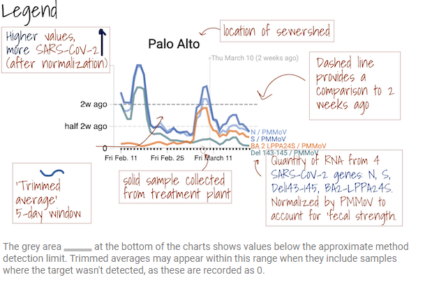
I like this dashboard because it does a good job of explaining exactly what users are looking at. On the top of the page, you see a legend walking you through the charts that appear below, along with a map showing the regions covered by these sewersheds.
The charts themselves have built-in context for users seeking to interpret recent trends: you can see how current coronavirus levels compare to levels from two weeks ago. And you have the option to toggle between different timescales: four weeks, six weeks, 12 weeks, six months, a year, and all surveillance since fall 2020. Other parts of the dashboard allow users to look at data that have been smoothed and normalized, showing how interpretations of coronavirus levels in wastewater may change depending on the analysis method.
In addition to the COVID-19 charts, the SCAN website also includes data on flu and RSV levels at sewershed sites, along with a detailed methodology section. I found this document describing different sources of variability in wastewater data particularly helpful, and linked out to it in my story.
I hope to see the CDC’s wastewater dashboard one day become this extensive!

Leave a comment