Blog

  • Star Trek predicted post-viral illness, but provided few tools to stop its spread

    Star Trek predicted post-viral illness, but provided few tools to stop its spread

    Spock finds some graffiti by an infected crew member in Star Trek: The Original Series episode The Naked Time. Image via the Memory Alpha wikipedia / Paramount Global.

    It’s been a somewhat slower week for COVID-19 news, so here’s something a little different: a reflection on a very old episode of Star Trek, in the context of post-viral illness.

    Star Trek: Strange New Worlds, one of the new shows airing on Paramount+, has got me on a bit of a kick for the franchise. So, I’ve been rewatching The Original Series (TOS), which was one of my favorite TV shows in high school. (My girlfriend, who hasn’t seen any of the old Star Trek shows, has humored me by watching with me.)

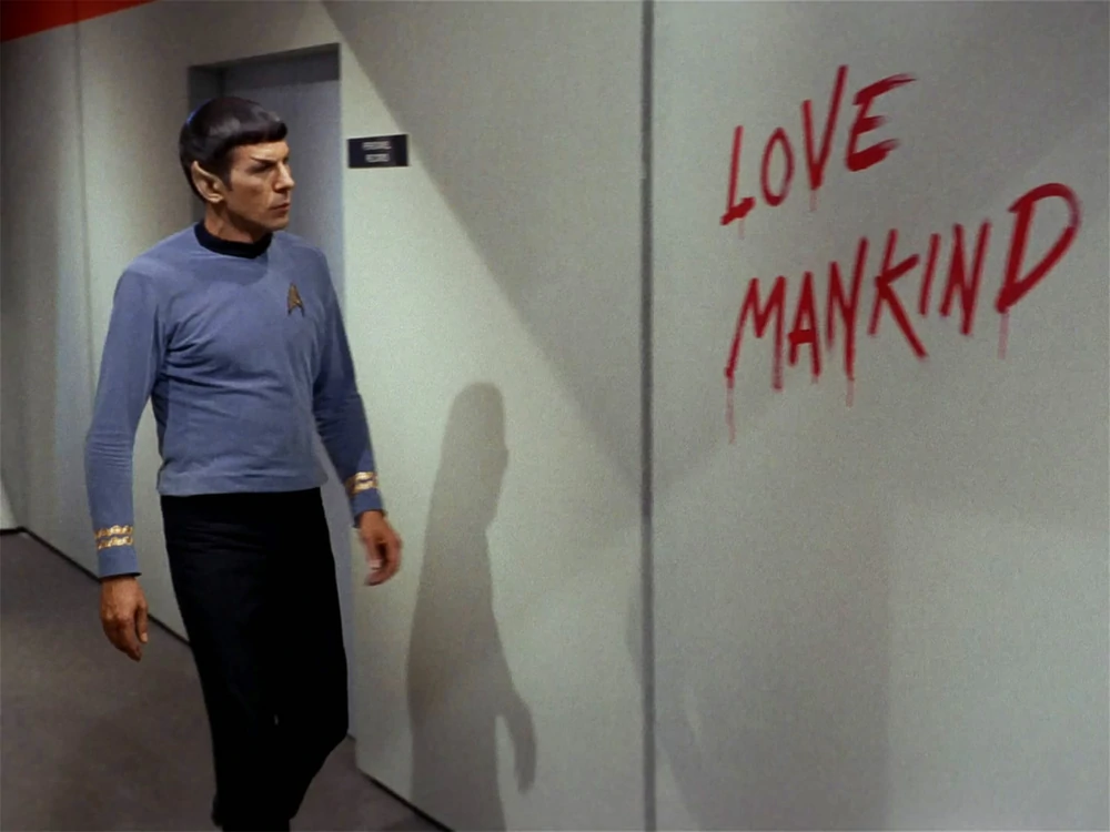
    Last week, we watched an episode I remembered as one of my favorites: The Naked Time, episode four in the first season. In this episode—which first aired in September 1966—a strange virus from an alien planet gets onto the Enterprise and infects a number of crew members. Once infected, crew members lose their inhibitions and behave as though emotionally naked; this leads to such iconic scenes as Spock “sobbing mathematically,” Sulu chasing his colleagues with a rapier, Uhura saying she’s neither fair nor a maiden, and so on.

    Rewatching this episode two years into the pandemic, it struck me that Star Trek predicted—like it predicted iPads, cellphones, and so many other things—neurological symptoms triggered by a viral infection. While the Epstein-Barr virus was discovered in 1964, it would be decades before scientists understood how viruses like this one could cause fatigue, chronic pain, post-exertional malaise, and other similar symptoms.

    Now, of course, the world is facing an epidemic of Long COVID, the most prevalent post-viral illness in history. Recent estimates from the U.K.’s Office for National Statistics suggest that two million people—or, 3% of the entire U.K. population—are living with Long COVID. And Long COVID is bringing renewed attention to other conditions like ME/CFS and dysautonomia, which have a lot of symptom overlap. It’s hard to deny that infectious diseases can have ramifications far beyond what we usually expect from a cold or the flu.

    My girlfriend, who previously hadn’t seen most of TOS, has commented on how much early Star Trek episodes center around psychological dilemmas. Rather than watching phaser battles, we’re watching characters grapple with questions like, “How do you stop a hormonal teenager with infinite power?” and, “What would happen if Captain Kirk were split into good and evil halves?”

    The Naked Time fits into this pattern, but it also feels more like a horror story than the others—especially when one watches it in the midst of a COVID-19 (and Long COVID) surge. Star Trek’s writers guessed, nearly 60 years ago, that an infectious disease could impact people’s minds. But here we are in 2022: Long COVID patients are still systematically discredited by doctors, unable to access treatment and financial support, and discarded by American leaders’ decision to “live with the virus.”

    The episode also offers some lessons in infection control measures by showing us what not to do when confronted with a novel illness. The alien virus gets onto the Enterprise in the first place because a crew member, investigating dead scientists on an abandoned planet, takes off his hazmat suit to touch his face; without realizing it, he transmits the virus from an infected surface to his skin. And after this index case starts acting strangely on the ship, other crew members don’t isolate him until it’s too late. Funny how our basic public health measures haven’t changed since the 60s, either.

    Anyway, because this is Star Trek, Dr. McCoy saves the day by quickly developing a cure for the virus. He has no trouble administering it to the crew—there’s no vaccine hesitancy on the Enterprise.

    Still, this episode sticks with me, more now than when I first watched it years ago. With all the new technology we have now to fight COVID-19, the basic measures we can take to control a novel virus haven’t changed. And the stakes are higher than ever.

    More on Long COVID

  • FAQ: BA.4 and BA.5, potentially the most transmissible Omicron subvariants yet

    FAQ: BA.4 and BA.5, potentially the most transmissible Omicron subvariants yet

    While the CDC is not yet reporting BA.4 and BA.5 separately, the subvariants are included in B.1.1.529; this grouping is driving increased transmission in some Midwestern and Southern states. Chart via the CDC variant dashboard.

    America’s current COVID-19 surge is being driven by BA.2 and its sublineage BA.2.12.1. But there are other versions of Omicron out there to which we need to pay attention—namely, BA.4 and BA.5. Here’s a brief FAQ on these two subvariants, including why scientists are concerned about them and where they’re spreading in the U.S.

    What are BA.4 and BA.5?

    Remember how, when South African scientists first sounded the alarm about Omicron in November, they identified three subvariants—BA.1, BA.2, and BA.3? BA.1 first spread rapidly around the world, followed by BA.2.

    Then, in the winter, South African scientists again identified new Omicron subvariants, called BA.4 and BA.5. These two variations split from the original Omicron lineage, and tend to be discussed together because they have similar mutations. (Specifically, they have identical spike protein mutations; this article discusses the mutations in more detail).

    It’s important to note that, while South African scientists characterized these subvariants, they likely didn’t originate in the country. South Africa has a better variant surveillance system than many other countries, particularly compared to its neighbors, allowing the country’s scientists to quickly identify variants of concern. BA.4 and BA.5 also caused a new surge in South Africa, allowing for study of the subvariants’ performance.

    Why are scientists concerned about these subvariants?

    Early studies of BA.4 and BA.5 indicate that not only are these subvariants more transmissible than other forms of Omicron, they’re also more capable of bypassing immunity from prior infection or vaccination.

    Last week, I shared a new preprint from a Japanese research consortium that found BA.4 and BA.5 are more capable of resisting protection from a prior Omicron infection than BA.1. This study, while not yet peer-reviewed, followed similar research from a South African team that found antibodies from an Omicron BA.1 infection offered limited immunity against BA.4 and BA.5, compared to a new BA.1 or BA.2 infection.

    Another study by researchers at Columbia University also follows this trend. These researchers tested antibodies from people who’d been vaccinated and boosted against BA.4 and BA.5; they found these two subvariants are “more than four times as likely to escape antibodies in people who’ve been vaccinated and boosted compared with BA.2 viruses,” CNN reports.

    While the differences between BA.4/BA.5 and BA.1/BA.2 are less dramatic than the differences between the Omicron family and Delta, scientists hypothesize that there is still enough distinction between these two Omicron sub-groups that people who already had Omicron BA.1 or BA.2/BA.2.12.1 could potentially get reinfected by BA.4 or BA.5.

    What are BA.4 and BA.5 doing in South Africa and other countries?

    BA.4 and BA.5 have been detected in over 30 countries, according to CNN. But scientists have again focused on South Africa, as this country has better surveillance than many others—particularly as PCR testing declines around the world.

    In South Africa, the BA.4/BA.5 wave that started in April has peaked and is now on the decline. Hospital admissions and deaths were lower in this recent wave than in the Omicron BA.1 wave in November and Decenter, largely thanks to high levels of immunity in the country. Still, the continued Omicron infections suggest that reinfection is a real concern for these subvariants.

    South Africa never really had a BA.2 wave, so BA.4 and BA.5 mostly competed with other Omicron lineages in that country. But in the U.K., which did face BA.2, recent data suggest that BA.4 and BA.5 have a growth advantage over even BA.2.12.1. In other words, BA.4 and BA.5 could potentially outcompete BA.2.12.1 to become the most transmissible Omicron subvariants yet.

    What are BA.4 and BA.5 doing in the U.S.?

    The subvariants are definitely here and spreading, but we have limited visibility into where and how much thanks to declined testing and surveillance. The CDC has yet to separate out BA.4 and BA.5 on its variant dashboard; according to White House COVID-19 Data Director Cyrus Shahpar, this is because the CDC has yet to identify these subvariants as causing 1% or more of new national cases in a given week.

    But the CDC does include BA.4 and BA.5 in its Omicron B.1.1.529 category, which has grown from causing 1% of new cases in the first week of May to causing 6% of new cases in the last week of the month. The number of cases sequenced in a week has dropped this spring compared to the first Omicron surge, leading me to wonder: are BA.4/BA.5 really causing fewer than 1% of new cases each, or do we just not have the data to detect them yet?

    CDC data do show that the B.1.1.529 group (which includes BA.4/BA.5) is causing over 10% of new cases in the Plain States, Gulf Coast, and Mountain West—compared to under 5% in the Northeast, where BA.2.12.1 is more dominant. This data aligns with local reports of BA.4 and BA.5 spreading in wastewater in some Midwestern states that track variants in their sewage. For example, scientists at the Metropolitan Council in the Twin Cities recently said they expect BA.4 and BA.5 to “replace BA.2.12.1 as the dominant variants” in the next few weeks.

    What could BA.4 and BA.5 mean for future COVID-19 trends in the U.S.?

    As I noted above, data from the U.K. suggest that BA.4 and BA.5 could outcompete BA.2—and even BA.2.12.1—to become the dominant Omicron subvariants in the U.S. Early data from U.S. Omicron sequences are showing a similar pattern, reported variant expert Trevor Bedford in a recent Twitter thread.

    “Focusing on the US, we see that BA.2.12.1 currently has a logistic growth rate of 0.05 per day, while BA.4 and BA.5 have logistic growth rates of 0.09 and 0.14 per day,” Bedford wrote. The country’s rising case counts can be mostly attributed to BA.2.12.1, he said, but BA.4 and BA.5 are clearly gaining ground. And, he noted, these two subvariants may be able to reinfect many people who already had BA.1 or BA.2.

    In short: even more Omicron breakthrough infections and reinfections could be coming our way. Even if BA.2.12.1 transmission dips (as it seems to be doing in the Northeast), we could quickly see new outbreaks driven by BA.4 and BA.5—leading overall case numbers to plateau or rise again.

    “For the summer, going into the winter, I expect these viruses to be out there at relatively high levels,” Dr. Alex Greninger from the University of Washington’s clinical virology lab told CNN. “Just the number of cases, the sheer disruptions of the workforce — It’s just a very high, high burden of disease.”

    More variant reporting

  • National numbers, June 5

    National numbers, June 5

    In the past week (May 28 through June 3), the U.S. reported about 700,000 new COVID-19 cases, according to the CDC. This amounts to:

    • An average of 100,000 new cases each day
    • 215 total new cases for every 100,000 Americans
    • 9% fewer new cases than last week (May 21-27)

    In the past week, the U.S. also reported about 27,000 new COVID-19 patients admitted to hospitals. This amounts to:

    • An average of 3,800 new admissions each day
    • 8.1 total admissions for every 100,000 Americans
    • 5% more new admissions than last week

    Additionally, the U.S. reported:

    • 1,700 new COVID-19 deaths (0.5 for every 100,000 people)
    • 94% of new cases are Omicron BA.2-caused; 59% BA.2.12.1-caused (as of May 28)
    • An average of 70,000 vaccinations per day (per Bloomberg)

    The BA.2/BA.2.12.1 surge continues. According to the CDC, the number of new cases reported nationwide dropped last week, compared to the prior week; but this drop is more likely a result of the Memorial Day holiday than of an actual slowdown in transmission. (As I frequently note in these updates, holidays always result in case reporting dips as public health workers take time off.)

    Despite the holiday, the country reported over 100,000 new cases a day last week. And, of course, this is a massive undercount. A new preprint from researchers at the City University of New York suggests that actual coronavirus infections during the BA.2/BA.2.12.1 surge may be 30 times as high as reported case counts—and that’s in New York City, which has better PCR infrastructure than most. (More on this study later in the issue.)

    Unlike official case counts, the number of COVID-19 patients newly admitted to hospitals across the country rose last week: an average of 3,800 patients were admitted each day, a 5% increase from the prior week. Hospital admissions are more reliable than case counts, especially after a holiday, suggesting that we are indeed still on the upswing of this surge.

    Similarly, coronavirus levels in the country’s wastewater keep rising. Biobot’s dashboard shows a continued national increase, as well as increases in the Midwest, West, and South regions. In the Northeast, virus levels dipped last week and now appear to be at a plateau.

    Has the Northeast peaked? Optimistically, I would like to say yes, but a combination of spotty data and the Memorial Day holiday makes it tough to say for sure. In New York City, case rates dropped last week—but so did testing. In Boston, coronavirus concentrations in wastewater seem to be on a downturn—but the data are noisy.

    And even if the Northeast is coming out of its BA.2/BA.2.12.1 surge, the rest of the country is on the opposite side of the wave. Reported case numbers in Southern and Midwest states like Missouri, Wyoming, Alabama, Utah, Mississippi, and Texas shot up by over 20% last week, while Hawaii and Florida now have the highest reported case rates, according to the June 2 Community Profile Report.

    Even the CDC’s highly lenient Community Levels are beginning to light up yellow and orange, suggesting that counties from Florida to central California should reinstate indoor mask requirements. But are any leaders actually putting these measures in place? It seems unlikely, leaving the increasingly-smaller COVID-concerned minority to fend for ourselves.

  • COVID source callout: CDC Community Levels

    COVID source callout: CDC Community Levels

    (Useless) Community Levels on the left; (useful) Community Transmission Levels on the right. Charts via the CDC.

    Anyone who’s been regularly reading the COVID-19 Data Dispatch for the last few weeks can probably tell that I think the CDC’s Community Levels are pretty useless. I was critical of these new metrics when the agency changed its guidance from the old Community Transmission Levels back in February. And during the BA.2 surge, I’ve pointed out how the CDC’s Community Levels map makes it look like the U.S. is doing fine at managing COVID-19 when, in fact, we are doing anything but.

    If you need a refresher, here are a few of the problems with the Community Levels:

    • The guidance overly uses hospitalization metrics; while these metrics (especially hospital admissions) are very reliable in showing COVID-19’s impact on the healthcare system, they lag behind actual infections and completely ignore Long COVID.
    • Hospitalizations are actually a regional metric, not a county-level metric (since plenty of U.S. counties do not have hospitals). As a result, the CDC’s Community Levels calculations are confusing and difficult to replicate in some places.
    • Thresholds in the Community Levels system, already using lagging indicators, are set very high—to the point that, by the time a county reaches the high level, its healthcare system is already in big trouble.
    • The CDC does not recommend universal masking until a county reaches the high level; it only recommends one-way masking for vulnerable people, which we know doesn’t really work, at lower levels.

    Essentially, these Community Levels are so lenient that many state and local leaders have taken the guidance as an excuse to avoid instituting new COVID-19 safety measures during the BA.2 surge. In Philadelphia, business owners even cited the CDC’s lenient guidance when suing the city for instituting a new indoor mask mandate.

    Moreover, as revealed by a recent article in the Tampa Bay Times, it appears that the CDC is not even consistent with its calculations of these Community Levels. The agency labeled three Florida counties as at medium COVID-19 risk, even though they met all the criteria for high risk, due to a data reporting issue from the Florida state health department.

    To quote from the article: “A public health tool isn’t useful if it can be undone by a single data issue, said University of South Florida virologist Michael Teng.”

    Reminder, you can still see the CDC’s old Community Transmission Level guidance (which is somewhat more useful for determining one’s actual COVID-19 risk) on the agency’s COVID-19 data portal. Just click the dropdown menu on the county view tab and select Community Transmission Levels.

  • Sources and updates, May 29

    • New Surgeon General advisory on health worker burnout: This week, U.S. Surgeon General Dr. Vivek Murthy released a new advisory on COVID-19 burnout among health workers, summarizing research on the issue and highlighting it as a public health priority. The advisory discusses a variety of societal, cultural, structural, and organizational factors contributing to health worker burnout, while tying this burnout to growing shortages of doctors and other health professionals. From the one-page summary of the advisory: “If not addressed, the health worker burnout crisis will make it harder for patients to get care when they need it, cause health costs to rise, hinder our ability to prepare for the next public health emergency, and worsen health disparities.”
    • CDC may change COVID-19 reporting for hospitals: The CDC is planning a few changes to its reporting requirements for hospitals in order to simplify the reporting process and cut down on redundant information, according to a draft plan shared with Bloomberg. Among the changes: hospitals may no longer be required to report suspected COVID-19 cases (i.e. those cases not yet confirmed with a PCR test); with most hospitals testing all patients when they’re admitted, suspected cases are less common and the data are less useful than they had been at earlier points in the pandemic. The CDC may also stop requiring COVID-19 reporting from some types of facilities, such as mental health centers, and may change the frequency of required reporting.
    • New preprint about Omicron BA.4 and BA.5: While the U.S. mostly worries about BA.2.12.1, additional Omicron subvariants BA.4 and BA.5 have been spreading in South Africa and other countries. A new study from a highly-regarded consortium of Japanese researchers suggests that BA.4 and BA.5 are about 20% more transmissible than BA.2 (similarly to BA.2.12.1). Also, even more concerning: the researchers found that BA.4 and BA.5 are more capable of resisting protection from a prior Omicron infection than BA.1. While the study has not yet been peer-reviewed, it garnered a lot of attention on Twitter this week from scientists warning that we need to watch out for these subvariants.
    • U.S. gets closer to a vaccine for kids under five: The FDA has set new dates for its vaccine advisory committee to review data on COVID-19 vaccines for children under age five: the committee will discuss both Moderna’s and Pfizer’s under-five vaccines on June 15, after discussing Moderna’s vaccine for children ages six to 17 on June 14. This announcement came after Pfizer and BioNTech released new data on their under-five vaccine, saying that a series of three doses provided strong protection against severe disease. There are some caveats for the data (which were shared via press release), but this is great news for children under age five and their families.
    • NIH sharing some COVID-19 technology (but not patents): I missed this news from earlier in May: the National Institutes of Health has made a deal with the World Health Organization’s COVID-19 Technology Access Pool and the Medicines Patent Pool to lisense 11 technologies used in COVID-19 vaccines and therapeutics. This lisense will allow pharmaceutical manufacturers around the world to make the coronavirus spike protein, RNA virus tests, and other COVID-19 components, increasing access to these technologies in low- and middle-income countries. Of course, it would be better for these countries if the NIH had shared full vaccine patents, but apparently that’s asking too much.

  • New Long COVID studies demonstrate danger of breakthrough cases

    New Long COVID studies demonstrate danger of breakthrough cases

    About one in five adults who have COVID-19 will face a health condition potentially related to long-term symptoms, a new CDC study found.

    Two new studies on Long COVID, published this week, provide an important reminder of the continued dangers this condition poses to people infected with the coronavirus—even after vaccination. Neither study provides wholly new information, but both are more comprehensive than many other U.S. papers on this condition as they’re based on large databases of electronic health records.

    First: a team at the Veterans Affairs (VA) Health Care System in St. Louis, Missouri used the VA’s extensive health records database to study breakthrough COVID-19 cases. The VA database includes more than 1,400 healthcare facilities serving veterans across the country; this St. Louis team has previously used it to characterize Long COVID symptoms more broadly, to study long-term heart disease risks of COVID-19, and for other research.

    In the new paper, published this week in Nature Medicine, the researchers put together a cohort of about 34,000 people who had breakthrough COVID-19 infections. They compared this group to larger control groups of people who hadn’t been infected and people who had been infected prior to vaccination, along with comparisons to the seasonal flu.

    Vaccination does reduce the risk of Long COVID, the researchers found: people with breakthrough cases were 15% less likely to report Long COVID symptoms than those who were infected prior to vaccination. Breakthrough Long COVID patients were notably less likely to have blood clots and respiratory symptoms than non-breakthrough patients.

    But a risk reduction of 15% is pretty minimal, compared to the protection that vaccination offers against COVID-related hospitalization and death. Moreover, for most Long COVID symptoms, patients who had breakthrough infections showed relatively little difference to those who had non-breakthroughs, the researchers found.

    “Overall, the burden of death and disease experienced by people with breakthrough SARS-CoV-2 infection is not trivial,” lead researcher Dr. Ziyad Al-Aly wrote in a Twitter thread summarizing the study. That’s scientist speak for, “A breakthrough COVID-19 case can really fuck you up in the long term!” Later in his thread, Dr. Al-Aly advocated for additional public health measures—beyond simply vaccines—to reduce Long COVID risks.

    And second: a paper from the CDC’s COVID-19 Emergency Response Team, published in the CDC’s Morbidity and Mortality Weekly Report (MMWR) last week, used electronic health records to examine overall Long COVID risk after an infection. These health records came from Cerner Real-World Data, a dataset including about 63.4 million records from over 100 health providers.

    The CDC researchers identified about 353,000 adults who had received either a COVID-19 diagnosis or a positive test result between March 2020 and November 2021. They matched this group of COVID-19 patients with a larger cohort of people who hadn’t tested positive, then looked at the COVID-19 patients’ risks of developing further symptoms more than a month after they were diagnosed.

    The findings are striking: About one in five COVID-19 survivors between the ages of 18 and 64 developed at least one “incident condition” (or, prolonged symptoms) that could be connected to their coronavirus infection. For COVID-19 survivors over age 65, that risk is one in four.

    Among the patients who potentially developed Long COVID, common symptoms were blockages in the lungs and other respiratory issues. Seniors were also likely to develop neurological and mental health symptoms, and the CDC researchers warned that Long COVID in this older age group could be linked to an increased risk of strokes and neurocognitive conditions, such as Alzheimers.

    In their paper, the CDC authors noted that patients represented in this health records database may not represent the U.S. overall, and that the methods used to identify possible Long COVID symptoms might be “biased toward a population that is seeking care.” Similar caveats apply to the VA study.

    Still, both studies clearly show the risk of just “letting COVID-19 rip” through the U.S. population, even after widespread vaccination. Studies like these should be headlines in every news publication, warning people that COVID-19 is not as mild as many of our leaders would like us to believe.

    Also, for journalists covering the pandemic: I highly recommend listening to this interview with Long COVID journalist and advocate Fiona Lowenstein, which aired on the WNYC show On the Media this weekend. (And I’m not just saying that because they plugged my recent story on the RECOVER study!) The Long COVID source list that Fiona and I collaborated on also continues to be a great resource for reporters covering this topic.

    More Long COVID reporting

  • We need more data on who’s getting Paxlovid

    We need more data on who’s getting Paxlovid

    Last week, I shared a new page from the Department of Health and Human Services (HHS), reporting statistics on COVID-19 therapeutic distribution in the U.S. The new dataset is a helpful step, but it falls far short of the information we actually need to examine who has access to COVID-19 treatments (particularly Paxlovid) and address potential health equity issues.

    The HHS dataset includes total counts of COVID-19 drugs ordered and administered in the U.S., both nationally and by state. It also includes weekly numbers of the doses available for health providers to order from the federal government (which the HHS calls “thresholds”), over the last five weeks; again, these are available nationally and by state.

    As most of the monoclonal antibodies developed for earlier variants do not provide much protection against Omicron, the majority of treatments used in the country last month were antiviral drugs Paxlovid (made by Pfizer) and Molnupiravir (made by Merck).

    Paxlovid is the most effective of the two, and the most in-demand. In recent weeks, some patients have reported difficulties with accessing this antiviral as BA.2 drives rising cases across the country. For instance, one COVID-19 Data Dispatch reader wrote to me last week to share that a family member who should’ve been eligible for Paxlovid had his prescription denied, as his pharmacy said the drug was in “limited supply.”

    In the first Omicron surge, during the winter, Paxlovid definitely was in limited supply. Then, as that surge waned, supplies improved: a Washington Post article last month reported that the federal government had plenty of doses going unused, and health leaders like COVID-19 coordinator Ashish Jha wanted to raise awareness of the antiviral with providers and patients.

    Now, as BA.2 and its subvariants drive a new surge, it’s unclear whether there are still plenty of Paxlovid doses for anyone who might need them—or whether the doses must once again be rationed for only the most vulnerable patients. If the latter is true, even if it’s true only in some states or counties hardest-hit by the Omicron variants, it’s a problem: as the U.S. seems completely unwilling to put in new safety measures, Paxlovid is an important tool to at least reduce severe disease and death. Without it, high-risk people are in an even worse position.

    As a data journalist, I would love to investigate this problem by digging into federal data to see where Paxlovid is getting used, and where there may be gaps. But the existing data are pretty sparse: the HHS has published only limited national and state-level data, with the only numbers on doses actually ordered and administered being cumulative (i.e. totals over a five-month period). There’s no information on how Paxlovid prescriptions have changed in different states or counties over time, or of whether the drug is actually reaching vulnerable people who need it.

    KHN’s Hannah Recht explained why this data gap is a problem for health providers prescribing Paxlovid, in an article earlier in May:

    Los Angeles County’s Department of Public Health has worked to ensure its 10 million residents, especially the most vulnerable, have access to treatment. When Paxlovid supply was limited in the winter, officials there made sure that pharmacies in hard-hit communities were well stocked, according to Dr. Seira Kurian, a regional health officer in the department. In April, the county launched its own telehealth service to assess residents for treatment free of charge, a model that avoids many of the hurdles that make treatment at for-profit pharmacy-based clinics difficult for uninsured, rural, or disabled patients to use.

    But without federal data, they don’t know how many county residents have gotten the pills. Real-time data would show whether a neighborhood is filling prescriptions as expected during a surge, or which communities public health workers should target for educational campaigns.

    Yasmeen Abutaleb’s article in the Washington Post (linked above) also discusses the need for data:

    Other experts welcomed the administration’s efforts, especially as cases rise, but said simply boosting the supply wasn’t enough, noting that inequities persist in who has access to Paxlovid. People without health insurance and those who live far away from medical providers or pharmacies are among those at highest risk from covid and face some of the highest hurdles to receiving effective treatment, said Julie Morita, executive vice president of the Robert Wood Johnson Foundation.

    “It is essential that we collect and report data on who is receiving Paxlovid and other antiviral medications to swiftly pinpoint and address any disparities that emerge,” Morita said. “If done right, this can be a real turning point — but it is essential that all populations and communities have the opportunity to reap the benefits.”

    In short, if health providers like community clinics and pharmacies could see data on which communities are receiving Paxlovid prescriptions and which ones are not, they could work to fill the gaps. The existing state-by-state data (published after Recht’s article) is a helpful starting point, but still has little utility for local health officials.

    Indeed, the limited state-by-state data already suggest that some states in the Northeast, the West Coast, and the Great Lakes region are ordering and administering more Paxlovid (relative to their populations), compared to others in the Midwest and South. This is a pattern worth examining further, but it’s difficult when the data are so unspecific.

    Here’s my wishlist of Paxlovid data that would be more useful:

    • More granular geographies. State-level data is pretty useless if you run a local health clinic, or if you’re a local journalist. We need prescription information at the county level, if not even smaller regions (like census tracts or ZIP codes.)
    • Demographic data. Without data on race and ethnicity, age, or other demographic factors, it’s very difficult to determine whether Paxlovid is reaching people in an equitable way—or if access to the drug is becoming another way in which the pandemic disproportionately impacts already-marginalized groups.
    • Provider type. Along the same lines as demographic data, seeing how many Paxlovid doses are going through large pharmacies as opposed to community health centers, hospitals, or other types of healthcare providers could be a useful measure of equity.
    • Patient health conditions. People with health conditions that predispose them to severe COVID-19 symptoms (compromised immune systems, diabetes, kidney disease, etc.) are supposed to be at the front of the line for Paxlovid. We need data to see whether they are actually getting this priority treatment.

    Come on, HHS: give us the granular data!

    More federal data

  • National numbers, May 29

    National numbers, May 29

    It’s not all mild cases: new COVID-19 hospital admissions have been rising at a similar rate to cases in the last couple of weeks. Chart via the CDC.

    In the past week (May 21 through 27), the U.S. reported about 770,000 new COVID-19 cases, according to the CDC. This amounts to:

    • An average of 110,000 new cases each day
    • 234 total new cases for every 100,000 Americans
    • 8% more new cases than last week (May 14-20)

    In the past week, the U.S. also reported about 25,000 new COVID-19 patients admitted to hospitals. This amounts to:

    • An average of 3,600 new admissions each day
    • 7.7 total admissions for every 100,000 Americans
    • 8% more new admissions than last week

    Additionally, the U.S. reported:

    • 2,200 new COVID-19 deaths (0.7 for every 100,000 people)
    • 97% of new cases are Omicron BA.2-caused; 58% BA.2.12.1-caused (as of May 21)
    • An average of 70,000 vaccinations per day (per Bloomberg)

    America’s largely-ignored BA.2 surge continues: the U.S. reported over 100,000 new cases a day last week, while an average of 3,600 new COVID-19 patients were admitted to hospitals each day. Both of these metrics rose about 8% from the week prior.

    Of course, as I am frequently reminding everyone these days, current case numbers are a drastic undercount of actual infections, thanks to at-home testing and increasingly-fractured PCR access. Our current surge might actually be the country’s “second-largest wave of COVID-19 infections since the pandemic began,” Wall Street Journal reporter Josh Zumbrun wrote last week.

    The culprits for this wave of infections are BA.2 and its sublineage BA.2.12.1; the latter is now causing more than half of new cases in the U.S., according to CDC estimates. Northeast states, which have been BA.2.12.1 hotspots for a few weeks now, continue to report the highest case rates: these include Rhode Island, Delaware, New Jersey, Massachusetts, D.C., and New York.

    There are some promising signs that the BA.2 wave in these Northeast states may soon be on a downturn, if it isn’t already. Data from Biobot show that coronavirus levels in wastewater are dropping in this region, with reports from Boston and from Maine contributing to this pattern. New York City, where I live, has reported a case plateau for the last week or so, but I’m hopeful that it could turn into a downturn soon.

    But will this encouraging pattern in the Northeast withstand the holiday weekend of largely-unmasked travel and gatherings? It may be a couple of weeks before we know for sure, because the holiday will interrupt data reporting (as holidays always do). The CDC itself is taking a long weekend off, with no Weekly Review this past Friday and no data updates at all Saturday, Sunday, and Monday.

    Meanwhile, COVID-19 deaths—the most lagging pandemic metric—are going up once again. More than 300 Americans died of the disease each day last week, in a 13% increase from the week prior. These are the consequences of our country’s continued failure to protect the vulnerable.

  • COVID source shout-out: The Yankee Candle Index

    It is a well-known pattern, at least on COVID-19 Media and Data Twitter, that new national surges of the virus are generally preceded by one nontraditional indicator: an increase in one-star Yankee Candle reviews in which users complain that they can’t smell their candles. Remember, a key COVID-19 symptom is loss of smell.

    Well, I regret to announce that this Yankee Candle Index is once again suggesting that a lot of COVID-19 is circulating in the U.S. right now:

    The Yankee Candle Index last suggested a spike in late December 2021, as Omicron was taking off nationwide. (At the time, I pointed readers to this SFGate article for more information; it’s still a helpful source if you’re unfamiliar with this index.)

  • Sources and updates, May 22

    • HHS begins releasing Paxlovid data: This past week, the Department of Health and Human Services (HHS) published data on how many courses of Paxlovid and other major COVID-19 therapeutics have been ordered and administered nationwide. As KHN reporter Hannah Recht pointed out on Twitter: “This is still not the detailed, complete data that county health officials need to do their jobs but it’s a start.” (See Recht’s article on this data gap for more context.)
    • COVID-19 Local Action Tracker: Since early 2020, the National League of Cities has tracked how cities and other local municipalities have responded to COVID-19. The tracker includes 800 cities and almost 5,000 policies, impacting over 100 million people; it links out to policy documents for each item. (H/t Data Is Plural.)
    • FEMA funeral assistance: The Federal Emergency Management Agency (FEMA) has distributed over $2 billion in aid for COVID-19 funerals since the beginning of the pandemic, supporting more than 300,000 families, the agency announced in a press release this spring. The press release also includes data providing the number of applicants and total funds awarded in each state.
    • New Long COVID studies with electronic records: Two recent papers on Long COVID caught my attention this week. First, researchers at data nonprofit FAIR Health analyzed a cohort of 78,000 Long COVID patients using a new diagnostic code for the condition, leading to useful findings about potential demographics and risk factors. Second, researchers at the University of North Carolina, the University of Colorado, and other collaborators used machine learning techniques on health records to identify potential Long COVID patients. Both studies used electronic health records to include wider patient pools than typical U.S. Long COVID research.
    • Limited immunity after Omicron infection: Another notable paper, published this week in Nature: researchers at Gladstone Institutes, a research organization in San Francisco, examined immunity after Omicron infections by testing out potential immune responses to different variants in mice and analyzing human serological samples. Their results suggest people infected with Omicron after vaccination have more protection against variants other than Omicron compared to unvaccinated people, which may only be protected against future Omicron infections.
    • FDA authorizes combined at-home test for COVID-19, flu, RSV: And a piece of diagnostic news for this week: for the first time, the FDA has provided emergency use authorization to an at-home test that can distinguish between COVID-19, the flu, and RSV. Processing the test does involve mailing results of a nasal swab to the testing company, Labcorp, so it’s not as simple as the at-home COVID-only tests we’ve all grown used to. Still, this authorization is an important step for future testing.