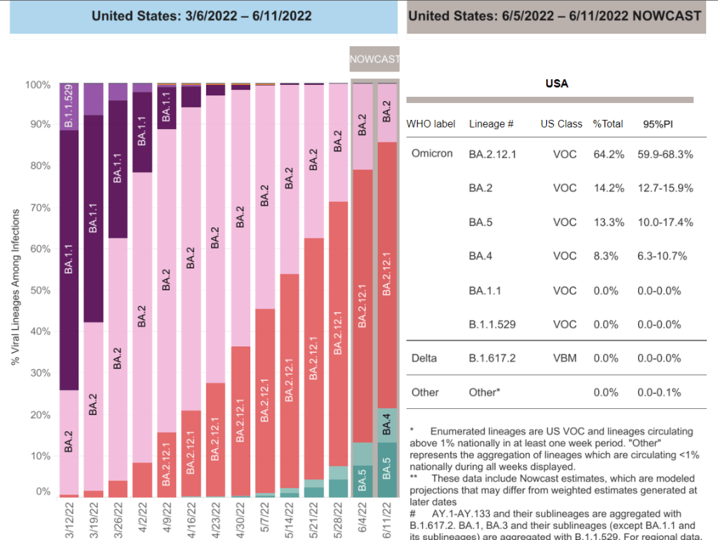
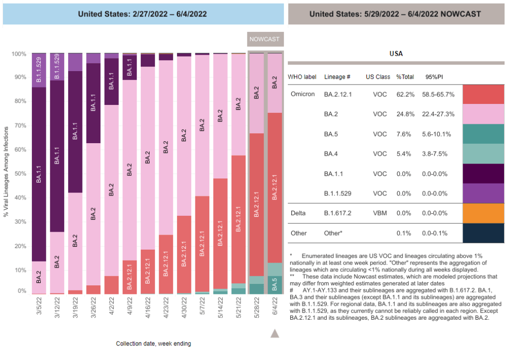
BA.4 and BA.5 caused more than 20% of new COVID-19 cases nationwide in the week ending June 11, according to CDC estimates.
This week, I had a new story published at TIME’s online news site, explaining what Omicron BA.4 and BA.5 could mean for COVID-19 trends in the U.S.
The story makes similar points to my FAQ post on these subvariants from earlier in June: basically, BA.4 and BA.5 have evolved to get around antibodies from a prior coronavirus infection or vaccination, and the U.S. is likely to see a lot of reinfections from these subvariants—even among people who already had BA.1 or BA.2 earlier this year. BA.2.12.1 has mutated in a similar way, leading experts to suspect that one of these subvariants (or all three) will dominate the next phase of the pandemic.
When I talked to variant experts for my TIME story, I asked them for their thoughts on surveillance. “Is it getting harder to identify and track new linages like BA.4 and BA.5 as fewer people use PCR tests and more use at-home tests?” I asked. “What improvements or shifts would you like to see in surveillance?”
All three experts I spoke to had different perspectives, which I found interesting—and worth sharing in the COVID-19 Data Dispatch, since I wasn’t able to include this (somewhat wonkier) information in my TIME story.
Here’s what they said:
Marc Johnson, a microbiology and immunology professor at the University of Missouri who leads the state’s wastewater surveillance program, thinks that expanding wastewater monitoring is the way to go (though he admitted his bias, as someone who works in this area). “Sewershed monitoring is a really good way to track variants going forward,” he said. “It gives you a comprehensive view without costing you hundreds of thousands of dollars… or without having to sequence a thousand people.”
Shishi Luo, associate director of bioinformatics and infectious diseases at Helix (a genomics and viral surveillance company), is thinking about how to ensure her company consistently receives enough PCR test samples to get useful data from sequencing. At the moment, pharmacies and community testing sites are still providing enough samples that Helix has sufficient information to track variants, she said. But, anticipating that those numbers may dwindle, Helix is connecting with urgent care clinics and hospitals that do diagnostic testing. “I think those places will continue to collect samples and perform qPCR tests,” she said.
Paul Bieniasz, a professor at Rockefeller University who studies viral evolution, thinks that the current levels of surveillance are sufficient—at least, when it comes to policymaking and updating vaccines. “I would like to keep surveillance at a level such that such that we can have a pretty accurate picture about what’s going on,” he said. But he wants to prioritize “the really important things”: namely, understanding changes to vaccine effectiveness, which treatments to use, and identifying a new “major antigenic shift” like the one that produced Omicron as soon as it occurs.
“But it can always be better,” he said. “The more intense the surveillance, the more sensitive it is, and the earlier you detect things that might be of concern in the future.”
I wrote about a change in hospitalization data, which had just shifted from the purview of the CDC to a different team at the Department of Health and Human Services (HHS). This felt like a niche topic at the time, but I wanted to provide a clear explanation of the change after seeing some misleading articles and social media posts suggesting that the CDC was losing control of all COVID-19 data.
At the time, my goals were simple: explain where COVID-19 data come from and how to interpret the numbers; provide tips and resources for other reporters on this complicated beat; and help people in my broader social network understand pandemic trends. The COVID-19 Data Dispatch’s aims haven’t changed too much, even as I’ve expanded it to its own website, worked with guest writers, coordinated events, and more.
As I look back on 100 issues, I wanted to share a few lessons for other reporters still on the COVID-19 beat (and, more broadly, anyone working on public health communications). I’m also sharing a couple of notes from readers about how the publication has helped them.
Lessons I’ve learned:
Lay readers can handle complicated topics! You don’t need to overly simplify things, just use clear language and examples that are easy to follow. This is honestly my entire ethos as a science writer so I found it hard to pick an example post, but one may be my piece on why U.S. Long COVID research is so difficult, which built on reporting for a Grid feature.
FAQs are good formats for breaking down complex topics or new information. I like to use FAQ formats and lots of subheaders whenever I’m writing about a new variant (or subvariant) of concern, like this post on BA.4 and BA.5, or when walking through the implications of a federal guidance change, like this post discussing testing and isolation with the Omicron variant.
Consistency is key. One thing I frequently hear from readers is that they appreciate the regularity of COVID-19 Data Dispatch issues; if they tune out of other pandemic news, they can still expect me to deliver some important updates once a week. This is definitely a built-in advantage of the newsletter format, but I try to take the consistency further by having regular sections (such as “National numbers”) with statistics reported in a similar way each week.
Emphasizing the same issues over and over can feel repetitive to the writer, but it’s helpful for readers. Whenever I remind readers about holiday data reporting lags, for example, I have to remind myself that most people are not constantly thinking about COVID-19 trends the way that I am—and might not be consistently reading my newsletters, either. It’s another aspect of being consistent.
Provide trends and context, not just isolated numbers. This is another key aspect of my “National numbers” updates: I always explain how a given week’s case or hospitalization numbers compare to previous weeks. Another important piece of context, I think, is where numbers come from: for example, reminding readers that case numbers mainly include PCR test results, not at-home antigen test results.
Acknowledge uncertainty! This is crucial in any kind of data reporting, especially when reporting from data systems that are as flawed and incomplete as the U.S.’s COVID-19 data systems. For example, last month’s post about interpreting limited data during our undercounted surge explains the limitations of several common sources, as well as what the sources can still tell us.
Provide readers with tools to see local data. This is a central reason why so many publications built COVID-19 dashboards in 2020, and why some outlets continue to maintain them now. People love to look up their states or counties! I often don’t have the bandwidth for hyperlocal visualizations myself, but point to these resources in “Featured sources” updates whenever possible.
Use readers’ questions to drive reporting. Some of my favorite COVID-19 Data Dispatch posts have been inspired by reader questions, from the “Your Thanksgiving could be a superspreader” post in fall 2020 to my explanation of why the CDC’s isolation guidance is not based on scientific evidence earlier this spring. If you write to me with a question, you’re probably not the only person with that question—at least, if my metrics on these posts are anything to go by.
Testimonials from readers:
Josh Zarrabi (software engineer at the Health Equity Tracker): “You’re, like, the only COVID news I get anymore. Every Sunday morning with my coffee.”
Chris Persaud (data reporter, Palm Beach Post): “Thanks to your newsletter, I’ve found useful data for my news reports.”
Jeremy Caplan (director of Teaching & Learning at Newmark J School): “COVID-19 Data Dispatch is consistently informative. I limit my COVID news diet, so it’s helpful to have this singularly focused resource for keeping up with the data.”
Congrats to the COVID-19 Data Dispatch on its upcoming 100th post. @c19datadispatch by @BetsyLadyzhets is consistently informative. I limit my COVID news diet, so it's helpful to have this singularly focused resource for keeping up with the data. Sign up: https://t.co/mEu1Af6f6W
My Grandma: “In our Berkeley family (C, P and me) we have relied on you and your newsletter for helping us through these difficult times. The research, guidance and advice in your Data Dispatch, is invaluable.”
Thank you to all of my readers for your support over the last 100 weeks. I hope the COVID-19 Data Dispatch can continue to provide you with the news and resources you need to navigate the (continuing!) pandemic.
In the past week (June 11 through 17), the U.S. reported about 700,000 new COVID-19 cases, according to the CDC. This amounts to:
An average of 100,000 new cases each day
215 total new cases for every 100,000 Americans
8% fewer new cases than last week (June 4-10)
In the past week, the U.S. also reported about 30,000 new COVID-19 patients admitted to hospitals. This amounts to:
An average of 4,300 new admissions each day
9.2 total admissions for every 100,000 Americans
5% more new admissions than last week
Additionally, the U.S. reported:
1,900 new COVID-19 deaths (0.6 for every 100,000 people)
64% of new cases are Omicron BA.2.12.1-caused; 22% BA.4/BA.5-caused (as of June 11)
An average of 130,000 vaccinations per day (per Bloomberg)
National COVID-19 cases appeared to plateau this week, as some parts of the country seem to have peaked in their Omicron subvariants wave while others are still reporting increasing transmission. The CDC reported an average of 100,000 cases each day—as always, this is a significant undercount of actual infections due to changing test availability.
Major indicators are showing continued high transmission around the country. National cases have leveled off or slightly dipped, but the number of new COVID-19 patients admitted to hospitals increased by 5% compared to the prior week—continuing a trend of steady increases since early April. (Hospitalization trends usually lag case trends, but the increased unreliability in case reporting may have shifted this.)
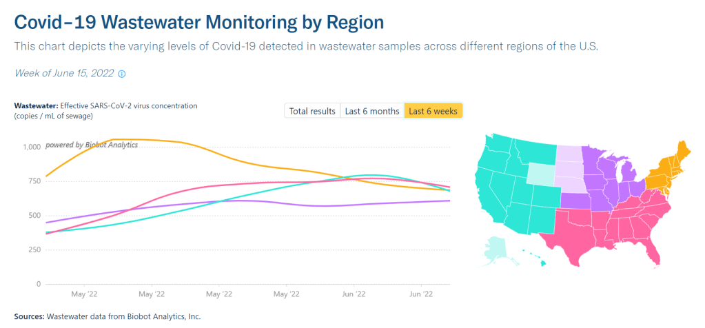
Wastewater surveillance also suggests that COVID-19 spread remains at high levels nationwide, with a very slight dip in the last week, according to Biobot’s tracker. The Northeast region is a couple of weeks past the point of its surge, at this point; data from individual Northeast cities like Boston, New York City, and New Haven, Connecticut back up this trend.
West Coast, Midwest, and Southern states continue to report rising or plateauing transmission, according to Biobot. Wyoming, Nevada, Montana, and Utah reported the highest increases in official case counts this week (compared to the prior week), according to the June 16 Community Profile Report.
Some of these Midwest and Southern states are also reporting high prevalences of BA.4 and BA.5, the latest (and, likely, most contagious) Omicron subvariants yet. The CDC estimates that these two lineages caused about 21% of new cases nationwide in the week ending June 11. But these data are always reported with a significant lag, suggesting that the true prevalence could be closer to 50%.
As many of our local leaders, workplaces, and social circles continue to pretend that the pandemic is over—when we are actually facing one of the country’s biggest COVID-19 waves yet—remember that there are still options to protect yourself and your community. Safety measures like wearing a good mask, testing frequently, and gathering outdoors or in well-ventilated spaces are more important than ever.
Many COVID-19 experts have developed a growing skepticism about “The Morning,” the flagship daily newsletter from the New York Times. David Leonhardt, who writes this newsletter, has pretty limited expertise in science and health reporting, yet he frequently delivers pandemic “explainers” that mislead readers—often by cherry-picking data or suggesting false consensus among experts.
This week, one of Leonhardt’s columns was particularly misleading. Titled “COVID and Race,” the newsletter reported that white Americans are now dying of COVID-19 at higher rates than Black, Latino, and Asian Americans.
But Leonhardt missed one very important factor: age-adjustment. Public health experts frequently adjust morbidity and mortality rates by age in order to account for demographic differences among groups. For COVID-19, this is especially important, because the disease disproportionately impacts older adults—and white Americans generally live longer than people of color because of many other structural health factors.
A feat accomplished by failing to age-adjust and also pretending Indigenous people don't exist. Another banger from @DLeonhardthttps://t.co/wKFfw1hOTr
In her Your Local Epidemiologist newsletter, Dr. Katelyn Jetelina further explained why age-adjsutment is important and why this “COVID and Race” column is wrong. When you adjust the death rates by age, Black and Latino Americans are, in fact, still more heavily impacted by COVID-19 deaths than white Americans, though the gap is shrinking.
Leonhardt’s newsletter also failed to discuss how COVID-19 has impacted Native Americans. This population has faced the highest death rates throughout the pandemic, according to the CDC and other sources.
It’s important to call out this error, I think, because “The Morning” has a huge reach and can be influential in impacting national pandemic conversations. If we ignore the continued health disparities around COVID-19, we will fail to address them.
CDC investigating deaths from Long COVID: Researchers at the CDC’s National Center for Health Statistics are currently working to investigate potential deaths from Long COVID, according to a report from POLITICO. The researchers are reviewing death certificates from 2020 and 2021, looking for causes of death that may indicate a patient died from Long COVID symptoms rather than during the acute stage of the disease. There’s currently no death code associated with Long COVID and diagnoses can be highly variable, so the work is preliminary, but I’m really looking forward to seeing their results.
CDC reports on ventilation improvements in schools: And one notable CDC study that was published this week: researchers at the agency from COVID-19, occupational health, and other teams analyzed what K-12 public schools are doing to improve their ventilation. The report is based on a survey of 420 public schools in all 50 states and D.C., with results weighted to best represent all schools across the country. While a majority of schools have taken some measures to inspect their HVAC systems or increase ventilation by opening windows, holding activities outside, etc., only 39% of schools surveyed had actually replaced or upgraded their HVAC systems. A lot more work is needed in this area.
Results from the COVID-19 U.S. State Policy database: The Boston University team behind the COVID-19 U.S. State Policy database has published a paper in BMC Public Health sharing major findings from their work. The database (which I’ve shared in the CDD before) documents what states have done to curb COVID-19 spread and address economic hardship during the pandemic, as well as how states report COVID-19 data. In their new paper, the BU team explains how this database may be used to analyze the impacts of these policy measures on public health.
Promising news about Moderna’s bivalent vaccine: Moderna, like other vaccine companies, has been working on versions of its COVID-19 vaccine that can protect better against new variants like Omicron. This week, the company announced results (in a press release, as usual) from a trial of a bivalent vaccine, which includes both genetic elements of the original SARS-CoV-2 virus and of Omicron. The bivalent vaccine works much better than Moderna’s original vaccine at protecting against Omicron infection, Moderna said; still, scientists are skeptical about how the vaccine may fare against newer subvariants (BA.2.12.1, BA.4, BA.5).
Call center and survey from FYLPRO: A reader who works at the Filipino Young Leaders Program (FYLPRO) requested that I share two resources from their organization. First, the program has set up a call center aimed at helping vulnerable community members with their COVID-19 questions. The call center is available on weekdays from 9 A.M. to 5 P.M. Pacific time in both English and Tagalog; while it’s geared towards the Filipino community, anyone can call in. And second, FYLPRO has launched a nationwide survey to study vaccine attitudes among Filipinos; learn more about it here.
Next Sunday, the COVID-19 Data Dispatch reaches a major milestone: issue #100.
When I started this project on Substack in July 2020, I did not expect to reach 100 issues. Honestly, I wasn’t thinking beyond the next federal data dump or COVID Tracking Project data entry shift. (If you’d like to read more about the CDD’s origins, see this Medium post.)
But here we are, 100 weeks later. I’ve written hundreds of posts on data quirks, data gaps, interpretations, visualizations, and reader questions. The topics I’ve covered have ranged from superspreader events to wastewater surveillance to explainers about (so many) new variants. I’ve hosted guest articles, hired an intern, and run a series of data workshops.
In honor of this milestone, I’d like to hear from you, dear readers. What have been your favorite issues or topics? Are there any posts that you frequently reference, or that you forwarded to friends and family members? How has this newsletter and blog helped you make sense of the pandemic? You’re also welcome to share any questions you’d like me to answer at this highly confusing time.
If you’d like to share, please comment below! You can also email me at betsy@coviddatadispatch.com or reach out on Twitter. I’ll share a few responses (with permission) in next week’s issue.
Also, if you’d prefer not to comment, consider sharing the COVID-19 Data Dispatch with a few friends instead! We are getting very close to my longtime goal of 1,000 free newsletter subscribers, and I would love to reach that by next week.
In April, the CDC launched a new center called the Center for Forecasting and Outbreak Analytics (or CFA). The new center aims to develop models of COVID-19 and other infectious diseases, while also helping public health agencies and individual Americans act on the information. One of CFA’s lead scientists compared it to the National Weather Service.
COVID-19 case data are becoming increasingly unreliable as PCR testing is less accessible and more people use at-home tests;
Hospitalization data are more reliable, but lag behind actual infections and may soon be unavailable in their current, comprehensive format;
Wastewater surveillance and other promising sources are not yet ready to replace clinical datasets;
A slow hiring process, as the center aims to bring on 100 scientists and communicators;
The CDC’s limited authority over state and local health agencies, and over the public.
At the COVID-19 Data Dispatch today, I’m sharing one of the interviews I did for the FiveThirtyEight story. I talked to Jason Salemi, an epidemiologist at the University of South Florida College of Public Health, whom you may know from his excellent dashboard and Twitter threads providing detailed COVID-19 updates.
While Salemi isn’t focused specifically on forecasting, he has a lot of insight about interpreting COVID-19 data and using the data for public health decisions. And I think he shares my frustration about the lack of safety measures that are being implemented across the U.S. at this dangerous point in the pandemic.
For context, this interview took place about one month ago, while BA.2/BA.2.12.1 were driving a surge in the Northeast but hadn’t quite hit other parts of the country yet. This interview has been lightly edited and condensed for clarity.
Betsy Ladyzhets: I wanted to start by asking, what do you see as the current state of trying to keep track of COVID in the United States? Like, what are some of the metrics that you’re looking at right now? What are some challenges that you’re facing as we deal with case numbers becoming less reliable?
Jason Salemi: Definitely the case numbers issue. Throughout the entire pandemic, we all know that the case numbers that we learn about when somebody actually tests positive and that information gets recorded somewhere, reported to a State Department of Health and ultimately to the CDC, that’s always underestimated the true number of infections that’s been circulating in the population. Obviously, very early in the pandemic, that was really, really bad—we were mostly picking up people as they were getting sick and landing in the hospital. But as testing expanded, obviously, we did a much better job of being able to gauge what was happening with true infections by relying on the reported case numbers.
However, during Omicron, and especially with the increased use of at-home testing—a lot of those at-home tests, if the person tested positive, were not making their way into a system that would actually get translated into the officially reported numbers. And negative at-home test results—those are definitely not making their way to public health agencies. I think in some jurisdictions, you were finding that 30%, 40% of all testing was actually antigen testing, and a significant portion of those were the at-home antigen test.
More recently, I think the official numbers that we hear about on a daily basis in terms of official COVID-19 cases, is becoming an increased undercount of the true number of infections that are circulating. Which is pretty striking, considering how much we’ve seen the numbers go up in the past few weeks. So, relying on officially reported cases does mean a lot less. But I still do believe that if you’re looking at—not necessarily where the numbers are exactly, but the trends in the numbers, how those numbers are changing over time—you can at least get a good feel for whether or not things are getting better or worse, even by using the COVID-19 case numbers.
Now, when you supplement that with things like wastewater numbers, data that are not biased by people taking advantage of testing or how they test, the wastewater numbers are maybe a better gauge for truer trends in the amount of viral spread. But again, even with wastewater numbers, two big things about those: number one is, it’s certainly not available, at least not that I can tell, for a lot of jurisdictions throughout the United States… It’s not available consistently across the country.
And number two, there’s nothing in those wastewater numbers where you actually can gauge: okay, this is the actual level of infection. What it helps us to do is, it’s a leading-edge indicator, where early on, we can say, “Oh, wow, we see an increase, a pretty pronounced increase in a particular area over time.” And hopefully, if we were doing things proactively, we could use those data to then implement some sort of concerted mitigation. So, this issue has become more of a challenge. But in many communities, we still can rely on how case numbers are changing over time to loosely gauge transmission rates.
Then, of course, a lot of people say, “It’s all about the hospitalization data, let’s utilize that.” Although I’d always love more metrics included in that [hospitalization] data set, it is something that, for some time now, we actually have consistently measured, at the national level, for every single state. You can get down to the hospital level, in some cases, and even by age group. We can have a decent understanding of how many people are being hospitalized with COVID 19. The nice thing about that is the consistency, and the fact that this [hospitalization dataset] is available everywhere, and we therefore have a decent resource that is capable of picking up indicators of more severe illness.
But there are a lot of problems with the hospitalization data: namely, it’s a lagging indicator. Ultimately, if we were to rely exclusively on COVID-19 hospitalization rates and hospital capacity issues—those indicators lag new infections, often by five to seven days, at least. So, by the time we see those particular metrics rise, we will have lost valuable time to prevent morbidity and mortality. That’s the big [problem].
The other thing is, there’s a lot of legitimacy to when people say, “Well, if a person went to the hospital for a non-COVID-19 related issue, and they just happened to test positive, they may not have been hospitalized because of COVID-19.” I think most are using the term “incidental.” Again, the numbers are not perfect. And when community transmission is as pronounced as it has been during many phases of Omicron, I think we do have a lot of situations where a lot of people are not being hospitalized because of COVID-19. But they are testing positive.
For example, Jackson Health System in Florida was Tweeting out every day during the Omicron phase. And they would say—giving hypothetical numbers here—“We’ve got 250 people who are hospitalized, and that are positive for COVID-19. Of those 250 people, 51% were hospitalized for non-COVID-related reasons.” Some areas would give you more specifics, they would also break down by vaccinated versus unvaccinated. You get a lot of more rich, detailed data from some areas, but obviously, that’s not consistent across the country. In fact, I think it’s pretty rare.
BL: Yeah, that point about hospitalizations being a lagging indicator is definitely something I want to highlight the story. And it seems very complicated, because I have heard from a couple of the modeling experts I’ve talked to that if you look at something like hospital admissions, specifically, that is less lagging. But still, overall, if you think about, like you were saying, trying to prevent more people from getting sick—even by the time you just see more hospital admissions, that’s still bad. You’ve still lost your chance to put in new mask measures, or whatever the case may be.
JS: Oh, absolutely. And, you know, if we really were in a state right now, where getting infected really did no damage to people, it never caused any severe illness, we would obviously care less about transmission levels. Although you could always use the argument that the more we let COVID-19 circulate, the more likely it is that new variants will emerge with potentially more dangerous characteristics. So, even if it wasn’t causing a lot of severe illness, you’ve always got that aspect of it.
But we are certainly not yet at a stage in which we can say [getting infected does no damage]—even though for the average individual Omicron is less severe when we compare it to something like Delta. But we paid a steep price in many areas in the United States to get the infection-acquired immunity and vaccine-acquired immunity that seems to be blunting the effects of Omicron. Right now, that’s why we’re not seeing the rise in hospitalization rates as steep as the rise in case rates.
But we are still seeing people getting hospitalized, an increasing number of people over the past couple of months. We’re not yet in a position where COVID-19 is not causing any damage. And we’re largely ignoring things like Long COVID. Just because somebody doesn’t get hospitalized, that doesn’t mean that [the virus is] still not causing a decrease in the quality of life for many people, and a decreased quality of life that can linger for some time.
BL: Yeah, definitely. And then, another issue with hospitalization data that I wanted to ask you about, because I know you’ve looked at this, is the fact that if you’re using these county risk levels, or community levels, whatever the CDC is calling them—not every county has a hospital. So really, this is data at a somewhat larger regional level. I’m wondering if you could explain why this is an important distinction.
JS: Yeah. And you know, this is not at all a criticism, this is kind-of the nature of the beast, so to speak. There are a lot of communities where—I’ll use Florida, because I’m most familiar with Florida, as an example. We have got a major health care system in Alachua County, which is really not a big county in Florida, not even in the top 20 largest counties. But it is a major area where a lot of people from surrounding smaller counties, like a nine- or ten-county catchment area, if they were to get really sick, that’s where they’re most likely going for treatment. And so, if you have a metric that is based on hospitalization rates, and you don’t have a hospital, obviously, you can no longer really provide a county-level indicator. It has to be more regional. And so you see a lot of variation in how the CDC has to now go from the county level to what they call health services areas.
These [health service areas] are established groupings. In these regions, the overwhelming majority of people in these locations are going to a hospital in the broader health service area. And so it’s confusing, I think, to people: with this newer CDC metric, they wonder, “How is it that there’s no hospital in my county or the county next to me, yet you’re giving me a county-level risk measure that is supposed to be based primarily on hospitalization data?”
And again, I think, some of the nuances of the metric get lost on people… Hospitalization data comes from a broader region [than cases], and there’s a lot of variation. There are some counties that are standalone, like Manatee County in Florida, so there is no health service area, it’s just one county for all measures. But there are some others where more than 15 counties that feed into that health service area. So again, for some people in some communities, I can understand where it’s just confusing and frustrating as to, “What does this risk level really mean, for me and the people that live near me, since the catchment region is so much larger?” This is not a right or a wrong, I understand why CDC does it the way that they do it if they’re trying to get a hospitalization-based measure. But it’s just challenging for people to digest.
BL: Yeah, it’s challenging on that communications front. With the previous transmission levels, you could just kind-of look at the case rate and the positivity rate and be like, “Okay, I get where this is coming from.” But yeah, now it’s a little trickier. Another thing on this topic: I saw a report from POLITICO this morning that is suggesting, basically, if the National Public Health Emergency gets ended this summer, then the CDC might lose its ability to require states or hospitals to actually report the hospitalization data that is basically our best source right now. So, what would the implications be if that happens in a few months?
JS: I’d say pretty significant implications. Look, I’ve tried to give credit where credit is due, like the gains made with improving the federal hospitalization data. I’ve also been a critic when I feel as though we are missing key data sources or data elements. An example is the hospitalization data not having race and ethnicity information, I feel like that’s a big component that would be meaningful.
But even with its limitations, the hospitalization data have been a very, very, very important tool for us to be able to report what’s happening in communities. And obviously, nobody wants to fly blind as it pertains to the pandemic. So if we don’t have uniform reporting from all of these states and jurisdictions, then we have to rely on the willingness of leaders at each state or community level to make similar information available, and to report that information in a timely and consistent manner.
Right now, we are fortunate that we continue to get the hospitalization data updated on a daily basis. And so yeah, that would obviously be a big loss if it were—it’s one thing to not have it required. But if states chose not to report that information, which certainly some states would choose not to… it would be a big loss, depending on what states choose to do to keep the population informed.
Because, to be honest, when we get this national data, it’s a gut reaction that we want to compare states on everything—on death rates, on case rates, on hospitalization rates. To me, this can be a huge mistake. One of the obvious reasons that everybody talks about is age differences, right? Some states have a much higher percentage of older people. But it’s not just age that makes state comparisons difficult. It’s weather, and racial and ethnic distribution, and the job industries in which people can work, population density. So, I don’t really care too much about national-level data being used primarily to make state comparisons and inferences that can be misguided.
But to have consistently reported information across the country, again, is important for us to be able to make more responsible decisions even at the local level. I would hope if that happens [losing the national dataset], we would still have states and cities and counties and communities and all these different geospatial areas continuing to report, collect, and make available to the public meaningful information in a timely manner so we can make responsible decisions.
BL: Yeah, that makes sense. And I know that question of authority and like, what can and can’t you require the states to do, is a large issue for the CDC. I was able to talk to Mark Lipsitch yesterday, he’s one of the scientists who’s working on this new forecasting center. And one challenge he mentioned to me is that the CDC really doesn’t have the authority that it would like to in terms of requiring data reporting. They can’t require every state to start doing wastewater surveillance, they can’t require every state to report vaccine effectiveness data or breakthrough cases. And to me, that just seems like a massive hurdle that they face in trying to do this kind of long-term improvement of infectious disease forecasting.
JS: Yeah—and it’s not just the ability, it’s also having the will. I’ve collaborated with some truly amazing scientists from the CDC for a very long time on a myriad of different initiatives, and I have little doubt that they will compile a team of experts that can analyze meaningful metrics to generate what I imagine will be a wealth of data on where we’re going in the pandemic. But it’s not just about analytic proficiency. I did read on their [CFA’s] site that their stated goal is to enable timely, effective decision-making to improve outbreak response. But how are we going to utilize those data to make recommendations? What outcomes are they going to emphasize? What communities are we thinking about when we make those recommendations?
A lot of people talk about the measures we use, and which ones are best, and how we collect the data, and the validity, and the sophistication of the approaches that we use to either nowcast or forecast into the future. But to me, it’s also the way in which we operationalize those measures for public health recommendations. That’s where a lot of the talk is now about the measures being utilized by CDC. So whether it’s their four-level community transmission measure, or that newer three-level measure that’s based mainly on hospitalization data—how we’re using that to make recommendations, it says something about what the agencies who establish those boundaries are willing to accept.
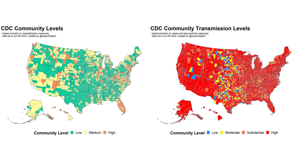
For example, I was just looking at some data again, when I did that thread this morning. The highest level on the community transmission metric, that used to indicate 100 cases or more per 100,000 people over the most recent seven-day window. Right now, based on the data that I just ran, we’ve got 105 counties in the United States with a population of at least 250,000—not just small counties, but large ones—that have a low community level [the CDC’s more recent metrics], the lowest possible, but they have a transmission level that is higher than that 100 per 100,000 threshold.
And more importantly, we’ve got 28 counties—again, with a population of 250,000 or more—that are classified as medium level. That is a level with no recommendations for mask-wearing in public indoor settings. And those 28 counties have a case rate that is more than triple the threshold for high transmission, that’s 300 per 100,000, over the past seven days. You expect that medium level to change to high in the not-to-distant future for many of these areas.
So again, it’s one thing to collect the metrics and have skilled analysis. But what we do with those measures and that analysis, is just as meaningful. And what does it mean, if we have an area that has really pronounced transmission—and we know in the past, that pronounced transmission means that the virus is going to be exceedingly good at finding vulnerable populations—and we’re not having any meaningful population-based recommendations…
When I looked, some of these counties were at like 400 per 100,000 [cases in a week], four times the threshold for the high transmission level [under the old CDC guidance], and they’re still not at a level where we’re supporting or recommending mask-wearing in public indoor settings. That’s pretty shocking. And I think that’s why anecdotally, now, even in my area, I’m just hearing about more and more people daily, that are not able to come to work. A lot of people are getting infected. And you’re seeing that in the rising numbers.
BL: Absolutely. I mean, isn’t the threshold for moving from low to medium under the new community levels 200 new cases per 100,000 [per week, regardless of hospitalization numbers]?
JS: Yeah, right. So even if you had no rise in hospitalizations, you can have a progression to the medium level. But that is now twice what the highest transmission threshold used to be. And again, I’m looking at counties that are in that medium level that now have almost twice even that newer threshold.
We’re not yet in a situation where COVID is not causing any severe illness whatsoever. We’re ignoring a lot of the ramifications of Long COVID, we’re ignoring the fact that, when community spread has gotten so pronounced, you tend to have the virus easily, efficiently finding the most vulnerable people in those communities and still inflicting damage.
I just feel like we’re missing an opportunity. We’re not talking about shutdowns, we’re talking about simple measures that we can put in place and recommend to people to try and balance having, normal living with putting reasonable but important precautions in place. Because that ultimately will prevent a lot of morbidity and mortality. And I feel like that’s maybe the big missed opportunity right now.
So, I’d be excited to see a new forecasting center come out of the CDC. They are very adept scientists. But it’s ultimately, what do we do? What do we do with the data that emerges out of that center? And what recommendations, simple recommendations, do we end up giving to the public based on those analyses?
BL: I totally agree. One of the new center’s focuses is that they want to hire a bunch of science communicators to think about these things. But still, I guess I’m a little skeptical about how much they’re gonna really be able to have an impact here, when we’re already at such a polarized position in the pandemic.
JS: Yeah, it’s not that any of this is easy. No matter what you do, you’re going to upset a whole lot of people nowadays. I speak strictly from a scientist’s perspective. And I really do get all sides of this equation, like the businesses and the very real toll that the pandemic has taken on people. And so it is, no matter what you do, there is a balance that you have to achieve.
But when I start to see—again, I’m going more from what has transpired specifically in Florida. And a lot of the talk this time last year, after we had the availability of vaccines, things were looking great for Florida. Numbers were really low. And that was pretty much throughout the United States, we had the vaccines, though we still heard a lot about protecting the most vulnerable, the oldest in our communities. And even as the cases started to rise, during Delta, it was like, well, just protect the vulnerable.
But again, when community transmission gets that pronounced, the virus will continue to find the most vulnerable. And it ended up inflicting by far the largest death toll in Florida than we’ve had at any point in the pandemic, after vaccines were available for a long period of time. And that included a significant percentage of people who were not seniors. So, it’s tough, but still, people’s livelihood and lives are on the line when we’re talking about COVID.
Omicron BA.4 and BA.5 (shown here in teal) have been spreading rapidly in the U.S. in the last month. CDC data are as of June 4.
In the past week (June 4 through June 10), the U.S. reported about 760,000 new COVID-19 cases, according to the CDC. This amounts to:
An average of 110,000 new cases each day
233 total new cases for every 100,000 Americans
8% more new cases than last week (May 28-June 3)
In the past week, the U.S. also reported about 29,000 new COVID-19 patients admitted to hospitals. This amounts to:
An average of 4,100 new admissions each day
8.8 total admissions for every 100,000 Americans
8% more new admissions than last week
Additionally, the U.S. reported:
2,100 new COVID-19 deaths (0.7 for every 100,000 people)
62% of new cases are Omicron BA.2.12.1-caused; 13% BA.4/BA.5-caused (as of June 4)
An average of 90,000 vaccinations per day (per Bloomberg)
As I predicted last week, the brief dip in reported COVID-19 cases was a result of the Memorial Day holiday, not an actual signal of the BA.2/BA.2.12.1 wave reaching its peak. National case counts are up again this week, with the country still reporting over 100,000 new cases a day. And remember, the true infection rate could be five or more times higher, thanks to under-testing.
Hospital admissions, a more reliable metric (less impacted by holiday interruptions) also went up this week. The number of Americans admitted to the hospital with COVID-19 has risen steadily each week since early April.
Even as millions of people are protected from severe symptoms by vaccination or prior infection, many are still susceptible—whether they’re too young to be vaccinated or have not yet received booster shots for which they are eligible. Plus, the U.S. continues to have next to zero data on Long COVID cases, a debilitating, long-term condition that can impact even people who are fully vaccinated and boosted.
Highly contagious Omicron subvariants continue to drive this surge. BA.2.12.1, the subvariant first identified in New York, is now causing almost two-thirds of cases nationwide, according to the CDC’s latest estimates. Meanwhile, the agency is finally listing separate estimates for BA.4 and BA.5, subvariants with greater capacity to reinfect people (even those who already had other versions of Omicron.)
BA.4 and BA.5 caused about 13% of cases combined in the week ending June 4, and are spreading fast. These two subvariants are currently more prevalent in parts of the Midwest and South, while BA.2.12.1 is more dominant in the Northeast. This pattern might partially explain why the Northeast is seeing virus transmission decrease or plateau, while other regions report increases.
Wastewater data from Biobot show a similar picture: a downward trend in the Northeast, offset by upward trends in the other regions. Cities like Boston and New York City are showing somewhat confusing signals right now, as Memorial Day travel and gatherings may have interrupted the decline.
We’ve received several questions about the recent divergence between the @MWRA_update North & South Systems—our Epidemiology team found that this is not an abnormal divergence. 1/3 pic.twitter.com/0hihJHJazn
According to the CDC’s old community transmission levels (which are based on cases, not hospitalizations), about 96% of U.S. counties are currently reporting high transmission—and should recommend masking in public. But new mask requirements or other safety measures have been few and far between as this surge remains largely invisible.
Well, this week, the Yankee Candle Index was joined by a new indicator: gasoline. Apparently, there’s a new TikTok trend in which users try to smell gasoline and find that it has no scent. I am not a TikTok user, so I learned about this from Twitter, but I agree with the COVID-19 commentators pointing out that this is likely a symptom of the BA.2/BA.2.12.1 surge.
TikTok discourse of the week: everyone is convinced gasoline has lost its smell. pic.twitter.com/jHhlLxSFe5
If about one in five New Yorkers got these Omicron subvariants within a two-week period, then that’s potentially a lot of people (in NYC, in the Northeast, or even nationwide) who have lost some sense of smell recently.
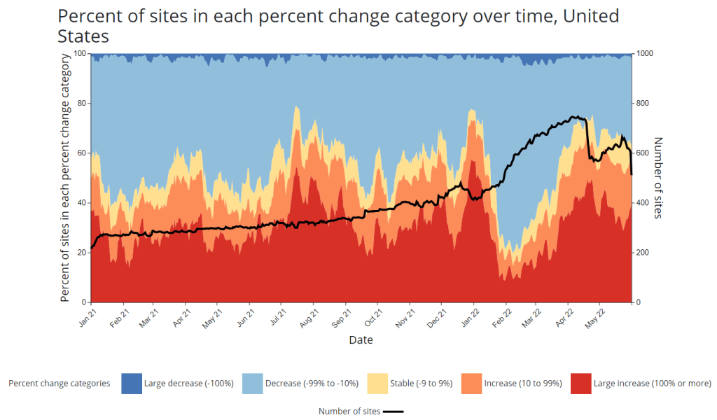
CDC adds new chart to wastewater dashboard: This week, the CDC updated its National Wastewater Surveillance System (NWSS) dashboard with a new chart that aims to summarize the overall picture of coronavirus trends in the country’s sewers. The chart shows the percentage of NWSS sites that have reported their coronavirus concentrations decreasing, staying stable, and increasing over two-week periods; it also shows the overall number of sites with recent data. (This number dropped when NWSS switched contractors, though it has ticked back up in recent weeks as Biobot onboards sites.) Of course, the sites included in NWSS represent a small fraction of the U.S. population, and different locations are using different analysis methods which may be difficult to summarize. But the new chart is still a helpful way to see national trends from the surveillance network.
Preprint suggests 30x scale of case underreporting: Last week, researchers from the City University of New York (CUNY) shared striking results from a study in which they’d surveyed about 1,000 New York City residents about their COVID-19 status during two weeks of the BA.2/BA.2.12.1 surge. The sample was designed to represent the broader city population, and residents could self-report positive test results on both PCR and at-home rapid tests as well as possible symptoms and contact with infected people. About 22% of the survey respondents had a coronavirus infection during the study period (April 23 to May 8), the researchers found. The study hasn’t been peer-reviewed and should be interpreted with caution, but still: it could indicate that one in five New Yorkers got COVID-19 within two weeks. Official case counts were 30 times lower, the researchers found, reflecting massive underreporting; and NYC has more access to PCR testing than many other places.
1. In our new (not yet peer reviewed) pre-print on NYC's BA.2/BA.2.12.1 surge, in a population-representative sample, we estimated SARS-CoV-2 prevalence to be 22.1% during April 23-May 8 (about 1.8M adults). About 31 times the official case count. https://t.co/Vr7PUWsWd7
CDC study demonstrates disproportionate COVID-19 impact on Native Americans: One study from the CDC’s Morbidity and Mortality Weekly Report (MMWR) that caught my attention this week: researchers in Alaska (at the state’s health agency and tribal health institutions) examined COVID-19 rates for the state’s indigenous population. They found that the age-adjusted COVID-19 case rate among Native Americans/Alaska Natives was about twice as high as the rate among white people living in Alaska, and the death rate was about three times higher. Many indigenous people in Alaska live in rural, remote areas, some inaccessible by car, which heightens the challenges of accessing healthcare.
Native American life expectancy fell during the pandemic: Another related preprint: researchers at Virginia Commonwealth University, the University of Colorado Boulder, and the Urban Institute have produced multiple studies examining how life expectancy changed during the pandemic. In general, COVID-19 led to massive decreases in life expectancy across the board; but the latest update from this group showed that Native Americans were particularly hard-hit. Native American life expectancy dropped by 4.7 years, compared to a 2.1 drop for the white American population. Steven Woolf, corresponding author, discussed the study in a Q&A with Virginia Commonwealth University. (H/t Andrew Stokes.)
Higher burden of COVID-19 in developing countries: And one more notable new study, published this week in BMJ Global Health: a group of researchers at institutions in the U.S., Australia, Brazil, and other countries conducted an in-depth review of global COVID-19 serology data to estimate the disease’s true infection and fatality rates across the world. The researchers found that infection fatality rates (i.e. the share of infected people who die of COVID-19) were much higher in developing/low-income countries than in developed/high-income countries, in some cases up to three times higher. “The results are, in a word, depressing,” lead author Gideon Meyerowitz-Katz wrote in a Twitter thread discussing the study.
New job posting at CDC forecasting center: The CDC’s new Center for Forecasting and Outbreak Analytics, formally launched in April, has posted a job opening for (at least one?) data scientist. Considering that the center plans to hire 100 scientists and science communicators, this singular posting is likely just one of many more opportunities to come.