- COVID-19 and antimicrobial resistance: The pandemic resulted in major losses for the fight against antimicrobial resistance, according to a new CDC report published last week. Antimicrobial resistance (AMR), in which bacteria evolve the ability to bypass commonly-used antibiotics, is a significant public health concern in the U.S. and globally. The CDC is still missing data for several major AMR threats during the pandemic, but data the agency was able to compile present a concerning picture about resistant infections in U.S. hospitals during the pandemic.
- CDC’s air travel contact tracing needs work: And now, a report about the CDC: the U.S. Government Accountability Office found that the agency’s data system for contact tracing on flights “needs substantial improvement.” Without a comprehensive, singular data source for airplane passenger contact information, the CDC has to do extra research and extend contact tracing time after a passenger tests positive for COVID-19.
- State COVID-19 data reporting continues slowing: New York Times reporter Adeel Hassan and colleagues described how states are reporting their COVID-19 data less frequently and closing public testing sites, leaving more gaps and delays in their numbers. This article provides a helpful summary of a trend I’ve alluded to in various blog posts for the last few weeks.
- Private companies step up to assist with PCR testing: Two major testing companies, Quest Diagnostics and Color Health, announced this week that they will provide free COVID-19 testing to some Americans without health insurance at hundreds of sites across the country; these site locations will be determined by the CDC’s Social Vulnerability Index. The CDC is picking up the tab for these testing costs, according to press releases. (H/t the COVID Weekly Testing Newsletter.)
- FDA authorization for Novavax vaccine: Novavax’s protein-based COVID-19 vaccine has been granted Emergency Use Authorization by the FDA. While this vaccine option is unlikely to substantially increase uptake in the U.S., the FDA’s authorization opens the door for Novavax shots to be used as fall booster shots—an idea that seemed promising to some members of the agency’s advisory committee in a recent meeting.
Blog
-
Sources and updates, July 17
-
Two major Long COVID reports are coming in August
Two new White House/HHS reports about Long COVID and other long-term pandemic impacts will be released next month. Screenshot via Twitter. This past Friday, the White House and the Department of Health and Human Services held a briefing previewing two major reports about Long COVID.
The reports, which the Biden administration plans to release in August, will share government resources and research priorities for Long COVID, as well as priorities for other groups impacted long-term by the pandemic, such as healthcare workers and people who lost loved ones to COVID-19. Friday’s briefing served to give people and organizations most directly impacted by this work (particularly Long COVID patients) advanced notice about the reports and future related efforts.
It was also, apparently, closed to the press—a fact that I did not learn until I had already publicly livetweeted half of the meeting. I later confirmed with other journalist friends that the White House and HHS press offices did not do a great job of communicating the meeting’s supposedly closed status, as none of us knew this beforehand.
Officials honestly didn’t share much information at this briefing that I didn’t already know, so it’s not as though I obtained a huge scoop by watching it. (For transparency’s sake: I received a link to register for the Zoom meeting via the COVID-19 Longhauler Advocacy Project’s listserv, and identified myself as a journalist when I signed up.)
Due to confusion around the briefing’s status and the fact that other attendees (besides myself) livetweeted it, I feel comfortable sharing a few key points from the call. If this gets me in trouble with the HHS press office, well… they’ve never answered my emails anyway.
Key points:
- These upcoming August reports are responding to a memorandum that the Biden administration issued in April calling for action on Long COVID.
- Over ten federal government agencies have been involved in producing the reports, which officials touted as an example of their comprehensive response to this condition.
- One report will focus on services for Long COVID patients and others facing long-term impacts from the pandemic. My impression is that this will mostly highlight existing services, rather than creating new COVID-focused services (though the latter could be developed in the future).
- The second report will focus on Long COVID research, providing priorities for both public and private scientific and medical research efforts. Worth noting: existing public Long COVID research is not going well so far, for reasons I have covered extensively.
- An HHS team focused on human-centered design has been pursuing an “effort to better understand Long COVID” (quoting from their web page). This project is currently wrapping up its first stage, and expects to publish a report in late 2022.
- Some Long COVID patients and advocates would like to see more urgent action from the federal government than what they felt was on display at this briefing.
Here are a couple of Tweets from advocates who attended:
I look forward to covering the reports when they’re released in August.
More Long COVID reporting
-
Introducing a new resource page on wastewater data

North Carolina is one of 17 states that maintains its own wastewater surveillance dashboard, independent of the CDC’s. As official COVID-19 case data become less and less reliable, wastewater surveillance can help provide a picture of where and how much the virus is spreading. This week, I put together a new COVID-19 Data Dispatch resource page that outlines major national, state, and local wastewater dashboards across the U.S.
Of course, wastewater surveillance is not capable of completely replacing clinical data. Wastewater testing is still pretty spotty across the country (though almost all states are now represented on the CDC’s dashboard), while scientists and public health officials are still working to determine how best to interpret and use these data; see my April FiveThirtyEight article for more on these challenges. There are also equity concerns around which communities have access to wastewater surveillance, as discussed in this recent paper from Colleen Naughton et al.
Still, if you live in a place where wastewater data are publicly available, I highly recommend keeping an eye on these numbers. Trends in wastewater data tend to closely match—or preempt—trends in case data, and wastewater testing includes everyone in a sewershed regardless of their access to (or interest in) getting a PCR test. This is one of the best COVID-19 indicators we have right now.
In the U.S., there are currently two main national wastewater dashboards:
- CDC’s National Wastewater Surveillance System (NWSS) dashboard: This dashboard presents data from about 800 sewershed sites across the country, including both those managed by state and local health departments and those tested through the CDC’s contract with Biobot. Different data providers have different testing and analysis methods, which can make it difficult to interpret the information here on a national scale. But, if your state or county is represented on the dashboard, you can click into an individual site to see coronavirus trends. Historical data are available for download here.
- Biobot Network dashboard: In addition to the company’s contract with the CDC, Biobot also tests wastewater at hundreds of sites across the country though its free Biobot Network, as well as through paid contracts with individual health departments and wastewater treatment plants. Biobot presents data from these non-CDC sites on its dashboard, updated weekly. One advantage of the Biobot dashboard over the CDC’s is that all Biobot sites are tested and analyzed with a uniform methodology, making the data easier to interpret. Data are available for download here.
My resource page also links out to COVIDPoops19, a dashboard summarizing wastewater monitoring efforts around the world. Run by researchers at the University of California Merced, this project links out to almost 150 public and academic wastewater sites. If you’re looking for wastewater surveillance in your area, this dashboard may be a good place to check.
At the smaller level, my page includes 17 statewide wastewater dashboards, seven at the local level (dedicated to a specific city or metropolitan area), and four at the regional level (representing multiple counties in a state).
While many more states are doing wastewater surveillance, the majority of state health departments have not yet developed their own dashboards—redirecting residents to the CDC NWSS site. Personally, I think some state-specific dashboards are much easier to navigate and interpret than the CDC’s, and would like to see more states produce their own. But I understand the resource limitations here.
Here are a few state and local dashboards I’d like to highlight:
- Boston, Massachusetts: The Massachusetts Water Resources Authority’s dashboard is one of the oldest in the U.S., launched in spring 2020 through a partnership with Biobot. It’s fairly simple (presenting static images, not interactive dashboards), and easy to interpret, with charts showing long-term and short-term trends.
- Colorado: Colorado’s dashboard follows a common format for presenting wastewater surveillance data: users are presented with a map of wastewater service areas, and can click into a specific area to see coronavirus trends for that sewershed. This state is also planning to expand wastewater testing to schools and other specific buildings, according to local reporting.
- Maine: Maine’s wastewater “dashboard” is really a collection of PDF reports, posted for individual counties at regular intervals. The PDFs come directly from Biobot, which is running the state’s surveillance through a contract with the Maine CDC; I find it interesting to see the report format Biobot is using for its clients.
- New York State: Researchers at Syracuse University, the State University of New York (SUNY), state departments of health and environmental conservation, and others collaborate on this wastewater surveillance project, which includes 54 counties and 90 treatment plants. Notably, the project does not include the five boroughs of New York City; the city has its own wastewater surveillance effort, but does not have its own dashboard. (NYC sites haven’t been updated on the CDC dashboard since April.)
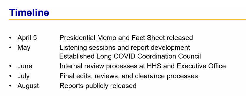
- North Carolina: Similarly to Colorado’s, North Carolina’s wastewater dashboard allows users to click into specific sites for coronavirus trends. This dashboard also provides reported case trends for comparison and information about concentration percentiles, similar to the metrics used by the CDC. It also gives users a lot of information about where the data come from—good for transparency!
- Twin Cities, Minnesota: The Metropolitan Council, a local agency in the Twin Cities, Minnesota metro area, has monitored COVID-19 in wastewater since early in the pandemic; I shared an interview with a lead scientist there in April. Recently, the Met Council added variant information to its dashboard, showing which versions of the virus are currently driving spread (BA.5 is taking the lead right now).
I know (from looking at the COVIDPoops19 dashboard) that my new resource page includes a small sample of academic and local wastewater sites; I chose to focus on those at the state level and for larger metro areas due to my own capacity. But if there’s another dashboard that you’d like to see added to the page, please reach out and let me know! I’ll try to keep it updated on a monthly cadence.
More wastewater reporting
-
National numbers, July 17

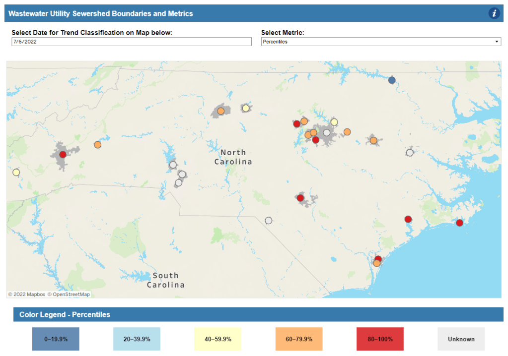
More than 40% of COVID-19 tests conducted at Walgreens pharmacies in the last week came back positive. This is not a good indicator, to put it mildly. In the past week (July 9 through 15), the U.S. reported about 870,000 new COVID-19 cases, according to the CDC. This amounts to:
- An average of 120,000 new cases each day
- 265 total new cases for every 100,000 Americans
- 16% more new cases than last week (July 2-8)
In the past week, the U.S. also reported about 41,000 new COVID-19 patients admitted to hospitals. This amounts to:
- An average of 5,900 new admissions each day
- 12.5 total admissions for every 100,000 Americans
- 14% more new admissions than last week
Additionally, the U.S. reported:
- 2,500 new COVID-19 deaths (0.8 for every 100,000 people)
- 65% of new cases are caused by Omicron BA.5; 16% by BA.4 (as of July 9)
- An average of 80,000 vaccinations per day (per Bloomberg)
As I suspected last week, the small dip in official COVID-19 case numbers was a result of the July 4 holiday, not an actual decline in transmission. This week, cases are up again nationwide, with the highest number reported since early February.
Of course, PCR testing capacity has declined substantially since February. And test positivity rates are high across the country: the CDC reported a nationwide rate of 17.5%, while the Walgreens COVID-19 Index (which compiles data from testing at Walgreens pharmacies) reports a rate of 42%. Such high positivity numbers indicate that our official case data are capturing a small fraction of cases.
And we have other indicators of the substantial COVID-19 spread happening right now. Biobot’s wastewater tracker reports increased transmission nationwide and in all four regions in the last two weeks. Over half of sewershed sites in the CDC’s National Wastewater Surveillance System reported increases in the two weeks ending July 11—and for about one-third of sites, those increases were more than 100%.
New hospital admissions of COVID-19 patients went up by 14% last week, similarly to the highest levels reported since February. Reports of COVID-19 symptoms are also on the upswing, according to survey data collected by the Delphi Group at Carnegie Mellon University.
While some hospitalization metrics and deaths may be low at the moment, remember that these are lagging indicators: they go up a few weeks after cases. And cases are definitely going up right now, driven by the Omicron subvariant BA.5—which is now dominant in the country.
BA.5 and BA.4 together caused more than 80% of new COVID-19 cases in the week ending July 9, according to CDC estimates. BA.5 is pulling ahead, though, readily reinfecting people in a national climate that seems to have largely given up on safety measures.
But measures like masking, testing, and booster shots can still reduce transmission. I was heartened this week to see Los Angeles County preparing for a new indoor mask mandate in response to rising cases; other places should follow this lead.
-
COVID source callout: CDC takes weekends off
If you went to pretty much any page on the CDC’s COVID Data Tracker this week, you might have noticed a new alert at the top of the page:
Beginning July 4, 2022, COVID Data Tracker will discontinue daily data refreshes 7 days per week, and will instead refresh data Monday through Friday.
In other words, the CDC is following in the footsteps of many state and local health departments across the country in taking weekends off from COVID-19 updates. This is pretty unsurprising, considering how many long weekends the agency’s COVID-19 tracking team has taken recently (see: last week’s callout post).
Indeed, only five states are still updating their COVID-19 dashboards daily, according to the Johns Hopkins University Coronavirus Resource Center. But the CDC’s move is still disappointing, as it represents yet another step away from this national public health agency fulfilling its responsibilities to inform Americans about the pandemic.
-
Sources and updates, July 10
- CDC adds (limited) Long COVID data to its dashboard: This week, the CDC’s COVID Data Tracker added a new page, reporting data from a study of “post-COVID conditions” (more colloquially known as Long COVID). The study, called Innovative Support for Patients with SARS-CoV-2 Infections (INSPIRE), follows patients who test positive for up to 18 months and tracks their continued symptoms. Among about 4,100 COVID-positive patients in the study, over 10% still had symptoms at three months after their infections, and over 1% still had symptoms at 12 months. This is just one study among many tracking Long COVID, but it is an important step for the CDC to add these data to their dashboard.
- Air change guidance by state: In recognition of the role ventilation can play in reducing COVID-19 spread, some states have put out recommendations for minimum air changes per hour (ACH), a metric for tracking indoor air quality. Researcher Devabhaktuni Srikrishna has compiled the recommendations on his website, Patient Knowhow, with a map showing ACH guidance by state. (I recently interviewed Srikrishna for an upcoming story about ventilation.)
- COVID-19 is a leading cause of death in the U.S.: A new study from researchers at the National Institutes of Health’s National Cancer Institute confirms that COVID-19 was the third-leading cause of death in the U.S., in both 2020 and 2021. The researchers utilized death records from the CDC in their analysis, comparing COVID-19 to common causes such as cancer and heart disease. COVID-19 was a top cause of death for every age group over age 15, the study found.
- COVID-19 disparities in Louisiana: Another notable study this week: researchers at the University of Maryland, College Park examined the roles of social, economic, and environmental factors in COVID-19 deaths in Louisiana, focusing on Black residents. “We find that Black communities in parishes with both higher and lower population densities experience higher levels of stressors, leading to greater COVID-19 mortality rate,” the researchers wrote. The study’s examination of environmental racism in relation to COVID-19 seems particularly novel to me; I hope to see more research in this area.
- Tracking coronavirus variants in wastewater: And one more new study: a large consortium of researchers, led by scientists at the University of California San Diego, explores the use of wastewater surveillance to track new variants. Variants can show up in wastewater up to two weeks earlier than they show up in samples from clinical (PCR) testing, the researchers found. In addition, some variants identified in wastewater are “not captured by clinical genomic surveillance.”
- Global COVID-19 vaccine and treatment initiative ending: The ACT-Accelerator, a collaboration between the World Health Organization and other health entities and governments, has run out of funding. This is bad news for low- and middle-income countries that relied on the program for COVID-19 vaccines and treatments—many of which are still largely unvaccinated, more than a year after vaccines became widely available in high-income countries. Global health equity initiatives will likely continue in another form, but funding will be a continued challenge.
-
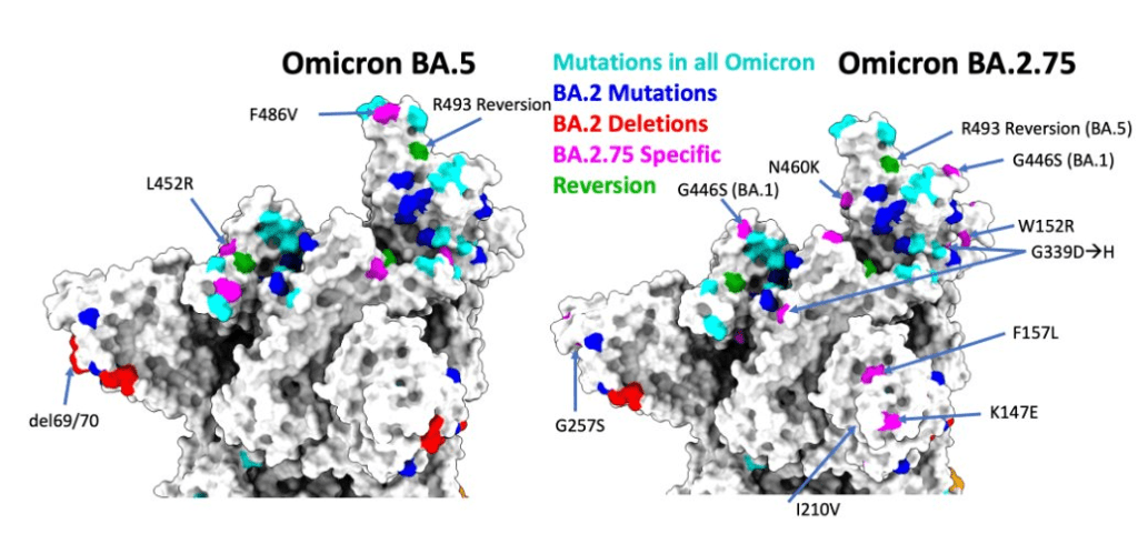
BA.2.75 is the latest Omicron subvariant of concern

BA.2.75 has further mutations which could allow the variant to bypass past immunity. Figure via scientist Ulrich Elling on Twitter. As if BA.4 and BA.5 aren’t already enough to worry about: some COVID-19 experts are sounding the alarm about BA.2.75, a new version of Omicron that evolved out of BA.2.
This subvariant was first identified in India in late May, and has now been reported in the U.K., Germany, and several other countries, according to the World Health Organization. Scientists are concerned because it has new spike protein mutations that could heighten its ability to bypass immunity from past infections or vaccinations—including, potentially, from BA.4 or BA.5.
At least three BA.2.75 cases have been reported in the U.S. so far, according to a Friday press release from the surveillance company Helix. Two of these cases were on the West Coast, in Washington and California. These cases are currently lumped in with other versions of BA.2 on the CDC dashboard.
The information on BA.2.75 is fairly preliminary at this point; the WHO is monitoring it as an additional lineage of Omicron, not a separate variant of concern, and watching for new data. It’s unclear how competitive it might be with BA.5, now dominant in the U.S., but is worth keeping an eye on. As Dr. Katelyn Jetelina points out in a recent issue of Your Local Epidemiologist, the spread of BA.2.75 could further complicate fall booster shot plans.
More variant reporting
-
FAQ: PCR testing is still important, but it’s become harder to access

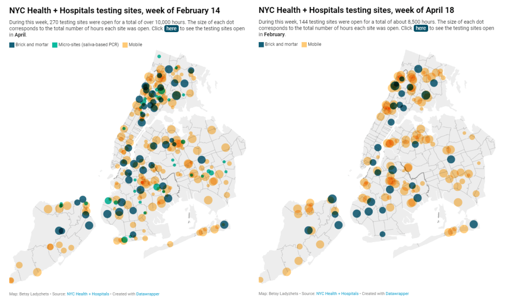
NYC has closed public testing sites and reduced hours this spring. For full, interactive charts, see the Gothamist story. New York City has been closing PCR testing sites, even as the city faced a major Omicron resurgence this spring. This was the main finding from a story I wrote for Gothamist and WNYC (New York Public Radio), based on my analysis of public information on city-run testing sites.
While this was a local story, I think the trends I found—and the pushback that the piece received from city health officials—are pretty indicative of the national state of COVID-19 testing right now. Since the federal government ran out of funding to cover testing for Americans without health insurance in late March, private testing companies have started requiring insurance information and, in many cases, raising their prices.
At the same time, state and local health departments have closed their public PCR testing sites and directed people to use at-home rapid tests instead. New York City still has more accessible testing than most of the country, but my story showed how even here, getting tested is becoming more difficult—and less popular.
Here are a few key statistics from the piece:
- The number of public PCR testing sites run by NYC Health + Hospitals was cut in half between mid-February and mid-April.
- The total hours that public testing sites were open decreased from over 10,000 during a week in February, to 8,500 during a week in April, to 7,500 in the last week of June.
- Manhattan testing hours remained relatively constant (about 1,500 in each of the weeks I analyzed), while hours were cut in other boroughs.
- The numbers of New Yorkers getting tested on a daily basis were similar in June 2021 and June 2022—even though reported case rates were about ten times higher this year.
- New York City’s test positivity rate recently shot above 10%, and is now over 15%. It was closer to 1% at this time last year.
The NYC health department had some issues with my story. In fact, city health commissioner Dr. Ashwin Vasan posted a Twitter thread stating that it was “missing key information” and that the city actually has “more testing resources than ever.” But the “testing resources” he cites here are mostly at-home tests; PCR testing in NYC is both less accessible and less popular. A follow-up story that I coauthored with Nsikan Akpan, my editor at Gothamist/WNYC, further explains the situation in the city.
The decline in PCR testing is making it harder to understand where and how fast the coronavirus is spreading, both in the city and around the U.S. To explain the implications of this trend, here’s a short FAQ on how to think about testing during our current surge.
Why is PCR testing still important for individuals?
One of the city officials’ main responses to my story was that NYC has made it easy for people to get free at-home rapid tests, in place of PCR testing. The city has distributed more than 35 million at-home tests at hundreds of libraries and other community sites.
At-home tests certainly have advantages: they’re more convenient, with results back in 15 minutes. Turnaround times for PCR tests are generally pretty fast right now thanks to limited demand (usually under 48 hours, if not under 24 hours, in NYC), but that’s still a long wait compared to a rapid test. Rapid, at-home tests also provide a better indicator of contagiousness.
Still, PCR tests have continued utility because they remain the gold standard of accuracy: they’re able to identify a COVID-19 case with much smaller amounts of coronavirus present in someone’s respiratory tract than a rapid test. As a result, if you were recently exposed or are showing some mild symptoms—but testing negative on rapid tests—a PCR test could be valuable to provide a more reliable COVID-19 status.
PCR tests can also be helpful for documenting a COVID-19 case. While many doctors will take a rapid test positive as a clear indicator of an infection, some settings may require a PCR test—in which results are verified by the lab that processes the test. This can be particularly true for Long COVID clinics, health advocate JD Davids told me. So, if you tested positive on a rapid test but are concerned about Long COVID symptoms, a PCR test may be a helpful verification step.
Why is PCR testing still important for communities?
Rapid, at-home test results generally do not travel further than your trashcan, or maybe your phone camera. They don’t get reported to testing companies, or local public health departments, or the CDC—unlike PCR tests, which have established data pipelines for such reporting. Some jurisdictions do have options for residents to self-report rapid test results, but this self-reporting is generally a small fraction of the total tests conducted.
As a result, public health experts generally rely upon PCR testing data to understand patterns in COVID-19 spread. When less PCR testing takes place, these patterns become more difficult to interpret. For example, in the U.S. as a whole, around 100,000 new cases a day have been reported for the last several weeks; but we know that the true trend would likely be a lot more variable if we had data from rapid tests.
Also, as Brown University epidemiologist Dr. Jennifer Nuzzo pointed out when my editor Nsikan interviewed her for our follow-up story, PCR tests are necessary for tracking variants. A selection of PCR test samples get genetically sequenced; this doesn’t happen for rapid tests.
“It’s really important for us to stay ahead of what variants are circulating in our communities,” Nuzzo said, citing what society has already learned about different variants to date. “Some are more transmissible. Some have been more severe. We need to stay ahead of the virus, so that we can know when and how and if to change our strategy about how to control it.”
What’s the value of abundant local testing sites?
If PCR testing is less popular in this current phase of the pandemic, you might ask, why not just have a few central testing hubs in a place like NYC, and maintain testing capacity in a more efficient way? This seems to be the city’s response, to some extent: officials explained that some brick-and-mortar testing sites (mostly at NYC hospitals) are staying open, while the city’s fleet of mobile testing vans can move around as needed.
But for a lot of people, traveling outside their neighborhood to get a test or tracking down the right mobile van can be a major barrier to getting tested. This is especially true for essential workers and low-income New Yorkers—who are the people most in need of testing. Maintaining public testing throughout the city is a health equity issue.
To quote again from the follow-up story:
And even if the testing capacity is technically maintained, location is important. Consider a region like South Brooklyn: Four brick-and-mortar testing sites scheduled to close in mid-July are all located in this area: 4002 Fort Hamilton, Bay Ridge, Bensonhurst and Midwood Pre-K.
It’s unclear whether mobile sites will move to South Brooklyn in response. Shrier said each closing site has “dedicated at-home test distribution sites” within one mile. But residents of Bay Ridge, Bensonhurst and other nearby neighborhoods may need to travel further to get a PCR test — or face high costs at private sites.
What data sources could replace information from PCR tests?
Dr. Denis Nash, an epidemiologist at the City University of New York whom I interviewed for the first NYC story, talked about two types of data that may be collected by a health agency tracking disease spread.
“There’s active surveillance and passive surveillance,” he said. “In active surveillance, the health department staff are actively going out and trying to ascertain how many cases there might be. They’re going to hospitals and to homes, looking for cases. And when you do that, you’re more likely to exhaustively find a high proportion of cases.” One example of active surveillance: a survey conducted by Nash and his team at CUNY in April and May, which indicated about 20% of New Yorkers may have had COVID-19 within a two-week period.
Meanwhile, passive surveillance “relies on healthcare providers and laboratories to voluntarily report their tests and cases to the health department,” Nash said. NYC and other health departments which receive much of their COVID-19 data—PCR test results, hospital admissions, etc.—from healthcare providers are exemplifying this passive approach.
As COVID-19 becomes less of a public concern and testing is less popular, health agencies should step up their active surveillance, Nash said. Wastewater can be another source of data that’s more active than PCR test results, since it reflects COVID-19 spread across a large population. (Unfortunately, in NYC, wastewater data is pretty inaccessible; that’s a topic for another time.)
What’s the best way to use at-home rapid tests?
Rapid test use can fall into three different categories. First, if you are trying to determine whether you’re actively contagious right before a gathering or seeing a high-risk person: take one test, as close in time to the event as possible. (For example, if I’m going to a large march in NYC, I plan to test myself a few minutes before heading to the subway.)
Second, if you had a recent COVID-19 exposure (or attended a high-risk event), test multiple times in succession—ideally at least twice in 48 hours. This testing process should start a couple of days after the exposure, because rapid tests aren’t accurate enough to pick up the infection right away. You could also use a single PCR test to serve the same purpose as multiple rapid tests.
And third, if you are isolating after a positive COVID-19 test, rapid tests can help identify when you’re no longer contagious and able to return to society. As I wrote in an earlier post, the CDC’s five-day isolation guidance is not actually backed up by data; testing out of isolation is much safer.
As always, if you have questions about testing or any other COVID-19 topic, my inbox is open.
More testing coverage
-

National numbers, July 10

Almost the entire country is currently experiencing high COVID-19 transmission, according to the old CDC guidance. And that’s just the cases we know about. In the past week (July 2 through 8), the U.S. reported about 750,000 new COVID-19 cases, according to the CDC. This amounts to:
- An average of 110,000 new cases each day
- 227 total new cases for every 100,000 Americans
- 4% fewer new cases than last week (June 25-July 1)
In the past week, the U.S. also reported about 36,000 new COVID-19 patients admitted to hospitals. This amounts to:
- An average of 5,000 new admissions each day
- 10.8 total admissions for every 100,000 Americans
- 3% more new admissions than last week
Additionally, the U.S. reported:
- 1,900 new COVID-19 deaths (0.6 for every 100,000 people)
- 27% of new cases are Omicron BA.2.12.1-caused; 70% BA.4/BA.5-caused (as of July 2)
- An average of 150,000 vaccinations per day (per Bloomberg)
Our prolonged Omicron subvariant surge continues, now dominated clearly by BA.5. While reported COVID-19 cases dipped slightly last week at the national level, this is almost certainly a result of the July 4 holiday rather than an actual slowing in coronavirus transmission.
As evidence, note that the number of COVID-19 patients newly reported to hospitals—a metric less impacted by holidays—continued to rise last week. About 5,000 new patients were admitted each day, double the hospitalization rate in early May.
Anecdotally, it seems like everyone knows someone who has COVID-19, even if their cases aren’t making it into official data due to at-home tests. And many of those people sick right now already had Omicron BA.1—or even BA.2—earlier this year. Such is the power of BA.4 and BA.5, the subvariants that have taken over the U.S. and many other countries in recent weeks.
BA.5 in particular seems to have a competitive advantage over all other Omicron subvariants. It’s now causing the majority of new COVID-19 cases in the country, with the most recent CDC estimates placing it at 54% prevalence as of July 2. This recent New York Magazine article does a good job of explaining by BA.5 is so worrying, as does this piece in the Guardian.
To quote from Melody Schreiber’s Guardian article:
“Covid-19 is very clearly not over. We’re seeing dramatic increases in the number of cases and hospitalizations in many places throughout the United States,” said Jason Salemi, an associate professor of epidemiology at the University of South Florida’s College of Public Health.
As BA.5, one of the Omicron sub-variants, begins buffeting the US, “we’re headed in a bad direction”, Salemi said. “We’ve seen it coming for a while … We’ve seen it go pretty unabated.”
More than one in three Americans live in a county at medium risk from Covid, and one in five are at high risk, according to the US Centers for Disease Control and Prevention (CDC) . That’s the highest proportion of the country facing risks since February, Salemi said.
Wastewater data from Biobot similarly shows transmission continuing to plateau or increase throughout the country. The Northeast, one region where BA.2 and BA.2.12.1 seemed to peak a couple of weeks ago, is now reporting case increases again. In New York City, for example, all five boroughs are now back in the CDC’s “high risk for hospitalizations” category.
As this surge continues, essential workers and those who are medically vulnerable continue to be most at risk. Remember this, when you consider masking and other precautions.
-
COVID source callout: CDC Weekly Review
I frequently rely on the CDC’s Weekly Review, a weekly newsletter that provides COVID-19 data updates, as a source for my own National Numbers updates. The CDC newsletter is usually posted on Friday afternoons. But this summer, the schedule has become far less regular.
This week, for example, there has been no Weekly Review update, even though the CDC’s long weekend didn’t start until Saturday. The same thing happened over Juneteenth weekend: no report that Friday, either.
I understand, of course, that the CDC data scientists who work on these updates deserve time off like everyone else. But these data summaries remain important for the millions of Americans relying on the CDC to track the pandemic. When the schedule of a “weekly” report becomes less regular, it demonstrates how the agency has deprioritized COVID-19.
