In the past week (August 27 through September 2), the U.S. reported about 590,000 new COVID-19 cases, according to the CDC. This amounts to:
An average of 80,000 new cases each day
179 total new cases for every 100,000 Americans
8% fewer new cases than last week (August 20-26)
In the past week, the U.S. also reported about 36,000 new COVID-19 patients admitted to hospitals. This amounts to:
An average of 5,100 new admissions each day
10.8 total admissions for every 100,000 Americans
4% fewer new admissions than last week
Additionally, the U.S. reported:
2,800 new COVID-19 deaths (0.9 for every 100,000 people)
89% of new cases are caused by Omicron BA.5; 8% by BA.4.6 (as of September 3)
An average of 70,000 vaccinations per day (per Bloomberg)
Over the past month, COVID-19 trends in the U.S. have been fairly consistent: disease spread has declined slowly around the country. Official case counts dropped from about 120,000 a day in the first week of August, to about 80,000 a day last week.
New hospital admissions, a more reliable metric these days, have also declined. A month ago, U.S. hospitals were admitting over 6,000 new COVID-19 patients a day; last week, that number was about 5,000. Wastewater data from Biobot and from the CDC suggest that this trend has been broadly consistent across different regions.
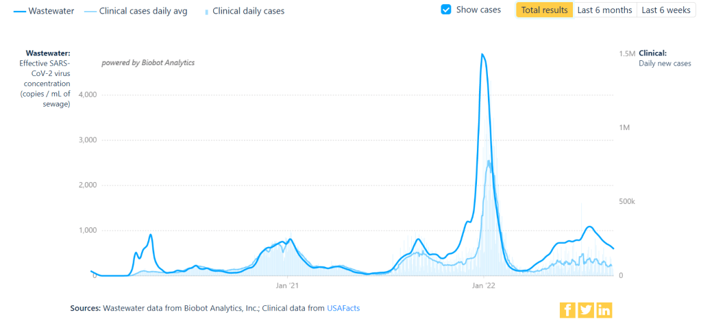
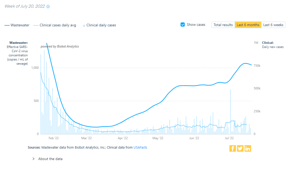
But coronavirus transmission is not currently at low levels by any means. For example, look at Biobot’s national chart showing virus concentration in wastewater compared to officially-reported case numbers. From case numbers alone, you might think that COVID-19 is much less prevalent now than it was in late August or early September last year. But the wastewater data reveal that transmission now is actually pretty close to early-Delta surge levels. (It is, in fact, PCR testing that has declined.)
Similarly, the CDC’s Community Transmission Levels (also known as the older metrics, based on cases and test positivity) show that about 90% of U.S. counties are currently facing high transmission and should require masks indoors. Even the current—and much more lenient—Community Levels suggest that more than half of the country is in a high- or medium-COVID-risk zone.
The summer surge has waned so slowly thanks to the U.S.’s complete abandonment of measures to mitigate COVID-19’s spread, combined with the rise of newer Omicron subvariants. BA.5 continues to dominate here, causing almost 90% of new cases in the week ending September 3, though it’s facing competition from BA.4.6: a version of BA.4 that appears to have a slight advantage.
Most experts agree that we will probably face another surge this fall and winter, as more people gather inside and travel for the holidays. The question is how severe that wave will be, which may be determined via a contest between updated vaccines (more on that later in the issue) and the coronavirus’ continued capacity for mutation.
One potential sign of such a wave: wastewater surveillance in South Africa has picked up an increase in coronavirus concentration, Bloomberg reported yesterday. Also: your usual reminder to be wary of data trends in the days following the holiday weekend.
You might have seen this statistic from President Biden or other White House officials: “COVID deaths are down nearly 90%.” The statistic is misleading and incorrect, to the point that I’d consider it misinformation—especially right now, as the U.S. faces a largely-ignored surge.
Let me explain where this number comes from. The White House is comparing average daily deaths from COVID-19 in recent weeks to this metric during the peak of the winter 2020-2021 surge, when Biden took office.
On January 20, 2021, the day of Biden’s inauguration, about 3,200 people were dying from COVID-19 each day, according to CDC data. This past week, as Biden battled COVID-19, about 400 people were dying each day. The percent change between 3,200 and 400 is about 88%, or “nearly 90%.”
But it’s misleading to just compare daily averages, as Biden has presided over several COVID-19 surges since he took office: the Delta surge last summer and fall, the first Omicron surge in the winter, and the Omicron subvariant surge this spring and summer. In fact, the number of COVID-19 deaths that occurred in the last year (July 2021 to July 2022) is pretty close to what it was in the prior year, and that’s not even accounting for thousands of excess deaths linked to the pandemic.
While Biden’s administration has contributed to COVID-19 vaccines, treatments, testing, and other safety measures, it’s far from eliminating our collective risk from the coronavirus. Always question when you see a percent change without context!
KFF poll shows low vaccine uptake for young kids: This week, the Kaiser Family Foundation released an update from their COVID-19 Vaccine Monitor, an ongoing project tracking U.S. attitudes towards vaccines. This latest update focuses on children under age five, and the results are worrying: about 43% of parents with kids in this age group say they will “definitely not” get their child vaccinated, citing concerns about vaccine safety. Conservative parents and those who are unvaccinated themselves were particularly likely to be against vaccinating their young kids, KFF found.
Vaccine side effects less common for second boosters: A new CDC study, published in this week’s Morbidity and Mortality Weekly Report, tracked reactions to COVID-19 boosters among Americans over age 50 using CDC monitoring systems. Among over 200,000 people who received third and fourth doses from the same vaccine manufacturer, side effects like a sore arm and fatigue were less common after the fourth dose compared to the third dose. Still, uptake for second boosters has been slow and potentially inequitable; the CDC recently published data on second boosters by race/ethnicity, showing that white Americans over age 50 are more likely to get this extra protection than non-white people in this age group.
White House summit on next-generation COVID-19 vaccines: And one more piece of vaccine news for this week: the White House brought together federal officials, scientists, and pharmaceutical executives for a summit discussing next-generation COVID-19 vaccines. The summit highlighted vaccine candidates designed to work against many potential coronavirus variants, as well as those that would be delivered through the nose—potentially producing more protection against coronavirus infection and transmission. Either option would require a lot of funding from a Congress that has been hesitant to support COVID-19 efforts.
States are letting health emergency declarations expire: While the federal declaration of COVID-19 as a public health emergency will remain in place at least through this fall, many states have let their declarations expire in recent months. These expirations impact the resources states are able to allocate for tracking and responding to COVID-19—ranging from data collection to telehealth access. The ending emergencies are certainly contributing to less frequent COVID-19 data updates in many states.
New studies on COVID-19’s origins: Two major studies have conclusively linked the coronavirus’ early spread to the Huanan Seafood Market in Wuhan, China. These studies, both published in Science, were produced by an international group of virologists and evolutionary biologists at the Scripps Research Institute, the University of Arizona, the University of Sydney, the University of Edinburgh, and many other institutions. The experts traced early cases in the seafood market, finding evidence of spillover from animals to humans. The precise origins of COVID-19 are still unknown, but these studies go a long way in demonstrating early spread tied to animals, not a lab leak.
On July 26, 2020, I sent out the first COVID-19 Data Dispatch newsletter. In the two years since that day, I have sent newsletters (and published blog posts) every Sunday, with no breaks. I’ve posted from vacations, over holidays, and on days when I was exhausted or approaching burnout.
While this schedule has felt punishing at times, I’m proud of it. The coronavirus doesn’t care about holiday schedules, after all, and I enjoy maintaining regular updates for the readers relying on this publication as a key source of COVID-19 news. (Also, not many writers can say they’re more consistent than the CDC.)
But even I have to admit that two years without breaks is a long time. When I’m scrambling to send out an issue every Sunday, it’s difficult to reflect on key questions, like, “Is my current posting format meeting readers’ needs?” and, “What does helpful COVID-19 coverage look like right now?” I wouldn’t call myself burned out, but at a few points in the last few months, I have felt like I’m operating on autopilot: writing around 3,000 words every weekend because it’s my routine, without evaluating how I might improve that routine.
This is a rather longwinded way of announcing that I’m about to take a break from the COVID-19 Data Dispatch. August 2022 will be a brief hiatus: over the next four weeks, I won’t write any newsletters or blog posts. I’m also taking this month off of freelancing and working fewer hours at my part-time job, making it basically the longest vacation I’ve had since graduating college.
I plan to use this time to reflect on this project’s future, including potential format and content changes that might make it easier for me to maintain long-term. I’m also going to reflect on some potential CDD side projects—more resources, events, even a podcast idea?—that I haven’t had the bandwidth to pursue while producing weekly issues.
Readers: if you have any feedback for me, please reach out! I would love to hear from you about the topics and formats you’d find helpful at this point in the pandemic.
I also wanted to share some tips for keeping track of COVID-19 data while this publication is on a break, as I’m very aware that we are still in an active surge across the country. (This post is also responding to a reader question that I received from a fellow data reporter last week, after I announced this upcoming break in the newsletter.)
Look at multiple data sources or metrics.
COVID-19 case data, once our best window into the virus’ spread, are becoming much less reliable thanks to a decline in PCR testing. Other singular metrics have their own flaws: hospitalization numbers often lump together patients admitted for severe COVID-19 symptoms with those who tested positive while admitted for other reasons; wastewater data are unevenly reported across the country and can be hard to interpret; death data lag significantly behind transmission trends, and so on.
As a result, it’s important to check a few different metrics rather than relying on just one. For example, you might notice that my “National numbers” posts these days typically cite cases, hospital admissions, and wastewater together to identify national trends.
Similarly, if I were trying to identify what’s going on in New York City, where I live, I would likely look at: case and test positivity data from the city health department, cases in public schools (which include positive at-home test results) compiled by the department of education, and wastewater data from Biobot, focusing on the northeast region and counties in the greater NYC area.
Case rates are still useful, if we acknowledge that they are undercounts.
Hospitalization rates are useful, particularly new hospital admissions.
The CDC’s old transmission level guidance is still actually pretty helpful for guiding health policies, especially for vulnerable populations.
Look at wastewater surveillance, if it’s available in your area.
The COVID Cast dashboard, from Carnegie Mellon University’s Delphi Group, is another helpful source.
Look at multi-week trends.
Just as you don’t want to rely on a single metric, you shouldn’t look at only one week of data. (Looking at just one or two days at a time is an even worse idea.) This has always been a good rule for interpreting COVID-19 numbers, but it’s even more true now, as many public health departments have fewer resources devoted to tracking COVID-19—and may take more time to compile data for a given day or week.
For example, the New York City health department’s daily updates to its COVID-19 dashboard frequently include changes to case numbers for prior days, in addition to new data for the past day. Experts call this “backdating”: in a data update on a Friday, new cases might be dated back to other days earlier in the week, changing broader trends.
Keep in mind data reporting schedules.
You especially need to be wary of backdating when there’s a holiday or some other interruption in reporting. For this reason, it’s important to keep track of reporting schedules: know when a health department is and is not updating their data, and interpret the data accordingly.
The biggest example of this is that most state and local health departments—and the CDC itself—are no longer updating COVID-19 data on weekends. In most places, every Saturday and Sunday is now essentially a mini-holiday, with numbers from those days incorporated into backdated updates on Mondays. (And then edited in further backdated updates on later weekdays.)
When I volunteered at the COVID Tracking Project, we regularly observed lower COVID-19 numbers on weekends, followed by increases towards the middle of the week when states “caught up” on cases that they didn’t report over the weekend. You can read more about this trend here; I suspect it has only become more pronounced as more places take weekends off.
Acknowledge uncertainty in the data.
This is the most important recommendation I can give you. Every COVID-19 number you see comes with a margin of error. Sometimes, we can approximate that margin of error: for example, we can estimate how far official COVID-19 death statistics might be off by looking at excess deaths. Sometimes, we really can’t: estimates of how far official case numbers might be off range from a factor of three to a factor of thirty.
As a result, it’s often helpful to look at trends in the data, rather than trying to approximate exactly how many people in your town or county have COVID-19 right now. Is transmission trending up or down? Are you at high risk of encountering the coronavirus if you go to a large gathering? These questions can still be answered, but the answers will never be as precise as we’d like.
Follow leaders from your local healthcare system.
To augment official data sources, I often find it helpful to see what people in healthcare settings are saying about COVID-19 trends. Experts like Dr. Craig Spencer (who works in an ER in NYC) and Dr. Bob Wachter (who leads the University of California San Francisco’s department of medicine) frequently share updates about what they’re seeing in their practices. This kind of anecdotal evidence can help back up trends in case or hospitalization data.
In a similar vein, you can look to essential workers in your community, like teachers and food service workers, as early indicators for transmission trends. If NYC teachers and parents are talking about more cases in their schools, for example, I know COVID-19 spread is increasing—because schools are often sources for transmission in the broader community.
Keep your goals in mind.
As you monitor COVID-19 numbers, it’s important to remember why this information is valuable. What are you using the numbers for? Are you making choices about when to put a mask on, or when to rapid test before a gathering? Are there high-risk people in your family or your broader social network whom you’re trying to protect? Or, if you’re a journalist, what questions are you trying to help your readers answer?
Keeping track of COVID-19 data and news can feel like a large burden, especially when it seems like so many people have entirely forgotten about the pandemic. I always find it helpful to remember why I do this: to stay informed about this ongoing health crisis, and to keep others in my community safe.
In the past week (July 23 through 29), the U.S. reported about 880,000 new COVID-19 cases, according to the CDC. This amounts to:
An average of 130,000 new cases each day
269 total new cases for every 100,000 Americans
1% fewer new cases than last week (July 16-22)
In the past week, the U.S. also reported about 44,000 new COVID-19 patients admitted to hospitals. This amounts to:
An average of 6,300 new admissions each day
13.5 total admissions for every 100,000 Americans
2% more new admissions than last week
Additionally, the U.S. reported:
2,500 new COVID-19 deaths (0.8 for every 100,000 people)
82% of new cases are caused by Omicron BA.5; 13% by BA.4 (as of July 23)
An average of 100,000 vaccinations per day (per Bloomberg)
The U.S.’s Omicron BA.5 wave appears to be creeping past its plateau, according to several major indicators. Nationwide, 1% fewer new cases were reported this week compared to last week, the second week in a row of clear deceleration in this metric (with no major holidays interrupting reports).
New hospital admissions are also slowing down: the number of COVID-19 patients newly admitted to hospitals this week was only 2% higher than it was last week. It’s a smaller increase than any reported week-over-week in the last couple of months.
And the plateau is showing up in wastewater, too: data from Biobot Analytics show that the coronavirus concentration in America’s sewers dipped slightly last week in all four regions of the country. About 55% of sewersheds in the CDC’s wastewater surveillance network reported coronavirus decreases or very slight increases in the last week, compared to 45% reporting more significant increases.
To me, these metrics are suggesting that the Omicron subvariant wave may be, finally, running out of people to infect (or reinfect). But the decline is incredibly slow, likely because the U.S. has taken almost no measures to curb transmission.
The CDC’s community transmission guidance (also known as the old guidance, pre-February 2022 switch to “Community Levels”) suggests that Americans in 98% of counties should be masking indoors right now. But almost no state or local public health departments have actually brought back mask requirements. Even Los Angeles County failed to institute its planned indoor mask mandate, due to public pushback at the measure and cases trending down.
Remember all the gaslighting from folks who said ‘we have to get rid of masks now while cases are lower so we have more credibility to bring them back when cases get higher’ and now we’ve met the metrics for being back masks and… nothing. https://t.co/3GGMjwgDTg
Meanwhile, testing indicators continue to suggest that reported case counts are a small fraction of the actual coronavirus infections happening across the country right now. The national PCR test positivity rate was 18% last week, according to the CDC; and almost every state reported a positivity rate over 10%, according to the July 28 Community Profile Report. (Experts consider test positivity over 10% to be evidence of high transmission and insufficient testing.)
As fewer PCR tests are conducted, the companies that process these tests are laying off workers and cutting their capacity, according to the Wall Street Journal. Even some companies that make at-home rapid tests are taking these measures, though rapid test capacity is still much higher than PCR testing capacity right now.
The safety measures that can prevent coronavirus transmission have not changed with BA.5. Individuals and small communities still have the ability to keep using masks, testing, gathering in outdoor spaces, etc., even as our institutions fail to keep us safe.
This is not a direct COVID-19 callout, but I wanted to acknowledge that many of the public health failures we saw early in the COVID-19 crisis are now being repeated with monkeypox—which the WHO just declared a global health emergency.
One major issue is a shortage of tests, leading public health experts to suggest that the true number of cases is much higher than what’s been reported. Also, while vaccines are available for monkeypox, the rollout has been inaccessible and inequitable, with very limited appointments in hotspots like NYC. ACT UP actually held a protest in the city last week to criticize local and federal officials for these issues.
According to BuzzFeed News coverage of the ACT UP protest, their demands included: “an ‘emergency safety net fund’ for those testing positive, increased access to vaccines, language-inclusive educational resources, and adequate staffing for both vaccination sites and quarantine locations.” All of which sounds familiar!
New CDC report on drug overdose deaths during the pandemic: Drug overdose deaths increased by 30% from 2019 to 2020, according to a new CDC report compiling data from 25 states and D.C. But this increase was higher for Black and Native Americans: deaths among these groups increased by 44% and 39%, respectively. The full report includes more details on how overdose deaths disproportionately occurred in Black and Native populations, as well as the need for more easily accessible treatments for substance abuse.
CDC survey of public health workers: Another CDC report that caught my attention this week presented results from a national survey of state and local public health workers in 2021. Almost three in four of the workers surveyed were involved with COVID-19 response last year. The survey provides further evidence of burnout among public health workers: 40% of those surveyed reported that they intend to leave their jobs within the next five years.
COVID-19 testing options: COVID-19 Testing Commons is a research group at Arizona State University’s College of Health Solutions that has compiled comprehensive information about COVID-19 tests available worldwide. You can search the database for tests by company, platform, type of specimen collected, regulatory status, and more. The group also recently compiled a report summarizing these testing options in the pandemic to date.
Congressional hearing on Long COVID: This week, Congress’s Select Subcommittee on the Coronavirus Crisis held a hearing specifically about Long COVID. Congressmembers heard from Long COVID patient advocates and researchers about the impacts of this condition and the urgent need for more research and support. I highly recommend reading or listening to the testimony of Hannah Davis, cofounder of the Patient-Led Research Collaborative, for a powerful summary of these impacts and needs. (If you’re watching the video: her testimony starts at about 28:50.)
CDC recommends Novavax vaccine: The CDC has officially authorized Novavax’s COVID-19 vaccine, following the FDA authorization that I mentioned in last week’s issue. Novavax’s vaccine is protein-based, which is an older type of vaccine but has been less common for COVID-19; some experts are hopeful that people who have hesitated with the mRNA vaccines may be more likely to get Novavax. Dr. Katelyn Jetelina has a helpful summary of this vaccine’s potential impact at Your Local Epidemiologist.
NYC prevalence preprint updated: I’ve linked a couple of times to this study from a group at the City University of New York, with the striking finding that an estimated one in five New Yorkers got COVID-19 during a two-week period in the BA.2/BA.2.12.1 surge. The researchers recently revised and updated their study, based on some feedback from the scientific community. Their primary conclusions are unchanged, lead author Denis Nash wrote in a Twitter thread, but the updated study includes some context about population immunity and NYC surveillance.
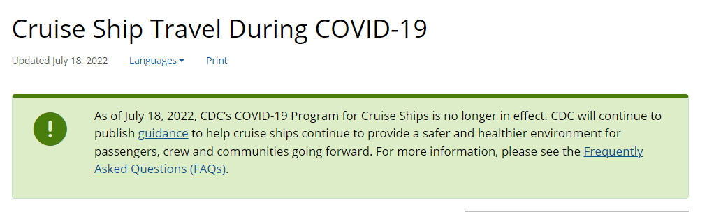
The CDC is no longer publishing data about COVID-19 outbreaks on cruise ships.
Last week, 93 out of 94 cruise ships reporting COVID-19 data to the CDC had active outbreaks, meeting the agency’s threshold of cases in at least 0.3% of passengers and crew.
As of July 18, 2022, CDC’s COVID-19 Program for Cruise Ships is no longer in effect. CDC will continue to publish guidance to help cruise ships continue to provide a safer and healthier environment for passengers, crew and communities going forward.
This seems a bit suspicious, considering that the U.S. (including cruise ships) is in the middle of a COVID-19 surge driven by the highly transmissible Omicron BA.5 variant. In a statement to the Washington Post, CDC spokesperson Kristen Nordlund said: “CDC has determined that the cruise industry has access to the necessary tools… to prevent and mitigate COVID-19 on board.”
But there have been no substantial changes to COVID-19 safety measures on cruise ships that might merit this change, according to the Post; in fact, cruises have only become more lenient since the beginning of 2022. Some cruise lines have stopped requiring tests before passengers board a ship.
Cruise lines will continue to report COVID-19 data to the CDC, but the process is voluntary. And without public data from cruise ships, passengers trying to decide whether they should proceed with a trip will need to call a cruise line directly to ask about potential outbreaks.
I’ve heard some commentators say that the end of the mask mandate on airplanes in April was a turning point in U.S. attitudes towards the pandemic. The end of cruise ship data feels like another potential turning point, demonstrating how the CDC is slowly pulling resources out of its COVID-19 response—even as the country faces a dangerous surge.
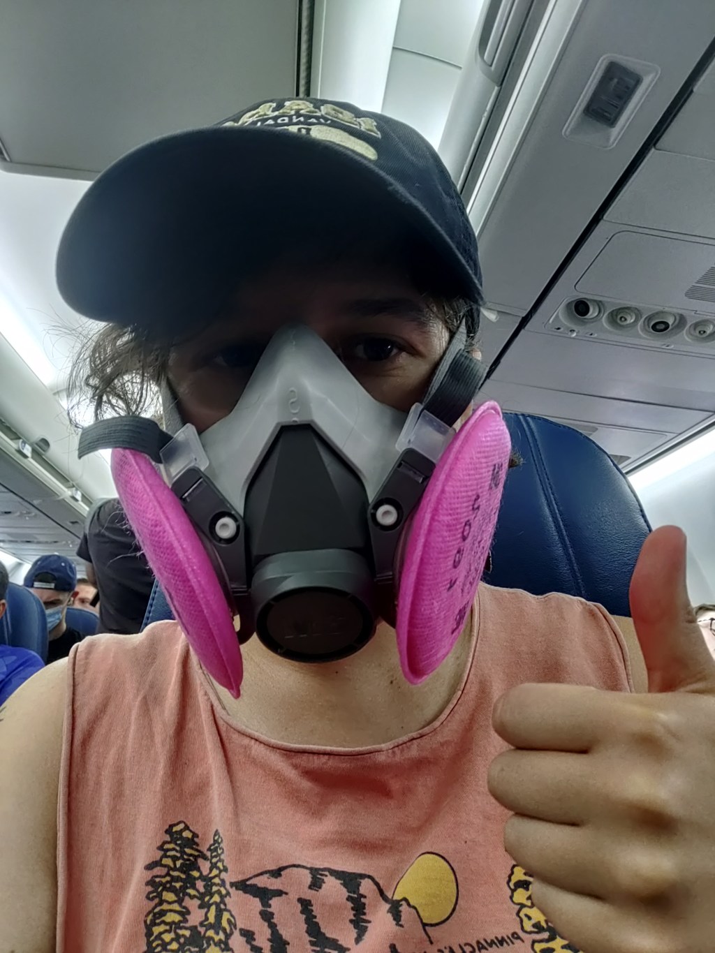
The author in a 3M respirator (with P100 filters), on the plane to Denver, Colorado.
This weekend, I traveled to Denver, Colorado for the final trip in an early-career fellowship which has covered some travel and trainings for me this past year.
Of course, going anywhere on a plane right now, during an intense COVID-19 surge, is not something I’d normally choose to do. This is basically my one plane trip of the summer; all my other travel has been by train and/or car. (And the fellowship event itself had some safety measures in place, eg. required masks and rapid tests.)
But I know a lot of people are traveling by plane right now—I know, because I saw so many of them at JFK Airport. So, I wanted to share a few things I did on this trip to reduce my risk.
First: I bought a respirator. These devices, considered to be a step above N95s/KN95s, are intended for use in occupational settings, such as for workers in chemical plants or firefighters going into smoke. You can read more about them on this CDC NIOSH (National Institute for Occupational Safety and Health) page.
I think of mine like a reusable N95 mask, with great longevity and an excellent seal to my face. I ordered one from 3M, which has several NIOSH-approved options. I also learned more about different respirators at Patient Knowhow, a site with reviews of a few major N95-equivalent options. (I recently talked to the site’s founder, Devabhaktuni Srikrishna, for an upcoming article on ventilation.)
plane trip with respirator was a success! TSA asked me to take it off when I went through security (so I put on a disposable mask for a few minutes), but otherwise I had no issues. pic.twitter.com/SDUA4slIQY
It’s important to note that, if you get one of these respirators, you may need to order air filters separately. I got P100 filters, which are the highest grade. Another add-on may be an exhalation valve filter, which cleans the air you exhale out of your respirator (basically, further ensuring that you aren’t getting other people sick as you wear it).
Now, one challenge with these respirators is that they may freak people out a little. I feel like a bug-eyed sci-fi villain with mine on; though I’m well-accustomed to NYC’s blase attitude towards weird behavior, so I don’t mind if I freak people out. For others, this could be a greater concern.
Respirators also aren’t common mask options yet, though they seem to be growing more popular—my Twitter selfie of me in my respirator on the plane got over 200 likes. But they aren’t yet well-known in transit settings. While I personally didn’t have issues (other than a bit of confusion at JFK’s security screening), I know that others have been told to take these off on flights. It’s good to have a backup N95/KN95 in case that happens.
Second: I follow guidance from ventilation experts. If you’d like to read about how plane ventilation works, masking options, and other small ways to improve travel safety, you can find a lot of this advice on Twitter. “Ventilation Twitter,” as I recently described it to a journalist friend, is generally very welcoming and willing to triage questions.
One key piece of advice: while I kept my respirator on throughout my flights (seriously, the briefest breaks possible for water and food), I made especially sure to stay masked while planes were at the gate or landing. These are the points in a flight when the plane’s ventilation system isn’t switched on, making masking more important.
Saahil Desai provides a helpful explanation of these priority periods for masking in a recent Atlantic article. Though I’d like to note, some experts have suggested that the article downplays the importance of masking as much as you can throughout a flight and using other safety strategies as well.
More helpful threads on this subject…
Top 10 tips everyone should know about wearing #N95 & #elastomeric masks.
Third: I avoid indoor dining as much as possible. This is, of course, one of the highest-risk settings for catching the coronavirus, because you have to take your mask off to eat or drink—while others nearby are also unmasking to eat or drink.
Sometimes, one can be put into tricky situations when there are truly no outdoor dining options (such as on a long airplane trip). But even in that scenario, there are ways to reduce risk. For example, when I needed to eat breakfast at JFK Airport, I found a corner of an unused gate where I could be relatively far from other people, rather than sitting in a crowded food court area.
I also appreciated that the other fellows in my group followed my recommendation for an outdoor dinner on Thursday evening, before our official activities started!
And finally: lots of testing. Remember, rapid tests can indicate whether you’re actively spreading the coronavirus, but PCR tests are still the gold standard for accuracy. I try to get PCR tests before and after travel or large gatherings, to be certain of my status. (Though I acknowledge that I live in NYC, where public testing is still available, albeit in decline.)
This trip went from Thursday to Saturday, with the riskiest event being an indoor dinner on Friday evening. My tests included: PCR test on Wednesday (same-day results); rapid test on Thursday morning; rapid test on Friday morning; rapid test on Friday evening (right before the dinner); rapid test on Saturday morning; and a planned PCR test for next Wednesday or Thursday. Rapid tests and symptom monitoring were also required for the rest of my group.
Is all of this inconvenient? Sure, somewhat. But I consider it worthwhile to have a safe trip and protect the people around me. If you have other safety tips or questions on this topic to share, please reach out and let me know.
Has the BA.5 surge reached a plateau? Data from wastewater and other sources seem to suggest, maybe. Chart via Biobot Analytics.
In the past week (July 16 through 22), the U.S. reported about 880,000 new COVID-19 cases, according to the CDC. This amounts to:
An average of 130,000 new cases each day
268 total new cases for every 100,000 Americans
1% more new cases than last week (July 9-15)
In the past week, the U.S. also reported about 43,000 new COVID-19 patients admitted to hospitals. This amounts to:
An average of 6,200 new admissions each day
13.2 total admissions for every 100,000 Americans
5% more new admissions than last week
Additionally, the U.S. reported:
2,400 new COVID-19 deaths (0.7 for every 100,000 people)
78% of new cases are caused by Omicron BA.5; 13% by BA.4 (as of July 16)
An average of 100,000 vaccinations per day (per Bloomberg)
Reported COVID-19 cases and hospital admissions seem to suggest that maybe the BA.5 surge is slowing down, at the national level. (And it is, definitively, the BA.5 surge, with almost 80% of new cases caused by this subvariant in the week ending July 16). According to CDC data, new cases only increased by 1% this week, compared to the week prior; last week, they increased by 17%.
New hospital admissions, similarly, increased by 5% this week, compared to 15% the week prior. And wastewater data from Biobot are showing a potential national plateau in the last week, with very slight increases or decreases in all four main regions of the country.
The CDC’s wastewater monitoring also shows that “most of the country is reporting moderate to high SARS-CoV-2 levels in wastewater.” About half of the 800 sites in the CDC network reported a decrease in coronavirus levels in the last two weeks, while 43% reported an increase.
These are all good signs. But I’m skeptical that we’re anywhere near the end of this current surge, for a few reasons. First, the continued underreporting of cases makes it difficult to evaluate case data, both nationally and in local settings. (For example, is NYC actually seeing a decline in transmission, or is the recent decline there a result of less PCR testing?) The CDC reported a national PCR test positivity of 17% last week, and it’s even higher in many states.
Second, the declines we’re seeing in hospital admissions and coronavirus levels in wastewater—both more reliable indicators than cases—are very slight. These patterns suggest that, while we may be near the peak of the BA.5 surge, it could take several weeks for it to actually abate. And by the time that happens, another new variant (maybe BA.2.75, maybe something else entirely) could likely come in and bump transmission again.
Finally, the U.S. as a whole is doing very little to manage this surge. I think this subheading from a recent POLITICO Pro article provides a good summary of the situation: “Strategies for managing 130,000 new daily Covid cases are largely the same as they were for managing 30,000 new daily cases four months ago.”
There’s been a slight uptick in second booster shots for Americans over age 50, according to CDC data. And a few, isolated localities are considering new mask mandates. But by and large, most people are heading into potential reinfection from BA.5 with limited protection. Stay safe out there.