
On July 26, 2020, I sent out the first COVID-19 Data Dispatch newsletter. In the two years since that day, I have sent newsletters (and published blog posts) every Sunday, with no breaks. I’ve posted from vacations, over holidays, and on days when I was exhausted or approaching burnout.
While this schedule has felt punishing at times, I’m proud of it. The coronavirus doesn’t care about holiday schedules, after all, and I enjoy maintaining regular updates for the readers relying on this publication as a key source of COVID-19 news. (Also, not many writers can say they’re more consistent than the CDC.)
But even I have to admit that two years without breaks is a long time. When I’m scrambling to send out an issue every Sunday, it’s difficult to reflect on key questions, like, “Is my current posting format meeting readers’ needs?” and, “What does helpful COVID-19 coverage look like right now?” I wouldn’t call myself burned out, but at a few points in the last few months, I have felt like I’m operating on autopilot: writing around 3,000 words every weekend because it’s my routine, without evaluating how I might improve that routine.
This is a rather longwinded way of announcing that I’m about to take a break from the COVID-19 Data Dispatch. August 2022 will be a brief hiatus: over the next four weeks, I won’t write any newsletters or blog posts. I’m also taking this month off of freelancing and working fewer hours at my part-time job, making it basically the longest vacation I’ve had since graduating college.
I plan to use this time to reflect on this project’s future, including potential format and content changes that might make it easier for me to maintain long-term. I’m also going to reflect on some potential CDD side projects—more resources, events, even a podcast idea?—that I haven’t had the bandwidth to pursue while producing weekly issues.
Readers: if you have any feedback for me, please reach out! I would love to hear from you about the topics and formats you’d find helpful at this point in the pandemic.
I also wanted to share some tips for keeping track of COVID-19 data while this publication is on a break, as I’m very aware that we are still in an active surge across the country. (This post is also responding to a reader question that I received from a fellow data reporter last week, after I announced this upcoming break in the newsletter.)
Look at multiple data sources or metrics.
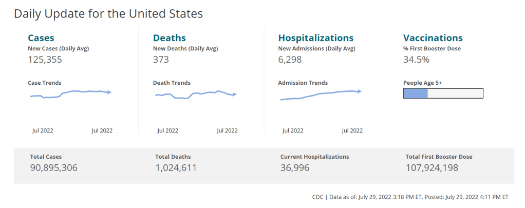
COVID-19 case data, once our best window into the virus’ spread, are becoming much less reliable thanks to a decline in PCR testing. Other singular metrics have their own flaws: hospitalization numbers often lump together patients admitted for severe COVID-19 symptoms with those who tested positive while admitted for other reasons; wastewater data are unevenly reported across the country and can be hard to interpret; death data lag significantly behind transmission trends, and so on.
As a result, it’s important to check a few different metrics rather than relying on just one. For example, you might notice that my “National numbers” posts these days typically cite cases, hospital admissions, and wastewater together to identify national trends.
Similarly, if I were trying to identify what’s going on in New York City, where I live, I would likely look at: case and test positivity data from the city health department, cases in public schools (which include positive at-home test results) compiled by the department of education, and wastewater data from Biobot, focusing on the northeast region and counties in the greater NYC area.
In May, I wrote a post listing datasets that I’d recommend looking at during the Omicron subvariant surge. Much of that advice still holds true, two months later. Here’s the summary (though you should check out the full post, if you haven’t read it):
- Case rates are still useful, if we acknowledge that they are undercounts.
- Hospitalization rates are useful, particularly new hospital admissions.
- The CDC’s old transmission level guidance is still actually pretty helpful for guiding health policies, especially for vulnerable populations.
- Look at wastewater surveillance, if it’s available in your area.
- The COVID Cast dashboard, from Carnegie Mellon University’s Delphi Group, is another helpful source.
Look at multi-week trends.
Just as you don’t want to rely on a single metric, you shouldn’t look at only one week of data. (Looking at just one or two days at a time is an even worse idea.) This has always been a good rule for interpreting COVID-19 numbers, but it’s even more true now, as many public health departments have fewer resources devoted to tracking COVID-19—and may take more time to compile data for a given day or week.
For example, the New York City health department’s daily updates to its COVID-19 dashboard frequently include changes to case numbers for prior days, in addition to new data for the past day. Experts call this “backdating”: in a data update on a Friday, new cases might be dated back to other days earlier in the week, changing broader trends.
Keep in mind data reporting schedules.
You especially need to be wary of backdating when there’s a holiday or some other interruption in reporting. For this reason, it’s important to keep track of reporting schedules: know when a health department is and is not updating their data, and interpret the data accordingly.
The biggest example of this is that most state and local health departments—and the CDC itself—are no longer updating COVID-19 data on weekends. In most places, every Saturday and Sunday is now essentially a mini-holiday, with numbers from those days incorporated into backdated updates on Mondays. (And then edited in further backdated updates on later weekdays.)
When I volunteered at the COVID Tracking Project, we regularly observed lower COVID-19 numbers on weekends, followed by increases towards the middle of the week when states “caught up” on cases that they didn’t report over the weekend. You can read more about this trend here; I suspect it has only become more pronounced as more places take weekends off.
Acknowledge uncertainty in the data.
This is the most important recommendation I can give you. Every COVID-19 number you see comes with a margin of error. Sometimes, we can approximate that margin of error: for example, we can estimate how far official COVID-19 death statistics might be off by looking at excess deaths. Sometimes, we really can’t: estimates of how far official case numbers might be off range from a factor of three to a factor of thirty.
As a result, it’s often helpful to look at trends in the data, rather than trying to approximate exactly how many people in your town or county have COVID-19 right now. Is transmission trending up or down? Are you at high risk of encountering the coronavirus if you go to a large gathering? These questions can still be answered, but the answers will never be as precise as we’d like.
Follow leaders from your local healthcare system.
To augment official data sources, I often find it helpful to see what people in healthcare settings are saying about COVID-19 trends. Experts like Dr. Craig Spencer (who works in an ER in NYC) and Dr. Bob Wachter (who leads the University of California San Francisco’s department of medicine) frequently share updates about what they’re seeing in their practices. This kind of anecdotal evidence can help back up trends in case or hospitalization data.
In a similar vein, you can look to essential workers in your community, like teachers and food service workers, as early indicators for transmission trends. If NYC teachers and parents are talking about more cases in their schools, for example, I know COVID-19 spread is increasing—because schools are often sources for transmission in the broader community.
Keep your goals in mind.
As you monitor COVID-19 numbers, it’s important to remember why this information is valuable. What are you using the numbers for? Are you making choices about when to put a mask on, or when to rapid test before a gathering? Are there high-risk people in your family or your broader social network whom you’re trying to protect? Or, if you’re a journalist, what questions are you trying to help your readers answer?
Keeping track of COVID-19 data and news can feel like a large burden, especially when it seems like so many people have entirely forgotten about the pandemic. I always find it helpful to remember why I do this: to stay informed about this ongoing health crisis, and to keep others in my community safe.

Leave a comment