
As official COVID-19 case data become less and less reliable, wastewater surveillance can help provide a picture of where and how much the virus is spreading. This week, I put together a new COVID-19 Data Dispatch resource page that outlines major national, state, and local wastewater dashboards across the U.S.
Of course, wastewater surveillance is not capable of completely replacing clinical data. Wastewater testing is still pretty spotty across the country (though almost all states are now represented on the CDC’s dashboard), while scientists and public health officials are still working to determine how best to interpret and use these data; see my April FiveThirtyEight article for more on these challenges. There are also equity concerns around which communities have access to wastewater surveillance, as discussed in this recent paper from Colleen Naughton et al.
Still, if you live in a place where wastewater data are publicly available, I highly recommend keeping an eye on these numbers. Trends in wastewater data tend to closely match—or preempt—trends in case data, and wastewater testing includes everyone in a sewershed regardless of their access to (or interest in) getting a PCR test. This is one of the best COVID-19 indicators we have right now.
In the U.S., there are currently two main national wastewater dashboards:
- CDC’s National Wastewater Surveillance System (NWSS) dashboard: This dashboard presents data from about 800 sewershed sites across the country, including both those managed by state and local health departments and those tested through the CDC’s contract with Biobot. Different data providers have different testing and analysis methods, which can make it difficult to interpret the information here on a national scale. But, if your state or county is represented on the dashboard, you can click into an individual site to see coronavirus trends. Historical data are available for download here.
- Biobot Network dashboard: In addition to the company’s contract with the CDC, Biobot also tests wastewater at hundreds of sites across the country though its free Biobot Network, as well as through paid contracts with individual health departments and wastewater treatment plants. Biobot presents data from these non-CDC sites on its dashboard, updated weekly. One advantage of the Biobot dashboard over the CDC’s is that all Biobot sites are tested and analyzed with a uniform methodology, making the data easier to interpret. Data are available for download here.
My resource page also links out to COVIDPoops19, a dashboard summarizing wastewater monitoring efforts around the world. Run by researchers at the University of California Merced, this project links out to almost 150 public and academic wastewater sites. If you’re looking for wastewater surveillance in your area, this dashboard may be a good place to check.
At the smaller level, my page includes 17 statewide wastewater dashboards, seven at the local level (dedicated to a specific city or metropolitan area), and four at the regional level (representing multiple counties in a state).
While many more states are doing wastewater surveillance, the majority of state health departments have not yet developed their own dashboards—redirecting residents to the CDC NWSS site. Personally, I think some state-specific dashboards are much easier to navigate and interpret than the CDC’s, and would like to see more states produce their own. But I understand the resource limitations here.
Here are a few state and local dashboards I’d like to highlight:
- Boston, Massachusetts: The Massachusetts Water Resources Authority’s dashboard is one of the oldest in the U.S., launched in spring 2020 through a partnership with Biobot. It’s fairly simple (presenting static images, not interactive dashboards), and easy to interpret, with charts showing long-term and short-term trends.
- Colorado: Colorado’s dashboard follows a common format for presenting wastewater surveillance data: users are presented with a map of wastewater service areas, and can click into a specific area to see coronavirus trends for that sewershed. This state is also planning to expand wastewater testing to schools and other specific buildings, according to local reporting.
- Maine: Maine’s wastewater “dashboard” is really a collection of PDF reports, posted for individual counties at regular intervals. The PDFs come directly from Biobot, which is running the state’s surveillance through a contract with the Maine CDC; I find it interesting to see the report format Biobot is using for its clients.
- New York State: Researchers at Syracuse University, the State University of New York (SUNY), state departments of health and environmental conservation, and others collaborate on this wastewater surveillance project, which includes 54 counties and 90 treatment plants. Notably, the project does not include the five boroughs of New York City; the city has its own wastewater surveillance effort, but does not have its own dashboard. (NYC sites haven’t been updated on the CDC dashboard since April.)
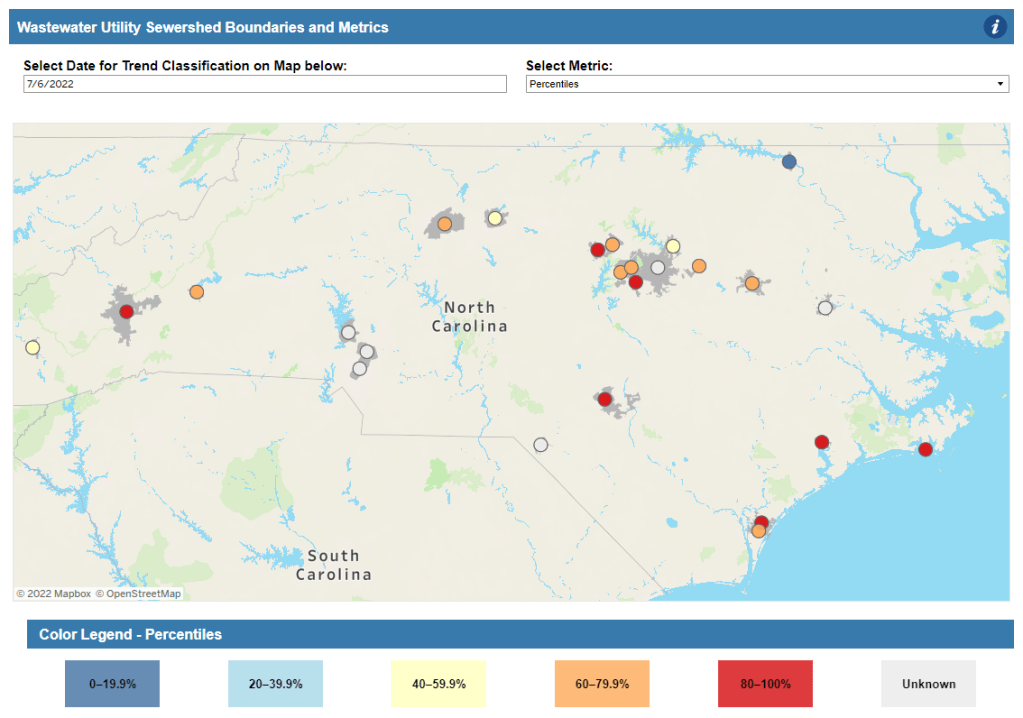
- North Carolina: Similarly to Colorado’s, North Carolina’s wastewater dashboard allows users to click into specific sites for coronavirus trends. This dashboard also provides reported case trends for comparison and information about concentration percentiles, similar to the metrics used by the CDC. It also gives users a lot of information about where the data come from—good for transparency!
- Twin Cities, Minnesota: The Metropolitan Council, a local agency in the Twin Cities, Minnesota metro area, has monitored COVID-19 in wastewater since early in the pandemic; I shared an interview with a lead scientist there in April. Recently, the Met Council added variant information to its dashboard, showing which versions of the virus are currently driving spread (BA.5 is taking the lead right now).
I know (from looking at the COVIDPoops19 dashboard) that my new resource page includes a small sample of academic and local wastewater sites; I chose to focus on those at the state level and for larger metro areas due to my own capacity. But if there’s another dashboard that you’d like to see added to the page, please reach out and let me know! I’ll try to keep it updated on a monthly cadence.

Leave a comment