Blog

  • COVID source callout: The CDC’s slow variant updates

    COVID source callout: The CDC’s slow variant updates

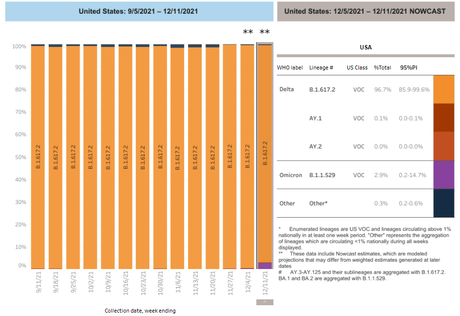
    Due to reporting delays, the CDC’s variant data fails to convey Omicron’s rapid spread through the country. Chart retrieved on December 19.

    On Tuesday, the CDC updated the Variant Proportions tab of its COVID-19 data dashboard. This update included some alarming information: Omicron had jumped from causing about 0.4% of cases in the week ending December 4, to 2.9% of cases in the week ending December 11. In the New York and New Jersey area, it was causing 13% of cases.

    At this rate of increase, we can anticipate that, as of yesterday (December 18), Omicron is already causing roughly 21% of cases in the U.S.—and more than 90% of cases in New York and New Jersey. But because of the CDC’s delayed updates, the majority of people who go look at the CDC’s dashboard anytime before its next update, this coming Tuesday, would likely presume that Omicron is still causing a tiny minority of cases.

    I’ve written before about the delays in collecting and reporting coronavirus sequencing data. It can take weeks for a COVID-19 test sample to go from a patient’s nose to a nationwide sequencing database, which leads to inevitable lags in the U.S.’s genomic surveillance. This is understandable. But in a crisis moment, when Omicron is here and spreading rapidly, the agency should clearly label the lags and update its projections to provide a more accurate view of the variant’s growth. 

    What’s more, the CDC’s data update on Tuesday was not communicated widely; Director Dr. Rochelle Walensky gave a TODAY Show interview, and that was about it.

  • Featured sources, December 19

    • COVID-19 preventable mortality and leading cause of death ranking: The Peterson-KFF Health System Tracker has recently updated its analysis of preventable deaths from COVID-19 and the disease’s position among top causes of death in the U.S. In November 2021, COVID-19 was the #3 cause of death after heart disease and cancer. And, between June and November, more than 160,000 COVID-19 deaths could have been prevented with vaccinations.
    • AARP analysis of nursing home data: AARP researchers have analyzed and visualized data showing staff shortages in nursing homes, along with vaccination rates, PPE availability, and other related figures. According to AARP’s analysis, almost one-third of the 15,000 nursing homes in the U.S. “recently reported a shortage of nurses or aides,” as of mid-November. (H/t Al Tompkins’ COVID-19 newsletter.)
    • News workers laid off and outlets closed during the pandemic: At least 6,154 workers at news organizations were laid off between March 2020 and August 2021, according to a new report from Columbia Journalism Review. And at least 100 organizations closed during this time, though 14 have since resumed operations to some extent. The report includes detailed data on these layoffs and organization closures.
    • Recommendations to transform public health data in the U.S.: The Robert Wood Johnson Foundation, a health philanthropy organization, has convened a commission of experts to reimagine how public health data are collected, shared, and used in the U.S. The commission put together this report, which includes recommendations ranging from data literacy to racial equity. While the report doesn’t include much data, per se, I wanted to include it in this week’s issue as a resource—and a source for potential story ideas.
    • Science Literacy Resource Guide: The Science Literacy Foundation, a new nonprofit in the scicomm space, had compiled this database of science literacy-related resources. It includes resources specific to journalism, communication, education, policy, and research; the guide isn’t COVID-specific, but has a lot of utility for continued pandemic coverage. (Disclaimer: I’ve previously worked on a project for the Science Literacy Foundation, but was not involved with this guide.)

  • Send me your favorite COVID-19 data stories of 2021

    In late December last year, I shared a list of news stories and projects that I considered the 20 best COVID-19 data stories of 2020. The list ranged from early STAT News coverage of the novel coronavirus, to a FiveThirtyEight investigation of testing access, to THE CITY’s online memorial of New Yorkers who lost their lives to COVID-19.

    I enjoyed compiling the list because it gave me a way to look back on COVID-19 news coverage throughout 2020, with a focus on those stories that dug into the numbers—whether that was visualizing pandemic trends or explaining an issue with data collection and reporting. (Also, it was a fairly straightforward issue to compile and send out two days after Christmas!)

    This year, I’m planning to compile a similar list: the 21 best COVID-19 data stories of 2021

    And I need your help to pick these stories! Last year’s list was very U.S.-heavy, as I primarily read coverage from national and New York city-specific publications, and I would love to make this year’s list more geographically diverse. Please send me COVID-19 data stories you loved from your local news outlet, your favorite science journalist, or any other publication.

    To submit ideas, you can comment below, email me at betsy@coviddatadispatch.com, or reach out on Twitter or Facebook. My full list will go out in next week’s issue, on December 26, and I’ll accept submissions until the 25th.

  • We failed to vaccinate the world in 2021; will 2022 be more successful?

    We failed to vaccinate the world in 2021; will 2022 be more successful?

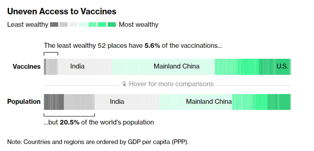
    According to Bloomberg, the 52 least wealthy places in the world have 5.6% of the vaccinations. Chart from Bloomberg’s vaccine tracker, screenshot taken on December 19.

    In January, COVAX set a goal that many global health advocates considered modest: delivering 2.3 billion vaccine doses to low- and middle-income countries by the end of 2021. COVAX (or COVID-19 Vaccines Global Access) is an initiative to provide equitable access to vaccines; its leadership includes the United Nations, the World Health Organization (WHO), and other organizations.

    Despite COVAX’s broad support, the initiative has revised its vaccine delivery projections down again and again this year. Now, the initiative is saying it’ll deliver just 800 million vaccine doses by the end of 2021, according to the Washington Post, and only about 600 million had been delivered by early December.

    Considering that most COVID-19 vaccines are two-dose series—and boosters will likely be necessary to combat Omicron—those doses are just a drop in the bucket. According to Bloomberg’s vaccine tracker: “The least wealthy 52 places have 5.6% of the vaccinations, but 20.5% of the world’s population.”

    Why this access gap? Many scientists and advocates in low- and middle-income nations blame vaccine manufacturers and rich countries like the U.S., I found when I reported a story on this topic for Popular Science.

    “We basically have artificial scarcity of vaccine doses,” says Robbie Silverman, a vaccine advocate at Oxfam America. The pharmaceutical companies control “where doses are produced, where they’re sold, and at what price.” The world’s vaccine supply is thus limited by contracts signed by a small number of big companies; and many of those contracts, [Fatima Hassan, health advocate from South Africa] says, are kept secret behind non-disclosure agreements.

    While rich countries claimed to support COVAX, the Washington Post reports, “they also placed advance orders with vaccine manufacturers before COVAX could raise enough money to do so.” This practice pushed COVAX to the back of the vaccine line—and then, when rich countries decided they needed booster shots, that pushed COVAX to the back of the line again. India’s spring 2021 surge didn’t help either, as the country blocked vaccine supplies produced at the Serum Institute of India from being exported to other nations.

    According to Our World in Data, low-income nations have administered about 60 million doses total, while high-income nations have administered more than 300 million booster shots. At times this winter, there were more booster shots administered daily than first and second doses in low-income countries.

    Even taking booster shots into consideration, there should be enough vaccine supplies produced by the end of this year to vaccinate 40% of the world’s population by the end of this year, meeting WHO targets, according to STAT News’ Olivia Goldhill. The world is on track to manufacture about 11 billion vaccines in total this year, Goldhill reports, while about 850 million doses are needed to get all countries to a 40% vaccination benchmark.

    But again, rich countries pose a problem: the countries currently focused on administering booster shots have stockpiled hundreds of millions of doses, and are unwilling to send their stockpiles abroad. From STAT News:

    “That number can be redistributed from what high-income countries expect to have by the end of this year. So it’s not an overall supply challenge,” said [Krishna Udayakumar, founding director of Duke’s Global Health Innovation Center]. “It’s very much an allocation challenge, as well as getting high income countries more and more comfortable that they don’t need to hold on to hundreds of millions of doses, for contingencies.”

    The vaccine shortage for low-income countries is less than the surplus vaccines within the G7 countries and the European Union, according to separate analyses from both Duke and Airfinity, a life sciences analytics firm that is tracking vaccine distribution.

    While leaders in the U.S., the U.K., and other nations with large stockpiles maintain that they can both administer booster shots at home and send doses for primary series shots abroad, their true priorities are clear. The U.S., for example, has pledged to donate 1.2 billion doses to other countries, but about 320 million—under one-third—of those doses have been shipped out so far.

    Another challenge is the type of vaccines being used in wealthy nations, as opposed to low- and middle-income nations. Wealthy nations have been particularly eager to horde Pfizer and Moderna’s vaccines, which are more effective against Omicron and other variants of concern. On the other hand, many low-income nations have relied on Sputnik, CoronaVac, and other vaccines which are less effective.

    “We’re now entering an era of second-class vaccines for second-class people,” Peter Maybarduk, director at the DC-based nonprofit Public Citizen, told me in October, discussing these differences in vaccine effectiveness. As Omicron spreads around the world, this concern is only growing.

    The more the coronavirus spreads across the world, particularly in regions with less immunity from vaccines, the more it can mutate and create new variants. Delta and Omicron provide clear examples, demonstrating the need to vaccinate the world in 2022.

    And there are some reasons to hope that this goal may be feasible. COVAX’s global supply forecast shows major jumps in vaccine supplies in the first three months of 2022. At the same time, vaccine companies are increasing their production capacity, and donations from the U.S. and other countries are expected to kick in. In South Africa, an mRNA vaccine hub is working to train African companies to manufacture COVID-19 vaccines similar to Pfizer and Moderna’s, without violating patents.

    Still, additional variants—and the need for additional booster shots—could be a major hurdle, as vaccine companies continue to prioritize wealthy nations. These companies continue to refuse to share their intellectual property with other manufacturers, even as they make patents for COVID-19 antiviral drugs widely available. And, once vaccines are delivered, getting them from shipments into arms will be a challenge.

    More international data

  • Omicron updates: Spreading rapidly in the U.S.

    Omicron updates: Spreading rapidly in the U.S.

    We keep learning about this dangerous variant as it spreads through the U.S. and the world. A few major updates from this week:

    • Omicron is spreading rapidly in the U.S. Last Tuesday, the CDC announced that Omicron had gone from causing 0.4% of new COVID-19 cases nationwide in the week ending December 4, to 2.9% of cases in the week ending December 11. That’s a seven-fold increase over the course of a week; the variant appears to be doubling every two to three days, based on data from the U.K. We can assume that it will be the dominant variant in the U.S. by the end of December, if not sooner.
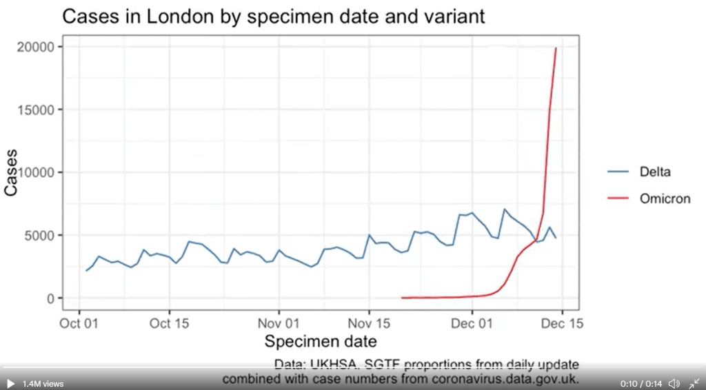
    • U.K. data provides information on just how fast Omicron can spread. The U.K.’s comprehensive genomic surveillance system, combined with its unified national public health system, allows British researchers to analyze their country’s Omicron cases in high detail. According to the latest briefing from the U.K. Health Security Agency (summarized by Meaghan Kall): risk of reinfection with Omicron is three to four times higher than with Delta; risk of household transmission with Omicron is two to three times higher than with Delta; and the variant is doubling every two days—or even every 1.5 days, in some parts of the U.K.
    Omicron’s rapid spread in London, compared with prior Delta cases. Chart by Theo Sanderson; see his Twitter for the full animated version.

    • New research from Hong Kong provides insight into why Omicron spreads so fast. Preliminary data from a Hong Kong University research team suggests that, within 24 hours of an Omicron infection, the virus “multiplied about 70 times faster inside respiratory-tract tissue than the Delta variant,” reports Megan Molteni at STAT News. More virus in the respiratory tract means more virus getting out into the air, Molteni explains. At the same time, the variant seems to be worse at multiplying within lung tissue, which may contribute to milder disease. While the Hong Kong study has yet to be peer reviewed, this finding aligns with reports of superspreading events among fully vaccinated people.
    • Skepticism about “Omicron being mild” continues despite more reports. Early this week, the largest health insurance company in South Africa posted results of a study examining the country’s Omicron wave. The study found that risk of hospitalization was 29% lower for Omicron patients than it had been during the country’s spring 2020 COVID-19 surge. While this finding follows other reports out of South Africa, experts are still skeptical: in part because it can take weeks for a coronavirus infection to progress to hospitalization, and in part because South Africa’s population has a lot of prior immunity from past surges and vaccinations. Also, a “milder” variant that’s more transmissible can still lead to significantly more hospitalizations.
    • We’re getting more evidence that vaccination protects against severe disease from Omicron. Basically: two shots are good, three shots are better. “Though these data are preliminary, they suggest that getting a booster will help protect people already vaccinated from breakthrough or possible severe infections with Omicron during the winter months,” writes NIH Director Dr. Francis Collins in a recent blog post summarizing both laboratory and real-world studies. If you’re eligible for a booster and haven’t yet gotten it, now is a great time.
    • But: We don’t know how well vaccines protect against Long COVID from an Omicron infection. As many experts continue to say that Omicron cases are mild for those who are vaccinated, the Long COVID experts and advocates I follow have pointed out that a mild breakthrough case can still lead to this prolonged condition. “Omicron is a huge individual threat,” wrote Long COVID researcher Hannah Davis on Twitter recently. “A 15-30% chance of being disabled for at least a year, but likely for the rest of your life, is a bigger threat than most of us ever faced ever before the pandemic.”
    • New York City is an Omicron hotspot in the U.S. As I noted in today’s National Numbers post, this variant has clearly hit NYC, as seen in record case numbers and felt in long lines for testing throughout the city. According to CDC estimates, Omicron was causing about 13% of new cases reported in New York and New Jersey in the week ending December 11. One week later, knowing how fast Omicron has outcompeted Delta in the U.K. and elsewhere, we can assume that it’s now causing the majority of cases in this region.
    • Other U.S. states and regions may be behind in their Omicron sequencing, so assume it’s spreading in your area even if it hasn’t been officially identified yet. As I’ve written before, genomic surveillance in the U.S. is geographically very spotty. NYC is a clear hotspot, but it’s also a city with a lot of sequencing infrastructure. In other parts of the country, Omicron may not have been formally identified yet—but that doesn’t mean it isn’t spreading. Take Orlando, Florida as an example: wastewater sampling in the surrounding county found that Omicron was completely dominating the community this week, according to AP, even though “practically no cases of clinical infection” have been reported.
    • Good news: South Africa’s case numbers are now trending down. As of yesterday, COVID-19 case numbers in Gauteng, the center of South Africa’s COVID-19 outbreak, as well as in other parts of the country, seem to be turning around. Computational biologist Trevor Bedford offered some potential explanations in an interview with New York Magazine: limited testing capacity and milder disease may lead to underreporting of COVID-19 cases in South Africa; less of the population may be susceptible due to prior immunity; and the variant may spread so fast that it can quickly burn through social networks and other avenues of transmission. We’ll need to see whether South Africa’s decline holds, and whether we see similar patterns in other Omicron hotspots.
    • The U.S. is not prepared for an Omicron surge. If you haven’t yet, take some time today to read Ed Yong’s latest feature in The Atlantic, which discusses how the U.S. has failed to learn from past COVID-19 outbreaks and prepare for the Omicron surge that has already arrived. “Rather than trying to beat the coronavirus one booster at a time, the country needs to do what it has always needed to do—build systems and enact policies that protect the health of entire communities, especially the most vulnerable ones,” Yong writes.
    • Omicron has altered the trajectory of the pandemic. Another piece to take time for today is this article in Science by Kai Kupferschmidt, discussing the “really, really tough winter” that scientists now see coming. Kupferschmidt explains that, even if many Omicron cases are mild, the variant is still spreading fast enough that it could land a lot of people in the hospital. In addition, the variant “may bring other, unpleasant evolutionary surprises” if future coronavirus variants evolve out of Omicron, Kupferschmidt writes.

    More variant reporting

  • National numbers, December 19

    National numbers, December 19

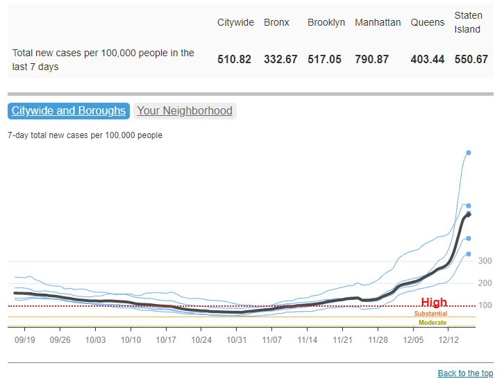
    COVID-19 cases have increased sharply in New York City in the past week, to over 500 new cases for every 100,000 people city-wide. Chart via NYC Health, retrieved December 19.

    In the past week (December 11 through 17), the U.S. reported about 860,000 new cases, according to the CDC. This amounts to:

    • An average of 122,000 new cases each day
    • 261 total new cases for every 100,000 Americans
    • 2% more new cases than last week (December 4-10)

    Last week, America also saw:

    • 55,000 new COVID-19 patients admitted to hospitals (17 for every 100,000 people)
    • 8,300 new COVID-19 deaths (2.5 for every 100,000 people)
    • 2.9% of new cases are Omicron-caused (as of December 11)
    • An average of 1.6 million vaccinations per day (including booster shots; per Bloomberg)

    The Omicron surge has arrived in the U.S. While national COVID-19 cases are not significantly up from last week to this week, last week’s bump in the numbers from delayed Thanksgiving reporting has been replaced with a true increase, thanks to the combined pressures of both Delta and Omicron.

    Hospitalizations are also increasing, with about 60,000 Americans hospitalized with COVID-19 nationwide as of December 15—a 9% increase from the previous week. The number of Americans dying from COVID-19 each day is increasing as well, now at about 1,200 deaths a day.

    Omicron’s impact feels particularly pronounced in New York City, where I live, as the city’s case rate more than doubled in the first two weeks of December. This past week, the city’s test positivity rate doubled in the span of three days. Yesterday, New York state reported a record number of new COVID-19 cases (about 22,000), with more than half of those cases reported in NYC.

    To be fair, the case rates reported in NYC this week are probably lower than the true case rates during spring 2020, as testing wasn’t widely available during the city’s first COVID-19 surge. But on a personal level, this city’s current Omicron surge is undeniable: testing lines stretch around the block, and everyone from my old college friends to my local City Council representative is reporting a breakthrough case. I personally have yet to catch “the Media Variant,” but I’m rapid testing frequently and avoiding indoor activities as I prepare to visit my parents for Christmas.

    Omicron was causing 13% of new COVID-19 cases in New York and New Jersey in the week ending December 11. By today, it’s likely causing the majority of new cases. But the NYC region isn’t the only part of the country seeing rapid case increases: Hawaii, Florida, Connecticut, Maine, and D.C. have all reported more than a 30% increase in cases from the previous week to this one, according to the latest Community Profile Report. Rhode Island, New Hampshire, Maine, and other Northern states have the highest cases per capita.

    Vaccines, particularly booster shots, can protect against this dangerous variant (more on that later in this issue). While 61% of Americans are fully vaccinated, according to the CDC, less than 30% have received booster doses. This includes about 53% of Americans over 65, even though seniors were one of the first groups become eligible for boosters—and are among those most in need of this additional protection.

  • Sources and updates, December 12

    • CDC adds booster shot trends to its dashboard: One significant update to the CDC’s COVID-19 dashboard this week: the agency has added daily booster shot administration trends to its Vaccination Trends page. Now, you can see how many booster shots are being given each day in your state; in New York, for example, I see clear jumps when eligibility opened to all adults, and when Omicron was identified after Thanksgiving.
    • Global Health Security Index: Back in fall 2019, a group of public health and national security researchers put out an index that ranked 195 countries around the world on their capacity to respond to future health threats. The U.S. was ranked number one—a ranking that soon became laughable as the country proved to be incredibly unprepared for the COVID-19 pandemic. This week, the organization released their 2021 update to that index… and the U.S. is, somehow, still number one. Yet despite this, the researchers say, “no country is fully prepared for future pandemic or epidemic threats.”
    • COVID Collaborative: Hidden Pain report: The COVID Collaborative is a team of health, education, and economic experts aiming to develop recommendations for U.S. leaders. Their recent Hidden Pain report focuses on children who lost parents or caretakers to COVID-19—a group that, the report estimates, includes over 167,000 children across the country.
    • State Alcohol-Related Laws During COVID-19: The Alcohol Policy Information System has compiled a database of alcohol-related state laws during the pandemic, including rules about drinking both inside and outside of bars and restaurants. The database allows you to see when a specific state allowed restaurants to open or close, restrictions for take-out only, shortened hours, and more. (H/t Data Is Plural.)

  • One month into vaccinations for kids 5-11, uptake varies wildly by state

    One month into vaccinations for kids 5-11, uptake varies wildly by state

    It’s been about a month since the FDA and CDC authorized a version of Pfizer’s vaccine for children ages five to 11. Those kids whose parents immediately took them to get vaccinated are now eligible for their second doses, and will be considered fully vaccinated by Christmas.

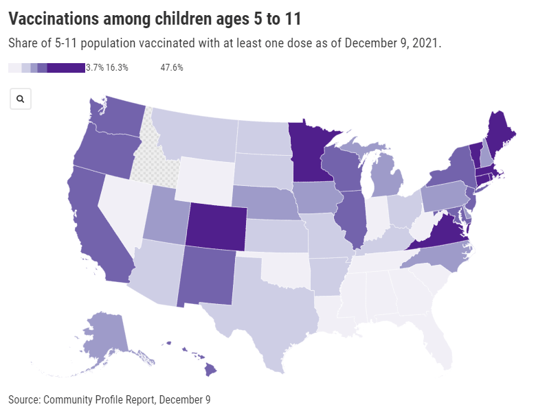
    Despite widespread availability of the shots, vaccine uptake has varied wildly: the share of children ages five to 11 who have received at least one dose ranges from almost 50% in Vermont—to under 4% in West Virginia. In Idaho, so few children in this age range have received a vaccine dose that the CDC has yet to report a number of children vaccinated.

    As you can see from the map (which uses data as of December 9), vaccination rates for kids are falling pretty much along partisan lines, with states in the Northeast and West Coast vaccinating more than those in the South and Midwest. This is unsurprising yet troubling, as the states with lower vaccination rates among kids are also those states with more lax COVID-19 safety measures in schools—suggesting that they’re exactly the kids who could use that protection.

    A new report from the Kaiser Family Foundation’s COVID-19 Vaccine Monitor provides context on slowing vaccination rates among children. According to KFF’s polling, three in ten American parents—both of teenagers and younger kids—say they will “definitely not” get their children vaccinated. Concerns about safety and potential long-term side effects abound, even though all data so far have suggested that the vaccines are very safe for children.

    While the overall data are troubling, we lack information in one key area: demographic data. Without breakdowns of child vaccination rates by race and ethnicity, it’s difficult to say whether the racial gap in vaccinations that we saw for adults earlier in 2021 has persisted for younger Americans. This data absence makes it difficult for policymakers and health advocates to address the potential need for vaccine messaging tailored to families of color.

    More vaccination data

  • New CDC mortality data: “Real-time public health surveillance at a highly granular level”

    New CDC mortality data: “Real-time public health surveillance at a highly granular level”

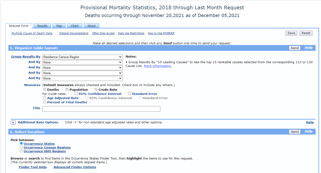
    The CDC’s new data release allows researchers to search through mortality data from 2020 and 2021 in great detail. Screenshot of the CDC’s search tool retrieved December 12.

    This past Monday, the CDC put out a major data release: mortality data for 2020 and 2021, encompassing the pandemic’s impact on deaths from all causes in the U.S.

    The new data allow researchers and reporters to investigate excess deaths, a measure of the pandemic’s true toll—comparing the number of deaths that occurred in a particular region, during a particular year, to deaths that would’ve been expected had COVID-19 not occurred. At the same time, the new data allow for investigations into COVID-19 disparities and increased deaths of non-COVID causes during the pandemic.

    To give you a sense of the scale here: As of Saturday, the U.S. has reported almost 800,000 COVID-19 deaths. But experts say the true COVID-19 death toll may be 20% higher, meaning that one million Americans have died from the virus. And that’s not counting deaths tied to isolation, drug overdoses, missed healthcare, and other pandemic-related causes.

    The CDC’s new data release is unique because, in a typical year, the CDC reports mortality data with a huge lag. Deaths from 2019 were reported in early 2021, for example. But now, the CDC has adapted its reporting system to provide the same level of detail that we’d typically get with that huge lag—now with a lag of just a few weeks. The CDC has also improved its WONDER query system, allowing researchers to search the data with more detail than before.

    “I would describe this new release as more real-time surveillance at more specific detail than any journalists, or epidemiologists, or any other kind of researcher even knows what to do with,” said Dillon Bergin, an investigative reporter and my colleague at the Documenting COVID-19 project, at the Brown Institute for Media Innovation and MuckRock.

    Along with Dillon and other Documenting COVID-19 reporters, I worked on a story explaining why these CDC data are such a big deal—along with what we’re seeing in the numbers so far. The story was published this week at USA Today and at MuckRock. Our team also compiled a data repository with state-level information from the new CDC release, combined with death data from 2019 and excess deaths.

    If you’re a reporter who’d like to learn more about the new CDC data, you can sign up for a webinar with the Documenting COVID-19 team—taking place next Wednesday, December 15, at 12 PM Eastern time. It’s free and will go for about an hour, with lots of time for questions. Sign up here!

    Editor’s note, December 27: This webinar was recorded; you can watch the recording here.

    Also, as our initial story is part of a larger investigation (in collaboration with USA Today), the team has put together a callout form for people to share their stories around COVID-19 deaths in their communities. If you have a story to share, you can fill out the form here.

    To provide some more information on why this new CDC release is so exciting—and what you can do with the data—I asked Dillon a few questions about it. As the lead reporter on our team’s excess deaths investigation, he’s spent more time with these data than anyone else. This interview has been lightly edited and condensed for clarity.


    Betsy Ladyzhets: How would you summarize this new release? What is it?

    Dillon Bergin: I would describe this new release as more real-time surveillance at more specific detail than any journalists, or epidemiologists, or any other kind of researcher even knows what to do with. It’s unfathomably detailed, and the fact that we’re going to be able to see updates in almost real time is really critical at this stage of the pandemic, or at any stage in a public health crisis. I think it’s a huge, huge step forward.

    BL: Specifically in the realm of COVID deaths, but also, all deaths during the pandemic.

    DB: Exactly, yes. In the realm of COVID deaths, we do know that there is a large gap between the total amount of excess deaths and the excess deaths that COVID accounts for. So it’s interesting from that angle, understanding what COVID might have been misclassified. But the data can also be used for a broad range of other types of deaths that have happened during the pandemic or possibly increased during the pandemic.

    BL: So why are researchers excited about this data release?

    DB: Previously, for something to go up on the WONDER website, or to become WONDER data, has to be finalized in the year after. So, data from 2020 would just be finalized now. Typically, we might not see that data until, probably, early in the new year [2022].

    But with the new tool, we’re getting that 2020 and 2021 WONDER data now. And the CDC does a great job of providing a lot of granular details about causes of death, and racial demographics… Those are things that general CDC [mortality] data gives you, but the WONDER data is even more detailed. So, the fact that researchers don’t have to wait anymore for that data to be finalized, that the CDC is providing provisional data at such a detailed level—that’s what researchers are excited about.

    BL: It’s the provisional data that’s being released, like, a year earlier than you would normally expect it to be published, right?

    DB: Yeah, a year earlier than you would expect it to be published. Which means it’s almost real-time, because it has, I think, a three- or four- week lag. This data is real-time public health surveillance at a highly granular level—which is what people have been asking for. It’s what epidemiologists have been asking for, researchers, advocates of all kinds, journalists, lots of people have been saying, “We need this type of surveillance.”

    BL: When you say a three- or four-week lag—the CDC is going to update it every couple of weeks, right?

    DB: Yes, that’s correct.

    BL: Do you have a sense of what the update schedule is going to be, or is the CDC not sure yet?

    DB: I’m not sure. I know it was a big haul for them to just get this out, I’m not sure what the next update will be…

    BL: Yeah, well, I’m sure we [Documenting COVID-19] will keep an eye on it. And we’ll tell everybody when it updates. (Editor’s note: As of December 12, it has already been updated! Data now go through November 20, 2021.) So, what are some of the things that you’ve seen in the data from the preliminary analysis that you’ve done so far?

    DB: One of the specific things that I’ve seen, that’s been really important for the work that I’m doing right now, is increases of different types of deaths at home. When people die, they don’t always die in a hospital—they could die in an outpatient clinic, or in an ER, or they could come to the hospital dead on arrival, they could die in hospice, or a nursing home, or at home.

    And one of the awesome things about the CDC data is that you can see, actually, where people have died, and what specific causes of death that those people had when they died. Or, to be precise, you can’t see specific people—but you can see, say, 50 people died of heart attacks in a specific county at home. You would be able to see [in the data] that those people not only died of a heart attack, but they died at home. 

    The takeaway for me has been that respiratory and cardiovascular deaths have increased at home in specific states and counties. Louisiana is one example: it looks like Louisiana has the highest increase of deaths at home from [the CDC designation] “other forms of heart disease,” of any state, at like a 60% increase from previous years. So then we have to ask ourselves, what could lead to that increase? Are people really dying more of heart disease at home, by that much higher of a rate? Or is something else going on here?

    BL: If you were talking to local reporters about this, what would they recommend that they do with the data?

    DB: I would recommend that they take a look at the most recent data, the data from 2020 and 2021, for their area. And also pull some previous years, probably five years [of data], and start looking at causes of death, ages of the people who died, racial and demographic makeup, and place of death. I think different combinations of those data will start to provide some interesting avenues that can lead you to do actual human reporting—asking, what was happening? And why was that happening at this scale?

    The new WONDER data, you can kind-of stretch it and bend it in so many different ways, it can be a little bit intimidating at first. So maybe, it would also be useful to start with a more specific question. If you’re wondering about, let’s say, certain types of deaths in a very specific county. Say you’re wondering if that’s from unintentional drug overdoses, or deaths from respiratory diseases in your county. Then you can start looking at the more granular level of details within those types of deaths—whether it’s racial and demographic makeup, or whether or not the body was autopsied. You can even see the day of the week [that people died]. There’s a lot of different places you can zoom in.

    My overall advice would be: Start with a general question and then explore, then reform that question and explore, then reform that question. The data is both so extensive and so granular that you can get lost in it very quickly.

    BL: You mentioned that it’s very intimidating, which I would second. The first time I looked at the WONDER data, I was like, “What is going on here?” So, what would be your recommendations for working with that data tool? Or any major caveats that you think people should know before they dive into this?

    DB: That’s a great question, because with WONDER, you have to use their querying tool through their website. You can’t really easily and quickly export things or work with an API, though you can export data once you do a query.

    My first caveat would be, keep in mind the suppression of any values under 10. So, that means you can zoom in on certain things, but then you may also have to zoom out. For example, if you wanted to know the leading causes of death for someone, when a body is dead on arrival—if you do that search at a state level, you’ll probably be able to see the first five or so causes before you reach causes that have only happened between one and 10 times, and then that value is oppressed and you can’t see the information. But if you were to do the same search on a national level, you would have a lot more causes for those types of deaths.

    So, I would keep in mind the suppression, when zooming in and out. And also keep in mind, if, say, you’re looking at “dead on arrival” deaths for every county in a specific state, so many causes of death for those [county-level searches] will be suppressed, that your totals from the counties would not match the actual totals [at the state level]. Because you may not be aware that the CDC is not showing you the values that were suppressed if you didn’t click a specific button—or if you’re quickly adding things.

    BL: Another thing that [our team ran into] is occurrence versus residence—that’s something people need to know about. “Residence” means sorting by where people lived, “occurrence” means sorting by where they died. Those don’t always match up.

    DB: Yes, I would say residence versus occurrence is very important to keep in mind, especially because, when you’re redoing a search and scrolling very fast, you can accidentally fill out a state for occurrence instead of residence. Which actually did happen to me, and then I was confused by my own numbers. Then I noticed that there were a bunch of states coming up that I hadn’t meant to search for, because I, like, filtered by residence and then searched by occurrence.

    So yeah, keeping in mind the difference between residence and occurrence is definitely important. Though if you go back in the historical data [before 2018], it’s just residence—just a single state for each death.

    Also, just clear some extra time to get used to working with the WONDER interface. Because, unlike the CDC data updates that are just on the data.cdc.gov website, that you can just quickly download and open up in your technical took of choice—for WONDER, you do have to use the WONDER query site, and it can be difficult to get used to searching and importing. 

    BL: I will say one more thing, while we’re on this topic, that I’ve been doing and that might be helpful for other people: make sure that, if you export data from WONDER, that you always save that notes section it gives you at the bottom [of the exported file]. Because that will tell you exactly what you searched for. So, if you want to replicate something later, you can just go back and look at the notes. I feel like my instinct, often, when I’m looking at a dataset, is to delete all the notes and anything I don’t need—so I have to remind myself, like, “No, you should keep this.”

    DB: That’s actually a really good tip, because I do that… I import the data [to my computer] and then I delete all the notes. That’s a great point.

    BL: Also, what recommendations do you have if people are looking for, like, experts to interview about these data? Say a local reporter wants to search for experts in their area, what should they do?

    DB: I can speak about that, because that’s been really useful for me in my reporting. Once you have this data, or once you’ve researched excess deaths in your area, you should talk with an epidemiologist or a social epidemiologist—someone who would know your state, or maybe even your more local area—about the broader mortality trends in your community. That will really give you a deep understanding of, what were the reasons that people were dying before the pandemic? And what has this expert thought about during the pandemic? And what have they heard, or read, or researched about why deaths are increasing? For example, I talked to two epidemiologists in Mississippi while working on our investigation, and they really helped me understand what I was looking at and looking for.

    BL: Awesome. And then, my last, kind-of big picture question is, why does this matter for people who aren’t epidemiologists or COVID reporters?

    DB: That is also a good question. I think the thing that I have been thinking about over and over again—and it’s something that an epidemiologist told me—which is that, if we understand how people die, then we might know what’s making them sick. And if we know what’s making them sick, then we have a shot at stopping that from happening.

    This data is a very important step in that process, which is learning, in real-time, why people are dying. If we know that, we know what’s making them sick, whether it’s unintentional drug overdoses, or an increase of deaths because of lung cancer or heart disease. Any of those things are important to know, especially in a public health crisis like the one we’re in right now.

    BL: I know we’ve talked before about this sort-of cycle of, what happens when COVID deaths are maybe undercounted in a certain community, and then that contributes to people maybe being less aware of COVID in their community. And then [that lack of awareness] contributes back to the same process.

    DB: Yeah, exactly. I think that’s an important thing as well. Throughout this process—reporting on this topic, and working with this data, and thinking more about death certificates and the information on them—I’ve been increasingly… Not evangelized, exactly, but I’ve seen the light on the importance of that final piece of information of people’s lives. And what it means not only to their families and to the local area and communities, but also what it means when we start pulling that data up to larger and larger groups, and trying to understand: what does this person’s death mean at the level of the county, or the state, or in their racial demographic, or in their age demographic, or by gender?

    All of this is critically important. And it sounds kind-of corny, but in a way, [the death certificate] is like, one really last piece of information that you leave behind for humans after you.


    More national data

  • Omicron updates: More transmissible, immune evading, but still not cause for panic

    Omicron updates: More transmissible, immune evading, but still not cause for panic

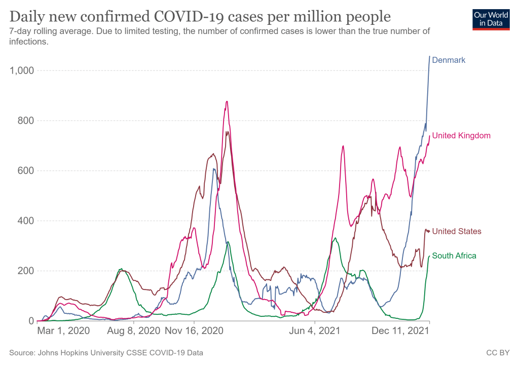
    COVID-19 cases are rising rapidly in countries where Omicron is spreading, including South Africa, the U.K., and Denmark. Chart from Our World in Data, retrieved September 12.

    We continue to learn more about this new variant as it spreads rapidly across the world, though much of the data are still preliminary. Here are a few major updates:

    • Omicron is still spreading very quickly in South Africa, as well as in the U.K. and Denmark—two other countries with great genetic surveillance. Preliminary estimates based on data from these countries suggest that the variant’s R-value is between 3 and 4, indicating that the average person infected with Omicron infects three or four others. As Sarah Zhang put it in The Atlantic: “Omicron is spreading in highly immune populations as quickly as the original virus did in populations with no immunity at all.”
    • Early vaccine studies show a drop in antibody levels against Omicron, but that doesn’t necessarily correspond to overall protection. This week, we saw the first results from early studies evaluating how well vaccines work against Omicron. Here’s a summary, drawing from Katherine Wu’s coverage of these studies in The Atlantic: vaccinated people confronted with Omicron appear to produce a lot fewer antibodies that can fight the virus, compared with older variants. Numbers range from a five-fold drop in antibodies to a 41-fold drop. But remember, antibodies are just one part of the immune system—specifically, they’re the part that’s easiest to measure. Vaccinated people also have memory immune cells that provide protection over a long time period, which isn’t captured in antibody studies. We’ll need more time and more data to actually evaluate how vaccines fare against Omicron in the real world, rather than in the lab.
    • The vaccines seem to protect against severe disease and death from Omicron. So far, the data suggest that our existing COVID-19 vaccines still work quite well at protecting people from severe symptoms—even when those severe symptoms are caused by an Omicron case. “When the shots’ protection ebbs, it tends to do so stepwise: first, against infection, then transmission and symptoms, and finally against severe disease,” Wu writes. For vaccinated people to lose protection against severe disease, the virus would have to change much more than Omicron has. At the same time, however, some experts are concerned that non-mRNA vaccines may not fare as well against Omicron as Moderna and Pfizer, conferring a disadvantage to the low- and middle-income countries that have had less access to the mRNA vaccines.
    • Booster shots increase protection against Omicron. While vaccinated people are less protected against infection with Omicron than previous variants, booster shots appear to help close that gap—even though currently-available booster shots are not designed specifically for Omicron. One U.K. study suggests that boosters can increase vaccine effectiveness against infection from 30% to 75%, for people who received the Pfizer vaccines. In other words: Omicron is a good reason to go get your booster shot, if you’re eligible and you live in a place where the shots are available.
    • Experts continue to be skeptical about Omicron being “more mild.” Reports out of South Africa continue to suggest that cases caused by Omicron are more mild than cases caused by Delta, with doctors saying that fewer patients are requiring hospitalization and those hospital stays are shorter than previous outbreaks. But many of the South Africans getting sick with Omicron may have some protection from vaccination or past infection; this means they’re more likely to have mild cases, as biostatistician Natalie Dean explains in an excellent Twitter thread. Plus, even if Omicron is more mild, it appears to be more transmissible—and a smaller share of severe cases out of a larger pool of cases overall can still lead to a pretty big number of people going to the hospital. In addition, we have zero data at this point on how Omicron may impact Long COVID cases, or how well vaccines protect against Long COVID from an Omicron infection.
    • Early U.K. data confirm Omicron’s high contagiousness and its capacity for evading protection from vaccines and prior cases. After the U.K.’s best-in-the-world genetic surveillance agency first identified Omicron in late November, I wrote that the country would likely provide invaluable data on this variant. Less than two weeks later, the U.K. Health Security Agency has released its first Omicron report. The country’s real-world data confirm that Omicron can spread quite fast: for example, “19% of Omicron cases resulted in household outbreaks vs 8.5% of Delta cases,” wrote epidemiologist Meaghan Kall in a summary of the report. The report also “paints a very consistent picture for Omicron being immune evading,” Kall said, though booster shots help a lot.
    • Anime NYC was a likely Omicron superspreader event. More and more reports have emerged of Omicron cases connected to Anime NYC, a convention held in Manhattan in mid-November. The CDC is currently investigating the convention: officials are working with the NYC health department to contact all 53,000 convention attendees for testing and contact tracing. “Data from this investigation will likely provide some of the earliest looks in this country on the transmissibility of the variant,” CDC Director Dr. Rochelle Walensky said at a press briefing on Tuesday.
    • The CDC formally named Omicron a Variant of Concern. On Friday, the CDC officially designated Omicron as a Variant of Concern and added it to the variant tracking page of the agency’s COVID-19 dashboard. As of December 4, Omicron is causing 0.0% of new COVID-19 cases in the U.S., the CDC estimates. The variant has yet to be added to the CDC’s state-by-state data. Given the continued geographic disparities of the U.S.’s genomic surveillance system, however, we may expect that the variant is already spreading in states where it has yet to be formally identified.
    • Omicron can likely compete with Delta, but we need more data to get a better sense of how well. “Omicron is picking up speed in Europe, which has often served as a preview of what was headed the U.S.’s way. It’s an early sign that the already bleak situation here may get worse,” writes Andrew Joseph in a recent STAT News story. U.K. data suggest that Omicron could cause a majority of cases there within two to four weeks, Joseph reports, and the U.S. may not be far behind. Still, more real-world data from countries and regions with clear Omicron outbreaks will give us a better idea of just how worried we need to be about a potential Omicron-fueled surge.

    In summary:

    More variant reporting