Blog

  • COVID source shout-out: FERN’s mapping project shuts down

    COVID source shout-out: FERN’s mapping project shuts down

    Screenshot of the COVID-19 food system outbreak map, taken on September 4.

    In April 2020, Leah Douglas started tracking COVID-19 outbreaks at meatpacking plants, food processing facilities, and farms. Douglas is a reporter at the Food & Environment Reporting Network (FERN); she shared her findings through an interactive dashboard on the FERN website while also writing stories to illuminate the numbers.

    On September 2, Douglas announced that the project is shutting down—after counting almost 100,000 COVID-19 cases and 466 deaths among workers in the U.S. food system.

    “Initially, I imagined the project would produce a one-time visualization of the spread of the virus at food manufacturing plants last spring,” Douglas writes in a post announcing the project’s end.  “But it quickly became clear that the scope of worker illness, and the lack of information disclosure from companies and public health authorities, necessitated deeper investigation.”

    Douglas explains that, while the project was challenged from the start by a lack of data from food companies and public health agencies alike, data have become even scarcer in recent months. “There likely hasn’t been another surge like the one witnessed at meatpacking plants in the spring of 2020, but data constraints mean that the true toll of the pandemic on food system workers is unknown,” she says.

    Douglas’ project was cited by major news outlets, appeared on TV shows, used by research organizations, and utilized by policymakers to draw attention to COVID-19 outbreaks in the food system. It was also listed as one of the COVID-19 Data Dispatch’s best COVID-19 data stories of 2020.

    Here at the CDD, we thank Leah Douglas for her months of hard work on this incredibly important issue—and wish her the best in her new position at Reuters.

  • Sources and updates, September 5

    This week, we have a couple of source updates and a couple of additional data news items.

    • Pediatric data from the CDC: In a rather timely update, the CDC has added a pediatric data tab to its COVID Data Tracker dashboard. The new page links to all the data on COVID-19 and kids that the agency has available: including multisystem inflammatory syndrome in children (MIS-C), demographic data for vaccinations and hospitalizations, and COVID-19 outcomes during pregnancy.
    • Additional vaccine doses (also CDC): The CDC recently added an important new field to the vaccination page of its dashboard: people who received an additional vaccine dose. This includes about 1.3 million people as of September 4. The count started on August 13, when the CDC’s vaccine advisory committee endorsed additional shots for immunocompromised Americans—though the CDC’s dashboard doesn’t distinguish between those additional dose recipients who are and are not immunocompromised, according to their “about the data” page.
    • More states pull back on COVID-19 reporting: Here at the CDD, we love to call out states that stop reporting key COVID-19 data points or make that reporting less frequent. A new article from KHN’s Andy Miller speaks to this trend, which has continued in recent weeks despite the Delta surge. The article specifically calls out government websites in Georgia, which stopped updating public data on COVID-19 in prisons and long-term care facilities “just as the dangerous Delta variant was taking hold,” Miller reports.
    • New study provides rigorous evidence that masks work: On Wednesday, authors of a randomized control trial study—the gold standard of scientific research—shared their findings in a preprint. The study investigated mask use by providing different levels of free mask supplies and promotion to different villages in Bangladesh. Villages that received the masks and learned about their use had fewer COVID-19 cases, with the villages that received surgical masks (as opposed to cloth masks) seeing the biggest impact. This study is a pretty big deal, with one commenter calling it “arguably the most important single piece of epidemiological research of the entire pandemic.” For more context, see this Washington Post article.

  • How I stayed safe on a recent trip to California

    How I stayed safe on a recent trip to California

    Two Abbott BinaxNOW antigen tests used by Betsy and her sister during their trip, demonstrating single-line negative results.

    As I mentioned in last week’s newsletter, I went on vacation during the last week of August. I traveled to California to visit my younger sister, who was living there over the summer for an internship. We spent a couple of days in the Bay Area, then drove to Southern California, hit a few different destinations, and finally flew out of Los Angeles International Airport (LAX).

    Both my sister and I are fully vaccinated, of course, but we still took a number of precautions to make our trip as safe as possible in light of the current COVID-19 surge. I wanted to share what we did in case it’s useful for others thinking about travel right now.

    Key precautions included:

    • Limited exposure and tests before traveling: For ten days before my flight out to California, I avoided all unmasked indoor activities, including small gatherings with fully vaccinated friends. Closer to my flight, I also avoided other activities outside my home (grocery shopping, taking the subway, and the like). I got a PCR test at a NYC Health site two days before my flight, and didn’t leave my apartment between that test and heading out to the airport.
    • Rapid testing every two days during the trip: I carried three packs’ worth of Abbott BinaxNOW rapid antigen tests in my suitcase, and bought a couple more packs in California. Starting two days after I arrived, my sister and I tested ourselves every other day. While antigen tests like these are more likely to give you a false negative than PCR tests, testing frequently increases your chances of catching a case—and catching it early in your disease progression, when you’re most likely to infect others. The tests were easy to incorporate into our routines, especially once we got used to the swabbing process.
    • Sticking to outdoor activities: Our trip included a lot of outside time: hiking in a redwood forest, hitting up Southern California beaches, camping for a night at Joshua Tree National Park, and lots of outdoor dining. The riskiest two activities of the week, we agreed, were an afternoon at Monterey Bay Aquarium and a day at Universal Studios in LA. But both of those establishments did a great job of reminding all patrons (including the vaccinated) to keep their masks on inside—following current mask regulations in the Bay Area and LA County.
    • Double-masking indoors: On both my flights and whenever I needed to be inside for a longer period of time, I wore two masks: a surgical mask and a fitted, multi-layer cloth mask. Studies suggest that cloth masks on their own are not the best option for protecting against Delta, but layering a cloth and surgical mask can increase protection. I especially like to layer masks because surgical masks typically don’t fit well on my face; when I add a cloth mask on top, the fit becomes much more snug.
    • Precautions when visiting relatives: My sister and I visited a few relatives over the course of our trip. For these visits, we basically followed the precautions that health experts recommended last Thanksgiving: eat outside whenever possible, mask up in common areas inside, open windows for extra ventilation, etc. We also organized the trip so that no visits occurred after Universal Studios, which we had deemed the riskiest activity of the week.
    • Extra testing after traveling: Flying out of LAX proved to be incredibly stressful, as neither the airport nor our airline put in effort to enforce mask guidance. My sister and I even gave extra masks to two fellow travelers at the check-in desk, because the airline apparently did not have any extras available. Because of this extra COVID-19 exposure risk, I did some extra testing upon my return to the East coast: daily rapid tests for two days in a row, followed by a PCR test.

    Personally, this will probably be my last major trip for a while. Conferences that I’d planned to attend in the fall have been moved to all-virtual formats, and I’m lucky to live close enough to my parents that I don’t need a flight to see them for the holidays. If I were to travel again, though, I’d likely follow these same precautions—with adjustments based on COVID-19 infection rates at my destination. Also, I would probably avoid LAX.

  • Delta updates: Disease severity, kids, boosters

    Delta updates: Disease severity, kids, boosters

    The states with the highest numbers of children in the hospital are also the states with the lowest vaccination rates, per CDC analysis.

    It’s been a minute since I last did a Delta variant update, and this seemed like a good week to check in. Here are a couple of major news items that I’ve seen, along with sources where you can read more.

    The Delta variant continues to be highly transmissible. On August 1, I wrote that an interaction of a few seconds is enough for Delta to spread from one person to another, when both people are unvaccinated and unmasked.

    All the new evidence that we have on Delta outbreaks backs up its incredible ability to spread. For example, in a California elementary school, an unvaccinated teacher spread the coronavirus to 12 out of the 24 students in her class, with students sitting closer to the teacher more likely to be infected. The classroom outbreak led to 27 cases in total, including the teacher—who worked for two days after first reporting her symptoms. All the cases were identified as Delta.

    Growing evidence points to Delta being more severe. A recent study in The Lancet from epidemiologists in the U.K. suggests that Delta causes severe disease more frequently than the Alpha variant (B.1.1.7). The researchers looked at hospitalization rates for British COVID-19 patients, finding that patients with Delta were twice as likely to require hospital care compared to those with Alpha. Delta patients were also younger, on average—though this could be conflated by high vaccination rates among British seniors.

    Commenting on this study in Your Local Epidemiologist, Dr. Katelyn Jetelina writes:

    This adds to the growing evidence that Delta is more severe. An early Scotland study found that the risk of hospitalization was nearly double than previous variants. An early Public Health of England technical report found this too. We also saw this in Singapore where Delta infection was associated with higher risk of oxygen requirement, ICU admission, or death.

    For kids, higher hospitalization rates are tied to community vaccination, not Delta severity. This Friday, the CDC released two reports on COVID-19 hospitalization in children.

    One major finding: out of all children with COVID-19 cases, the proportion of kids who have a severe case has not increased from previous surges to this current Delta surge. Prior to June 2021, about 27% of hospitalized COVID-19 patients under age 18 required ICU admission; in late June and July (during the Delta surge), that number was 23%. Also, the average hospital stay was shorter during the Delta surge than previously (1-4 days compared to 2-5 days). These statistics indicate that Delta isn’t more severe for kids—rather, we’re seeing cases in such high numbers that it drives up hospitalizations.

    According to the CDC’s other Friday report, hospitalizations among children (under age 18) were four times higher in states with low vaccination levels compared to states with high vaccination levels. In other words: vaccination is crucial not just to protect yourself from severe COVID-19, but to lower community transmission and protect young children who can’t yet be vaccinated.

    Evidence for boosters continues to be questionable. After the Biden administration announced that the U.S. plans to provide third vaccine doses to everyone who received Pfizer or Moderna’s vaccines, I wrote that evidence and transparency on this decision were lacking. The situation hasn’t changed much; while studies show that COVID-19 antibody levels decline several months after vaccination, many experts are not convinced that boosters are necessary for everyone at this point.

    If immunity is “waning,” why don’t we need extra shots? As usual, Katherine Wu at The Atlantic has a great article explaining the complexities here. Here’s a key paragraph from her piece:

    Defensive cells study decoy pathogens even as they purge them; the recollections that they form can last for years or decades after an injection. The learned response becomes a reflex, ingrained and automatic, a “robust immune memory” that far outlives the shot itself, Ali Ellebedy, an immunologist at Washington University in St. Louis, told me. That’s what happens with the COVID-19 vaccines, and Ellebedy and others told me they expect the memory to remain with us for a while yet, staving off severe disease and death from the virus at extraordinary rates.

    In short, though antibody levels may drop, that represents just one measurement of the immune system’s ability to fight COVID-19. Other parts of the immune system will remain ready to address the coronavirus for long after an individual is vaccinated—you just might be more likely to have an asymptomatic or mild case, rather than avoiding infection entirely. (One big caveat here: We don’t know much about the risk of Long COVID after vaccination.)

    In fact, both Rochelle Walensky (CDC director) and Janet Woodcock (interim head of the FDA) are reportedly “pushing back on the White House’s plan” for booster shots, saying they need more time to collect and review data. I, for one, hope all of their data — and discussions — are made public in the coming weeks.

    More variant news

    • Opening profile: Close-knit community in Port Orford and Langlois, Oregon

      Opening profile: Close-knit community in Port Orford and Langlois, Oregon

      By Betsy Ladyzhets

      The actual Port in Port Orford, Oregon. Photo from Yurivict via Wikimedia Commons.

      In Port Orford, Oregon, it’s a quick walk from the elementary and middle school building to the town library—the two buildings are right down the street from each other. In fact, the town library and school are linked by more than geography, since the school district’s two libraries became part of the Port Orford library system in 2017. The town’s library system stepped in to assist the district in buying books, organizing the collection, and other management tasks.

      Much like how town librarians stepped in to save the school libraries in 2017, they also provided crucial space, books, wifi, and activities to students during the pandemic. The school-library partnership exemplifies the close-knit community of the two small, coastal towns making up the Port Orford-Langlois School District.

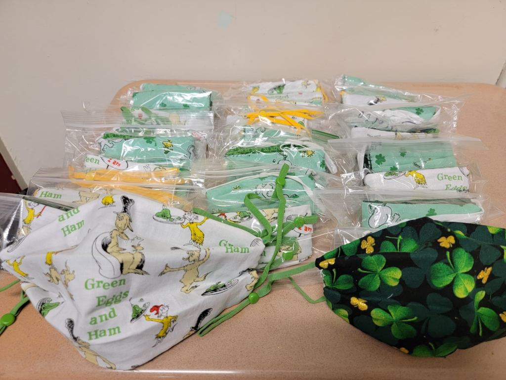
      District parents and other community members additionally stepped up to provide homemade face masks for teachers and staff. The district built up community trust and used a cautious, step-by-step reopening strategy to make it through the 2020-2021 school year with zero cases identified in school buildings.

      The Port Orford-Langlois School District is the subject of the fourth profile in the COVID-19 Data Dispatch’s “Opening” series. Alongside four other school communities, we selected it because the majority of the district’s students returned to in-person learning during the 2020-2021 school year — and officials identified COVID-19 cases in under 5% of the student population. (According to the CDC, about 5% of school-aged children in the U.S. contracted COVID-19 between the start of the pandemic and early August 2021.)

      Demographics for Port Orford, Oregon

      American Community Survey 2019 5-year estimates

      • Population: 1,000
      • Race: 94.7% white, 2.0% Native American, 3.4% two or more races, 1.5% Hispanic/Latino
      • Education: 92.8% have high school degree, 11.0% have associate’s degree, 21.5% have bachelor’s degree
      • Income: $27,500 is median household income, 27.5% in poverty
      • Computer: 87.6% have a computer, 77.0% have broadband internet1
      • Free lunch: 68.9% of students receive free or reduced-price lunch2

      COVID-19 stats for Port Orford-Langlois School District 2CJ

      • Total enrollment: 205 students3
      • In-person enrollment: Estimated 85%-90% at the start of the school year (K-3 students only), 95% at the end (all grades)3
      • Total cases, 2020-2021 school year: 0 cases reported4

      1Source: County-level statistic
      2Source: National Center for Education Statistics
      3Source: Interview with Principal Krista Nieraeth
      4Source: Reported by Oregon Health Authority


      Library partnership and community

      Both of the towns in this Oregon school district are tiny. Port Orford has a population of about 1,000, and Langlois has an even smaller population of 135. The district is made up of two schools: a high school and a K-8 school, where class sizes tend to be under 20 students. The two schools have a total enrollment of about 200 students combined. Staffers at the district wear multiple hats — Krista Nieraeth, for instance, serves as principal for both schools.

      In these two small towns, communication between school parents and administrators was direct — and personal. Nieraeth recalled how she often received information about students who needed to quarantine: “I would get a Facebook message [from a parent] at eight o’clock at night going, what do I do?” Some parents also called her personal cell number to ask questions or alert her to COVID-19 symptoms in their households, while district teachers had individual calls with parents before classes started. This level of direct communication reflected trust between the community and the district’s administration.

      One example of community partnership was the district’s connection to the Port Orford Public Library, which manages the school district’s library system. Starting in fall 2020, the library hosted IT specialists and teachers from the school in one of the library’s conference rooms. Students were able to come get technological support or a bit of face-to-face homework help. 

      The library later dedicated more spaces for after-school homework help, allowing families to come in and utilize the free wifi. Both the library and school buildings also kept their wifi turned on, so that families could sit in their parking lots and use it from their cars; the library’s wifi was on 24/7. Similarly to Garrett County in Maryland, the geography of this rural district makes broadband access inaccessible for many families.

      “The biggest feedback I had was a wish for longer hours,” Library Director Denise Willms said, when asked how district families responded to the library’s services. Due to low staffing, the library was unable to operate a full seven-days-a-week schedule. Willms additionally noted that the library does not have a great ventilation system or easily-openable windows — and unlike school districts across the country, she was unable to access a government grant for ventilation updates.

      Librarians and district staff ultimately brought services from the library directly to students. The school libraries were unavailable for browsing (because they were temporarily used as large classrooms), so library staff and teachers coordinated book delivery directly to classrooms. Kari Hansen, the K-8 school’s library coordinator, recalled using gloves to handle the books and reading out story descriptions to students, so that they could learn about their options at a distance before making a reading choice.

      The Port Orford youth services librarian, Cheryl Frances, and school staff also produced take-home activity kits for students. The library’s kits included literacy, dinosaurs, and other STEAM learning materials. Parents could pick these activity packs up at the library, and when extras were available, library staff took them over to the school. The kits served as a way to remind students that “the library is here,” Frances said.

      Social studies, history, and economics teacher Phoebe Skinner observed that these take-home activities were very popular with students and parents alike. Since the kits had “everything you need” right in the package, she said, overwhelmed parents didn’t need to hunt down extra supplies or do any other additional labor. The district additionally ran its own virtual events, such as a movie night and bingo games.

      Reflecting on the school-library partnership, Willms — the library director — said that her experience embodied: “students first, community first, ego second.” Principal Nieraeth similarly said that the library, along with churches and other community civic organizations, “really would help step up and ask us, ‘What do you need?’”

      Homemade facemasks donated to the school district by parents in March 2021. Photo via the district’s Facebook page.

      “Playing it safe”

      Similarly to other districts profiled in this project, Port Orford-Langlois prioritized getting students back in physical classrooms during the COVID-19 pandemic. To prepare for that reopening, Nieraeth said, she and other staffers focused on spacing and ventilation. After using tape to map out every classroom in seven-by-five-foot blocks, the staff put a desk in each space.

      The staff also prioritized ventilation: windows needed to be open in each classroom. In some cases, classroom assignments were shuffled around to allow proper social distancing. One class with over 20 students, for example, was moved into the library.

      In addition to these precise preparations, the district opted to delay its fall 2020 semester by two weeks for extra prep time. Then, age groups were brought back to classrooms in intervals to test out safety measures and build trust in the community.

      The first phase of this reopening was the youngest students, grades kindergarten through third grade. Those younger students “needed that stability” of in-person learning, Nieraeth said.

      After six weeks of the youngest children in classrooms, case numbers were low enough both in the school district itself and in surrounding Curry County to bring more students back: grades four through six. Administrators had planned to bring back middle and high school students six weeks after that, but by that point, the winter COVID-19 surge had hit Oregon, leading the district to opt for caution and continue virtual learning for older students.

      Nieraeth estimated that, at the start of the fall semester, 10% to 15% of the K-3 students chose all-remote learning. But, throughout the semester, more families decided to go back in person, as they saw that the district adhered to safety protocols while also letting kids play together. Parents also developed trust in the district by watching Nieraeth share district updates on social media and respond to parents’ questions.

      In addition to basic safety measures like social distancing and ventilation, the district barred visitors from the school buildings, conducted daily temperature and symptom checks, and encouraged lots of handwashing and sanitation.

      “My desk had never been cleaner in 20 years of teaching,” said Skinner, the social studies, history, and economics teacher.

      Masks were required for all students and staff as well. Nieraeth said she was “pleasantly surprised” to see that even the youngest children wore their masks responsibly. She credited this, in part, to the district’s parents, who modeled mask-wearing for their children — even though the community leans conservative, and parents may not have been overly enthusiastic about masking themselves.

      Precautions continue into fall 2021

      When the spring semester started in February, middle and high school students were finally able to return to classrooms. Skinner noted that a significant batch of students returned in March, after older family members in their households were able to get vaccinated. By the end of the year, she said, out of 60 to 70 students in her social studies classes, all but eight were attending class in person. Principal Nieraeth similarly estimated that about 95% of the district’s students were attending school in person by the end of the spring semester. 

      Overall, the safety measures and low community spread helped the Port Orford-Langlois schools avoid outbreaks. The Oregon Health Authority did not identify a single case in the district for the entire 2020-2021 school year; Principal Nieraeth confirmed this statistic.

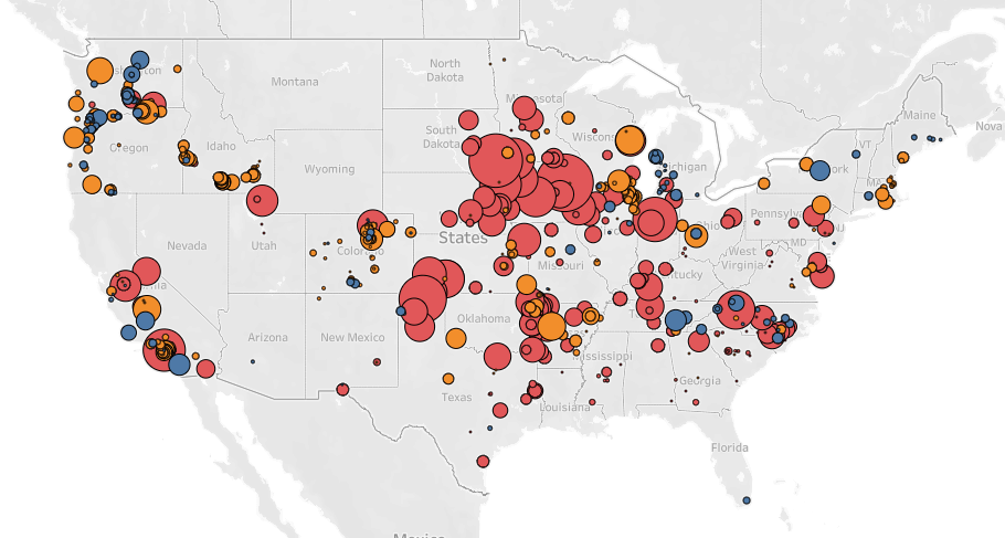
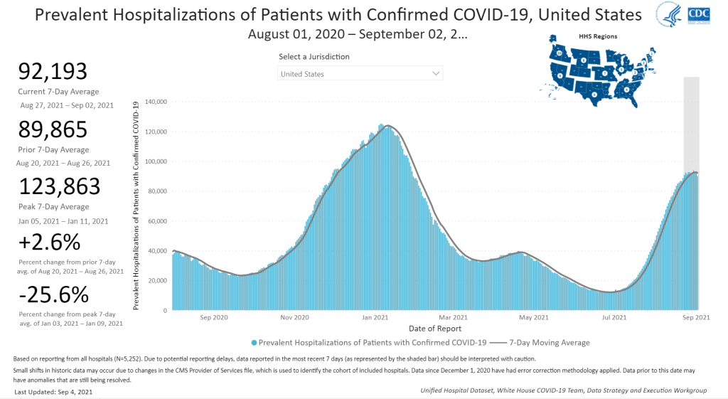
      In fall 2021, the Port Orford-Langlois district is continuing similar safety measures to last year, including required masks. But this semester is less likely to proceed with zero outbreaks: the surrounding county, like much of Oregon, is now seeing some of its highest case rates of the pandemic. And, in mid-August, this county reported more cases per person than any other in the state. As of September 1, 51% of county residents are fully vaccinated, per Oregon state data; teachers and staff have until October 18 to comply with a state vaccine mandate.

      In a follow-up interview on Sept. 2 — four days into the new school year — Principal Nieraeth said her district was following all the protocols that worked well last year. “We’re working with our families and really reliant on them to help us ensure that we’re being safe at school,” she said.


      The COVID-19 Data Dispatch’s “Opening” series is available for other publications to republish, free of charge. If you or your outlet is interested in publishing any part of this series, please contact betsy@coviddatadispatch.com.

      Edit, Sept. 7, 2021: An earlier version of this story misrepresented the activity kits produced by the Port Orford Public Library; the story has been updated with accurate examples.

      More from the Opening series

    • National numbers, September 5

      National numbers, September 5

      About 90,000 Americans are currently in the hospital with COVID-19; this has been the daily average for the past two weeks. Chart via the CDC, screenshot taken on September 4.

      In the past week (August 28 through September 3), the U.S. reported about one million new cases, according to the CDC. This amounts to:

      • An average of 153,000 new cases each day
      • 327 total new cases for every 100,000 Americans
      • 5% more new cases than last week (August 21-27)

      Last week, America also saw:

      • 85,000 new COVID-19 patients admitted to hospitals (26 for every 100,000 people)
      • 7,300 new COVID-19 deaths (2.2 for every 100,000 people)
      • 99% of new cases now Delta-caused (as of August 28)
      • An average of one million vaccinations per day (per Bloomberg)

      Nationally, the current COVID-19 surge appears to be in a plateau. The number of new cases rose by just 5% this week, after a 3% rise last week. Hospitalizations are in a similar position: the number of patients in the hospital with COVID-19 has held steady at about 90,000 for the past two weeks.

      Among the COVID-19 experts I follow, I’ve seen some speculation that this could be the start of a Delta decline—similar to what we’ve seen in other countries, like India and the U.K. At the same time, others are noting that the U.K. saw a brief case decline followed by another rebound. If Delta does the same thing here, it would coincide with more schools starting their fall semesters and colder weather, neither of which bode well for transmission.

      And there are already a lot of children in hospitals right now. According to the COVID-NET surveillance system, there were about 14 children (under age 18) hospitalized with COVID-19 for every one million kids in the U.S. during the week ending August 28. For children under age 5, that number is 20 for every million—higher than at any other point in the pandemic.

      Thanks to COVID-19 and other diseases (like RSV, another virus that’s impacting many kids right now), pediatric intensive care units are overwhelmed, especially in the South. To understand what that means, I recommend this powerful op-ed by health equity expert Dr. Uché Blackstock. (Recent CDC research suggests that higher child hospitalization numbers are due to Delta’s high transmission, not because it impacts children more intensely. More on that later in the issue.)

      Meanwhile, high test positivity rates indicate that many COVID-19 cases are probably not being caught—especially those breakthrough cases in vaccinated people which may be mild, but can still spread the virus to others. At the national level, our test positivity rate is about 10% right now. In several states—South Dakota, Tennessee, Oklahoma, Alabama—positivity is over 20%, meaning we probably are not getting a clear picture of the surges in these locations.

      The U.S. is now seeing over 1,000 COVID-19 deaths a day, a level that we had not hit since the winter surge. Almost all of these deaths are preventable. This will continue, for as long as the Delta surge lasts.

    • Featured sources, August 29

      I was on vacation last week, unable to scour the internet for COVID-19 sources like I usually do. So, here are a couple of old favorites from the archives:

      • School Survey Dashboard from the Institute of Education Statistics (featured 3/28/21): As part of the Biden Administration’s commitment to reopening K-12 schools across the country, the federal government is now collecting data on how students are receiving education—and releasing those data on a monthly basis. This dashboard draws from surveys of a nationally represented sample including 7,000 rural, suburban, and urban schools, focusing on fourth-graders and eighth-graders. We (still!) don’t have data on COVID-19 cases, tests, or enrollment numbers, however.
      • Vaccine consent laws by state (featured on 5/23/21): As schools reopen, a lot of teenagers out there may want to know if they can get vaccinated without parental permission. The site VaxTeen provides these kids with information on the consent laws in every state, as well as a guide for talking to your parents about vaccines and other resources.
      • COVID-19 in ICE detention centers (featured on 11/1/20): Since March 2020, researchers from the Vera Institute of Justice have been compiling data from Immigration and Customs Enforcement (ICE) on COVID-19 cases and testing in immigrant detention centers. The researchers note that ICE replaces previously reported numbers whenever its dataset is updated, making it difficult to track COVID-19 in these facilities over time.
      • Rural hospital closures (featured on 6/20/21): The North Carolina Rural Health Research Program at the University of North Carolina tracks hospitals in rural areas that close or otherwise stop providing in-patient care. The database includes 181 hospitals that have closed between 2005 and 2021, available in both an interactive map and a downloadable Excel file.

    • One data researcher’s journey through South Carolina’s COVID-19 reporting

      One data researcher’s journey through South Carolina’s COVID-19 reporting

      By Philip Nelson

      COVID-19 hospitalizations in South Carolina, as of August 26. Posted on Twitter by Philip Nelson.

      If you post in the COVID-19 data Twitter-sphere, you’re likely familiar with Philip Nelson, a computer science student at Winthrop University—and an expert in navigating and sharing data from the state of South Carolina. Philip posts regular South Carolina updates including the state’s case counts, hospitalizations, test positivity, and other major figures, and contributes to discussions about data analysis and accessibility.

      I invited Philip to contribute a post this week after reading his Tweets about his ongoing challenges in accessing his state’s hospitalization data. Basically, after Philip publicized a backend data service that enabled users to see daily COVID-19 patient numbers by individual South Carolina hospital, the state restricted this service’s use—essentially making the data impossible for outside researchers to analyze.

      To me, his story speaks to broader issues with state COVID-19 data, such as: agencies adding or removing data without explanation, a lack of clear data documentation, failure to advertise data sources to the public, and mismatches between state and federal data sources. These issues are, of course, tied to the systematic underfunding of state and local public health departments across the country, making them unequipped to respond to the pandemic.

      South Carolina seems to be particularly arduous to deal with, however, as Philip describes below.


      I’ve been collecting and visualizing South Carolina-related COVID-19 data since April 2020. I’m a computer science major at Winthrop University, so naturally I like to automate things, but collecting and aggregating data from constantly-changing data sources proved to be far more difficult than I anticipated.

      At the beginning of the pandemic, I had barely opened Excel and had never used the Python library pandas, but I knew how to program and I was interested in tracking COVID-19 data. So, in early March 2020, I watched very closely as the South Carolina Department of Health and Environmental Control (DHEC) reported new cases.

      During the early days of the pandemic, DHEC provided a single chart on their website with their numbers of negative and positive tests; I created a small spreadsheet tracking these cases. After a few days, DHEC transitioned to a dashboard that shared county level data.

      On March 23, I noticed an issue with the new dashboard. Apparently, someone had misconfigured authentication on something in the backend. (When data sources are put behind authentication, anyone outside of the organization providing that source loses access.) The issue was quickly fixed and I carried on with my manual entry, but this was not the last time I’d have to think about authentication.

      Initially, I manually entered the number of cases and deaths that DHEC reported. I thought I might be able to use the New York Times’ COVID-19 dataset, but after comparing it to the DHEC’s data, I decided that I’d have to continue my own manual entry.

      South Carolina’s REST API

      In August 2020, I encountered some other programmers on Twitter who had discovered a REST API on DHEC’s website. REST is a standard for APIs that make it easier for developers to use services on the web. In this case, I was able to make simple requests to the server and receive data as a response. After starting a database fundamentals course during the fall 2020 semester, I figured out how to query the service: I could use the data in the API to get cases and deaths for each county by day.

      This API gave me the ability to automate all of my update processes. By further exploring the ArcGIS REST API website, I realized that DHEC had other data services available. In addition to county-level data, the agency also provided an API for cases by ZIP code. I used these data to create custom zip code level graphs upon request, and another person I encountered built a ZIP code map of cases.

      During August 2020, the CDC stopped reporting hospitalization data and the federal government shifted to using data collected by the Department of Health and Human Services (HHS) and Teletracking. DHEC provided a geoservice for hospitalizations, based off of data provided to DHEC by Teletracking on behalf of the HHS. I did some exploration of the hospitalization REST API and found that the data in this API was facility-level (individual hospitals), updated daily. I aggregated the numbers in the API based on the report date in order to provide data for my hospitalization graph. At the time, I didn’t know that the federal government does not provide daily facility level data to the public.

      In October 2020, DHEC put their ZIP code-level API behind authentication. I voiced my displeasure publicly.  In late December 2020, DHEC put the API that contained county level cases and deaths behind authentication. At this point, I began to get frustrated with DHEC for putting things behind authentication without warning, but I kind-of gave up on getting the deaths data out of an API. Thankfully, DHEC still provided an API for confirmed cases, so I switched my scripts to scrape death data from PDFs provided by DHEC each day. I didn’t like using the PDFs because they did not capture deaths that were retroactively moved from one date to another, unlike the API.

      I ran my daily updates until early June 2021, when DHEC changed their reporting format to a weekday-only schedule.  I assumed that we’d seen the last wave of the pandemic and that, thanks to readily available vaccines, we had relegated the virus to a containable state. Unfortunately, that was not the case — and by mid-July, I had resumed my daily updates.

      Hospitalization data issues

      In August 2021, people in my Twitter circle became interested in pediatric data. I decided to return to exploring the hospitalization API because I knew it had pediatric-related attributes. It was during that exploration that I realized I had access to daily facility-level data that the federal government was not providing to the public; the federal government provides weekly facility-level data. My first reaction was to build a Tableau dashboard that let people look at the numbers of adults and pediatric patients with COVID19 at the facility level in South Carolina over time.

      After posting that dashboard on Twitter, I kept hearing that people wanted a replacement for DHEC’s hospitalization dashboard which, at the time, only updated on Tuesdays. So, I made a similar dashboard that provided more information and allowed users to filter down to specific days and individual hospitals, then I tweeted it at DHEC. Admittedly, this probably wasn’t the smartest move.

      I kept exploring the hospitalization data and found that it contained COVID-19-related emergency department visits by day, another data point provided weekly by HHS. After plotting out the total number of visits each day and reading the criteria for this data point, I decided I needed to make another dashboard for this. A day after I posted the dashboard to Twitter, DHEC put the API I was using behind authentication, again I tweeted my frustration

      A little while later, DHEC messaged me on Twitter and told me that they were doing repairs to the API. I was later informed that the API was no longer accessible, and that I would have to use DHEC’s dashboard or HHS data. The agency’s dashboard does not allow data downloads, making it difficult for programmers to use it as a source for original analysis and visualization.

      I asked for information on why the API was no longer operational; DHEC responded that they had overhauled their hospitalization dashboard, resulting in changes to how they ingest data from the federal government. This response did not make it clear why DHEC needed to put authentication on the daily facility-level hospitalization data.

      Meanwhile, DHEC’s hospital utilization dashboard has started updating daily again. But after examining several days’ worth of data, I cannot figure out how the numbers on DHEC’s dashboard correlate to HHS data. I’ve tried matching columns from a range dates to the data displayed, but haven’t been able to find a date where the numbers are equal. DHEC says the data is sourced from HHS’ TeleTracking system on their dashboard, but it’s not immediately clear to me why the numbers do not match. I’ve asked DHEC for an explanation, but haven’t received a response.

      Lack of transparency from DHEC

      I’ve recently started to get familiar with the process of using FOIA requests. In the past week, I got answers on requests that I submitted to DHEC for probable cases by county per day. This data is publicly accessible (but not downloadable) via a Tableau dashboard, but there is over 500 days’ worth of data for 46 counties. The data DHEC gave to me through the FOI process are heavily suppressed and, in my opinion, not usable.

      This has been quite a journey for me, especially in learning how to communicate and collect data. It’s also been a lesson in how government agencies don’t always do what we want them to with data. I’ve learned that sometimes government agencies don’t always explain (or publicize) the data they provide, and so the job of finding and understanding the data is left to the people who know how to pull the data from these sources.

      It’s also been eye-opening to understand that sometimes, I’m not going to be able to get answers on why a state-level agency is publishing data that doesn’t match a federal agency’s data. Most of all, it’s been a reminder that we always need to press government-operated public health agencies to be as transparent as possible with public health data.

    • Learn more about the Opening series via a live Q&A with Betsy

      Learn more about the Opening series via a live Q&A with Betsy

      Event description via SWINY’s website.

      I’m very excited to share that I’ll be discussing my “Opening” series at a virtual conversation this coming Wednesday, September 1 with David Levine, co-chair of Science Writers in New York (SWINY).

      The “Opening” series is a solutions journalism project, profiling school districts that successfully brought the majority of their students back to in-person learning during the 2020-2021 school year while keeping case numbers down. Catch up on the series here. At the event, I hope to talk about the motivations behind this project, lessons from the districts I’ve profiled, continued school data concerns, and how Delta heightens reopening challenges.

      SWINY has held numerous virtual Q&As throughout the pandemic, discussing the challenges of reporting on this crisis with science writers and experts including Carl Zimmer and Apoorva Mandavilli. It’s an honor to join that esteemed group of speakers. I look forward to answering questions from COVID-19 Data Dispatch readers and other science writing fans!

      Register for the event here. It’ll be held virtually this coming Wednesday, September 1 at 7 PM Eastern.

      Update, September 30: This event was recorded and is now available to watch on YouTube.

      Read the “Opening” series

    • Opening profile: Personal responsibility in Andrews, Texas

      Opening profile: Personal responsibility in Andrews, Texas

      By Betsy Ladyzhets

      Andrews County students gather at a football game in August 2021. Photo via the district’s Facebook page.

      On July 28, 2020, before the start of fall extracurriculars, Andrews Independent School District held a town hall in the high school auditorium. Parents and community members came from across the county to grill the district administrators on their reopening plans. While some parents wanted the details on safety measures, others were more concerned about their individual freedoms.

      Bobby Azam, the district superintendent, recalls parents asking questions like, “Are you going to force my child to sit still all day?” or “Are you going to penalize my child if their mask slips off?”

      Ultimately, when schools reopened for in-person classes, students in this West Texas district were not penalized for letting a mask slip. The school district prioritized personal responsibility, giving families information to make individual choices about their children’s safety. Partnerships with the local health department, outdoor classes, increased ventilation, and an intensive cleaning regimen also helped keep cases down — even though the district did not follow all Centers for Disease Control and Prevention (CDC) protocols, such as required quarantines and masks for the youngest students.

      Andrews County’s school district is the subject of the third profile in the COVID-19 Data Dispatch’s “Opening” series. Alongside four other school communities, we selected it because the majority of the district’s students returned to in-person learning during the 2020-2021 school year — and officials identified COVID-19 cases in under 5% of the student population. (According to the CDC, about 5% of school-aged children in the U.S. have contracted COVID-19 since the start of the pandemic.)

      Though this district did not adhere to the full extent of COVID-19 prevention guidance, it offers valuable lessons in addressing community politics while still maintaining safety measures — reflecting the challenges that many Sun Belt districts face this fall.

      Demographics for Andrews County, Texas
      Census population estimates, July 2019

      • Population: 19,000
      • Race: 56.6% Hispanic/Latino, 39.9% white, 2.0% Black, 1.5% Native American, 1.5% two or more races, 0.7% Asian
      • Education: 72.3% have high school degree, 12.2% have bachelor’s degree
      • Income: $76,200 is median household income, 10.2% in poverty
      • Computer: 91.6% have a computer, 86.2% have broadband internet
      • Free lunch: 47.9% of students eligible for free or reduced-price lunch1

      COVID-19 stats for Andrews Independent School District
      Texas Department of State Health Services, Public Schools COVID-19 data

      • Total enrollment: 4,000
      • In-person enrollment: 82% in late September, 2020; 100%, January through June, 2021
      • Total cases, 2020-2021 school year: 167 cases in students, 76 in staff
        • Clearfork Elementary School: 6 students, 0 staff
        • Underwood Elementary School: 9 students, 0 staff
        • Devonian Elementary School: 10 students, 0 staff
        • Andrews Education Center: 12 students, 1 staff
        • Andrews Middle School: 48 students, 0 staff
        • Andrews High School: 68 students, 0 staff
        • Unspecified campus: 14 students, 75 staff

      1Source: National Center for Education Statistics


      Preparing for reopening

      When the schools shut down in March 2020, Andrews County was prepared to provide computers for all students. Still, remote learning proved challenging. Many Andrews parents work in the oil industry, which is a major employer in the region, and were unable to work from home — which left many students at home alone.

      As a result, when Gov. Greg Abbott announced a plan for fall reopening in June 2020, Andrews district administrators went full speed ahead. Planning for reopening relied on constant communication with the school board and the late July town hall, along with other opportunities for parents to provide feedback.

      Administrators also prepared for reopening by intensifying cleaning efforts at Andrews school buildings. The district hired an outside cleaning service to deep clean all buildings, both before the semester began and at regular intervals during the first couple weeks of classes.

      All teachers and students in Andrews County had to choose between an all-in-person or all-virtual experience. Unlike other Texas districts, teachers were organized to lead either an entirely virtual or entirely in-person class — no need to teach hybrid classes and split focus between the students in a classroom and the students on Zoom. Meanwhile, students had to commit to in-person class in order to participate in sports or other extracurriculars. In late September, about 82% of students were attending class in person, according to Texas state health department data.

      Students who opted for those in-person classes had more outside time than in previous years. Andrews has a warm climate, with temperatures rarely falling below freezing; district staff took advantage by opening windows and doors to outside air, as well as holding class in the playground. Research suggests that outdoor coronavirus transmission is incredibly rare, and ventilation is more effective than cleaning in preventing the spread of aerosols — those tiny virus particles that travel through the air.

      “Anytime we could be outside, we did,” Azam said. He found that many students — who were stuck learning from home in spring 2020, while their parents were at work — were especially appreciative of the extra playtime.

      Parents’ choice — and parents’ responsibility

      Like other districts profiled in this series, the Andrews County school district partnered with the local public health department during its fall reopening. During the fall semester, the public health department shared information about new COVID-19 cases directly with school administrators — notifying the district about a new student case at the same time as the student’s parents. This method went above and beyond guidance from the state of Texas, which stipulated that parents should inform their school district of a case, then the district should inform the public health department. The rapid communication helped the district identify cases quickly and ensure that no cases were missed due to a parent’s reporting hesitancy.

      Once a case was identified, the classroom would be immediately cleared and custodians wiped down every surface that the student may have touched. The student’s parents would get a call to pick up their child, and notifications went out to families sharing a classroom with the infected child via ParentSquare, the school’s parent communication service. Those families were all able to access free, drive-through testing right at the local health department — with results in under 24 hours, according to Suzanne Mata, assistant superintendent of student services at the district.

      This health department partnership was challenged, however, by “differences of opinion” between district leadership and health workers, as Mata described the relationship. The Andrews school district opted not to require masks beyond the state guidance — which said children under 10 were exempt — and made quarantines optional when a case was identified. The department urged the district to follow CDC guidance: quarantine all exposed students and require masks for all children, including those under age ten.

      Rather than relying on strict restrictions, the district “utilized parents,” as Superintendent Azam put it. Parents were able to choose whether a child under age 10 required a mask, while also taking responsibility for other safety measures.

      “We said, ‘Mom, Dad, you know your kid better than us,’” Azam said. The district’s quarantine policy reflected this philosophy. While the district required any student with COVID-19 symptoms or a positive test result stay home from school, children who shared a classroom with an infected student had the choice to quarantine or continue coming to class as usual.

      “We just said, an individual has been in your student’s classroom… that has actually tested positive — please be aware to look for these symptoms,” Mata said, describing the notification that parents received after a positive case. The notice also reminded parents that any child with symptoms had to stay home.

      Gordon Mattimoe, director of the Andrews County Health Department, called the district’s policy “not ideal for mitigation.” After the fall 2020 semester and deterioration of the relationship between district and health department, as Mata described the situation, the health department stopped sharing case information directly with the school district. Instead, parents were asked to report any student cases, further placing the responsibility for COVID-19 mitigation on parents. Administrators felt that parents had sufficient understanding and trust in the district’s protocol to report cases responsibly.

      Transitioning to 100% in person

      !function(){“use strict”;window.addEventListener(“message”,(function(e){if(void 0!==e.data[“datawrapper-height”]){var t=document.querySelectorAll(“iframe”);for(var a in e.data[“datawrapper-height”])for(var r=0;r<t.length;r++){if(t[r].contentWindow===e.source)t[r].style.height=e.data["datawrapper-height"][a]+"px"}}}))}();

      The fall 2020 semester started off smoothly, except for a small outbreak in a sports team. As parents saw the district keep case numbers low — while remaining flexible on safety measures — in-person enrollment grew.

      “Every week, we had more and more kids… coming back face to face,” Superintendent Azam said. The students who had opted for the district’s virtual learning option struggled, both with getting assignments turned in and with mental health while home alone.

      As a result, the district decided to end the virtual option halfway through the fall semester, phasing students back in throughout October and November. During this transition, some families chose to drop out of the public school district entirely and switch to homeschooling or another option. According to data from the Texas public health department, the district’s total enrollment dropped by 157 students — from 4,149 in October 2020 to 3,992 in January 2021.

      In total, the Texas health department reported 167 cases among Andrews students over the course of the school year, representing about 4% of the total student body. They reported 76 cases among staff. The district saw its highest case spikes in November, December, and January, when the country was undergoing its highest surge, followed by almost zero cases between March and the end of the school year in late May. This may be an undercount, however, as the public health department was no longer sharing case data with the district during the spring.

      Superintendent Azam acknowledged that luck may have been a factor in Andrews’ low case counts; this rural district was not hit hard by COVID-19 like El Paso and other parts of Texas. The district also likely benefited from improved ventilation, via outdoor classes and open windows. Finally, while parents were expected to report cases to the school and take responsibility for quarantines, administrators say that trust built up throughout the fall semester enabled district parents and staff to become unified around the goal of keeping kids in classrooms and COVID-19 out of classrooms — making this individual responsibility system effective.

      The Andrews district has taken away key lessons from the 2020-2021 school year. These include: a continued focus on cleaning when COVID-19 or any other illness is identified in a school building; telling teachers and students to stay home if they feel sick; and holding class outside whenever possible.

      As the Delta variant now sweeps through Texas and Governor Abbott blocks school mask mandates, Mattimoe, from the county health department, is concerned that Andrews’ flexible safety strategy may be harder to maintain this year. The public health department typically partners with the district on fall childhood vaccination events, he said, but opted not to hold events at the middle school this year due to COVID-19 vaccine polarization in the community. About 42% of the county’s eligible population is fully vaccinated as of August 28, according to Texas state data; the state average is 57%.

      “With the governor’s orders, the school is going back to business as usual,” Mattimoe said.

      Mata, the assistant superintendent, said that the district is “staying very vigilant” and aiming to “do what’s right for our students and our staff.” As of August 22, the district has yet to report any cases in the fall 2021 semester.


      The COVID-19 Data Dispatch’s “Opening” series is available for other publications to republish, free of charge. If you or your outlet is interested in publishing any part of this series, please contact betsy@coviddatadispatch.com.

      More from the Opening series