Biobot provides wastewater testing and analysis for more than 400 sites in the NWSS network, accounting for about one-third of the system’s total 1,200 sites. The CDC/Biobot arrangement basically makes it easy for these wastewater treatment plants to participate in COVID-19 and mpox testing, since sites can send in samples without spending the time and resources needed to build up their own testing programs.
I was glad to see this news, as the continued contract will mean no interruptions in CDC NWSS data for at least another six months. Long-time readers might remember that there were major wastewater data gaps last spring, when the CDC switched contractors from LuminUltra to Biobot.
Of course, six months is far from the long-term investment that the U.S. should be making in wastewater surveillance… but that’s a topic for another week.
This week, two major COVID-19 tracking efforts announced that they will stop collecting data. While the decisions make sense in light of reduced data availability these days, this news still feels like a signal that fewer institutions want to spend time and resources on pandemic tracking.
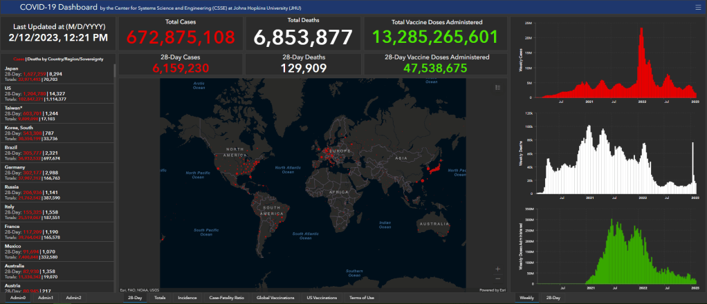
The Johns Hopkins global dashboard and broader Coronavirus Resource Center is one of those shutting down. Its team plans to stop data collection and reporting on March 10, 2023. Johns Hopkins’ project was one of the very first COVID-19 trackers to come online in early 2020, filling a void when the CDC and other government agencies failed to provide the frequent, user-friendly updates people wanted.
Lauren Gardner, a Johns Hopkins professor who helped run the project, told NPR that its end is “bittersweet” but that “it’s an appropriate time to move on.” Other countries, as well as individual states and counties in the U.S. that the project used as data sources, are now updating their COVID-19 numbers less frequently and less reliably.
These reduced state and local updates are also one reason why the New York Times’ COVID-19 tracker will shut down, according to an update posted to the project’s GitHub repository this week. “As case and death reporting at the local level has become less frequent and comprehensive, the daily data we have been able to gather has become less useful for indicating real-time trends about the virus,” wrote NYT graphics editor Wilson Andrews.
The NYT’s COVID-19 dashboard will still get updated, according to Andrews’ GitHub note, but it will rely on the CDC and other federal data sources rather than compiling its own data. Andrews shared several key links where readers can find federal data, including the CDC’s main dashboard, the White House Community Profile Reports, and data pulled from death certificates. (H/t to Nicki Camberg for flagging the NYT announcement!)
It’s worth noting here that the COVID Tracking Project—for which I served as a volunteer—similarly pointed users to federal data sources when it shut down, nearly two years ago. Data from the CDC and HHS have improved significantly throughout the pandemic, to a point that these sources are likely more reliable than adding up numbers from individual states and localities. But federal data still suffer from case undercounting, lack of standardization (for some metrics), and other issues.
For my own updates at the COVID-19 Data Dispatch, I mostly use CDC data, along with wastewater surveillance data from a couple of outside sources (Biobot, WastewaterSCAN). So I get why places like Johns Hopkins and the NYT would want to point people to these sources, rather than spending time collecting their own data.
Even so, this feels like the end of an era for pandemic tracking: two giants of the field are shutting down. The announcements seem to suggest that people are no longer interested in learning about COVID-19 spread in their communities—even though, I can tell you from writing this newsletter, the audience is very much still present, and the work is very much still necessary.
And in case it needs to be said: the COVID-19 Data Dispatch isn’t going anywhere.
Washington’s dashboard includes coronavirus concentration levels over time from a selection of wastewater treatment plants in the state, with data going back to early 2022. It also includes some helpful notes about how to interpret wastewater data and maps showing the service areas for each treatment plant.
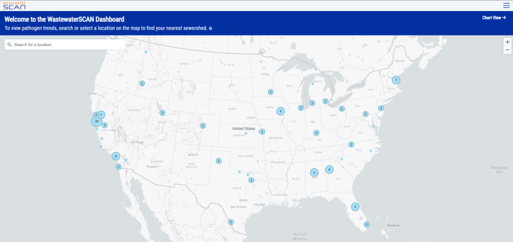
I also recently learned that WastewaterSCAN has released a new, upgraded dashboard to share its surveillance data. WastewaterSCAN is a project started by researchers at Stanford and Emory universities (with a focus on sites in California) that has since expanded across the country. The new dashboard makes it easier for users to find SCAN testing sites in their areas and answer specific questions with the data.
As official case numbers become less and less reliable, I’m glad to see public agencies and research efforts step up to make wastewater surveillance more accessible. Both the Washington dashboard and new WastewaterSCAN link are now included on my wastewater data resource page.
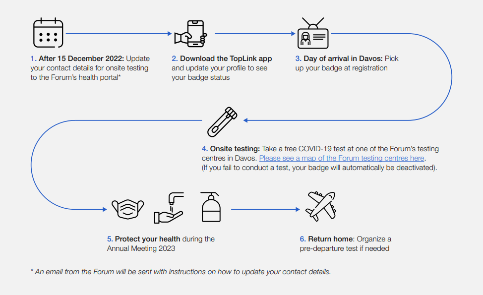
This week, thousands of top political and business leaders gathered in Davos, Switzerland for the World Economic Forum—one of the highest-profile mass events in the world. And the forum, colloquially called Davos after its location, had excellent COVID-19 safety protocols.
The protocols included: PCR tests required onsite (and event badges linked to negative results), masks recommended and available throughout the meeting venue, state-of-the-art ventilation systems, and far-UVC light. Only the best safety measures for the world’s elite, right? Even as many of those elites claim the pandemic is “over”?
News of the Davos COVID-19 protocols has led to media commentary and a Twitter hashtag, #DavosSafe, as public health experts point out that high-quality testing, ventilation, and other measures should not just be for billionaires.
Organizing tip for COVID activists: Highlighting (a) how elites are protecting themselves but not others (#DavosSafe) & (b) higher risk people are being harmed & locked out of society by status quo policies, are the most effective talking points for achieving policy change.
Rather than get angry about the inequities here, I’d like to use Davos as a reminder that many disease mitigation strategies don’t have to be expensive or restricted. Individuals can wear masks, build Corsi-Rosenthal boxes, test before gatherings, and take other relatively cheap measures to cut down on disease spread.
We deserve better. We deserve to be #DavosSafe as the hashtag going around on twitter puts it. Your children deserve to be treated with the care that world leaders are treating each other. Your family deserves to be protected from the disease which is still- unlike the flu- the third leading cause of death in the US. We don’t deserve to be shoved back into poorly ventilated workplaces while our politicians and press assure us that only crazy people would demand to breathe clean air.
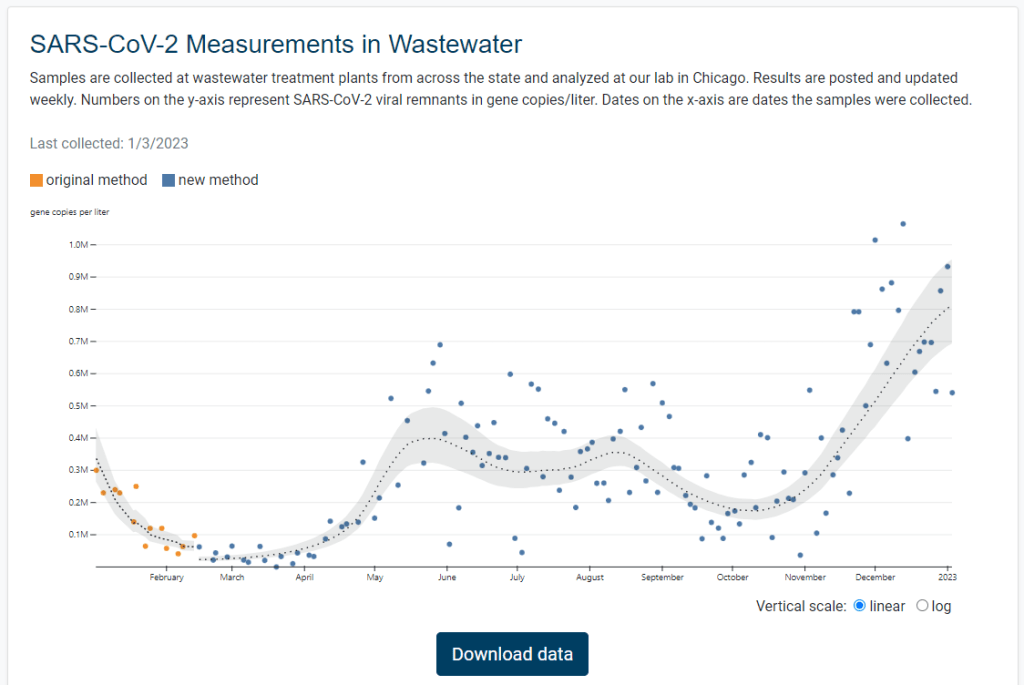
Illinois is the latest state to get its own dashboard for COVID-19 wastewater surveillance, with a new website that launched earlier this week. It includes data for 75 sites across the state.
The new dashboard—like the state’s wastewater surveillance program itself—is a collaboration between the Illinois Department of Public Health and the Discovery Partners Institute, a research center at the University of Illinois. Illinois’ agency received more than $6.5 million in federal grants to fund wastewater testing, according to local TV station WTTW.
I poked around a bit on the new dashboard, and I’m a fan: it includes a map of sampling locations, charts showing COVID-19 trends over time, easily-downloadable data, and ample information on how to interpret results. Nice work, Illinois!
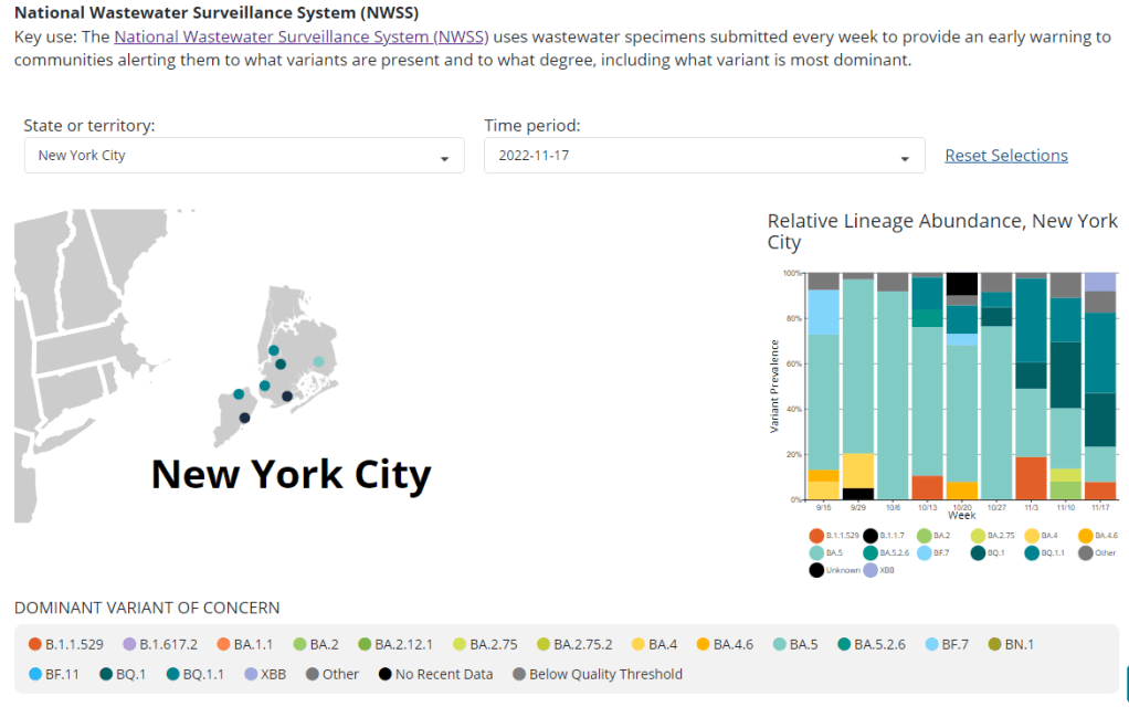
I recently learned that the CDC is publishing a limited amount of variant surveillance data from its National Wastewater Surveillance System (NWSS).
While NWSS is mostly focused on tracking coronavirus concentrations in wastewater as a proxy for transmission patterns, about 100 sites in the national network are also sequencing their wastewater samples and providing variant data. These data are available on the “Variant Summary” page of the CDC’s COVID Data Tracker, along with data from the CDC’s clinical specimen and traveler surveillance systems.
The NWSS variant data is not very representative of the entire country (as a relatively small number of jurisdictions are sending the CDC this information), but this is still a helpful starting point for expanding wastewater surveillance to include sequencing. I hope to see this program expand in the coming months.
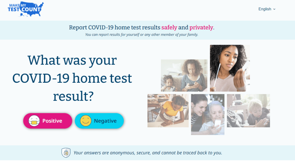
Make My Test Count is a new NIH website for people to report at-home COVID-19 test results.
This week, the National Institutes of Health launched a new website that allows people to anonymously report their at-home test results. While I’m skeptical about how much useful data will actually result from the site, it could be a helpful tool to gauge how willing Americans are to self-report test results.
The website, MakeMyTestCount.org, puts users through a series of basic questions about their at-home test experience: your test result, the test brand you used, when you tested, and whether you have COVID-19 symptoms. The site also asks for basic demographic information, including your age, ZIP code, race, and ethnicity. After you report your test result, the website provides additional context on interpreting that result, such as suggesting a repeat test in the next two days if you have symptoms.
These survey questions mimic the information that typically gets collected when someone receives a PCR test, and the resulting data could potentially be used to examine who is using at-home tests and what their results are. The NIH’s Rapid Acceleration of Diagnostics (or RADx) initiative, a program to speed up development and use of COVID-19 testing technologies, designed the website.
Of course, there are a lot of potential issues here. This website was launched more than two years after the first COVID-19 rapid tests were authorized and almost one year after they gained widespread popularity during the first Omicron surge. No matter how many people report their results now, the NIH will miss a lot of data and a lot of opportunities to advertise the site.
And how many people will report their results now? Pandemic safety measures like at-home testing are less popular than they were a year ago, and the launch of this website doesn’t seem to be paired with a public outreach campaign about using and reporting at-home tests. Basically, the results shared with the NIH are likely to be biased towards people who still care about taking precautions (and those who pay attention to federal COVID-19 resources). It’s also very easy to submit false results, as the website doesn’t ask for a photo of your test or anything similar.
Still, I’m excited to see this website launched—collecting some at-home test results is better than no test results! I hope lots of people use it, and I look forward to seeing any data the NIH eventually releases from the tool.
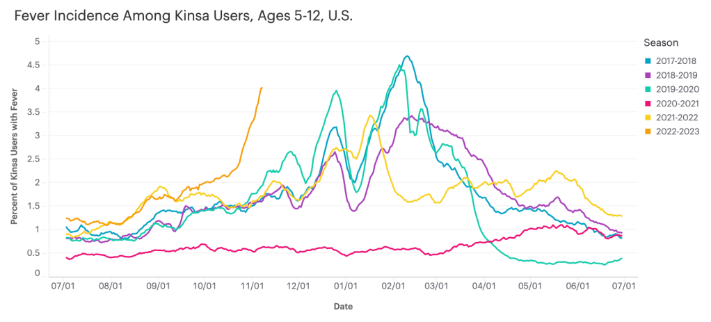
Data from Kinsa suggest that diseases causing fever are rising sharply among children ages five to 12, compared to past fall/winter seasons.
I recently learned about the Kinsa HealthWeather dashboard, a resource providing COVID-19 risk estimates by state and county based on data from smart thermometers.
Kinsa is a health tech company based in San Francisco that offers a health app paired with a smart thermometer. Users can submit their temperature data and symptoms to receive guidance on how to manage their illness. And at the population level, epidemiologists and data scientists can predict disease prevalence based on information from 2.5 million households using the app.
Danielle Bloch, epidemiology lead at Kinsa (and a former COVID Tracking Project volunteer, like myself), explained the process this way:
The data come from a network of 2.5 million households (of which about 600,000 users have taken a temperature in the past year) that have opted in to share information about their body temperature and symptoms, which are recorded through an app and smart thermometer. We’re currently in the process of updating our site to better incorporate other circulating infectious illnesses beyond COVID (Flu, GI symptoms, other respiratory infections) given the current landscape of diseases.
Right now, Bloch said, Kinsa’s data are showing an increase in fevers across the U.S.—with the biggest uptick in children ages five to 12. This trend likely reflects increasing COVID-19, flu, and RSV spread all at once.
As official case data from public health agencies become less reliable, new sources like Kinsa’s dashboard are a helpful way to continue tracking disease spread at the local level. I hope to see more sources like these in the future, along with more environmental monitoring (wastewater, air quality, etc.)
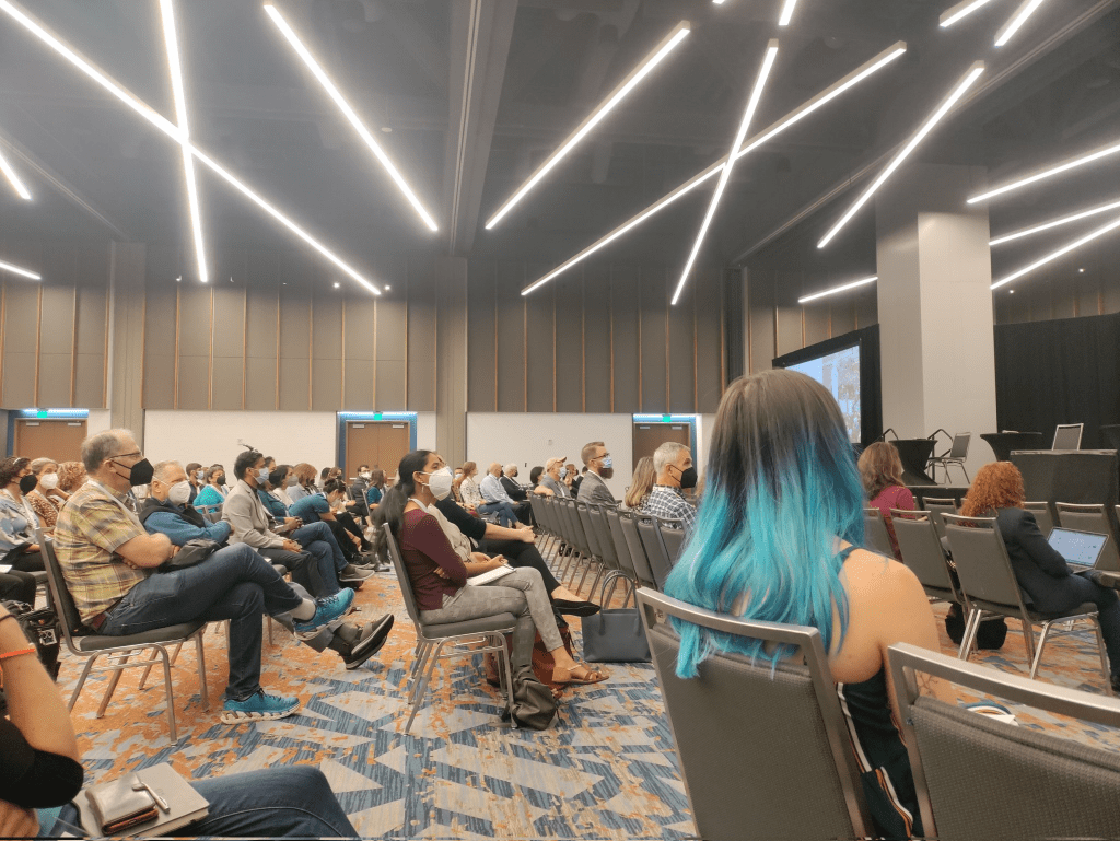
Masked Science Writers attendees watch a conference session. Photo by Betsy Ladyzhets.
A couple of weeks ago, I wrote that the Science Writers conference—which I attended in-person—had great COVID-19 safety policies, better than other events I’ve gone to this year.
The meeting of about 450 science journalists and communicators included required masks indoors, outdoor space for meals, and a vaccine requirement, among other safety measures. As I write this, about three weeks after the conference, there have been no reports of COVID-19 outbreaks (though the organizers were not requiring attendees to share all test results).
I’ve previously reported on COVID-19 safety at large events, so I wanted to learn more about how the Science Writers organizers planned the conference and communicated policies to attendees. To find out, I talked to Tinsley Davis, executive director of the National Association of Science Writers.
Davis shared behind-the-scenes insight into planning the 2022 Science Writers conference and tips for other event organizers. Her insight might be helpful whether you’re organizing a large journalism meeting or a small family gathering at Thanksgiving.
Rather than transcribing the entire interview, I wrote a paraphrased summary (with quotes from Davis throughout). Let me know what you think about this format in comparison to past Q&As!
Paying attention to COVID-19 news, planning in advance
Representatives from both organizations meet regularly on a steering committee to plan the annual meeting, Davis explained. In early 2021, that group paid attention to the vaccine rollout and started thinking about safety for a potential in-person meeting in the fall.
“We are very fortunate to have, amongst our volunteer leadership, science journalists and science communicators, and people who are generally paying very close attention to not only what’s happening in the news, but what’s happening in the research community,” Davis said. “And they’re paying to attention to it both out of professional interests, but also out of personal interest… So we can leverage that in our discussions, and we don’t need to separately bring people up to speed.”
These discussions led to initial plans for a hybrid meeting in October 2021, which would have both in-person and virtual components. The in-person conference planned to include a vaccine requirement and other safety measures. But in August, when the Delta variant surged across the country, NASW and CASW decided to shift the meeting to only virtual.
Still, the 2021 plans and discussions proved to be helpful when the steering committee began to plan the next year’s meeting. “When we started the conversation in earnest in early 2022, we looked back to those policies that we had developed for 2021 and used those as a base to start thinking,” Davis said.
Collaborating with the venue
Science Writers 2022 took place in Memphis, Tennessee, with most events at the Renesant Convention Center. But unlike other conferences I’ve attended this year, most sessions with food were not held inside the convention center: the center had space available outside for people to eat and drink in a much lower-risk environment.
I asked Davis about how she and the other organizers planned for outdoor dining. Staff at the convention center were very receptive to safety requests, she said: “We were met with such support and creativity.” This included closing down a street outside the conference center for one outdoor lunch event, and taking advantage of another outdoor area that was closed to traffic.
It’s worth noting here, the weather really worked in favor of outdoor dining and socializing. For most of the weekend, temperatures were pleasant (in the 60s and 70s) and there was no rain. “It was a beautiful fall weekend,” Davis said.
In addition to the outdoor plans, venue staff shared what they’d learned about COVID-19 safety from hosting other large conferences in spring and summer 2022, Davis told me. That included plans for how to arrange chairs in conference rooms for social distancing, and using security guards (required for crowd control) to help “gently remind” conference attendees to keep their masks on. Staff were also “readily able to talk about MERV ratings,” a measure of ventilation in the building, Davis added.
Conferences like Science Writers typically aren’t able to extend their COVID-19 safety measures beyond attendees—in other words, the organizers can’t require convention center staff to mask up. But staff at the Resenant Convention Center “were very thoughtful about masking up” in conference spaces, Davis noted. (I observed and appreciated this as well.)
Balancing safety and cost
One of the best measures to reduce COVID-19 spread at a large event is rapid testing at the door, a safety policy backed up by scientific studies. But this type of mass testing can get pretty expensive for a conference of about 450 people, the size of Science Writers this year.
“Cost is part of any decision,” Davis said. “And anytime you put the word ‘conference’ in front of something, it gets way more expensive. Like even a cup of yogurt gets more expensive when you have the words ‘conference catering’ in front of it.”
Operating with a limited budget, the Science Writers organizing committee chose to prioritize an independent vaccine verification system, so that staff didn’t need to check all attendees’ vaccine cards upon arrival. They used the CrowdPass system and required everyone attending in-person to submit their vaccination information before traveling to Memphis.
CrowdPass does offer on-site testing, Davis said. It would have been a great layer of safety, “but that was just an order of magnitude more expensive, and not something we could afford.” The conference also didn’t require attendees to report positive COVID-19 tests, though people were encouraged to stay home if they felt sick before the conference.
Communication and control
In the U.S.’s current COVID-19 environment, with rapidly-spreading variants and limited safety measures in most places, having an entirely COVID-free event is not really possible, Davis said. “What we did want to do is try and mitigate as much as possible in the spaces that we could control,” she explained.
“Spaces of control” included vaccine verification before the event, required masks in the conference center, and prohibiting eating or drinking during sessions so that attendees stayed masked in those settings. Outside of the official event—in spaces like hotel elevators or nearby bars—the conference organizers had less control.
But the safety policies for official events made it easier for attendees of varying COVID-19 risk comfort levels to participate. Making the conference broadly accessible was a priority for organizers, Davis said, as was providing safety information well in advance.
“We tried to be very thorough, very clear, communicate early, and to really manage expectations,” she said. “We wanted someone to know, when they registered, exactly the kinds of precautions that we would be taking as a conference, and what would be expected of them as an attendee, and to really underlie it with the ‘why.’”
Organizers aimed to clearly convey why this conference was taking COVID-19 safety so seriously: to help keep the community safe so that a wide group of people could participate. “We are so lucky as a community to be able to even ponder getting back together in person after two and a half horrible years, that we really owe it to each other, to be as thoughtful as possible,” Davis said.
Overall, the communication strategy seemed effective: throughout the conference, Davis had to remind “exactly one person” to put a mask on, she said. It probably helped that many people attending the meeting had reported on COVID-19, or at least had closely followed pandemic news in their communities.
“It was very heartening to see the level of, not just compliance with the COVID policies, but really the embracing of and the appreciation for them,” Davis said. Regardless of personal risk, everyone followed the conference policies.
COVID-19 safety as a statement of values
When I posted about the Science Writers conference’s COVID-19 safety policies on Twitter, one commenter pointed out that this meeting had “more precautions than some medical conferences.”
Incredible to see how Science Writers conference is taking more #COVID precautions than some medical conferences! https://t.co/skvFBRThi1
I asked Davis for her thoughts on this comment, as well as how the safety measures on display at the conference showed NASW and CASW’s organizational values. “Not being a medical professional myself, but being someone who organizes conferences, I’m really proud of the values that we were able to bring forward and really proud of our community for complying with them, if not embracing them,” she said. She acknowledged, however, that as a relatively small conference, Science Writers might have been able to prioritize safety in a way that would’ve been more challenging for a bigger event.
Our conversation ended with a few other tips for organizers of large events:
Make COVID-19 safety “a continuing part of the conversation,” not just a “box that you need to tick off.” Organizers should keep an eye on the evolving COVID-19 landscape and be prepared to adjust their policies if needed.
Think about accessibility tradeoffs, such as when and for whom masks should be required. For example, Science Writers allowed speakers to take off their masks while at a distance from audience members so that people could read their lips and see facial signals if needed.
Take note of any tricky situations that come up and plan for the next year, so that safety measures and communications can continuously improve over time.
Put your COVID-19 policies online! Davis and other organizers found it helpful to look at public safety policies from other organizations. “Someone will find the experiences you’ve had helpful in craft crafting their own event, even if it’s much, much smaller than yours,” she said.
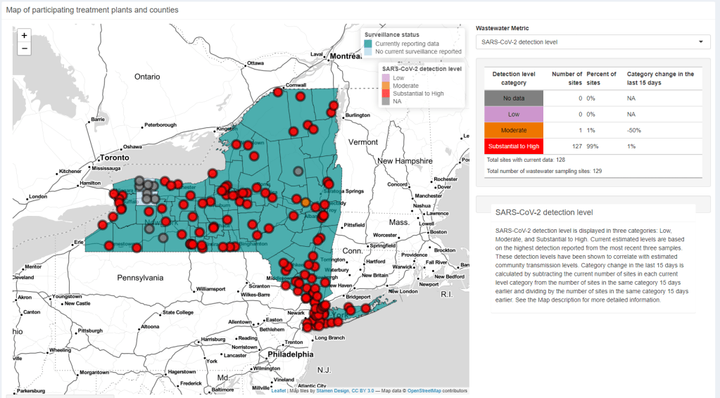
I look at a lot of wastewater surveillance dashboards these days—sometimes reporting on this type of COVID-19 data, sometimes trying to gauge my own risk level. The New York State Wastewater Surveillance Network’s dashboard is one of my favorites, both because I like how it’s set up and because of location bias (i.e. I live in New York).
The New York State network is a collaboration between state agencies and researchers at Syracuse University, the State University of New York, and others. It covers every single county in the state; most wastewater treatment plants included work directly with the researchers, with the exception of New York City (which does its own sampling and sends data to the state team).
On the dashboard, you can see the coronavirus detection levels and recent trends for every county. Then, upon clicking on a specific wastewater treatment plant, you can see time series of both coronavirus concentration in wastewater and reported COVID-19 cases. Seeing the time series is pretty important because it provides broader context on how current coronavirus levels compare to past trends.
NYC used to not be included on this dashboard, but the NYC sites were added in recent weeks. To me, this is a pretty big deal because the city doesn’t have its own wastewater dashboard (yet). For now, I’m adding the state dashboard to my regular rotation of local data sources.