
I look at a lot of wastewater surveillance dashboards these days—sometimes reporting on this type of COVID-19 data, sometimes trying to gauge my own risk level. The New York State Wastewater Surveillance Network’s dashboard is one of my favorites, both because I like how it’s set up and because of location bias (i.e. I live in New York).
The New York State network is a collaboration between state agencies and researchers at Syracuse University, the State University of New York, and others. It covers every single county in the state; most wastewater treatment plants included work directly with the researchers, with the exception of New York City (which does its own sampling and sends data to the state team).
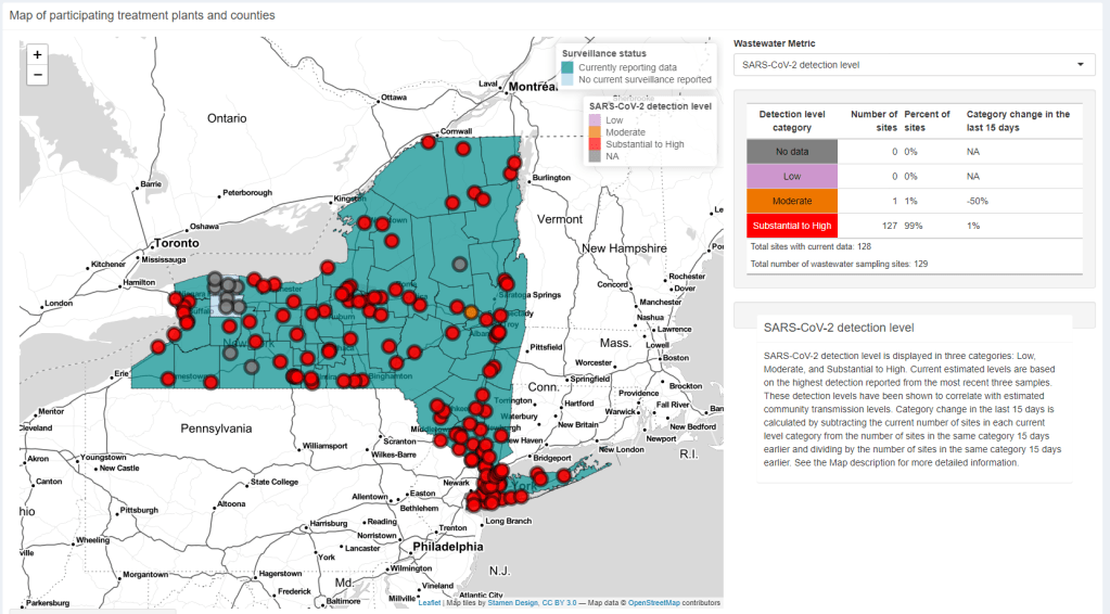
On the dashboard, you can see the coronavirus detection levels and recent trends for every county. Then, upon clicking on a specific wastewater treatment plant, you can see time series of both coronavirus concentration in wastewater and reported COVID-19 cases. Seeing the time series is pretty important because it provides broader context on how current coronavirus levels compare to past trends.
NYC used to not be included on this dashboard, but the NYC sites were added in recent weeks. To me, this is a pretty big deal because the city doesn’t have its own wastewater dashboard (yet). For now, I’m adding the state dashboard to my regular rotation of local data sources.

Leave a comment