Category: Hospitalization

  • Hospitalization data lag behind the actual crisis

    Hospitalization data lag behind the actual crisis

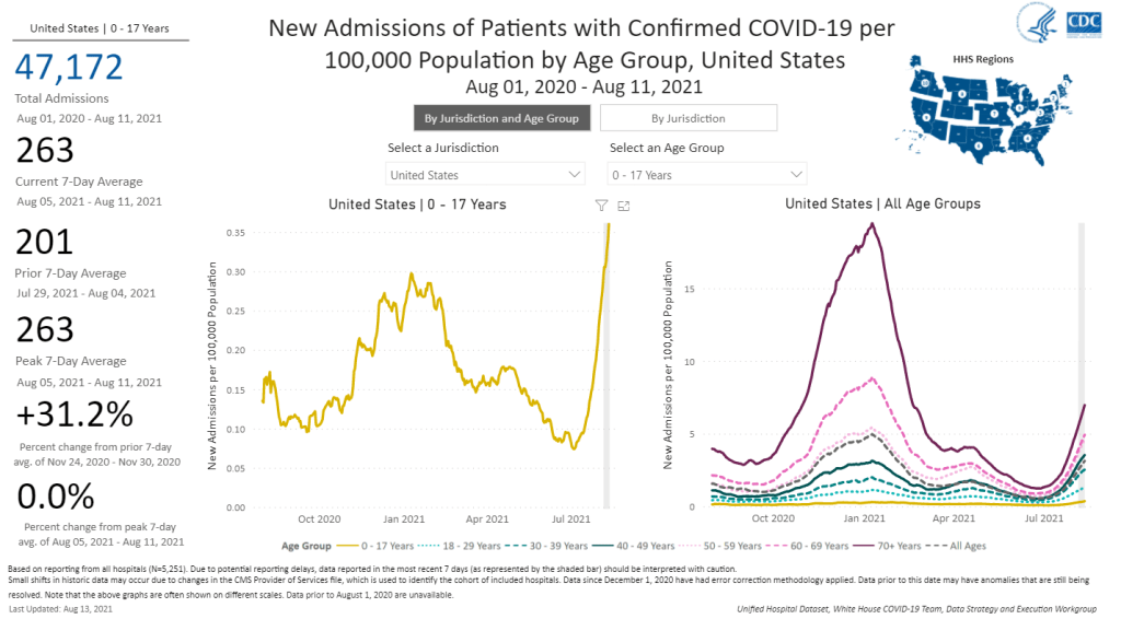
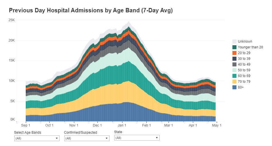
    A record number of COVID-19 patients are now receiving care in U.S. hospitals, according to data from the Department of Health and Human Services (HHS). As of January 16, the agency reports that about 157,000 COVID-19 patients are currently hospitalized nationwide, and one in every five hospitalized Americans has been diagnosed with this disease.

    The HHS also reports that about 78% of staffed hospital beds and 82% of ICU beds are currently occupied. These numbers, like the total COVID-19 patient figure, are higher than they have been at any other point during the pandemic.

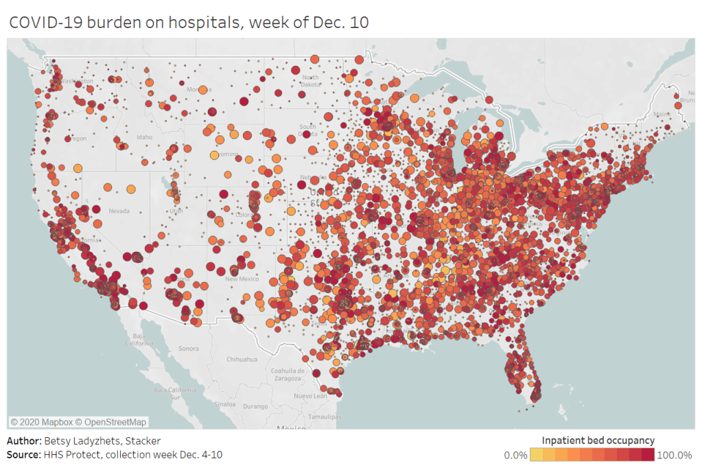
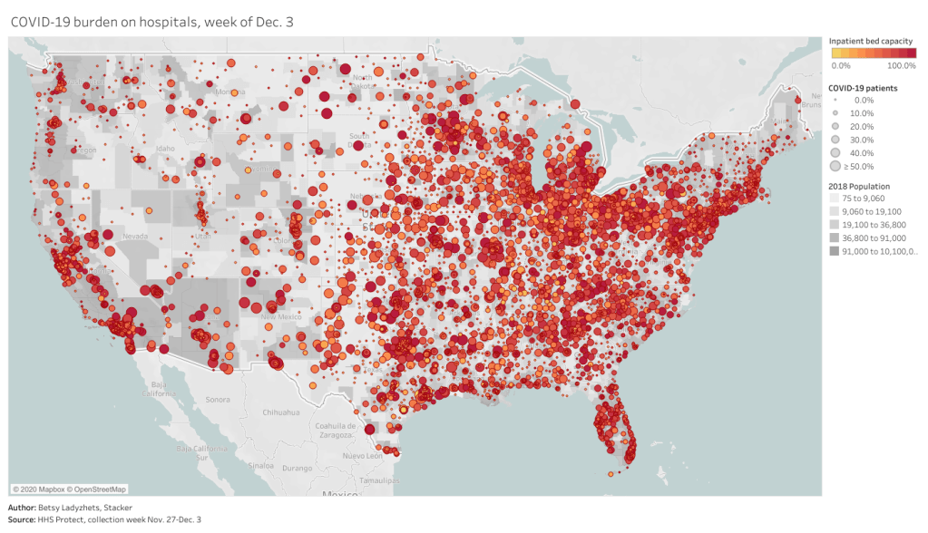
    Even so, reports from the doctors and other staff working in these hospitals—conveyed in the news and on social media—suggest that the HHS data don’t capture the current crisis. The federal data may be reported with delays and fail to capture the impact of staffing shortages, obscuring the fact that many regions and individual hospitals are currently operating at 100% capacity.

    Dr. Jeremy Faust, an emergency physician at Brigham and Women’s Hospital and professor at Harvard Medical School, recently made this argument in Inside Medicine, his Bulletin newsletter. Last week, I shared Faust and colleagues’ circuit breaker dashboard, which extrapolates from both federal hospitalization figures and current case data to model hospital capacity in close-to-real-time. This week, Faust used that dashboard to show that the crisis inside hospitals is more dire than HHS numbers suggest.

    He writes:

    There seems to be a disconnect between the official data made available to the public and what’s happening on the ground. The reason for this is unacceptable delays in reporting. HHS and other agencies have always acknowledged that public reports on hospital capacity—for Covid-19 and all other conditions—actually reflect data that are 1-2 weeks old. But until now, such lags rarely mattered because most hospitals haven’t had to operate near or above 100% capacity routinely, even during the pandemic. Under normal circumstances, whether a hospital was 65% or 75% full does not make much of a difference, though as the numbers creep up, care can be compromised. And even in past moments when capacity was closer to 100%, a wave of Omicron-driven Covid-19 was not headed towards hospitals.

    For example: on Monday, Faust wrote, his team’s circuit breaker dashboard showed that “every single county in Maryland appears to be over 100% capacity,” even though the HHS said that 87% of hospital beds were occupied in the state. Healthcare workers in Maryland backed up the claim that all counties were over 100% capacity, with personal accounts of higher-than-ever cases and hospitals going into crisis standards.

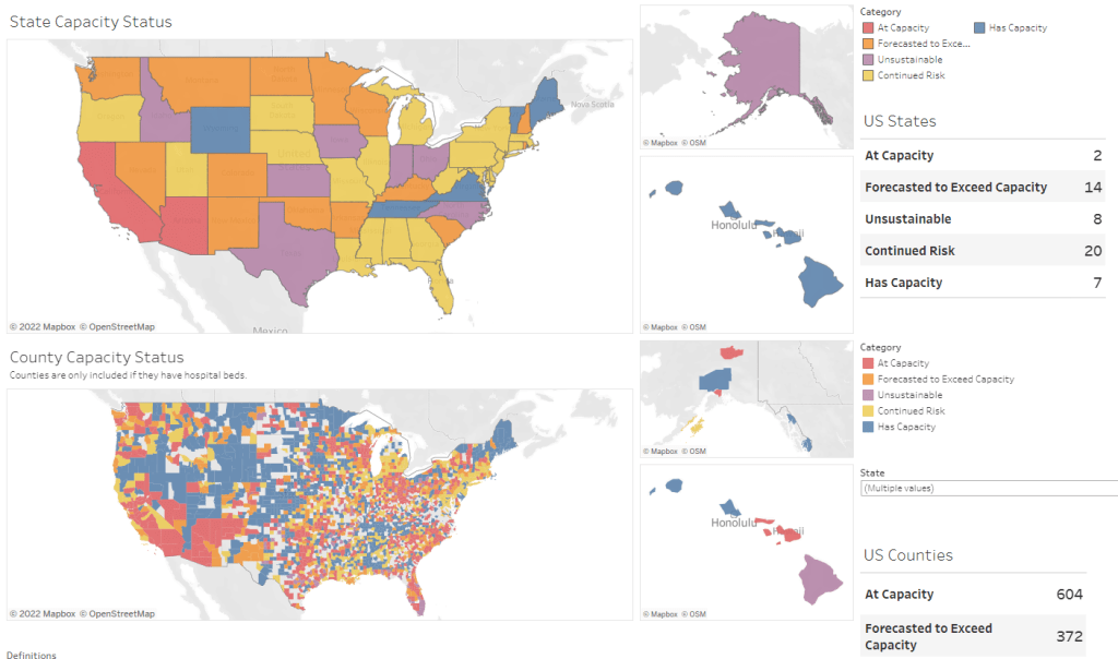
    On Thursday, Faust shared an update: the circuit breaker dashboard, at that point, projected that hospitals in Arizona, California, Washington, and Wisconsin were approaching 100% capacity, if they weren’t at that point already. As of Saturday, California and Arizona are still projected to be at “at capacity,” according to the dashboard, while 14 other states ranging from Montana to South Carolina are “forecasted to exceed capacity” in coming days.

    var divElement = document.getElementById(‘viz1642354079303’); var vizElement = divElement.getElementsByTagName(‘object’)[0]; if ( divElement.offsetWidth > 800 ) { vizElement.style.minWidth=’1087px’;vizElement.style.maxWidth=’100%’;vizElement.style.minHeight=’1736px’;vizElement.style.maxHeight=(divElement.offsetWidth*0.75)+’px’;} else if ( divElement.offsetWidth > 500 ) { vizElement.style.minWidth=’1087px’;vizElement.style.maxWidth=’100%’;vizElement.style.minHeight=’1736px’;vizElement.style.maxHeight=(divElement.offsetWidth*0.75)+’px’;} else { vizElement.style.width=’100%’;vizElement.style.height=’3027px’;} var scriptElement = document.createElement(‘script’); scriptElement.src = ‘https://public.tableau.com/javascripts/api/viz_v1.js’; vizElement.parentNode.insertBefore(scriptElement, vizElement);

    From Faust’s descriptions and the accounts of healthcare workers he quotes, it’s also evident that determining between hospitalizations “with” COVID-19 and hospitalizations “from” COVID-19 is not a useful way to spend time and resources right now. Even if some of the COVID-19 patients currently in U.S. hospitals “happened to test positive” while seeking treatment for some other condition, these patients are still contributing to the intense pressure our healthcare system is under right now.

    Plus, as Ed Yong explains in a recent article in The Atlantic describing this false patient divide, COVID-19 can worsen other conditions that at first seem unrelated:

    The problem with splitting people into these two rough categories is that a lot of patients, including those with chronic illnesses, don’t fit neatly into either. COVID isn’t just a respiratory disease; it also affects other organ systems. It can make a weak heart beat erratically, turn a manageable case of diabetes into a severe one, or weaken a frail person to the point where they fall and break something. “If you’re on the margin of coming into the hospital, COVID tips you over,” Vineet Arora, a hospitalist at the University of Chicago Medicine, told me. In such cases, COVID might not be listed as a reason for admission, but the patient wouldn’t have been admitted were it not for COVID.

    In short: Omicron might be a milder variant at the individual level—thanks to a combination of the variant’s inherent biology and protection from vaccines and prior infections—but at a systemic level, it’s devastating. And rather than asking hospitals to split their patients into “with” versus “from” numbers, we should be giving them the staff, supplies, and other support they need to get through this crisis.

  • Malnutrition, other gastrointestinal issues are common in Long COVID

    Did you know that diarrhea, nausea, and vomiting are all common COVID-19 symptoms? I knew they were included on the CDC’s list of symptoms, but I didn’t realize how often these symptoms occur—or how nasty they can get—until I reported this story for Gothamist, a news site run by New York City’s public radio station.

    The story focuses on a recent paper from Northwell Health, a hospital system in NYC. Northwell clinicians investigated rates of gastrointestinal symptoms (or, symptoms in the digestive system) among their COVID-19 patients. Out of 17,500 patients, over 3,200 had gastrointestinal symptoms—almost 20% of the group. These symptoms included diarrhea caused by intestinal infection, bleeding in the GI tract, and malnutrition.

    For several hundred patients, the researchers were able to track their GI symptoms for six months after they left the hospital. This led to another concerning discovery: at the six-month mark, more than half of the patients who’d suffered malnutrition in the hospital were still experiencing this symptom. Same thing for the patients who’d suffered chronic weight loss.

    In reporting this story, I also talked to Lauren Nichols—a Long COVID patient and advocate with Body Politic. She’s been facing COVID-related GI symptoms for eighteen months, ranging from intensive diarrhea in spring 2020 to an inability to gain weight and, now, potential autoimmune issues. Many other Long COVID patients have experienced these symptoms, according to a large survey of patients.

    As I wrote a couple of weeks ago, Long COVID provides a great argument in favor of getting vaccinated. This disease isn’t just a run-of-the-mill cough, or flu—it can truly mess up people’s lives in the long term.

  • Sources and updates, October 17

    • COVID-19 cases, deaths, hospitalizations by vaccination status: The latest addition to the CDC’s COVID-19 dashboard, this week, is a set of two pages that break out case, death, and hospitalization rates by vaccination status. The page with case and death rates draws on CDC monitoring programs, and may not be entirely representative of data for the entire U.S. The page with hospitalization rates draws on COVID-NET, a network of over 250 hospitals in 14 states.
    • Hospitalization data will shift back to the CDC: Bloomberg reported this week that the Biden administration will bring the HHS Protect system, which tracks hospitalization data, under the auspices of the CDC. Hospitalization data moved from CDC responsibility to HHS responsibility in summer 2020—a move covered extensively by the COVID-19 Data Dispatch. At the time, this change drew criticism, though the HHS Protect system developed into a highly reliable data source. It is unclear how a move back to the CDC may impact hospitalization tracking.
    • Mask Diplomacy in Latin America During the COVID-19 Pandemic: This dataset, compiled by political scientists Diego Telias and Francisco Urdinez, includes over 500 donations of COVID-19 supplies—face masks, respirators, tests, and more. The data underlie a preprint posted online in August 2020 discussing China’s diplomacy in Latin America and the Caribbean. (h/t Data Is Plural.)

  • One data researcher’s journey through South Carolina’s COVID-19 reporting

    One data researcher’s journey through South Carolina’s COVID-19 reporting

    By Philip Nelson

    COVID-19 hospitalizations in South Carolina, as of August 26. Posted on Twitter by Philip Nelson.

    If you post in the COVID-19 data Twitter-sphere, you’re likely familiar with Philip Nelson, a computer science student at Winthrop University—and an expert in navigating and sharing data from the state of South Carolina. Philip posts regular South Carolina updates including the state’s case counts, hospitalizations, test positivity, and other major figures, and contributes to discussions about data analysis and accessibility.

    I invited Philip to contribute a post this week after reading his Tweets about his ongoing challenges in accessing his state’s hospitalization data. Basically, after Philip publicized a backend data service that enabled users to see daily COVID-19 patient numbers by individual South Carolina hospital, the state restricted this service’s use—essentially making the data impossible for outside researchers to analyze.

    To me, his story speaks to broader issues with state COVID-19 data, such as: agencies adding or removing data without explanation, a lack of clear data documentation, failure to advertise data sources to the public, and mismatches between state and federal data sources. These issues are, of course, tied to the systematic underfunding of state and local public health departments across the country, making them unequipped to respond to the pandemic.

    South Carolina seems to be particularly arduous to deal with, however, as Philip describes below.


    I’ve been collecting and visualizing South Carolina-related COVID-19 data since April 2020. I’m a computer science major at Winthrop University, so naturally I like to automate things, but collecting and aggregating data from constantly-changing data sources proved to be far more difficult than I anticipated.

    At the beginning of the pandemic, I had barely opened Excel and had never used the Python library pandas, but I knew how to program and I was interested in tracking COVID-19 data. So, in early March 2020, I watched very closely as the South Carolina Department of Health and Environmental Control (DHEC) reported new cases.

    During the early days of the pandemic, DHEC provided a single chart on their website with their numbers of negative and positive tests; I created a small spreadsheet tracking these cases. After a few days, DHEC transitioned to a dashboard that shared county level data.

    On March 23, I noticed an issue with the new dashboard. Apparently, someone had misconfigured authentication on something in the backend. (When data sources are put behind authentication, anyone outside of the organization providing that source loses access.) The issue was quickly fixed and I carried on with my manual entry, but this was not the last time I’d have to think about authentication.

    Initially, I manually entered the number of cases and deaths that DHEC reported. I thought I might be able to use the New York Times’ COVID-19 dataset, but after comparing it to the DHEC’s data, I decided that I’d have to continue my own manual entry.

    South Carolina’s REST API

    In August 2020, I encountered some other programmers on Twitter who had discovered a REST API on DHEC’s website. REST is a standard for APIs that make it easier for developers to use services on the web. In this case, I was able to make simple requests to the server and receive data as a response. After starting a database fundamentals course during the fall 2020 semester, I figured out how to query the service: I could use the data in the API to get cases and deaths for each county by day.

    This API gave me the ability to automate all of my update processes. By further exploring the ArcGIS REST API website, I realized that DHEC had other data services available. In addition to county-level data, the agency also provided an API for cases by ZIP code. I used these data to create custom zip code level graphs upon request, and another person I encountered built a ZIP code map of cases.

    During August 2020, the CDC stopped reporting hospitalization data and the federal government shifted to using data collected by the Department of Health and Human Services (HHS) and Teletracking. DHEC provided a geoservice for hospitalizations, based off of data provided to DHEC by Teletracking on behalf of the HHS. I did some exploration of the hospitalization REST API and found that the data in this API was facility-level (individual hospitals), updated daily. I aggregated the numbers in the API based on the report date in order to provide data for my hospitalization graph. At the time, I didn’t know that the federal government does not provide daily facility level data to the public.

    In October 2020, DHEC put their ZIP code-level API behind authentication. I voiced my displeasure publicly.  In late December 2020, DHEC put the API that contained county level cases and deaths behind authentication. At this point, I began to get frustrated with DHEC for putting things behind authentication without warning, but I kind-of gave up on getting the deaths data out of an API. Thankfully, DHEC still provided an API for confirmed cases, so I switched my scripts to scrape death data from PDFs provided by DHEC each day. I didn’t like using the PDFs because they did not capture deaths that were retroactively moved from one date to another, unlike the API.

    I ran my daily updates until early June 2021, when DHEC changed their reporting format to a weekday-only schedule.  I assumed that we’d seen the last wave of the pandemic and that, thanks to readily available vaccines, we had relegated the virus to a containable state. Unfortunately, that was not the case — and by mid-July, I had resumed my daily updates.

    Hospitalization data issues

    In August 2021, people in my Twitter circle became interested in pediatric data. I decided to return to exploring the hospitalization API because I knew it had pediatric-related attributes. It was during that exploration that I realized I had access to daily facility-level data that the federal government was not providing to the public; the federal government provides weekly facility-level data. My first reaction was to build a Tableau dashboard that let people look at the numbers of adults and pediatric patients with COVID19 at the facility level in South Carolina over time.

    After posting that dashboard on Twitter, I kept hearing that people wanted a replacement for DHEC’s hospitalization dashboard which, at the time, only updated on Tuesdays. So, I made a similar dashboard that provided more information and allowed users to filter down to specific days and individual hospitals, then I tweeted it at DHEC. Admittedly, this probably wasn’t the smartest move.

    I kept exploring the hospitalization data and found that it contained COVID-19-related emergency department visits by day, another data point provided weekly by HHS. After plotting out the total number of visits each day and reading the criteria for this data point, I decided I needed to make another dashboard for this. A day after I posted the dashboard to Twitter, DHEC put the API I was using behind authentication, again I tweeted my frustration

    A little while later, DHEC messaged me on Twitter and told me that they were doing repairs to the API. I was later informed that the API was no longer accessible, and that I would have to use DHEC’s dashboard or HHS data. The agency’s dashboard does not allow data downloads, making it difficult for programmers to use it as a source for original analysis and visualization.

    I asked for information on why the API was no longer operational; DHEC responded that they had overhauled their hospitalization dashboard, resulting in changes to how they ingest data from the federal government. This response did not make it clear why DHEC needed to put authentication on the daily facility-level hospitalization data.

    Meanwhile, DHEC’s hospital utilization dashboard has started updating daily again. But after examining several days’ worth of data, I cannot figure out how the numbers on DHEC’s dashboard correlate to HHS data. I’ve tried matching columns from a range dates to the data displayed, but haven’t been able to find a date where the numbers are equal. DHEC says the data is sourced from HHS’ TeleTracking system on their dashboard, but it’s not immediately clear to me why the numbers do not match. I’ve asked DHEC for an explanation, but haven’t received a response.

    Lack of transparency from DHEC

    I’ve recently started to get familiar with the process of using FOIA requests. In the past week, I got answers on requests that I submitted to DHEC for probable cases by county per day. This data is publicly accessible (but not downloadable) via a Tableau dashboard, but there is over 500 days’ worth of data for 46 counties. The data DHEC gave to me through the FOI process are heavily suppressed and, in my opinion, not usable.

    This has been quite a journey for me, especially in learning how to communicate and collect data. It’s also been a lesson in how government agencies don’t always do what we want them to with data. I’ve learned that sometimes government agencies don’t always explain (or publicize) the data they provide, and so the job of finding and understanding the data is left to the people who know how to pull the data from these sources.

    It’s also been eye-opening to understand that sometimes, I’m not going to be able to get answers on why a state-level agency is publishing data that doesn’t match a federal agency’s data. Most of all, it’s been a reminder that we always need to press government-operated public health agencies to be as transparent as possible with public health data.

  • Three more COVID-19 data points, August 15

    Three more COVID-19 data points, August 15

    The number of children hospitalized with COVID-19 has shot up in recent weeks. Chart from the CDC COVID Data Tracker.

    A couple of additional items from this week’s COVID-19 headlines:

    • 1,900 children now hospitalized with COVID-19 in the U.S.: More kids are now seriously ill with COVID-19 than at any other time in the pandemic. The national total hit 1,902 on Saturday, according to HHS data. Asked about this trend at a press briefing on Thursday, Dr. Anthony Fauci explained that, thanks to Delta’s highly contagious properties, we’re now seeing more children get sick with COVID-19 just as we are seeing more adults get it. The vast majority of kids who contract the virus have mild cases, but this is still a worrying trend as schools reopen with, in many cases, limited safety measures. For more on this issue, I recommend Katherine J. Wu’s recent article in The Atlantic.
    • 2.7% of Americans now eligible for a third vaccine dose: Both the FDA and the CDC have now given the go-ahead for cancer patients, organ transplant recipients, and other immunocompromised Americans to get additional vaccine doses. There are about 7 million Americans eligible, comprising 2.7% of the population. Studies have shown that two Pfizer or Moderna doses do not provide these patients with sufficient COVID-19 antibodies to protect against the virus, while three doses bring the patients up to the same immune system readiness that a non-immunocompromised person would get out of two dioses. Still, this move goes against the World Health Organization’s push for wealthy nations to stop giving out boosters until the rest of the world has received more shots.
    • 203 cases so far linked to Lollapalooza, out of 385,000 attendees: Chicago residents and public health experts worried that Lollapalooza, a massive music festival held in the city in late July, would become a superspreader event. Two weeks out from the festival, however, local public health officials are seeing no evidence of superspreading, with a low number of cases identified in attendees. Lollapalooza may thus be an indicator that large events can still be held safely during the Delta surge—if events are held outdoors and the vast majority of attendees are vaccinated. (Officials estimated that 90% of the Lollapalooza crowd had gotten their shots.)

  • Five more things, May 9

    I couldn’t decide which of these news items to focus on for a short post this week, so I wrote blurbs for all five. This title and format are inspired by Rob Meyer’s Weekly Planet newsletter.

    1. HHS added vaccinations to its facility-level hospitalization dataset: Last week, I discussed the HHS’s addition of COVID-19 patient admissions by age to its state-level hospitalization dataset. This week, the HHS followed that up with new fields in its facility-level dataset, reflecting vaccinations among hospital staff and patients. You can find the dataset here and read more about the new fields in the FAQ here (starting on page 14). It’s crucial to note that these are optional fields, meaning hospitals can submit their other COVID-19 numbers without any vaccination reporting. Only about 3,200 of the total 5,000 facilities in the HHS dataset have opted in—so don’t sum these numbers to draw conclusions about your state or county. Still, this is the most detailed occupational data I’ve seen for the U.S. thus far.
    2. A new IHME analysis suggests the global COVID-19 death toll may be double reported counts: 3.3 million people have died from COVID-19 worldwide as of May 8, according to the World Health Organization. But a new modeling study from the University of Washington’s Institute for Health Metrics and Evaluation (IHME) suggests that the actual death number is 6.9 million. Under-testing and overburdened healthcare systems may contribute to reporting systems missing COVID-19 deaths, though the reasons—and the undercount’s magnitude—are different in each country. In the U.S., IHME estimates about 900,000 deaths, while the CDC counts 562,000. Read STAT’s Helen Branswell for more context on this study.
    3. The NYT published a dangerous misrepresentation of vaccine hesitancy (then quietly corrected it): A New York Times story on herd immunity garnered a lot of attention (and Twitter debate) earlier this week. One specific aspect of the story stuck out to some COVID-19 data experts, though: a U.S. map entitled, “Uneven Willingness to Get Vaccinated Could Affect Herd Immunity.” The map, based on HHS estimates, claims to display vaccine confidence at the county level. But the estimates are really more reflective of state averages, and moreover, the NYT originally double-counted the people who are strongly opposed to vaccines, leading to a map that made the U.S. look much more hesitant than it actually is. Biologist Carl Bergstrom has a thread detailing the issue, including original and corrected versions of the map.
    4. We still need better demographic data: A poignant article in The Atlantic from Ibram  Kendi calls attention to gaps in COVID-19 data collection that continue to loom large, more than a year into the pandemic. The story primarily discusses race and ethnicity data, citing the COVID Racial Data Tracker (which I worked on), but Kendi also highlights other underreported populations. For example: “The only available COVID-19 data on undocumented immigrants come from Immigration and Customs Enforcement detention centers.”
    5. NIH college student trial is having a hard time recruiting: If you, like me, have been curious about how that big NIH trial to study vaccine effectiveness in college students has progressed since it was announced last March, I recommend this story from U.S. News reporter Chelsea Cirruzzo. The study aimed to recruit 12,000 students at a select number of colleges, but because the vaccine rollout has progressed faster than expected, researchers are having a hard time finding not-yet-vaccinated students to enroll. (1,000 are enrolled so far.) Now, students at all higher ed institutions can join.

  • HHS makes it easier to compare hospitalizations by age

    HHS makes it easier to compare hospitalizations by age

    Since mid-December, the Department of Health and Human Services has published a dataset on how the pandemic is impacting individual hospitals across the country. (You can read the CDD’s detailed description of that dataset here.) One of the most useful—and, in my opinion, most under-utilized—aspects of this facility dataset is that it provides COVID-19 hospital admissions broken out by age, allowing data users to discern which age groups are getting hardest hit by severe COVID-19 cases in different parts of the country.

    This week, the HHS made it much easier to do that analysis. The agency added hospital admissions by age to its state-level hospitalization dataset. Now, if you want to see a patient breakdown for your state, you can simply look at the state-level info already compiled by HHS data experts, rather than summing up numbers from the facility-level info yourself.

    Besides that convenience factor, there are two big advantages of the state-level info:

    • The state-level dataset is updated daily, while the facility-level dataset is updated weekly. More frequent data updates allow for more specific time series analysis.
    • Low patient numbers aren’t suppressed. In the facility-level dataset, patient numbers between 1 and 4 are suppressed with an error value (-999999) to protect patient privacy. In the age data, this happens at a lot of facilities, so it’s impossible for an outside data user to calculate accurate totals for a given city, county, or state. On the other hand, with HHS experts doing the aggregation in the state-level dataset, no values need to be obscured—basically, these state-level figures are much more accurate.

    The age groups in the state-level dataset match those available in the facility-level dataset: pediatric COVID-19 patients, patients age 18-19, patients in ten-year age ranges from 20 to 79, and patients age 80 or older. HHS also splits the patient counts into those who have confirmed COVID-19 cases (meaning their diagnosis is verified by a PCR test) and those who have suspected cases (meaning the patients have COVID-19 symptoms or a positive result on a non-PCR test.)

    You can find these new data in two places:

    Also, Conor Kelly, COVID Tracking Project volunteer and COVID-19 visualizer extraordinaire, has added these new data to his COVID-19 Tableau dashboard. (See “Hosp. Admissions Over Time,” then “Admissions by Age.”) Highly recommend checking out that dashboard and exploring the trends for your state.

    (Finally, it is possible I’m a little annoyed that the HHS made this lovely update immediately after I turned in an assignment in which I did this analysis the long way, with the facility-level dataset. Look out for that story early next week.)

    Related posts

    • Featured sources, Jan. 10

      This week’s featured sources are all about hospitalizations and treatments. See the full CDD source list here.

      • Hospital facilities visualization by the COVID Tracking Project: Last month, the Department of Health and Human Services (HHS) released an extensive dataset showing how COVID-19 patients are impacting hospitals at the individual facility level. (See my Dec. 13 post for more information on this dataset.) The COVID Tracking Project has produced an interactive visualization from this dataset, allowing users to zoom in to individual facilities or search for hospitals in a particular city or ZIP code. I contributed some copy to this page.
      • Therapeutics distribution (from HHS): The HHS is posting a list of locations that have received monoclonal antibody therapies, for the purpose of treating COVID-19. Bamlanivimab, one such therapy, received EUA from the FDA in early November. The HHS page notes that this is not a complete list: “Although monoclonal antibody therapeutic treatments have been shipped nationwide, shipment locations are displayed for those States that have opted to have their locations displayed on this public website.”
      • Hospital discharge summaries (from the Healthcare Cost and Utilization Project): This project, under the HHS umbrella, posts time series data on U.S. hospital patients. The site recently posted summaries on patients from April to June 2020, including datasets specific to COVID-19, flu, and other viral respiratory infections. As epidemiologist Jason Salemi explains in a summary Twitter thread, the data doesn’t provide new information but may be useful for a researcher looking to dig into spring and summer hospitalization trends.
    • Facility-level hospitalization data updated on schedule

      Facility-level hospitalization data updated on schedule

      In the interest of giving credit to the HHS where credit is due: the agency updated its new facility-level hospitalization dataset right on schedule this past Monday.

      This dataset allows Americans to see exactly how COVID-19 is impacting individual hospitals across the country. In last week’s issue, I explained why I was excited about this dataset and what researchers and reporters could do with it. (The highlights: hyperlocal data that can be aggregated to different geographies, a time series back to August, demographic information on COVID-19 patients, and HHS transparency.)

      Last week, I used this hospitalization dataset—along with the HHS’s state-level hospitalization data—to build several visualizations showing how COVID-19 has hit hospitals at the individual, county, and state levels.

      I also wrote a brief article on COVID-19 hospitalizations for Stacker, hosting visualizations and highlighting some major insights. The article was sent out to local journalists across the country via a News Direct press release. (If your outlet wants to repurpose Stacker’s article, get in touch with my coworker Mel at melanie@thestacker.com!)

      A few national statistics:

      • Nearly 700 hospitals are at over 90% inpatient capacity, as of the most recent HHS data. 750 hospitals are at over 90% capacity in their ICUs.
      • The states with the highest rates of occupied beds are Maryland (79.8% of all beds occupied), Washington D.C. (80.0%), and Rhode Island (85.2%).
      • States with the highest shares of their populations hospitalized with COVID-19 are Arizona (53 patients per 100,000 population), Pennsylvania (55 per 100K), and Nevada (67 per 100K).
      • 19% of hospitals in the nation are facing critical staffing shortages, while 24% anticipate such a shortage within the next week.
      • Staffing shortages are highest in Arkansas (33.6% of hospitals in the state), Wisconsin (35.6%), and North Dakota (42.0%).

      Meanwhile, The Accountability Project has developed a datasette version of this hospitalization dataset. With a bit of code, you can query the data to access metrics for a specific hospital, city, county, or state. The Project has provided example queries to help you get started.

    • COVID-19 data for your local hospital

      COVID-19 data for your local hospital

      var divElement = document.getElementById(‘viz1608004219965’); var vizElement = divElement.getElementsByTagName(‘object’)[0]; if ( divElement.offsetWidth > 800 ) { vizElement.style.width=’100%’;vizElement.style.height=(divElement.offsetWidth*0.75)+’px’;} else if ( divElement.offsetWidth > 500 ) { vizElement.style.width=’100%’;vizElement.style.height=(divElement.offsetWidth*0.75)+’px’;} else { vizElement.style.width=’100%’;vizElement.style.height=’650px’;} var scriptElement = document.createElement(‘script’); scriptElement.src = ‘https://public.tableau.com/javascripts/api/viz_v1.js’; vizElement.parentNode.insertBefore(scriptElement, vizElement);

      When the Department of Health and Human Services (HHS) started reporting hospitalization data at the state level back in July, I wistfully told a friend that I wished the agency would report facility-level numbers. Another federal agency had recently started reporting this type of data for nursing homes, and I appreciated the flexibility and granularity with which I was able to analyze how the pandemic was impacting nursing home patients and staff. I wanted to see the pandemic’s impact on hospitals in the same way.

      At the time, I considered this a pipe dream. The HHS was already facing major challenges: implementing a new data pipeline across the country, navigating bureaucratic issues with state public health departments, and working with individual hospitals to help them report more accurately and more often. Plus, transparency issues and political scandals plagued the agency. Making more data public seemed to be the least of its priorities.

      But I’m happy to say that this week, my pipe dream came true. On Monday, the HHS published a new hospitalization dataset including capacity, new admissions, and other COVID-19-related numbers—for over 4,000 individual facilities across America.

      This is, as I put it in a COVID Tracking Project blog post analyzing the dataset, a big deal. Project lead Alexis Madrigal called it “probably the single most important data release that we’ve seen from the Federal government.” I, in somewhat less professional terms, texted my girlfriend:

      Please appreciate the level of self-control it took for me to not actually title this issue “HHS queen shit.”

      Let me explain why this new dataset is so exciting—not just for a nerd like me, but for any American following the pandemic. I’m drawing on a COVID Tracking Project blog post unpacking the dataset, to which I contributed some explanatory copy.

      • Hyperlocal data: At a time when hospitals are overwhelmed across the nation, it is incredibly useful to see precisely which hospitals are the worst off and how COVID-19 is impacting them. Data scientists can pinpoint specific patterns and connections between regions. National aid groups can determine where to send PPE and other supplies. Journalists can see which hospitals should be the focus of local stories. The stories that can be told with this dataset are endless.
      • Aggregating to different geographies: The individual facility is the most detailed possible level of reporting for COVID-19 hospitalizations. But this HHS dataset also includes the state, county, and ZIP code for each hospital, along with unique codes that identify hospitals in the Medicare and Medicaid system. The data for specific facilities can thus be combined to make comparisons on a variety of geographic levels. I tried out a county-level visualization, for example; some counties are not represented, but you can still see a much more granular picture of hospital capacity than you would in a state-level map.
      • Time series back to August: HHS didn’t just provide data on how hospitals are coping with COVID-19 right now. They provided a full time series going back to the first week of August, with data starting shortly after the HHS began collecting information from hospitals. These historical data allow researchers to make more detailed comparisons between the nation’s last major COVID-19 peak and our current outbreak. There are some reporting errors from hospitals in the early weeks of the dataset; COVID Tracking Project analysis has shown that these errors become less significant in the week of August 28.
      • Includes coverage details: The dataset includes fields that can help researchers check the quality of an individual hospital’s reporting. These fields, called “coverage” numbers, show the number of days in a given week on which data were reported. A value of six for total_adult_patients_hospitalized_confirmed_and_suspected_covid_7_day_coverage, for example, indicates that this hospital reported how many adult COVID-19 patients it was treating on six of seven days in the past week. Many hospitals are now reporting all major metrics on six or seven days a week—HHS has really stepped up to encourage this level of reporting in recent months. For more information on hospital reporting coverage, see HHS Protect.
      • Admissions broken out by age: The HHS began reporting hospital COVID-19 admissions, or new COVID-19 patients entering the hospital, at the state level in November. The new dataset includes this information, at the facility level, for every week going back until August, and breaks out those new patients by age group. You can see exactly who is coming to the hospital with COVID-19 in age brackets of 18-19, ten-year ranges from 20 to 79, and 80+. Several other metrics in the dataset are also broken out by adult and children patients.
      • New fields: This dataset reports counts of emergency department visits, including both total visits for any reason and visits specifically related to COVID-19. (The HHS data dictionary defines this as “meets suspected or confirmed definition or presents for COVID diagnostic testing.”) These figures allow researchers to calculate the share of emergency department visits at a given hospital that are COVID-related, a new metric that wasn’t available from previous HHS reporting.
      • Signifies major effort from the HHS: When it comes to reporting hospitalization data, this agency has come a long way from the errors and transparency questions of the summer. Last week, the COVID Tracking Project published an analysis finding that HHS counts of COVID-19 patients are now in close proximity to similar counts reported by state public health departments—signifying that the federal data may be a useful, reliable complement to state data. (I discussed this analysis in last week’s issue.) The new facility-level dataset indicates that HHS data scientists understand the needs of COVID-19 researchers and communicators, and are working to make important data public. I will continue to carefully watch this agency, as will many of my fellow reporters. But I can’t deny that this data release was a major step for transparency and trust.

      To get started with this dataset, you can zoom in to look at your community on this Tableau dashboard I made, visualizing the most recent week of data. (That most recent week of data reflects November 27 through December 3. As the dataset was first published last Monday, December 7, I’m anticipating an update tomorrow.)

      Or, if you’d like to see more technical details on how to use the dataset, check out this community FAQ page created by data journalists and researchers at Careset Systems, the University of Minnesota, COVID Exit Strategy, and others.

      Finally, for more exploration of the research possibilities I outlined above, you can read the COVID Tracking Project’s analysis. The post includes some pretty striking comparisons from summer outbreaks to now.