Blog

  • Featured sources, Oct. 25

    These sources have been added to the COVID-19 Data Dispatch resource list, along with all sources featured in previous weeks.

    • Missing in the Margins: Estimating the Scale of the COVID-19 Attendance Crisis: This new report by Bellwether Education Partners provides estimates and analysis of the students who have been unable to participate in virtual learning during the pandemic. While the state-by-state estimates and city profiles may be useful to local reporters, the overall numbers should shock us all: three million students, now left behind.
    • The Pandemic and ICE Use of Detainers in FY 2020: The Transactional Records Access Clearinghouse (or TRAC) at Syracuse University has collected data on U.S. immigration since 2006. The project’s most recent report describes the pandemic’s impact on Immigration and Customs Enforcement (ICE)’s practice of detaining individuals as a step for apprehending and deporting them.
    • COVID-19 Risk Levels DashboardThis dashboard by the Harvard Global Health Institute and other public health institutions now includes COVID-19 risk breakdowns at the congressional district level. Toggling back and forth between the county and congressional district options allows one to see that, when risk is calculated by county, a few regions of the U.S. are in the “green”; at the congressional district level, this is not true for a single area.
    • COVID-19 at the White House: VP Outbreak: The team behind a crowdsourced White House contact tracer (discussed in my October 4 issue) is now tracking cases connected to Vice President Mike Pence.
  • HHS changes may drive hospitalization reporting challenges

    This past week, the Department of Health and Human Services (HHS) opened up a new area of data reporting for hospitals around the country. In addition to their numbers of COVID-19 patients and supply needs, hospitals are now asked to report their numbers of influenza patients, including flu patients in the ICU and those diagnosed with both flu and COVID-19.

    The new reporting fields were announced in an HHS directive on October 6. They became “available for optional reporting” this past Monday, October 19; but HHS intends to make the flu data fields mandatory in the coming weeks. The move makes sense, broadly speaking—as public health experts worry about double flu and COVID-19 outbreaks putting incredible pressure on hospital systems, collecting data on both diseases at once can help the federal public health agencies quickly identify and get aid to the hospitals which are struggling.

    However, it seems likely that the new fields have caused both blips in HHS data and challenges for the state public health departments which rely upon HHS for their own hospitalization figures. As the COVID Tracking Project (and this newsletter) reported over the summer, any new reporting requirement is likely to strain hospitals which are understaffed or underprepared with their in-house data systems. Such challenges at the hospital level can cause delays and inaccuracies in the data reported at both state and federal levels.

    This week, the COVID Tracking Project’s weekly update called attention to gaps in COVID-19 hospitalization data reported by states. Missouri’s public health department specifically linked their hospitalization underreporting to “data changes from the US Department of Health and Human Services.” Five other states—Kansas, Wisconsin, Georgia, Alabama, and Florida—also reported significant decreases or partial updates to their hospitalization figures. These states didn’t specify reasons for their hospitalization data issues, but based on what I saw over the summer, I believe it is a reasonable hypothesis to connect them with HHS’s changing requirements.

    Jim Salter of the Associated Press built on the COVID Tracking Project’s observations by interviewing state public health department officials. He reported that, in Missouri, some hospitals lost access to HHS’s TeleTracking data portal:

    Missouri Hospital Association Senior Vice President Mary Becker said HHS recently implemented changes; some measures were removed from the portal, others were added or renamed. Some reporting hospitals were able to report using the new measures, but others were not, and as a result, the system crashed, she said.

    “This change is impacting hospitals across the country,” Becker said in an email. “Some states collect the data directly and may not yet be introducing the new measures to their processes. Missouri hospitals use TeleTracking and did not have control over the introduction of the changes to the template.”

    As the nation sets COVID-19 records and cases spike in the Midwest, the last thing that public health officials should be worrying about right now is inaccurate hospitalization data. And yet, here we are.

  • It is, once again, time to talk about antigen testing

    It is, once again, time to talk about antigen testing

    Long-term readers might remember that I devoted an issue to antigen testing back in August. Antigen tests are rapid, diagnostic COVID-19 tests that can be used much more quickly and cheaply than their polymerase chain reaction (PCR) counterparts. They don’t require samples to be sent out to laboratories, and some of these tests don’t even require specialized equipment; Abbott’s antigen test only takes a swab, a testing card, and a reagent, and results are available in 15 minutes.

    But these tests have lower sensitivity than PCR tests, meaning that they may miss identifying people who are actually infected with COVID-19 (what epidemiologists call false negatives). They’re also less accurate for asymptomatic patients. In order to carefully examine the potential applications of antigen testing, we need both clear public messaging on how the tests should be used, and accessible public data on how the tests are being used already. Right now, I’m not seeing much of either.

    When I first covered antigen testing in this newsletter, only three states were publishing antigen test data. Now, we’re up past ten states with clear antigen test totals, with more states reporting antigen positives or otherwise talking about these tests in their press releases and documentation. Pennsylvania, for example, announced that the governor’s office began distributing 250,000 antigen test kits on October 14.

    Meanwhile, antigen tests have become a major part of the national testing strategy. Six tests have received Emergency Use Authorization from the FDA. After Abbott’s antigen test was given this okay-to-distribute in late August, the White House quickly purchased 150 million tests and made plans to distribute them across the country. Context: the U.S. has done about 131 million total tests since the pandemic began, according to the COVID Tracking Project’s most recent count.

    Clearly, antigen testing is here—and beginning to scale up. But most states are ill-prepared to report the antigen tests going on in their jurisdictions, and federal public health agencies are barely reporting them at all.

    I’ve been closely investigating antigen test reporting for the past few weeks, along with my fellow COVID Tracking Project volunteers Quang Nguyen, Kara Schechtman, and others on the Data Quality team. Our analysis was published this past Monday. I highly recommend you give it a read—or, if you are a local reporter, I highly recommend that you use it to investigate antigen test reporting in your state.

    But if you just want a summary, you can check out this Twitter thread:

    And I’ve explained the two main takeaways below.

    First: state antigen test reporting is even less standardized than PCR test reporting. While twelve states and territories do report antigen test totals, nine are combining their antigen test counts with PCR test counts, which makes it difficult to analyze the use of either test type or accurately calculate test positivity rates. The reporting practices in sixteen other states are unclear. And even among those states with antigen test totals, many relegate their totals to obscure parts of their dashboards, fail to publish time series, report misleading test positivity rates, and engage in other practices which make the data difficult for the average dashboard user to interpret.

    Second: antigen tests reported by states likely represent significant undercounts. Data reporting inconsistences between the county and state levels in Texas, as well as a lack of test reporting from nursing homes, suggest that antigen tests confuse data pipelines. While on-site test processing is great for patients, it cuts out a lab provider which is set up to report all COVID-19 tests to a local health department. Antigen tests may thus be conducted quickly, then not reported. The most damning evidence for underreporting comes from data reported by test maker Quidel. Here’s how the post explains this:

    Data shared with Carnegie Mellon University by test maker Quidel revealed that between May 26 and October 9, 2020, more than 3 million of the company’s antigen tests were used in the United States. During that same period, US states reported less than half a million antigen tests in total. In Texas alone, Quidel reported 932,000 of its tests had been used, but the state reported only 143,000 antigen tests during that same period.

    Given that Quidel’s antigen test is one of six in use, the true number of antigen tests performed in the United States between late May and the end of September was likely much, much higher, meaning that only a small fraction are being reported by states.

    Again: this is for one of six tests in use. America’s current public health data network can’t even account for three million antigen tests—how will it account for 150 million?

    And, for some bonus reading, here’s context from the Associated Press about the antigen test reporting pipeline issue.

  • What I learned from my Science Writers session

    What I learned from my Science Writers session

    This week, I’ve gotta be honest, I’m pretty wiped. The Science Writers 2020 virtual conference was a full slate of sessions on diversity, climate change, and other important topics—on top of my usual Stacker workload. So, today’s issue provides a rundown of the session I led on the intersections between data journalism and science writing.

    The session I organized was called “Diving into the data: How data reporting can shape science stories.” Its goal was to introduce science writers to the world of data and to show them that this world is not a far-off inaccessible realm, but is rather a set of tools that they can add to their existing reporting skills.

    The session was only an hour long, but I packed in a lot of learning. First, I gave a brief introduction to data journalism and my four panelists introduced themselves. Then, I walked the attendees through a tutorial on Workbench, an online data journalism platform. Finally, panelists answered questions from the audience (and a couple of questions from me). The session itself was private to conference attendees, but many of the materials and topics we discussed are publicly available, hence my summarizing the experience for all of you.

    First, let me introduce the panelists (and recommend that you check out their work!):

    The Workbench tutorial that I walked through with attendees was one of two that I produced for The Open Notebook this year, in association with my instructional feature on data journalism for science writers. Both workflows are designed to give science writers (or anyone else interested in science data) some basic familiarity with common science data sources and with the steps of cleaning and analyzing a dataset. You can read more about the tutorials here. If you decide to try them out, I am available to answer any questions that you have—either about Workbench as a whole or the choices behind these two data workflows. Just hit me up on Twitter or at betsyladyzhets@gmail.com.

    I wasn’t able to take many notes during the session, of course, but if there’s one thing I know about science writers, it’s that they love to livetweet. (Conference organizers astutely requested that each session organizer pick out a hashtag for their event, to help keep the tweets organized. Mine was #DataForSciComm.)

    Here are two great threads you can read through for the highlights:

    Although some attendees had technical difficulties with Remo, Workbench, or both, I was glad to see that a few people did manage to follow the tutorial along to its final step: a bar chart showcasing American cities which have seen high particle pollution days in 2019.

    Finally, I’d like to share a few insights that I got from the panelists’ conversation during our Q&A. As an early-career journalist myself, I always jump at the chance to learn from those I admire in my field—and yes, okay, I did invite four of them to a panel partially in order to manufacture one of those opportunities. The conversation ranged from practical questions about software tools to more ethical questions, such as how journalists can ensure their stories are being led by their data, rather than the other way around.

    These are the main conclusions I took for my own work:

    • Use the simplest tool for the job, but make sure it does work for that job. I was surprised to hear all four panelists say that they primarily use Google Sheets for their data work, as I sometimes feel like I’m not a “real data journalist” due to my inexperience with coding. (I’m working on learning R, okay?) But they also acknowledged that simpler tools may cause problems, such as the massive reporting error recently seen by England’s public health department thanks to reliance on Microsoft Excel.
    • Fact-checking is vital. Data journalists must be transparent about both the sources they use and the steps they take in analysis, and fact-checkers should go through all of those steps before a big project is published—just as fact-checkers need to check every quote and assertion in a feature.
    • A newsroom’s biggest stories are often data stories. Many publications now are seeing their COVID-19 trackers or other large visualizations get the most attention from readers. Data stories can bring readers in and keep them engaged as they explore an interactive feature or look for updates to a tracker, which can often make them worth the extra time and resources that they take compared to more traditional stories.
    • There’s a data angle to every story. Sara Simon talked about building her own database for her Miss America project, and how this process prepared her for more thorough coverage when she actually attended a pageant. Sometimes, a data story is not based around an analysis or visualization; rather, building a dataset out of other information can help you see trends which inform a written story.
    • Collaboration is key. Duncan Geere talked about finding people whose strengths make up for your weaknesses, whether that is their knowledge of a coding language or their eye for design. Now, I’m thinking about what kind of collaborations I might be able to foster with this newsletter. (If you’re reading this and you have an idea, hit me up!)
    • COVID-19 data analysis requires time, caution, and really hard questions. Jessica Malaty Rivera talked about the intense editing and fact-checking process that goes into COVID Tracking Project work to ensure that blog posts and other materials are as accurate and transparent as possible. Hearing about this work from a more outside perspective stuck with me because it reminded me of my goals for this newsletter. Although I work solo here, I strive to ask the hard questions and lift up other projects and researchers that are excelling at accuracy and transparency work.

    If you attended the session, I hope you found it informative and not too fast-paced. If you didn’t, I hope this recap gave you an idea of how data journalism and science communication may work together to tell more complex and engaging stories.

  • Featured sources, Oct. 18

  • How did the Bachelorette test contestants?

    This week, for the first time since I was peer-pressured into watching the Bachelor franchise two-ish years ago, I listened to a recap podcast.

    To be clear, this was not your typical Bachelor franchise recap podcast. The hosts did not judge contestants on their attractiveness, nor did they speculate about the significance of the First Impression Rose. Instead, it was POLITICO’s Dan Diamond and Jeremy Siegel, discussing COVID-19 safety precautions and public health messaging as seen on The Bachelorette. They were inspired by this tweet, which apparently garnered more attention than Diamond had anticipated:

    They also talked about the NBA’s championship bubble. It was a pretty fun episode—highly recommend. But the episode got me thinking: neither this podcast nor the Bachelorette season premiere itself mentioned what kind of COVID-19 tests the contestants were taking, how often they were tested during the show, or any data from the show’s filming.

    As I explained last week, differentiation between the various COVID-19 tests now available is a major gap in American public health messaging. Everyone from White House staffers to the patients at my neighborhood clinic wants to be tested with the fastest option available, and they want to do it without going onto the FDA’s website and reading through every test’s Emergency Use Authorization (EUA). It’s crucial for anyone publicly talking about testing to get specific about what kind of tests they’re using and why—this type of messaging will help people make their own educated decisions.

    The Bachelorette had an opportunity to not only show average Americans the COVID-19 testing experience, but to also explain which tests are more useful for particular situations, and, yes, explain how to interpret some COVID-19 data. In interviews with Variety and The Hollywood Reporter, producers on the show described how contestants went through regular testing with the “full nasal test” and undertook quarantine measures. But first of all: the “full nasal test” could refer to one of about 40 nucleic acid and antigen tests which have received EUA, and second of all, talking in general terms about your show’s testing protocol makes it hard for a journalist like me, much less for an actual public health expert, to evaluate what you did. And, most importantly, it only gives the TV show’s millions of viewers a general idea of the options available to them when they need to get tested themselves.

    The best thing I could find on Bachelorette testing, through some pretty targeted Google searches, was a headline from the Nashville Scene reading: “The Bachelorette Recap: Testing Positive for Love.” Which, honestly? I’m glad someone used that joke.

    What I’m saying is, I want a Bachelorette COVID-19 dashboard. I want numbers of all the tests conducted, I want to know their manufacturers, I want a timeline of when the tests happened, and I want to know all of the test results. If anyone reading this has a contact at ABC… hook me up.

  • New, shareable graphics from the COVID Racial Data Tracker

    New, shareable graphics from the COVID Racial Data Tracker

    Twice a week, the COVID Tracking Project’s COVID Racial Data Tracker compiles and standardizes demographic data from every U.S. state and territory. I am intimately familiar with this work because I’m one of those volunteers. I watch the numbers tick up and, inevitably, paint a clear picture of how centuries of racism have left people of color more vulnerable to this pandemic.

    This week, the COVID Tracking Project’s web design team launched a new feature that makes our demographic data more accessible to readers. It’s called Infection and Mortality by Race and Ethnicity: simply click on a state or territory, and the feature will return a chart that compares COVID-19 cases and deaths to that region’s population.

    Here’s the chart for the U.S. as a whole:

    Adjusting case and death values by population makes it much easier to see disparity. For example, while Native Hawaiians and Pacific Islanders are a relatively small fraction of America’s population, they are much more likely to contract the novel coronavirus. Meanwhile, Black, Hispanic/Latino, and indigenous Americans are more likely to die of the disease.

    These charts are easy to share on Facebook, Twitter, and Instagram, and the graphics will be updated automatically when our data updates twice a week. Volunteers who work on this part of the Project are hoping that these charts can make it easier for people to draw attention to COVID-19 disparity in their communities, as well as to the data that are still missing in many states. For example, here’s me yelling about New York.

    Check out the chart for your state, and if you feel compelled, share it. We need people talking about these data in order to drive change. (Also: shout-out to product lead Neesha Wadhwa and other design folks working behind the scenes at the COVID Tracking Project who made these charts possible!)

  • CDC’s failure to resist political takeover

    This past week, two outlets published major investigations of the Centers for Disease Control & Prevention (CDC). The first story, by Science’s Charles Piller, focuses on White House Coronavirus Task Force Coordinator Dr. Deborah Birx and her role in the hospitalization data switch from the CDC to the Department of Health and Human Services (HHS). The second story, by ProPublica’s James Bandler, Patricia Callahan, Sebastian Rotella, and Kristen Berg, provides a broader view of internal CDC dynamics and challenges since the start of the pandemic.

    These stories do not focus on data specifically, but I wanted to foreground them this week as crucial insights into how the work of science and public health experts is endangered when powerful leaders prioritize their own narratives. Both stories describe how Dr. Birx disrespected and overrode CDC experts. She wanted data from every hospital in the country, every day, and failed to understand why the CDC could not deliver. The ProPublica story quotes an anonymous CDC scientist:

    Birx expected “every hospital to report every piece of data every day, which is in complete defiance of statistics,” a CDC data scientist said. “We have 60% [of hospitals] reporting, which was certainly good enough for us to have reliable estimates. If we got to 80%, even better. A hundred percent is unnecessary, unrealistic, but that’s part of Birx’s dogma.”

    As I explained in this newsletter’s very first issue, in July, the CDC’s hospital data reporting system was undercut in favor of a new system, built by the software company TeleTracking and managed by the HHS. Hospitals were told to stop reporting to the CDC’s system and start using TeleTracking instead. The two features published this week tie that data switch inexorably to Dr. Birx’s frustration with the CDC and her demand for more frequent data at any cost.

    Public health experts across the country worried that already-overworked hospital staff would face significant challenges in switching to a new data system, from navigating bureaucracy to, in some cases, manually entering numbers into a form with 91 categories. Initial data reported by the new HHS system in July were fraught with errors—such as a report of 118% hospital beds occupied in Rhode Island—and inconsistencies when compared to the hospital data reported out by state public health departments. I co-wrote an analysis of these issues for the COVID Tracking Project.

    But at least, I thought at the time, the HHS system was getting more complete data. The HHS system quickly increased the number of hospitals reporting to the federal government by about 1,500, and by October 6, Dr. Birx bragged at a press briefing that 98% of hospitals were reporting at least weekly. As Piller’s story in Science describes, however, such claims fail to mention that the bar for a hospital to be included in that 98% is very low:

    At a 6 October press briefing, Birx said 98% of hospitals were reporting at least weekly and 86% daily. In its reply to Science, HHS pegged the daily number at 95%. To achieve that, the bar for “compliance” was set very low, as a single data item during the prior week. A 23 September CDC report, obtained by Science, shows that as of that date only about 24% of hospitals reported all requested data, including protective equipment supplies in hand. In five states or territories, not a single hospital provided complete data.

    Piller goes on to describe how HHS’s TeleTracking data system allows errors—such as typos entered by overworked hospital staff—to “flow into [the] system” and then (theoretically) be fixed later. This method further makes HHS’s data untrustworthy for the public health researchers using it to track the pandemic. The agency is working on improvements, certainly, and public callouts of the hospital capacity numbers have slowed since TeleTracking’s rollout in July. Still, the initial political media storm created by this hospitalization data switch, combined with the details about the switch revealed by these two new features, has led me to be much warier of future data releases by both the HHS and the CDC than I was before 2020.

    Just as the White House boasted, “Our staffers get tested every day,” in response to critiques of President Trump’s flaunting of public health measures, the head of the White House Coronavirus Task Force wanted to boast, “We collect data every day,” in response to critiques of the country’s overburdened healthcare system. But testing and collecting data should both be only small parts of the national response to COVID-19. When scientists see their expertise ignored in favor of recommendations that will fit a chosen political narrative, public trust is lost in the very institutions they represent. And rebuilding that trust will take a long time.

  • Contact tracing: Too little, too late, no public data

    Contact tracing: Too little, too late, no public data

    Most states are not ready to find and trace all of their new COVID-19 cases as the country heads into a new wave of outbreaks. Screenshot via Test and Trace, taken on October 18.

    On October 1, a little over two weeks ago, I received an email from New York Governor Andrew Cuomo’s office.

    The email invited me to download a new COVID-19 phone application, developed by the New York State Department of Health along with Google and Apple. The app, called COVID Alert NY, is intended to help New Yorkers contact trace themselves. (Side note: I am not entirely sure how Cuomo’s office got my email, but I suspect it has something to do with the complaints I left about his budget back in June.)

    Here’s how Cuomo’s office describes the app:

    COVID Alert NY is New York State’s official Exposure Notification App. This is a free smartphone app available to anyone 18+ who lives and/or works in New York. The app uses Bluetooth technology—not location data—to quickly alert users if they have been in close contact with someone who has tested positive for COVID-19. Once alerted, users can quickly protect themselves and others by self-quarantining, contacting their physician and getting tested.

    The app is intended to fit into New York’s contact tracing efforts by automatically informing app users that they have been exposed to COVID-19 and prompting them to take the necessary precautions. It also features a sypmtom checker, which asks users to note if they have exhibited a fever, cough, or other common COVID-19 symptoms, and a page with the latest case and testing data for every county in New York.

    Contact tracing, or the practice of limiting disease spread by personally informing people that they have been exposed, has been a major method for controlling COVID-19 spread in other countries, such as South Korea. But in the U.S. the strategy is—like every other part of our nation’s COVID-19 response—incredibly patchwork. We have no national contact tracing app, much less a national contact tracing workforce, leaving states to set up these systems on their own.

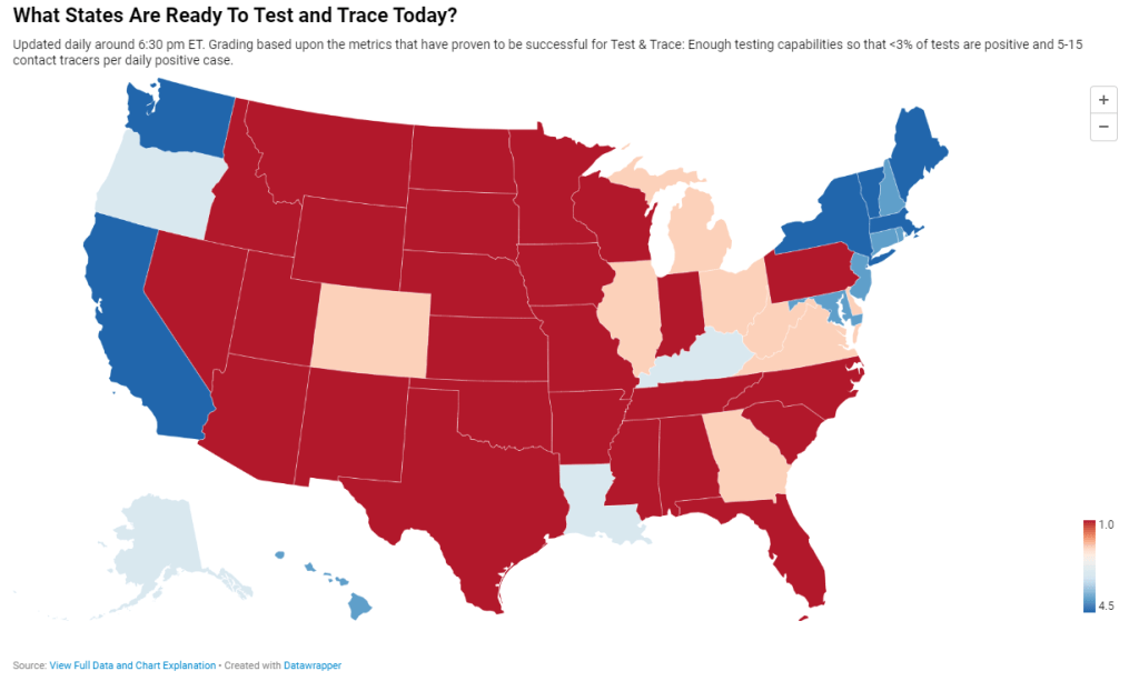
    Back in May, I researched and wrote an article for Stacker about this problem. I compared contact tracing targets, calculated by researchers at George Washington University, with the actual numbers of contact tracers employed in every state, compiled by the public health data project Test and Trace. GWU’s estimates started at a baseline 15 contact tracers per 100,000 people, then were adjusted based on COVID-19 trends in every state. Now, this story should be seen as a historical snapshot (the summer’s Sun Belt outbreaks hadn’t yet started when I wrote it), but it is telling to scroll through and see that, even several months into America’s COVID-19 outbreak, the majority of states had tiny fractions of the contact tracing workforces they needed to effectively trace new cases. New York, for example, had a reported 575 contact tracers employed, compared to an estimated need of over 15,000 contact tracers.

    Today, many states are doing better. New York is up to 9,600 contact tracers, according to Test and Trace’s latset counts, and has planned to hire thousands more. This state, along with Massachusetts, New Hampshire, New Jersey, Connecticut, Vermont, and Washington D.C., has received high marks from Test and Trace’s scoring system, with 5 to 15 tracers employed for every new positive COVID-19 case. But all of these high-scoring states are in the Northeast, where COVID-19 outbreaks peaked in the spring. The Midwestern states currently seeing spikes, such as Wisconsin and Missouri, all rank far lower on their preparedness to trace new cases. (See the screenshot above.)

    Meanwhile, actual data on the efficacy of these contact tracers are difficult to come by. To continue using New York as an example: since the application’s release on October 1, New York’s Department of Health has not released any data on how many people have downloaded the application, much less how many positive cases have been logged or how many contacts have been traced. Data have neither been mentioned in Cuomo’s press releases nor have they appeared on the state’s COVID-19 dashboard.

    According to tech website 9to5Mac, as of October 1, 11 states had registered contact tracing apps with Google and Apple’s exposure notification technology. These states include Alabama, Arizona, Delaware, Nevada, New Jersey, North Carolina, North Dakota, Pennsylvania, Virginia, and Wyoming, as well as New York. Six more states have apps in development.

    A brief analysis by yours truly found that, of those 11 states with contact tracing apps, only four post contact tracing data: Delaware, New Jersey, North Dakota, and Wyoming. Delaware and New Jersey both have dedicated data pages detailing the share of COVID-19 cases which have successfully participated in the state’s contact tracing efforts (57% and 71%, respectively). North Dakota and Wyoming both post statistics on their cases’ source of COVID-19 exposure, including such categories as “contact with a known case,” “community spread,” and “travel”; these data must be sourced from contact tracing investigations. 11.1% of North Dakota’s cases and 27.1% of Wyoming’s cases have an exposure source listed as “unknown” or “under investigation,” as of October 18. Meanwhile, Pennsylvania and North Carolina have both posted statistics on their contact tracing workforces, but no data on the results of these workforces’ efforts.

    Other states without registered apps may also be posting contact tracing data. But it is still a notable discrepancy that, among the states that have systematic contact tracing technology, tracing results are lacking. Compare these states to South Korea, which at the height of its outbreak publicly posted demographic information and travel histories for individual COVID-19 cases in alerts to surrounding communities. South Korea’s approach has faced criticism, however, for reporting private information about people who tested positive.

    And that brings me to the biggest weakness for American contact tracing: lack of public trust. Americans, more than residents of other nations, tend to be concerned about personal privacy and, as a result, are more wary of speaking to strangers on the phone or using an application that sends their data to the government, even if all those data are anonymized. Olga Khazan explained this issue in an article for The Atlantic, published in late August:

    Still, contract tracing depends on trust, and many Americans don’t trust the government enough to give up their contacts or follow quarantine orders. Of the 121 agencies Reuters surveyed, more than three dozen said they had been hindered by peoples’ failure to answer their phone or provide their contacts. About half of the people whom contact tracers call don’t answer the phone, because they don’t want to talk with government representatives, Anthony Fauci, the director of the National Institute of Allergy and Infectious Diseases, said during a June news conference.

    Black and Hispanic or Latino communities are particularly likely to distrust the government and avoid contact tracers’ calls. This attitude makes sense, given how both America’s government and medical systems are inexorably tied to racist histories. But for the public tracers hoping to help these communities—which have been disproportionately impacted COVID-19—it’s another barrier to stopping the virus’ spread.

    Even I, as someone who understands more about the need for contact tracing than the average American, am wary about using New York’s COVID Alert app. The app asks me to turn on both Bluetooth and location data, and even though COVID Alert purports to be anonymous, Twitter, Instagram, and other applications have made no such promises. So far, I have been using the application when I go to the park, grocery shop, or ride the subway, but for the vast majority of my days it sits dormant on my phone.

    And of course, I have to wonder: where was this app in March, when the city shut down and my neighborhood filled with ambulance sirens? Like most other parts of America’s COVID-19 response, contact tracing has been scattered and difficult to evaluate, but the data we do have indicate that most states are doing too little, too late.

  • COVID source shout-out: Glastonbury, CT

    COVID source shout-out: Glastonbury, CT

    I’m doing a shout-out instead of a callout this week, because sometimes even I tire of finding data issues to upon which I can focus my tirades.

    Every few weeks, my mom forwards me an email from the Town Manager in my hometown, Glastonbury, Connecticut. This email comprises the Town Manager’s Weekly COVID-19 update, including data for the town, updates for the state, and the occasional public service announcements. The most recent email, sent on October 7, includes Halloween best practices, information on flu clinics, and absentee ballot resources.

    After peering at endlessly complicated state dashboards during COVID Tracking Project shifts, it’s refreshing to see a COVID-19 update which presents data as simply as possible—no hovering or scrolling required. And yeah, they clearly made that chart in Microsoft Excel, but it does its job!