This week, I’ve gotta be honest, I’m pretty wiped. The Science Writers 2020 virtual conference was a full slate of sessions on diversity, climate change, and other important topics—on top of my usual Stacker workload. So, today’s issue provides a rundown of the session I led on the intersections between data journalism and science writing.
The session I organized was called “Diving into the data: How data reporting can shape science stories.” Its goal was to introduce science writers to the world of data and to show them that this world is not a far-off inaccessible realm, but is rather a set of tools that they can add to their existing reporting skills.
The session was only an hour long, but I packed in a lot of learning. First, I gave a brief introduction to data journalism and my four panelists introduced themselves. Then, I walked the attendees through a tutorial on Workbench, an online data journalism platform. Finally, panelists answered questions from the audience (and a couple of questions from me). The session itself was private to conference attendees, but many of the materials and topics we discussed are publicly available, hence my summarizing the experience for all of you.
First, let me introduce the panelists (and recommend that you check out their work!):
- Duncan Geere: writer, editor, information designer. His projects include a data visualization blog, pen plotter art, a newsletter, and the world’s first data sonification podcast.
- Jessica Malaty Rivera: Science Communication Lead at the COVID Tracking Project and infectious disease epidemiologist at the COVID-19 Dispersed Volunteer Research Network.
- Christie Aschwanden: freelance journalist and author of the NYT bestseller Good to Go: What the Athlete in All of Us Can Learn from the Strange Science of Recovery. Her latest story, for Nature, discusses the complicated premise of herd immunity.
- Sara Simon: data reporter, software engineer for newsrooms, and, most recently, COVID Tracking Project volunteer. During the session, she discussed her investigative projects on Pennsylvania’s COVID-19 mortality data and Miss America pageants.
The Workbench tutorial that I walked through with attendees was one of two that I produced for The Open Notebook this year, in association with my instructional feature on data journalism for science writers. Both workflows are designed to give science writers (or anyone else interested in science data) some basic familiarity with common science data sources and with the steps of cleaning and analyzing a dataset. You can read more about the tutorials here. If you decide to try them out, I am available to answer any questions that you have—either about Workbench as a whole or the choices behind these two data workflows. Just hit me up on Twitter or at betsyladyzhets@gmail.com.
I wasn’t able to take many notes during the session, of course, but if there’s one thing I know about science writers, it’s that they love to livetweet. (Conference organizers astutely requested that each session organizer pick out a hashtag for their event, to help keep the tweets organized. Mine was #DataForSciComm.)
Here are two great threads you can read through for the highlights:
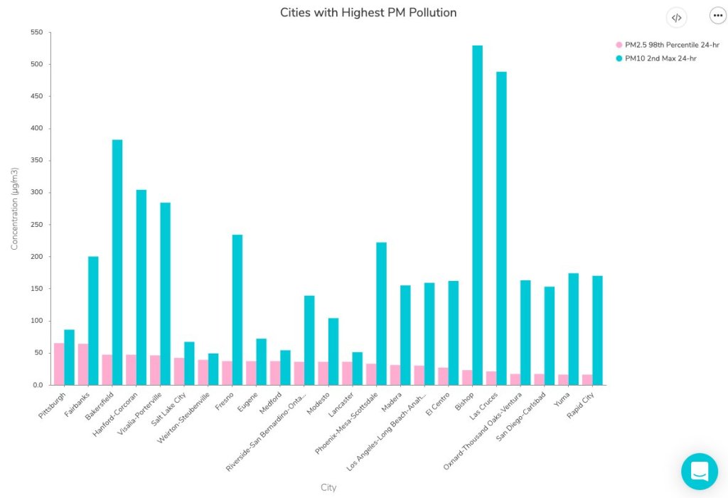
Although some attendees had technical difficulties with Remo, Workbench, or both, I was glad to see that a few people did manage to follow the tutorial along to its final step: a bar chart showcasing American cities which have seen high particle pollution days in 2019.
Finally, I’d like to share a few insights that I got from the panelists’ conversation during our Q&A. As an early-career journalist myself, I always jump at the chance to learn from those I admire in my field—and yes, okay, I did invite four of them to a panel partially in order to manufacture one of those opportunities. The conversation ranged from practical questions about software tools to more ethical questions, such as how journalists can ensure their stories are being led by their data, rather than the other way around.
These are the main conclusions I took for my own work:
- Use the simplest tool for the job, but make sure it does work for that job. I was surprised to hear all four panelists say that they primarily use Google Sheets for their data work, as I sometimes feel like I’m not a “real data journalist” due to my inexperience with coding. (I’m working on learning R, okay?) But they also acknowledged that simpler tools may cause problems, such as the massive reporting error recently seen by England’s public health department thanks to reliance on Microsoft Excel.
- Fact-checking is vital. Data journalists must be transparent about both the sources they use and the steps they take in analysis, and fact-checkers should go through all of those steps before a big project is published—just as fact-checkers need to check every quote and assertion in a feature.
- A newsroom’s biggest stories are often data stories. Many publications now are seeing their COVID-19 trackers or other large visualizations get the most attention from readers. Data stories can bring readers in and keep them engaged as they explore an interactive feature or look for updates to a tracker, which can often make them worth the extra time and resources that they take compared to more traditional stories.
- There’s a data angle to every story. Sara Simon talked about building her own database for her Miss America project, and how this process prepared her for more thorough coverage when she actually attended a pageant. Sometimes, a data story is not based around an analysis or visualization; rather, building a dataset out of other information can help you see trends which inform a written story.
- Collaboration is key. Duncan Geere talked about finding people whose strengths make up for your weaknesses, whether that is their knowledge of a coding language or their eye for design. Now, I’m thinking about what kind of collaborations I might be able to foster with this newsletter. (If you’re reading this and you have an idea, hit me up!)
- COVID-19 data analysis requires time, caution, and really hard questions. Jessica Malaty Rivera talked about the intense editing and fact-checking process that goes into COVID Tracking Project work to ensure that blog posts and other materials are as accurate and transparent as possible. Hearing about this work from a more outside perspective stuck with me because it reminded me of my goals for this newsletter. Although I work solo here, I strive to ask the hard questions and lift up other projects and researchers that are excelling at accuracy and transparency work.
If you attended the session, I hope you found it informative and not too fast-paced. If you didn’t, I hope this recap gave you an idea of how data journalism and science communication may work together to tell more complex and engaging stories.

Leave a comment