Category: Federal data

  • CDC’s failure to resist political takeover

    This past week, two outlets published major investigations of the Centers for Disease Control & Prevention (CDC). The first story, by Science’s Charles Piller, focuses on White House Coronavirus Task Force Coordinator Dr. Deborah Birx and her role in the hospitalization data switch from the CDC to the Department of Health and Human Services (HHS). The second story, by ProPublica’s James Bandler, Patricia Callahan, Sebastian Rotella, and Kristen Berg, provides a broader view of internal CDC dynamics and challenges since the start of the pandemic.

    These stories do not focus on data specifically, but I wanted to foreground them this week as crucial insights into how the work of science and public health experts is endangered when powerful leaders prioritize their own narratives. Both stories describe how Dr. Birx disrespected and overrode CDC experts. She wanted data from every hospital in the country, every day, and failed to understand why the CDC could not deliver. The ProPublica story quotes an anonymous CDC scientist:

    Birx expected “every hospital to report every piece of data every day, which is in complete defiance of statistics,” a CDC data scientist said. “We have 60% [of hospitals] reporting, which was certainly good enough for us to have reliable estimates. If we got to 80%, even better. A hundred percent is unnecessary, unrealistic, but that’s part of Birx’s dogma.”

    As I explained in this newsletter’s very first issue, in July, the CDC’s hospital data reporting system was undercut in favor of a new system, built by the software company TeleTracking and managed by the HHS. Hospitals were told to stop reporting to the CDC’s system and start using TeleTracking instead. The two features published this week tie that data switch inexorably to Dr. Birx’s frustration with the CDC and her demand for more frequent data at any cost.

    Public health experts across the country worried that already-overworked hospital staff would face significant challenges in switching to a new data system, from navigating bureaucracy to, in some cases, manually entering numbers into a form with 91 categories. Initial data reported by the new HHS system in July were fraught with errors—such as a report of 118% hospital beds occupied in Rhode Island—and inconsistencies when compared to the hospital data reported out by state public health departments. I co-wrote an analysis of these issues for the COVID Tracking Project.

    But at least, I thought at the time, the HHS system was getting more complete data. The HHS system quickly increased the number of hospitals reporting to the federal government by about 1,500, and by October 6, Dr. Birx bragged at a press briefing that 98% of hospitals were reporting at least weekly. As Piller’s story in Science describes, however, such claims fail to mention that the bar for a hospital to be included in that 98% is very low:

    At a 6 October press briefing, Birx said 98% of hospitals were reporting at least weekly and 86% daily. In its reply to Science, HHS pegged the daily number at 95%. To achieve that, the bar for “compliance” was set very low, as a single data item during the prior week. A 23 September CDC report, obtained by Science, shows that as of that date only about 24% of hospitals reported all requested data, including protective equipment supplies in hand. In five states or territories, not a single hospital provided complete data.

    Piller goes on to describe how HHS’s TeleTracking data system allows errors—such as typos entered by overworked hospital staff—to “flow into [the] system” and then (theoretically) be fixed later. This method further makes HHS’s data untrustworthy for the public health researchers using it to track the pandemic. The agency is working on improvements, certainly, and public callouts of the hospital capacity numbers have slowed since TeleTracking’s rollout in July. Still, the initial political media storm created by this hospitalization data switch, combined with the details about the switch revealed by these two new features, has led me to be much warier of future data releases by both the HHS and the CDC than I was before 2020.

    Just as the White House boasted, “Our staffers get tested every day,” in response to critiques of President Trump’s flaunting of public health measures, the head of the White House Coronavirus Task Force wanted to boast, “We collect data every day,” in response to critiques of the country’s overburdened healthcare system. But testing and collecting data should both be only small parts of the national response to COVID-19. When scientists see their expertise ignored in favor of recommendations that will fit a chosen political narrative, public trust is lost in the very institutions they represent. And rebuilding that trust will take a long time.

  • CMS data and reporting updates

    CMS data and reporting updates

    The county-level testing dataset published by CMS has become a regular topic for this newsletter since it was released in early September. As a refresher for newer readers: CMS publishes both total PCR tests and test positivity rates for every county in the country; the dataset is intended as a resource for nursing home administrators, who are required to test their residents and staff at regular intervals based on the status of their county.

    This past Monday, October 5, I was pleasantly surprised to find a new update posted on CMS’ COVID-19 data page. I say “surprised” because I had been led to believe, both by past dataset updates and by reporting when the dataset was first published, that this source would be updated once every two weeks. And yet, here was a new update, with only one week’s delay (the last update before this was on Monday, September 28). CMS is also now posting weekly updates on an Archive page which goes back to August 19; some of these updates are older, while others were posted or edited in the past week.

    I always appreciate more frequent data, even when the data provider in question is not particularly transparent about their update strategy. Frequent updates are particularly useful for testing data; the nursing home administrators monitoring testing in their counties will be able to see information that better reflects the level of COVID-19 risk around them.

    I’ve updated my Tableau dashboard which visualizes these county-level data:

    As you can see, the majority of the Northeast and much of the West Coast continues to be in the green (positivity rates under 5%), while areas in the South and Midwest are not faring so well. Twelve counties have extremely high positivity rates (over 30%), eleven of which are in Midwestern states. This table allows you to rank and sort the test positivity rates by state.

    Also, a note on my methodology for this dashboard: in earlier iterations, I used state-level data from the COVID Tracking Project to calculate state test positivity rates for the same time period as the CMS has provided county-level rates. I then compared the county-level rates against state-level rates; this was the source of the “[x]% above state positivity rate” tooltips on the dashboard. After reading a new COVID Tracking Project blog post about the challenges of calculating and standardizing positivity rates, however, I realized that combining positivity rates from two different sources might misrepresent the COVID-19 status in those counties. So, I switched my method: the county-to-state comparisons are now based on averages of all the CMS-reported county-level positivity rates in each state.

    Finally, out of curiosity (and to practice my Tableau skills), I compared the CMS-reported test positivity rates for the five counties of New York City to the city-level rate reported by the NYC Department of Health.

    The positivity rates reported by the two sources follow the same general direction, but it’s interesting to see how the rates diverge when the five counties split up. Manhattan remaining far below 1% while Brooklyn surges up to 2%? Not surprising.

    Meanwhile, CMS is cracking down on COVID-19 reporting from hospitals: NPR reported this week that hospitals which fail to report complete, daily data to HHS can lose money from Medicare and Medicaid, starting this coming January.

  • Another update to county-level testing data

    Another update to county-level testing data

    This past Monday, September 28, the Centers for Medicare & Medicaid Services (CMS) updated the county-level testing dataset which the agency is publishing as a resource for nursing home administrators.

    I’ve discussed this dataset in detail in two past issues: after it was published in early September, and when it was first updated two weeks ago. The most recent update includes data from September 10 to September 23; CMS is continuing to analyze two weeks’ worth of testing data at a time, in order to improve the stability of these values. And this update came on a Monday, rather than a Thursday, decreasing the data lag from one week to five days.

    CMS press release from this past Tuesday describes one update to how CMS assigns test positivity categories, which nursing home administrators look at to determine how often they are required to test their patients and staff:

    Counties with 20 or fewer tests over 14 days will now move to “green” in the color-coded system of assessing COVID-19 community prevalence. Counties with both fewer than 500 tests and fewer than 2,000 tests per 100,000 residents, and greater than 10 percent positivity over 14 days – which would have been “red” under the previous methodology – will move to “yellow.”

    This change intends to address the concerns of rural states which are not doing much testing due to their small populations.

    I’ve updated my Tableau visualization with the most recent county data. The majority of the Northeast continues to be in the green, while areas in the South and Midwest pose higher concerns.

  • Issue #10: reflecting and looking forward

    Issue #10: reflecting and looking forward

    Candid of me reading Hank Green’s new book (very good), beneath some fall foliage. It sure is great to go outside!

    I like to answer questions. I’m pretty good at explaining complicated topics, and when I don’t know the answer to something, I can help someone find it. These days, that tendency manifests in everyday conversations, whether it’s with my friend from high school or a Brooklyn dad whose campsite shares a firepit with my Airbnb. I make sure the person I’m talking to knows that I’m a science journalist, and I invite them to ask me their COVID-19 questions. I do my best to be clear about where I have expertise and where I don’t, and I try to point them to sources that will fill in my gaps.

    I want this newsletter to feel like one of those conversations. I started it when hospitalization data switched from the auspices of the Centers for Disease Control and Prevention (CDC) to the Department of Health and Human Services (HHS), and I realized how intensely political agendas were twisting public understanding of data in this pandemic. I wanted to answer my friends’ and family members’ questions, and I wanted to do it in a way that could also become a resource for other journalists.

    This is the newsletter’s tenth week. As I took a couple of days off to unplug, it seemed a fitting time to reflect on the project’s goals and on how I’d like to move forward.

    What should data reporting look like in a pandemic?

    This is a question I got over the weekend. How, exactly, have the CDC and the HHS failed in their data reporting since the novel coronavirus hit America back in January?

    The most important quality for a data source is transparency. Any figure will only be a one-dimensional reflection of reality; it’s impossible for figures to be fully accurate. But it is possible for sources to make public all of the decisions leading to those figures. Where did you get the data?  Whom did you survey?  Whom didn’t you survey?  What program did you use to compile the data, to clean it, to analyze it?  How did you decide which numbers to make public?  What equations did you use to arrive at your averages, your trendlines, your predictions?  And so on and so forth. Reliable data sources make information public, they make representatives of the analysis team available for questions, and they make announcements when a mistake has been identified.

    Transparency is especially important for COVID-19 data, as infection numbers drive everything from which states’ residents are required to quarantine for two weeks when they travel, to how many ICU beds at a local hospital must be ready for patients. Journalists like me need to know what data the government is using to make decisions and where those numbers are coming from so that we can hold the government accountable; but beyond that, readers like you need to know exactly what is happening in your communities and how you can mitigate your own personal risk levels.

    In my ideal data reporting scenario, representatives from the CDC or another HHS agency would be extremely public about all the COVID-19 data they’re collecting. It would publish these data in a public portal, yes, but this would be the bare minimum. This agency would publish a detailed methodology explaining how data are collected from labs, hospitals, and other clinical sites, and it would publish a detailed data dictionary written in easily accessible language.

    And, most importantly, the agency would hold regular public briefings. I’m envisioning something like Governor Cuomo’s PowerPoints, but led by the actual public health experts, and with substantial time for Q&A. Agency staff should also be available to answer questions from the public and direct them to resources, such as the CDC’s pages on childcare during COVID-19 or their local registry of test sites. Finally, it should go without saying that, in my ideal scenario, every state and local government would follow the same definitions and methodology for reporting data.

    Why am I doing this newsletter?

    The CDC now publishes a national dataset of COVID-19 cases and deaths, and the HHS publishes a national dataset of PCR tests. Did you know about them?  Have you seen any public briefings led by health experts about these data?  Even as I wrote up this description, I realized how deeply our federal government has failed at even the basics of data transparency.

    Neither the CDC nor HHS even published any testing data until MayMeanwhile, state and local public health agencies are largely left to their own devices, with some common definitions but few widely enforced standards. Florida publishes massive PDF reports, which fail to include the details of their calculations. Texas dropped a significant number of tests in August without clear explanation. Many states fail to report antigen test counts, leaving us with a black hole in national testing data.

    Research efforts and volunteer projects, such as Johns Hopkins’ COVID-19 Tracker and the COVID Tracking Project, have stepped in to fill the gap left by federal public health agencies. The COVID Tracking Project, for example, puts out daily tweets and weekly blog posts reporting on the state of COVID-19 in the U.S. I’m proud to be a small part of this vital communication effort, but I have to acknowledge that the Project does a tiny fraction of the work that an agency like the CDC would be able to mount.

    Personally, I feel a responsibility to learn everything I can about COVID-19 data, and share it with an audience that can help hold me accountable to my work. So, there it is: this newsletter exists to fill a communication gap. I want to tell you what state and federal agencies are doing—or aren’t doing—to provide data on how COVID-19 is impacting Americans. And I want to help you attain some data literacy along the way. I don’t have fancy PowerPoints like Cuomo or fancy graphics like the COVID Tracking Project (though my Tableau skills are improving!). But I can ask questions, and I can answer them. I hope you’re reading this because you find that useful, and I hope this project can become more useful as it grows.

    What’s next?

    America is moving into what may be a long winter, with schools open and the seasonal flu incoming. (If you haven’t yet, this is your reminder: get your flu shot!)  I’m in no position to hypothesize about second waves or vaccine deployment, but I do believe this pandemic will not go away any time soon.

    With that in mind, I’d like to settle in this newsletter for the long haul. And I can’t do it alone. In the coming months, I want this project to become more reader-focused. Here are a couple of ideas I have about how to make that happen; please reach out if you have others!

    • Reader-driven topics: Thus far, the subjects of this newsletter have been driven by whatever I am excited and/or angry about in a given week. I would like to broaden this to also include news items, data sources, and other topics that come from you.
    • Answering your questions: Is there a COVID-19 metric that you’ve seen in news articles, but aren’t sure you understand?  Is there a data collection process that you’d like to know more about?  Is there a seemingly-simple thing about the virus that you’ve been afraid to ask anywhere else?  Send me your COVID-19 questions, data or otherwise, and I will do my best to answer.
    • Collecting data sources: In the first nine weeks of this project, I’ve featured a lot of data sources, and the number will only grow as I continue. It might be helpful if I put all those sources together into one public spreadsheet to make a master resource, huh?  (I am a little embarrassed that I didn’t think of this one sooner.)  I’ll work on this spreadsheet, and share it with you all next week.
    • Events??  One of my goals with this project is data literacy, and I’d like to make that work a little more hands-on. I’m thinking about potential online workshops and collaborations with other organizations. I’m also looking into potential funding options for such events; there will hopefully be more news to come on this front in the coming weeks.
  • County-level test data gets an update

    County-level test data gets an update

    I spent the bulk of last week’s issue unpacking a new testing dataset released by the Centers for Medicare & Medicaid Services which provides test positivity rates for U.S. counties. At that point, I had some unanswered questions, such as “When will the dataset next be updated?” and “Why didn’t CMS publicize these data?”

    The dataset was updated this past week—on Thursday, September 17, to be precise. So far, it appears that CMS is operating on a two-week update schedule (the dataset was first published on Thursday, September 3). The data themselves, however, lag this update by a week: the spreadsheet’s documentation states that these data are as of September 9.

    CMS has also changed their methodology since the dataset’s first publication. Rather than publishing 7-day average positivity rates for each county, the dataset now presents 14-day average positivity rates. I assume that the 14 days in question are August 27 through September 9, though this is not clearly stated in the documentation.

    This choice was reportedly made “in order to use a greater amount of data to calculate percent test positivity and improve the stability of values.” But does it come at the cost of more up-to-date data? If CMS’s future updates continue to include one-week-old data, this practice would be antithetical to the actual purpose of the dataset: letting nursing home administrators know what the current testing situation is in their county so that they can plan testing at their facility accordingly.

    Additional documentation and methodology updates include:

    • The dataset now includes raw testing totals for each county (aggregated over 14 days) and 14-day test rates per 100,000 population. Still, without total positive tests for the same time period, it is impossible to replicate the CMS’s positivity calculations.
    • As these data now reflect a 14-day period, counties with under 20 tests in the past 14 days are now classified as Green and do not have reported positivity rates.
    • Counties with low testing volume, but high positivity rates (over 10%), are now sometimes reassigned to Yellow or Green tiers based on “additional criteria.” CMS does not specify what these “additional criteria” may be.

    I’ve made updated versions of my county-level testing Tableau visualizations, including the new total test numbers:

    This chart is color-coded according to CMS’s test positivity classifications. As you can see, New England is entirely in the green, while parts of the South, Midwest, and West Coast are spottier.

    Finally: CMS has a long way to go on data accessibility. A friend who works as a web developer responded to last week’s newsletter explaining how unspecific hyperlinks can make life harder for blind users and other people who use screenreaders. Screenreaders can be set to read all the links on a page as a list, rather than reading them in-text, to give users an idea of their navigation options. But when all the links are attached to the same text, users won’t know what their options are. The CMS page that links to this test positivity dataset is a major offender: I counted seven links that are simply attached to the word “here.”

    This practice is challenging for sighted users as well—imagine skimming through a page, looking for links, and having to read the same paragraph four times because you see the words “click here” over and over. (This is my experience every time I check for updates to the test positivity dataset.)

    “This is literally a test item in our editor training, that’s how important it is,” my friend said. “And yet people still get it wrong. ALL THE TIME.”

    One would think an agency dedicated to Medicare and Medicaid services would be better at web accessibility. And yet.

  • County-level testing data from an unexpected source

    County-level testing data from an unexpected source

    On September 3, 2020, the Center for Medicare & Medicaid Services (CMS) posted a county-level testing dataset. The dataset specifically provides test positivity rates for every U.S. county, for the week of August 27 to September 2.

    This is huge. It’s, like, I had to lie down after I saw it, huge. No federal health agency has posted county-level testing data since the pandemic started. Before September 3, if a journalist wanted to analyze testing data at any level more local than states, they would need to aggregate values from state and county public health departments and standardize them as best they could. The New York Times did just that for a dashboard on school reopening, as I discussed in a previous issue, but even the NYT’s data team was not able to find county-level values in some states. Now, with this new release, researchers and reporters can easily compare rates across the county and identify hotspot areas which need more testing support.

    So Betsy, you might ask, why are you reporting on this new dataset now? It’s been over a week since the county-level data were published. Well, as is common with federal COVID-19 data releases, this dataset was so poorly publicized that almost nobody noticed it.

    It didn’t merit a press release from CMS or the Department of Health and Human Services (HHS), and doesn’t even have its own data page: the dataset is posted towards the middle of this CMS page on COVID-19 in nursing homes:

    Highlighting mine.

    The dataset’s release was, instead, brought to my attention thanks to a tweet by investigative reporter Liz Essley Whyte of the Center for Public Integrity:

    In today’s issue, I’ll share my analysis of these data and answer, to the best of my ability, a couple of the questions that have come up about the dataset for me and my colleagues in the past few days.

    Analyzing the data

    Last week, I put together two Stacker stories based on these data. The first includes two county-level Tableau visualizations; these dashboards allow you to scroll into the region or state of your choice and see county test positivity rates, how those county rates compare to overall state positivity rates (calculated based on COVID Tracking Project data for the same time period, August 27 to September 2), and recent case and death counts in each county, sourced from the New York Times’ COVID-19 data repository. You can also explore the dashboards directly here.

    The second story takes a more traditional Stacker format: it organizes county test positivity rates by state, providing information on the five counties with the highest positivity rates in each. The story also includes overall state testing, case, and outcomes data from the COVId Tracking Project.

    As a reminder, a test positivity rate refers to the percent of COVID-19 tests for a given population which have returned a positive result over a specific period of time. Here’s how I explained the metric for Stacker:

    These positivity rates are typically reported for a short period of time, either one day or one week, and are used to reflect a region’s testing capacity over time. If a region has a higher positivity rate, that likely means either many people there have COVID-19, the region does not have enough testing available to accurately measure its outbreak, or both. If a region has a lower positivity rate, on the other hand, that likely means a large share of the population has access to testing, and the region is diagnosing a more accurate share of its infected residents.

    Test positivity rates are often used as a key indicator of how well a particular region is controlling its COVID-19 outbreak. The World Health Organization (WHO) recommends a test positivity rate of 5% or lower. This figure, and a more lenient benchmark of 10%, have been adopted by school districts looking to reopen and states looking to restrict out-of-state visitors as a key threshold that must be met.

    Which counties are faring the worst, according to this benchmark? Let’s take a look:

    This screenshot includes the 33 U.S. counties with the highest positivity rates. I picked the top 33 to highlight here because their rates are over 30%—six times the WHO’s recommended rate. The overall average positivity rate across the U.S. is 7.7%, but some of these extremely high-rate counties are likely driving up that average. Note that two counties, one in South Dakota and one in Virginia, have positivity rates of almost 90%.

    Overall, 1,259 counties are in what CMS refers to as the “Green” zone: their positivity rates are under 5%, or they have conducted fewer than 10 tests in the seven-day period represented by this dataset. 874 counties are in the “Yellow” zone, with positivity rates between 5% and 10%. 991 counties are in the “Red” zone, with positivity rates over 10%. South Carolina, Alabama, and Missouri have the highest shares of counties in the red, with 93.5%, 61.2%, and 50.4%, respectively:

    Meanwhile, eight states and the District of Columbia, largely in the northeast, have all of their counties in the green:

    My Tableau visualizations of these data also include an interactive table, which you can use to examine the values for a particular state. The dashboards are set up so that any viewers can easily download the underlying data, and I am, as always, happy to share my cleaned dataset and/or answer questions from any reporters who would like to use these data in their own stories. The visualizations and methodology are also open for syndication through Stacker’s RSS feed—I can share more details on this if anyone is interested.

    Answering questions about the data

    Why is the CMS publishing this dataset? Why not the CDC or HHS overall?

    These test positivity rates were published as a reference for nursing home administrators, who are required to test their staff regularly based on the prevalence of COVID-19 in a facility’s area. A new guidance for nursing homes dated August 26 explains the minimum testing requirement: nursing homes in green counties must test all staff at least once a month, those in yellow counties must test at least once a week, and those in red counties must test at least twice a week.

    It is important to note that facilities are only required to test staff, not residents. In fact, the guidance states that “routine testing of asymptomatic residents is not recommended,” though administrators may consider testing those residents who leave their facilities often.

    Where did the data come from?

    The CMS website does not clearly state a source for these data. Digging into the downloadable spreadsheet itself, however, reveals that the testing source is a “unified testing data set,” which is clarified in the sheet’s Documentation field as data reported by both state health departments and HHS:

    COVID-19 Electronic Lab Reporting (CELR) state health department-reported data are used to describe county-level viral COVID-19 laboratory test (RT-PCR) result totals when information is available on patients’ county of residence or healthcare providers’ practice location. HHS Protect laboratory data (provided directly to Federal Government from public health labs, hospital labs, and commercial labs) are used otherwise.

    What are the units?

    As I discussed at length in last week’s newsletter, no testing data can be appropriately contextualized without knowing the underlying test type and units. This dataset reports positivity rates for PCR tests, in units of specimens (or, as the documentation calls them, “tests performed.”) HHS’s public PCR testing dataset similarly reports in units of specimens.

    How are tests assigned to a county?

    As is typical for federal datasets, not every field is exactly what it claims to be. The dataset’s documentation elaborates that test results may be assigned to the county where a. a patient lives, b. the patient’s healthcare provider facility is located, c. the provider that ordered the test is located, or d. the lab that performed the test is located. Most likely, the patient’s address is used preferentially, with these other options used in absence of such information. But the disparate possiblities lead me to recommend proceeding with caution in using this dataset for geographical comparisons—I would expect the positivity rates reported here to differ from the county-level positivity rates reported by a state or county health department, which might have a different documentation procedure.

    How often will this dataset be updated?

    Neither the CMS page nor the dataset’s documentation itself indicate an update schedule. A report from the American Health Care Association suggests that the file will be updated on the first and third Mondays of each month—so, maybe it will be updated on the 21st, or maybe it will be updated tomorrow. Or maybe it won’t be updated until October. I will simply have to keep checking the spreadsheet and see what happens.

    Why won’t the dataset be updated every week, when nursing homes in yellow- and red-level counties are expected to test their staff at least once a week? Why is more public information about an update schedule not readily available? These are important questions which I cannot yet answer.

    Why wasn’t this dataset publicized?

    I really wish I could concretely answer this one. I tried submitting press requests and calling the CMS’ press line this past week; their mailbox, when I called on Friday, was full.

    But here’s my best guess: this dataset is intended as a tool for nursing home facilities. In that intention, it serves a very practical purpose, letting administrators know how often they should test their staff. If CMS or HHS put out a major press release, and if an article was published in POLITICO or the Wall Street Journal, the public scrutiny and politically-driven conspiracy theorists which hounded HHS during the hospitalization data switch would return in full force. Nursing home administrators and staff have more pressing issues to worry about than becoming part of a national political story—namely, testing all of their staff and residents for the novel coronavirus.

    Still, even for the sake of nursing homes, more information about this dataset is necessary to hold accountable both facilities and the federal agency that oversees them. How were nursing home administrators, the intended users of this dataset, notified of its existence? Will the CMS put out further notices to facilities when the data are updated? Is the CMS or HHS standing by to answer questions from nursing home staff about how to interpret testing data and set up a plan for regular screening tests?

    For full accountability, it is important for journalists like myself to be able to access not only data, but also the methods and processes around its collection and use.

  • No, we’re not done talking about HHS hospitalization data

    The HHS is still collecting and publishing COVID-19 hospitalization data, and I, personally, feel as though I know both more and less than I did when I wrote last week’s newsletter. This week’s issue is already rather long, so here, I will focus on outlining the main questions I have right now.

    Why are HHS’s COVID-19 hospitalization numbers higher than states’? While HHS’s most public-facing dataset is the HHS Protect hospital utilization dataset, last updated on July 23, the department also reports daily counts of the hospital beds occupied in every state. This dataset includes counts of all currently hospitalized patients with confirmed and suspected COVID-19. Local public health departments in all 50 states and D.C. also report the same datapoint; the COVID Tracking Project collects, standardizes, and reports these local counts daily.

    According to analysis by the COVID Tracking Project, over the week of July 20 to July 26, HHS reported an average of 24% more hospitalized COVID-19 patients across the U.S. than the states did. Figures for some states show even more variation. In Florida, for example, HHS’s count nearly doubled from July 26 to July 27 (from about 11,000 patients to about 21,500 patients). The state reported about 9,000 hospitalized COVID-19 patients both days.

    In Arkansas, meanwhile, the state has reported about 500 hospitalizations each day for the past week, while HHS has reported about 1,600. Overall, for 28 out of 53 states and territories, there is at least one day in the past week when HHS’s count of currently hospitalized COVID-19 patients is at least 50% higher than the state public health department’s count.

    The COVID Tracking Project suggests several potential reasons for this discrepancy. Some hospitals may report to HHS, but not to their state public health departments, either because they are federally-run hospitals (such as hospitals run by the Veteran’s Association) or because HHS’s tie to federal supplies such as remsidivir provides a greater incentive for complete reporting. State definitions for who counts as a COVID-19 patient differ from place to place, and may be narrower than the federal categorization, which includes all confirmed and suspected cases. And some hospitals might also be inputting data entry errors or double-counting their patient numbers as they adjust to the new reporting system. As I noted in last week’s issue, we do not know how HHS is screening for and removing data entry errors in their dataset.

    How did the CDC-to-HHS switch impact local public health departments? The COVID Tracking Project’s blog post on hospitalization data also explains that several states had delays or errors in reporting current hospitalization numbers because the states previously relied on the CDC’s database for these values. Public health departments in Idaho, Missouri, South Carolina, Wyoming, Texas, and California have all documented issues with compiling hospitalization data at the state level thanks to the CDC-to-HHS system change. Similar issues may be going unreported in other states.

    As I described last week, changing database systems in the middle of a pandemic can be particularly challenging for already-overburdened hospitals. It can take multiple hours a day to enter data into both HHS and state reporting systems, and that’s on top of the technological and bureaucratic hurdles that hospitals must clear. Public health departments are scrambling to help their hospitals, as hospitals are scrambling to report the correct data—to say nothing of actually taking care of their patients.

    Why should I trust a database built by a tech company that got the job through suspicious means? According to an investigation by NPR, TeleTracking Technologies received its federal contract to build HHS’s data system for collecting hospital data under some unusual circumstances. For one thing, HHS claimed that TeleTracking’s contract was won through competitive bidding, but none of 20 competitors contacted by NPR knew about this opportunity. For another, the process HHS used to award that contract is typically used for scientific research and new technology, not database building. And finally, Michal Zamagias, TeleTracking’s CEO, is a real estate investor and long-time Republican donor with ties to the Trump Organization.

    Rep. Clyburn—you know, that chair of the congressional coronavirus subcommittee—has launched an investigation into TeleTracking and its CEO. Other Congressmembers are asking questions, too. I, for one, am excited to see what they find.

  • “Is Dr. Anthony Fauci on Cameo?”

    “Is Dr. Anthony Fauci on Cameo?”

    NIAID Director Dr. Anthony Fauci testifies before House Select Subcommittee on the Coronavirus Crisis on July 31. Screenshot retrieved from the hearing’s livestream.

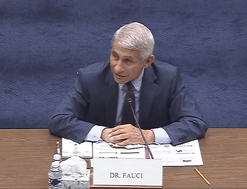
    In the most recent episode of comedy podcast My Brother, My Brother and Me (approx. timestamp 23:50), youngest brother Griffin McElroy solemnly asks, “Is Dr. Anthony Fauci on Cameo?”

    McElroy’s question, asked in the context of a rather silly and unscientific discussion on contaminated basketballs, refers to a video-sharing service in which fans can pay celebrities to send personalized messages. Dr. Fauci is, of course, not on Cameo. But he did make a public appearance this past Friday: he testified before the House Subcommittee on the Coronavirus Crisis. This was Dr. Fauci’s first Congressional appearance in several weeks; Democrats have claimed that the White House blocked him from testifying earlier in the summer.

    Dr. Fauci was joined on the witness stand by Centers for Disease Control and Prevention (CDC) Director Dr. Robert Redfield and Assistant Secretary for Health Admiral Brett Giroir, who leads policy development at the Department of Health and Human Services (HHS). All three witnesses answered questions about their respective departments, covering COVID-19-related topics from test wait times to the public health implications of Black Lives Matter protests.

    For comprehensive coverage of the hearing, you can read my Tweet thread for Stacker:

    But here, I will focus on five major takeaways for the COVID-19 data world.

    First: the results of scientific studies on the pandemic are publicly shared. In his opening statement, Dr. Fauci cited four top priorities for the National Institute of Allergy and Infectious Diseases (NIAID): improving scientific knowledge of how the novel coronavirus works, developing tests that can diagnose the disease, characterizing and testing methods of treating patients, and developing and testing vaccines. The Congressmembers on the House subcommittee were particularly interested in this last priority; Dr. Fauci reassured several legislators that taking vaccine development at “warp speed” will not come at the cost of safety.

    Rep. Jackie Walorski, a Republican from Indiana, was especially concerned about Chinese interference in vaccine development. She repeatedly asked Dr. Fauci if he believed China was “hacking” American vaccine research, and if he believed this was a threat to the progress of such work. Dr. Fauci replied that all clinical results from NIAID work are shared publicly through the usual scientific process, to invite feedback from the greater medical community.

    Clinical studies in particular are listed in a National Institutes of Health (NIH) database called ClinicalTrials.gov. On this site, any user can easily search for studies relating to COVID-19; there are2,844 listed at the time I send this newsletter256 of these studies are marked as “completed,” and two of those have results posted. I see no reason to doubt that, if Rep. Walorski were to visit this database in the coming months, she would find the results of vaccine trials here as well.

    Dr. Fauci also publicized the COVID-19 Prevention Network, a website on which Americans can volunteer for vaccine trials. According to Dr. Fauci, 250,000 individuals had registered by the time of the hearing.

    Second: nursing homes are getting COVID-19 antigen tests, big time. Dr. Redfield, Admiral Giroir, and several of the House representatives at the hearing highlighted a recent initiative by HHS to distribute rapid diagnostic COVID-19 tests to nursing homes in hotspot areas. In his opening remarks, Dr. Redfield stated that, by the end of this week, federal health agencies will have delivered “nearly one million point-of-care test kits to 1,019 of the highest risk nursing homes, with 664 nursing homes scheduled for next week.”

    The tests being distributed identify antigens, protein fragments on the surface of the novel coronavirus. Like polymerase chain reaction (PCR) tests, antigen tests determine if a patient is infected at the time they are tested; unlike PCR tests, they may be produced and distributed cheaply, and return results in minutes. Antigen tests have lower sensitivity, however, meaning that they may miss identifying patients who are in fact infected.

    The antigen test distribution initiative is great news for the nursing homes across the country that will be able to test and treat their residents more quickly. But from a data perspective, it poses one major question: how will the results of these tests be reported? While antigen tests may be diagnostic, their results should not be lumped in with PCR test results because they have a different accuracy level and serve a different purpose in the pandemic.

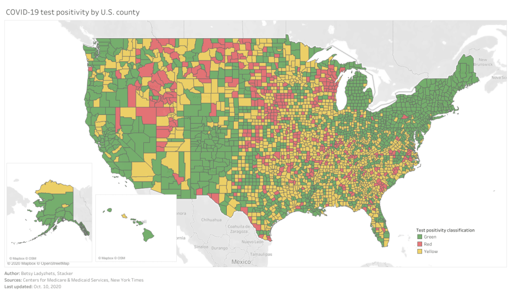
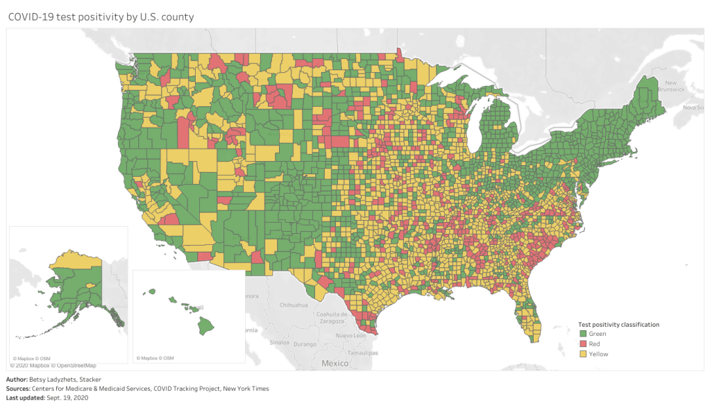
    The Nursing Home COVID-19 Public File, a national dataset run by the Center for Medicare and Medicaid Services, reports “confirmed” and “suspected” COVID-19 cases in the nation’s nursing homes. The dataset does not specify what types of tests were used to identify these cases, or the total tests conducted in each home. Similarly, state-reported datasets on COVID-19 in nursing homes typically report only cases and deaths, not testing numbers. And, as of the most recent COVID Tracking Project analysis, the only state currently reporting antigen tests in an official capacity is Kentucky. But more states may be including antigen test numbers in their counts of “confirmed cases” or “molecular tests,” as several states lumped PCR and serology tests this past spring. As hundreds of nursing homes across the country begin to use the antigen tests so graciously distributed by the federal government, we must carefully watch to identify where those numbers show up.

    Third: Admiral Giroir doesn’t know what data his agency publishes.

    If you watch just five minutes from Friday’s hearing, I highly recommend the five minutes in which Rep. Nydia Velázquez (a Democrat from New York) interrogates Admiral Giroir about COVID-19 test wait times. Here’s my transcript of a key moment in the conversation:

    Rep. Velázquez: Dr. Redfield, I’d like to turn to you. Does the CDC have comprehensive information about the wait times for test results in all 50 states?

    Dr. Redfield: I would refer that question back to the Admiral.

    Rep. Velázquez: Sir?

    Admiral Giroir: Yes, we have comprehensive information on wait times in all 50 states, from the large, commercial labs.

    Rep. Velázquez: And do you publish this data? These data?

    Admiral Giroir: Uh… we talk about it. Always. I mean, I was on… I was with 69 journalists yesterday, and we talk about that frequently.

    He went on to claim that decisionmakers at the state and city level have data on test wait times from commercial labs. But where are these data? HHS has collected testing data since the beginning of the pandemic; these data were first published on a CDC dashboard in early May and are now available on HealthData.gov.

    The HealthData.gov dataset includes test results from CDC labs, commercial labs, state public health labs, and in-house hospital labs. For each test, the dataset includes geographic information, a date, and the test’s outcome. It does not include the time between the test being administered and its results being reported to the patient. In fact, that “date” can either be a. the date the test was completed, b. the date the result was reported, c. the date the specimen was collected, d. the date the test arrived at a testing facility, or e. the date the test was ordered. So, if there’s another, secret dataset which includes more precise dating, I personally would love to see it made public.

    Also, who are those 69 journalists, Admiral Giroir? How do I join those ranks? I have some questions about HHS hospitalization data.

    Fourth: everyone wants to reopen schools. Dr. Redfield said, opening schools is “in the best public health interest of K-12 students.” Dr. Fauci said, schools should reopen so that schools can access health services, teachers can identify instances of child abuse, and to avoid “downstream unintended consequences for families.” Rep. Steve Scalise, the subcommittee’s Ranking Member (and a Republican from Louisiana, home to one of the country’s most annoying COVID-19 dashboards), said, “Don’t deny these children the right to seek the American dream that everybody else has deserved over the history of our country.” Rep. James Clyburn, the subcommittee’s Chair (a Democrat from South Carolina), said that school reopening must not be a “one size fits all approach,” but it should be done for the good of students and their families.

    Clearly, reopening schools is a popular political opinion. But does the country have the data we need to determine if schools can reopen safely? Reopening, as Dr. Fauci explained in response to an early question from Rep. Clyburn, is most safely done when COVID-19 is no longer circulating widely in a community. School districts can determine whether the disease is circulating widely through looking at case counts over time, but for those case counts to be accurate, the region must be doing enough testing and contact tracing to catch all cases.

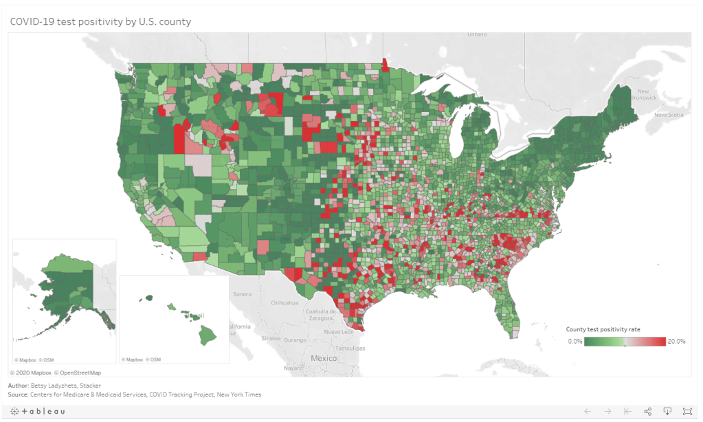
    And testing data, while they are certainly collected at the county and zip code levels by local public health departments, are not standardized at all. HHS doesn’t publish county-level testing data. Nor does the COVID Tracking Project. This lack of standardization for any geographic region smaller than a state is troubling, as public health leaders and journalists alike cannot currently assess the scope of local outbreaks with any kind of broad comparison. To put it simply: I would love to do a story on how many school districts can safely reopen right now, based on their case counts and test metrics. But the data I would need to do this story do not exist.

    Fifth: all data are political; COVID-19 data are especially political. I know, I know. Data have been political since humans started collecting them. One of America’s most comprehensive data sources, the U.S. Census, started as a way to enforce the Three-Fifths Compromise.

    But watching this Friday’s hearing hammered home for me how the mountains of data produced by this pandemic, coupled with the complete lack of standards across the institutions producing them, has made it particularly easy for politicians to quote random numbers out of context in order to advance their agendas. Rep. Clyburn said, “At least 11 states… are currently performing less than 30% of the tests they need to control the virus.” (Which states? How many tests do they need to perform? Where di that benchmark come from? What other metrics should the states be following?) And, on the other side of the aisle, Rep. Scalise held up a massive stack of paper and waved it right at the camera, claiming that the high number of tests that have been conducted in this country is evidence of President Trump’s national plan. (But how many tests have we conducted per capita? What are the positivity rates? What statistics can we actually correlate to President Trump’s plan?)

    In fact, after the hearing, the White House put out a press release claiming that America has “the best COVID-19 testing system in the world.” The briefing includes such claims as, “the U.S. has already conducted more than 59 million tests,” and, “the Federal Government has distributed more than 44 million swabs and 36 million tubes of media to all 50 States.” None of the statistics in the briefing are put into terms reflecting how many people have actually been tested, compared to the country’s total population. And none of the statistics are contextualized with public health information on what targets we should be meeting to control the pandemic.

    The experts who might have been consulted on that brief—Dr. Fauci, Dr. Redfield, and Admiral Giroir—all sat before Congressional Representatives on Friday morning, quietly nodding when Representatives asked if their respective departments were doing everything possible to protect America. If they had answered otherwise, they may not have returned for future hearings. The whole thing felt very performative to me: the Democrats threw veiled jibes at President Trump, the Republicans bemoaned China and Black Lives Matter protests, and Dr. Fauci fact-checked such basic statements as, “Children are not immune to COVID-19.”

    And almost everyone in the room—including all three witnesses—removed their mask when they spoke.

    If Dr. Fauci were available to commission on the video service Cameo, I would pay him good money to send a personal message to every Congressmember on that subcommittee telling them, confidentially, exactly what he thinks of their questions. And then I would ask him for Admiral Giroir’s personal cell phone number.

  • Hospital capacity dataset gets a makeover

    Hospital capacity dataset gets a makeover

    Screenshot retrieved from the HHS Protect Public Data Hub on July 26, 2020.

    On July 14, the White House announced that hospitals across America would no longer report their COVID-19 patient numbers and supply needs to the Centers for Disease Control and Prevention (CDC). Instead, they would report numbers through a data portal set up in April by the Department of Health & Human Services (HHS). A July 10 guidance issued by HHS requests that hospitals send reports on how many overall patients they have, how many COVID-19 patients they have, the status of those patients, and their needs for crucial supplies such as PPE and remdesivir.

    In some ways, this switch actually makes sense: HHS’ data portal, built by a contractor called TeleTracking, is designed specifically to support more efficient data collection during COVID-19. HHS was already collecting hospitalization data second-hand through state reports, some hospital-to-HHS reports, and the CDC’s old system, called the National Healthcare Safety Network; the new system is more streamlined at the federal level. HHS is also the primary federal entity collecting data on COVID-19 lab test results, through reports that go directly from laboratories to HHS (often bypassing local and state public health departments).

    Simplifying data collection to one office—just HHS, rather than HHS and CDC—should theoretically make it easier for hospitals to report their needs and receive aid from the federal governmentquickly. But switching systems during the middle of a pandemic is dangerous. Switching systems during a COVID-19 surge in the Sun Belt when hospitals are being pushed to their full capacity is especially dangerous. Hospital databases, once set up to report to the CDC, must be reconfigured—or worse, exhausted healthcare workers must manually enter their numbers into the new system.

    STAT News’ Nicholas Florko and Eric Boodman explore this issue in more detail, but here is one quote from John Auerbach, president and CEO of Trust for America’s Health, which summarizes the problem:

    Hospitals are incredibly varied across the country in terms of their capacity to report data in a timely and accurate way. If you’re going to say every hospital, regardless of its size, its resources, its capacity, has to learn a new system quickly, it’s problematic.

    It is inevitable that, for the first few weeks of this new system, any hospital capacity data reported by HHS will be rife with errors. And yet, public health leaders, researchers, and people simply living in Texas and Florida need to know how their hospitals are doing right now, so HHS has published the results of their new reporting system only a week after the ownership shift. The new website HHS built to publish these data, called the HHS Protect Public Data Hub, went live this past Monday, July 20. (Veteran users noted that this page copied the homework of the dataset’s former home on the CDC website—same color scheme and everything.)

    As I send this newsletter, the HHS Protect dataset was most recently updated on Thursday, July 23 with data as of the previous day. Experts looking at these data, including my fellow volunteers at the COVID Tracking Project, quickly noticed that something seemed off:

    You read that right: according to HHS Protect, 118% of Rhode Island’s hospital beds are currently occupied. As are 123% of its intensive care beds. And that’s just an extreme example; when one compares the hospital capacity estimates in this HHS update to the most recent estimates from the CDC’s system (dated July 14), only 6 states do not show changes of at least 20%. New Mexico, for example, has supposedly seen its number of COVID-19 patients skyrocket 265% in eight days’ time.

    Yes, the HHS system is collecting figures from about 1,500 more hospitals than the CDC system did. And yes, 21 states are currently listed as having “uncontrolled spread” by public health research groupCOVID Exit Strategy. But hospitalization figures typically rise slowly, with a slight delay from cases; for journalists like myself who have been looking at this data point for months, the jump reported by HHS is simply not reasonable.

    It’s good news for journalists and public health leaders that hospital capacity data is once again publicly available from a standardized, federal source. But I have a lot of questions for HHS. What is the agency doing to support already-taxed hospitals that do not have the staff or resources to transfer their database systems? When hospitals inevitably submit their data with errors, what protocols are in place to catch these issues and ensure all data going out to the public portal is accurate? How will the new system support state public health departments, such as Missouri and South Carolina, that previously relied on the CDC for their hospitalization figures? Will HHS make other datasets available on the HHS Protect portal (such as lab data), and if so, when?

    A fellow volunteer from the COVID Tracking Project and I are drafting a strongly worded email to HHS’s press team including these questions and many more; I hope to have some answers for you by next week. In the meantime, you can read Stacker’s story on hospital capacity by state, which does not cite the new HHS figures. Don’t ask me how many times I had to update the story’s methodology.