I spent the bulk of last week’s issue unpacking a new testing dataset released by the Centers for Medicare & Medicaid Services which provides test positivity rates for U.S. counties. At that point, I had some unanswered questions, such as “When will the dataset next be updated?” and “Why didn’t CMS publicize these data?”
The dataset was updated this past week—on Thursday, September 17, to be precise. So far, it appears that CMS is operating on a two-week update schedule (the dataset was first published on Thursday, September 3). The data themselves, however, lag this update by a week: the spreadsheet’s documentation states that these data are as of September 9.
CMS has also changed their methodology since the dataset’s first publication. Rather than publishing 7-day average positivity rates for each county, the dataset now presents 14-day average positivity rates. I assume that the 14 days in question are August 27 through September 9, though this is not clearly stated in the documentation.
This choice was reportedly made “in order to use a greater amount of data to calculate percent test positivity and improve the stability of values.” But does it come at the cost of more up-to-date data? If CMS’s future updates continue to include one-week-old data, this practice would be antithetical to the actual purpose of the dataset: letting nursing home administrators know what the current testing situation is in their county so that they can plan testing at their facility accordingly.
Additional documentation and methodology updates include:
- The dataset now includes raw testing totals for each county (aggregated over 14 days) and 14-day test rates per 100,000 population. Still, without total positive tests for the same time period, it is impossible to replicate the CMS’s positivity calculations.
- As these data now reflect a 14-day period, counties with under 20 tests in the past 14 days are now classified as Green and do not have reported positivity rates.
- Counties with low testing volume, but high positivity rates (over 10%), are now sometimes reassigned to Yellow or Green tiers based on “additional criteria.” CMS does not specify what these “additional criteria” may be.
I’ve made updated versions of my county-level testing Tableau visualizations, including the new total test numbers:
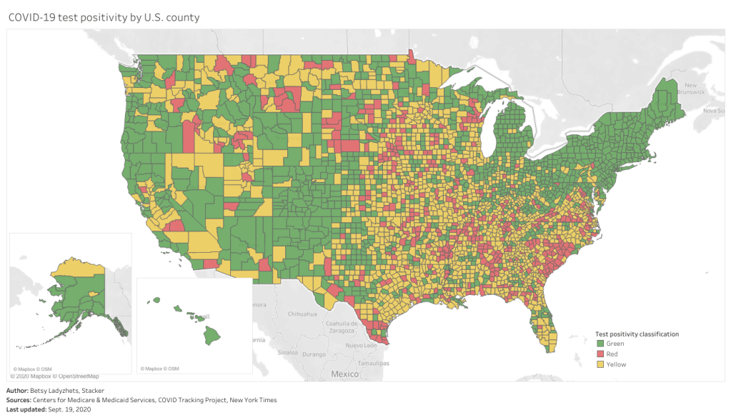
This chart is color-coded according to CMS’s test positivity classifications. As you can see, New England is entirely in the green, while parts of the South, Midwest, and West Coast are spottier.
Finally: CMS has a long way to go on data accessibility. A friend who works as a web developer responded to last week’s newsletter explaining how unspecific hyperlinks can make life harder for blind users and other people who use screenreaders. Screenreaders can be set to read all the links on a page as a list, rather than reading them in-text, to give users an idea of their navigation options. But when all the links are attached to the same text, users won’t know what their options are. The CMS page that links to this test positivity dataset is a major offender: I counted seven links that are simply attached to the word “here.”
This practice is challenging for sighted users as well—imagine skimming through a page, looking for links, and having to read the same paragraph four times because you see the words “click here” over and over. (This is my experience every time I check for updates to the test positivity dataset.)
“This is literally a test item in our editor training, that’s how important it is,” my friend said. “And yet people still get it wrong. ALL THE TIME.”
One would think an agency dedicated to Medicare and Medicaid services would be better at web accessibility. And yet.

Leave a comment