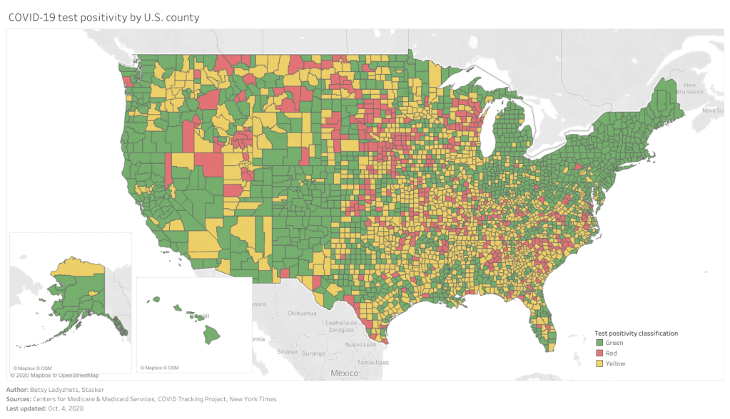
This past Monday, September 28, the Centers for Medicare & Medicaid Services (CMS) updated the county-level testing dataset which the agency is publishing as a resource for nursing home administrators.

I’ve discussed this dataset in detail in two past issues: after it was published in early September, and when it was first updated two weeks ago. The most recent update includes data from September 10 to September 23; CMS is continuing to analyze two weeks’ worth of testing data at a time, in order to improve the stability of these values. And this update came on a Monday, rather than a Thursday, decreasing the data lag from one week to five days.
A CMS press release from this past Tuesday describes one update to how CMS assigns test positivity categories, which nursing home administrators look at to determine how often they are required to test their patients and staff:
Counties with 20 or fewer tests over 14 days will now move to “green” in the color-coded system of assessing COVID-19 community prevalence. Counties with both fewer than 500 tests and fewer than 2,000 tests per 100,000 residents, and greater than 10 percent positivity over 14 days – which would have been “red” under the previous methodology – will move to “yellow.”
This change intends to address the concerns of rural states which are not doing much testing due to their small populations.
I’ve updated my Tableau visualization with the most recent county data. The majority of the Northeast continues to be in the green, while areas in the South and Midwest pose higher concerns.

Leave a comment