Last night, I received my first dose of the Moderna COVID-19 vaccine. I don’t usually publish more personal writing in the CDD, but it felt appropriate to share a short reflection I wrote during my 15-minute waiting period.
I write this sitting in a back corner of the Science Skills High School gym, a couple of minutes after receiving my first dose of the Moderna vaccine.
“I can’t take credit for it,” said the health professional who gave me the shot, with a voice that reminded me of my high school biology teacher.
I believe she was referring to how easy the shot went in—in and out, the smoothest jab, I might not have felt it if I hadn’t been paying close attention, the goosebumps on my arms rising. I believe she was being specific. But I like to imagine she meant the whole thing—the gym, the people in scrubs and yellow vests, the red dots marking six-foot intervals on the floor, the vials. The vials, manufactured somewhere in New Hampshire or maybe Colorado, packed and stored below freezing and brought here. All the centuries of science and people that brought me here, to the gym, brought the shot to my arm. It went in smooth, but I felt the weight behind it.
I thought about telling her, I’m a science reporter. I’ve been on the COVID beat for a year. We are almost one year since my first COVID Tracking Project shift, my first time squinting at the numbers on dashboards and wondering if that ever might be me. But I didn’t say anything, let her deliver her form speech, her warnings about the side effects. “Your arm will be sore, maybe a light fever, take Tylenol,” she said. “Better than getting COVID, though!” I replied.
Better to let me be just another data point, today. Another body moving through the pipeline. Another voice saying, thank you.
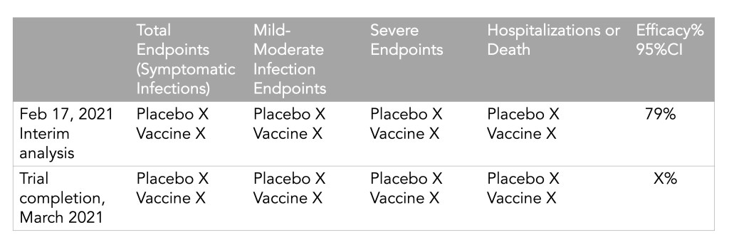
Remember when I said “we’ll see if anything else happens” in last week’s article on AstraZeneca’s issues? Well, I accept full responsibility for manifesting the chaos that happened earlier this week and I promise I won’t tempt fate again this time around. If you’re confused, as I certainly was, here’s just what the hell happened.
On Monday, AstraZeneca released results from their Phase 3 trials in the United States, and they looked good: 79% efficacy against symptomatic disease, 100% efficacy against hospitalizations and deaths. This was certainly a welcome result for the company which is continuing to grapple with fallout from rare cases of blood clots that have been reported in some people after they got the vaccine, and gears started to turn to get EUA approval in the United States. (Even though, again, the U.S. just promised most of their supply to Canada and Mexico. Everyone wants FDA clout, I guess.)
But on Tuesday, officials started to question the results. The results released on Monday had looked better than more recent results released elsewhere, one of which showed an overall efficacy of around 60%. Also, as Dr. Eric Topol pointed out, the data were fairly incomplete:
Independent reviewers from the data and safety monitoring board sent “a harsh note” to AstraZeneca, according to Anthony Fauci, and sure enough, it soon became clear that AstraZeneca had released outdated (better) numbers instead of the real results from the trial, obfuscating how efficacious the vaccine actually was in the U.S. trial.
#AstraZeneca saying its vaccine was 79% effective against symptomatic Covid when it is 76% effective is just like that guy on Hinge who says he is 5'11" when he is actually 5'9". Just why?
Following the end of the federal public health emergency in May, the CDC has lost its authority to collect vaccination data from all state and local health agencies that keep immunization records. As a result, the CDC is no longer providing comprehensive vaccination numbers on its COVID-19 dashboards. But we still have some information about this year’s vaccination campaign, thanks to continued CDC efforts as well as reporting by other health agencies and research organizations.
This week, the FDA authorized Novavax’s updated COVID-19 vaccine. Here’s why some people are excited to get Novavax’s vaccine this fall, as opposed to Pfizer’s or Moderna’s.
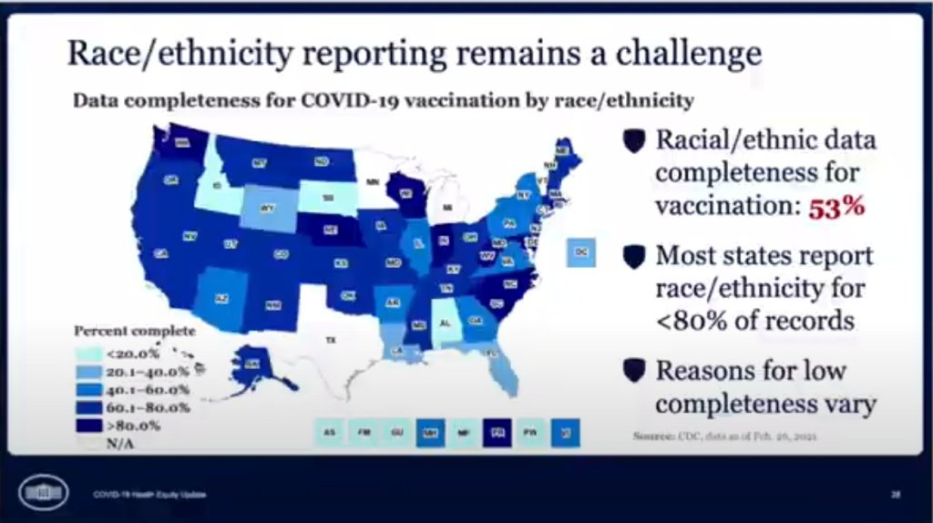
In the White House COVID-19 briefing this past Monday, equity task force director Dr. Marcella Nunez-Smith showed, for one fleeting minute, a slide on completeness of state-by-state data on vaccinations by race and ethnicity. The slide pointed out that racial/ethnic data was only available for 53% of vaccinations, and most states report these data for fewer than 80% of records.
alright @CDCgov so clearly you have the state-by-state data for vaccinations by race/ethnicity… even if it's limited… when are you gonna start publishing it publicly? pic.twitter.com/mO9QeXrk0v
Still, though, this slide demonstrated that the CDC does have access to these crucial data. As we’ve discussed in past issues, while many states (45 plus DC) are now reporting vaccinations by race/ethnicity, huge inconsistencies in state reporting practices make these data difficult to compare. It is properly the job of the CDC to standardize these data and make them public.
The CDC is actually under scrutiny right now from the HHS inspector general for failing to collect and report complete COVID-19 race/ethnicity data. You can read POLITICO for more detail here; suffice it to say, I’m excited to see the results of this investigation.
Also, while we’re at it, let’s publicly shame the five states that are not yet reporting vaccinations by race/ethnicity on their own dashboards. Get it together, Hawaii, Montana, New Hampshire, South Dakota, and Wyoming!
As of this past Monday, K-12 teachers in every state are now eligible for vaccination. Teachers were already prioritized in most of the country, but Biden directed the remaining states to adjust their priority lists last week. The federal government also pulled teachers into the federal pharmacy program, previously used for long-term care facilities.
This is great news, of course—teachers should get vaccinated ASAP so that they can safely return to their classrooms, allowing schools to reopen in person with much lower risk. Vaccinations have become a stipulation for reopening, in fact, in some states like Oregon, even though the CDC has said this should not be a requirement.
But there’s one big problem: we have no idea how many teachers have actually been inoculated. Sarah wrote about why we need occupational data on vaccinations a few weeks ago:
For example, NYC has included “in-person college instructors” in eligibility for the vaccine since January 11. Wouldn’t it be nice to know just how many in-person professors have gotten vaccinated? It’d sure be helpful if Barnard ever decides to do in-person classes again. Or what about taxi drivers? Again in NYC, because that’s where I live, they became eligible for vaccination on February 2. From a personal standpoint, I’d like to know if I could send my taxi driver to the hospital if my mask slips.
The data situation hasn’t improved since February. New York’s report of vaccine coverage among state hospital workers is still the closest thing we have to occupation reporting. A recent article from EdWeek sheds some light on the issue, citing privacy concerns and a lack of data from vaccine administration sites themselves:
Some state agencies and districts have said privacy concerns prevent them from tracking or publishing teacher vaccination data. Others say vaccine administration sites are not tracking recipients’ occupations and they are not in position to survey employees themselves.
It appears that state and local public health departments were even less prepared to track occupations of vaccine patients than they were to track those patients’ race and ethnicity. But without these numbers, it may take even longer for students to return to classrooms, as evidenced by this quote from Megan Collins, co-director of the Johns Hopkins Consortium for School-Based Health Solutions:
“We’re seeing a substantial disconnect. There are states not prioritizing teachers for vaccine that are fully open for in-person instruction, and others that are prioritizing teachers for vaccines, but aren’t open at all,” Collins said. “If states are going to use teacher vaccinations as a part of the process for safely returning to classrooms, it’s very important then to be able to communicate that information so people know that teachers are actually getting vaccines.”
Biden’s administration has also given schools more money for testing, allocating $650 million in grants to help public schools get access to tests, testing supplies, and logistical assistance. But of course, school testing isn’t being tracked either. New York continues to be the only state that reports detailed data in this area; see our K-12 school data annotations for more info.
On November 18, New York City mayor Bill de Blasio announced that the city’s schools would close until further notice. The NYC schools discrepancy is indicative of an American education system that is still not collecting adequate data on how COVID-19 is impacting classrooms—much less using these data in a consistent manner.
The Johnson & Johnson vaccine has fully dropped—not just in the arms of millions of Americans, but also on state vaccine dashboards. When I updated the CDD’s vaccination data annotations yesterday, I noticed that several states had switched from labeling their shots as “first dose” and “second dose” to labeling them as “first dose” and “completed series,” or something similar. Since the J&J vaccine is only one dose, a single shot from this manufacturer could launch you right into that “completed series” category.
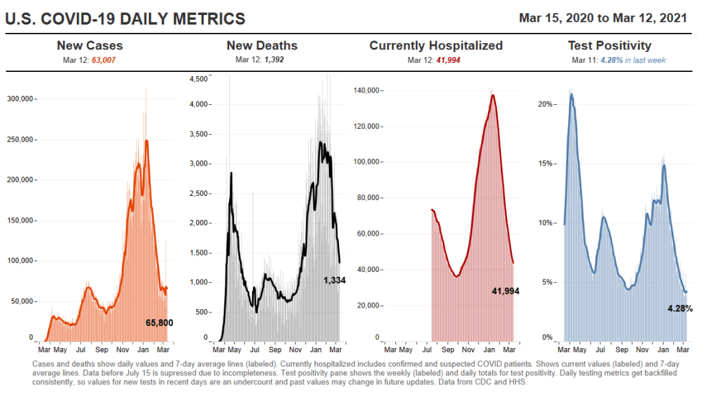
However you label them, the U.S. is now vaccinating about 2.5 million people per day. One in four adults has received at least their first shot. And we crossed the 100-million dose mark on Friday, far earlier than President Biden’s 100-day goal. Meanwhile, cases, deaths, and hospitalizations continue to decline.
These numbers have inspired some guarded optimism, at least on the part of the federal government. On Thursday, Biden announced that he’s directing all states, tribes, and territories to make all adults eligible for vaccination by May 1. Alaska became the first state to reach that milestone this week.
Of course, there’s a big difference between making people eligible and actually getting shots in arms. But vaccine hesitancy is reportedly dropping, as Americans see their family members and friends safely get inoculated. One new poll from NPR/PBS NewsHour/Marist shows that 73% of Black people and 70% of white people said they’re either planning to get vaccinated or have received a shot already.
Variants also continue to be a concern (see Sarah’s section later in this issue). But it’s hard to argue with the fact that millions of our family members, friends, and neighbors are now protected from COVID-19, with more people getting vaccinated every day.
As of yesterday, 45 states and D.C. are reporting vaccinations by race and ethnicity. (See the CDD’s full annotations here.) This is great—with five more states, we’ll have national coverage. But the lack of standardization in how states report these figures leaves much to be desired.
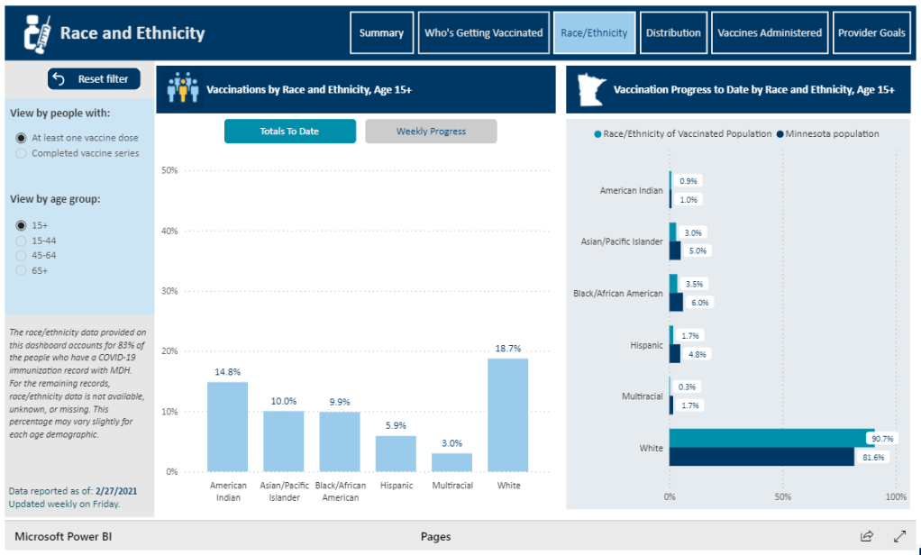
One of the newest states to start reporting race/ethnicity vaccination data is Minnesota. At a glance, the Race/Ethnicity tab of the state’s vaccine data dashboard looks comprehensive: it includes demographic data stratified by age, as well as a bar chart that compares the population that’s been vaccinated to Minnesota’s population overall.
Race/Ethnicity tab on Minnesota’s vaccine dashboard, showing percent comparisons.
But a closer examination shows that the age groups reported on this Race/Ethnicity tab (15-44, 45-64, 65+) don’t match the age groups used to report vaccinations by age on a different tab (16-17, 18-49, 50-64, 65+). So if a journalist or researcher were trying to analyze Minnesota’s vaccine demographics, they wouldn’t be able to derive whole numbers from these percentages.
This is one small example of a common issue across state vaccine demographic reporting—and demographic reporting in general. When categories don’t match, it’s difficult to make comparisons, and age brackets are particularly heinous. We need the CDC to start providing vaccine demographics by state, like, last December.
One of those 42 states is Oklahoma. Oklahoma wasn’t listed as reporting any demographic data in our annotations until yesterday—but in fact, this state has been reporting vaccinations by race, ethnicity, age, and gender since January. I missed this information in previous weeks because the state has been reporting these data in its Weekly Epidemiology and Surveillance Reports, rather than on its main COVID-19 dashboard where the totals are reported.
So, this week, the COVID source shout-out section is also a public apology to the good state of Oklahoma. I’m sorry I missed your vaccination demographics. You’re doing great.
Yesterday, the FDA gave the Janssen—did you know it’s pronounced yahn-sen? I didn’t—vaccine Emergency Use Authorization, allowing it to join the likes of Pfizer and Moderna in the exclusive club of vaccines that may now be distributed in the U.S. Welcome, Janssen. (As a total coincidence I’m wearing my shirt that just says “Vaccines!” on it as I write this.) But the addition of a new vaccine in circulation also brings data reporting questions with few easy answers.
I got to hear the VRBPAC (Vaccines and Related Biological Products Advisory Committee) hold music for the first time on Friday. As I am a full-time student, I couldn’t watch the entire meeting; thus, a lot of this coverage is aided by Helen Branswell and Matthew Herper’s liveblog on STAT News—thank you guys for saving me hours of video to sift through.
The gist of the meeting is that of course it passed the committee vote. I’m pretty sure no one expected it wouldn’t. Katelyn Jetelina, who runs the Your Local Epidemiologist newsletter, certainly didn’t, especially because we knew beforehand that it was 100% effective in preventing hospitalizations and deaths.
However, I did find it interesting that the vote was unanimous—which I wasn’t expecting, given the pattern established by Pfizer and Moderna beforehand. Pfizer passed with 17 pro and 4 against (and 1 abstention); they did not explain their votes in that meeting but authorization for kids aged 16-17 was a sticking point. Moderna passed with 20 pro and 1 abstention; the question—“Based on the totality of scientific evidence available, do the benefits of the Moderna Covid-19 vaccine outweigh its risks for use in individuals 18 years of age and older?”—was worded too broadly, and the abstainer would have preferred to target authorization to high risk populations).
So what changed? Herper noted in the liveblog that the unanimous vote doesn’t necessarily mean this is a better vaccine than Pfizer or Moderna. It was more about panelists’ increased faith in the EUA process. Pfizer and Moderna have been EUA’d for a while and, per Patrick Moore of the University of Pittsburgh, “things are looking good.” Agreed! Now if we could just get it into more deltoids…
But we’re not here for deltoids, we’re here for data. The J&J presentation basically reiterated what we knew with some key statistics: The big Phase 3 study enrolled more than 44,000 participants globally. Across the entire study, the protection efficacy against severe disease was 85%, and that’s including the U.S. and South Africa (important because of variant prevalence in the latter country). No one who got the vaccine was hospitalized or died due to COVID-19. The efficacy against moderate to severe disease was 72% in the US, and 66% across all countries studied. These numbers were similar across ages, comorbidity statuses, sexes, races, and ethnicities. In short: it works.
There is a lack of data in people aged 75 or older. Only 755 people (3.8% of all participants) in this age group received the vaccine in the ENSEMBLE trial, and the FDA noted that it’s hard to interpret such low numbers. As Branswell says in the STAT liveblog, the trial didn’t prove that the vaccine works in older individuals. However, the VRBPAC committee barely touched on this. Either way, it’s been approved for adults 18 and over, and there’s nothing in the recent communications that indicates adults 60 and over aren’t advised to get it.
There are data questions beyond the VRBPAC committee meeting, though. Most vaccination dashboards are set up for a two-dose vaccine; they document how many people have gotten both shots and how many people have gotten just the first. So we don’t really know what’s going to happen when the Janssen vaccine becomes available—will that number factor into “people who have only gotten one dose?” Personally, I think the dashboards are going to have to change to “people who have partially completed dosing regimen” and “people who have completed the dosing regimen,” but knowing the states, it’ll likely be more complicated than that. Drew Armstrong, who runs Bloomberg’s Vaccine Tracker, mentioned in our CDD workshop last week that his team is already calling public health departments in order to discern how their reporting will change.
The question of how the dashboards will change gets more complicated when one considers a sticking point that actually was brought up in the committee meeting: just how many doses Janssen will eventually recommend. This particular petition was for a single dose vaccine. But Janssen has also been testing a two-dose regimen. Dr. Paul Offit, a member of the committee and a vaccine researcher, brought this up and raised a very important question: what if the two-dose regimen works better? What happens then? How is that going to be communicated to the public? How is that going to show up in the dashboards?
It’s tricky. The response, for now, is that the two-dose trial is still double-blinded, and that right now we’re concerned with granting EUA to a single-dose vaccine. The possibility was raised that the two-dose regimen might be what Janssen presents for true-blue FDA authorization. But we’re not there yet.
However, to go back to our dashboard question, let’s entertain for a minute that Janssen sees that the two-dose regimen works demonstrably better than the single-dose regimen. I find it hard to believe that this will come before the single-dose vaccines have started to be administered—and documented in dashboards. What happens to the dashboards then? Even if we assume it’s changed by then to “completed vaccine regimen” vs “partially completed vaccine regimen,” does that mean everyone who got the Janssen vaccine before – and would be counted under “completed regimen”—would have to be moved to “partially completed regimen?”
The ending sentiment seemed to be that the two-dose questions are a bridge we should cross when we get to it. While I sort of agree, I do think it’s worth considering now when it comes to data ramifications. States should be thinking about how they’re going to document this so we’re not blindsided if Janssen and the FDA decide that you need two shots for maximum COVID protection. We have enough data problems as it is, why add more?
Following the end of the federal public health emergency in May, the CDC has lost its authority to collect vaccination data from all state and local health agencies that keep immunization records. As a result, the CDC is no longer providing comprehensive vaccination numbers on its COVID-19 dashboards. But we still have some information about this year’s vaccination campaign, thanks to continued CDC efforts as well as reporting by other health agencies and research organizations.
This week, the FDA authorized Novavax’s updated COVID-19 vaccine. Here’s why some people are excited to get Novavax’s vaccine this fall, as opposed to Pfizer’s or Moderna’s.
I was having a truly lovely evening, hot chocolate in hand, paging through the New York State vaccination dashboard until I realized one glaring absence: Why is there no occupational data for who is getting vaccinated?
This isn’t just a problem with the New York state dashboard. According to our updated annotations on state vaccination data sources, not a single one reports out vaccination by occupation. I suppose I shouldn’t ask for so much—only 36 states report vaccination by race and ethnicity, which I thought was the bare minimum—but I’m used to getting disappointment at this point.
Nihilism aside, here’s why that’s weird. Pretty much everyone is considering one’s occupation into whether they’re eligible for the vaccine or not—hell, that’s how this whole thing started after all. But now that we’ve moved beyond just health care workers getting vaccinated, the data hasn’t kept up.
For example, NYC has included “in-person college instructors” in eligibility for the vaccine since January 11. Wouldn’t it be nice to know just how many in-person professors have gotten vaccinated? It’d sure be helpful if Barnard ever decides to do in-person classes again. Or what about taxi drivers? Again in NYC, because that’s where I live, they became eligible for vaccination on February 2. From a personal standpoint, I’d like to know if I could send my taxi driver to the hospital if my mask slips.
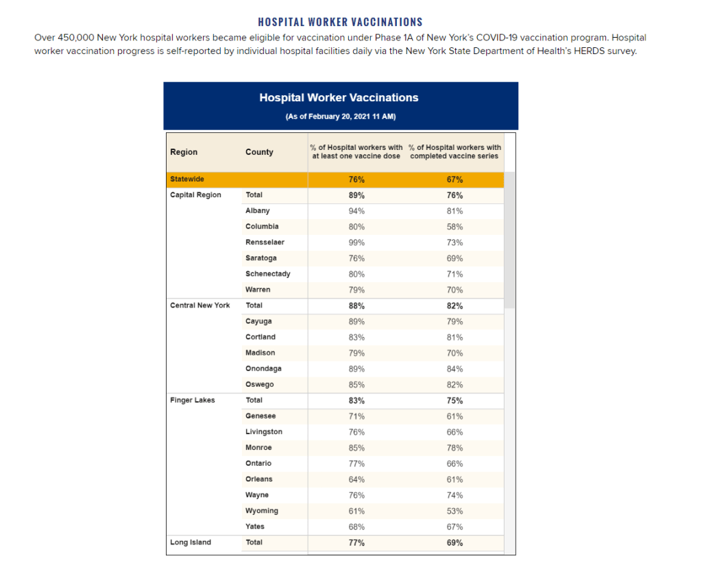
To be fair, we are seeing some occupation-adjacent data. First, a few sources group vaccinations by where the shots were given, like Massachusetts, or by provider type, like Utah. These include shots given in correctional facilities. While it’s not as good as just stating outright which occupations people getting vaccinated have, it could be used as a proxy for something similar. Additionally, New York tracks hospital worker vaccinations, but they don’t differentiate between physicians and other staff. Finally, long-term care facilities are going through a different program, so data for LTC employees usually gets its own category in a lot of states, like in New York again.
But we shouldn’t be satisfied with proxies and incomplete data; I’ve realized my worth since drafting the title for this segment. I—no, we—deserve better. This is critical for understanding vaccine equity and how close we are to restoring “normalcy.” If we don’t know how many taxi drivers or how many college instructors are getting vaccinated, it’s going to be a lot harder to have conversations about when it’s safe to ride in a taxi or attend in-person classes. It’s going to be a lot harder to have conversations about which taxi drivers or which instructors are able to get vaccinated. It’s also important to see just how well pushing taxi drivers to the front of the line works in actually getting them vaccinated. We’ve lifted one barrier, but are there others that we’re missing?
It’s entirely possible that healthcare providers just aren’t used to collecting this kind of data. But it’s still necessary, and right now, it’s just another example of flying blind when we really shouldn’t be.
Following the end of the federal public health emergency in May, the CDC has lost its authority to collect vaccination data from all state and local health agencies that keep immunization records. As a result, the CDC is no longer providing comprehensive vaccination numbers on its COVID-19 dashboards. But we still have some information about this year’s vaccination campaign, thanks to continued CDC efforts as well as reporting by other health agencies and research organizations.
This week, the FDA authorized Novavax’s updated COVID-19 vaccine. Here’s why some people are excited to get Novavax’s vaccine this fall, as opposed to Pfizer’s or Moderna’s.
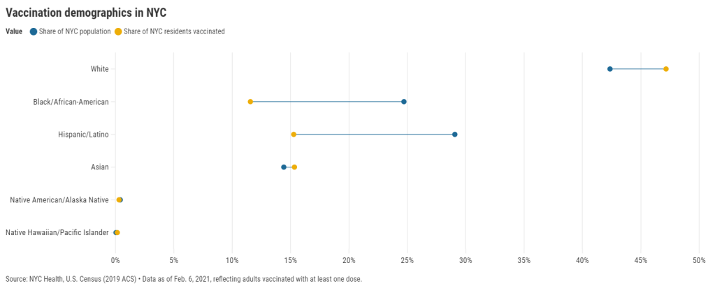
27 states are now reporting race and ethnicity data for their vaccinations. This week, New York joined that number. New York City also started reporting these data last Sunday, as we noted in that day’s issue. Despite promises from city and state leadership to prioritize equity in the vaccine rollout, the numbers so far are showing white New Yorkers getting vaccinated at much higher rates than their Black and Hispanic/Latino neighbors.
Here’s one way of visualizing the disparity: Black New Yorkers make up 25% of NYC’s population, but only 12% of those vaccinated. Latino New Yorkers make up 29% of the population, but only 15% of those vaccinated.
Here’s another way of visualizing the disparity: about 4.6% of white NYC residents have been vaccinated, compared to 2.2% of Latino New Yorkers and only 2% of Black New Yorkers. White New Yorkers are getting vaccinated twice as fast as their neighbors. This is particularly striking when you consider that Black and Latino New Yorkers disproportionately make up our essential workers—they constitute the majority of grocery workers, public transit workers, healthcare workers, childcare workers, and cleaning services workers, according to a March 2020 report by the NYC Comptroller’s office.
As someone who lived in NYC during the height of the city’s spring surge, I’ve seen how hard the pandemic has hit my neighbors of color. Sirens screamed through my north Brooklyn neighborhood at all hours, and hundreds of requests for aid came into my local mutual aid group. About 7,400 Black New Yorkers and 8,000 Latino New Yorkers have died of COVID-19 since the pandemic hit this city. In any version of an equitable vaccine rollout, these communities should be first in line.
So, what’s happening? Why are vaccinations for Black and Brown New Yorkers lagging? The answer is a combination of poor planning and poor access. The city didn’t set up appropriate systems to tell its most vulnerable communities about the vaccines or help them set up appointments. As a result, those NYC residents who have the time, know-how, and internet access to navigate a complex system are snapping up appointments—and you can guess which residents those are.
“What we’re going through now with the vaccine rollout reminds me of what we were going through at the beginning of the pandemic,” said Dr. Uché Blackstock, emergency physician and founder of the organization Advancing Health Equity, at a webinar with City Councilmember Mark Levine this past week. She described how she struggled to get enough tests and PPE to care for her patients—many of whom were Black and Latino essential workers—last spring.
Now, there’s both a supply gap and an information gap. In one example now infamous in the city, a vaccination site in Washington Heights (home to NYC’s Little Dominican Republic) was primarily catering to white patients from other parts of the city, the suburbs, and even New Jersey. Josefa Velasquez, a reporter at THE CITY who exposed the problems at this site, described how the vaccination center was ill-equipped to serve the population in its neighborhood:
At the door, most people entering appeared to be white and unfamiliar with the neighborhood. Some asked security guards where they could find parking. Nylon Longchamp handbags and Burberry scarves stood out.
Outside of the site, run by NewYork-Presbyterian Hospital near its Washington Heights medical center complex, Olga encountered another language barrier: None of the handful of guides and security guards outside directing people spoke Spanish.
Velasquez herself actually helped translate for some of the seniors trying to get vaccinated. After her reporting brought the vaccination center’s problems to light, the center limited all new appointments to NYC residents and reserved 60% of slots for Washington Heights residents. But the story is still indicative of larger issues: NYC data show that 23% of vaccinations in the city have gone to non-residents, and a significant majority of those non-residents are white.
Even when appointments are reserved for New Yorkers, barriers to vaccine access remain. Just this week, Yankee stadium opened as a vaccination site with all doses reserved for residents of the Bronx. Councilmember Levine posted on Friday that thousands of these appointments were still open, unreserved—while appointments elsewhere in the city get snapped up in minutes.
A reply to Levine’s Tweet reveals one reason: Bronx residents can’t access these Yankee stadium appointments through the NYC vaccination website, because this clinic is run by a network of private physicians. The city website is confusing enough already for many New Yorkers—and now that website doesn’t even encompass all available appointments.
Some residents of the Bronx also associate the stadium with invasions of their community:
I live in the shadow of the stadium and this is the first time in my life that the stadium has fulfilled its promise of being a community center after Pres. Carrion and Diaz shoved the multitude of community services it was supposed to offer residents of 10452 down our throats https://t.co/LJUK2D1Svj
— “naked to the world” plays softly in the backgrnd (@elliottraylassi) February 6, 2021
At the same webinar that I cited earlier, Councilmember Levine announced a redesign of the official NYC vaccine appointment scheduler. The site’s design has been simplified and made more accessible. On the homepage, for example, users are provided with four options: Schedule First Dose, Schedule Second Dose, Reschedule Appointment, Cancel Appointment. But users still have to navigate through a checklist and input a lot of personal information in tiny boxes. And, while NYC does have a vaccine hotline, it “hasn’t been adequately staffed,” according to Levine—nor is there adequate translation.
In an ideal world, Dr. Blackstock suggests that doctors should call all their patients proactively to offer vaccine appointments. Community health workers should go door-to-door. Vaccination centers should be set up in every low-income housing development. NYC clearly dedicated nor the advance planning time nor the funding to such proactive measures. But the least we can do should be setting up an easy-to-use website and phone line, right?
(We also need more data on vaccinations by occupations, preexisting health conditions, and ZIP codes—but that’s a topic for another issue.)
Following the end of the federal public health emergency in May, the CDC has lost its authority to collect vaccination data from all state and local health agencies that keep immunization records. As a result, the CDC is no longer providing comprehensive vaccination numbers on its COVID-19 dashboards. But we still have some information about this year’s vaccination campaign, thanks to continued CDC efforts as well as reporting by other health agencies and research organizations.
This week, the FDA authorized Novavax’s updated COVID-19 vaccine. Here’s why some people are excited to get Novavax’s vaccine this fall, as opposed to Pfizer’s or Moderna’s.