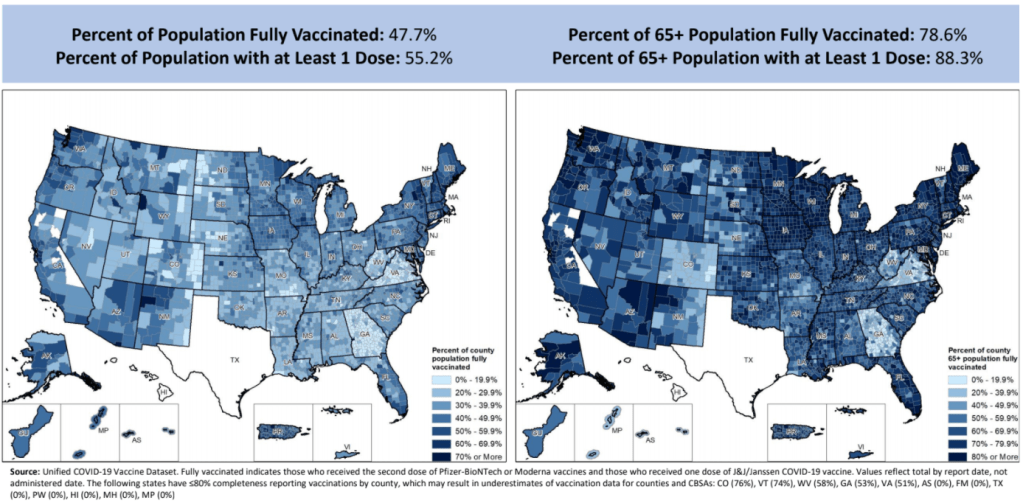
Vaccination rates by county, included in the July 8 HHS Community Profile report. Note the missing data for Texas.
Anyone who’s tried to work with the federal government’s vaccination data has noticed this issue: there’s a Texas-shaped hole in the numbers.
While the CDC and HHS report vaccination data for counties and metropolitan areas in the vast majority of states, data are missing for the entire state of Texas. Data are also incomplete for several other states, including Colorado, Nebraska, and Virginia.
What’s up with Texas? A reporter friend recently asked me this question, inspiring me to look into the issue. There’s limited information directly on the CDC dashboard; a vague note in the Community Profile Reports simply notes that several states have “ ≤80% completeness reporting vaccinations by county,” including Texas at 0%—implying that the states, rather than the federal agency, is at fault.
A great article by Houston Chronicle reporter Kirkland An dives into the precise issue. An cites a CDC page on county-level vaccination data reporting, which says that, “Texas provides data that are aggregated at the state level and cannot be stratified by county.” (I later realized that this page is linked in incredibly tiny text at the very bottom of the CDC’s dashboard—classic.)
Why is Texas providing state-level data? The answer, it turns out, lies with a unique state law:
When asked about the lack of data, Douglas Loveday, a press officer with the Texas Department of State Health Services (DSHS), said, “State statute prevents us from sharing person-level immunization data.”
Texas Health and Safety Code Sec. 161.0073 states that DSHS “may not release registry information to any individual or entity without the consent of the individual or the individual’s legally authorized representative.” There are exceptions to the rule, specifically reporting “non-identifying summary statistics.” But reporting individual records to the CDC, even if they have been stripped of identifying information, is not one of the exceptions granted by the code.
In other words: almost every other state submits anonymous, line-level vaccination data to the CDC. Each line in the dataset represents one vaccinated individual, including their county of residence and other demographic information. The CDC aggregates this line-level information into the county-level statistics published on its dashboard. But Texas is prohibited from sending this type of individual data outside of the state without individual consent, so Texas is missing from the CDC data.
Texas’ health agency does compile its own county-level vaccination data, which are available on the Texas COVID-19 vaccine dashboard. But most public health researchers (and journalists like yours truly) rely on the CDC’s standardized, national datasets—leaving Texas out of many important analyses on the vaccine rollout.
An reports that Texas’s agency does send the CDC aggregated county-level data; it’s just organized by vaccine provider, instead of by county of residence for vaccine recipients. The national agency is working with Texas to switch to county-of-residence reporting so that the state may appear in national datasets without breaking state law. Hopefully, that Texas-sized hole in the data may be filled soon.
(It’s unclear whether similar efforts are underway for a Hawaii-sized hole in the same dataset; the CDC currently reports that Hawaii “does not provide CDC with county-of-residence information.”)
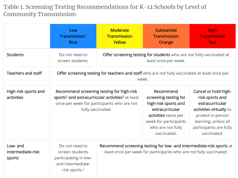
The new recommendations prioritize getting kids into classrooms, even when schools aren’t able to implement all prevention strategies. They also prioritize vaccination; the CDC says that all teachers and students over age 12 should get vaccinated, and those individuals who get their shots don’t need to wear masks at school.
This guidance adds to growing evidence that the majority of America’s K-12 schools will be fully open in the fall. Some areas that were bastions of remote learning—like New York City, where I live—will no longer allow that option.
But there’s a big problem with this trend: we still do not have good data on COVID-19 in schools. I’ve written about this issue extensively; over a year into the pandemic, there’s still no federal dataset on cases that have arisen in COVID-19 schools, and state reporting is incredibly fragmented. If this situation continues into next fall, we will be ill-equipped to understand which safety measures are working best in a fully reopened America—and to protect the young children who are not yet eligible for vaccination.
Throughout the 2020-2021 school year, the COVID-19 Data Dispatch has maintained a set of annotations on school COVID-19 data. I updated these annotations yesterday after a couple of months’ hiatus. I found that, in some locations, reporting is even worse than it was in the spring.
Here are a few highlights:
A number of states have paused their K-12 COVID-19 reporting for the summer, as schools are on break. These states include Alabama, Connecticut, Idaho, Louisiana, Mississippi, the Dakotas, Tennessee, Washington, and West Virginia.
A couple of other states (Maine, Montana) appear to have paused this reporting, but did not include clear language on their dashboard to back this up.
South Carolina and Delaware both stopped reporting for the summer, with notes on their dashboards indicating that the state health departments have not yet decided whether to resume reporting in the fall. Delaware’s note is particularly ominous.
Florida stopped providing regular school COVID-19 reports in early June, when the state discontinued its dashboard and switched to providing a single weekly report for all state data.
Both Arkansas and Iowa discontinued their school COVID-19 pages during the spring, with no indication that reporting will resume in the future.
Another major update to the CDC’s guidance, from my perspective, was a new emphasis on screening tests. The CDC now recommends regular COVID-19 tests for unvaccinated students and teachers, and for those taking part in school athletics and other higher-risk activities.
I was glad to see this update because my reporting on rapid tests—including an upcoming piece on rapid testing in schools—has led me to believe that this type of testing is a key strategy for avoiding school outbreaks. But it’s another area where good data are lacking right now. New York continues to be the only state reporting school testing numbers; and from the looks of other state dashboards, they don’t appear prepared to track these key data at a systematic level.
Delta is increasingly hitting younger populations, including children not old enough to be vaccinated. The CDC’s guidance encourages schools to bring these kids into classrooms, but it puts a lot of pressure onto individual districts at a time when they need more support, as Dr. Katelyn Jetelina points out in a recent Your Local Epidemiologist post.
The guidance also says literally nothing about data collection and reporting. I worry that, if we don’t get better data infrastructure in place for schools, we could miss Delta outbreaks this fall.
Also: this feels like a good time to announce that I’m currently working on a big project covering school reopening. I’m identifying and profiling districts that successfully brought their students back into classrooms, supported with a grant from the Solutions Journalism Network. The stories will be published here in the COVID-19 Data Dispatch starting in August.
On November 18, New York City mayor Bill de Blasio announced that the city’s schools would close until further notice. The NYC schools discrepancy is indicative of an American education system that is still not collecting adequate data on how COVID-19 is impacting classrooms—much less using these data in a consistent manner.
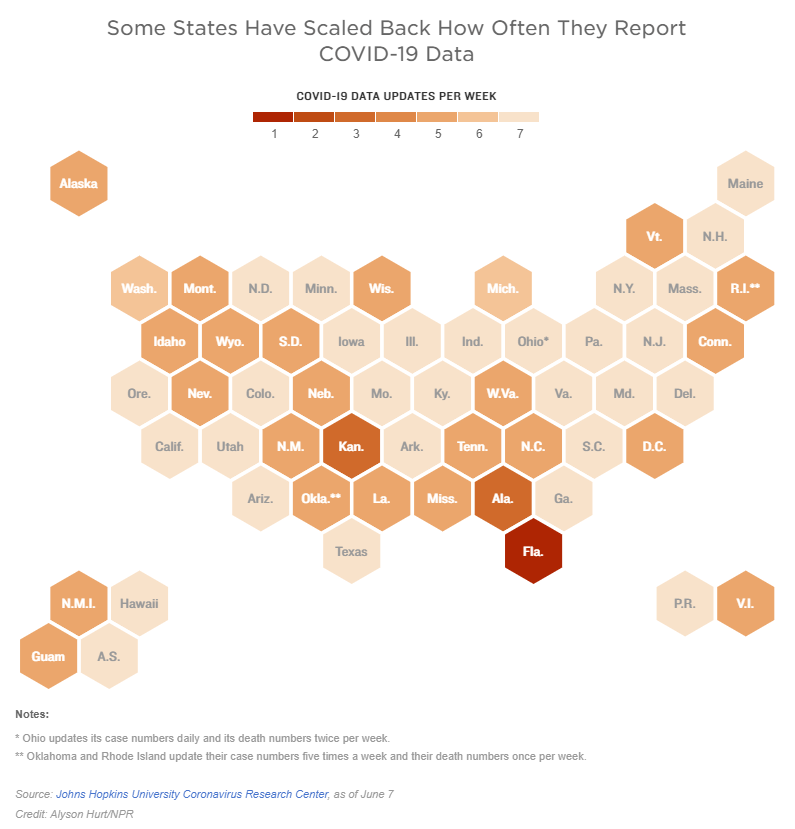
Two weeks ago, I reported that Florida had made a big change to its COVID-19 data reporting: the state switched from daily updates to weekly updates. Previously, Florida had maintained a dashboard and released detailed PDF reports each day; now, the state releases PDF reports once a week on Fridays.
Other states are making similar changes. Only about half of states update their COVID-19 data every day, NPR reported last week. Florida is the only state to cut back to only one update a week, but several others now skip updating on weekends or otherwise reduce their reporting load.
It’s important to note, however, that these changes are not all new. There have always been states that skipped updating—or published limited updates—on weekends, going back to spring 2020. And, for a long time, Kansas was the least-frequent-reporting state: for many months, it’s only published updates on Mondays, Wednesdays, and Fridays. More states started skipping weekends earlier in 2021, though, at the same time as many state public health agencies were spinning up vaccination dashboards in addition to their existing COVID-19 reporting systems.
When states do not update their data every day, journalists and researchers are less able to precisely track COVID-19 developments and identify trends. John Hopkins’ Beth Blauer compared this challenge to viewing a photo in low resolution instead of high resolution: it’s harder to see a pattern when you’re not getting as much detail.
Even for those states that do publish updates every day, though, there are still challenges inherent in interpreting data that naturally fluctuate over the course of a week. New York might update its COVID-19 data every day, for example, but some test sites in New York are closed on weekends—leading to natural dips in testing and case numbers on those days, followed by higher numbers in the middle of the week. COVID Tracking Project volunteer Hannah Hoffman has written about this phenomenon in detail.
Still, even as states start to skip days or make their reporting less precise, the CDC and HHS continue to update their national COVID-19 datasets daily. There are admittedly many discrepancies between federal and state data—in large part because of the lack of federal leadership early in the pandemic—but the federal data are now highly standardized and reliable at a level that would be incredibly difficult to get from states. This is why I personally choose to use the CDC’s dashboard for COVID-19 Data Dispatch weekly updates, rather than JHU or another source that aggregates from states.
It’s also important to acknowledge that state public health agencies have been chronically underfunded for decades before the pandemic hit—and daily data updates have been a huge timesuck for many of these agencies. If scaling down COVID-19 dashboard updates frees up some personnel and resources for a state like Alabama or South Dakota to redirect into vaccination programs, that, to me, seems worthwhile.
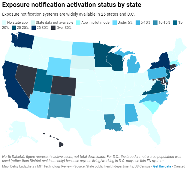
Exposure notification systems are availalbe in 25 states and D.C.
This week, I have a new feature out in MIT Technology Review. It’s an investigation into the usage rates and public opinion of exposure notification apps—those Bluetooth-enabled systems that promised to function as a method of digital contact tracing. You can read the story here; and for the CDD this week, I wanted to provide kind-of an extended methodology behind the piece.
The inspiration for this feature came from my conversation with Jenny Wanger, which was published in the CDD back in March. Wanger is the Director of Programs at Linux Foundation of Public Health, a software development network that has worked on exposure notification systems. We discussed the privacy-first design of this technology, as well as how difficult it has been to evaluate how well the apps are working.
That conversation got me thinking: someone should actually try to collect comprehensive data on how many Americans are using exposure notifications. The federal government doesn’t provide any data on this topic, and most of the states that have exposure notification systems available don’t publicly report data, either. But, I thought, there might be other ways to gather some estimates.
When I talked to Lindsay Muscato, an editor at Technology Review’s Pandemic Technology Project (and a longtime CDD reader!), a few weeks later, she agreed that such an investigation would be valuable. The Pandemic Technology Project has done a lot of reporting on exposure notification apps, but hadn’t yet pursued the kind of novel data collection project I was envisioning.
The project started with a hypothesis: that exposure notification systems are underutilized in the U.S. due to a lack of trust in governments and in new technology.
Initially, I planned to use app reviews from the Google Play and Apple stores as the main data source for the story. The two online stores provide download estimates, which I intended to use as a proxy for app usage rates—along with ratings and reviews that I could use as a proxy for public opinion. (Shout-out to machine learning engineer Venelin Valkov, who has put together a great tutorial on scraping and analyzing app store reviews with Python.)
But an interview early in the reporting process caused me to change my data collection plans. I talked to two exposure notification experts at the New Jersey public health agency, who told me that the app download count I saw on the state’s COVID-19 dashboard was actually a significant underrepresentation of the state residents who had exposure notifications enabled on their smartphones.
This data disconnect was due to something called Exposure Notification Express, or ENX. ENX is an upgrade to the digital contact tracing system, released by Apple and Google last September, that made it easier for states to develop new apps. The upgrade also built exposure notifications directly into the iPhone operating system, allowing millions of people to opt into the notifications without downloading a new app.
In short, I couldn’t use app downloads as a proxy for usage rates. I also couldn’t use Apple app store reviews, because the majority of iPhone users were using ENX rather than downloading a new app. Many state apps are listed on the Google Play store but not on the Apple store, for this reason.
I still used Google Play reviews for the public opinion piece of my story. But to determine usage rates, I developed a new plan: reach out to every state public health agency with an exposure notification system and ask for their opt-in numbers. This involved a lot of calling and emailing, including multiple rounds of follow-up for some states.
The vast majority of state public health agencies to whom I reached out did actually get back to me. (Which I appreciate, considering how busy these agencies are!) The only one that didn’t respond was South Dakota; I assumed this state likely had a low number of residents opted into exposure notifications because South Dakota shares an app with two other low-activation states, North Dakota and Wyoming.
Based on my compilation of state data, 13 states have over 15% of their populations opted into exposure notifications as of early May—passing a benchmark that modeling studies suggest can have an impact on a community’s case numbers.
(I used the U.S. Census 2019 Population Estimates to calculate these opt-in rates. I chose to base these rates on overall population numbers, not numbers of adults or smartphone users, because that 15% benchmark I mentioned refers to the overall population.)
This is a smaller number than the engineers who developed this technology may have hoped for. But it does mean these 13 states—representing about one-third of the U.S. population in total—are seeing some degree of case mitigation thanks to exposure notifications. Not bad, for an all-new technology.
I was also impressed by the five states that reported over 30% of their populations had opted into the notifications: Hawaii, Connecticut, Maryland, Colorado, and Nevada. Hawaii had the highest rate by far at about 46%.
For anyone who would like to build on my work, I’m happy to share the underlying data that I collected from state public health agencies. It’s important to note, however, that the comparisons I’m making here are imperfect. Here’s a paragraph from the story that I’d like to highlight:
Comparing states isn’t perfect, though, because there are no federal standards guiding how states collect or report the data—and some may make very different choices to others. For example, while DC reports an “exposure notification opt-in” number on its Reopening Metrics page, this number is actually higher than its residential population. A representative of DC Health explained that the opt-in number includes tourists and people who work in DC, even if they reside elsewhere. For our purposes, we looked at DC’s activation rate as a share of the surrounding metropolitan area’s population (including parts of nearby Maryland, Virginia, and West Virginia).
So, did my research support my hypothesis, that exposure notification systems are underutilized in the U.S. due to a lack of trust? Somewhat. I definitely found that the technology has failed to live up to its potential, and the app reviews that I read indicated that many Americans did not trust the technology—or simply failed to understand its role in COVID-19 prevention.
At the same time, however, I found that some states have seen significant shares of their populations opting into the new technology. Plus, the app reviews showed that a lot of people not only trusted the technology—they bought in enough to advocate for it. The majority of states actually had more five-star ratings than any other category, and a lot of those reviewers tried to combat the mistrust they saw elsewhere in the comment section with explanations and endorsements. This is a job that should’ve been done by public health agencies themselves, of course, but the positive reviews may indicate a promising future for this technology.
In the story’s conclusion, I argue that exposure notification technology is still in its trial run here in the U.S. State public health agencies had limited budgets, limited resources, and limited capacity for trust-building. As a result, they focused simply on getting as many people to opt into the technology as possible—rather than any kind of comprehensive data collection or analysis.
“The ultimate goal [of exposure notifications] is for more folks to know they’ve been exposed,” says Hanna Sherrill, an Eagleton Science and Politics Fellow at Rutgers University who worked with the New Jersey public health agency on its exposure notifications system. “Hopefully some of them will take the advice to quarantine, and then they will stop the spread from there. Even if there’s one or two people who do that, that’s a good thing from our perspective.”
Other state public health staffers who responded to Technology Review’s data requests echoed her sentiment—and their attitudes suggest that digital contact tracing in the US may still be in its trial run. We have 26 different prototypes, tested in 26 different communities, and we’re still trying to understand the results.
“In the US, the existing apps and tools have never hit the level of adoption necessary for them to be useful,” Sabeti says. But such success may not be out of reach for future public health crises.
I’m hopeful that, with more investment into this technology, public health agencies can build on the prototypes and develop community trust—before we see another pandemic.
I plan to keep reporting on this topic (including investigation into Google and Apple’s role in the technology, which a couple of readers have pointed out was lacking in the Technology Review piece). If you have further questions or story ideas, don’t hesitate to reach out.
The majority of states do not collect or report detailed information on how their residents became infected with COVID-19. This type of information would come from contact tracing, in which public health workers call up COVID-19 patients to ask about their activities and close contacts. Contact tracing has been notoriously lacking in the U.S. due to limited resources and cultural pushback.
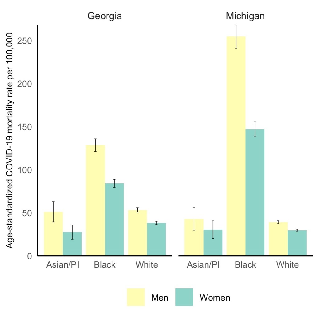
Black men have the highest COVID-19 death rate, but Black women die at higher rates than white or Asian men. Via the GenderSci Lab.
We’ve spent a lot of time in the COVID-19 Data Dispatch discussing how the COVID-19 pandemic has disproportionately impacted racial and ethnic minorities in the U.S., along with gaps and problems in the available data on this issue. (You can find past coverage here.)
A new study from the GenderSci Lab at Harvard sheds light on a more underreported side of the issue: how race and sex intersect in COVID-19 death rates. The lab has been tracking gender/sex and COVID-19 since April 2020, compiling data from states through a similar methodology to what the COVID Tracking Project did. And, similarly to the COVID Tracking Project, the GenderSci Lab faces challenges in producing a standardized dataset from 50 states that each have their own data definitions and reporting practices.
One of those challenges: very few states report COVID-19 data by both sex and other demographic factors, such as age and race/ethnicity. Such intersectional data are useful because they can provide more detailed information on who is most at risk from the disease, which may be tied to comorbidities and other social determinants of health.
For their recent study, GenderSci Lab researchers Tamara Rushovich et al. used data from the only two states that provide COVID-19 mortality data on sex, race, and age: Georgia and Michigan. The patterns they found in both states complicate the well-known trend that men are more likely to die of COVID-19 than women.
Black men have the highest death rate overall in Georgia and Michigan, significantly higher than white men. In Michigan, 254 out of every 100,000 Black men have died, compared to 39 out of every 100,000 white men. But the data also show that Black men and women both have significantly higher death rates compared with white and Asian men.
As the GenderSci Lab researchers note in a Twitter thread sharing this study, these data demonstrate that the sex difference in COVID-19 deaths is driven by comorbidities and social factors, not by some intrinsic, biological difference between men and women that makes men more vulnerable. Men may be less likely to wear masks or adhere to social distancing precautions, for example, and Black Americans are disproportionately represented in essential jobs and in incarcerated populations.
The researchers say that more data on this topic are needed (hello, other 48 states!) as well as more intersectional analysis:
There is an urgent need to understand why some men (often Black, Indig., and Latino) are so vulnerable to COVID, but we must recognize that many women (Black, Indig., and Latina) are much more vulnerable to COVID than many men (especially white men). @BlackFeministHS
Editor’s note, April 11, 6 PM: My friend (and CDD reader) Charlotte Minsky, who works on the COVID Racial Data Tracker, has pointed out that three states in addition to the two used in the GenderSci Lab’s analysis report COVID-19 mortality data by sex and race. Georgia and Michigan are the only two states to report by sex, race, and age; the researchers used age stratifications to calculate age-adjusted mortality rates. I’ve edited the post for clarification.
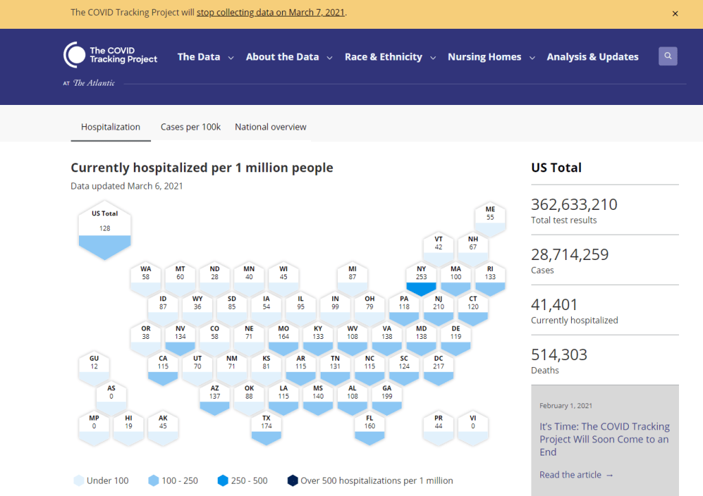
The COVID Tracking Project’s homepage on March 7, 2021.
A couple of hours after I send today’s newsletter, I will do my final shift of data entry work on the COVID Tracking Project’s Testing and Outcomes dataset. Then, later in the evening, I will do my final shift on the COVID Racial Data Tracker. And then I will probably spend another hour or two bothering my fellow volunteers on Slack because I don’t want it to be over quite yet.
In case you aren’t fully embroiled in the COVID-19 data world, here’s some context. Last spring, a few journalists and other data-watchers realized that the U.S.’s national public health agencies weren’t doing a very good job of reporting COVID-19 tests. Alexis Madrigal and Rob Meyer (of The Atlantic) compiled their own count from state public health agencies. Jeff Hammerbacher (of Related Sciences) had independently compiled his own count, also from state agencies. And, as the About page on the website goes: “The two efforts came together March 7 and made a call for volunteers, our managing editor, Erin Kissane joined up, and the COVID Tracking Project was born.”
Now, one year after that formal beginning of the Project’s test-counting efforts, the team is ending data collection work. Erin Kissane and Alexis Madrigal provided some background for that decision in a blog published on February 1. I recommend reading the piece in full, if you haven’t yet, but the TL;DR is that a. this data collection work should be done by federal public health agencies, not a motley group of researchers and volunteers, and b. the federal agencies have greatly improved their own data collection and reporting efforts in recent months.
The Project’s core Testing and Outcomes dataset formally ceases updates today, along with the Racial Data Tracker and Long-Term Care Data Tracker. But the Project has provided a lot of documentation and guidance for data users who want to keep tracking the pandemic, along with analysis that will be useful for months (if not years) to come. The rest of this post shares the highlights from those resources, along with a few personal reflections.
Where to find your COVID-19 data now
So, you’re a journalist who’s relied on the COVID Tracking Project’s tweets to illuminate pandemic trends for the past year. Or you’re a researcher who’s linked the Project’s API to your own tracking dashboard. Or you’re a concerned reader who’s checked up on your state regularly, watching the time series charts and annotations. Where do you go for your data now?
Through a series of analysis posts and webinars over the past few weeks, Project staff have made their recommendation clear: go to the federal government. In recent months, the CDC and the HHS have built up data collection practices and public dashboards that make these data easier to work with.
Here are a few highlights:
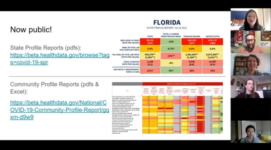
For daily updates at all geographic levels, use the Community Profile Reports. After months of private updates sent from the White House COVID-19 task force to governors, the data behind these in-depth reports were made public in December. The PDF reports themselves were made public in January, after Biden took office. The reports include detailed data on cases, deaths, tests, and hospitalizations for states, counties, and metropolitan areas. I’ve written more about the reports here.
For weekly updates, use the COVID Data Tracker Weekly Review. As I mentioned in a National Numbers post two weeks ago: the CDC is doing weekly updates now! These updates include reports on the national trends for cases, deaths, hospitalizations, vaccinations, and SARS-CoV-2 variants. They may be drier than CTP blog posts, but they’re full of data. You can also sign up to receive the updates as a newsletter, sent every Friday afternoon—the CDC has really moved into the 21st-century media landscape.
For state-specific updates, use the State Profile Reports. Similarly to the Community Profile Reports, these documents provide many major state-level metrics in one place, along with local data and color-coding to show areas of concern. They’re released weekly, and can be downloaded either state-by-state or in one massive federal doc.
For case and deaths data, use the CDC’s state-by-state dataset. This dataset compiles figures reported by states, territories, and other jurisdictions. It matches up pretty closely to CTP’s data, though there are some differences due to definitions that don’t match and other discrepancies; here’s an analysis post on cases, and here’s a post on deaths. You can also see these data in the CDC’s COVID Data Tracker and reports.
For testing data, use the HHS PCR testing time series. This dataset includes results of PCR tests from over 1,000 labs, hospitals, and other testing locations. Unlike CTP, the federal government can mandate how states report their tests, so this dataset is standardized in a way that the Project’s couldn’t be. Kara Schechtman has written more about where federal testing data come from and how to use them here. The HHS isn’t (yet) publishing comprehensive data on antibody or antigen tests, as these test types are even more difficult to standardize.
For hospitalization data, use the HHS hospitalization dataset. I’ve reported extensively on this dataset, as has CTP. After a rocky start in the summer, the HHS has shown that it can compile a lot of data points from a lot of hospitals, get them standardized, and make them public. HHS data for current hospitalizations are “usually within a few percentage points” of corresponding data reported by states themselves, says a recent CTP post on the subject. Find the state-level time series here and the facility-level dataset here.
For long-term care data, use the CMS nursing home dataset. The Centers for Medicare & Medicaid Services are responsible for overseeing all federally-funded nursing homes. Since last spring, this responsibility has included tracking COVID-19 in those nursing homes—including cases and deaths among residents and staff, along with equipment, testing availability, and other information. The CMS dataset accounts for fewer overall cases than CTP’s long-term care dataset because nursing homes only account for one type of long-term care facility. But, like any federal dataset, it’s more standardized and more detailed. Here’s an analysis post with more info.
For race and ethnicity data, there are a couple of options. The CDC’s COVID Data Tracker includes national figures on total cases and deaths by race and ethnicity—at least, for the 52% of cases and 74% of cases where demographic information is available. More detailed information (such as state-by-state data) is available on deaths by race and ethnicity via the CDC’s National Center for Health Statistics. A blog post with more information on substitutes for the COVID Racial Data Tracker is forthcoming.
The COVID Tracking Project’s federal data webinars concluded this past Thursday with a session on race and ethnicity and long-term care facilities. Slides and recordings from these sessions haven’t been publicly posted yet, but you can look out for them on the Project’s website. Also, for the more technical data nerds among you: COVID Act Now has written up a Covid Tracking Migration Guide for users of the CTP API, and the Johns Hopkins Coronavirus Resource Center announced that it will begin providing state testing data.
Analysis and update posts to re-read
It took a lot of self control for me to not just link every single CTP article in here. But I’ll give you just a few of my favorites, listed in no particular order.
Test Positivity in the US Is a Mess (Oct. 8): This piece was one of my “20 best COVID-19 data stories of 2020.” To repeat what I wrote then: “Out of the many informative blog posts produced by the COVID Tracking Project since last spring, this is the one I’ve shared most widely. Project Lead Erin Kissane and Science Communication Lead Jessica Malaty Rivera clearly explain how COVID-19 test positivity—what should be a simple metric, the share of tests conducted in a given region that return a positive result—can be calculated in several different ways.”
Daily COVID-19 Data Is About to Get Weird (Nov. 24): I probably linked to this piece in newsletters once a week from the end of November until early January. Erin Kissane clearly explains the patterns around holiday data and how to interpret them—an explanation that continues to prove useful, as we saw a kind-of holiday reporting pattern take place after winter storms hit the South.
The “Good” Metric Is Pretty Bad: Why It’s Hard to Count the People Who Have Recovered from COVID-19 (Jan. 13): The “recovered” number that many states publish is even more inconsistent than other metrics. Some states use hospital discharges to calculate this number, while others simply re-categorize cases as “recovered” if a worse outcome hasn’t occurred in a designated timeframe. All definitions exclude long haulers, who face symptoms months after getting sick.
Counting COVID-19 Tests: How States Do It, How We Do It, and What’s Changing (Aug. 13): You know how the federal testing dataset is more standardized than what CTP can do? This is because there are three (3!) different units for COVID-19 test reporting, and every state does something slightly different. Kara Schechtman gets into all of the weeds here.
What We’ve Learned About the HHS’s Hospitalization Data (Dec. 4): I love this post because it says, in no uncertain terms, look, we did all this analysis, and we’re telling you, you can trust the HHS hospitalization data now. It’s an early indication of CTP recognizing increased transparency from the federal agency, weeks before the facility-level dataset would be released.
Florida’s COVID-19 Data: What We Know, What’s Wrong, and What’s Missing (July 8): This one is essentially a feature-length, detailed, clearly written callout post for the state of Florida. Many of the issues described in this post have now been resolved, but one of the most important developments occurred just days after it was published: Florida started publishing a count of current COVID-19 patients.
The State of State Antigen Test Reporting (Oct. 19): I co-wrote this one with Quang Nguyen. The post explains what we know about antigen tests, those useful-for-surveillance-but-pesky-for-data rapid tests, and calls attention to potential underreporting.
I joined the COVID Tracking Project as a volunteer in early April, 2020. I actually searched back through my calendar to find exactly when I did a data entry training—it was Thursday, April 2.
At the time, I wanted to better understand the numbers I kept seeing, in tweets and news stories and Cuomo’s powerpoints. But more than that, I wanted to do something. I sat, cooped up in my little Brooklyn apartment, listening to the endless sirens screaming by. I ran to the park and wanted to yell at every person I saw walking without a mask. I donated to mutual aid funds, but even that felt empty, almost impersonal.
The Project put out a call for volunteers, and I thought, okay, data entry. I can do data entry. I can do spreadsheets. I know spreadsheets.
Well, I know spreadsheets much better now, almost a year later. I know how to navigate through a state dashboard, find all its data definitions, and puzzle through its update time. But beyond all the technical stuff, volunteering for CTP gave me a sense of purpose and community. No matter how tired or angry the world made me feel, I knew that, for a few hours a week, I’d be contributing to something bigger than myself. My work played a small part in making data accessible, bringing information to a wider audience.
Much ink has been spilled about how mutual aid groups have helped neighbors find each other, especially during that period of spring 2020 when everything seemed so bleak. I have seen the Project as another form of mutual aid. I’ve given countless hours to CTP over the past year in the form of data entry shifts, analysis, writing, and custom emojis—but those hours have also been given back to me, in everything from Tableau tricks to playlist recommendations. My fellow volunteers, the vast majority of whom I’ve never met in person, are my neighbors. We live in the same spreadsheets and Slack channels; we see the world in the same way.
I am beginning to understand how journalism, or something like journalism, can work when it is led by a community. By community, I mean: a group of people united in one mission. And by mission, I mean: bringing information to the public. Accessibility and accountability are common buzzwords right now, I think, but CTP approaches the truth of these principles, whether it’s by doing shifts through Christmas or by writing out detailed process notes on how to navigate Wyoming’s dashboard(s).
I know why the Project’s data collection efforts are ending. The federal government can compile—and is compiling—data on a far more detailed and standardized level than a group of researchers and volunteers ever could. But I am grateful to have been part of this beautiful thing, so much bigger than myself. It is the bar by which I will measure every organization I join from here on out.
If you’ve ever read the About page on the COVID-19 Data Dispatch website, you may have noticed a disclaimer stating that, while I volunteer for CTP, this publication is an entirely separate project that reflects my own reporting and explanations. This is true; I’m careful to keep this project distinct. But of course, the COVID-19 Data Dispatch has been influenced by what I’ve learned volunteering for CTP. I have attempted to carry forward those values, accessibility and accountability. I’ll keep carrying them forward. Feedback is always welcome.
To all my neighbors in the CTP Slack: thank you. And to everyone who has followed the data: there is work still to be done.
Liz Essley Whyte, an investigative reporter at the Center for Public Integrity, discussed her work bringing White House COVID-19 reports to the public before they were officially released. Erica Hensley, an independent health and data journalist based in Jackson, Mississippi, provided advice for navigating relationships with local public health officials based on her work reporting on COVID-19 in Mississippi. And Tom Meagher, a senior editor at The Marshall Project, described the communication and coordination work behind his newsroom’s yearlong tracker of COVID-19 in the U.S. prison system. Thank you to everyone who attended!
For those who couldn’t make it live, you can watch the recording of the session below. You can also check out the slides here. I’m also sharing a brief recap of the workshop in today’s issue.
The final workshop in our series, Communicating COVID-19 data, is coming up this coming Wednesday, March 3, from 4:30 to 6 PM ET. This session will feature freelance reporter Christie Aschwanden, The Washington Post’s Júlia Ledur, and THE CITY’s Ann Choi, and Will Welch discussing strategies for both written reporting and data visualization. If you aren’t registered for the series yet, you can sign up here.
Finding and navigating government data
Liz Essley Whyte started her talk by providing backstory on the White House COVID-19 reports.
In the middle of the summer, she said, a source gave her access to documents that the White House Coronavirus Task Force was sending out to governors—but wasn’t publishing publicly. The documents included detailed data on states, counties, and metro areas, along with recommendations for governors on how to mitigate the spread. Whyte published the documents to which she’d obtained access, marking the start of a months-long campaign from her and other journalists to get the reports posted on a government portal.
“Despite weeks of me asking the White House, why aren’t these public, they were never made public for a while,” Whyte said. She continued collecting the reports and publishing them; the historical reports are all available in DocumentCloud.
If you need to find some government data—such as private White House reports—there are a few basic questions that Whyte recommended you start with:
Who collects the data?
Who uses it?
Who has access to it?
Has anyone else found it or published it before?
What do you really want to find out? If you can’t get the data you really need, are there other datasets that could illuminate the situation?
While journalists often like to find fully original scoops, Whyte said, sometimes your best source for data could be another reporter. “There’s some really great datasets out there, especially in the health space, that people have maybe written one or two stories, but they have hundreds of stories in them.” So get creative and look for collaborators when there’s a source you really want to find.
She provided a few other ideas for obtaining government data: besides getting a leak from a source (which can be hard to do), you can scour government websites, ask public information officers what data are available behind their public website, contact other officials (such as those mentioned in a one-off legislative report), or file a FOIA. Third-party sources such as the COVID Tracking Project or The Accountability Project also may have useful repositories of public information, or could help you navigate to what you need. Even for-profit data collecting companies might let journalists use their work for free.
Once you have the data, talk to your contact person for the dataset and “make sure you fully understand it,” Whyte said. Ask: Who collected the data and how? How is it being used? What’s the update schedule? How complete is it? And other similar questions, until you’re sure you know how to best use the dataset. If a data dictionary is available, make sure to comb through it and ask all your term and methodology questions.
In some cases this year, Whyte has looked at document information and contacted people who are listed as a document’s author or modifier. These are often great sources, she said, who can provide context on data even if they aren’t able to speak on the record.
The White House COVID-19 reports that Whyte spent so much time chasing down this past summer are now public. The Trump’s administration started publishing the data behind these reports in December, and Biden’s administration has now started publishing the PDF reports themselves—albeit minus the recommendations to governors that previous iterations contained. Whyte provided a run-down of the reports on Twitter, which should be required reading for any local journalist who wants to get more in-depth with their pandemic coverage.
“I think they’re really great for local reporting because they break down all kinds of different metrics by state, county, and metro area,” she said. The reports notably make it easy for us to compare across jurisdictions, since the federal government has standardized all the data. And you can find story ideas in the data notes, such as seeing where a state or region had a data error. The CDD also wrote about these reports when they were first published.
Working with local gatekeepers to find data
Erica Hensley discussed a few lessons she learned from covering COVID-19 in Mississippi, where data availability has lagged some other states.
Local reporting, she said, provides journalists with a unique situation in which they’re directly relying on one local agency for news and data. She stressed the importance of building a relationship with agency representatives, helping them understand exactly what you’re looking for and why you need it.
“They’re [Mississippi’s public health agency] an under-resourced agency that was strapped for time to even address my request,” she said. Understanding on her part and a lot of back-and-forth helped her to eventually get those requests met.
Hensley also described how she worked to fill data gaps by doing her own analysis at Mississippi Today, a local nonprofit newsroom, then showed her work to the public health agency. For example, she used the total case numbers published by the state to calculate daily and weekly figures, and presented the data in a percent change map. This project helped Mississippi residents see where COVID-19 spread was progressing most intensely—but it also showed the state that this information was needed. She similarly calculated a test positivity rate; to this day, she said, state public health officials go to Mississippi Today’s website to see positivity rates, as these rates are not included on the state’s COVID-19 site.
When you can do some calculations yourself, Hensley said, do those—and focus your FOIA time on those data that are less readily available, such as names of schools and long-term care facilities that have faced outbreaks. Long-term care has been a big focus for her, as residents in these facilities tend to be more vulnerable.
Since Mississippi wasn’t releasing state long-term care data, she used federal data from the Centers for Medicare and Medicaid Services (CMS) and ProPublica to investigate the facilities. Matching up sites with high COVID-19 case counts and sites that had completed infection control training, Hensley found that the majority of long-term care facilities in the state had failed to adequately prepare for outbreaks. Her reporting revealed serious issues in the state.
Hensley advocates for local reporters to dig into long-term care stories; the CMS dataset has a lot of rich data, down to the individual facility level, that can be a springboard to stories about how facilities are (or aren’t) keeping their residents safe.
While Hensley stressed the importance of earning a local health department’s trust, she also said that health reporters need to be trusted by their colleagues. “A big part of my job early on, on top of collecting the data, was helping the newsroom understand how this applies to other local beats,” she explained. Reporters who serve as resources to each other will produce more interdisciplinary stores, and reporters who team up to request data will get the information out faster.
Building a massive system to track COVID-19 in prisons
Reporters at The Marshall Project have spent the past year tracking COVID-19 cases in U.S. prisons. Tom Meagher discussed how they did it, including a lot of external and internal communication.
After the newsroom went on lockdown, Meagher said, “Once of the first things we thought of was, prisons—being congregate living facilities—were going to be seriously affected by this pandemic.” But at first, the data they wanted simply didn’t exist.
To compile those data on COVID-19 in prisons, The Marshall Project’s team had to manage relationships with agencies in every state and D.C. They divided up all the states among their newsroom, and later worked with The Associated Press as well. At first, the reporters called every state and simply asked for numbers with no intention to publish them, in order to see if a compilation would be possible. This was easier said than done: “Prisons are not always the most transparent agencies to deal with,” Meagher said.
TMP reporters asked each agency three carefully-worded questions: How many people have been tested for the coronavirus? How many have tested positive? And how many have died? They wanted to get those numbers for both prison inmates and staff. Meagher and his colleague Katie Park had to do a lot of work to clean and standardize the numbers, which are often inconsistent across states.
The team made it clear to prison agencies that this wasn’t just a one-off ask—they came back with the same questions every week. Within a month, a lot of state agencies started setting up websites, which made data collection easier; but reporters still call and email every week in order to clarify data issues and fill in gaps. Meagher uses Google Sheets and Mail Merge to coordinate much of the data collection, cleaning, and outreach back to states with lingering questions.
The newsroom also uses a tool called Klaxon to monitor prison websites for changes and record screenshots, often useful for historical analysis. In one instance, TMP’s screenshots revealed that Texas’ justice system removed seven names from its list of prison deaths; they were able to use this evidence to advocate for names to be returned.
TMP’s data collection system is manual—or, primarily done by humans, not web scrapers. They opted for this route because prison data, like a lot of COVID-19 data, are messy and inconsistent. You might find that an agency switches its test units from people to specimens without warning, Meagher said, or fixes a historical error by removing a few cases from its total count. In these instances, a human reporter can quickly notice the problem and send a question out to the state agency.
“If we’ve learned anything from all of this, it’s that there’s a lot of different ways data can go wrong,” Meagher said. Even when public health officials are well-intentioned and questions are clearly asked, misunderstandings can still happen that lead to data errors down the line.
The goal of this dataset is really to give people insight into what’s happening—for prison inmates, for their families, and for advocates. Even agencies themselves, he said, are “eager to see how they’re doing compared to other states.” Since a similar dataset doesn’t exist on a federal level, states are using TMP’s to track their own progress, creating an incentive for them to report more accurately to begin with. These data are freely available online, including case and death numbers for every week since March. If you have questions, Meagher and his colleagues may serve as a resource for other reporters hoping to report on COVID-19 in the prison system.
Drew Armstrong, Bloomberg News‘s senior editor for health care, talked about his work on the publication’s Vaccine Tracker; and Arielle Levin Becker, director of communications and strategic initiatives for the Connecticut Health Foundation, discussed how to navigate COVID-19 race and ethnicity data. Thank you to everyone who attended—we had a great turnout!
For those who couldn’t make it live, you can watch the recording of the session below. You can also check out the slides here. I’m also sharing a brief recap of the workshop in today’s issue.
In next Wednesday’s workshop, we’ll discuss engaging COVID-19 data providers, featuring Liz Essley Whyte (Center for Public Integrity), Tom Meagher (The Marshall Project), and Erica Hensley (independent reporter from Mississippi). If you aren’t registered for the series yet, you can sign up here.
The Bloomberg Vaccine Tracker
In his presentation, Drew Armstrong provided a behind-the-scenes look at Bloomberg’s tracker and shared some advice on analyzing vaccine data more broadly.
“We attempt to capture every vaccine dose that’s reported for COVID-19, every single day, around the world,” he said. In addition to the tracker’s daily updates on vaccine doses distributed and administered, the site also includes information on vaccine contracts between companies and countries—allowing a window into future distribution.
All of the data on the tracker comes from public sources, largely national and state public health departments that share figures via their own dashboards, press conferences, and social media. Like other aspects of pandemic data, these figures can be pretty messy. Every country, and even every state, may have its own definition of an “administered dose” or a “vaccinated individual”—and these definitions are evolving as the rollout progresses.
Armstrong provided one example: Tennessee reports “number of people with 1 dose only” vs. “2 doses,” and moves people from the first category to the second after they receive that second dose. Maryland, on the other hand, reports total people who have received one and two doses; both totals are always growing. It’s difficult to make apples-to-apples comparisons when every jurisdiction is doing something different. If you can, Armstrong said, actually get on the phone with your local official and make sure you understand precisely what the terms on their vaccine reports mean. When the Johnson & Johnson vaccine (which only requires one dose) starts rolling out, this definitional landscape will only get more complicated.
As a result of this messy data landscape, figures for the Bloomberg Vaccine Tracker are compiled manually by a huge team, including reporters from every bureau of the publication. “You have to really get your hands dirty with this data to understand it,” Armstrong said.
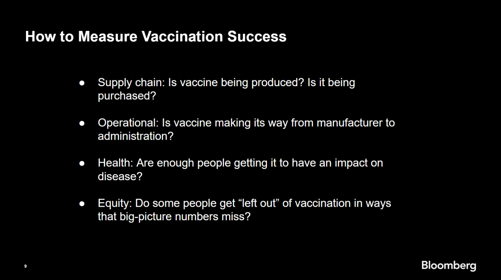
Armstrong also provided four ways for reporters to measure vaccination success. I’m including his slide here because I think it provides a good look at the multifaceted nature of vaccine data analysis and communication; your state might be vaccinating residents at a quick pace, but if the most vulnerable members of your community have been left out, you can’t fully call that rollout a success.
Slide from Drew Armstrong’s talk discussing the Bloomberg Vaccine Tracker.
On the equity front: Armstrong announced that the Bloomberg tracker now includes a demographic vertical. This tracker currently includes data from 27 states and two cities which are reporting vaccinations by race and/or ethnicity—you can check it out here. Bloomberg’s team is planning to update this tracker weekly, adding more states as their data become available.
Armstrong emphasized that he and his colleagues want their tracker to be a resource for other journalists, civic engagement, and other public health communication. “All of our DMs are open,” he said. (Or you can send feedback to the team through a public form.)
He also noted that reporting on these data—or even @-ing your governor on Twitter and asking them why the numbers aren’t better—is a useful way of actually making the data better. By letting public officials know that we’re looking at these numbers and noticing the gaps, we can put the pressure on for changes to be made.
Analyzing sources of race and ethnicity data
In her presentation, Arielle Levin Becker shared some strategies and resources for navigating a new data source—with a focus on demographic data.
“Data is incredibly important—and easy to misuse,” she said at the start of her talk. Vetting a source properly, she explained, can help you understand both how to properly use this source and how to address its limitations in your reporting.
Vetting questions to consider:
Who’s compiling this source?
Who’s funding it?
How transparent are they about their methods? Can you identify how it was compiled, or even track the chain of their methodology?
Do they disclose the limitations of the data?
Similarly to Armstrong, Levin Becker recommended reaching out to a source directly when you have questions. People who compile public data are often “very welcoming” about explaining their work, she said, and may be excited to help you better use their data.
Once you get to the analysis stage, Levin Becker suggested asking another round of questions, such as, “Do the numbers in this source match other numbers from similar sources?” and “How could I explain these numbers in plain English?” One particularly important question, she said, is: “What’s the denominator?” Does this analysis apply to everyone in a state or to a particular subset, like the over-65 population? As we’ve discussed before, denominators can be a particular challenge for COVID-19 school data—without enrollment numbers or clear data definitions, case numbers associated with schools are difficult to interpret.
Levin Becker honed in on age adjustment, a process that’s commonly used in health data analysis to compare outcomes for different populations. It’s kind-of a complicated statistical process, she said, but the basic idea is, you weight your data by the age distribution of a population. White populations tend to skew older than Black and Hispanic/Latino populations, for example; to compare these groups in a more equivalent way, a researcher might calculate what their disease rates would be if the different populations had the same age distribution.
Before the state of Connecticut started age-adjusting its COVID-19 death rates, Levin Becker said, the public health department was boasting that Hispanic/Latino residents of the state were less likely to die from the disease than white residents. But after doing an age adjustment, the state revealed that residents of color were actually at higher risk.
Slide from Arielle Levin Becker’s talk, showing how age adjustment can reveal health disparities. Chart is from the CT health department.
“The median age for a non-Hispanic white resident is 47 years,” Levin Becker said. “For a non-Hispanic Black resident, the median age is 34 years, and for a Hispanic resident, it’s 29 years.”
Finally, of course, there are many instances in which the lack of data is the story. There’s been a big focus on race and ethnicity data for COVID-19 vaccinations, but we’re also still missing data on other pandemic impacts. For example, the federal government and the vast majority of states don’t report COVID-19 tests by race and ethnicity. In a lot of cases, Levin Becker said, healthcare providers simply aren’t required to record the race and ethnicity of their patients—“it hasn’t been prioritized in health systems.”
When the COVID-19 pandemic is no longer an imminent crisis, she said, “keep poking at the questions of what’s being collected and how it’s used.” Continued advocacy by journalists and other communicators can keep the pressure on to improve our race and ethnicity healthcare data—and use it to reveal the disparities that must be fixed.
Related resources
A few links shared in the chat during this session:
!function(){“use strict”;window.addEventListener(“message”,(function(a){if(void 0!==a.data[“datawrapper-height”])for(var e in a.data[“datawrapper-height”]){var t=document.getElementById(“datawrapper-chart-“+e)||document.querySelector(“iframe[src*=’”+e+”‘]”);t&&(t.style.height=a.data[“datawrapper-height”][e]+”px”)}}))}();
Back in September, I read the Interim COVID-19 Vaccination Playbook released by the Centers for Disease Control and Prevention—the first national plan for how vaccination was supposed to proceed. Here’s an excerpt from my newsletter issue covering this playbook:
Once COVID-19 vaccination begins, the CDC will report national vaccination data on a dashboard similar to the agency’s existing flu vaccination dashboard. According to the playbook, this dashboard will include estimates of the critical populations that will be prioritized for vaccination, locations of CDC-approved vaccine providers and their available supplies, and counts of how many vaccines have been administered.
This past week, the first COVID-19 vaccine doses were administered to frontline healthcare workers across the country. The FDA issued Emergency Use Authorization to a second vaccine. But I haven’t seen a vaccination dashboard from the CDC; the closest we’ve come so far is a dataset listing initial allocations of Pfizer doses for every state. This federal agency is lagging behind several states that are making their vaccination counts public, as well as journalists who have already begun to compile the limited information that’s available.
Here’s how the reporting of vaccination data is supposed to work. When someone goes in to get their COVID-19 shot, the provider of that shot will enter their name and other personal information to a state registry called an Immunization Information System, or IIS. Vaccine providers that issue shots and send data may include hospitals, clinics, pharmacies, pop-up vaccination sites, and any other institution that is giving shots.
Most states and several large cities, like New York City, have these immunization registries; New Hampshire is still getting its registry ready to track COVID-19 vaccines. The registries stay private, with data only available for the people who ship, administer, and manage vaccines. A data system called the IZ gateway will help different state immunization systems link up with each other and with the CDC, which has asked all states to formally agree to share their data with this federal agency. (The CDC has asked states to share a pretty extensive list of data points for each vaccine patient, including names and addresses, which some states are not willing to send.)
The CDC has also developed a system to help vaccine providers manage supplies and patients, a public-facing website that will help Americans see where they can get vaccinated, and a new software that will pull all vaccine-related information into one place for Operation Warp Speed officials to use. Finally, an HHS data system called the Vaccine Adverse Event Reporting System will collect information on patient reactions to the vaccines, such as headaches and fatigue—both of which are expected reactions to the Pfizer and Moderna vaccines.
Theoretically, the CDC should have precise counts of how many people have received vaccine doses in every state, as well as personal identifying information for all of those people. So far, however, it appears that many states are beginning to make these data public, while the federal government has yet to release national numbers.
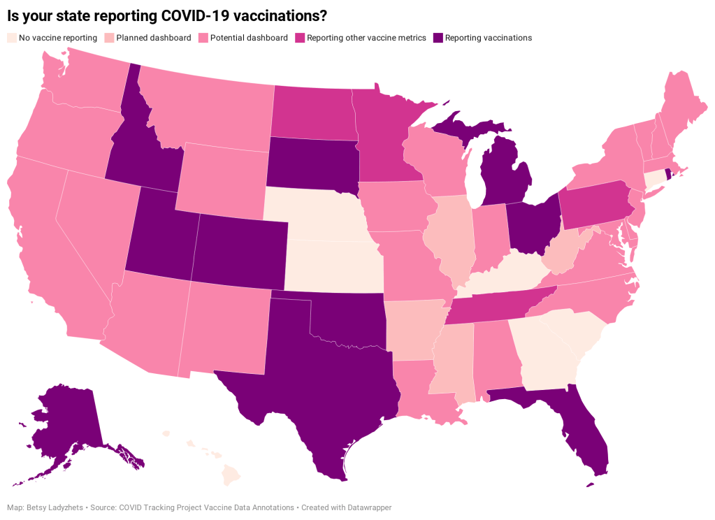
Five states have added a count of vaccine doses administered as a single metric on their dashboards: Alaska, Colorado, Idaho, Oklahoma, and Rhode Island.
Two states have added vaccination-specific pages to their dashboards: South Dakota and Utah.
Three states have built entirely new dashboards for vaccination: Michigan, Ohio, and Texas.
Florida is releasing daily vaccination reports.
Four states are reporting vaccine-related metrics (such as counts of approved providers and doses delivered) that don’t yet include actual counts of the doses administered: Minnesota, Pennsylvania, North Dakota, and Tennessee.
Five states are reporting some form of demographic data: Michigan reports vaccinations by age; Texas reports by county; Utah reports by local health jurisdiction; Ohio reports by age and county; South Dakota reports by age, gender, and county; and Florida reports by race, age, gender, and county.
For links to all of these states’ dashboards and reports, see the COVID Tracking Project’s annotations.
Florida is the only state to report vaccination counts broken down by race so far, though the state has not yet reported such counts for different ethnicities. Public health experts have widely agreed that people of color—especially Black Americans, Native Americans, and Hispanic/Latino Americans—should be prioritized in COVID-19 vaccination because these communities have been disproportionately impacted by the pandemic. But without knowing vaccination rates in these vulnerable communities, it will be impossible to determine whether they are receiving the medical treatment they deserve.
In state vaccination registries, race and ethnicity fields are simply considered “nice to have,” explained Mitchel Rothholz, chief of governance and state affiliates for the American Pharmacists Association. While other fields are mandatory, such as the patient’s contact information and date of birth, leaving race and ethnicity blank “won’t keep a provider from submitting the data if they don’t have it.”
In other words, if a Black woman gets the Moderna vaccine at a Walgreens in Brooklyn, she could feel uncomfortable disclosing her race on the pharmacy’s form—and little action would be taken to explain to her why such disclosure is important and how her information would be used. The “race” checkbox on her form would be left blank. She would likely go uncounted by researchers and journalists trying to hold the government accountable to its promises of equity.
The federal government should be both more rigorous in requiring race and ethnicity data and more transparent in disclosing these data—but I’d take a simple, national count of how many people in America have received COVID-19 shots to start. Recent data releases from the HHS have made me pretty optimistic about the federal public health agency’s ability to be transparent (see: the next two sections of this issue.) But the lack of a federal dataset so far means that key COVID-19 information is once again scattered.
In a Poynter webinar last week, Al Thompkins asked a panel of top infectious disease experts—including scientists on both the FDA’s and the CDC’s vaccine advisory panels—a simple question: Will the public be able to see counts of how many people are getting vaccinated? None of those experts had a clear answer. There may be a dashboard in the works behind the scenes of which the panelists hadn’t been informed, but their responses still did not inspire confidence.
Of course, journalists are once again stepping in to cobble together vaccination counts from all the public sources they can find. Bloomberg has counted 211,000 Pfizer doses in the U.S., as of December 19, by compiling numbers from state websites, press conferences, and interviews. The New York Times has surveyed state public health departments. Benjy Renton continues to update a Tableau dashboard that compares planned Pfizer and Moderna shipments to state populations.
And the Kaiser Family Foundation released its COVID-19 Vaccine Monitor, an ongoing project to track public perception of and experiences with vaccination. The latest survey from this monitor shows that 71% of Americans would “definitely or probably” get a vaccine for COVID-19 if it was determined to be safe and freely available.
This week, as I’ve seen the vaccination numbers—and the photos of frontline healthcare workers getting these well-deserved shots—I’ve felt something strange. Something hopeful. For the first time since March, I’m looking at numbers that I actually want to see go up. Now, if we could just get more comprehensive numbers, and get them more standardized, and get them reported with a priority on racial justice…
The COVID Racial Data Tracker, a collaboration between the COVID Tracking Project and the Boston University Center for Antiracist Research, collects COVID-19 race and ethnicity data from 49 states and the District of Columbia. We compile national statistics and compare how different populations are being impacted across the country.
But there are a lot of gaps in our dataset. We can only report what the states report, and many states have issues: for example, 93% of cases in Texas do not have any reported demographic information, and West Virginia has not reported deaths by race since May 20.
A new form on the COVID Tracking Project website allows you to help us advocate for better quality data. Simply select your state, then use the contact information and suggested script to get in touch with your governor. States with specific data issues (such as Texas and West Virginia) have customized scripts explaining those problems.
If you try this out for your state, please use the bottom of the form to let us know how it went!