Our first workshop happened this week!
Drew Armstrong, Bloomberg News‘s senior editor for health care, talked about his work on the publication’s Vaccine Tracker; and Arielle Levin Becker, director of communications and strategic initiatives for the Connecticut Health Foundation, discussed how to navigate COVID-19 race and ethnicity data. Thank you to everyone who attended—we had a great turnout!
For those who couldn’t make it live, you can watch the recording of the session below. You can also check out the slides here. I’m also sharing a brief recap of the workshop in today’s issue.
In next Wednesday’s workshop, we’ll discuss engaging COVID-19 data providers, featuring Liz Essley Whyte (Center for Public Integrity), Tom Meagher (The Marshall Project), and Erica Hensley (independent reporter from Mississippi). If you aren’t registered for the series yet, you can sign up here.
The Bloomberg Vaccine Tracker
In his presentation, Drew Armstrong provided a behind-the-scenes look at Bloomberg’s tracker and shared some advice on analyzing vaccine data more broadly.
“We attempt to capture every vaccine dose that’s reported for COVID-19, every single day, around the world,” he said. In addition to the tracker’s daily updates on vaccine doses distributed and administered, the site also includes information on vaccine contracts between companies and countries—allowing a window into future distribution.
All of the data on the tracker comes from public sources, largely national and state public health departments that share figures via their own dashboards, press conferences, and social media. Like other aspects of pandemic data, these figures can be pretty messy. Every country, and even every state, may have its own definition of an “administered dose” or a “vaccinated individual”—and these definitions are evolving as the rollout progresses.
Armstrong provided one example: Tennessee reports “number of people with 1 dose only” vs. “2 doses,” and moves people from the first category to the second after they receive that second dose. Maryland, on the other hand, reports total people who have received one and two doses; both totals are always growing. It’s difficult to make apples-to-apples comparisons when every jurisdiction is doing something different. If you can, Armstrong said, actually get on the phone with your local official and make sure you understand precisely what the terms on their vaccine reports mean. When the Johnson & Johnson vaccine (which only requires one dose) starts rolling out, this definitional landscape will only get more complicated.
As a result of this messy data landscape, figures for the Bloomberg Vaccine Tracker are compiled manually by a huge team, including reporters from every bureau of the publication. “You have to really get your hands dirty with this data to understand it,” Armstrong said.
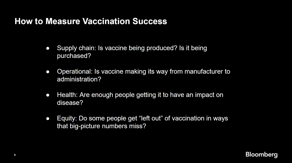
Armstrong also provided four ways for reporters to measure vaccination success. I’m including his slide here because I think it provides a good look at the multifaceted nature of vaccine data analysis and communication; your state might be vaccinating residents at a quick pace, but if the most vulnerable members of your community have been left out, you can’t fully call that rollout a success.

On the equity front: Armstrong announced that the Bloomberg tracker now includes a demographic vertical. This tracker currently includes data from 27 states and two cities which are reporting vaccinations by race and/or ethnicity—you can check it out here. Bloomberg’s team is planning to update this tracker weekly, adding more states as their data become available.
Armstrong emphasized that he and his colleagues want their tracker to be a resource for other journalists, civic engagement, and other public health communication. “All of our DMs are open,” he said. (Or you can send feedback to the team through a public form.)
He also noted that reporting on these data—or even @-ing your governor on Twitter and asking them why the numbers aren’t better—is a useful way of actually making the data better. By letting public officials know that we’re looking at these numbers and noticing the gaps, we can put the pressure on for changes to be made.
Analyzing sources of race and ethnicity data
In her presentation, Arielle Levin Becker shared some strategies and resources for navigating a new data source—with a focus on demographic data.
“Data is incredibly important—and easy to misuse,” she said at the start of her talk. Vetting a source properly, she explained, can help you understand both how to properly use this source and how to address its limitations in your reporting.
Vetting questions to consider:
- Who’s compiling this source?
- Who’s funding it?
- How transparent are they about their methods? Can you identify how it was compiled, or even track the chain of their methodology?
- Do they disclose the limitations of the data?
Similarly to Armstrong, Levin Becker recommended reaching out to a source directly when you have questions. People who compile public data are often “very welcoming” about explaining their work, she said, and may be excited to help you better use their data.
Once you get to the analysis stage, Levin Becker suggested asking another round of questions, such as, “Do the numbers in this source match other numbers from similar sources?” and “How could I explain these numbers in plain English?” One particularly important question, she said, is: “What’s the denominator?” Does this analysis apply to everyone in a state or to a particular subset, like the over-65 population? As we’ve discussed before, denominators can be a particular challenge for COVID-19 school data—without enrollment numbers or clear data definitions, case numbers associated with schools are difficult to interpret.
Levin Becker honed in on age adjustment, a process that’s commonly used in health data analysis to compare outcomes for different populations. It’s kind-of a complicated statistical process, she said, but the basic idea is, you weight your data by the age distribution of a population. White populations tend to skew older than Black and Hispanic/Latino populations, for example; to compare these groups in a more equivalent way, a researcher might calculate what their disease rates would be if the different populations had the same age distribution.
Before the state of Connecticut started age-adjusting its COVID-19 death rates, Levin Becker said, the public health department was boasting that Hispanic/Latino residents of the state were less likely to die from the disease than white residents. But after doing an age adjustment, the state revealed that residents of color were actually at higher risk.

“The median age for a non-Hispanic white resident is 47 years,” Levin Becker said. “For a non-Hispanic Black resident, the median age is 34 years, and for a Hispanic resident, it’s 29 years.”
To put COVID-19 race and ethnicity data in context, Levin Becker recommended looking at other health data—particularly on preexisting conditions that might constitute higher risks for severe COVID-19. The Kaiser Family Foundation, Behavioral Risk Factor Surveillance System, and CDC life expectancy data by ZIP code are three sources she suggested reporters dig into.
Finally, of course, there are many instances in which the lack of data is the story. There’s been a big focus on race and ethnicity data for COVID-19 vaccinations, but we’re also still missing data on other pandemic impacts. For example, the federal government and the vast majority of states don’t report COVID-19 tests by race and ethnicity. In a lot of cases, Levin Becker said, healthcare providers simply aren’t required to record the race and ethnicity of their patients—“it hasn’t been prioritized in health systems.”
When the COVID-19 pandemic is no longer an imminent crisis, she said, “keep poking at the questions of what’s being collected and how it’s used.” Continued advocacy by journalists and other communicators can keep the pressure on to improve our race and ethnicity healthcare data—and use it to reveal the disparities that must be fixed.
Related resources
A few links shared in the chat during this session:

Leave a comment