Tag: Source callout

  • COVID source callout: Still no state-by-state data on vaccinations by race/ethnicity

    COVID source callout: Still no state-by-state data on vaccinations by race/ethnicity

    This week, the CDC added a new feature to the vaccination section of its COVID-19 dashboard: you can now look at demographic vaccination trends at the state level, not just nationally and regionally.

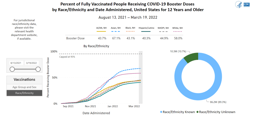
    But there’s a catch: the state-by-state demographic trends only include age and sex data. Vaccination trends by race and ethnicity are still only available at the national level; in fact, when you click on “Race/Ethnicity” on the booster shots section of this dashboard, the CDC directs you to “please visit the relevant health department website” for more local data.

    For state-level race and ethnicity data, the CDC directs users to state public health agencies. Screenshot taken on March 20.

    It is now over a year into the U.S.’s vaccine rollout, and the CDC is still failing to publicly share data on vaccinations by state and race/ethnicity. I actually wrote a callout post about this in March 2021, and nothing has changed since then!

    This is a major issue because such data are needed to examine equity in the vaccine rollout. While it’s possible to compile data from the states that report vaccinations by race and ethnicity themselves, major inconsistencies in state reporting practices make these data hard to standardize. Why isn’t the CDC doing this? Or, if the CDC is doing this, why aren’t the data public?

  • COVID source callout: Kentucky

    COVID source callout: Kentucky

    While updating my vaccine data annotations yesterday, I noticed that Kentucky has made some changes to its COVID-19 data reporting. Kentucky’s state health department has switched from daily to weekly updates, following a common trend in state reporting over the past few weeks.

    But this state also downgraded its vaccination data: it has, as far as I can tell, stopped publishing a report of vaccinations by race, ethnicity, and other demographic categories (previously posted once a week). And Kentucky’s new COVID-19 dashboard includes a “Weekly Surveillance Data” tab with, truly, some of the lowest-quality data visualizations I have seen throughout the entire course of the pandemic.

    Kentucky, what is going on with this image quality?

    Like, you can’t even read these numbers! Admittedly, the dashboard links out to a PDF report with better-quality visualizations, but it’s still a far cry from interactive or downloadable data. Two years into the pandemic, states are still struggling with reporting their numbers in an accessible manner.

  • COVID source callout: Iowa ends COVID-19 dashboards

    On February 16, Iowa’s two COVID-19 dashboards—one dedicated to vaccination data, and one for other major metrics—will be decommissioned. The end of these dashboards follows the end of Iowa’s public health emergency declaration, on February 15.

    In a statement announcing the end of the public health emergency, Iowa Governor Kim Reynold assures residents that “the state health department will continue to review and analyze COVID-19 and other public health data daily.” Data reporting on COVID-19 will be more closely aligned to reporting on the flu and other respiratory diseases, she said. Even though COVID-19 is causing the death of more than 100 Iowa residents a week, according to CDC data.

    Iowa used to be the state with the most frequent COVID-19 data reporting, with a dashboard that updated multiple times an hour. In fact, I wrote an ode to its frequent updates here at the COVID-19 Data Dispatch, back in fall 2020. But now, Iowa joins Florida, Nebraska, and other states in ending its public health emergency and, consequently, severely downgrading the level of information that it’s providing to residents who are very much still living in a public health emergency.

    At least the state will continue providing regular updates to the CDC—those requirements haven’t changed.

  • COVID source callout: CDC’s weekly data review emails

    I am a big fan of the CDC’s COVID Data Tracker Weekly Review newsletter, in which the agency sends key COVID-19 statistics, interpretations of the data, and other updates to my inbox every Friday afternoon (unless the data team is taking a holiday break). I use the emails regularly for my own National Numbers updates, and I find them helpful for flagging new CDC studies I may have missed.

    However, I couldn’t help but notice that the writers of these Weekly Review newsletters are getting a bit… uncreative with their subject lines:

    Last week’s email was titled, “Are You Up to Date?”, reminding readers to get their booster shots if they’re eligible. This week’s email got the remix of that title: “Stay Up to Date.”

    CDC newsletter writers, if you’re reading this: I am available to spruce up your weekly review subject lines and, based on my track record with the COVID-19 Data Dispatch, I bet I could improve your open rates. Hit me up.

  • COVID source callout: Underreported cases in prisons

    COVID source callout: Underreported cases in prisons

    In a recent story for FiveThirtyEight, I highlighted prisons and jails as one setting highly vulnerable to COVID-19 outbreaks during the Omicron surge. Similarly to nursing homes and other long-term care facilities, these places house high numbers of people in close quarters; and many inmates are older adults or have medical conditions that increase their risk of severe symptoms.

    Data collected by the UCLA Law COVID Behind Bars Data Project show that Omicron is, indeed, spreading incredibly fast in U.S. prisons. Some facilities have seen case increases over 1,000% in recent weeks.

    Despite these skyrocketing case numbers, the vast majority of state incarceration systems are not doing a good job of reporting COVID-19 cases right now. The UCLA project rates every state in a scorecard from A to F, based on the metrics its department of corrections makes available and a few key aspects of data quality.

    As of the most recent scorecard update in October 2021, the majority of states were rated F or D for their reporting on COVID-19 in the incarceration system—the lowest possible grades. It seems unlikely that the situation has improved, even as Omicron heightens the urgency of collecting and reporting data on cases in these highly vulnerable settings. Plus, many of these facilities are not offering vaccines to inmates or are failing to report vaccination data, according to The Marshall Project.

  • COVID source callout: COVID-19 deaths in U.S. hospitals

    Readers active on COVID-19 Data Twitter may have seen this alarmist Tweet going around earlier this weekend. In this post, a writer (notably, one with no science, health, or data background) posted a screenshot showing that the Department of Health and Human Services (HHS) is no longer requiring hospitals to include COVID-19 deaths that occur at their facilities in their daily reports to the agency.

    This is not the end of U.S. COVID-19 death reporting, as the Tweet’s author insinuated. Primarily because: hospitals are not the primary source of COVID-19 death numbers. These statistics come from death certificates, which are processed by local health departments, coroners, and medical examiners; death certificate statistics are sent to state health departments, which in turn send the numbers to the CDC. The CDC is still reporting COVID-19 deaths with no disruptions, and, in fact, released a highly detailed new dataset on these deaths last month.

    For more explanation, see this thread by Erin Kissane (COVID Tracking Project co-founder) and this one from epidemiologist Justin Feldman. It’s particularly important to note here that, as Feldman points out, plenty of COVID-19 deaths don’t occur in hospitals! About one-third of COVID-19 deaths occurred outside these facilities in 2020.

    (Note: The Documenting COVID-19 project has written, in great detail, about how COVID-19 deaths are reported in our Uncounted series. See: this article at USA Today and this reporting recipe.)

    It is certainly worth asking why the HHS took in-hospital COVID-19 deaths off the list of required metrics for hospitals. This data field had some utility for researchers looking to identify COVID-19 mortality rates within these facilities—though, from what I could tell, nobody was looking at it very much before this weekend.

    But, again, this is not the end of COVID-19 death reporting! This is the HHS making one small change to a massive hospitalization dataset—which was primarily used for looking at other metrics—while the CDC’s death reporting continues as usual.

  • COVID source callout: JHU positivity rates

    On Friday, a COVID-19 Data Dispatch reader asked for my help in interpreting a wildly high test positivity rate: 544% in Washington, D.C. The source of this rate, she said, was Johns Hopkins University (JHU)’s COVID-19 dashboard.

    Test positivity rates seem simple; they’re calculated by dividing the number of positive tests over the total tests reported in a particular place, over a particular period of time. But these rates can be hard to calculate accurately because positive tests—a.k.a. COVID-19 cases—are often reported on a different time scale from all (positive and negative) tests.

    If a health department is swamped with COVID-19 data—or if it’s coming off of a holiday break—it will prioritize analyzing and reporting the case numbers over other metrics, because case reporting is most important for public health measures like contact tracing. Similarly, some labs might send in positive test results before they send in negative test results. This can lead to something like 100 cases reported on a Monday, but the tests used to find those cases not getting reported until later in the week.

    States and localities that calculate their own positivity rates have systems to account for these time differences, usually by matching up the dates that tests took place. But JHU doesn’t do this, because JHU test positivity rates come from automatic data scrapes and calculations with none of the backend timing information that you’d need to actually determine an accurate positivity rate.

    In short, if you see a wildly high test positivity rate sourced from JHU’s dashboard, don’t trust it. Go look at the state, city, or county’s own COVID-19 data, or check the CDC dashboard instead.

    Also: I’d like to write more about test positivity next week, since this is such a confusing metric right now. If you have questions on this topic, send them my way!

  • COVID source callout: The CDC’s slow variant updates

    COVID source callout: The CDC’s slow variant updates

    Due to reporting delays, the CDC’s variant data fails to convey Omicron’s rapid spread through the country. Chart retrieved on December 19.

    On Tuesday, the CDC updated the Variant Proportions tab of its COVID-19 data dashboard. This update included some alarming information: Omicron had jumped from causing about 0.4% of cases in the week ending December 4, to 2.9% of cases in the week ending December 11. In the New York and New Jersey area, it was causing 13% of cases.

    At this rate of increase, we can anticipate that, as of yesterday (December 18), Omicron is already causing roughly 21% of cases in the U.S.—and more than 90% of cases in New York and New Jersey. But because of the CDC’s delayed updates, the majority of people who go look at the CDC’s dashboard anytime before its next update, this coming Tuesday, would likely presume that Omicron is still causing a tiny minority of cases.

    I’ve written before about the delays in collecting and reporting coronavirus sequencing data. It can take weeks for a COVID-19 test sample to go from a patient’s nose to a nationwide sequencing database, which leads to inevitable lags in the U.S.’s genomic surveillance. This is understandable. But in a crisis moment, when Omicron is here and spreading rapidly, the agency should clearly label the lags and update its projections to provide a more accurate view of the variant’s growth. 

    What’s more, the CDC’s data update on Tuesday was not communicated widely; Director Dr. Rochelle Walensky gave a TODAY Show interview, and that was about it.

  • COVID source callout: CDC’s breakthrough case data

    The CDC has not updated its breakthrough case data since September. A full two months ago.

    Earlier in 2021, the agency reported a total count of breakthrough infections, hospitalizations, and deaths—then switched to reporting only those breakthrough cases leading to hospitalization or death in May.

    The page that used to house this data now no longer includes total case counts; instead, the CDC redirects users to a couple of other pages:

    The CDC and FDA expanded booster shot eligibility to all adults in part because of increasing COVID-19 cases across the country.  But without comprehensive breakthrough case data, as I’ve said numerous times, it’s hard to pinpoint exactly how well the vaccines are working—and who’s most at risk of a breakthrough case.

    MedPage Today, which published a detailed article on this topic, received a statement from the CDC claiming that the breakthrough case and death data will be updated “in mid-November, to reflect data through October 2.” This long lag is due to the time it takes for the CDC to link case surveillance records to vaccination records, the agency said.

    Almost a year into the U.S.’s COVID-19 vaccination campaign, you’d really think our national public health system would have a better way of monitoring breakthrough cases by now.

  • COVID source callout: Illinois, where’s your vaccination data?

    COVID source callout: Illinois, where’s your vaccination data?

    As I updated my vaccine data source annotations this weekend, I found that the state of Illinois has overhauled its COVID-19 dashboard. The dashboard now highlights a few key metrics tied to Illinois’ reopening status on its home page (new hospital admissions, available ICU beds, etc.), while a menu at the side of the dashboard links out to pages on several other COVID-19 topics, along with a data portal.

    I like the new organization. Illinois has had a pretty cluttered dashboard for a while, and it’s much easier to navigate through the new version. But there’s one big problem: in this reorganization, Illinois seems to have taken down the vast majority of its vaccination data.

    The new dashboard includes one vaccination chart on its homepage: vaccinations among Illinois residents over time (at least one dose and fully vaccinated). You can download vaccination data by county through the dashboard’s data portal section. And there are vaccination charts included in both the “long-term care data” and “school and youth data” pages.

    The vaccination chart on Illinois’ COVID-19 dashboard homepage. Screenshot taken on November 7.

    But Illinois used to report a lot more metrics, including vaccination coverage by different age ranges, dose inventory, and breakthrough hospitalizations and deaths. Illinois was one of the first states to report breakthrough cases of any kind, and (as far as I am aware), it was the only state to publicly report a count of “unusable vaccine doses,” those doses that went to waste due to defects or other issues.

    What happened to these vaccine metrics? Will the Illinois health department put them back in a future dashboard update? If any local reporters from the state are reading this, I would love to know more about what’s going on here.