Tag: reader questions

  • Answering reader questions: Incubation period, vaccines coming this fall, nasal sprays

    I received a couple of reader questions in recent weeks that I’d like to answer here, in the hopes that my responses will be more broadly helpful. As a reminder, if you ever have a COVID-19 question that you’d like to ask, you can email me at betsy@coviddatadispatch.com, or send it anonymously through this Google form.

    COVID-19’s incubation period

    One reader asked:

    I’d love to learn more about COVID’s incubation period. I have read that it’s 2 to 14 days … but the median time seems to be on the low end (and could be as low as 24 hours?) How likely is it that it’s more like 14 days? I’d love to better understand this so that I know how to better handle exposures… Should I avoid someone who has had an exposure for two full weeks?

    This is a tricky question for two reasons. First, the incubation period—or the time between exposure to COVID-19 and starting to show symptoms of infection—does indeed vary a lot. One review of studies on this topic, posted as a preprint in May, found a range from two to seven days, though it can be even longer. The CDC recommends precautions for up to ten days after exposure.

    Second, the incubation period has changed as the coronavirus has mutated. The virus is constantly evolving to keep infecting us even as people build up immunity; shortening the incubation period is one of its strategies. Omicron has a notably shorter period than past variants; Katherine Wu at The Atlantic wrote an article about this in December 2021 that I think is still informative.

    The preprint I cited above found that Omicron had an average incubation period of 3.6 days, shorter than other variants. I think it’s reasonable to assume that this period has continued to get shorter as Omicron has evolved into the many lineages we’re dealing with now. But the pace of research on this topic has slowed somewhat (with less contact-tracing data available for scientists to work with), so it’s hard to say for certain.

    So, with these complexities in mind, how should one handle exposures? My personal strategy for this (noting that I’m not a doctor or qualified to give medical advice, just sharing my own experience) is to rely on a combination of timing, testing, and symptom monitoring. For the first couple of days after exposure, you wouldn’t be likely to have a positive test result even if you are infected, as it takes time for enough virus to build up in the body for tests to catch it. So, for those days, I’d just avoid people as much as possible.

    After three to four days, PCR tests would start to be effective, and after five to six days, rapid tests would be. So at that point, I’d start testing: using a mix of PCR and rapid tests over the course of several days, up to two weeks after exposure. Studies have shown that the more tests you do, the more likely you are to catch an infection (and this applies to both PCRs and rapids). Daily is the best strategy, but less frequent regimens can still be useful if your access to tests is limited. At the same time, I’d keep track of any new symptoms, as that can be a sign of infection even if all tests are negative.

    I’d personally be comfortable hanging out with someone who has had an exposure but consistent negative test results and no symptoms. But others who are less risk-tolerant than I am might avoid any contact for two weeks. The type of contact matters, too: a short, outdoor meeting or one with masks on is safer than a prolonged indoor, no-mask meeting.

    Vaccine effectiveness

    Another reader asked:

    Is there any information on the effectiveness of the latest vaccines, including vaccines that combine Covid and RSV, and are there similarities between these viruses (related?)

    As we head into respiratory virus season in the U.S., there will be, for the first time, vaccines available for all three major diseases: COVID-19, the flu, and RSV. I’ll talk about effectiveness for each one separately, because they are all separate vaccines for separate viruses. There’s no combined COVID-RSV vaccine on the market.

    COVID-19: We know the fall boosters will target XBB.1.5, a variant that has dominated COVID-19 spread in the U.S. recently. There isn’t much data available on these vaccines yet, because the companies developing them (Pfizer, Moderna, Novavax) have yet to present about their boosters to the FDA and CDC, as is the typical process. The CDC’s vaccine advisory committee is meeting this coming Tuesday to talk fall vaccines, though, so it’s likely we will see some data from that meeting.

    Also worth noting: some early laboratory studies suggest that vaccines based on XBB.1.5 will provide good protection against BA.2.86, despite concerns about differences between these variants. (More on this later in today’s issue.)

    Flu: Every year, scientists and health officials work together to update flu vaccines based on the influenza strains that are circulating around the world. Effectiveness can vary from year to year, depending on how well the shots match circulating strains.

    This week, we got a promising update about the 2023 flu vaccines: CDC scientists and colleagues studied how well these shots worked in the Southern Hemisphere, which has its flu season before the Northern Hemisphere. The vaccine reduced patients’ risk of flu-related hospitalization by 52%, based on data from several South American countries that participate in flu surveillance. This is pretty good by flu vaccine standards; see more context about the study in this article from TIME.

    RSV: There are two new RSV vaccines that will be available this fall, both authorized by the FDA and CDC in recent months. These vaccines—one produced by Pfizer, one by GSK—both did well in clinical trials, reducing participants’ risks of severe RSV symptoms by about 90% (for the first year after infection, with effectiveness declining over time).

    Both vaccines were authorized specifically for older adults, and Pfizer’s was also authorized for pregnant people as a protective measure for their newborns. We’ll get more data about these vaccines as the respiratory virus season progresses, but for now, experts are recommending that eligible adults do get the shots. This article from Yale Medicine goes into more details.

    Nasal sprays as COVID-19 protection

    Another reader asked:

    I’m thinking of researching what foods and supplement are anti-viral anti-COVID. I’m wondering if anyone has done any research on that?

    I haven’t seen too much research on about foods and supplements, since dietary options are usually not considered medical products for study. Generally, having a healthy diet can be considered helpful for reducing risk from many health conditions, but it’s not something to rely on as a precaution in the same way as you might rely on masking or cleaning air.

    Another thing you might try, though, would be nasal sprays to boost the immune system. I have yet to try these myself, but have seen them recommended on COVID-19 Safety Twitter and by cautious friends. The basic idea of these nasal sprays is to kill viruses in one’s upper respiratory tract, essentially blocking any coronavirus that might be present from spreading further. People take these sprays as a preventative measure before potential exposures.

    A couple of references on nasal sprays:

  • Resources from last week’s community event

    Thank you to everyone who logged onto Slack for last Sunday’s community event! I really appreciated the opportunity to hear your COVID-19 questions and concerns, and I hope the discussion was helpful for those who attended.

    One thing I loved about the event was that it didn’t just consist of me answering questions. The readers who attended also helped answer each other’s questions and shared resources, such as information about air filters and local COVID-safe meet-up groups.

    To bring those resources outside those who attended the event, I’ve compiled the list here:

    For both readers who attended the event and those who didn’t, I would love to hear your feedback. Should I host more of these? If yes, what would you like to discuss at events—general COVID-19 questions, or more focus on specific topics? Is Slack a good platform to use? (I.e., would it be worthwhile to pay for pro options on the server?)

    Let me know what you’re thinking: email me, comment on this blog post, etc. And thank you again to those who attended last Sunday, I learned a lot from all of you.

  • Ask your COVID-19 questions at the CDD community event next Sunday

    It’s a confusing, stressful time for those of us still following COVID-19 news and trying to avoid infection. Services like testing have become more limited, thanks to the end of the federal public health emergency, while changes in data availability make it harder to even recognize the ongoing risk.

    I’d like to give you—readers of the COVID-19 Data Dispatch—an opportunity to share your concerns about this latest stage of the pandemic and connect with others who feel similarly. So, I’m hosting a community event: a live Q&A in a private Slack server.

    Here’s how this will work. Next Sunday, June 11, at 5 PM Eastern time, I will log onto the private COVID-19 Data Dispatch Slack server. I’ll start a live audio chat in a channel labeled “community_events”, using Slack’s huddle feature.

    Attendees will be able to ask questions through audio or through text, in the Slack channel, and I’ll try to answer them in both formats. I also hope that attendees will respond to each other’s questions and connect about shared challenges. Remaining COVID-19 cautious these days can be an isolating experience, and I hope this event will help folks find a bit of community.

    I’ve tried using Slack for the COVID-19 Data Dispatch before; I actually created my server in early 2021, when I launched the publication’s independent website and financial support options. At the time, readers weren’t particularly interested in community discussions. But I suspect that may be different now, with the current phase of the pandemic—so I’m testing this out again. If the event next weekend goes well, I might make it a regular occurrence.

    In order to keep the community event to a manageable size, I’m going to limit it to readers who have financially supported the COVID-19 Data Dispatch. If you’ve donated at any point in the last three years, please expect a Slack invitation in your email later this afternoon.

    If you haven’t donated before but would like to attend the event, please do so before next Sunday. It can be any amount, and can be a one-time donation through my Ko-fi page or a reoccurring contribution through the website. I’ll also reserve a few spots for folks who would like to attend but are unable to donate right now—just email me to ask about that.

    You can also email me with any logistical questions! I’m looking forward to the event and hope to hear from many of you there.

  • Answering reader questions about wastewater data, rapid tests, Paxlovid

    I wanted to highlight a couple of questions (and comments) that I’ve received recently from readers, hoping that they will be useful for others.

    Interpreting wastewater surveillance data

    One reader asked about how to interpret wastewater surveillance data, specifically looking at a California county on the WastewaterSCAN dashboard. She noticed that the dashboard includes both line charts (showing coronavirus trends over time) and heat maps (showing coronavirus levels), and asked: “I’m wondering what the difference is, and which is most relevant to following actual infection rates and trends?”

    My response: Wastewater data can be messy because environmental factors can interfere with the results, and what may appear to be a trend may quickly change or reverse course (this FiveThirtyEight article I wrote last spring on the topic continues to be relevant). So a lot of dashboards use some kind of “risk level” metric in addition to showing linear trends in order to give users something a bit easier to interpret. See the “virus levels” categories on the CDC dashboard, for instance.

    Personally, I like to look at trends over time to see if there might be an uptick in a particular location that I should worry about, but I find the risk level metrics to be more useful for actually following infection rates. Of course, every dashboard has its own process for calculating these levels—and we don’t yet have a good understanding of how wastewater data actually correlate to true community infections—so it’s helpful to also check out other metrics, like hospitalizations in your county.

    Rapid test accuracy

    Another reader asked: “Is there any data on the effectiveness of rapid tests for current variants like Arcturus? I’m hearing more and more that they are working less and less well as COVID evolves.”

    My response: Unfortunately, I’m not aware of any specific data on rapid test effectiveness for recent variants. Early in the Omicron period, there were a few studies that showed the rapid tests still worked for that variant. The virus has obviously evolved a lot since then, but there is less interest in and fewer resources for evaluating these questions at this point in the pandemic, so it’s hard to say whether the continued mutations have had a significant impact on test effectiveness.

    I think it’s important to flag, though, that rapid tests have never been highly accurate. People have tested negative on rapids—only to get a positive PCR the next day—since these tests were first introduced in spring 2021. The tests can be helpful for identifying if someone is contagious, with a high viral load, but are less accurate for people without symptoms. So, my recommendation with these tests is always to test multiple times, and to get a PCR if you have access to that. (Acknowledging there is less and less PCR access these days.) Also, if you were recently exposed to COVID-19, wait a few days to start rapid testing; see more details in this post from last year.

    Double dose of Paxlovid

    Another reader wrote in to share their experience with accessing Paxlovid during a recent COVID-19 case. The reader received a Paxlovid prescription, which led to a serious alleviation of symptoms. But when she experienced a rebound of symptoms after finishing the Paxlovid course, she had a hard time getting a second prescription.

    “Fauci, Biden, head of Pfizer and CDC director got a second course of Paxlovid prescribed to them,” the reader wrote. “When I attempted to get this, my doctors pretended I was crazy and said this was never done.” She added that she’d like to publicize the two-course Paxlovid option.

    My response: I appreciate this reader sharing her experience, and I hope others can consider getting multiple Paxlovid prescriptions for a COVID-19 case. The FDA just provided full approval to Pfizer for the drug, which should alleviate some bureaucratic hurdles to access. I also know that current clinical trials testing Paxlovid as a potential Long COVID treatment are using a longer course; 15 days rather than five days. The results of those trials may provide some evidence to support a longer course overall.

    If you have a COVID-19 question, please send me an email and I’ll respond in a future issue!

  • Answering reader questions about data interpretation, good masking

    Answering reader questions about data interpretation, good masking

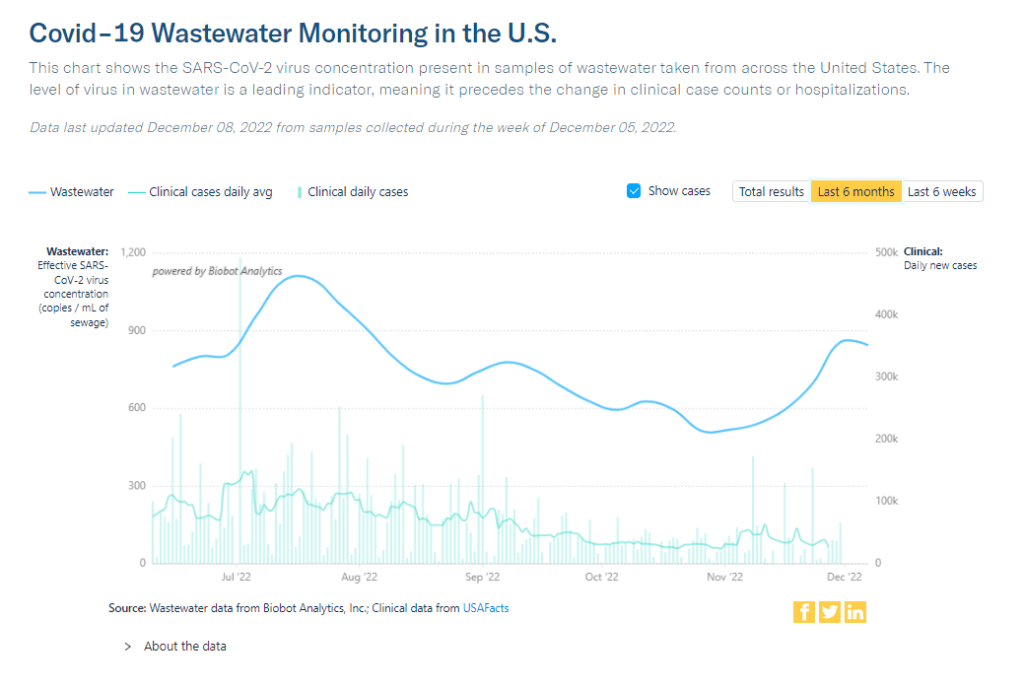
    As this chart from Biobot shows, trends in wastewater and case data often look a bit different. But how do you compare wastewater numbers to true infection numbers?

    This week, I’m sharing answers to three questions from readers that came in recently, through emails and the COVID-19 Data Dispatch Google form. The questions discuss interpreting wastewater and case data, and an interesting masking conundrum.

    Q1: Comparing wastewater trends to case trends

    I would love to know if there is any data on what levels of COVID in wastewater equals what risk level—are there any guidelines that could be used to turn masking policies on or off, for example? We know going up is bad and that the data is noisy but, if there’s any information on what concentrations in sewage corresponds to what level of cases I would love to know.

    I would love to be able to point you to specific guidelines about matching wastewater levels to cases, but unfortunately this isn’t really available right now. And if it were available, you would likely need to tailor the analysis pretty closely to where you live.

    An ongoing challenge with using wastewater surveillance data, as I wrote about for FiveThirtyEight and MuckRock in the spring, is that this type of environmental information is categorically pretty different from traditional case data. When a public health agency provides case numbers, they are adding up results from tests done in hospitals, doctors’ offices, and other healthcare settings. Each test result generally represents one person and can be interpreted with that framework.

    But with wastewater data, figuring out exactly what your test results represent can be more complicated. The data generally include people sick with COVID-19 who shed the coronavirus in their waste, but different people might shed different amounts of virus depending on what stage of illness they’re at, the severity of their symptoms, and possibly other factors that scientists are still working to figure out. Environmental factors like a big rainstorm or runoff from nearby agriculture could also interfere with the data. Population shifts, like college students returning to their campus after a break, can cause noise, too.

    As a result, public health experts who interpret wastewater data generally need a lot of data—like, a year or more of testing’s worth of data—from a specific location in order to analyze how wastewater trends correlate with case trends. And the data has to be consistent; if your wastewater collection team switches their sample processing methods halfway through the year, that might interrupt the analysis.

    A few institutions have figured out the wastewater-to-cases correlation for their communities. For examples, see the section on San Diego in this story and this paper by researchers in Gainesville, Florida. But for most research groups and health departments, it’s still a work in progress.

    All of that said, I don’t think this complexity should stop individuals or organizations from using wastewater data to recommend turning mask policies (or other policies) on or off. This surveillance might be less precise, but a sustained increase in coronavirus concentrations in the sewer is still certainly cause for concern and can be used to inform public health guidance.

    Q2: Estimating case underreporting

    How do you estimate how undercounted COVID testing is? Asking because I work for Whentotest.org—our COVID Risk Quiz assumes that COVID testing is undercounted by 7x, but I believe I’ve seen you estimate that it could be undercounted by as much as 20x. Wondering how you get to that number—we want to keep our Quiz as up to date as possible, and that number is a moving target.

    It is definitely a moving target, since COVID-19 testing (especially the lab-based PCR testing that generally contributes to official case numbers) can go up or down depending on people’s access to tests, perceptions of how much transmission is going on, and so many other factors.

    That said, I would personally put undercounting in the 10 times to 20 times range for this fall, likely with different levels of undercounting for different locations. I have two sources for the 20 times number: the first is an estimate from the Institute for Health Metrics and Evaluation made in September, suggesting that 4% to 5% of infections in the U.S. were reported at that time. (If 5% of infections are reported, case counts are 20 times higher than reported cases.)

    My second source is a paper from epidemiologist Denis Nash and his team at the City University of New York, released as a preprint earlier this fall. The researchers surveyed a representative sample of 3,000 U.S. adults, finding that about 17% of the respondents had Omicron during a two-week period in the summer BA.5 surge. Extrapolating from the survey findings, the researchers estimated that about 44 million people across the country had COVID-19 in this timeframe—compared to 1.8 million reported cases. This estimate suggests reported cases were undercounted by a factor of 24.

    Unfortunately, I have to use months-old estimates here because the U.S. does not have a regular data source comparing cases to true infections. The Census and CDC’s Household Pulse Survey comes close to this, as it includes questions about whether survey respondents have recently received a COVID-19 diagnosis; but it doesn’t ask about rapid tests, recent exposure, or other factors needed to determine the true infection rate, so the numbers here are also underestimates.

    Personally, I keep a close eye out for survey studies like those done by Nash and his team at CUNY and use those results to inform how I interpret national case data. I’ll make sure to flag any future studies like this for readers.

    Q3: Nose-only masking

    I follow some masking subs on Reddit and folks periodically suggest to others or refer to hacking masks that only cover their nose (KN95, N95s, etc.) for dental appointments or unavoidable indoor eating scenarios. Assuming they’re successful in creating a proper seal for these “half masks,” would there actually be any scientific backing this is helpful in minimizing risk?

    I wasn’t sure how to answer this question, so I shared it on Twitter, tagging a couple of masking and ventilation experts I know.

    Overall, the consensus that emerged from my replies is that it could be helpful to wear a mask over one’s nose for short periods of time, but it’s hard to say for sure due to a lack of rigorous research in this area. Behavior also plays a big role in how effective such a mask might be in alleviating risk.

    One expert, Devabhaktuni Srikrishna, pointed out that having a sealed filter over one’s nose could reduce the amount of virus that gets inhaled, if the coronavirus is present in the space. (This “inhalation dose” might correlate with one’s chances of infection and/or severity of symptoms if infected, though research is still ongoing on these questions.)

    Achieving a sealed filter over the nose is easier said than done, though. You can’t just use a standard mask, since that’s designed for the nose and mouth. One commenter shared a system that he uses, an elastomeric nose mask held in place with a headband. Another suggested using nasal filters designed to block allergens. As far as I know, there hasn’t been any research showing what might be most successful—unlike the extensive research that has gone into showing the value of high-quality face-masks and respirators.

    In addition to the discussion of designing a nose-only mask, this reader’s question led to some discussion about the careful behavior needed to use it successfully. One commenter pointed out that, if you’re eating alone, it’s easier to stay focused on breathing patterns than if you’re eating in a group and engaged in conversation. I also appreciated this reply from a Louisiana-based behavioral scientist:

    So, to summarize, I’d say that a nose filter could be helpful for situations like a dentist appointment and could be helpful (but trickier) for indoor dining—but it’s hard to say for sure. A much easier conclusion: avoid indoor dining as much as possible during COVID-19 surges like the one we’re in right now.

    More reader responses

  • Potential data fragmentation when the federal COVID-19 public health emergency ends

    Potential data fragmentation when the federal COVID-19 public health emergency ends

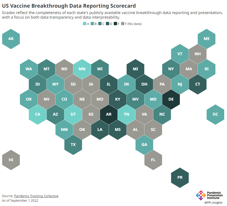
    About half of U.S. states have D or F grades on their breakthrough case reporting, according to the Pandemic Prevention Institute and Pandemic Tracking Collective. Other metrics could be heading in this direction next year.

    COVID-19 is still a public health emergency. At the moment, this is true according to both the general definition of this term and official declarations by the federal government. But the latter could change in the coming months, likely leading to more fragmentation in U.S. COVID-19 data.

    A reader recently asked me about the federal government’s ability to compile and report COVID-19 data, using our new anonymous Google form. They asked: “Will the CDC at some point stop reporting COVID data even though it may still be circulating, or is it a required, reportable disease?”

    It’s difficult to predict what the CDC will do, as we’ve seen in the agency’s many twists and turns throughout the pandemic. That said, my best guess here is that the CDC will always provide COVID-19 data in some form; but the agency could be severely limited in data collection and reporting based on the disease’s federal status.

    The CDC’s authority

    One crucial thing to understand here is that the CDC does not actually have much power over state and local public health departments. It can issue guidance, request data, distribute funding, and so forth, but it isn’t able to require data collection in many circumstances.

    Here’s Marc Lipsitch, an epidemiologist at Harvard’s public health school and interim director of science at the CDC’s Center for Forecasting and Outbreak Analytics, explaining this dynamic. This quote is from an interview that I conducted back in May for my FiveThirtyEight story on the new center:

    Outside of a public health emergency, CDC has no authority to require states to share data. And even in an emergency, for example, if you look on the COVID Data Tracker, there are systems that have half the states or some of the states. That’s because those were the ones that were willing to share. And that is a very big handicap of doing good modeling and good tracking… Everything you’re trying to measure, for any decision, is better if you measure it in all the states.

    Consider breakthrough cases as one example. According to the Pandemic Prevention Institute’s scorecard for breakthrough data reporting, about half of U.S. states have D or F grades, meaning that they are reporting zero or very limited data on post-vaccination COVID-19 cases. The number of states with failing grades has increased in recent months, as states reduce their COVID-19 data resources. As a result, federal agencies have an incomplete picture of vaccine effectiveness.

    Wastewater data is another example. While the CDC is able to compile data from all state and local public health departments with their own wastewater surveillance systems—and can pay Biobot to expand the surveillance network—the agency has no ability to actually require states to track COVID-19 through sewage. This lack of authority contributes to the CDC’s wastewater map still showing many empty spaces in states like Alabama and North Dakota.

    The COVID-19 public health emergency

    According to the Department of Health and Human Services (HHS), a federal public health emergency gives the HHS and CDC new funding for health measures and the authority to coordinate between states, among other expanded powers.

    During the COVID-19 pandemic, the federal emergency was specifically used to require data collection from state health departments and individual hospitals, POLITICO reported in May. According to POLITICO, the required data includes sources that have become key to our country’s ability to track the pandemic, such as:

    • PCR test results from state and local health departments;
    • Hospital capacity information from individual healthcare facilities;
    • COVID-19 patients admitted to hospitals;
    • COVID-19 cases, deaths, and vaccination status in nursing homes.

    The federal COVID-19 public health emergency is formally controlled by HHS Secretary Xavier Becerra. Becerra most recently renewed the emergency in July, with an expiration date in October. Health experts anticipate that it will be renewed again in October, because HHS has promised to give states a 60-day warning before the emergency expires and there’s been no warning for this fall. That leaves us with a new potential expiration date in January 2023.

    CDC officials are seeking to permanently expand the agency’s authority to include this data collection—with a particular priority on hospitalization data. But that hasn’t happened yet, to the best of my knowledge. So, what might happen to our data when the federal emergency ends?

    Most likely, metrics that the CDC currently requires from states will become voluntary. As we see right now with breakthrough cases and wastewater data, some states will probably continue reporting while others will not. Our federal data will become much more piecemeal, a patchwork of reporting for important sources such as hospitalizations and lab test results.

    It’s important to note here that many states have already ended their own public health emergencies, following a trend that I covered back in February. Many of these states are now devoting fewer resources to free tests, contact tracing, case investigations, public data dashboards, and other data-related efforts than they were in prior phases of the pandemic. New York was the latest state to make such a declaration, with Governor Kathy Hochul letting her emergency powers expire last week.

    How the flu gets tracked

    COVID-minimizing officials and pundits love to compare “endemic” COVID-19 to the flu. This isn’t a great comparison for many reasons, but I do think it’s helpful to look at how flu is currently tracked in the U.S. in order to get a sense of how COVID-19 may be tracked in the future.

    The U.S. does not count every flu case; that kind of precise tracking on a large scale was actually a new innovation for COVID-19. Instead, the CDC relies on surveillance networks that estimate national flu cases based on targeted tracking.

    There are about 400 labs nationwide (including public health labs in all 50 states) participating in flu surveillance via the World Health Organization’s global program, processing flu tests and sequencing cases to track viral variants. Meanwhile, about 3,000 outpatient healthcare providers in the U.S. Outpatient Influenza-like Illness Surveillance Network provide the CDC with flu-related electronic health records. You can read more about both surveillance programs here.

    Sample CDC flu reporting from spring 2020. The agency provides estimates of flu activity rather than precise case numbers.

    The CDC reports data from these surveillance programs on a dashboard called FluView. As you can see, the CDC provides estimates about flu activity by state and by different demographic groups, but the data may not be very granular (eg. no estimates by county or metro area) and are provided with significant time delays.

    Other diseases are tracked similarly. For example, the CDC will track new outbreaks of foodborne illnesses like E. coli when they arise but does not attempt to log every infection. When researchers seek to understand the burden of different diseases, they often use hospital or insurance records rather than government data.

    One metric that I’d expect to remain unchanged when the COVID-19 emergency ends is deaths: the CDC’s National Center for Health Statistics (NCHS) comprehensively tracks all deaths through its death certificate system. But even provisional data from NCHS are reported with a delay of several weeks, with complete data unavailable for at least a year.

    Epidemiologists I’ve interviewed say that we should be inspired by COVID-19 to improve surveillance for other diseases, rather than allowing COVID-19 to fall into the flu model. Wastewater data could help with this; a lot of wastewater researchers (including those at Biobot) are already working on tracking flu and other diseases. But to truly improve surveillance, we need more sustained investment in public health at all levels—and more data collection authority for the CDC and HHS.

    More federal data

  • Reflections and format shifts following the CDD’s first hiatus

    Reflections and format shifts following the CDD’s first hiatus

    Beach selfie from my last week of vacation!

    This is my first COVID-19 Data Dispatch issue after my August hiatus! Here are a few updates on how that went and changes I’m thinking about for the publication going forward.

    First off, I owe a big thank you to everyone who reached out with well wishes on this break. After two years without missing a single week of publication, I was (perhaps irrationally) nervous that some readers would be upset that I was taking off for a bit. But that didn’t happen! I appreciate everyone’s understanding and patience.

    Besides a few hours at my part-time job (MuckRock’s Documenting COVID-19 project) and one day of poll working for New York City’s August primary, I didn’t work at all between August 4 and August 29. Here are a few fun things I did instead:

    • Spent a lot of time outside (mostly at various beaches and NYC parks);
    • Biked in every NYC borough (longest trip: to Van Cortlandt Park and Woodlawn Cemetery in the Bronx);
    • Read three books (highly recommend “An Immense World” by Ed Yong!);
    • Drafted most of a long fanfiction project;
    • Watched a lot of Star Trek: The Original Series.

    If you’re curious about the logistics of taking a longer vacation as a freelancer, you can check out this Twitter thread I wrote last week:

    The break was really all that I had hoped it would be: a refreshing step away from constant COVID-19 coverage that allowed me to reflect on why I do this job. With the COVID-19 Data Dispatch and my other work, I aim to give readers the information they need to make individual health decisions, while also thinking about how they fit into broader communities. While my work has evolved a lot over the last two years, that basic tenet hasn’t changed.

    At the same time, though, my hiatus made me think more about how I can balance the newsletter and blog with other activities that are important for maintaining my mental health: getting off my computer, spending time outside, non-journalism writing, investing in new skills, and so on. I’m probably not unlike other independent creators when I say there are weeks when writing this newsletter/blog feels more like a chore than a useful service; I want to keep it feeling like the latter.

    With that in mind, here are a few shifts I’m thinking about for the coming months:

    • The “National numbers” and “Sources and updates” sections will stay consistent. In considering this project’s format, I knew that these two sections are particularly valuable for readers (and they tend to be fairly straightforward for me to write). So, don’t expect any big changes here.
    • Shorter posts. As any editor who’s worked with me could tell you, I am a writer who constantly goes over my assigned word count. And when I have no set word count, as is the case for these issues… They often get quite long, even though I know that shorter summaries tend to be more helpful for readers. In the future, I’m aiming to keep posts shorter, and only write a longer explainer or commentary when it seems actually necessary.
    • More reader engagement. We continue to be in a confusing phase of the pandemic, with less reliable data or reliable guidance. I want to prioritize answering your questions. To that end, I’ve made an anonymous Google form for submitting COVID-19 queries. It’ll be linked in every issue going forward and on the website’s homepage. While you can still reply to emails too, I hope this will be an easier way to send me ideas for topics I should cover.
    • Potential events and multimedia: As older readers may remember, in spring 2021, the COVID-19 Data Dispatch ran a series of virtual data workshops— which I really enjoyed putting together! I’m thinking about more possible virtual events for the future, as well as ideas for new content formats (maybe a podcast miniseries? should I do explainers on TikTok?). I’d love to hear from you, readers, if there’s anything in particular you want to see here.
    • Expanding beyond COVID-19: Between the continued monkeypox outbreak, the resurgence of polio in New York, and plenty of climate disasters this summer, it’s clear that COVID-19 is far from our only public health concern right now. While my projects in the immediate future are still mostly COVID-focused, you might see some other public health and data information creep into newsletters/blogs going forward. (For example, this week’s “Sources and updates” section includes a couple of non-COVID items.)
    • Occasional breaks. While I have no intention of making like the CDC and pausing my newsletter for any federal holiday, you can expect that the COVID-19 Data Dispatch will not run every single weekend going forward. Like, I’ll take Christmas off. Reasonable stuff.

    None of these are particularly major changes, but in the spirit of transparency, I wanted to share what I’m thinking about with all of you. As always, comments or questions are very welcome: just shoot me an email or fill out the new anonymous question form.

  • Nine areas of data we need to manage the pandemic

    Nine areas of data we need to manage the pandemic

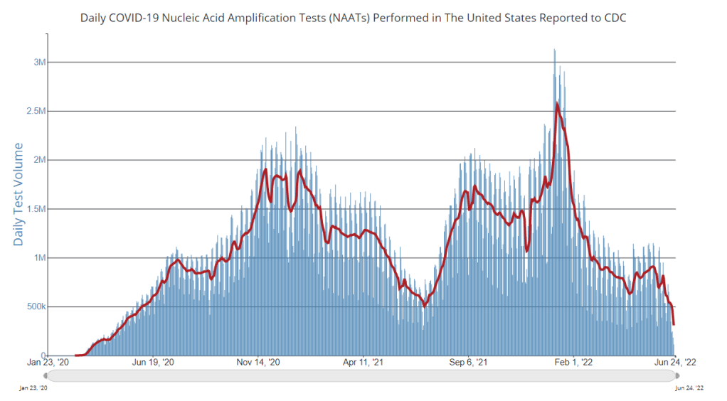
    PCR testing has greatly declined in recent months; we need new data sources to help replace the information we got from it. Chart via the CDC.

    Last week, I received a question from my grandmother. She had just read my TIME story about BA.4 and BA.5, and was feeling pessimistic about the future. “Do you think we’ll ever get control of this pandemic?” she asked.

    This is a complicated question. And it’s one that I’ve been reflecting on as well, as I approach the two-year anniversary of the COVID-19 Data Dispatch and consider how this publication might shift to meet the current phase of the pandemic. I am not an infectious disease or public health expert, but I wanted to share a few thoughts on this; to stay in my data lane, I’m focusing on data that could help the U.S. better manage COVID-19.

    The coronavirus is going to continue mutating, evolving past immune system defenses built by prior infection and vaccination. Scientists will need to continue updating vaccines and treatments to match the virus, or we’ll need a next-generation vaccine that can protect against all coronavirus variants.

    Candidates for such a vaccine, called a “pan-coronavirus vaccine,” are under development by the U.S. Army and at several other academic labs and pharmaceutical companies. But until a pan-coronavirus vaccine becomes available, we’ll need to continue tracking new variants and the surges they produce. We also need to better track Long COVID, a condition that our current vaccines do not protect well against.

    Eventually, COVID-19 will likely be just another respiratory virus that we watch out for during colder months and large indoor gatherings, broadly considered “endemic” by scientists. But it’s important to note—as Dr. Ellie Murray did in her excellent Twitter thread about how pandemics end—that endemicity does not mean we stop tracking COVID-19. In fact, thousands of people work to monitor and respond to another endemic virus, the flu.

    With that in mind, here are nine categories of data that could help manage the pandemic:

    • More comprehensive wastewater surveillance: As I’ve written here and at FiveThirtyEight, sewers can offer a lot of COVID-19 information through a pipeline that’s unbiased and does not depend on testing access. But wastewater monitoring continues to be spotty across the country, as the surveillance can be challenging to set up—and more challenging for public health officials to act on. Also, current monitoring methods exclude those 21 million households that are not connected to public sewers. As wastewater surveillance expands, we will better be able to pinpoint new surges right as they’re starting.
    • Variant surveillance from wastewater: Most of the U.S.’s data on circulating variants currently comes from a selection of PCR test samples that are run through genomic sequencing tests. But this process is expensive, and the pool of samples is dwindling as more people use at-home rapid tests rather than PCR. It could be cheaper and more comprehensive to sequence samples from wastewater instead, Marc Johnson explained to me recently. This is another important aspect of expanding our wastewater monitoring.
    • Testing random samples: Another way to make up for the data lost by less popular PCR testing is conducting surveillance tests on random samples of people, either in the U.S. overall or in specific cities and states. This type of testing would provide us with more information on who is getting sick, allowing public health departments to respond accordingly. The U.K.’s Office for National Statistics conducts regular surveys like this, which could serve as a model for the U.S.
    • More demographic data: Related to random sample testing: the U.S. COVID-19 response still needs more information on who is most impacted by the pandemic, as well as who needs better access to vaccines and treatments. Random sampling and surveys, as well as demographic data connected to distributions of treatments like Paxlovid, could help address this need.
    • Vaccine effectiveness data: I have written a lot about how the U.S. does not have good data on how well our COVID-19 vaccines work, thanks to our fractured public health system. This lack of data makes it difficult for us to identify when vaccines need to be updated, or who needs another round of booster shots. Connecting more vaccination databases to data recording cases, hospitalizations, and Long COVID would better inform decision-making about boosters.
    • Air quality monitoring: Another type of data collection to better inform decision-making is tracking carbon dioxide and other pollutants in the air. These metrics can show how well-ventilated (or poorly-ventilated) a space is, providing information about whether further upgrades or layers of safety measures are needed. For example, I’ve seen experts bring air monitors on planes, citing poor-quality air as a reason to continue wearing a mask. Similarly, the Boston public school district has installed air monitors throughout its buildings and publishes the data on a public dashboard.
    • Tracking animal reservoirs: One potential source for new coronavirus variants is that the virus can jump from humans into animals, mutate in an animal population, and then jump back into humans. This has happened in the U.S. at least once: a strain from minks infected people in Michigan last year. But the U.S. is not requiring testing or any mandatory tracking of COVID-19 cases in animals that we know are susceptible to COVID-19. Better surveillance in this area could help us catch variants.
    • Better Long COVID surveillance: For me personally, knowledge of Long COVID is a big reason why I remain as cautious about COVID-19 as I am. Long COVID patients and advocates often say that if more people understood the ramifications of this long-term condition, they might be more motivated to take precautions; I think better prevalence data would help a lot with this. (The Census and CDC just made great strides in this area; more on that later in the issue.) Similarly, better data on how the condition impacts people would help in developing treatments—which will be crucial for getting the pandemic under control.
    • More accurate death certificates: The true toll of the pandemic goes beyond official COVID-19 deaths, as the Documenting COVID-19 project has discussed at length in our Uncounted investigation. If we had a better accounting of everyone whose deaths were tied to COVID-19, directly or indirectly, that could be another motivator for people to continue taking safety precautions and protecting their communities.

    If you are working to improve data collection in any of these areas—or if you know a project that is—please reach out! These are all topics that I would love to report on further in the coming months.

    More federal data

  • Interpreting limited data in our undercounted surge

    Interpreting limited data in our undercounted surge

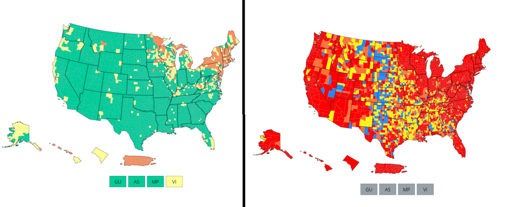
    Comparing the CDC’s new Community Levels (left) and old Community Transmission Levels (right), as of May 22. Red indicates higher transmission.

    There’s no sugarcoating it: we are in an extremely confusing and frustrating phase of the pandemic. We see the rising (yet undercounted) case numbers, we hear from friends and family members who have recently tested positive. And yet the CDC’s official COVID-19 guidance is still based on a mostly-green map, while local leaders refuse to reinstate mask mandates or other safety measures.

    I wrote about this tension for the New York City news site Gothamist last week, in a story about COVID-19 outbreaks in city public schools. As official case counts approach the levels of the winter Omicron surge and the city officially goes into “high COVID-19 alert level,” no action has been taken to slow the spread beyond distributing more rapid at-home tests to students.

    Moreover, students, parents, and teachers have limited (and often conflicting) information about COVID-19 cases in their schools. The issues include:

    • While the NYC Department of Education does allow parents to report positive results from at-home tests, reporting is not required and can take several days, potentially leading to undercounts and delays.
    • Data sources from the city and the state often do not match due to reporting differences, and both may lag behind anecdotal reports from students and teachers.
    • Other NYC data sources are also unreliable, since the city health department does not count at-home tests at all and novel sources such as wastewater surveillance aren’t readily available.

    In this phase of the pandemic, much of the official guidance from the federal government and aligned experts centers around individual responsibility. There may not be a mask mandate, but you can wear a mask if you feel it’s necessary. Large events may be taking place, but you can take a rapid test before and afterwards if you want. And so on.

    Of course, I’m not saying that you shouldn’t wear a mask or use testing. But the problem with this narrative is that, as our data sources become less reliable, it becomes harder and harder to figure out when or how one should take these individual-level actions.

    As Sarah Allen, a NYC teacher and parent whom I interviewed for my Gothamist story, put it: “You can’t say, ‘It’s up to you as an individual,’ when the level of risk is being withheld from you.”

    Still, even as our official data sources become harder to use, there are still ways to keep track of the COVID-19 risk in your community—you just may need to look at more sources and acknowledge more uncertainty in the numbers. While I was working on the Gothamist story, I received a question from a reader along similar lines; she asked what datasets I would recommend looking at right now, particularly when seeking to protect seniors and other vulnerable populations.

    Here’s what I responded (edited lightly for publication):

    • Case rates are still useful, if we acknowledge that they are undercounts. Jeffrey Shaman, an infectious disease expert at Columbia University whom I talked to for the Gothamist story, put it this way: our current datasets “will tell you the trends of what’s happening, but it won’t necessarily tell you the magnitude.” In other words, if case counts are going up and you’re also hearing about a lot of friends testing positive on rapid tests, that is still a good indication that more transmission is happening in your area. But you need to consider that the actual transmission is several times higher than the official case counts, due to more rapid testing and less PCR testing.
    • Hospitalization rates are useful, particularly new hospital admissions. As you may have noticed, COVID-19 Data Dispatch National Numbers posts in the last few months have used new hospital admissions at the same level as cases to discuss national COVID-19 trends. Some modelers I talk to really like this metric, because it’s more reliable than cases and has less of a lag than other kinds of  hospitalization metrics (such as total patients in the hospital or bed capacity), since it is driven by new people with COVID-19 coming into the hospital for treatment. The big caveat with hospitalization numbers is that they mainly tell you about healthcare system capacity, eg. if you get severely ill, will there be a bed in the hospital for you?  It’s harder to extrapolate from hospitalization numbers to other impacts of COVID-19, like Long COVID.
    • The CDC’s old transmission level guidance is still actually pretty helpful for guiding health policies, especially for vulnerable populations. In this guidance, the “high” level means that a county is reporting over 100 new COVID-19 cases for every 100,000 people, over the course of a week. This high level may also be associated with high test positivity rates, a sign of high transmission and/or undertesting. So, if your county is reporting high transmission under this old guidance, it’s a pretty decent signal that there is a lot of COVID-19 circulating there — and reaching this level is actually even more concerning now than it would’ve been a few months ago, since so many rapid tests are going unreported. (The CDC itself actually recommends that healthcare facilities use this guidance, in a note at the top of its COVID-19 dashboard.)
    • Wastewater surveillance, if it’s available in your area. That “if” is a pretty big caveat; and even in some places where wastewater surveillance has been available, data have been scarce recently (see: later in this issue). But if you do have access to COVID-19 prevalence data from sewersheds in your community, this information of how coronavirus spread is changing in your area: is transmission increasing; or if you’re in a wave, has it started to decrease again yet? Beyond the CDC NWSS and Biobot dashboards, you can use the COVIDPoops19 dashboard to look for wastewater surveillance near you.
    • The COVID Cast dashboard, from Carnegie Mellon University’s Delphi Group, is another helpful source recommended to me recently by a modeling expert. The Delphi group does modeling work and provides data based on surveys of the U.S. population, answering questions like, “How many people are wearing masks?” Their dashboard also incorporates other unique data points you won’t find elsewhere, including antigen test positivity from one major test provider (Quidel), trends in COVID-related doctors visits, and analysis of Google search trends for COVID-like symptoms.

    As always, if you have further questions, please reach out.

    More federal data

  • Answering reader questions: Encouraging policy changes

    Answering reader questions: Encouraging policy changes

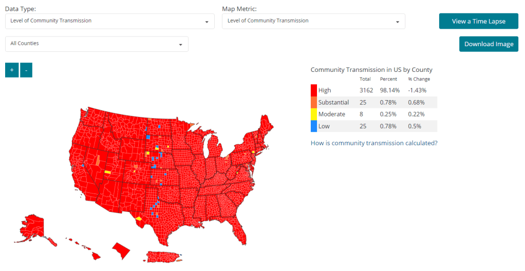
    As of February 11, 98% of U.S. counties are seeing high COVID-19 transmission, according to the CDC. Chart from the CDC COVID-19 dashboard.

    In January, I invited readers to fill out a survey asking what you’d like to see from the COVID-19 Data Dispatch in 2022. Thank you to everyone who responded—your feedback gave me some great ideas for topics to focus on and new CDD-related initiatives to pursue this year!

    This week, though, I want to focus on a topic that multiple readers brought up in the survey: how individuals can impact COVID-19 policies. One reader asked, “What can I as an individual do to make better the lacking local, state, federal, and international societal responses to COVID-19?” Another reader asked, along the same lines, “What can I do to encourage policy changes that keep people safer?”

    These questions feel particularly pertinent this week, as leaders of several states loosen up on mask mandates and other COVID-19 safety measures. Governors in New Jersey, Connecticut, Delaware, Oregon, and Massachusetts have all announced that they’re ending mask mandates in public schools, and in some cases, in other public spaces. New York Governor Kathy Hochul is keeping the state’s K-12 school mask mandate in place for now, but ending a mandate for New York businesses.

    Policy changes like these go against long-standing guidance from the CDC. In summer 2021, the agency recommended that communities base their levels of COVID-19 safety measures on two primary metrics: new cases per 100,000 people in the last week, and the percent of PCR tests that returned positive results in the last week. A high case rate indicates a lot of COVID-19 in the community, while a high test positivity rate can indicate the community’s testing infrastructure is not picking up a large share of cases—both suggest that measures should be put in place to control the virus’ spread.

    At the time, this guidance was instituted as a response to the CDC’s preemptive recommendation that vaccinated people could go maskless. The agency said that counties seeing “high” or “substantial” transmission, according to the CDC’s metrics, should mandate masks for all, while counties with lower transmission could allow vaccinated people to go maskless. Gotta be honest: I do not know of a single state or county that’s actually following this guidance. Still, this combination of metrics is, I find, a useful and simple way to evaluate community spread.

    As I’ve pointed out in recent National Numbers updates, even though case numbers in the U.S. have dropped significantly since the Omicron peak in January, they are still at very high levels across the country. You can see on the CDC’s dashboard that, as of this week, about 98% of counties fall into the “high transmission” category—with over 100 new cases per 100,000 people and test positivity over 10%. And beyond the case numbers: many hospitals are currently recovering from record Omicron surges, while over 2,000 Americans are dying of COVID-19 each day.

    According to the CDC’s own guidance, 98% of U.S. counties should have a mask mandate right now. But instead, among the small number of Democrat-led states that have retained mandates, safety measures are now being lifted. The CDC itself is having a hard time commenting on this situation, and is reportedly “considering updating its guidelines on the metrics states should use,” according to POLITICO.

    During this time of “opening” the small number of places that were not already fully open, what can individuals do to make their voices heard—or at least improve COVID-19 safety in their own communities? I have three suggestions:

    1. Call your political representatives and tell them how you feel.

    If your state, city, or other local region is considering lifting some COVID-19 safety measures, you have a representative whose job literally includes listening to your complaints about this issue—whether that’s a state assembly member or city councilor.

    You can use this website to find your national and state representatives, and many localities have their own equivalents (for example, this site for New York City). Once you’ve found the contact information for your representatives, call or email them to express your support for continued COVID-19 precautions. This document offers a couple of potential phone call and email scripts; it’s New York-specific, but can easily be translated to other states.

    In the last couple of years, conservative Americans have often been more politically active at the local level than more left-leaning Americans. Republicans often show up to school board meetings, call their representatives, and make their anger heard—sometimes supported by astroturfing campaigns. Anecdotal reports suggest that public health officials tend to hear more from community members who hate mandates than from those who actually want to see COVID-19 safety in their communities. You can push back against this trend.

    And if you want to do some additional phone-calling or emailing beyond political representatives, consider reaching out to your state or local public health department and offering some support! They can probably use it.

    2. Volunteer for local organizations helping to provide vaccinations, masks, tests, and other resources.

    About 80% of Americans ages five and up have received at least one COVID-19 vaccine dose, according to the CDC. This number may sound impressive, but’s more concerning when we look at the other side of the statistic: 20% of eligible Americans have not yet received at least one COVID-19 vaccine dose. Plus, among those Americans who have been fully vaccinated, more than half haven’t received a booster shot.

    A lot of unvaccinated Americans are conservatives whose minds are very hard to change, this is true. But many of them are low-income workers with intense schedules, lingering health concerns, and other barriers to actually getting the shots that are surmountable, health policy expert Julia Raifman told me for a FiveThirtyEight story last month.

    As a result, volunteer organizations around the country are still working to get their communities vaccinated and boosted. For example, Bed-Stuy Strong, a mutual aid group in my Brooklyn neighborhood, has hosted vaccination drives focused on local seniors and disseminated information on vaccinations and testing in the area.

    Look for an effort like this that you might be able to join in your community! Or, if nothing like this currently exists, reach out to a local organization—like a public school, library, community center, etc.—and see if they might want to host a vaccine drive. Your local public health department could likely provide the supplies.

    3. Educate your friends, family, and community members.

    Beyond political and volunteer efforts, you can increase COVID-19 safety in your community simply by spreading the word about tools like high-quality masks and rapid tests. It might seem obvious, at this point in the pandemic, that we should all be stocking up on KN95s and testing kits, but many people do not have access to these tools—or simply don’t know why they’re useful.

    You can send friends, family, and community members to websites like Project N95, which sells masks and other PPE, and Bona Fide Masks, a family business and leading KN95/N95 distributor. You can also tell them about antigen test distributors like iHealth Labs and Walmart, which are seeing fewer delays and supply crunches as the Omicron surge wanes.

    In addition, if you have the resources, you can buy these masks and rapid tests in bulk and give them out. I recently gave out a couple of KN95 masks to contractors who were sent to look at a water issue in my apartment building, because I had the masks to spare. It’s that easy!

    If you take any of these suggestions and see some impact, please email me (betsy@coviddatadispatch.com) and tell me about it!

    More on federal data