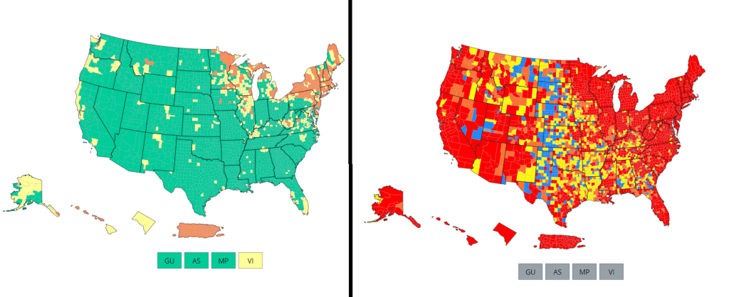

There’s no sugarcoating it: we are in an extremely confusing and frustrating phase of the pandemic. We see the rising (yet undercounted) case numbers, we hear from friends and family members who have recently tested positive. And yet the CDC’s official COVID-19 guidance is still based on a mostly-green map, while local leaders refuse to reinstate mask mandates or other safety measures.
I wrote about this tension for the New York City news site Gothamist last week, in a story about COVID-19 outbreaks in city public schools. As official case counts approach the levels of the winter Omicron surge and the city officially goes into “high COVID-19 alert level,” no action has been taken to slow the spread beyond distributing more rapid at-home tests to students.
Moreover, students, parents, and teachers have limited (and often conflicting) information about COVID-19 cases in their schools. The issues include:
- While the NYC Department of Education does allow parents to report positive results from at-home tests, reporting is not required and can take several days, potentially leading to undercounts and delays.
- Data sources from the city and the state often do not match due to reporting differences, and both may lag behind anecdotal reports from students and teachers.
- Other NYC data sources are also unreliable, since the city health department does not count at-home tests at all and novel sources such as wastewater surveillance aren’t readily available.
In this phase of the pandemic, much of the official guidance from the federal government and aligned experts centers around individual responsibility. There may not be a mask mandate, but you can wear a mask if you feel it’s necessary. Large events may be taking place, but you can take a rapid test before and afterwards if you want. And so on.
Of course, I’m not saying that you shouldn’t wear a mask or use testing. But the problem with this narrative is that, as our data sources become less reliable, it becomes harder and harder to figure out when or how one should take these individual-level actions.
As Sarah Allen, a NYC teacher and parent whom I interviewed for my Gothamist story, put it: “You can’t say, ‘It’s up to you as an individual,’ when the level of risk is being withheld from you.”
Still, even as our official data sources become harder to use, there are still ways to keep track of the COVID-19 risk in your community—you just may need to look at more sources and acknowledge more uncertainty in the numbers. While I was working on the Gothamist story, I received a question from a reader along similar lines; she asked what datasets I would recommend looking at right now, particularly when seeking to protect seniors and other vulnerable populations.
Here’s what I responded (edited lightly for publication):
- Case rates are still useful, if we acknowledge that they are undercounts. Jeffrey Shaman, an infectious disease expert at Columbia University whom I talked to for the Gothamist story, put it this way: our current datasets “will tell you the trends of what’s happening, but it won’t necessarily tell you the magnitude.” In other words, if case counts are going up and you’re also hearing about a lot of friends testing positive on rapid tests, that is still a good indication that more transmission is happening in your area. But you need to consider that the actual transmission is several times higher than the official case counts, due to more rapid testing and less PCR testing.
- Hospitalization rates are useful, particularly new hospital admissions. As you may have noticed, COVID-19 Data Dispatch National Numbers posts in the last few months have used new hospital admissions at the same level as cases to discuss national COVID-19 trends. Some modelers I talk to really like this metric, because it’s more reliable than cases and has less of a lag than other kinds of hospitalization metrics (such as total patients in the hospital or bed capacity), since it is driven by new people with COVID-19 coming into the hospital for treatment. The big caveat with hospitalization numbers is that they mainly tell you about healthcare system capacity, eg. if you get severely ill, will there be a bed in the hospital for you? It’s harder to extrapolate from hospitalization numbers to other impacts of COVID-19, like Long COVID.
- The CDC’s old transmission level guidance is still actually pretty helpful for guiding health policies, especially for vulnerable populations. In this guidance, the “high” level means that a county is reporting over 100 new COVID-19 cases for every 100,000 people, over the course of a week. This high level may also be associated with high test positivity rates, a sign of high transmission and/or undertesting. So, if your county is reporting high transmission under this old guidance, it’s a pretty decent signal that there is a lot of COVID-19 circulating there — and reaching this level is actually even more concerning now than it would’ve been a few months ago, since so many rapid tests are going unreported. (The CDC itself actually recommends that healthcare facilities use this guidance, in a note at the top of its COVID-19 dashboard.)
- Wastewater surveillance, if it’s available in your area. That “if” is a pretty big caveat; and even in some places where wastewater surveillance has been available, data have been scarce recently (see: later in this issue). But if you do have access to COVID-19 prevalence data from sewersheds in your community, this information of how coronavirus spread is changing in your area: is transmission increasing; or if you’re in a wave, has it started to decrease again yet? Beyond the CDC NWSS and Biobot dashboards, you can use the COVIDPoops19 dashboard to look for wastewater surveillance near you.
- The COVID Cast dashboard, from Carnegie Mellon University’s Delphi Group, is another helpful source recommended to me recently by a modeling expert. The Delphi group does modeling work and provides data based on surveys of the U.S. population, answering questions like, “How many people are wearing masks?” Their dashboard also incorporates other unique data points you won’t find elsewhere, including antigen test positivity from one major test provider (Quidel), trends in COVID-related doctors visits, and analysis of Google search trends for COVID-like symptoms.
As always, if you have further questions, please reach out.

Leave a comment