
This week, I’m sharing answers to three questions from readers that came in recently, through emails and the COVID-19 Data Dispatch Google form. The questions discuss interpreting wastewater and case data, and an interesting masking conundrum.
Q1: Comparing wastewater trends to case trends
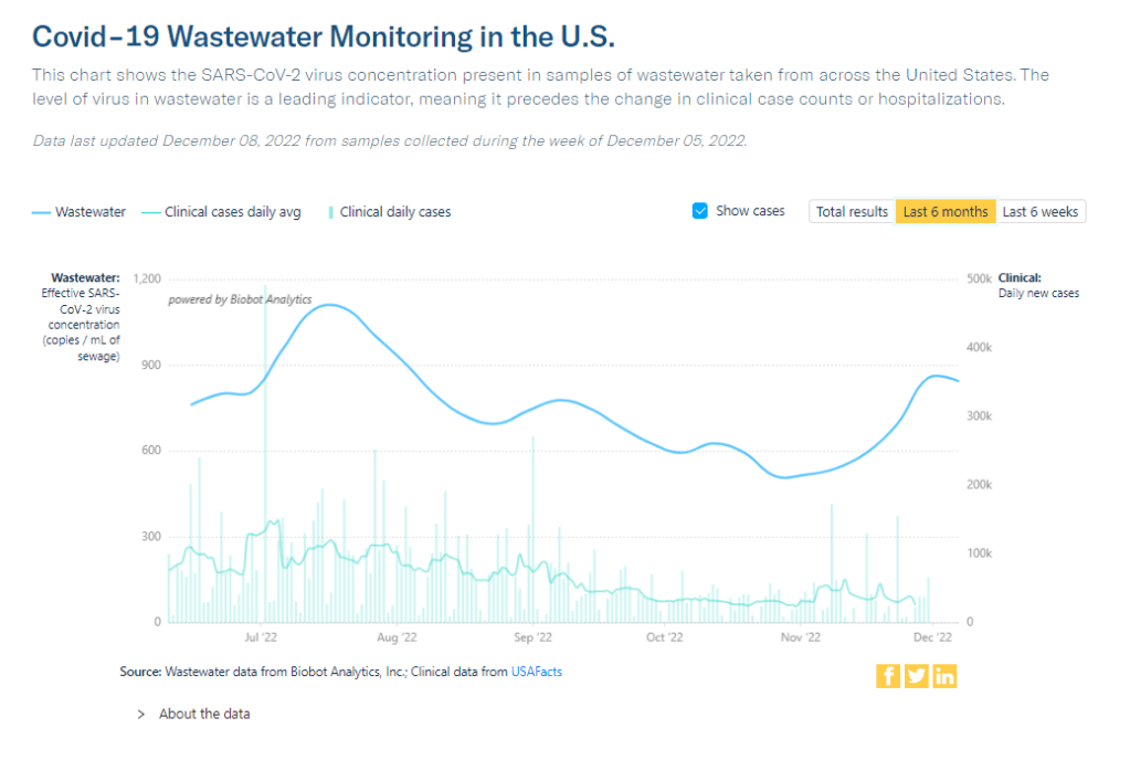
I would love to know if there is any data on what levels of COVID in wastewater equals what risk level—are there any guidelines that could be used to turn masking policies on or off, for example? We know going up is bad and that the data is noisy but, if there’s any information on what concentrations in sewage corresponds to what level of cases I would love to know.
I would love to be able to point you to specific guidelines about matching wastewater levels to cases, but unfortunately this isn’t really available right now. And if it were available, you would likely need to tailor the analysis pretty closely to where you live.
An ongoing challenge with using wastewater surveillance data, as I wrote about for FiveThirtyEight and MuckRock in the spring, is that this type of environmental information is categorically pretty different from traditional case data. When a public health agency provides case numbers, they are adding up results from tests done in hospitals, doctors’ offices, and other healthcare settings. Each test result generally represents one person and can be interpreted with that framework.
But with wastewater data, figuring out exactly what your test results represent can be more complicated. The data generally include people sick with COVID-19 who shed the coronavirus in their waste, but different people might shed different amounts of virus depending on what stage of illness they’re at, the severity of their symptoms, and possibly other factors that scientists are still working to figure out. Environmental factors like a big rainstorm or runoff from nearby agriculture could also interfere with the data. Population shifts, like college students returning to their campus after a break, can cause noise, too.
As a result, public health experts who interpret wastewater data generally need a lot of data—like, a year or more of testing’s worth of data—from a specific location in order to analyze how wastewater trends correlate with case trends. And the data has to be consistent; if your wastewater collection team switches their sample processing methods halfway through the year, that might interrupt the analysis.
A few institutions have figured out the wastewater-to-cases correlation for their communities. For examples, see the section on San Diego in this story and this paper by researchers in Gainesville, Florida. But for most research groups and health departments, it’s still a work in progress.
All of that said, I don’t think this complexity should stop individuals or organizations from using wastewater data to recommend turning mask policies (or other policies) on or off. This surveillance might be less precise, but a sustained increase in coronavirus concentrations in the sewer is still certainly cause for concern and can be used to inform public health guidance.
Q2: Estimating case underreporting
How do you estimate how undercounted COVID testing is? Asking because I work for Whentotest.org—our COVID Risk Quiz assumes that COVID testing is undercounted by 7x, but I believe I’ve seen you estimate that it could be undercounted by as much as 20x. Wondering how you get to that number—we want to keep our Quiz as up to date as possible, and that number is a moving target.
It is definitely a moving target, since COVID-19 testing (especially the lab-based PCR testing that generally contributes to official case numbers) can go up or down depending on people’s access to tests, perceptions of how much transmission is going on, and so many other factors.
That said, I would personally put undercounting in the 10 times to 20 times range for this fall, likely with different levels of undercounting for different locations. I have two sources for the 20 times number: the first is an estimate from the Institute for Health Metrics and Evaluation made in September, suggesting that 4% to 5% of infections in the U.S. were reported at that time. (If 5% of infections are reported, case counts are 20 times higher than reported cases.)
My second source is a paper from epidemiologist Denis Nash and his team at the City University of New York, released as a preprint earlier this fall. The researchers surveyed a representative sample of 3,000 U.S. adults, finding that about 17% of the respondents had Omicron during a two-week period in the summer BA.5 surge. Extrapolating from the survey findings, the researchers estimated that about 44 million people across the country had COVID-19 in this timeframe—compared to 1.8 million reported cases. This estimate suggests reported cases were undercounted by a factor of 24.
Unfortunately, I have to use months-old estimates here because the U.S. does not have a regular data source comparing cases to true infections. The Census and CDC’s Household Pulse Survey comes close to this, as it includes questions about whether survey respondents have recently received a COVID-19 diagnosis; but it doesn’t ask about rapid tests, recent exposure, or other factors needed to determine the true infection rate, so the numbers here are also underestimates.
Personally, I keep a close eye out for survey studies like those done by Nash and his team at CUNY and use those results to inform how I interpret national case data. I’ll make sure to flag any future studies like this for readers.
Q3: Nose-only masking
I follow some masking subs on Reddit and folks periodically suggest to others or refer to hacking masks that only cover their nose (KN95, N95s, etc.) for dental appointments or unavoidable indoor eating scenarios. Assuming they’re successful in creating a proper seal for these “half masks,” would there actually be any scientific backing this is helpful in minimizing risk?
I wasn’t sure how to answer this question, so I shared it on Twitter, tagging a couple of masking and ventilation experts I know.
Overall, the consensus that emerged from my replies is that it could be helpful to wear a mask over one’s nose for short periods of time, but it’s hard to say for sure due to a lack of rigorous research in this area. Behavior also plays a big role in how effective such a mask might be in alleviating risk.
One expert, Devabhaktuni Srikrishna, pointed out that having a sealed filter over one’s nose could reduce the amount of virus that gets inhaled, if the coronavirus is present in the space. (This “inhalation dose” might correlate with one’s chances of infection and/or severity of symptoms if infected, though research is still ongoing on these questions.)
Achieving a sealed filter over the nose is easier said than done, though. You can’t just use a standard mask, since that’s designed for the nose and mouth. One commenter shared a system that he uses, an elastomeric nose mask held in place with a headband. Another suggested using nasal filters designed to block allergens. As far as I know, there hasn’t been any research showing what might be most successful—unlike the extensive research that has gone into showing the value of high-quality face-masks and respirators.
In addition to the discussion of designing a nose-only mask, this reader’s question led to some discussion about the careful behavior needed to use it successfully. One commenter pointed out that, if you’re eating alone, it’s easier to stay focused on breathing patterns than if you’re eating in a group and engaged in conversation. I also appreciated this reply from a Louisiana-based behavioral scientist:
So, to summarize, I’d say that a nose filter could be helpful for situations like a dentist appointment and could be helpful (but trickier) for indoor dining—but it’s hard to say for sure. A much easier conclusion: avoid indoor dining as much as possible during COVID-19 surges like the one we’re in right now.

Leave a comment