As of this week, the CDC has switched to reporting COVID-19 cases and deaths on a weekly basis.
As of this Thursday, the CDC is updating COVID-19 case and death data every week instead of every day. Here are some thoughts on interpreting COVID-19 data in the wake of this change, citing an article I recently wrote for The Atlantic.
To me, the CDC’s shift to weekly updates feels like the end of an era for tracking COVID-19. While I understand the change, considering both our less-complete case information and other data analysis needs for the agency, I can’t help but wish we had a national public health agency with enough resources to continue providing us with frequent, reliable information on this ongoing pandemic. After all, shouldn’t that be the CDC’s job?
The CDC has clearly deprioritized two major metrics (cases and deaths) that used to be the first places people looked to see the pandemic’s impact on their communities. Instead, the agency now points us to hospitalization metrics, variant surveillance, and wastewater—all metrics that are certainly useful, but may be harder for the average user to interpret.
And even the case data we do have are quite unreliable at this point, as PCR tests become less and less accessible compared to rapid tests. Case numbers may be underreported by twenty times or more; it’s difficult to even get a good estimate of how far off the numbers are. Public communications like the CDC’s “Weekly Review” report fail to acknowledge this problem, and the agency does not appear to be making any effort to determine the true infection rates right now.
Through its current data communication choices, the CDC seems to be saying, “If you still care about keeping track of COVID-19, you’re on your own.” Even though we are likely heading for a fall surge and many people need to keep track of this disease in order to keep their communities safe.
In absence of useful information from our public health leaders, it falls on us to survey the best available data sources and help others interpret them. My article in The Atlantic takes on this question, focusing on wastewater surveillance and population surveys as particularly useful sources we should consider right now.
Interpreting wastewater data
Wastewater data, unlike case data, don’t require people to actively go out and get tested: if their public sewer system is getting sampled for COVID-19, they will automatically be included in the data. You can look for wastewater surveillance in your area on Biobot’s dashboard, the CDC’s dashboard, or other state and local dashboards, depending on where you live. (I have a list of state dashboards here.)
But interpreting wastewater data can be pretty different from interpreting case data. Here are a couple of key tips for approaching this source, based on my interview with Biobot president and cofounder Newsha Ghaeli:
Look at “directionality” and “magnitude.” “Directionality” means whether viral levels are going up or down, and “magnitude” means how they compare with earlier points in the pandemic. To quote from the story: “A 10 percent uptick when levels are low is less concerning than a 10 percent uptick when the virus is already spreading widely.”
If you do not have public wastewater data for your county, data from a neighboring county still provides useful info. When we talked, Ghaeli gave the example of a New York City resident looking at data from New Jersey or Connecticut counties neighboring the city: as people from these areas commute into NYC, a surge in one place could quickly drive a surge in the other.
Wastewater data are not a perfect proxy for infections. Scientists are still learning about how to best use this newer surveillance tool. Unlike clinical metrics (like cases), wastewater data can differ based on local environmental factors, and it often takes a long time for researchers to build useful interpretations of their communities. (See my past FiveThirtyEight story for more detail on this.)
These data can’t tell you who is getting sick. To comprehensively answer demographic questions, we need to actively survey people in our communities and ask them about their experiences with COVID-19. (See the story for more about how this works.)
Other interpretation tips
Beyond looking at wastewater data, here are a couple of tips I received from experts for readers seeking to watch their local COVID-19 numbers this fall:
“Look as local as you can,” said Pandemic Prevention Initiative expert Sam Scarpino. In other words, if you can find data for your individual county or even ZIP code, go there.
Consider local events and behavior, Scarpino said. Quoting from the story: “If a popular community event or holiday happened recently, low case numbers might need to be taken with a grain of salt.”
I also wanted to give a quick shout-out here to the People’s CDC, a volunteer science communication and advocacy organization. If you’re looking for more thoughtful analysis of national COVID-19 data, their weekly “weather reports” are a really helpful and accessible source. The organization also provides resources to help people push for more COVID-19 safety measures in their communities.
“People do want layers of protection, they do want to keep themselves in each other safe from COVID,” said Mary Jirmanus Saba, a geographer and volunteer with the People’s CDC whom I interviewed (with a couple of other volunteers) for my story. The weather reports and other similar initiatives help the organization’s followers “see that we really are there for each other,” she said.
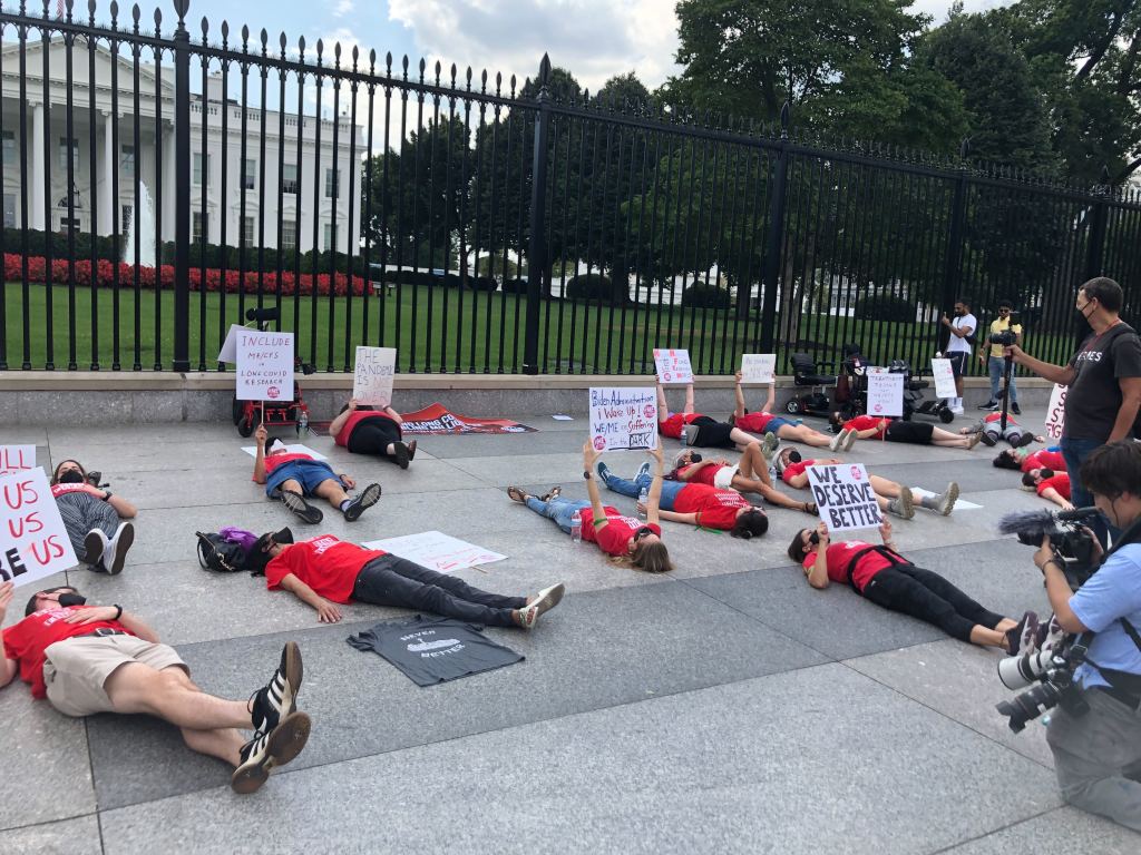
Long COVID and ME/CFS patients protest in front of the White House, telling Biden that the pandemic is not over and demanding action on their conditions. Image courtesy of ME Action.
“The pandemic is over,” Biden said, while walking through the Detroit Auto Show with 60 Minutes correspondent Scott Pelley. “We still have a problem with COVID. We’re still doing a lot of work on it. But the pandemic is over. If you notice, nobody’s wearing masks, everybody seems to be in pretty good shape.”
Most of the debate and dissection of this interview has focused on Biden’s statement that the “pandemic is over.” Is it, actually? (Epidemiologists say no.) Does he have the authority to declare it over? (No, that’s a job for the WHO.) Was his statement just reflecting what most Americans are already thinking? (Depends on who you call “most Americans.”)
See, I think the key part of Biden’s quote here actually comes at the end: “everybody seems to be in pretty good shape.” Seems to be is doing a lot of work here. In the interview, Biden is strolling through the auto show, through groups of unmasked people looking at car exhibits.
He is not actually talking to these bystanders, asking them whether they’ve lost loved ones to COVID-19, lost work during the pandemic, or faced any lingering symptoms after catching the virus themselves. Biden also isn’t considering the people who were excluded from this auto show: the Americans who were left disabled with Long COVID, and those still taking safety precautions due to other health conditions.
Images of the auto show, like those of packed indoor restaurants or maskless stadiums, seem to suggest that, yeah, Americans no longer care about COVID-19. But there are plenty of other images that don’t make it into high-profile media settings like Biden’s interview.
Today, I invite you to consider a few of the images that Biden isn’t seeing. Here are 12 statistics showing how the COVID-19 pandemic continues to have a massive impact on Americans:
At least 400 Americans are dying with COVID-19 every day, about 47,000 deaths total between June and September 2022. Daily death data tend to be underestimates, because it can take weeks to process death certificates (and numbers are often retroactively edited up). But we can still see that hundreds of people are dying each day. As Sarah Zhang points out in The Atlantic, this is several times the threshold experts set in early 2021 for calling the pandemic at an end.
About 25,000 people are currently hospitalized with COVID-19 cases. Yes, many of the people included in this statistic probably entered the hospital for another reason, then tested positive as part of routine screening. But incidental coronavirus infections still put pressure on the hospitals caring for these patients, and can intersect with a wide variety of other health conditions, potentially causing long-term issues for patients.
About 7.6% of adults are currently experiencing some form of Long COVID, as of early August. This estimate, which I pulled from the Census and CDC’s Household Pulse Survey, rises for certain demographics: almost 10% of women, 11% of transgender adults, 11% of adults with less than a high school diploma, and 15% of adults with a disability are currently experiencing Long COVID.
Hundreds of Long COVID and ME/CFS patients protested at the White House and online on Monday. Biden’s statement coincidentally landed the night before a planned protest, in which patient-advocates called for the president to declare a national emergency around Long COVID and ME/CFS. The protest was covered in the New York Times,MedPage Today, the BMJ, and other outlets.
Long COVID and ME patients are at the White House calling for action on these conditions! Chants I've heard on the livestream include: "No treatment, no peace, we won’t ever cease," "Too sick to chant, funding now." #MillionsMissingpic.twitter.com/phJiTzgwzm
19 patients, patient-advocates, and experts testified at a New York City Council hearing about Long COVID and gender on Thursday. Long COVID patients and those with related conditions (like ME/CFS and HIV) talked about dismissals from doctors and inability to return to their pre-COVID lives. They called for more comprehensive medical care and other forms of financial and social support for patients. I covered the hearing for Gothamist/WNYC.
About 2.5 million adults were recently out of work due to a COVID-19 case, either because they were sick themselves or were caring for a sick person. Another 1.6 million adults were out of work due to concern about getting or spreading COVID-19. These statistics come from the most recent iteration of the Household Pulse Survey, conducted from July 27 to August 8, 2022.
About 2.2 million adults were recently laid off or furloughed due to the COVID-19 pandemic. Another one million had their employers go out of business due to the pandemic, and 900,000 had their employers close temporarily due to COVID-19. These data are from the same Household Pulse Survey.
Over 50 million adults experienced symptoms of anxiety for at least half the days in the last two weeks, at the time of the most recent Household Pulse Survey. Almost 40 million adults experienced symptoms of depression for at least half the days in the same two-week period.
Over 80% of Americans still support the federal government providing free COVID-19 vaccines, treatments, and tests to anyone who needs them, according to an Axios-Ipsos poll conducted in early September. A past iteration of that poll, from March 2022, found that 74% of Americans reported they were “likely to wear a mask outside the home if COVID-19 cases surge again in their area.”
About 3% of Americans, or around 12 million people, are immunocompromised and still have reason to take intense COVID-19 precautions. Immunocompromised people have been eligible for extra vaccine doses, but are still more vulnerable to both severe COVID-19 symptoms and Long COVID.
2.5 billion people worldwide still haven’t been vaccinated, according to estimates from Our World in Data. Bloomberg’s vaccine tracker estimates that, at the current pace of first doses administered, it will take another 10 months for just 75% of the global population to have received at least one COVID-19 shot. As long as COVID-19 continues to spread anywhere in the world, new variants can be a threat everywhere.
COVID-19 is still a public health emergency. At the moment, this is true according to both the general definition of this term and official declarations by the federal government. But the latter could change in the coming months, likely leading to more fragmentation in U.S. COVID-19 data.
A reader recently asked me about the federal government’s ability to compile and report COVID-19 data, using our new anonymous Google form. They asked: “Will the CDC at some point stop reporting COVID data even though it may still be circulating, or is it a required, reportable disease?”
It’s difficult to predict what the CDC will do, as we’ve seen in the agency’s many twists and turns throughout the pandemic. That said, my best guess here is that the CDC will always provide COVID-19 data in some form; but the agency could be severely limited in data collection and reporting based on the disease’s federal status.
The CDC’s authority
One crucial thing to understand here is that the CDC does not actually have much power over state and local public health departments. It can issue guidance, request data, distribute funding, and so forth, but it isn’t able to require data collection in many circumstances.
Outside of a public health emergency, CDC has no authority to require states to share data. And even in an emergency, for example, if you look on the COVID Data Tracker, there are systems that have half the states or some of the states. That’s because those were the ones that were willing to share. And that is a very big handicap of doing good modeling and good tracking… Everything you’re trying to measure, for any decision, is better if you measure it in all the states.
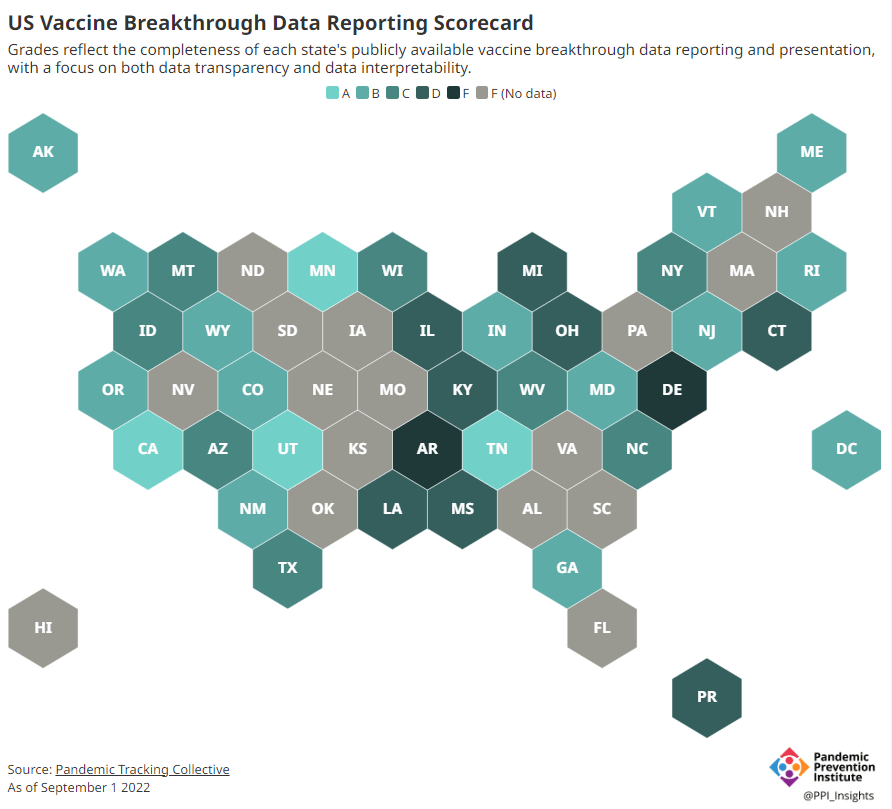
Consider breakthrough cases as one example. According to the Pandemic Prevention Institute’s scorecard for breakthrough data reporting, about half of U.S. states have D or F grades, meaning that they are reporting zero or very limited data on post-vaccination COVID-19 cases. The number of states with failing grades has increased in recent months, as states reduce their COVID-19 data resources. As a result, federal agencies have an incomplete picture of vaccine effectiveness.
Wastewater data is another example. While the CDC is able to compile data from all state and local public health departments with their own wastewater surveillance systems—and can pay Biobot to expand the surveillance network—the agency has no ability to actually require states to track COVID-19 through sewage. This lack of authority contributes to the CDC’s wastewater map still showing many empty spaces in states like Alabama and North Dakota.
During the COVID-19 pandemic, the federal emergency was specifically used to require data collection from state health departments and individual hospitals, POLITICO reported in May. According to POLITICO, the required data includes sources that have become key to our country’s ability to track the pandemic, such as:
PCR test results from state and local health departments;
Hospital capacity information from individual healthcare facilities;
COVID-19 patients admitted to hospitals;
COVID-19 cases, deaths, and vaccination status in nursing homes.
The federal COVID-19 public health emergency is formally controlled by HHS Secretary Xavier Becerra. Becerra most recently renewed the emergency in July, with an expiration date in October. Health experts anticipate that it will be renewed again in October, because HHS has promised to give states a 60-day warning before the emergency expires and there’s been no warning for this fall. That leaves us with a new potential expiration date in January 2023.
CDC officials are seeking to permanently expand the agency’s authority to include this data collection—with a particular priority on hospitalization data. But that hasn’t happened yet, to the best of my knowledge. So, what might happen to our data when the federal emergency ends?
Most likely, metrics that the CDC currently requires from states will become voluntary. As we see right now with breakthrough cases and wastewater data, some states will probably continue reporting while others will not. Our federal data will become much more piecemeal, a patchwork of reporting for important sources such as hospitalizations and lab test results.
It’s important to note here that many states have already ended their own public health emergencies, following a trend that I covered back in February. Many of these states are now devoting fewer resources to free tests, contact tracing, case investigations, public data dashboards, and other data-related efforts than they were in prior phases of the pandemic. New York was the latest state to make such a declaration, with Governor Kathy Hochul letting her emergency powers expire last week.
How the flu gets tracked
COVID-minimizing officials and pundits love to compare “endemic” COVID-19 to the flu. This isn’t a great comparison for many reasons, but I do think it’s helpful to look at how flu is currently tracked in the U.S. in order to get a sense of how COVID-19 may be tracked in the future.
The U.S. does not count every flu case; that kind of precise tracking on a large scale was actually a new innovation for COVID-19. Instead, the CDC relies on surveillance networks that estimate national flu cases based on targeted tracking.
There are about 400 labs nationwide (including public health labs in all 50 states) participating in flu surveillance via the World Health Organization’s global program, processing flu tests and sequencing cases to track viral variants. Meanwhile, about 3,000 outpatient healthcare providers in the U.S. Outpatient Influenza-like Illness Surveillance Network provide the CDC with flu-related electronic health records. You can read more about both surveillance programs here.
The CDC reports data from these surveillance programs on a dashboard called FluView. As you can see, the CDC provides estimates about flu activity by state and by different demographic groups, but the data may not be very granular (eg. no estimates by county or metro area) and are provided with significant time delays.
Other diseases are tracked similarly. For example, the CDC will track new outbreaks of foodborne illnesses like E. coli when they arise but does not attempt to log every infection. When researchers seek to understand the burden of different diseases, they often use hospital or insurance records rather than government data.
One metric that I’d expect to remain unchanged when the COVID-19 emergency ends is deaths: the CDC’s National Center for Health Statistics (NCHS) comprehensively tracks all deaths through its death certificate system. But even provisional data from NCHS are reported with a delay of several weeks, with complete data unavailable for at least a year.
Epidemiologists I’ve interviewed say that we should be inspired by COVID-19 to improve surveillance for other diseases, rather than allowing COVID-19 to fall into the flu model. Wastewater data could help with this; a lot of wastewater researchers (including those at Biobot) are already working on tracking flu and other diseases. But to truly improve surveillance, we need more sustained investment in public health at all levels—and more data collection authority for the CDC and HHS.
On July 26, 2020, I sent out the first COVID-19 Data Dispatch newsletter. In the two years since that day, I have sent newsletters (and published blog posts) every Sunday, with no breaks. I’ve posted from vacations, over holidays, and on days when I was exhausted or approaching burnout.
While this schedule has felt punishing at times, I’m proud of it. The coronavirus doesn’t care about holiday schedules, after all, and I enjoy maintaining regular updates for the readers relying on this publication as a key source of COVID-19 news. (Also, not many writers can say they’re more consistent than the CDC.)
But even I have to admit that two years without breaks is a long time. When I’m scrambling to send out an issue every Sunday, it’s difficult to reflect on key questions, like, “Is my current posting format meeting readers’ needs?” and, “What does helpful COVID-19 coverage look like right now?” I wouldn’t call myself burned out, but at a few points in the last few months, I have felt like I’m operating on autopilot: writing around 3,000 words every weekend because it’s my routine, without evaluating how I might improve that routine.
This is a rather longwinded way of announcing that I’m about to take a break from the COVID-19 Data Dispatch. August 2022 will be a brief hiatus: over the next four weeks, I won’t write any newsletters or blog posts. I’m also taking this month off of freelancing and working fewer hours at my part-time job, making it basically the longest vacation I’ve had since graduating college.
I plan to use this time to reflect on this project’s future, including potential format and content changes that might make it easier for me to maintain long-term. I’m also going to reflect on some potential CDD side projects—more resources, events, even a podcast idea?—that I haven’t had the bandwidth to pursue while producing weekly issues.
Readers: if you have any feedback for me, please reach out! I would love to hear from you about the topics and formats you’d find helpful at this point in the pandemic.
I also wanted to share some tips for keeping track of COVID-19 data while this publication is on a break, as I’m very aware that we are still in an active surge across the country. (This post is also responding to a reader question that I received from a fellow data reporter last week, after I announced this upcoming break in the newsletter.)
Look at multiple data sources or metrics.
COVID-19 case data, once our best window into the virus’ spread, are becoming much less reliable thanks to a decline in PCR testing. Other singular metrics have their own flaws: hospitalization numbers often lump together patients admitted for severe COVID-19 symptoms with those who tested positive while admitted for other reasons; wastewater data are unevenly reported across the country and can be hard to interpret; death data lag significantly behind transmission trends, and so on.
As a result, it’s important to check a few different metrics rather than relying on just one. For example, you might notice that my “National numbers” posts these days typically cite cases, hospital admissions, and wastewater together to identify national trends.
Similarly, if I were trying to identify what’s going on in New York City, where I live, I would likely look at: case and test positivity data from the city health department, cases in public schools (which include positive at-home test results) compiled by the department of education, and wastewater data from Biobot, focusing on the northeast region and counties in the greater NYC area.
Case rates are still useful, if we acknowledge that they are undercounts.
Hospitalization rates are useful, particularly new hospital admissions.
The CDC’s old transmission level guidance is still actually pretty helpful for guiding health policies, especially for vulnerable populations.
Look at wastewater surveillance, if it’s available in your area.
The COVID Cast dashboard, from Carnegie Mellon University’s Delphi Group, is another helpful source.
Look at multi-week trends.
Just as you don’t want to rely on a single metric, you shouldn’t look at only one week of data. (Looking at just one or two days at a time is an even worse idea.) This has always been a good rule for interpreting COVID-19 numbers, but it’s even more true now, as many public health departments have fewer resources devoted to tracking COVID-19—and may take more time to compile data for a given day or week.
For example, the New York City health department’s daily updates to its COVID-19 dashboard frequently include changes to case numbers for prior days, in addition to new data for the past day. Experts call this “backdating”: in a data update on a Friday, new cases might be dated back to other days earlier in the week, changing broader trends.
Keep in mind data reporting schedules.
You especially need to be wary of backdating when there’s a holiday or some other interruption in reporting. For this reason, it’s important to keep track of reporting schedules: know when a health department is and is not updating their data, and interpret the data accordingly.
The biggest example of this is that most state and local health departments—and the CDC itself—are no longer updating COVID-19 data on weekends. In most places, every Saturday and Sunday is now essentially a mini-holiday, with numbers from those days incorporated into backdated updates on Mondays. (And then edited in further backdated updates on later weekdays.)
When I volunteered at the COVID Tracking Project, we regularly observed lower COVID-19 numbers on weekends, followed by increases towards the middle of the week when states “caught up” on cases that they didn’t report over the weekend. You can read more about this trend here; I suspect it has only become more pronounced as more places take weekends off.
Acknowledge uncertainty in the data.
This is the most important recommendation I can give you. Every COVID-19 number you see comes with a margin of error. Sometimes, we can approximate that margin of error: for example, we can estimate how far official COVID-19 death statistics might be off by looking at excess deaths. Sometimes, we really can’t: estimates of how far official case numbers might be off range from a factor of three to a factor of thirty.
As a result, it’s often helpful to look at trends in the data, rather than trying to approximate exactly how many people in your town or county have COVID-19 right now. Is transmission trending up or down? Are you at high risk of encountering the coronavirus if you go to a large gathering? These questions can still be answered, but the answers will never be as precise as we’d like.
Follow leaders from your local healthcare system.
To augment official data sources, I often find it helpful to see what people in healthcare settings are saying about COVID-19 trends. Experts like Dr. Craig Spencer (who works in an ER in NYC) and Dr. Bob Wachter (who leads the University of California San Francisco’s department of medicine) frequently share updates about what they’re seeing in their practices. This kind of anecdotal evidence can help back up trends in case or hospitalization data.
In a similar vein, you can look to essential workers in your community, like teachers and food service workers, as early indicators for transmission trends. If NYC teachers and parents are talking about more cases in their schools, for example, I know COVID-19 spread is increasing—because schools are often sources for transmission in the broader community.
Keep your goals in mind.
As you monitor COVID-19 numbers, it’s important to remember why this information is valuable. What are you using the numbers for? Are you making choices about when to put a mask on, or when to rapid test before a gathering? Are there high-risk people in your family or your broader social network whom you’re trying to protect? Or, if you’re a journalist, what questions are you trying to help your readers answer?
Keeping track of COVID-19 data and news can feel like a large burden, especially when it seems like so many people have entirely forgotten about the pandemic. I always find it helpful to remember why I do this: to stay informed about this ongoing health crisis, and to keep others in my community safe.
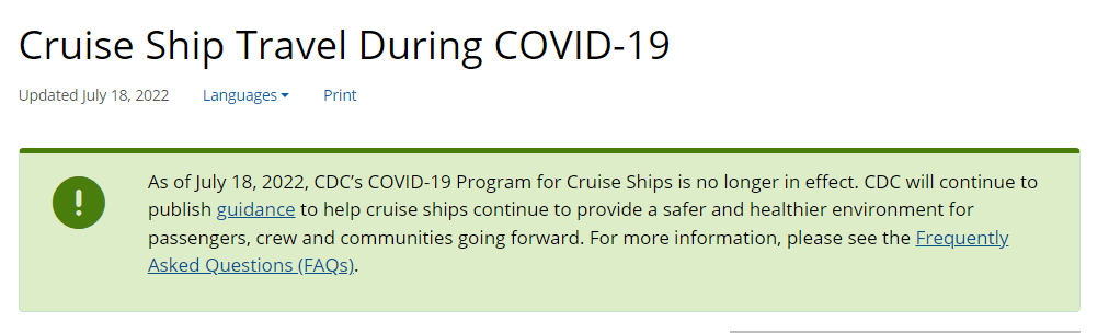
The CDC is no longer publishing data about COVID-19 outbreaks on cruise ships.
Last week, 93 out of 94 cruise ships reporting COVID-19 data to the CDC had active outbreaks, meeting the agency’s threshold of cases in at least 0.3% of passengers and crew.
As of July 18, 2022, CDC’s COVID-19 Program for Cruise Ships is no longer in effect. CDC will continue to publish guidance to help cruise ships continue to provide a safer and healthier environment for passengers, crew and communities going forward.
This seems a bit suspicious, considering that the U.S. (including cruise ships) is in the middle of a COVID-19 surge driven by the highly transmissible Omicron BA.5 variant. In a statement to the Washington Post, CDC spokesperson Kristen Nordlund said: “CDC has determined that the cruise industry has access to the necessary tools… to prevent and mitigate COVID-19 on board.”
But there have been no substantial changes to COVID-19 safety measures on cruise ships that might merit this change, according to the Post; in fact, cruises have only become more lenient since the beginning of 2022. Some cruise lines have stopped requiring tests before passengers board a ship.
Cruise lines will continue to report COVID-19 data to the CDC, but the process is voluntary. And without public data from cruise ships, passengers trying to decide whether they should proceed with a trip will need to call a cruise line directly to ask about potential outbreaks.
I’ve heard some commentators say that the end of the mask mandate on airplanes in April was a turning point in U.S. attitudes towards the pandemic. The end of cruise ship data feels like another potential turning point, demonstrating how the CDC is slowly pulling resources out of its COVID-19 response—even as the country faces a dangerous surge.
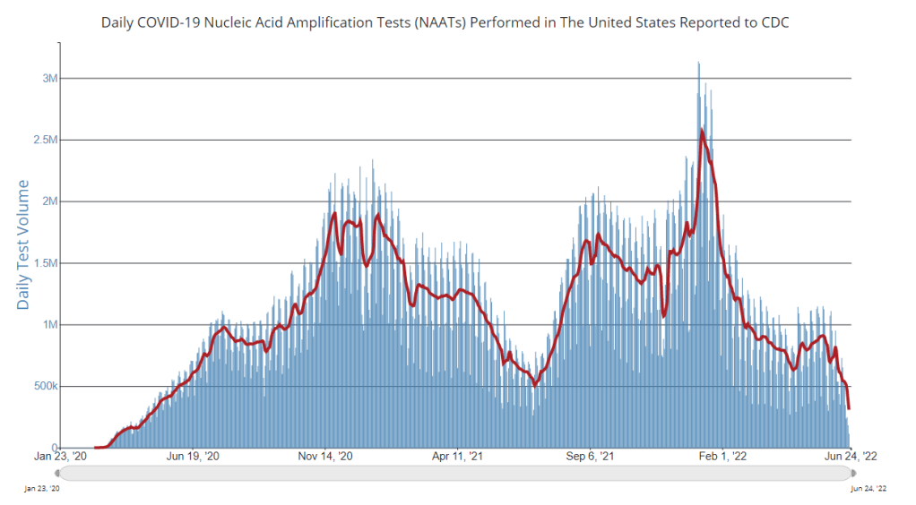
PCR testing has greatly declined in recent months; we need new data sources to help replace the information we got from it. Chart via the CDC.
Last week, I received a question from my grandmother. She had just read my TIME story about BA.4 and BA.5, and was feeling pessimistic about the future. “Do you think we’ll ever get control of this pandemic?” she asked.
This is a complicated question. And it’s one that I’ve been reflecting on as well, as I approach the two-year anniversary of the COVID-19 Data Dispatch and consider how this publication might shift to meet the current phase of the pandemic. I am not an infectious disease or public health expert, but I wanted to share a few thoughts on this; to stay in my data lane, I’m focusing on data that could help the U.S. better manage COVID-19.
The coronavirus is going to continue mutating, evolving past immune system defenses built by prior infection and vaccination. Scientists will need to continue updating vaccines and treatments to match the virus, or we’ll need a next-generation vaccine that can protect against all coronavirus variants.
Candidates for such a vaccine, called a “pan-coronavirus vaccine,” are under development by the U.S. Army and at several other academic labs and pharmaceutical companies. But until a pan-coronavirus vaccine becomes available, we’ll need to continue tracking new variants and the surges they produce. We also need to better track Long COVID, a condition that our current vaccines do not protect well against.
Eventually, COVID-19 will likely be just another respiratory virus that we watch out for during colder months and large indoor gatherings, broadly considered “endemic” by scientists. But it’s important to note—as Dr. Ellie Murray did in her excellent Twitter thread about how pandemics end—that endemicity does not mean we stop tracking COVID-19. In fact, thousands of people work to monitor and respond to another endemic virus, the flu.
Every time I tweet about this I get people in mentions saying “but we don’t take precautions for the flu!”
Those people are 100% WRONG!
Thousands of people work daily to monitor, prepare for, & respond to fluctuations in flu number and in the flu virus itself! It’s a HUGE task!
With that in mind, here are nine categories of data that could help manage the pandemic:
More comprehensive wastewater surveillance: As I’ve written here and at FiveThirtyEight, sewers can offer a lot of COVID-19 information through a pipeline that’s unbiased and does not depend on testing access. But wastewater monitoring continues to be spotty across the country, as the surveillance can be challenging to set up—and more challenging for public health officials to act on. Also, current monitoring methods exclude those 21 million households that are not connected to public sewers. As wastewater surveillance expands, we will better be able to pinpoint new surges right as they’re starting.
Variant surveillance from wastewater: Most of the U.S.’s data on circulating variants currently comes from a selection of PCR test samples that are run through genomic sequencing tests. But this process is expensive, and the pool of samples is dwindling as more people use at-home rapid tests rather than PCR. It could be cheaper and more comprehensive to sequence samples from wastewater instead, Marc Johnson explained to me recently. This is another important aspect of expanding our wastewater monitoring.
Testing random samples: Another way to make up for the data lost by less popular PCR testing is conducting surveillance tests on random samples of people, either in the U.S. overall or in specific cities and states. This type of testing would provide us with more information on who is getting sick, allowing public health departments to respond accordingly. The U.K.’s Office for National Statistics conducts regular surveys like this, which could serve as a model for the U.S.
More demographic data: Related to random sample testing: the U.S. COVID-19 response still needs more information on who is most impacted by the pandemic, as well as who needs better access to vaccines and treatments. Random sampling and surveys, as well as demographic data connected to distributions of treatments like Paxlovid, could help address this need.
Vaccine effectiveness data: I have written a lot about how the U.S. does not have good data on how well our COVID-19 vaccines work, thanks to our fractured public health system. This lack of data makes it difficult for us to identify when vaccines need to be updated, or who needs another round of booster shots. Connecting more vaccination databases to data recording cases, hospitalizations, and Long COVID would better inform decision-making about boosters.
Air quality monitoring: Another type of data collection to better inform decision-making is tracking carbon dioxide and other pollutants in the air. These metrics can show how well-ventilated (or poorly-ventilated) a space is, providing information about whether further upgrades or layers of safety measures are needed. For example, I’ve seen experts bring air monitors on planes, citing poor-quality air as a reason to continue wearing a mask. Similarly, the Boston public school district has installed air monitors throughout its buildings and publishes the data on a public dashboard.
Tracking animal reservoirs: One potential source for new coronavirus variants is that the virus can jump from humans into animals, mutate in an animal population, and then jump back into humans. This has happened in the U.S. at least once: a strain from minks infected people in Michigan last year. But the U.S. is not requiring testing or any mandatory tracking of COVID-19 cases in animals that we know are susceptible to COVID-19. Better surveillance in this area could help us catch variants.
Better Long COVID surveillance: For me personally, knowledge of Long COVID is a big reason why I remain as cautious about COVID-19 as I am. Long COVID patients and advocates often say that if more people understood the ramifications of this long-term condition, they might be more motivated to take precautions; I think better prevalence data would help a lot with this. (The Census and CDC just made great strides in this area; more on that later in the issue.) Similarly, better data on how the condition impacts people would help in developing treatments—which will be crucial for getting the pandemic under control.
More accurate death certificates: The true toll of the pandemic goes beyond official COVID-19 deaths, as the Documenting COVID-19 project has discussed at length in our Uncounted investigation. If we had a better accounting of everyone whose deaths were tied to COVID-19, directly or indirectly, that could be another motivator for people to continue taking safety precautions and protecting their communities.
If you are working to improve data collection in any of these areas—or if you know a project that is—please reach out! These are all topics that I would love to report on further in the coming months.
In April, the CDC launched a new center called the Center for Forecasting and Outbreak Analytics (or CFA). The new center aims to develop models of COVID-19 and other infectious diseases, while also helping public health agencies and individual Americans act on the information. One of CFA’s lead scientists compared it to the National Weather Service.
COVID-19 case data are becoming increasingly unreliable as PCR testing is less accessible and more people use at-home tests;
Hospitalization data are more reliable, but lag behind actual infections and may soon be unavailable in their current, comprehensive format;
Wastewater surveillance and other promising sources are not yet ready to replace clinical datasets;
A slow hiring process, as the center aims to bring on 100 scientists and communicators;
The CDC’s limited authority over state and local health agencies, and over the public.
At the COVID-19 Data Dispatch today, I’m sharing one of the interviews I did for the FiveThirtyEight story. I talked to Jason Salemi, an epidemiologist at the University of South Florida College of Public Health, whom you may know from his excellent dashboard and Twitter threads providing detailed COVID-19 updates.
While Salemi isn’t focused specifically on forecasting, he has a lot of insight about interpreting COVID-19 data and using the data for public health decisions. And I think he shares my frustration about the lack of safety measures that are being implemented across the U.S. at this dangerous point in the pandemic.
For context, this interview took place about one month ago, while BA.2/BA.2.12.1 were driving a surge in the Northeast but hadn’t quite hit other parts of the country yet. This interview has been lightly edited and condensed for clarity.
Betsy Ladyzhets: I wanted to start by asking, what do you see as the current state of trying to keep track of COVID in the United States? Like, what are some of the metrics that you’re looking at right now? What are some challenges that you’re facing as we deal with case numbers becoming less reliable?
Jason Salemi: Definitely the case numbers issue. Throughout the entire pandemic, we all know that the case numbers that we learn about when somebody actually tests positive and that information gets recorded somewhere, reported to a State Department of Health and ultimately to the CDC, that’s always underestimated the true number of infections that’s been circulating in the population. Obviously, very early in the pandemic, that was really, really bad—we were mostly picking up people as they were getting sick and landing in the hospital. But as testing expanded, obviously, we did a much better job of being able to gauge what was happening with true infections by relying on the reported case numbers.
However, during Omicron, and especially with the increased use of at-home testing—a lot of those at-home tests, if the person tested positive, were not making their way into a system that would actually get translated into the officially reported numbers. And negative at-home test results—those are definitely not making their way to public health agencies. I think in some jurisdictions, you were finding that 30%, 40% of all testing was actually antigen testing, and a significant portion of those were the at-home antigen test.
More recently, I think the official numbers that we hear about on a daily basis in terms of official COVID-19 cases, is becoming an increased undercount of the true number of infections that are circulating. Which is pretty striking, considering how much we’ve seen the numbers go up in the past few weeks. So, relying on officially reported cases does mean a lot less. But I still do believe that if you’re looking at—not necessarily where the numbers are exactly, but the trends in the numbers, how those numbers are changing over time—you can at least get a good feel for whether or not things are getting better or worse, even by using the COVID-19 case numbers.
Now, when you supplement that with things like wastewater numbers, data that are not biased by people taking advantage of testing or how they test, the wastewater numbers are maybe a better gauge for truer trends in the amount of viral spread. But again, even with wastewater numbers, two big things about those: number one is, it’s certainly not available, at least not that I can tell, for a lot of jurisdictions throughout the United States… It’s not available consistently across the country.
And number two, there’s nothing in those wastewater numbers where you actually can gauge: okay, this is the actual level of infection. What it helps us to do is, it’s a leading-edge indicator, where early on, we can say, “Oh, wow, we see an increase, a pretty pronounced increase in a particular area over time.” And hopefully, if we were doing things proactively, we could use those data to then implement some sort of concerted mitigation. So, this issue has become more of a challenge. But in many communities, we still can rely on how case numbers are changing over time to loosely gauge transmission rates.
Then, of course, a lot of people say, “It’s all about the hospitalization data, let’s utilize that.” Although I’d always love more metrics included in that [hospitalization] data set, it is something that, for some time now, we actually have consistently measured, at the national level, for every single state. You can get down to the hospital level, in some cases, and even by age group. We can have a decent understanding of how many people are being hospitalized with COVID 19. The nice thing about that is the consistency, and the fact that this [hospitalization dataset] is available everywhere, and we therefore have a decent resource that is capable of picking up indicators of more severe illness.
But there are a lot of problems with the hospitalization data: namely, it’s a lagging indicator. Ultimately, if we were to rely exclusively on COVID-19 hospitalization rates and hospital capacity issues—those indicators lag new infections, often by five to seven days, at least. So, by the time we see those particular metrics rise, we will have lost valuable time to prevent morbidity and mortality. That’s the big [problem].
The other thing is, there’s a lot of legitimacy to when people say, “Well, if a person went to the hospital for a non-COVID-19 related issue, and they just happened to test positive, they may not have been hospitalized because of COVID-19.” I think most are using the term “incidental.” Again, the numbers are not perfect. And when community transmission is as pronounced as it has been during many phases of Omicron, I think we do have a lot of situations where a lot of people are not being hospitalized because of COVID-19. But they are testing positive.
For example, Jackson Health System in Florida was Tweeting out every day during the Omicron phase. And they would say—giving hypothetical numbers here—“We’ve got 250 people who are hospitalized, and that are positive for COVID-19. Of those 250 people, 51% were hospitalized for non-COVID-related reasons.” Some areas would give you more specifics, they would also break down by vaccinated versus unvaccinated. You get a lot of more rich, detailed data from some areas, but obviously, that’s not consistent across the country. In fact, I think it’s pretty rare.
BL: Yeah, that point about hospitalizations being a lagging indicator is definitely something I want to highlight the story. And it seems very complicated, because I have heard from a couple of the modeling experts I’ve talked to that if you look at something like hospital admissions, specifically, that is less lagging. But still, overall, if you think about, like you were saying, trying to prevent more people from getting sick—even by the time you just see more hospital admissions, that’s still bad. You’ve still lost your chance to put in new mask measures, or whatever the case may be.
JS: Oh, absolutely. And, you know, if we really were in a state right now, where getting infected really did no damage to people, it never caused any severe illness, we would obviously care less about transmission levels. Although you could always use the argument that the more we let COVID-19 circulate, the more likely it is that new variants will emerge with potentially more dangerous characteristics. So, even if it wasn’t causing a lot of severe illness, you’ve always got that aspect of it.
But we are certainly not yet at a stage in which we can say [getting infected does no damage]—even though for the average individual Omicron is less severe when we compare it to something like Delta. But we paid a steep price in many areas in the United States to get the infection-acquired immunity and vaccine-acquired immunity that seems to be blunting the effects of Omicron. Right now, that’s why we’re not seeing the rise in hospitalization rates as steep as the rise in case rates.
But we are still seeing people getting hospitalized, an increasing number of people over the past couple of months. We’re not yet in a position where COVID-19 is not causing any damage. And we’re largely ignoring things like Long COVID. Just because somebody doesn’t get hospitalized, that doesn’t mean that [the virus is] still not causing a decrease in the quality of life for many people, and a decreased quality of life that can linger for some time.
BL: Yeah, definitely. And then, another issue with hospitalization data that I wanted to ask you about, because I know you’ve looked at this, is the fact that if you’re using these county risk levels, or community levels, whatever the CDC is calling them—not every county has a hospital. So really, this is data at a somewhat larger regional level. I’m wondering if you could explain why this is an important distinction.
JS: Yeah. And you know, this is not at all a criticism, this is kind-of the nature of the beast, so to speak. There are a lot of communities where—I’ll use Florida, because I’m most familiar with Florida, as an example. We have got a major health care system in Alachua County, which is really not a big county in Florida, not even in the top 20 largest counties. But it is a major area where a lot of people from surrounding smaller counties, like a nine- or ten-county catchment area, if they were to get really sick, that’s where they’re most likely going for treatment. And so, if you have a metric that is based on hospitalization rates, and you don’t have a hospital, obviously, you can no longer really provide a county-level indicator. It has to be more regional. And so you see a lot of variation in how the CDC has to now go from the county level to what they call health services areas.
These [health service areas] are established groupings. In these regions, the overwhelming majority of people in these locations are going to a hospital in the broader health service area. And so it’s confusing, I think, to people: with this newer CDC metric, they wonder, “How is it that there’s no hospital in my county or the county next to me, yet you’re giving me a county-level risk measure that is supposed to be based primarily on hospitalization data?”
And again, I think, some of the nuances of the metric get lost on people… Hospitalization data comes from a broader region [than cases], and there’s a lot of variation. There are some counties that are standalone, like Manatee County in Florida, so there is no health service area, it’s just one county for all measures. But there are some others where more than 15 counties that feed into that health service area. So again, for some people in some communities, I can understand where it’s just confusing and frustrating as to, “What does this risk level really mean, for me and the people that live near me, since the catchment region is so much larger?” This is not a right or a wrong, I understand why CDC does it the way that they do it if they’re trying to get a hospitalization-based measure. But it’s just challenging for people to digest.
BL: Yeah, it’s challenging on that communications front. With the previous transmission levels, you could just kind-of look at the case rate and the positivity rate and be like, “Okay, I get where this is coming from.” But yeah, now it’s a little trickier. Another thing on this topic: I saw a report from POLITICO this morning that is suggesting, basically, if the National Public Health Emergency gets ended this summer, then the CDC might lose its ability to require states or hospitals to actually report the hospitalization data that is basically our best source right now. So, what would the implications be if that happens in a few months?
JS: I’d say pretty significant implications. Look, I’ve tried to give credit where credit is due, like the gains made with improving the federal hospitalization data. I’ve also been a critic when I feel as though we are missing key data sources or data elements. An example is the hospitalization data not having race and ethnicity information, I feel like that’s a big component that would be meaningful.
But even with its limitations, the hospitalization data have been a very, very, very important tool for us to be able to report what’s happening in communities. And obviously, nobody wants to fly blind as it pertains to the pandemic. So if we don’t have uniform reporting from all of these states and jurisdictions, then we have to rely on the willingness of leaders at each state or community level to make similar information available, and to report that information in a timely and consistent manner.
Right now, we are fortunate that we continue to get the hospitalization data updated on a daily basis. And so yeah, that would obviously be a big loss if it were—it’s one thing to not have it required. But if states chose not to report that information, which certainly some states would choose not to… it would be a big loss, depending on what states choose to do to keep the population informed.
Because, to be honest, when we get this national data, it’s a gut reaction that we want to compare states on everything—on death rates, on case rates, on hospitalization rates. To me, this can be a huge mistake. One of the obvious reasons that everybody talks about is age differences, right? Some states have a much higher percentage of older people. But it’s not just age that makes state comparisons difficult. It’s weather, and racial and ethnic distribution, and the job industries in which people can work, population density. So, I don’t really care too much about national-level data being used primarily to make state comparisons and inferences that can be misguided.
But to have consistently reported information across the country, again, is important for us to be able to make more responsible decisions even at the local level. I would hope if that happens [losing the national dataset], we would still have states and cities and counties and communities and all these different geospatial areas continuing to report, collect, and make available to the public meaningful information in a timely manner so we can make responsible decisions.
BL: Yeah, that makes sense. And I know that question of authority and like, what can and can’t you require the states to do, is a large issue for the CDC. I was able to talk to Mark Lipsitch yesterday, he’s one of the scientists who’s working on this new forecasting center. And one challenge he mentioned to me is that the CDC really doesn’t have the authority that it would like to in terms of requiring data reporting. They can’t require every state to start doing wastewater surveillance, they can’t require every state to report vaccine effectiveness data or breakthrough cases. And to me, that just seems like a massive hurdle that they face in trying to do this kind of long-term improvement of infectious disease forecasting.
JS: Yeah—and it’s not just the ability, it’s also having the will. I’ve collaborated with some truly amazing scientists from the CDC for a very long time on a myriad of different initiatives, and I have little doubt that they will compile a team of experts that can analyze meaningful metrics to generate what I imagine will be a wealth of data on where we’re going in the pandemic. But it’s not just about analytic proficiency. I did read on their [CFA’s] site that their stated goal is to enable timely, effective decision-making to improve outbreak response. But how are we going to utilize those data to make recommendations? What outcomes are they going to emphasize? What communities are we thinking about when we make those recommendations?
A lot of people talk about the measures we use, and which ones are best, and how we collect the data, and the validity, and the sophistication of the approaches that we use to either nowcast or forecast into the future. But to me, it’s also the way in which we operationalize those measures for public health recommendations. That’s where a lot of the talk is now about the measures being utilized by CDC. So whether it’s their four-level community transmission measure, or that newer three-level measure that’s based mainly on hospitalization data—how we’re using that to make recommendations, it says something about what the agencies who establish those boundaries are willing to accept.
For example, I was just looking at some data again, when I did that thread this morning. The highest level on the community transmission metric, that used to indicate 100 cases or more per 100,000 people over the most recent seven-day window. Right now, based on the data that I just ran, we’ve got 105 counties in the United States with a population of at least 250,000—not just small counties, but large ones—that have a low community level [the CDC’s more recent metrics], the lowest possible, but they have a transmission level that is higher than that 100 per 100,000 threshold.
And more importantly, we’ve got 28 counties—again, with a population of 250,000 or more—that are classified as medium level. That is a level with no recommendations for mask-wearing in public indoor settings. And those 28 counties have a case rate that is more than triple the threshold for high transmission, that’s 300 per 100,000, over the past seven days. You expect that medium level to change to high in the not-to-distant future for many of these areas.
So again, it’s one thing to collect the metrics and have skilled analysis. But what we do with those measures and that analysis, is just as meaningful. And what does it mean, if we have an area that has really pronounced transmission—and we know in the past, that pronounced transmission means that the virus is going to be exceedingly good at finding vulnerable populations—and we’re not having any meaningful population-based recommendations…
When I looked, some of these counties were at like 400 per 100,000 [cases in a week], four times the threshold for the high transmission level [under the old CDC guidance], and they’re still not at a level where we’re supporting or recommending mask-wearing in public indoor settings. That’s pretty shocking. And I think that’s why anecdotally, now, even in my area, I’m just hearing about more and more people daily, that are not able to come to work. A lot of people are getting infected. And you’re seeing that in the rising numbers.
BL: Absolutely. I mean, isn’t the threshold for moving from low to medium under the new community levels 200 new cases per 100,000 [per week, regardless of hospitalization numbers]?
JS: Yeah, right. So even if you had no rise in hospitalizations, you can have a progression to the medium level. But that is now twice what the highest transmission threshold used to be. And again, I’m looking at counties that are in that medium level that now have almost twice even that newer threshold.
We’re not yet in a situation where COVID is not causing any severe illness whatsoever. We’re ignoring a lot of the ramifications of Long COVID, we’re ignoring the fact that, when community spread has gotten so pronounced, you tend to have the virus easily, efficiently finding the most vulnerable people in those communities and still inflicting damage.
I just feel like we’re missing an opportunity. We’re not talking about shutdowns, we’re talking about simple measures that we can put in place and recommend to people to try and balance having, normal living with putting reasonable but important precautions in place. Because that ultimately will prevent a lot of morbidity and mortality. And I feel like that’s maybe the big missed opportunity right now.
So, I’d be excited to see a new forecasting center come out of the CDC. They are very adept scientists. But it’s ultimately, what do we do? What do we do with the data that emerges out of that center? And what recommendations, simple recommendations, do we end up giving to the public based on those analyses?
BL: I totally agree. One of the new center’s focuses is that they want to hire a bunch of science communicators to think about these things. But still, I guess I’m a little skeptical about how much they’re gonna really be able to have an impact here, when we’re already at such a polarized position in the pandemic.
JS: Yeah, it’s not that any of this is easy. No matter what you do, you’re going to upset a whole lot of people nowadays. I speak strictly from a scientist’s perspective. And I really do get all sides of this equation, like the businesses and the very real toll that the pandemic has taken on people. And so it is, no matter what you do, there is a balance that you have to achieve.
But when I start to see—again, I’m going more from what has transpired specifically in Florida. And a lot of the talk this time last year, after we had the availability of vaccines, things were looking great for Florida. Numbers were really low. And that was pretty much throughout the United States, we had the vaccines, though we still heard a lot about protecting the most vulnerable, the oldest in our communities. And even as the cases started to rise, during Delta, it was like, well, just protect the vulnerable.
But again, when community transmission gets that pronounced, the virus will continue to find the most vulnerable. And it ended up inflicting by far the largest death toll in Florida than we’ve had at any point in the pandemic, after vaccines were available for a long period of time. And that included a significant percentage of people who were not seniors. So, it’s tough, but still, people’s livelihood and lives are on the line when we’re talking about COVID.
Last week, I shared a new page from the Department of Health and Human Services (HHS), reporting statistics on COVID-19 therapeutic distribution in the U.S. The new dataset is a helpful step, but it falls far short of the information we actually need to examine who has access to COVID-19 treatments (particularly Paxlovid) and address potential health equity issues.
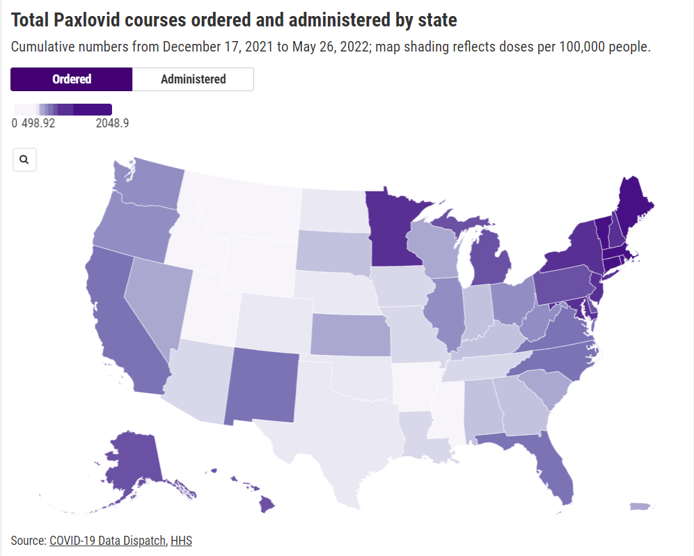
The HHS dataset includes total counts of COVID-19 drugs ordered and administered in the U.S., both nationally and by state. It also includes weekly numbers of the doses available for health providers to order from the federal government (which the HHS calls “thresholds”), over the last five weeks; again, these are available nationally and by state.
As most of the monoclonal antibodies developed for earlier variants do not provide much protection against Omicron, the majority of treatments used in the country last month were antiviral drugs Paxlovid (made by Pfizer) and Molnupiravir (made by Merck).
Paxlovid is the most effective of the two, and the most in-demand. In recent weeks, some patients have reported difficulties with accessing this antiviral as BA.2 drives rising cases across the country. For instance, one COVID-19 Data Dispatch reader wrote to me last week to share that a family member who should’ve been eligible for Paxlovid had his prescription denied, as his pharmacy said the drug was in “limited supply.”
In the first Omicron surge, during the winter, Paxlovid definitely was in limited supply. Then, as that surge waned, supplies improved: a Washington Post article last month reported that the federal government had plenty of doses going unused, and health leaders like COVID-19 coordinator Ashish Jha wanted to raise awareness of the antiviral with providers and patients.
Now, as BA.2 and its subvariants drive a new surge, it’s unclear whether there are still plenty of Paxlovid doses for anyone who might need them—or whether the doses must once again be rationed for only the most vulnerable patients. If the latter is true, even if it’s true only in some states or counties hardest-hit by the Omicron variants, it’s a problem: as the U.S. seems completely unwilling to put in new safety measures, Paxlovid is an important tool to at least reduce severe disease and death. Without it, high-risk people are in an even worse position.
As a data journalist, I would love to investigate this problem by digging into federal data to see where Paxlovid is getting used, and where there may be gaps. But the existing data are pretty sparse: the HHS has published only limited national and state-level data, with the only numbers on doses actually ordered and administered being cumulative (i.e. totals over a five-month period). There’s no information on how Paxlovid prescriptions have changed in different states or counties over time, or of whether the drug is actually reaching vulnerable people who need it.
KHN’s Hannah Recht explained why this data gap is a problem for health providers prescribing Paxlovid, in an article earlier in May:
Los Angeles County’s Department of Public Health has worked to ensure its 10 million residents, especially the most vulnerable, have access to treatment. When Paxlovid supply was limited in the winter, officials there made sure that pharmacies in hard-hit communities were well stocked, according to Dr. Seira Kurian, a regional health officer in the department. In April, the county launched its own telehealth service to assess residents for treatment free of charge, a model that avoids many of the hurdles that make treatment at for-profit pharmacy-based clinics difficult for uninsured, rural, or disabled patients to use.
But without federal data, they don’t know how many county residents have gotten the pills. Real-time data would show whether a neighborhood is filling prescriptions as expected during a surge, or which communities public health workers should target for educational campaigns.
Yasmeen Abutaleb’s article in the Washington Post (linked above) also discusses the need for data:
Other experts welcomed the administration’s efforts, especially as cases rise, but said simply boosting the supply wasn’t enough, noting that inequities persist in who has access to Paxlovid. People without health insurance and those who live far away from medical providers or pharmacies are among those at highest risk from covid and face some of the highest hurdles to receiving effective treatment, said Julie Morita, executive vice president of the Robert Wood Johnson Foundation.
“It is essential that we collect and report data on who is receiving Paxlovid and other antiviral medications to swiftly pinpoint and address any disparities that emerge,” Morita said. “If done right, this can be a real turning point — but it is essential that all populations and communities have the opportunity to reap the benefits.”
In short, if health providers like community clinics and pharmacies could see data on which communities are receiving Paxlovid prescriptions and which ones are not, they could work to fill the gaps. The existing state-by-state data (published after Recht’s article) is a helpful starting point, but still has little utility for local health officials.
Indeed, the limited state-by-state data already suggest that some states in the Northeast, the West Coast, and the Great Lakes region are ordering and administering more Paxlovid (relative to their populations), compared to others in the Midwest and South. This is a pattern worth examining further, but it’s difficult when the data are so unspecific.
Here’s my wishlist of Paxlovid data that would be more useful:
More granular geographies. State-level data is pretty useless if you run a local health clinic, or if you’re a local journalist. We need prescription information at the county level, if not even smaller regions (like census tracts or ZIP codes.)
Demographic data. Without data on race and ethnicity, age, or other demographic factors, it’s very difficult to determine whether Paxlovid is reaching people in an equitable way—or if access to the drug is becoming another way in which the pandemic disproportionately impacts already-marginalized groups.
Provider type. Along the same lines as demographic data, seeing how many Paxlovid doses are going through large pharmacies as opposed to community health centers, hospitals, or other types of healthcare providers could be a useful measure of equity.
Patient health conditions. People with health conditions that predispose them to severe COVID-19 symptoms (compromised immune systems, diabetes, kidney disease, etc.) are supposed to be at the front of the line for Paxlovid. We need data to see whether they are actually getting this priority treatment.
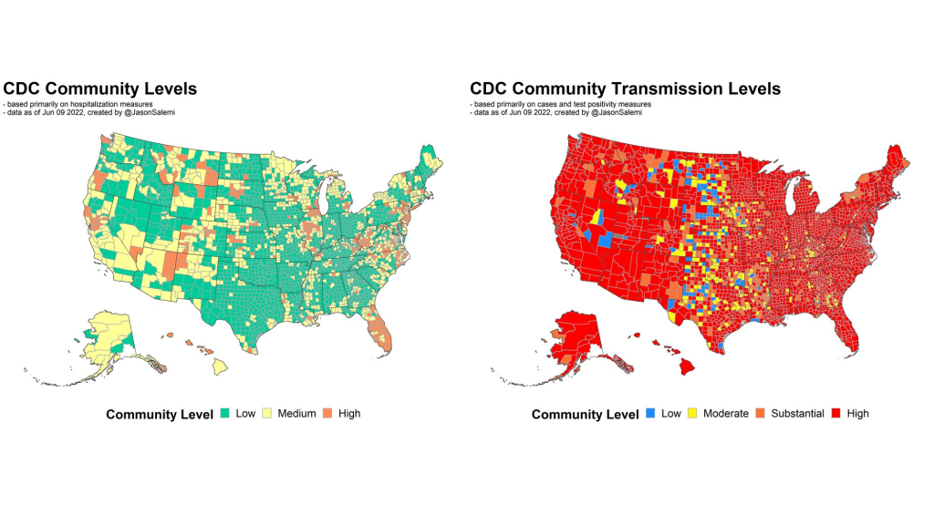
Comparing the CDC’s new Community Levels (left) and old Community Transmission Levels (right), as of May 22. Red indicates higher transmission.
There’s no sugarcoating it: we are in an extremely confusing and frustrating phase of the pandemic. We see the rising (yet undercounted) case numbers, we hear from friends and family members who have recently tested positive. And yet the CDC’s official COVID-19 guidance is still based on a mostly-green map, while local leaders refuse to reinstate mask mandates or other safety measures.
I wrote about this tension for the New York City news site Gothamist last week, in a story about COVID-19 outbreaks in city public schools. As official case counts approach the levels of the winter Omicron surge and the city officially goes into “high COVID-19 alert level,” no action has been taken to slow the spread beyond distributing more rapid at-home tests to students.
Moreover, students, parents, and teachers have limited (and often conflicting) information about COVID-19 cases in their schools. The issues include:
While the NYC Department of Education does allow parents to report positive results from at-home tests, reporting is not required and can take several days, potentially leading to undercounts and delays.
Data sources from the city and the state often do not match due to reporting differences, and both may lag behind anecdotal reports from students and teachers.
Other NYC data sources are also unreliable, since the city health department does not count at-home tests at all and novel sources such as wastewater surveillance aren’t readily available.
In this phase of the pandemic, much of the official guidance from the federal government and aligned experts centers around individual responsibility. There may not be a mask mandate, but you can wear a mask if you feel it’s necessary. Large events may be taking place, but you can take a rapid test before and afterwards if you want. And so on.
Of course, I’m not saying that you shouldn’t wear a mask or use testing. But the problem with this narrative is that, as our data sources become less reliable, it becomes harder and harder to figure out when or how one should take these individual-level actions.
As Sarah Allen, a NYC teacher and parent whom I interviewed for my Gothamist story, put it: “You can’t say, ‘It’s up to you as an individual,’ when the level of risk is being withheld from you.”
Still, even as our official data sources become harder to use, there are still ways to keep track of the COVID-19 risk in your community—you just may need to look at more sources and acknowledge more uncertainty in the numbers. While I was working on the Gothamist story, I received a question from a reader along similar lines; she asked what datasets I would recommend looking at right now, particularly when seeking to protect seniors and other vulnerable populations.
Here’s what I responded (edited lightly for publication):
Case rates are still useful, if we acknowledge that they are undercounts. Jeffrey Shaman, an infectious disease expert at Columbia University whom I talked to for the Gothamist story, put it this way: our current datasets “will tell you the trends of what’s happening, but it won’t necessarily tell you the magnitude.” In other words, if case counts are going up and you’re also hearing about a lot of friends testing positive on rapid tests, that is still a good indication that more transmission is happening in your area. But you need to consider that the actual transmission is several times higher than the official case counts, due to more rapid testing and less PCR testing.
Hospitalization rates are useful, particularly new hospital admissions. As you may have noticed, COVID-19 Data Dispatch National Numbers posts in the last few months have used new hospital admissions at the same level as cases to discuss national COVID-19 trends. Some modelers I talk to really like this metric, because it’s more reliable than cases and has less of a lag than other kinds of hospitalization metrics (such as total patients in the hospital or bed capacity), since it is driven by new people with COVID-19 coming into the hospital for treatment. The big caveat with hospitalization numbers is that they mainly tell you about healthcare system capacity, eg. if you get severely ill, will there be a bed in the hospital for you? It’s harder to extrapolate from hospitalization numbers to other impacts of COVID-19, like Long COVID.
The CDC’s old transmission level guidance is still actually pretty helpful for guiding health policies, especially for vulnerable populations. In this guidance, the “high” level means that a county is reporting over 100 new COVID-19 cases for every 100,000 people, over the course of a week. This high level may also be associated with high test positivity rates, a sign of high transmission and/or undertesting. So, if your county is reporting high transmission under this old guidance, it’s a pretty decent signal that there is a lot of COVID-19 circulating there — and reaching this level is actually even more concerning now than it would’ve been a few months ago, since so many rapid tests are going unreported. (The CDC itself actually recommends that healthcare facilities use this guidance, in a note at the top of its COVID-19 dashboard.)
Wastewater surveillance, if it’s available in your area. That “if” is a pretty big caveat; and even in some places where wastewater surveillance has been available, data have been scarce recently (see: later in this issue). But if you do have access to COVID-19 prevalence data from sewersheds in your community, this information of how coronavirus spread is changing in your area: is transmission increasing; or if you’re in a wave, has it started to decrease again yet? Beyond the CDC NWSS and Biobot dashboards, you can use the COVIDPoops19 dashboard to look for wastewater surveillance near you.
The COVID Cast dashboard, from Carnegie Mellon University’s Delphi Group, is another helpful source recommended to me recently by a modeling expert. The Delphi group does modeling work and provides data based on surveys of the U.S. population, answering questions like, “How many people are wearing masks?” Their dashboard also incorporates other unique data points you won’t find elsewhere, including antigen test positivity from one major test provider (Quidel), trends in COVID-related doctors visits, and analysis of Google search trends for COVID-like symptoms.
As always, if you have further questions, please reach out.
This week, many headlines declared that the U.S. has reached one million COVID-19 deaths. While a major milestone, this number is actually far below the full impact of the pandemic; looking at excess deaths and demographic breakdowns allows us to get closer.
NBC News was the first outlet to make this declaration, announcing that its internal COVID-19 tracker had hit the one million mark. Other trackers, including the CDC itself, have yet to formally reach this number, but major publications still jumped on the news cycle in anticipation of this milestone. (Various trackers tend to have close-but-differing COVID-19 counts due to differences in their methodologies; Sara Simon wrote about this on the COVID Tracking Project blog back when the official death toll was 200,000.)
But the recent articles about “one million deaths” fail to mention that the U.S. actually reached this milestone a long time ago. This is because the official count only includes the deaths formally logged as COVID-19, in which the disease was listed on a death certificate or diagnosed before a patient passed. Such a count fails to include deaths that were tied to COVID-19, but never proven with a positive test result, or deaths that were indirectly linked to the pandemic for a myriad of reasons.
We're at the point when different news outlets will say NOW is the point the US passes 1,000,000 COVID deaths based on their own calculations.
But in truth, we passed that point long ago because deaths have always been undercounted. 1/ https://t.co/m8NLvMxybV
To get closer to the pandemic’s true toll, demographers use a metric called excess deaths: the number of deaths that occurred in a given region and time period above what would be expected for that region and time period. Experts calculate that “expected death” number with statistical models based on patterns from previous years.
To give a more specific example: in the U.S., in the week ending January 22, 2022, CDC analysts estimated that 61,303 deaths would have occurred if there were no COVID-19 pandemic. But actually, a total of 85,179 deaths occurred in the country that week. The difference between the observed and expected values, 23,876, is the excess deaths for this week.
I selected the week ending January 22 as an example here because it has one of the highest excess death tolls of any week in the last two years. This week marked the peak of the Omicron surge, a variant that many U.S. leaders called “mild” and dismissed without instituting further safety measures.
During this week, the CDC reports 21,130 official COVID-19 deaths. That suggests most of the excess deaths in this week, the deaths which occurred over pre-pandemic expectations, were directly caused by the virus.
But what about the 2,746 deaths that weren’t? How many of these deaths were also caused by COVID-19, but in patients who were never able to access a PCR test? How many occurred in counties like Cape Girardeu, Missouri, where coroner Wavis Jordan claimed his office “doesn’t do COVID deaths” and refuses to put the disease on a death certificate without specific proof?
And how many deaths resulted from people being unable to access the healthcare they needed because hospitals were full of COVID-19 patients, or people dying in car accidents during an era of less road safety, or people dying of opioid overdoses brought on by increased stress and financial instability?
Answering these questions takes a lot of in-depth reporting, which I know well because the Documenting COVID-19 team has been doing our best to answer them through our (award-winning!) Uncounted investigation.
As we’ve found, every state—and in some cases, every county—has a unique system for investigating and reporting deaths, especially those linked to the pandemic. In some places, coroners or medical examiners are elected officials who face political pressure to report COVID-19 deaths in a particular way. In others, they face chronic underfunding and a lack of training, leaving them to work long hours in an attempt to produce accurate numbers.
You can see the resource difference when comparing officially-reported COVID-19 deaths to excess deaths by state or county. Some states, like those in New England, have COVID-19 death numbers that closely match or even exceed their excess death numbers; medical examiners in these states have centralized death reporting systems and a lot of resources for this process, reporting by my colleague Dillon Bergin showed.
Other states, like Alaska, Oregon, and West Virginia, have officially logged fewer than three in four excess deaths as COVID-19 deaths. Such a number may signal that a state is failing to properly identify all of its COVID-19 fatalities.
Excess deaths can also show how the pandemic continues to hit disadvantaged Americans harder. In 2020, COVID-19 death rates (i.e. deaths per 100,000 people) for Black, Indigenous, and Hispanic Americans were higher than the rates for White Americans; in 2021, some of these disparities actually got worse despite the broad availability of vaccines and other mitigation measures. Non-white groups also saw all-cause mortality (not just COVID-19 deaths) increase more from 2019 in both 2020 and 2021, compared to white Americans.
Please note, the chart below shows crude death rates, which don’t account for differences in age breakdowns between race and ethnicity groups. For example, crude death rates for white Americans tend to be higher because white people generally live longer than people of color in the U.S., and more seniors have died of COVID-19. You can see the difference that ade-adjustment makes in the CDC charts here.
Why is it important to acknowledge and investigate these excess deaths, going beyond the reported COVID-19 numbers? At an individual level, family members who lost loved ones to COVID-19 find that diagnosis important; they can access FEMA aid for funerals, and can receive acknowledgment of how this one death fits into the broader pandemic.
And at the county, state, and national levels, looking at excess deaths allows us to see a full picture of how COVID-19 has affected us. Experts say that inaccurate COVID-19 death numbers can create a negative feedback loop: if your community has a too-low toll, you may not realize the disease’s impact, and so you may be less likely to wear a mask or practice other safety precautions—contributing to more deaths going forward.
As a data journalist, sharing these statistics and charts is my way of acknowledging the one million deaths milestone, and all of the uncounted deaths that are not included in it. But this pales in comparison to actual stories shared by family members and friends of those who have died in the last two years.
To read these stories, I often turn to memorial projects like Missing Them (from THE CITY), which captures names and stories of over 2,000 New Yorkers who died from COVID-19. Social media accounts like FacesOfCOVID also share these stories. And if any COVID-19 Data dispatch readers would like to share a story of someone they lost to this disease, please email me at betsy@coviddatadispatch.com; I would be honored to share your words in next week’s issue.