Tag: CDC

  • As Omicron hits schools, K-12 data void is wider than ever

    As Omicron hits schools, K-12 data void is wider than ever

    Two years into the pandemic, you might think that, by now, schools would have figured out a strategy to continue teaching kids while keeping them safe from the coronavirus. Instead, the school situation is more chaotic than ever—thanks to Omicron combined with staff shortages, pandemic fatigue, and other ongoing issues.

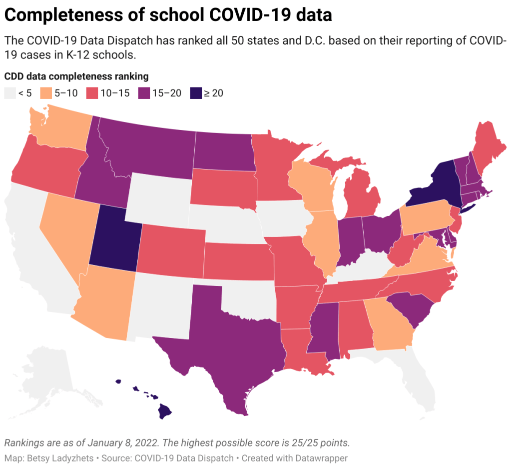
    Thousands of schools went online or closed entirely this week, likely more than in any other week since spring 2020. And yet: there is currently no national data source tracking COVID-19 cases in schools, and nine states fail to report any data on this crucial topic.

    This week, I had a story published in education outlet The Hechinger Report about the challenges that schools faced in staying open during the fall 2021 semester. For the story, I returned to the five school communities that I profiled last summer during my Opening project to see how they fared in the fall.

    The story identifies four major challenges:

    • Quarantines: When a school or district faces a COVID-19 outbreak, contact tracing for all of the cases can quickly become incredibly time-consuming. This work “can be very burdensome for the school and the health department,” pediatrician Leah Rowland told me—especially when a school doesn’t have its own school nurse.
    • Testing: Surveillance testing can help identify cases early, while test-to-stay programs can keep kids out of quarantine; in fact, the CDC recently endorsed test-to-stay, adding the strategy to its official schools guidance. But testing programs are costly and hard to set up; in absence of state-wide testing support, they tend to be implemented at larger and wealthier school districts.
    • Staff shortages: Every single school leader and expert I spoke to for the story named staff shortages as a major challenge. “[Potential staff] can work at McDonald’s, and have a whole lot less stress and make more money than working as an instructional assistant for Garrett County Public Schools,” Alison Sweitzer, director of finance at this Maryland district, told me.
    • Pandemic fatigue: In a lot of places around the U.S., schools are one of the only—if not the only—institution still enforcing COVID-19 policies, like masks and social distancing. This can drive up tension between parents and school staff; and school nurses, who act as public health experts within the school, often bear the brunt of the criticism. Robin Cogan, legislative co-chair for the New Jersey State School Nurses Association, told me that she’s never felt this exhausted, in 21 years of serving as a school nurse.
    • Low vaccination rates: As of this week, about one in four children ages five to 11 has received at least one dose of a COVID-19 vaccine. This ranges wildly by state, though, with 57% of children in this age group vaccinated in Vermont compared to under 20% in much of the South. Vaccinated students and staff don’t have to quarantine when they’re exposed to a COVID-19 case, but despite this strong motivator, the school leaders I spoke to have not seen much enthusiasm for the shots.

    I reported most of that Hechinger Report story before Omicron hit the U.S. But it’s clear to see how the new variant has exacerbated all of these challenges. As this super-contagious variant hits schools, cases are increasingly rapidly—leading to more quarantines and contact tracing pressures. School staff are getting sick, intensifying shortages. And the students and staff who are unvaccinated are the most vulnerable.

    “Pediatric hospitalizations are at the highest rate compared to any prior point in the pandemic,” CDC Director Dr. Rochelle Walensky said at a press briefing on Friday. The CDC is investigating whether this increase reflects an inherent severity of Omicron in children or whether it’s simply the product of record-high cases everywhere. Either way, though, the data clearly show that vaccination is the best way to protect children from severe COVID-19. For children under age five, Dr. Walensky said, “it’s critically important that we surround them with people who are vaccinated to provide them protection.”

    According to Burbio’s K-12 School Opening Tracker, 5,441 schools had disruptions in the week of January 2. Those disruptions include schools going online or canceling instruction entirely—anything caused by the pandemic, as opposed to by weather or some other reason. This is higher than any other week in the 2021-2022 school year by a long shot; the previous record was 2,846 disruptions in early November.

    New York City has been one of the U.S.’s first Omicron hotspots, and the variant has had a massive impact on the city school system. Case rates shot up in December, with almost 5,000 new cases reported by the city Department of Education (DOE) in the week ending December 26. This number, as well as January DOE data, is likely a massive undercount, though, because of the sheer number of cases being reported within the city right now.

    The PRESS NYC schools dashboard, which references DOE data, provides this caveat: “As we understand it, the Situation Room cannot keep up with cases coming in and many cases aren’t even making it into DOE data.”

    Stories from inside the public school system suggest that kids are going into classrooms just to sit in study hall and, very likely, infect each other. One Reddit post from a NYC high school student described the case numbers at their school shooting up from six total cases in mid-December, to 100 on January 3, to over 200 by the end of this week. The majority of those cases weren’t yet reflected in DOE data, the student said.

    Yet NYC’s new mayor, Eric Adams, seems determined to keep schools open at all costs.

    Other districts have also had their fair share of conflict this week. In Chicago, teachers are on strike for safer in-person conditions. The situation has led to classes getting canceled entirely, as the school district locked striking teachers out of their online accounts—preventing them from teaching remotely. And in many other districts, including Seattle and Washington D.C., the start of the spring semester was delayed as the district sought to test all students, teachers, and staff before reopening.

    With all of this tension in mind, I set out yesterday to update my K-12 school data annotations for the first time in several months. These annotations reflect the availability of data on COVID-19 cases and related metrics in school buildings, by state and at the national level.

    Here’s what I found:

    • 31 states and D.C. are reporting data on COVID-19 cases in K-12 school settings. There’s a lot of variability in this reporting, though, from states like Connecticut, which reports a detailed breakdown of cases by school (including downloadable historical data), to states like Maine, which only reports cases in “active outbreaks.”
    • 10 states are reporting what I categorize as “somewhat” cases in K-12 schools. This includes states like Arizona, which reports the number of schools with COVID-19 outbreaks by county (but no case numbers), and Illinois, which reports cases in school-aged children (but not cases that are school-specific).
    • Nine states are not reporting any K-12 school data. These states are: Alaska, California, Florida, Iowa, Kentucky, Nebraska, New Mexico, Oklahoma, and Wyoming. Note, both Florida and Kentucky used to report school data, but have discontinued this reporting since last school year.
    • New York continues to have the most complete school data, by my assessment, as it’s the only state to report both COVID-19 tests and school enrollment.
    • Six states are now reporting in-person school enrollment, a key metric needed to analyze COVID-19 data: Connecticut, Delaware, Hawaii, New York, Texas, and Utah.
    !function(){“use strict”;window.addEventListener(“message”,(function(e){if(void 0!==e.data[“datawrapper-height”]){var t=document.querySelectorAll(“iframe”);for(var a in e.data[“datawrapper-height”])for(var r=0;r<t.length;r++){if(t[r].contentWindow===e.source)t[r].style.height=e.data["datawrapper-height"][a]+"px"}}}))}();

    In short, while a lot of data on COVID-19 in schools are available from state public health departments, these data are wildly unstandardized and difficult to analyze holistically. See the annotations page for more details on your state.

    Meanwhile: at this time, there is no national data source on COVID-19 cases in schools. The federal government has never reported these data; the best that our federal health agencies can do, apparently, is compile rarely-updated dashboards of school learning modes (i.e. which districts are in-person vs. remote). Last school year, a couple of research projects sprung up to compile information from state agencies and other sources; but as of now, those projects are all discontinued.

    While a number of studies have demonstrated the effectiveness of common safety policies (masks, vaccinations, ventilation, etc.), many of the researchers who study school COVID-19 safety have to use small sample sizes, such as a single district or state. CDC researchers often rely on proxies like county case rates to analyze the impact of different policies. This research is a far cry from the work that we could do with a comprehensive, national dataset of COVID-19 cases in schools.

    Without detailed data on COVID-19 in schools, it’s difficult to make good policy decisions. The data void leaves space for pundits on both sides of the aisle: some can argue that schools are safe and must remain open in-person no matter how high community cases get, while others can argue that schools are incredibly dangerous and must close.

    The COVID-19 in schools data void is wider than ever right now, even though we need information desperately as Omicron spreads.
    More K-12 reporting

  • FAQ: Testing and isolation in the time of Omicron

    FAQ: Testing and isolation in the time of Omicron

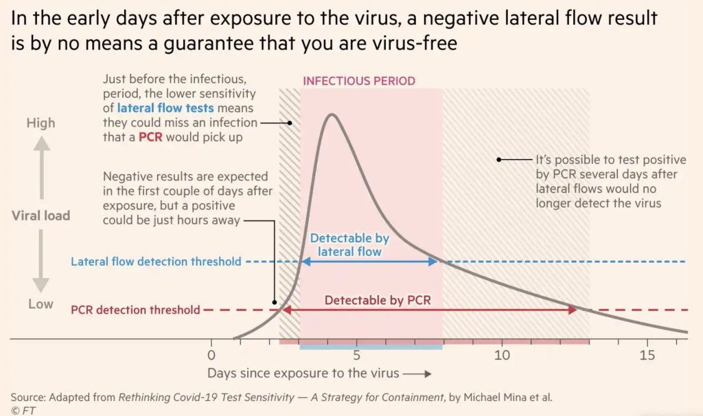
    After exposure to the coronavirus, someone may test negative on rapid antigen tests for multiple days before their viral load becomes high enough for such a test to detect their infection. Chart by Michael Mina, adapted by the Financial Times.

    As Omicron spreads rapidly through the U.S., this variant is driving record case numbers—and record demand for testing, including both PCR and rapid at-home tests. In other words, it feels harder than ever to get tested for COVID-19, largely because more people currently need a test due to recent exposure to the virus than at any other time during the pandemic.

    Also this week, the CDC changed its guidance for people infected with the coronavirus: rather than isolating for 10 days after a positive test, Americans are now advised to isolate for only five days, if they are asymptomatic. Then, for the following five days, people should wear a mask in all public settings. This guidance change has prompted further discussion (and general confusion) about who needs to get tested for COVID-19, when, and how.

    Here’s a brief FAQ, to help navigate this complicated testing-and-isolation landscape. In addition to the CDC guidance, it’s inspired by a recent question from a reader about testing and isolation following a positive PCR result in her family.

    What’s the difference between being infected and being contagious?

    As we think about interpreting COVID-19 test results in the Omicron era, it’s key to distinguish between being infected with the coronavirus and being actively contagious.

    • Infected: The virus is present in your body.
    • Contagious: The virus is present in your body at high enough levels that you can potentially spread it to other people.

    In a typical coronavirus infection, it takes a couple of days after you encounter the virus—i.e. breathe the same air as someone who was contagious—for the coronavirus to build up enough presence in your body that tests can begin detecting it. PCR tests can typically detect the virus within one to three days after an infection begins, while rapid tests may take longer.

    How do you use testing to tell if you’re infected and/or contagious?

    Timing is extremely important with coronavirus tests, and has become even more so with Omicron. If you learn about a recent exposure to the virus, you don’t want to get tested immediately after that exposure, since the test would not pick up a potential infection yet. Say you had dinner with a friend on Wednesday, and they tell you on Thursday that they just tested positive; you should wait until Friday or Saturday to get tested with PCR, or until Saturday or Sunday to get tested with a rapid at-home test. (And ideally, you would avoid interacting with other people while you wait to get tested.)

    PCR tests can detect the virus within a couple of days of infection. Rapid tests, which are less precise, generally can’t detect the virus until it’s at high enough levels for someone to be contagious. This can take time—though Omicron may have shortened the window between infection and becoming contagious to just three days, according to some early studies. A new CDC study released this week provides additional evidence here.

    This chart, an adaptation of a figure by rapid test expert Michael Mina published in the Financial Times, shows how someone could potentially test negative on rapid tests for multiple days after a coronavirus exposure, even though they are infected:

    When this person tests positive on a rapid test, the result indicates that they’ve become contagious with the virus. Then, it’s possible that the person may continue testing positive on PCR tests after they stop testing positive with antigen tests, because they are no longer contagious but continue to carry enough virus genetic material that a PCR test can pick it up.

    How do you get ahold of rapid tests, in the first place?

    In order to use rapid tests to tell whether you’re contagious with the coronavirus, you need to get some rapid tests! Here are a couple of suggestions:

    • Order online from Walmart: If you look at this website right now, Walmart will probably say that Abbott BinaxNOW rapid tests are out of stock. But if you leave the page open and refresh often, you may be able to snag some rapid tests right after Walmart restocks (which happens roughly once a day, I think). I like ordering from Walmart because they’re cheaper than other BinaxNOW vendors and ship quickly, usually within a week.
    • Order online from iHealth Labs: iHealth Labs is one rapid test manufacturer that’s grown in popularity recently, as an alternative to BinaxNOW. You can order up to 10 packs (with two tests each) directly from the manufacturer, and report test results in an app. In my experience, though, iHealth Labs is slower to ship than other distributors; an order I placed on December 22 is due to arrive two weeks later, on January 5.
    • Use NowInStock to see availability: This website tracks rapid test availability at a number of websites, including CVS, Walgreens, Walmart, Amazon, and others. It’s helpful to see your options for a number of different tests, but bear in mind that tests sold by third-party vendors (like Amazon) may be less reliable than those sold directly by pharmacies.
    • Follow local news: A lot of city and state governments have recently started making rapid tests available to the public for free, from D.C. libraries to Connecticut towns. I recommend keeping an eye on local news and government websites in your area to look for similar initiatives—or, if your area isn’t making rapid tests available, call your local representative and ask that they do!

    Why did the CDC change its guidance for isolation?

    As I mentioned above, the CDC recently changed its guidance for people who test positive for the coronavirus. If someone has no symptoms five days after their positive test result, they can stop isolating from others—but they need to wear a mask in all public settings.

    According to the CDC, the new guidance is “motivated by science demonstrating that the majority of SARS-CoV-2 transmission occurs early in the course of illness, generally in the 1-2 days prior to onset of symptoms and the 2-3 days after.” In other words, the CDC is saying that people are generally contagious for a few days after their symptoms start. After that, they’re less likely to infect others, so isolation may be less necessary—and good mask-wearing may be sufficient to prevent further coronavirus spread.

    Many experts are attributing the guidance chance to economic needs: as Omicron causes flight cancellations, closed restaurants, and other business disruptions, a shorter isolation period can help people get back to work more quickly. The recent isolation change follows a similar guidance change the previous week, which said healthcare workers could shorten their isolation periods if their facilities were experiencing staffing shortages.

    What are experts saying about the new guidance?

    Much of the commentary is not positive. While the CDC said the new guidance is “motivated by science,” the agency has failed to cite specific studies backing it up—though some such studies exist, as Dr. Katelyn Jetelina discusses in this Your Local Epidemiologist post.

    Generally, it does seem that most people—particularly vaccinated people—are no longer contagious five days after their symptoms start. (Reminder: five days after symptoms start could be seven to nine days into the infection period, since it takes time for the virus to build up in your body and cause symptoms.) But this is by no means guaranteed for everyone, as each person infected with the coronavirus has a unique COVID-19 experience.

    As a result, many experts have said that the CDC should have required negative rapid tests for people to leave isolation after five days. A negative rapid test would indicate that someone is no longer contagious, the argument goes, and they can then go back into the world. In the U.K., two negative rapid test results are required to shorten isolation from ten to seven days.

    However, for everyone in the U.S. to be able to rapid test out of isolation, the country would need a far greater supply of those tests than we currently have available. This Twitter thread, by epidemiologist Matt Ferrari, explains the challenges posed by limited rapid testing:

    Ferrari argues that the CDC guidance makes sense, given the information and resources currently available in the U.S., as well as the fact that simpler rules are easier to follow. Still, I personally would say that, if you have the rapid tests available to test out of isolation, you should.

    More Omicron reporting

  • COVID source callout: The CDC’s slow variant updates

    COVID source callout: The CDC’s slow variant updates

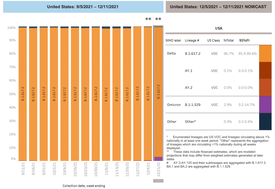
    Due to reporting delays, the CDC’s variant data fails to convey Omicron’s rapid spread through the country. Chart retrieved on December 19.

    On Tuesday, the CDC updated the Variant Proportions tab of its COVID-19 data dashboard. This update included some alarming information: Omicron had jumped from causing about 0.4% of cases in the week ending December 4, to 2.9% of cases in the week ending December 11. In the New York and New Jersey area, it was causing 13% of cases.

    At this rate of increase, we can anticipate that, as of yesterday (December 18), Omicron is already causing roughly 21% of cases in the U.S.—and more than 90% of cases in New York and New Jersey. But because of the CDC’s delayed updates, the majority of people who go look at the CDC’s dashboard anytime before its next update, this coming Tuesday, would likely presume that Omicron is still causing a tiny minority of cases.

    I’ve written before about the delays in collecting and reporting coronavirus sequencing data. It can take weeks for a COVID-19 test sample to go from a patient’s nose to a nationwide sequencing database, which leads to inevitable lags in the U.S.’s genomic surveillance. This is understandable. But in a crisis moment, when Omicron is here and spreading rapidly, the agency should clearly label the lags and update its projections to provide a more accurate view of the variant’s growth. 

    What’s more, the CDC’s data update on Tuesday was not communicated widely; Director Dr. Rochelle Walensky gave a TODAY Show interview, and that was about it.

  • New CDC mortality data: “Real-time public health surveillance at a highly granular level”

    New CDC mortality data: “Real-time public health surveillance at a highly granular level”

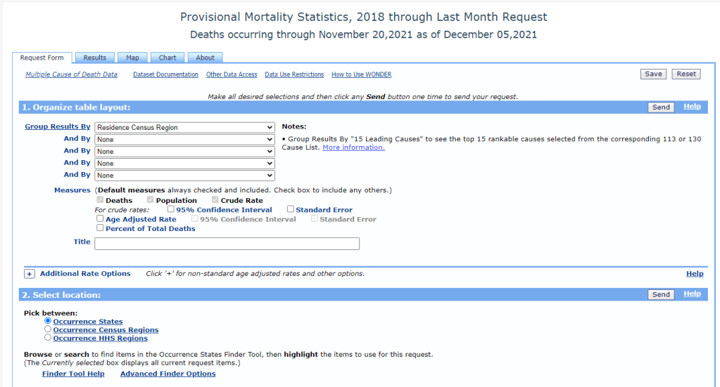
    The CDC’s new data release allows researchers to search through mortality data from 2020 and 2021 in great detail. Screenshot of the CDC’s search tool retrieved December 12.

    This past Monday, the CDC put out a major data release: mortality data for 2020 and 2021, encompassing the pandemic’s impact on deaths from all causes in the U.S.

    The new data allow researchers and reporters to investigate excess deaths, a measure of the pandemic’s true toll—comparing the number of deaths that occurred in a particular region, during a particular year, to deaths that would’ve been expected had COVID-19 not occurred. At the same time, the new data allow for investigations into COVID-19 disparities and increased deaths of non-COVID causes during the pandemic.

    To give you a sense of the scale here: As of Saturday, the U.S. has reported almost 800,000 COVID-19 deaths. But experts say the true COVID-19 death toll may be 20% higher, meaning that one million Americans have died from the virus. And that’s not counting deaths tied to isolation, drug overdoses, missed healthcare, and other pandemic-related causes.

    The CDC’s new data release is unique because, in a typical year, the CDC reports mortality data with a huge lag. Deaths from 2019 were reported in early 2021, for example. But now, the CDC has adapted its reporting system to provide the same level of detail that we’d typically get with that huge lag—now with a lag of just a few weeks. The CDC has also improved its WONDER query system, allowing researchers to search the data with more detail than before.

    “I would describe this new release as more real-time surveillance at more specific detail than any journalists, or epidemiologists, or any other kind of researcher even knows what to do with,” said Dillon Bergin, an investigative reporter and my colleague at the Documenting COVID-19 project, at the Brown Institute for Media Innovation and MuckRock.

    Along with Dillon and other Documenting COVID-19 reporters, I worked on a story explaining why these CDC data are such a big deal—along with what we’re seeing in the numbers so far. The story was published this week at USA Today and at MuckRock. Our team also compiled a data repository with state-level information from the new CDC release, combined with death data from 2019 and excess deaths.

    If you’re a reporter who’d like to learn more about the new CDC data, you can sign up for a webinar with the Documenting COVID-19 team—taking place next Wednesday, December 15, at 12 PM Eastern time. It’s free and will go for about an hour, with lots of time for questions. Sign up here!

    Editor’s note, December 27: This webinar was recorded; you can watch the recording here.

    Also, as our initial story is part of a larger investigation (in collaboration with USA Today), the team has put together a callout form for people to share their stories around COVID-19 deaths in their communities. If you have a story to share, you can fill out the form here.

    To provide some more information on why this new CDC release is so exciting—and what you can do with the data—I asked Dillon a few questions about it. As the lead reporter on our team’s excess deaths investigation, he’s spent more time with these data than anyone else. This interview has been lightly edited and condensed for clarity.


    Betsy Ladyzhets: How would you summarize this new release? What is it?

    Dillon Bergin: I would describe this new release as more real-time surveillance at more specific detail than any journalists, or epidemiologists, or any other kind of researcher even knows what to do with. It’s unfathomably detailed, and the fact that we’re going to be able to see updates in almost real time is really critical at this stage of the pandemic, or at any stage in a public health crisis. I think it’s a huge, huge step forward.

    BL: Specifically in the realm of COVID deaths, but also, all deaths during the pandemic.

    DB: Exactly, yes. In the realm of COVID deaths, we do know that there is a large gap between the total amount of excess deaths and the excess deaths that COVID accounts for. So it’s interesting from that angle, understanding what COVID might have been misclassified. But the data can also be used for a broad range of other types of deaths that have happened during the pandemic or possibly increased during the pandemic.

    BL: So why are researchers excited about this data release?

    DB: Previously, for something to go up on the WONDER website, or to become WONDER data, has to be finalized in the year after. So, data from 2020 would just be finalized now. Typically, we might not see that data until, probably, early in the new year [2022].

    But with the new tool, we’re getting that 2020 and 2021 WONDER data now. And the CDC does a great job of providing a lot of granular details about causes of death, and racial demographics… Those are things that general CDC [mortality] data gives you, but the WONDER data is even more detailed. So, the fact that researchers don’t have to wait anymore for that data to be finalized, that the CDC is providing provisional data at such a detailed level—that’s what researchers are excited about.

    BL: It’s the provisional data that’s being released, like, a year earlier than you would normally expect it to be published, right?

    DB: Yeah, a year earlier than you would expect it to be published. Which means it’s almost real-time, because it has, I think, a three- or four- week lag. This data is real-time public health surveillance at a highly granular level—which is what people have been asking for. It’s what epidemiologists have been asking for, researchers, advocates of all kinds, journalists, lots of people have been saying, “We need this type of surveillance.”

    BL: When you say a three- or four-week lag—the CDC is going to update it every couple of weeks, right?

    DB: Yes, that’s correct.

    BL: Do you have a sense of what the update schedule is going to be, or is the CDC not sure yet?

    DB: I’m not sure. I know it was a big haul for them to just get this out, I’m not sure what the next update will be…

    BL: Yeah, well, I’m sure we [Documenting COVID-19] will keep an eye on it. And we’ll tell everybody when it updates. (Editor’s note: As of December 12, it has already been updated! Data now go through November 20, 2021.) So, what are some of the things that you’ve seen in the data from the preliminary analysis that you’ve done so far?

    DB: One of the specific things that I’ve seen, that’s been really important for the work that I’m doing right now, is increases of different types of deaths at home. When people die, they don’t always die in a hospital—they could die in an outpatient clinic, or in an ER, or they could come to the hospital dead on arrival, they could die in hospice, or a nursing home, or at home.

    And one of the awesome things about the CDC data is that you can see, actually, where people have died, and what specific causes of death that those people had when they died. Or, to be precise, you can’t see specific people—but you can see, say, 50 people died of heart attacks in a specific county at home. You would be able to see [in the data] that those people not only died of a heart attack, but they died at home. 

    The takeaway for me has been that respiratory and cardiovascular deaths have increased at home in specific states and counties. Louisiana is one example: it looks like Louisiana has the highest increase of deaths at home from [the CDC designation] “other forms of heart disease,” of any state, at like a 60% increase from previous years. So then we have to ask ourselves, what could lead to that increase? Are people really dying more of heart disease at home, by that much higher of a rate? Or is something else going on here?

    BL: If you were talking to local reporters about this, what would they recommend that they do with the data?

    DB: I would recommend that they take a look at the most recent data, the data from 2020 and 2021, for their area. And also pull some previous years, probably five years [of data], and start looking at causes of death, ages of the people who died, racial and demographic makeup, and place of death. I think different combinations of those data will start to provide some interesting avenues that can lead you to do actual human reporting—asking, what was happening? And why was that happening at this scale?

    The new WONDER data, you can kind-of stretch it and bend it in so many different ways, it can be a little bit intimidating at first. So maybe, it would also be useful to start with a more specific question. If you’re wondering about, let’s say, certain types of deaths in a very specific county. Say you’re wondering if that’s from unintentional drug overdoses, or deaths from respiratory diseases in your county. Then you can start looking at the more granular level of details within those types of deaths—whether it’s racial and demographic makeup, or whether or not the body was autopsied. You can even see the day of the week [that people died]. There’s a lot of different places you can zoom in.

    My overall advice would be: Start with a general question and then explore, then reform that question and explore, then reform that question. The data is both so extensive and so granular that you can get lost in it very quickly.

    BL: You mentioned that it’s very intimidating, which I would second. The first time I looked at the WONDER data, I was like, “What is going on here?” So, what would be your recommendations for working with that data tool? Or any major caveats that you think people should know before they dive into this?

    DB: That’s a great question, because with WONDER, you have to use their querying tool through their website. You can’t really easily and quickly export things or work with an API, though you can export data once you do a query.

    My first caveat would be, keep in mind the suppression of any values under 10. So, that means you can zoom in on certain things, but then you may also have to zoom out. For example, if you wanted to know the leading causes of death for someone, when a body is dead on arrival—if you do that search at a state level, you’ll probably be able to see the first five or so causes before you reach causes that have only happened between one and 10 times, and then that value is oppressed and you can’t see the information. But if you were to do the same search on a national level, you would have a lot more causes for those types of deaths.

    So, I would keep in mind the suppression, when zooming in and out. And also keep in mind, if, say, you’re looking at “dead on arrival” deaths for every county in a specific state, so many causes of death for those [county-level searches] will be suppressed, that your totals from the counties would not match the actual totals [at the state level]. Because you may not be aware that the CDC is not showing you the values that were suppressed if you didn’t click a specific button—or if you’re quickly adding things.

    BL: Another thing that [our team ran into] is occurrence versus residence—that’s something people need to know about. “Residence” means sorting by where people lived, “occurrence” means sorting by where they died. Those don’t always match up.

    DB: Yes, I would say residence versus occurrence is very important to keep in mind, especially because, when you’re redoing a search and scrolling very fast, you can accidentally fill out a state for occurrence instead of residence. Which actually did happen to me, and then I was confused by my own numbers. Then I noticed that there were a bunch of states coming up that I hadn’t meant to search for, because I, like, filtered by residence and then searched by occurrence.

    So yeah, keeping in mind the difference between residence and occurrence is definitely important. Though if you go back in the historical data [before 2018], it’s just residence—just a single state for each death.

    Also, just clear some extra time to get used to working with the WONDER interface. Because, unlike the CDC data updates that are just on the data.cdc.gov website, that you can just quickly download and open up in your technical took of choice—for WONDER, you do have to use the WONDER query site, and it can be difficult to get used to searching and importing. 

    BL: I will say one more thing, while we’re on this topic, that I’ve been doing and that might be helpful for other people: make sure that, if you export data from WONDER, that you always save that notes section it gives you at the bottom [of the exported file]. Because that will tell you exactly what you searched for. So, if you want to replicate something later, you can just go back and look at the notes. I feel like my instinct, often, when I’m looking at a dataset, is to delete all the notes and anything I don’t need—so I have to remind myself, like, “No, you should keep this.”

    DB: That’s actually a really good tip, because I do that… I import the data [to my computer] and then I delete all the notes. That’s a great point.

    BL: Also, what recommendations do you have if people are looking for, like, experts to interview about these data? Say a local reporter wants to search for experts in their area, what should they do?

    DB: I can speak about that, because that’s been really useful for me in my reporting. Once you have this data, or once you’ve researched excess deaths in your area, you should talk with an epidemiologist or a social epidemiologist—someone who would know your state, or maybe even your more local area—about the broader mortality trends in your community. That will really give you a deep understanding of, what were the reasons that people were dying before the pandemic? And what has this expert thought about during the pandemic? And what have they heard, or read, or researched about why deaths are increasing? For example, I talked to two epidemiologists in Mississippi while working on our investigation, and they really helped me understand what I was looking at and looking for.

    BL: Awesome. And then, my last, kind-of big picture question is, why does this matter for people who aren’t epidemiologists or COVID reporters?

    DB: That is also a good question. I think the thing that I have been thinking about over and over again—and it’s something that an epidemiologist told me—which is that, if we understand how people die, then we might know what’s making them sick. And if we know what’s making them sick, then we have a shot at stopping that from happening.

    This data is a very important step in that process, which is learning, in real-time, why people are dying. If we know that, we know what’s making them sick, whether it’s unintentional drug overdoses, or an increase of deaths because of lung cancer or heart disease. Any of those things are important to know, especially in a public health crisis like the one we’re in right now.

    BL: I know we’ve talked before about this sort-of cycle of, what happens when COVID deaths are maybe undercounted in a certain community, and then that contributes to people maybe being less aware of COVID in their community. And then [that lack of awareness] contributes back to the same process.

    DB: Yeah, exactly. I think that’s an important thing as well. Throughout this process—reporting on this topic, and working with this data, and thinking more about death certificates and the information on them—I’ve been increasingly… Not evangelized, exactly, but I’ve seen the light on the importance of that final piece of information of people’s lives. And what it means not only to their families and to the local area and communities, but also what it means when we start pulling that data up to larger and larger groups, and trying to understand: what does this person’s death mean at the level of the county, or the state, or in their racial demographic, or in their age demographic, or by gender?

    All of this is critically important. And it sounds kind-of corny, but in a way, [the death certificate] is like, one really last piece of information that you leave behind for humans after you.


    More national data

  • COVID source callout: CDC’s breakthrough case data

    The CDC has not updated its breakthrough case data since September. A full two months ago.

    Earlier in 2021, the agency reported a total count of breakthrough infections, hospitalizations, and deaths—then switched to reporting only those breakthrough cases leading to hospitalization or death in May.

    The page that used to house this data now no longer includes total case counts; instead, the CDC redirects users to a couple of other pages:

    The CDC and FDA expanded booster shot eligibility to all adults in part because of increasing COVID-19 cases across the country.  But without comprehensive breakthrough case data, as I’ve said numerous times, it’s hard to pinpoint exactly how well the vaccines are working—and who’s most at risk of a breakthrough case.

    MedPage Today, which published a detailed article on this topic, received a statement from the CDC claiming that the breakthrough case and death data will be updated “in mid-November, to reflect data through October 2.” This long lag is due to the time it takes for the CDC to link case surveillance records to vaccination records, the agency said.

    Almost a year into the U.S.’s COVID-19 vaccination campaign, you’d really think our national public health system would have a better way of monitoring breakthrough cases by now.

  • Sources and updates, November 14

    • Directory of Local Health Departments: The National Association of County and City Health Officials maintains this database of all local public health departments in the U.S. You can navigate to health department lists for specific states by clicking on the map, or explore a 180-page PDF that includes the name, website link, and contact information (in some cases) for every single department. 
    • Media and Misinformation update from the KFF Vaccine Monitor: The Kaiser Family Foundation typically updates its COVID-19 Vaccine Monitor project with reports once a month. This week, however, the Vaccine Monitor team released an additional report focusing on American adults’ experiences with misinformation. One key finding: about 78% of those surveyed “believe or are unsure about at least one common falsehood” about COVID-19 or the vaccines.
    • More data on vaccination for kids 5-11 is coming: About 900,000 children in the recently-eligible 5 to 11 age group were vaccinated in the first week since the CDC authorized shots for these kids, the White House announced on Wednesday. At the time, this estimate was higher than official numbers on the CDC’s dashboard due to data lags; but the agency is planning to publish more data on this age group by the end next week, according to Bloomberg editor Drew Armstrong.

  • Public health data in the US is “incredibly fragmented”: Zoe McLaren on booster shots and more

    Public health data in the US is “incredibly fragmented”: Zoe McLaren on booster shots and more

    This week, I had a new story published at the data journalism site FiveThirtyEight. The story explores the U.S.’s failure to comprehensively track breakthrough cases, and how that failure has led officials to look towards data from other countries with better tracking systems (eg. Israel and the U.K.) as they make decisions about booster shots.

    In the piece, I argue that a lack of data on which Americans are most at risk of breakthrough cases—and therefore most in need of booster shots—has contributed to the confusion surrounding these additional doses. Frequent COVID-19 Data Dispatch readers might recognize that argument from this CDD post, published at the end of September.

    Of course, an article for FiveThirtyEight is able to go further than a blog post. For this article, I expanded upon my own understanding of the U.S.’s public health data disadvantages by talking to experts from different parts of the COVID-19 data ecosystem.

    At the CDD today, I’d like to share one of those interviews. I spoke to Zoe McLaren, a health economist at the University of Maryland Baltimore County, about how the U.S. public health data system compares to other countries, as well as how data (or the lack of data) contribute to health policies. If you have been confused about your booster shot eligibility, I highly recommend giving the whole interview a read. The interview has been lightly edited and condensed for clarity.


    Betsy Ladyzhets: I’m writing about this question of vaccine effectiveness data and breakthrough case data in the U.S., and how our data systems and sort-of by extension public health systems compare to other countries. So, I wanted to start by asking you, what is your view of the state of this data topic in the U.S.? Do you think we can answer key questions? Or what information might we be missing?

    Zoe McLaren: It’s the age-old problem of data sources. A lot of cases are not going to be reported at all. And then even the ones that are reported may not be connected to demographic data, for example, or even whether the people are vaccinated or not. Whereas other countries like Israel, and the U.K., your positive COVID test goes into your electronic health record that also has all the other information. 

    And Medicare patients, they have that whole [records] system. There will be information [in the system] about whether they got vaccinated, as well as whether they have a positive test. So that data will be in there. But for other people, it may or may not be in an electronic health record. And then of course, there’s multiple different electronic health record systems that can’t be integrated easily. So you don’t get the full picture.

    But it’s all about sample selection. Not everyone [who actually has COVID] is ending up in the data, which messes up both your numerator and denominator when you’re looking at rates.

    BL: Could you say more about how our system in the U.S. is different from places like Israel and the U.K., where they have that kind of national health record system?

    ZM: When the government is providing health insurance, then all of your records and the [medical] payments that happen, there’s a record of them… And then, because it’s a national system, it’s already harmonized, and everyone’s in the same system. So it’s really easy to pull a dataset out of that and analyze it.

    Whereas in the US, everything is incredibly fragmented. The data, and the systems and everything is very fragmented. The electronic health systems don’t merge together easily at all. And so you get a very fragmented view of what’s going on in the country.

    BL: Right, that makes sense. Yesterday, I was talking to a researcher at the New York State Health Department who did a study where they matched up the New York State vaccination records with testing records and hospitalization records, and were able to do an analysis of vaccine effectiveness. And he said, basically, the more specific, you tried to go with an analysis, the harder it is to match up the records correctly, and that kind of thing.

    ZM: Exactly. It’s easy to match on things like age, sex, race, since everybody has them. But then, the different data fields are gonna have different formats and be much harder to merge together.

    BL: So what can we do to improve this? I know Medicare for All is one option— 

    ZM: Medicare for All, end of story, end of article. It would solve so many problems.

    It’s tricky, though, because there isn’t a simple fix. All of these health systems have their own electronic health records, and integrating them is really costly and hard to do, and who is going to pay for that? There’s also additional privacy concerns about integrating things, in terms of protecting privacy and confidentiality. So, that’s really tricky.

    The way that we get around that, in general, is to have reporting requirements. Like with COVID tests, [providers are] required to report to the CDC or the HHS… Still, that’s also costly and time consuming. But that is kind-of the best thing that we can do right now, is have the different [public health] entities produce reports on a regular basis and send that to a centralized location. And the reports are supposed to be produced in a way that they are harmonized, they’re easy to put together from all the different systems.

    The problem with the different systems not integrating is, it requires everyone to basically fill out the equivalent of a form and send it in—listing individual patient information, or at the state level, individual county information. An example of that is the COVID data. All of the COVID data gets reported up to the national level [by state and county health departments]… 

    But the reporting often gives you the numerators, when you need to figure out the denominators. Because you would want to know, for example, we want to know what proportion of breakthrough cases end up hospitalized. But if only the hospitalized people end up in the data, and a lot of breakthrough cases go either undetected or never tested, or they do an at-home test and there’s no record of that positive case in the system, then your denominator is—there’s a problem with your denominator. That’s a problem with sample selection, you get people that are self-selecting into the numerator [by testing positive], but also self-selecting into the denominator [by getting a test to begin with].

    BL: Yeah, that makes sense. I know you said it would be pretty complicated to basically force different public health departments—to standardize them so that they’re all reporting in the same way. Is there more that researchers in the US could be doing in the short-term to either improve data collection or use what we have to answer questions like, what occupations might confer higher risk of a breakthrough case? 

    ZM: This is a coordination problem. Because in general, we all have an incentive to contribute to having a better understanding of breakthrough cases. But the trick is that, unless the national government or the CDC takes the role of saying what the [data] format’s gonna look like…

    Part of the problem is that there’s an effort involved [in collecting these data] and people don’t want to put in the effort. But if they do want to put in the effort, then you still have a coordination problem, because who gonna to be deciding what format we’re using?

    BL: Or like, what the data definitions are.

    ZM: Exactly. Like, do you report the month and the day of the vaccination dose, or just the month of the dose? Things like that where it doesn’t seem like a big deal, but it does matter for research purposes. If you look, for example, at the Census, or any of the national surveys, like the Current Population Survey or the National Labor Force Survey where we get unemployment numbers, there are big committees that figure out which questions we’re asking and how we ask them. So, if the CDC just says, like, “This is the dataset we’re building,” then everyone [local agencies] will be like, “Okay, we’re gonna send our reports in that way.” 

    Part of [the challenge] is that it takes effort to produce the data, and part of it is somebody needs to coordinate. And usually that would be something the CDC would do, saying, “This is the data that needs to be reported to us,” and everybody reports to them. But they could be doing more, they could be asking for more detailed information—for example, data based on vaccination status, because that information will be important for understanding the progression of the pandemic.

    BL: Yeah. I volunteered for the COVID Tracking Project for a while, and one of the most tedious things that we had to do there was figuring out different definitions for like, what states were considering a case or a test, or whatever else. So that definitely makes sense to me.

    ZM: Exactly. And the COVID Tracking Project filled a gap. Nobody was doing that [collecting data from the states], so the COVID Tracking Project did that… But it’s tricky, because a lot of the stuff that seems like splitting hairs [on definitions] really does make a difference when you’re doing your analysis.

    BL: I also wanted to ask you about what the implications are of this lack of standardized data in the U.S., and the lack of information that we have—largely around vaccinations, but I think there are other areas as well where we’re missing information. So I’m trying to figure out, for this story, how data gaps might contribute to the confusion that people feel when they watch health agencies make decisions. Like watching all the back and forth on booster shots, or thinking about Long COVID, other things like that.

    ZM: Well, we talk about evidence-based medicine, and we also care about evidence-based policy. And so it means that when the quality of data is poor, the quality of our policy is going to be worse. So it really is in everybody’s best interest to have high-quality data, because that is the bedrock of producing high quality policy.

    BL: Right. So if we don’t know, for example, if people who live and work in certain situations are more likely to have a breakthrough case, then we can’t necessarily tell them—we can’t necessarily say, “These specific occupations should go get booster shots.” And then we just say, “Everyone can go get a booster shot.”

    ZM: It means that we’re flying blind. And the problem of flying blind is twofold. One is that you can end up making poor decisions, the wrong decisions, because you don’t have the data. And then the other problem is that you end up making decisions that, in economics, we call it “inefficient.” I think about [these decisions] as, you end up with “one size fits all.” 

    If we have really high quality data, then we’re able to create different policies for different types of people, and that helps minimize any of the downsides. But the less data we have, the more we have to rely on “one size fits all.” And of course, if “one size fits all,” it’s going to be too much for some people and too little for others. Data would help improve that.

    BL: How do you think that this kind of “one size fits all” contributes to how individual people might be confused or might not be sure how to kind of interpret the policies for their own situations?

    ZM: I think in a “one size fits all,” people get very frustrated because they see in their own lives, both the uncertainty and how that can be stressful—and also the waste. The situations where they fall under one policy, but they have enough information to know that that policy doesn’t necessarily apply to them. It does undermine confidence in policymaking. People get frustrated with “one size fits all,” because it seems wasteful.

    Though sometimes the “one size fits all” is still optimal, it’s better than the alternative. For example, the recommendation of “one size fits all” wearing masks tends to trump the “one size fits all” of not wearing masks. But there’s waste. There are situations where we end up wearing masks where they wouldn’t necessarily be needed. And vice versa.

    BL: Yeah. That makes me think of friends I have who are eligible to get booster shots because of medical conditions, but they’re sort-of thinking, “I wish the shots could go to another country where they need vaccinations more.” And that’s not something individuals have any control over, but it’s frustrating.

    ZM: Part of it is, with the booster shots, is the guidelines that say people who have higher occupational exposure to risk [are eligible] without specifying exactly who that is. That is one way that we allow some leeway. So it’s not a “one size fits all” where nobody gets it, because there’s actually people who qualify under higher occupational exposure. But we also don’t want to have a “one size fits all” where we tell everyone they need it, because we do want to be sending doses abroad as well.

    So that’s a situation where we know that a “one size fits all” is not perfect. And so we create a, like, “use your judgement, talk to your doctor” kind-of thing that tries to help people self-select into the right groups… There are likely a lot of people who do have higher exposure and should be getting it, but don’t think the benefit applies to them.

    Editor’s note: According to one analysis, about 89% of U.S. adults will qualify for a booster shot after enough time has passed from their primary vaccine series. And, according to the October COVID-19 Vaccine Monitor report, four in ten vaccinated adults were unsure whether they qualified.

    BL: I also wanted to ask, you mentioned rapid tests—those don’t necessarily get reported. Are there other other things that you think pose data gaps in the U.S. public health system?

    ZM: With rapid tests, the actual tests are not getting reported. But the important thing is, people are getting tested. I mean, the reason we want good data quality is to reduce cases, and we wouldn’t want to limit access to rapid tests in order to collect data, because it’s much easier to prevent the cases by allowing people to get tested in their homes.

    But yeah, just the fact that there’s no centralized database for analysis [is a gap]. I mean, if you look at the U.K., and Israel, they have these great studies, because they’re able to just download, like, the entire population into a dataset. And it has all the information they need, like demographic factors. The fact that the U.S. has made so much of its national policy based on Israeli data, this shows how far behind we are with having our own data to answer these questions.

    BL: Yeah. I know, it’s something like half or a third of cases in the U.S., the CDC doesn’t have race and ethnicity information for [editor’s note: it’s 35%], and other stuff like that. It’s wild.

    ZM: Yeah… And one of the things about reporting is that every additional piece of data you want is very costly. And so you have to be very judicious about [collecting new values].

    BL: Well, those were all my questions. Is there anything I didn’t ask you that you think would be important for me to know for this story?

    ZM: Just that data is helpful for planning now, and helpful for the future. If we can improve our data systems now—it’s part of being prepared for the next pandemic.

    More vaccine reporting

  • Sources and updates, October 17

    • COVID-19 cases, deaths, hospitalizations by vaccination status: The latest addition to the CDC’s COVID-19 dashboard, this week, is a set of two pages that break out case, death, and hospitalization rates by vaccination status. The page with case and death rates draws on CDC monitoring programs, and may not be entirely representative of data for the entire U.S. The page with hospitalization rates draws on COVID-NET, a network of over 250 hospitals in 14 states.
    • Hospitalization data will shift back to the CDC: Bloomberg reported this week that the Biden administration will bring the HHS Protect system, which tracks hospitalization data, under the auspices of the CDC. Hospitalization data moved from CDC responsibility to HHS responsibility in summer 2020—a move covered extensively by the COVID-19 Data Dispatch. At the time, this change drew criticism, though the HHS Protect system developed into a highly reliable data source. It is unclear how a move back to the CDC may impact hospitalization tracking.
    • Mask Diplomacy in Latin America During the COVID-19 Pandemic: This dataset, compiled by political scientists Diego Telias and Francisco Urdinez, includes over 500 donations of COVID-19 supplies—face masks, respirators, tests, and more. The data underlie a preprint posted online in August 2020 discussing China’s diplomacy in Latin America and the Caribbean. (h/t Data Is Plural.)

  • COVID source callout: Booster shot trends

    COVID source callout: Booster shot trends

    It’s now been almost two months since the CDC approved third vaccine doses for patients with weakened immune systems—and over two weeks since the agency approved third Pfizer doses for patients with increased breakthrough case risk. Since August 13, the CDC’s dashboard says, about 7.3 million Americans have received a third dose.

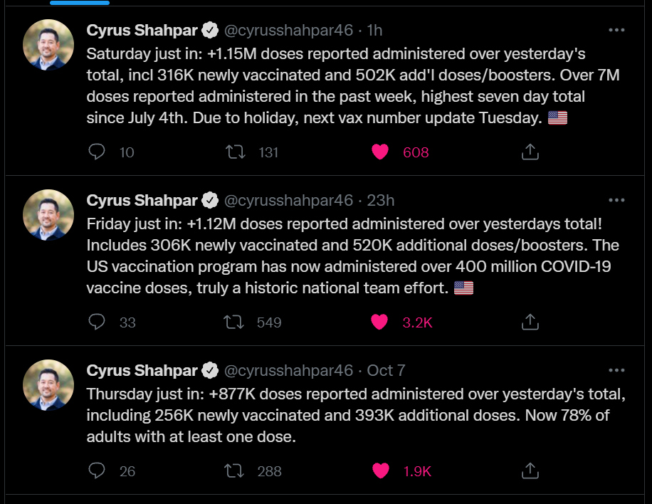
    As I mentioned in today’s National Numbers post, these booster shots are obfuscating the country’s vaccination trends. Over one million people have been vaccinated every day for the past week, but roughly half of those people were getting their booster shots.

    One might think I am sourcing that daily booster shot number from the CDC dashboard, but no: it comes, as many key COVID-19 data updates do these days, from the Twitter account of White House COVID-19 Data Director Cyrus Shahpar. The CDC has yet to add any booster shot data to its dashboard beyond a total count of doses administered.

    Shahpar’s daily updates. Screenshot taken on October 9.

    Much as I appreciate Shahpar’s daily updates, I would like to see the agency add those daily booster shot counts to its dashboard. And why stop there? The CDC should also provide information on the demographics of those getting booster shots, such as age and race/ethnicity, as well as geographic trends.

    Notably, the New York Times has added a booster shot trendline to its vaccination dashboard; see the chart titled “New reported people vaccinated.” As I noted last week, 15 states have added booster shots to their vaccine dashboards and reports as well, including three states that are reporting demographic breakdowns. The CDC is behind the data reporting curve, as usual.

  • The data problem underlying booster shot confusion

    The data problem underlying booster shot confusion

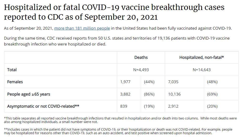
    This is all the breakthrough case data that the CDC gives us. Screenshot taken on September 26.

    This past Thursday, an advisory committee to the CDC recommended that booster doses of the Pfizer vaccine be authorized for seniors and individuals with high-risk health conditions. The committee’s recommendation, notably, did not include individuals who worked in high-risk settings, such as healthcare workers—whom the FDA had included in its own Emergency Use Authorization, following an FDA advisory committee meeting last week.

    Then, very early on Friday morning, CDC Director Rochelle Walensky announced that she was overruling the advisory committee—but agreeing with the FDA. Americans who work in high-risk settings can get booster shots. (At least, they can get booster shots if they previously received two doses of Pfizer’s vaccine.)

    This week’s developments have been just the latest in a rather confusing booster shot timeline:

    Why has this process been so confusing? Why don’t the experts agree on whether booster shots are necessary, or on who should get these extra shots? Part of the problem, of course, is that the Biden administration announced booster shots were coming in August, before the scientific agencies had a chance to review all the relevant evidence.

    But from my (data journalist’s) perspective, the booster shot confusion largely stems from a lack of data on breakthrough cases.

    Let’s go back in time—back four months, or about four years in pandemic time. In May, the CDC announced a major change in its tracking of breakthrough cases. The agency had previously investigated and published data on all breakthrough cases, including those that were mild. But starting in May, the CDC was only investigating and publishing data on those severe breakthrough cases, i.e. those which led to hospitalization or death.

    At the time, I called this a lazy choice that would hinder the U.S.’s ability to track how well the vaccines are working. I continued to criticize this move, when researchers and journalists attempted to do the CDC’s job—but were unable to provide data as comprehensive as what the CDC might make available. 

    Think about what might have been possible if the CDC had continued tracking all breakthrough cases, or had even stepped up its investigation of these cases through increased testing and genomic sequencing. Imagine if we had data showing breakthrough cases by age group, by high-risk health condition, or by occupational setting—all broken out by their severity. What if we could compare the risk of someone with diabetes getting a breakthrough case, to the risk of someone who works in an elementary school?

    If we had this kind of data, the FDA and CDC advisory committees would have information that they could use to determine the potential benefits of booster shots for specific subsets of the U.S. population. Instead, these committees had to make guesses. Their guesses didn’t come out of nowhere; they had scientific studies to review, data from Pfizer, and information from Israel and the U.K., two countries with better public health data systems than the U.S. But still, these guesses were much less informed than they might have been if the CDC had tracked breakthrough cases and outbreaks in a more comprehensive manner.

    From that perspective, I can’t really fault the CDC and the FDA for casting their guesses with a fairly wide net—including the majority of Americans who received Pfizer shots in their authorization. There’s also a logistical component here; the U.S. has a lot of doses that are currently going unused (thanks to vaccine hesitancy), and may be wasted if they aren’t used as boosters.

    But it is worth emphasizing how a lack of data on breakthrough cases has driven a booster shot decision based on fear of who might be at risk, rather than on hard evidence about who is actually at risk. Other than seniors; the risk for that group is fairly clear.

    The booster shot decision casts a wide net. But at the same time, it creates a narrow band of booster eligibility: only people who got two doses of Pfizer earlier in 2021 are now eligible for a Pfizer booster. Recipients of the Moderna and Johnson & Johnson vaccines are still left in the dark, even though some of those people may need a booster more than many people who are now eligible for additional Pfizer shots. (Compare, say, a 25-year-old teacher who got Pfizer to a 80-year-old, living in a nursing home, with multiple health conditions who got Moderna.)

    That Pfizer-only restriction also stems from a data issue. The federal government’s current model for approving vaccines is very specific: first a pharmaceutical company submits its data to the FDA, then the FDA reviews these data, then the FDA makes a decision, then the CDC reviews the data, then the CDC makes a decision.

    By starting with the pharmaceutical company, the decision-making process is restricted to options presented by that company. As a result, we aren’t seeing much data on mixing-and-matching different vaccines, which likely wouldn’t be profitable for vaccine manufacturers. (Even though immunological evidence suggests that this could be a useful strategy, especially for Johnson & Johnson recipients.)

    In short, the FDA and CDC’s booster shot decision is essentially both ahead of evidence on who may benefit most from a booster, but behind evidence for non-Pfizer vaccine recipients. It’s kind-of a mess.

    I also can’t end this post without acknowledging that we need to vaccinate the whole world, not just the U.S. Global vaccination went largely undiscussed at the FDA and CDC meetings, even though it is a top concern for many public health experts outside these agencies.

    At an international summit this week, President Biden announced more U.S. donations to the global vaccine effort. His administration seems convinced that the U.S. can manage both boosters at home and donations abroad. But the White House only has so much political capital to spend. And right now, it’s pretty clearly getting spent on boosters, rather than, say, incentivizing the vaccine manufacturers to share their technology with the Global South.

    I can only imagine this situation getting messier in the months to come.

    More vaccine reporting