Blog

  • We’re not doing enough sequencing to detect B.1.1.7

    We’re not doing enough sequencing to detect B.1.1.7

    The CDC has identified 63 cases of the B.1.1.7 variant as of Jan. 8, but this is likely a significant undercount thanks to the nation’s lack of systematic sequencing.

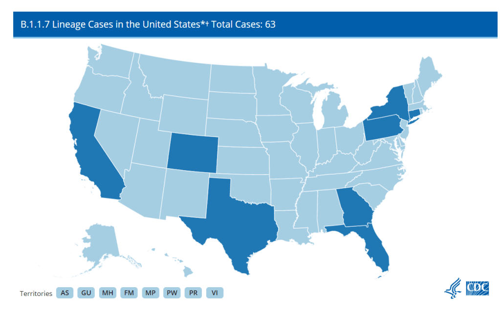
    A new, more transmissible strain of COVID-19 (known as B.1.1.7) has caused quite a stir these past few weeks. It surfaced in the United Kingdom and has been detected in eight states: California, Colorado, Connecticut, Florida, Georgia, New York, Texas, and Pennsylvania. The fact that a mutant strain happened isn’t a surprise, as RNA viruses mutate quite often. But as vaccines roll out, the spread of a new strain is yet another reminder that we’re nowhere near out of the woods yet.  

    It’s entirely possible to differentiate between strains of SARS-CoV-2 through genetic testing. To detect the B.1.1.7 variant, COVID-19 positive samples can be sequenced to search for a telltale deletion in the virus’s RNA. And in theory, we could track the spread of this variant with good testing data. A truly robust tracking effort should include a centralized surveillance program to sequence the RNA of the SARS-CoV-2 virus in all positive cases—or at least a good sample—to detect any mutant strains and track their impact. However, this is an area where the US has consistently faltered: as of December 23rd, only 51,212 out of 18 million positive cases had been sequenced. 

    As with most of the government’s response, handling this seems to be mostly up to the states. According to releases from Colorado, Pennsylvania, Connecticut, and Texas, it looks like these states are making sequencing efforts. Georgia said, “The variant was discovered during analysis of a specimen sent by a pharmacy in Georgia to a commercial lab”, which I can only assume means they have been conducting some kind of sequencing effort. I couldn’t find references to the extent of sequencing efforts in the announcements from California, Florida, or New York

    From these releases, it’s obvious that there is no unified cross-state effort. Pennsylvania stated that they had been sending “10-35 random samples biweekly to the CDC since November to study sequencing,” but that’s not going to be nearly enough to track this more transmissible variant. Are there any plans to ramp up sequencing? And that’s just from Pennsylvania because they deigned to tell us—are all states going to ramp up sequencing? It’s just not clear. 

    And after all that, starting to test for the variant now still won’t tell us just how widespread it is. The first case in New York was in someone with no evident travel history. Indeed, this is true for most people who have been infected, and, per Dr. Angela Rasmussen in Buzzfeed News, this suggests that the variant is already circulating in the community. To know how widespread the variant is, we would need to retroactively test samples that had already tested positive. Colorado’s press release mentioned that they would be doing some retroactive testing, but what about the other seven states? 

    Plus, that’s just states with already confirmed cases—there absolutely will be more confirmed cases in other states, because if it is already present in the community, there probably already are cases in other states. To know just where this variant is, every positive test in the US stretching back months into the past would have to be retroactively re-tested for the variant—an unlikely occurrence. 

    Even if there were a coordinated effort to retroactively sequence all positive tests, some cases of the variant could still slip through the cracks, because most states still aren’t doing enough PCR testing as it is. As of January 8th, according to Ashish Jha’s team at the Brown University School of Public Health, 86% of states aren’t meeting their testing targets. (Meeting testing targets indicates that enough testing is happening to “identify most people reporting symptoms and at least two of their close contacts.” State targets on this dashboard were last configured on October 1, so keep that in mind.) Only two states where the variant has surfaced, Connecticut and New York, are meeting their targets—and cases are surging in both states right now. Longtime readers are going to be very familiar with this problem, but if any new people are reading, this means that in most states we don’t even know how widespread our “garden variety” COVID-19 is. So how are we supposed to know where the UK variant is if we can’t even keep track of the virus that’s been here for almost a year? 

    Beyond testing, even reporting on confirmed cases of the variant is spotty at best. The CDC is reporting how many detected cases of COVID-19 have been caused by the variant, but no state with a confirmed case caused by B.1.1.7 is displaying that data on their dashboard. (I checked the 8 states’ dashboards and left a comment on California’s because the ask box was right there.) Why is this not on their dashboards? I couldn’t tell you, but it seems like important information that should be reported.

    All of these unanswered questions show, yet again, that we desperately need a unified effort from the federal government to track and combat this virus. It should not be this hard to find how we’re tracking the spread of this variant, it should not be this hard to tell which methods work for even identifying the variant, and it should at least be possible to find this data on state health dashboards. It might look like we’re close to the finish line as vaccines continue to be distributed, but we’re tripping over the exact same problems we did at the beginning. 

  • Vaccine confusion abounds—and this is the easy stage

    Vaccine confusion abounds—and this is the easy stage

    !function(){“use strict”;window.addEventListener(“message”,(function(a){if(void 0!==a.data[“datawrapper-height”])for(var e in a.data[“datawrapper-height”]){var t=document.getElementById(“datawrapper-chart-“+e)||document.querySelector(“iframe[src*=’”+e+”‘]”);t&&(t.style.height=a.data[“datawrapper-height”][e]+”px”)}}))}();

    It’s been one month since the Pfizer/BioNTech vaccine was authorized for use in the U.S. Since then, about 22 million Pfizer and Moderna doses have been distributed—and at least 6.7 million of those have actually made it into people’s arms, according to the CDC. (The CDC is not yet tracking second doses.)

    Despite the federal government’s intense push to get vaccines through safety trials, that “last mile” step—from the Pfizer and Moderna factories to people’s arms—has been under-planned and underfunded. In the past month, we’ve been shocked by news stories ranging from a Wisconsin medical employee “intentionally removing” doses from a refrigerator to a local journalist in Florida individually helping over 150 seniors register for vaccination appointments. 

    State public health departments, already overwhelmed from ten months of running every other aspect of pandemic response, needed more money and resources to simultaneously coordinate millions of vaccinations and communicate their importance. The needed money didn’t come until this month, and recommendations from the federal government have left a lot of room for interpretation—leaving state and local health agencies scrambling.

    And this first month was supposed to be the easy part! As The Atlantic’s Sarah Zhang explains, early U.S. vaccination efforts were aimed at easy-to-reach people: those in hospitals, nursing homes, and other long-term care facilities. In these locations, it’s easy to quickly identify the most vulnerable patients and get them registered for vaccination appointments. The next groups of eligible Americans will not be so easy to reach. Doctors’ offices, pharmacies, and many other businesses will need to figure out vaccine logistics while also ramping up campaigns to convince people to even get vaccinated in the first place.

    (For a plain-language explanation of this issue that you can send to confused friends and relatives, I highly recommend the latest episode of the Sawbones podcast with Dr. Sydnee McElroy and Justin McElroy.)

    When I updated my vaccine data annotations yesterday, I added notes on how the vaccine rollout is progressing in each state. For the 38 states (and D.C.) now reporting vaccinations, you’ll find two new fields: the state’s vaccination phase (1A, 1B, etc.; 31 states are reporting this) and any prominently featured information on how residents can get vaccinated, such as a registration portal or contact information for local public health departments (at least 12 states are doing this).

    Please note that, while most states do not yet have state-wide vaccine registration portals, many local public health departments are setting up such portals at the regional and county level. I highly recommend searching for your local public health agency to see what they have available. Also, New Mexico, which has a registration portal but no vaccine data dashboard, is not included in the annotations.

    State data availability (as of Jan. 9)

    • 39 jurisdictions are reporting some form of COVID-19 vaccination data on a dedicated page or dashboard
    • 16 states are reporting race and ethnicity of vaccinated residents
    • 20 states are reporting age of vaccinated residents
    • 17 states are reporting gender or sex of vaccinated residents
    • 20 states are reporting vaccinations by county or a similar local jurisdiction
    • 31 states are reporting their vaccination phase (1A, 1B, etc.)
    • 12 states are prominently featuring information on how residents can get vaccinated, such as a registration portal or contact information for local public health departments

    More vaccine data news

    • Jurisdictions with new vaccine dashboards or pages include: Arkansas, Arizona, California, Washington D.C., Kansas, Nebraska, and South Carolina.
    • The CDC’s vaccination data are now available for download, via a table beneath the interactive dashboard. The agency updated its state-by-state data every weekday this past week—an improvement from the past two holiday weeks. A time series isn’t yet available, though.
    • Bloomberg’s vaccine tracker now has time series for both individual states and several countries which have begun administering vaccines. The states currently leading the pack for vaccinations per capita in the U.S. are West Virginia, the Dakotas, and Maine.
    • KFF has updated its COVID-19 Vaccination Monitor with polling data on vaccine hesitancy in rural America. Compared to urban and suburban residents, the foundation found, rural residents are significantly more hesitant. 31% of the rural residents sampled said they would “definitely get” a vaccine, compared to over 40% in other categories. Rural residents are also more likely to say they’re “not worried” that they or someone in their family will get sick with COVID-19.
    • NPR’s Selena Simmons-Duffin and Pien Huang surveyed experts to determine several major ways the U.S. could “jump start its sluggish vaccine rollout.” These include: more money for state and local health departments, more vaccine types (hopefully some easier-to-transport brands), massive administration sites, more regular supplies from the federal government, and public awareness campaigns.
    • The Trump administration is speeding up at least one thing: a plan to help pharmacies administer COVID-19 vaccines. According to POLITICO’s Rachel Roubein, almost 40,000 pharmacies are involved in the federal program, including those part of the Costco, Rite Aid, and Walmart chains. Pharmacies which are already used to administering flu vaccines each year—and already have huge patient databases—are strong candidates for the next phase of vaccine rollout.  
    • After some classic infighting from Governor Andrew Cuomo and Mayor Bill de Blasio, New York state is moving to Phase 1B—meaning seniors and essential workers will start to see vaccinations. However, as City Councilmember Mark Levine pointed out on Twitter, the city has: “One website for H+H sites, another for DOHMH sites, another for Costco. For community clinics, 7 have their own different websites, 4 require calling, and 1 is by email.” (I want to get vaccinated at Costco, personally, if the opportunity arises.)
    • A Twitter thread from KFF Senior Vice President Jen Kates points out more of the methods states and counties are using to get residents signed up for vaccination appointments. They range from the expected online portals to SurveyMonkey and Eventbrite.

    Related posts

    • Sources and updates, November 12
      Sources and updates for the week of November 12 include new vaccination data, a rapid test receiving FDA approval, treatment guidelines, and more.
    • How is the CDC tracking the latest round of COVID-19 vaccines?
      Following the end of the federal public health emergency in May, the CDC has lost its authority to collect vaccination data from all state and local health agencies that keep immunization records. As a result, the CDC is no longer providing comprehensive vaccination numbers on its COVID-19 dashboards. But we still have some information about this year’s vaccination campaign, thanks to continued CDC efforts as well as reporting by other health agencies and research organizations.
    • Sources and updates, October 8
      Sources and updates for the week of October 8 include new papers about booster shot uptake, at-home tests, and Long COVID symptoms.
    • COVID source shout-out: Novavax’s booster is now available
      This week, the FDA authorized Novavax’s updated COVID-19 vaccine. Here’s why some people are excited to get Novavax’s vaccine this fall, as opposed to Pfizer’s or Moderna’s.
  • National numbers, Jan. 10

    National numbers, Jan. 10

    In the past week (January 3 through 9), the U.S. reported about 1.7 million new cases, according to the COVID Tracking Project. This amounts to:

    • An average of 240,000 new cases each day
    • 447 total new cases for every 100,000 Americans
    • 1 in 196 Americans getting diagnosed with COVID-19 in the past week
    Nationwide COVID-19 metrics published in the COVID Tracking Project’s daily update on January 9. More than 3,000 Americans are now dying of COVID-19 every day.

    Already, in 2021, America has reported 2.1 million new COVID-19 cases. That’s 31 times the number of cases South Korea has reported in the entire pandemic. (Remember, the two nations had their first cases on the same day back in January 2020.)

    Last week, America also saw:

    • 131,000 people now hospitalized with COVID-19 (40 for every 100,000 people)
    • 21,700 new COVID-19 deaths (7 for every 100,000 people)

    The nation is now recording an average of 3,000 deaths every day, more than the number of lives lost on September 11, 2001. Yet cases are still rising—the COVID Tracking Project reported a record 310,000 on January 8—and hospitals continue to fill with patients.

    Some of the cases and deaths added to national counts this week were likely reported late, making up for holiday dips over the winter holidays. (See previous issues for more on this phenomenon.) But many weren’t. 

    “Things will get worse as we get into January,” Dr. Fauci said in an interview with NPR this week.

  • School data update, Jan. 3

    Many school districts across the nation will once again open for in-person instruction later this month. But data on how COVID-19 spreads in schools remain inadequate.

    At the request of one of my readers, I’ve updated my annotations of state K-12 data reporting, first published on December 6. The annotations are posted on a new resource page, which also includes notes on the four major national sources for COVID-19 school data.  I’ll be updating this page every two weeks.

    Here’s how the state data stand, as of January 1:

    • 34 states and the District of Columbia are reporting COVID-19 cases in K-12 schools, in some form
    • 7 states are reporting incomplete data on school outbreaks or cases in school-aged children
    • 20 states are separating out school case counts by students and staff
    • 5 states are reporting deaths linked to school outbreaks
    • 1 state is reporting COVID-19 tests conducted for school students and staff (New York)
    • 2 states are reporting in-person enrollment (New York and Texas)

    Related posts

    • COVID-19 school data remain sporadic
      On November 18, New York City mayor Bill de Blasio announced that the city’s schools would close until further notice. The NYC schools discrepancy is indicative of an American education system that is still not collecting adequate data on how COVID-19 is impacting classrooms—much less using these data in a consistent manner.
  • Vaccination data update, Jan. 3

    Despite the holidays, several more states began reporting vaccination data in the past week. The Centers for Disease Control and Prevention (CDC) also made a huge update: this national dashboard is now posting vaccination counts at the state level.

    Here are the notable updates:

    • I launched a vaccination data page on the CDD site which includes annotations on ten major national sources and every state’s vaccination reporting. I’ll be updating it weekly—the most recent update was yesterday.
    • Five states have started regularly reporting vaccination data since December 27: Alabama, Alaska, Indiana, Mississippi, and Wisconsin. 32 total states are now reporting these data; 15 states are reporting race and ethnicity of vaccinated residents. See more details on the resource page.
    • On December 30, the CDC started reporting state-level vaccination data on its national COVID-19 dashboard. For every state, the CDC is reporting total vaccine doses distributed and total people who have received their first dose. The dashboard also includes national counts—both for the U.S. as a whole and for long-term care facilities. Data are not yet available for download. According to the most recent update (yesterday, January 2), 4.2 million Americans have received their first dose.
    • Drew Armstrong, the Bloomberg reporter who runs the publication’s vaccination dashboard, posted a vaccine data user guide on Twitter. While the Tweet thread primarily describes the methodology and design choices behind Bloomberg’s dashboard, it also provides useful context for vaccination data overall. Two notable details: all vaccination data lag (the CDC’s data lag by about 50 hours, according to Armstrong), and Bloomberg is working on making the underlying data behind their dashboard public.
    • Benjy Renton halted updates for the “Doses Administered” tracker on his Vaccine Allocation Dashboard. As the CDC is now providing standardized state counts—and Renton is a one-person tracking operation—he’s switching to focus on analyzing vaccination trends and accessibility.  
    • Distribution delays: Operation Warp Speed promised that, if the Pfizer and Moderna vaccines received Emergency Use Authorization from the FDA, 20 million Americans would get vaccine doses by the end of 2020. That clearly didn’t happen. What went wrong? To answer that question, I recommend two articles: this STAT News story and this CNN story. Both articles suggest that a lag in data reporting may be one reason why the current vaccination counts look so low. Still, there’s a big difference between 4.2 million and 20 million.
    • Vaccination and the new COVID-19 strain: As the B.1.1.7 coronavirus variant, identified in the U.K., becomes an increasingly ominous threat to America’s COVID-19 containment, vaccination becomes increasingly urgent. Zeynep Tufekci’s latest piece in The Atlantic explains the issue. One piece that stuck out to me: the U.S. doesn’t have good genomic surveillance—or, a system to systematically sequence the virus genomes for people infected with SARS-CoV-2—which makes us less equipped to see where the new strain is actually spreading. As Tufekci puts it: “we are flying without a map.”
    • One dose or two? Scientists and public health leaders have been debating changing our vaccination protocol. Should the U.S. stick to the script, so to speak, and reserve enough vaccine doses that everyone who receives one dose can receive a second in the prescribed time window? Or should we give as many people first doses as we can, accepting that some may not get a second dose for months—or at all? (The U.K. opted for the latter earlier this week.) University of Washington professor Carl Bergstrom has compiled some Twitter threads that explain the debate. Dr. Fauci said on Friday that the U.S. will stick to the official two-dose regimen, but the scientific discourse will likely continue.

    Related posts

    • Sources and updates, November 12
      Sources and updates for the week of November 12 include new vaccination data, a rapid test receiving FDA approval, treatment guidelines, and more.
    • How is the CDC tracking the latest round of COVID-19 vaccines?
      Following the end of the federal public health emergency in May, the CDC has lost its authority to collect vaccination data from all state and local health agencies that keep immunization records. As a result, the CDC is no longer providing comprehensive vaccination numbers on its COVID-19 dashboards. But we still have some information about this year’s vaccination campaign, thanks to continued CDC efforts as well as reporting by other health agencies and research organizations.
    • Sources and updates, October 8
      Sources and updates for the week of October 8 include new papers about booster shot uptake, at-home tests, and Long COVID symptoms.
    • COVID source shout-out: Novavax’s booster is now available
      This week, the FDA authorized Novavax’s updated COVID-19 vaccine. Here’s why some people are excited to get Novavax’s vaccine this fall, as opposed to Pfizer’s or Moderna’s.
  • Your guide to choosing a COVID-19 data source

    Your guide to choosing a COVID-19 data source

    In preparing for this re-launch, I asked a few of my readers what they liked about the COVID-19 Data Dispatch and how it could better serve them. One common answer was that the publication has helped readers navigate the landscape of COVID-19 data sources, and pick the best source for a given story.

    The first two resources pages I’ve produced take this service to the next level.

    First: The Featured Source List is an upgraded version of the Google spreadsheet I’ve been using to keep track of data sources featured in the newsletter since July. You can use the table to search, sort, and filter all 82 featured sources by their names and categories. The little green plus icons toggle expanded views, with more details on every source. Much friendlier than a spreadsheet!  (Though, if you want to see the raw spreadsheet, it’s still accessible here.)

    Second: The Data Source Finder tool tells you exactly where to find the data you need for a given story.  (Or for a Facebook post, or an argument with your friend, and so forth.)  The tool includes detailed annotations on 16 data sources which I consider the primary COVID-19 sources in the U.S.

    Here’s how to use it. You start out by selecting the geographic scale on which you’d like to see data (global, U.S. states, counties, or cities), then choose the type of metric you’re looking for. The tool will return your options, including each dataset’s available metrics, methodologies, update schedule, download links, and more.

    It’s essentially an interactive flowchart, aimed to make it easy to compare and contrast sources for reporters on deadline and students engaged in Twitter debates alike. You can also find the full set of annotations linked on the page.

    While I compiled the annotations, the interactive tool was coded in Twine by my girlfriend, Laura Berry.  Your membership fees will help me buy Laura a nice dinner to thank her for her work.

  • Support the COVID-19 Data Dispatch

    Support the COVID-19 Data Dispatch

    For the past five months, I’ve produced this publication for free. It’s been an act of service to my fellow COVID-19 reporters, public health communicators, and readers who simply want to understand the pandemic a bit better.

    The newsletter will continue to be free, as will many of the COVID-19 data resources I publish. But in tandem with this new site, I’m launching a membership program. 

    This program will enable COVID-19 communicators to connect more directly with each other, as well as to provide feedback that will shape what I cover.  It’ll also help me cover my own costs, which have grown significantly as I moved platforms.

    I already talked about my technical reasons for moving from Substack to a full-fledged website. I have another big reason for setting up a site, though: I’m planning to keep the CDD going beyond this pandemic. Its name might change later in 2021 or 2022, but my mission will stay the same—building accessibility and accountability for public health data in the United States.

    This publication won’t end when COVID-19 does. But even that idea, COVID-19 “ending,” feels tenuous to me. Maybe you feel that way, too. Maybe you’ve been reading articles like Ed Yong’s “Where Year Two of the Pandemic Will Take Us” or Maryn McKenna’s “2021 Will Be a Lot Like 2020,” that unpack how far we still need to go before life returns to some semblance of normalcy. Maybe you realize that America’s recovery from the pandemic won’t be so simple as 70% of the population getting vaccinated. Maybe you feel haunted by the structural inequities that COVID-19 revealed in our healthcare system and beyond, and you know you could never write enough stories or donate to enough mutual aid funds to make up the gap.

    Covering COVID-19, I’ve realized, is not just about this virus.  It’s about making sure we’re ready for the next public health crisis.  And we do that not just by growing our scientific capability but by prioritizing the public in public health.  To change the systems in which we live, we need to understand them—and we need to bring our communities along with us.

    If you feel this way, too, join me!  Help me build a network that will be ready to cover this pandemic and the next one.

    And now, the technical details.  Here are the benefits of membership:

    • Community: Join a Slack server where COVID-19 reporters and communicators share resources and advice.
    • Resources: Exclusive cleaned datasets, visualizations, and other tools to assist you in your work.
    • Shape the Dispatch: Your priorities and needs will shape what the CDD covers and which new resources are produced.
    • Accessibility: Keep the CDD free for all its readers! Support accountability for public health data!

    The recommended membership fee is $10/month.

    But I understand that the pandemic is a difficult time for financial commitments. As such, I’m also offering pay-what-you-will pricing, starting at $2/month. There’s no difference in benefits between the two price tiers.

    In the interest of transparency, I’ve published my major costs here. To break even, I would need 120 members to join at the recommended $10/month tier.

    I also want to call attention to the second line on that costs page: Intern’s research and writing time. That’s right—this is going from a one-person publication to a two-person publication!  My friend (and current Barnard junior) Sarah Braner has agreed to join me as an intern for their spring semester.  You’ll learn more about them next week.

    As I am extremely against unpaid internships, my top financial priority right now is paying Braner’s salary. That shakes out to 18 members joining at $10/month.

    If you’re not ready to commit to membership right now, you can still support the publication with a one-time donation on Ko-fi.

  • The COVID-19 Data Dispatch has moved

    The COVID-19 Data Dispatch has moved

    It feels like every journalist started a Substack in 2020. I proudly joined that number when I launched the COVID-19 Data Dispatch in late July.

    But after five months of screenshotting Tableau charts, struggling to keep organized, and hitting Gmail’s email size limit again and again—I realized the platform wasn’t serving my needs. I wanted to give my readers clear archives and easy-to-navigate resources, and Substack just wasn’t providing.

    From now on, I’ll be publishing each issue as a series of posts on the site and sending out a newsletter with the highlights. This will help keep issues concise while still allowing me to do deep dives into important data issues.

    More on the new site below. But first, some housekeeping.

    Housekeeping

    Here’s how to make sure you don’t miss my emails on the new platform.

    If you have any questions or find that you’re missing my emails on Sundays, hit me up at betsy@coviddatadispatch.com.

    Why I moved

    The choice to switch platforms wasn’t an easy one. Substack allowed me to focus on content without worrying about any technical setup, and it provided an easy experience for new readers who wanted to sign up. But after deliberating the move, talking to mentors, and spending a few weeks setting up my new system, I’m feeling good about this decision.

    Here are a few of the reasons why I made this move.

    • Linking out to posts: Probably the most common criticism of the CDD (Substack edition) was that it was simply too long. Emails got cut off in inboxes, and readers would need to scroll past thousands of words of analysis to get to new featured sources or my weekly snarky comment about a data dashboard.  I wanted to make the email reading experience easier without compromising my desire to really dive into data sources.  This new format—short blurbs in the newsletter, linked out to longer posts on the site—helps me do just that.
    • Organized archives: Publishing each newsletter as a series of posts rather than as one long article also helps me keep the site organized—and makes it easier for you to find the information you need. I’ve set up several major categories, such as “Federal data,” “K-12 schools,” and “Hospitalization,” which group similar newsletter segments together. The archives are also organized with tags (which get a little more specific than the categories) and by date.
    • Hosting data resources: In addition to posts from my newsletter issues, the new website includes dedicated resource pages. These pages pull together data source recommendations, annotations, and tips in a format that’s much more accessible than a Google spreadsheet. (Shout-out to the WordPress plugin TablePress, which is my new best friend.) The first couple of pages are up; more will be posted in the coming weeks.
    • Hosting visualizations: One big reason for moving off Substack: on this website, I can actually embed Tableau dashboards. And Datawrapper charts, and Flourish charts, and basically any other type of visualization. This will make it much easier for you to interact with the charts I feature, whether those are charts I produced specifically for the newsletter or figures I’m hosting from other sources.
    • Setting up for search: The new website is searchable both internally and externally. Internally: a “Search” widget on the site’s sidebar and at the bottom of every page allows you to search for topics like “Texas” or “Dr. Fauci.” Externally: I’m using a couple of WordPress tools to make the website more easily recognizable by Google and other search engines. This should help more readers find the publication.
  • National numbers, Jan. 3

    National numbers, Jan. 3

    In the past week (December 27 through January 2), the U.S. reported about 1.4 million new cases, according to the COVID Tracking Project. This amounts to:

    • An average of 201,000 new cases each day
    • 430 total new cases for every 100,000 Americans
    • 1 in 232 Americans getting diagnosed with COVID-19 in the past week
    Nationwide COVID-19 metrics published in the COVID Tracking Project’s daily update on January 2. Daily cases hit a new record thanks to reporting backlogs from New Years.

    These numbers must be interpreted with caution: COVID-19 reporting has been significantly impacted by Christmas and New Years. 20 states didn’t update their COVID-19 data on December 25, and 24 didn’t update their data on January 1—followed by a record day with 276,000 cases reported on January 2. As I’ve noted in previous issues, reporting gaps over holidays lead to spikes several days later, as states catch up on the cases, deaths, and tests that took place over their break.

    But hospitals didn’t close for the holidays. Over 125,000 Americans were hospitalized with COVID-19 this week—the nation continues to break its own record for this morbid metric. For more context and regional analysis on hospitalizations, see the COVID Tracking Project’s most recent weekly update.

  • COVID source shout-out: Dr. Fauci

    COVID source shout-out: Dr. Fauci

    This newsletter observes Dr. Anthony S. Fauci Day, a new holiday declared in Washington, D.C. on December 24 in honor of Dr. Fauci’s 80th birthday. Thank you, Dr. Fauci, for your tireless years of service.

    And thank you, ABC News, for this video of Dr. Fauci getting vaccinated, which I have watched approximately 50 times since last Tuesday. To quote my girlfriend: “dr. fauci’s vaccination video is exactly asmr.”