- COVID-19 Neuro Databank: The National Institutes of Health has started a new database to keep track of neurological symptoms associated with COVID-19. The database will be fully anonymized, and it’ll be accessible for scientists who want to better understand neurological complications with the disease. For more information, see this press release from the NIH.
- Covid Performance Index: How do different countries rank in their management of the pandemic? This index, from think tank the Lowy Institute, attempts to answer that question by comparing infection rates, death rates, and testing for 98 countries with available data. New Zealand, Vietnam, and Taiwan are at the top of the list; the U.S. ranks #94.
- COVAX Global Supply Forecast: Another global data source is this report from COVAX, an initiative from the World Health Organization and Gavi, the Coalition for Epidemic Preparedness. The report provides summaries of the global vaccine supply, including both existing contracts and those under negotiation.
- OpenSky COVID-19 Flight Dataset: Martin Strohmeier, a computer scientist at Oxford University, and other collaborators have compiled a dataset of flight data related to the COVID-19 pandemic. According to a blog post published in late December, Strohmeier plans to update the dataset once a month.
Blog
-
Featured sources, Jan. 31
-
Experts say schools could reopen, but data are still scarce
The medical journal JAMA released an article written by three CDC officials about opening schools. The conclusion was that it appears that reopening schools safely is possible—but before we turn everyone loose, there are a lot of caveats. And critically, protective measures that need to be taken are not limited to the schools themselves.
When experts say that schools can be reopened safely, it means that so far, schools haven’t been driving community transmission the way other public spaces remaining open have. In a case study comparing 154 students who had been infected with SARS-CoV-2 and 243 who had not, schools posed much less of an infection risk than other social activities. The paper also cited two case studies, one from North Carolina and one from Wisconsin, where cases in general were fairly uncommon, and the vast majority of the recorded cases came from cases acquired from the community, not the schools.
It’s clearly inaccurate to say that COVID-19 simply hasn’t hit schools. Indeed, if it hadn’t, we wouldn’t need our school trackers. And while many US school outbreaks have mostly been small, it’s not impossible a future outbreak could be anything but. The JAMA paper cites an outbreak in Israel where out of 1161 students and 151 staff members tested, 153 and 25 cases were found in students and staff, respectively, within two weeks of reopening. “Crowded classrooms…, exemption from face mask use, and continuous air conditioning that recycled interior air in closed rooms” were cited as contributing to the outbreak. Additionally, school-related activities such as extracurriculars and athletics could also pose a higher risk.
For longtime readers of this newsletter or even for anyone who’s kept up with the news, the path to reopening schools may sound familiar. Measures taken need to include universal mask use, a robust screening program, physical distancing, and hybrid models of education to reduce classroom density (including online options). But, critically, the article also stresses that measures need to be taken in the surrounding community to reduce spread, singling out indoor dining in particular. Indeed, schools are not isolated islands; the health of students returning for school depends on if a community can control the spread. Schools themselves may not be driving much community spread, but if COVID-19 is running uncontrolled in the community, it’s still not going to be safe to hold in-person classes.
While it is exciting that schools reopening may be on the horizon, safe schools are nowhere near promised if governments and administrations aren’t willing to take necessary measures to control community spread. Closing restaurants and gyms is politically unpopular in many places. The economic incentives to keep indoor dining and to open movie theaters are hard to ignore. It may be a choice – open your schools and keep tight restrictions everywhere else, or loosen restrictions on dining and gyms and keep schools online. It’s not an easy choice. But, as the JAMA article points out, “Committing today to policies that prevent SARS-CoV-2 transmission in communities and in schools will help ensure the future social and academic welfare of all students and their education.”
Two days after the JAMA article was published, NYT columnist David Brooks published a column decrying teachers unions and insisting that schools reopen, citing financial concerns for students in the future and current mental health problems. He pointed out that typically, white students have had greater access to in-person learning than black and brown students, going on to say: “I guess I would ask you, do Black lives matter to you only when they serve your political purpose? If not, shouldn’t we all be marching to get Black and brown children back safely into schools right now?”
The response was swift, with many pointing out that the pandemic has disproportionately affected black and brown communities in terms of infection and death rates, and that they are more likely to live in underfunded communities where it might be a lot harder to keep students and staff safe. and that teachers maybe shouldn’t be blamed for not wanting to go back to work when there is still uncontrolled spread across the country. This Twitter thread sums up a lot of the backlash.
Indeed, even if schools do open up, as we talked about in our January 17 issue, we’re still having a lot of problems tracking cases. There still isn’t a federal dataset; however, there is reason to hope that we’ll get some better federal data soon after Biden included a call for data to inform safe K-12 school reopening and data on the pandemic’s impact on teachers and students in his executive order on school reopening. (See the CDD’s K-12 school data annotations here.)
We do know that black and brown children have been disproportionately affected by the pandemic; Hispanic/Latino and Black children account for 38.2% of cases in their age group while Hispanic/Latino and Black people account for only 31.4% of Americans. If schools do reopen in person, it’s clear that actions need to be taken to address structural inequity that would prevent them from doing so safely.
Related posts
- COVID-19 school data remain sporadicOn November 18, New York City mayor Bill de Blasio announced that the city’s schools would close until further notice. The NYC schools discrepancy is indicative of an American education system that is still not collecting adequate data on how COVID-19 is impacting classrooms—much less using these data in a consistent manner.
- COVID-19 school data remain sporadic
-

Vaccinations so far are perpetuating existing inequity
Two weeks ago, I wrote that only 19 states were reporting vaccinations by race and/or ethnicity. This demographic information is key to evaluating the vaccine rollout: both government officials and watchdogs should be able to see how well this process is serving vulnerable populations. Without good data, we can’t see the true picture—making it harder to advocate for a more equitable system.
Demographic vaccine data has improved since then, but not by much. The federal government is still not reporting these data on a national level. 23 states are reporting some form of vaccinations by race and ethnicity—but the data are difficult to standardize, as every state is reporting slightly different demographic categories. Several states are reporting in percentages, rather than whole numbers, which makes the data less precise.
And a lack of federal standards for these data means it’s easy for states to change things up: Indiana, which started reporting vaccinations by race/ethnicity early in January, is now only reporting vaccinations by age and gender. New York City also reported demographic data for vaccinations in December, then removed the figures after disparities were revealed, according to Gothamist. (NYC’s demographic data are back, as of this morning, but they still show white residents getting vaccinated at disproportionately high rates compared to the city’s population.)
(For more detail on which states these are and how to navigate their vaccination data, see the COVID-19 Data Dispatch’s annotations.)
Meanwhile, the data we have so far continue to show significant disparities. In 23 states with available data, white Americans are being vaccinated at higher rates than Black Americans, a recent analysis by Kaiser Health News’ Hannah Recht and Lauren Weber found. This analysis followed a similar study that I cited two weeks ago—Recht and Weber write that “disparities haven’t significantly changed” with two more weeks and several more states reporting.
In all but six of the states Recht and Weber analysed, white residents had been vaccinated at double (or more) the rate of Black residents. In Pennsylvania, this rate rises to 4.2 times. Indiana reported white residents vaccinated at 2.6 times the rate of Black residents—before the state took these data off its dashboard. Polling from the Kaiser Family Foundation continues to show that Black Americans are more hesitant; 42% of those surveyed said they want to “wait and see” how the vaccines are working for others before getting a shot.
This vaccination news builds on the continued, deep strain that COVID-19 has placed on Black communities. Alice Goldfarb provided an update this week in an analysis post for the COVID Tracking Project. While the piece maps out disparities in COVID-19 cases for Black, Hispanic or Latino, and Indigenous populations in every state, Goldfarb also provides a stark comparison for the toll this pandemic has taken:
More Black Americans have died of COVID-19 since the pandemic began than there are names on the Vietnam Memorial. More Black or Latinx people have died than the number of people commemorated on the AIDS Memorial Quilt.
The urgency of fixing our vaccine system is clear. And politicians are starting to take note: Massachusetts Representative Ayanna Pressley and Senators Elizabeth Warren and Edward Markey called for better demographic data in a letter to the Department of Health and Human Services this week. They urged the department to better work with states, local public health departments, and labs to collect more data and publish it publicly.
In a statement to the Associated Press, Pressley says:
That which gets measured gets done, and the first step towards ensuring we are able to effectively address these disparities and direct lifesaving resources to our hardest-hit communities is for our government to collect and publish anonymized demographic data, including race and ethnicity, of vaccine recipients.
White Massachusetts residents are getting vaccinated at 1.4 times the rate of Black residents, according to KHN.
Dr. Marcella Nunez-Smith, the chair of Biden’s new COVID-19 equity task force, similarly discussed the need for better data and equitable vaccination at briefings this week. She mentioned leveraging existing data sources, removing barriers to vaccination in underserved communities, sharing ideas between states, and generally making vaccines more accessible, along with a vaccine communications campaign. But she didn’t go into many specifics.
The federal government may be able to make vaccine distribution more equitable, if it can provide the funding that state and local public health departments—along with health clinics, community centers, churches, and so many other possible vaccine providers—need right now. But one thing it can do is require race and ethnicity data, and make it standardized. We need that, like, a month ago.
More vaccination data updates
There were a couple of great features this week on problems with America’s vaccine data system(s), as well as updates to major sources. Here are the highlights:
- STAT’s Nicholas St. Fleur wrote about the struggle to find a vaccine appointment, highlighting a viral Twitter thread from intensive care physician Dr. Arghavan Salles. Convoluted online systems are simply not working for seniors and many other vulnerable populations.
- In another STAT piece, Mario Aguilar described vaccination data challenges in Utah as a microcosm of similar issues across the country. Even within this single state, he writes, some counties with robust IT already in place were able to adapt their tech for COVID-19 vaccination, while in others, exhausted healthcare workers must enter every data point by hand.
- KHN’s Rachana Pradhan and Fred Schulte describe how a lack of standards for race and ethnicity data collection have led some states to leave this field optional, while others aren’t tracking it at all. Similar problems persist for occupation data, which should be crucial when we’re supposedly prioritizing essential workers for earlier vaccination!
- Cat Ferguson at MIT Technology Review gives the full picture of Vaccine Administration Management System, or VAMS, a brand-new vaccine data system that the CDC commissioned for COVID-19 vaccination—and that is completely failing to do its job. Most states in the country have chosen not to use this free system, as it is difficult to use, arbitrarily cancels appointments, and confuses patients.
- A team from POLITICO laid out Biden’s journey to locate 20 million vaccine doses. The White House briefings were “short on details,” these authors claim, because behind the scenes, the Biden team was still struggling to get their hands on basic information that should’ve been communicated during the transition. Once doses are delivered to states, the state public health systems are fully responsible for tracking these doses until they are officially recorded as “administered”; this makes it difficult for the federal government to track the overall vaccine rollout.
- KFF has a new dashboard for its COVID-19 Vaccine Monitor, which is tracking public opinions of and responses to vaccines. The organization is also running a dashboard of state COVID-19 vaccine priorities, which makes it easy to compare strategies across states.
- Vaccine Finder, a tool developed at Boston Children’s Hospital which makes it easy for Americans to find vaccine providers in their communities, is partnering with Google Maps to “bring wider awareness and access to COVID-19 vaccines,” according to John Brownstein, Chief Innovation Officer at the hospital.
Related posts
- Sources and updates, November 12Sources and updates for the week of November 12 include new vaccination data, a rapid test receiving FDA approval, treatment guidelines, and more.
- How is the CDC tracking the latest round of COVID-19 vaccines?Following the end of the federal public health emergency in May, the CDC has lost its authority to collect vaccination data from all state and local health agencies that keep immunization records. As a result, the CDC is no longer providing comprehensive vaccination numbers on its COVID-19 dashboards. But we still have some information about this year’s vaccination campaign, thanks to continued CDC efforts as well as reporting by other health agencies and research organizations.
- Sources and updates, October 8Sources and updates for the week of October 8 include new papers about booster shot uptake, at-home tests, and Long COVID symptoms.
- COVID source shout-out: Novavax’s booster is now availableThis week, the FDA authorized Novavax’s updated COVID-19 vaccine. Here’s why some people are excited to get Novavax’s vaccine this fall, as opposed to Pfizer’s or Moderna’s.
-
The federal government starts acting like a federal government

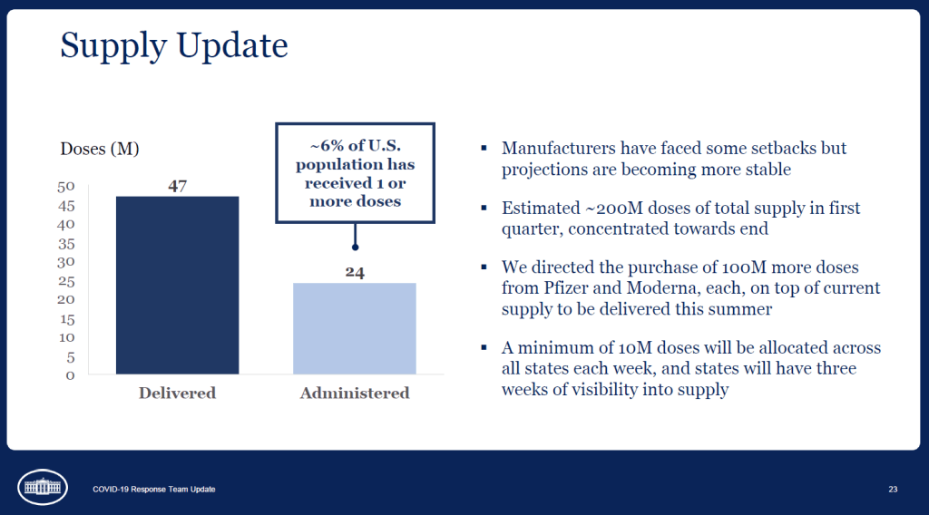
A slide from the January 27 White House COVID-19 briefing, featuring the Biden team’s new commitment to provide states with three weeks’ lead time into their vaccine supply. Good afternoon only to the reporters on last Wednesday’s White House COVID-19 press call who told Dr. Anthony Fauci that he was on mute.
And yes, you read that right: the White House is doing regular COVID-19 press calls again! With Dr. Fauci! Who is now President Biden’s Chief Medical Advisor on COVID-19! And CDC Director Dr. Rochelle Walensky! And chair of Biden’s health equity task force Dr. Marcella Nunez-Smith!
Okay, that’s enough exclamation points. The briefings, which will be held three times a week, provide data-driven updates on the state of the pandemic and allow journalists to ask hard questions of the Biden administration’s response. In addition to the scientific experts, briefings so far have featured White House advisors/COVID-19 coordinators Jeff Zients and Andy Slavitt, who can speak to the more logistical aspects of the administration’s actions.
This is, essentially, what a responsible federal government should have been doing since January 2020. But after a year of the Trump administration’s confusion, lack of coordination, and outright lies, it’s refreshing to watch a White House COVID-19 briefing in which every statement doesn’t need to be rigorously fact-checked in real-time.
Besides the press briefings, here are a couple of moves the Biden team made this week that underscore the new administration’s commitment to better (and more transparent) COVID-19 data:
- Publicly releasing the COVID-19 State Profile Reports: Since last spring, the White House COVID-19 Task Force has regularly compiled detailed reports to help national and state leaders respond to the pandemic. The reports include COVID-19 data for states, counties, and cities, along with specific assessments on where governors and state public health officials should focus their efforts in order to control the virus’ spread. In late December, the data behind these reports were released to the public; here’s a CDD post with more info on that release. Biden’s COVID-19 Task Force has kept the data releases going, and this week, they also shared the PDF reports themselves. What’s more, new White House COVID-19 Data Director Cyrus Shahpar made this release his first Tweet on his new official account—and he thanked public advocates for these data, such as the Center for Public Integrity’s Liz Essley Whyte and COVID Exit Strategy’s Ryan Panchadsaram. The release indicates a new commitment to data transparency that we did not see from Trump’s White House for the majority of his tenure.
- Updating the CDC’s COVID-19 dashboard: The CDC has been building out a COVID-19 tracker since the spring, featuring data on cases, testing, vulnerable populations, and (since December) vaccination. But it got a major upgrade this week: the dashboard now has a curated landing page and a sidebar menu that makes it much easier for users to see all the available data. This dashboard also now includes those State Profile Reports I mentioned above, making it easy for users to find information about their regions. And, under the “Your Community” label, you’ll also find an interactive COVID-19 vulnerability index: select your county, and the map will show you how susceptible you are to the pandemic based on your community’s current infection rate, testing, population demographics, health disparities, and more.
- More lead time for vaccine distribution: Last week, I discussed how unpredictable vaccine shipments from the federal government were making it difficult for states—and by extension, local public health departments and individual providers—to coordinate their dose administration. Biden’s team improved the situation this week by giving states their shipment numbers three weeks in advance. The extended lead time will allow vaccine providers to plan out appointments and coordinate other logistics in order to ensure all doses are used. Both the CDC’s Pfizer and Moderna distribution datasets were most recently updated on January 26, with allocation numbers for January 25 and February 1.
- Stepping up the genomic surveillance: In both of this week’s White House COVID-19 briefings, CDC Director Rochelle Walensky announced that the agency is actively looking for new SARS-CoV-2 variants by working with local and international partners. She gave some specifics in Friday’s briefing: “We are now asking for surveillance from every single state,” she said, requiring states to sequence 750 strains each week. Collaborations with both commercial labs and research universities will take the surveillance to thousands of strains per week. As Sarah Braner wrote earlier in January, such surveillance is key to understanding how prevalent the new—and more contagious—coronavirus strains are in the U.S., as well as to detecting future strains that may become a threat in the coming months.
It looks like the CDC may be on its way to adapting its current dashboard into the Nationwide Pandemic Dashboard that Biden promised in his transition plan. But I, for one, am trying not to get too comfortable. The statements still need to be fact-checked, and the hard questions need to be asked. Biden’s team is making the bare minimum look nice—albeit with a few Zoom glitches.
As I look forward into my coverage of the Biden administration’s COVID-19 response, and its healthcare policies more broadly, I’m thinking about this quote from Chris La Tray in his most recent newsletter issue, “Same as it Ever Was”:
“I’m already sick of all the white liberal people humping each other’s legs every time Biden does something that is simply his damn job. “It’s so nice to have a president that….” Blech. Puke. There is copious lingering accountability to be addressed and Joe goddamn Biden is neck deep in it. We are not going back to anything that resembles the last 40 years of his political career, our only way is forward.”
Our only way is forward. To end this pandemic, to prepare for the next one.
Related posts
-
National numbers, Jan. 31
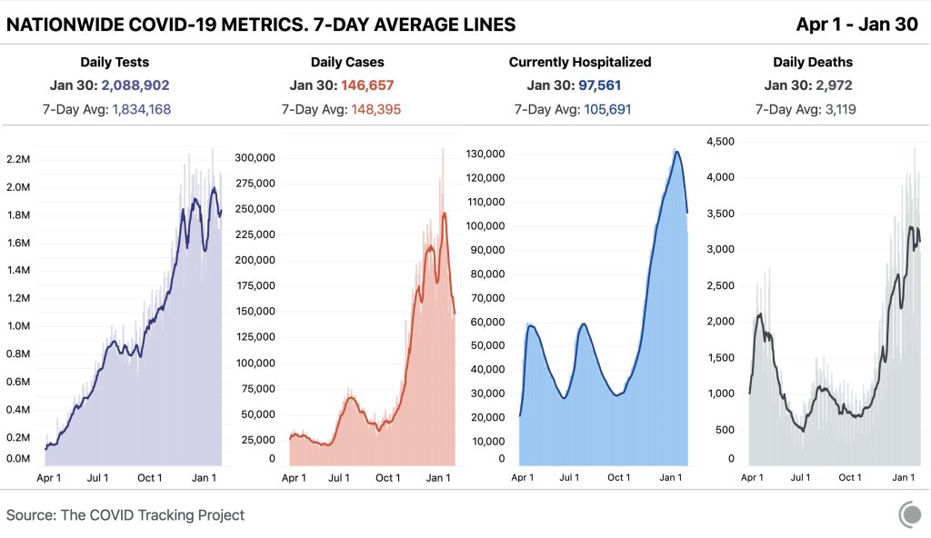
In the past week (January 24 through 31), the U.S. reported about 1.0 million new cases, according to the COVID Tracking Project. This amounts to:
- An average of 148,000 new cases each day
- 317 total new cases for every 100,000 Americans
- 1 in 316 Americans getting diagnosed with COVID-19 in the past week
- 38% fewer new cases than we reported three weeks ago

Nationwide COVID-19 metrics published in the COVID Tracking Project’s daily update on January 30. Current hospitalizations are under 100,000 for the first time in almost two months. Last week, America also saw:
- 97,600 people now hospitalized with COVID-19 (30 for every 100,000 people)
- 21,800 new COVID-19 deaths (6.7 for every 100,000 people)
- An average of 1.35 million vaccinations per day (according to Bloomberg)
The number of patients hospitalized with COVID-19 is under 100,000 for the first time since December 1. Still, this current number is about 60% higher than the peak number of patients hospitalized during either of the U.S.’s previous surges last spring and summer (60,000).
In late 2020, COVID-19 became the leading cause of death in the U.S. It was the third-highest cause of death in that year overall. Already, in 2021, over 3,000 Americans have died of COVID-19 each day—making this disease a far higher burden than heart disease and cancer, typically the top two drivers of mortality.
While new COVID-19 cases and hospitalizations continue to slow, continuing the trend from last week, new SARS-CoV-2 variants continue to give experts cause for concern. South Carolina’s public health department identified two cases of the B 1.351 variant first reported in South Africa; this variant is known to be more contagious and less susceptible to vaccines. Meanwhile, the B.1.1.7 variant (first reported in the U.K.) continues to spread—CDC officials are concerned that it could be the dominant strain here by the spring.
And New York—which has already reported 42 B.1.1.7 cases—is planning to open indoor dining in February. I’m no public health expert, but I plan to be ordering takeout for a long time yet.
-

COVID source shout-out: A new national team
While some of President Biden’s lieutenants in the pandemic control effort await Senate confirmation, many leaders have already taken charge. Mere hours after the inauguration, new CDC Director Rochelle Walensky extended the agency’s eviction moratorium until March 31. And Dr. Anthony Fauci is once again taking a prominent role in White House communications, appearing at press briefings and announcing America’s return to the World Health Organization.
Maybe it’s the lighting, but Dr. Fauci looks ten years younger. We love to see it.
-
Featured sources, Jan. 24
We have two featured sources this week, both related to vaccination data:
- US COVID-19 Vaccination Tracking: This is a new vaccination dashboard focused on demographics, developed by researchers at Georgetown University’s Bansal Lab. The dashboard compiles data on vaccination by race, ethnicity, sex, and gender from state reporting. Users can also hover over counties to see what share of the county’s population has been vaccinated, based on county or state data. Here’s a Twitter thread from lead researcher Shweta Bansal on the dashboard’s methodology and findings so far.
- COVIDcast vaccination survey results: I’ve featured COVIDcast, a project by the Delphi Group at Carnegie Mellon University, before. The project’s dashboard interactive maps for a variety of COVID-19 indicators ranging from movement trends to antigen tests. But I’m featuring the source again this week because recently, the Delphi Group collected survey data on vaccine acceptance. You can download the data and compare vaccine hesitancy across counties; read more about the release in MIT Technology Review.
-
COVID-19 data whistleblower Rebekah Jones gets arrested, tests positive
Late Sunday, January 17, COVID-19 data scientist Rebekah Jones turned herself in to Florida Law Enforcement authorities. The charge against her, according to a press release from the Florida Department of Law Enforcement (FDLE) on the 18th, is “one count of offenses against users of computers, computer systems, computer networks and electronic devices”. She allegedly hacked a government communication system and sent an authorized message urging workers to “[s]peak up before another 17,000 are dead.”
She was released on the 18th with a bond of $2,500, and is allowed to have internet access—but is not allowed to access the Florida Department of Health website—until her trial. According to her attorney, she tested positive for COVID-19 before her release. The main dashboard for her project, Florida Covid Action, is still updating as of 6:44 PM on January 22nd, and The COVID Monitor (her tracker of COVID-19 cases in schools) appears to still be active as well.
Earlier in December, Jones faced a police break-in as police raided her house to search for evidence that she had illegally accessed government data. They seized her phone and computer, and pointed guns at her and her children. Jones denies all charges, and she sued the FDLE for “violat[ing] her rights under the First, Fourth, and Fourteenth Amendments”, along with “terroriz[ing]” her family.
Jones was fired from her government job in May 2020, in what she claims was retaliation for her refusal to manipulate data in order to make it look like Florida was in a better position to reopen than it actually was. Since her firing, she has maintained two ongoing COVID-19 data projects: Florida Covid Action uses open-source information as an alternative general dashboard, and The Covid Monitor tracks K-12 school data nationwide. (We’ve used their dashboard before in our schools coverage.)
It is unclear when Jones’ next court appearance will be. For now, she has been cleared to return to her home in Maryland, where she moved out of fear for her family’s safety.
We’re covering her story because whether the allegations against her prove true or not, Florida leadership and law enforcement clearly consider Jones a threat. And no matter the outcome of the trial, her story forces us to question the state of Florida’s commitment to unaltered, accurate data.
-
Vaccination is a logistics problem
Earlier this week, I got a frantic email from my grandma. She wanted my help in finding a vaccination appointment. She’d talked to her primary care provider and looked at her state public health agency’s website, but wasn’t sure how to actually secure her own spot in line. She lives in California, which is still officially in Phase 1A (vaccinating healthcare workers and long-term care facility residents), but is allowing some providers to start vaccinating seniors and essential workers based on “available supply.”
My uncle did help my grandma get an appointment—one month from now and an hour’s drive away. Despite living in Berkeley, near several research universities, she’ll be heading to Palo Alto for her shots. I told her to keep a close eye on her county public health department’s website in case something becomes available there (which would be my advice to anyone else in this position), but I couldn’t guarantee that she’d be able to find an appointment any closer than the one she has now.
And she’s not alone: a lot of grandmas are having trouble getting vaccination appointments. In fact, recent survey data from the Kaiser Family Foundation suggests that the majority of American seniors “do not have enough information about when and where they will be able to get the vaccine.” Black, Hispanic, and low income adults also report not having enough information about vaccinations, according to KFF. The minority communities that continue to be heavily impacted by the pandemic are supposed to be first in line for vaccines, but barriers to information and technology—particularly to vaccine registration portals—are leaving them behind once again.
It would be easy to say the problem here is a lack of vaccine doses. But that’s not exactly it. The federal government is distributing millions of doses each week, and many of those doses are making it into arms: according to Bloomberg’s vaccine tracker, an average of 1.1 million shots were reported each day this past week. By sheer numbers, we are already on track to meet President Biden’s 100 million vaccinations in 100 days goal.
Our current problem is, in fact, a logistics one. It’s a build up of infrastructure failures, with all the weight falling on those underfunded local public health departments I mentioned in the previous section. Right now, these public health workers are trying to set up vaccination appointments, while also dealing with constantly-changing information from their state on how many doses they will get, while also stretching out a depleted budget, while also probably short on personnel because half of their staff quit or got COVID-19 in 2020, while also dealing with backlash from their communities, while also fielding endless calls from confused grandmas… and all of this while still testing, contact tracing, and communicating basic pandemic safety measures. Whew. I got tired just writing that sentence.
Some dimensions of this problem, such as the funding and lack of community trust, are years in the making. But there’s one piece the federal government may be able to solve soon, and it’s a data issue. The federal government is not giving states—and by extension, local public health agencies—enough lead time to coordinate their vaccine distribution. ProPublica reporters Caroline Chen, Isaac Arnsdorf and Ryan Gabrielson explained the situation in a detailed feature this week: unpredictable shipments at the national level mean that vaccine providers are unable to use up all of their shots in some weeks and cancelling appointments in others. The whole piece is worth reading, but I want to highlight the one quotation near the end:
Starting Wednesday, it will be up to the Biden administration to provide clear visibility for states, according to a member of the president-elect’s COVID-19 team, who asked not to be identified because he wasn’t authorized to speak on behalf of the new administration.
“The government can point at the manufacturer, but it’s like asking the [Defense Department], ‘How many planes do you have?’ and them saying, ‘I don’t know, ask Boeing,’” the person said.
Reporters at POLITICO similarly found that public health workers simply don’t trust the dose allocation system. While the Biden administration may want to ramp up vaccine production in order to vaccinate more Americans, this goal may be more easily achieved by ensuring vaccines are properly tracked. At every part of the vaccination pipeline, stakeholders should know how many doses they’re getting and when. Shipments should be predictable, and appointments should be easily managed, freeing up public health workers’ time to take on the important task of actually vaccinating people.
And there are still holes in our data on who’s getting vaccinated, too. Only 23 states are reporting vaccinations by race and ethnicity; this is an improvement from last week, but still a far cry from comprehensive data collection. Another ProPublica investigation, meanwhile, found that many states aren’t requiring providers to report vaccine doses that go wasted, making it difficult to see a comprehensive picture of the shots that get spoiled or thrown in the trash.
It also bears mentioning that Pfizer will now be shipping out fewer vaccine vials to account for the “surprise 6th dose” that providers are often able to get out of each vial—since Pfizer charges by the dose. It is unclear whether this reduction in dose availability will affect the rollout.
One piece of good news, on the vaccination data front: the CDC vaccination tracker stepped up its reporting to include weekend updates, as of yesterday. But the agency still isn’t reporting demographic data, comprehensive data on long-term care facilities, or even a time series of doses administered per day. Vaccination tracking has a long way to go.
Related posts
- Sources and updates, November 12Sources and updates for the week of November 12 include new vaccination data, a rapid test receiving FDA approval, treatment guidelines, and more.
- How is the CDC tracking the latest round of COVID-19 vaccines?Following the end of the federal public health emergency in May, the CDC has lost its authority to collect vaccination data from all state and local health agencies that keep immunization records. As a result, the CDC is no longer providing comprehensive vaccination numbers on its COVID-19 dashboards. But we still have some information about this year’s vaccination campaign, thanks to continued CDC efforts as well as reporting by other health agencies and research organizations.
- Sources and updates, October 8Sources and updates for the week of October 8 include new papers about booster shot uptake, at-home tests, and Long COVID symptoms.
- COVID source shout-out: Novavax’s booster is now availableThis week, the FDA authorized Novavax’s updated COVID-19 vaccine. Here’s why some people are excited to get Novavax’s vaccine this fall, as opposed to Pfizer’s or Moderna’s.
- Sources and updates, November 12
-

Can Biden clean up America’s COVID-19 data?

President Biden signing executive orders related to COVID-19 on January 21. Screenshot via the White House’s livestream. Shortly after President Joe Biden’s inauguration, the official White House website got a makeover. It now hosts the president’s priorities and COVID-19 plan—including a promise to create a “Nationwide Pandemic Dashboard.”
I wrote about this promise in November, when it first appeared on Biden’s transition plan website. The promise hasn’t changed since then:
Create the Nationwide Pandemic Dashboard that Americans can check in real-time to help them gauge whether local transmission is actively occurring in their zip codes. This information is critical to helping all individuals, but especially older Americans and others at high risk, understand what level of precaution to take.
We don’t have a clear timeline for this dashboard yet, of course, much less details on what it will include. But the foundation was laid this week: Biden released a detailed national COVID-19 plan and signed 30 executive orders—three of which are directly related to tracking the pandemic.
In the coming weeks, I’ll be closely watching to see how the Biden administration follows through on these plans. Will the new administration build on the strengths of existing federal and state data systems, or will it tear down old systems and sow unnecessary confusion?
What Biden is promising:
- A Nationwide Pandemic Dashboard: We covered this one already. Biden’s national strategy document specifies that the federal government will track cases, testing, vaccinations, and hospital admissions—and will “make real-time information available.” The “real-time” promise here is worth highlighting, as real-time pandemic data do not actually exist; every metric from cases to vaccinations has its own lag based on reporting and data-sharing technologies. (COVID-19 deaths, in particular, may be reported weeks after they occur.) Still, the federal government is already tracking all of these metrics. The Biden team’s goal, then, is to consolidate them into an easily accessible dashboard that is widely used by everyone from county public health leaders to elementary school teachers.
- Coordinated federal data collection: One of Biden’s executive orders, signed on January 21, requires several federal agencies to “designate a senior official” who will lead that agency’s COVID-19 data collection. The officials must both coordinate with each other and make data public. Meanwhile, the Department of Health and Human Services secretary will review the national public health data systems and figure out how to increase their efficiency and accuracy. (Xavier Becerra, Biden’s pick for HHS secretary, hasn’t been confirmed by the Senate yet; will this review need to wait until he officially starts the position?)
- A focus on equity: Another Biden executive order promises to address the disproportionate impact that COVID-19 has had on people of color and other minority communities. The executive order specifically calls out a lack of standardized COVID-19 data on these communities, saying this data gap has “hampered efforts to ensure an equitable pandemic response.” Biden’s COVID-19 Health Equity Task Force will be required to address this data gap by coordinating with federal agencies—both expanding data collection for underserved populations right now and making recommendations to prevent this issue in future public health crises. This task is easier said than done, though; a recent STAT News article called using data to ensure vaccination equity one of the biggest challenges Biden faces as he takes office.
- School data collection: Last week, I wrote that there was no mention of data-gathering in Biden’s K-12 COVID-19 plan. Well, maybe someone from his team reads the COVID-19 Data Dispatch, because his executive order on supporting school reopening requires data collection in two areas: data to inform safe reopening of K-12 schools, and data to understand the pandemic’s impact on students and educators. I would have liked to see a more specific promise to track COVID-19 cases, tests, and student enrollment in public schools, but this is a good start.
- Data-based briefings: Jen Psaki, the new White House press secretary, said on Wednesday that the administration would hold regular briefings with health officials, “with data.” Ideally, such briefings should explain trends in COVID-19 data and put numbers into context for the Americans watching at home.
The promises are, well, promising. And I’m rooting for President Biden! Seriously! My job would be way easier if I could just give you all updates using one centralized dashboard each week. But I’ve spent enough time hacking through the weeds of this country’s highly confusing, irregular data systems to know that the new president can’t just flip a switch and make a nationwide pandemic dashboard magically appear on whitehouse.gov.
If anyone from the Biden administration is reading this, hello! Please put me on all your press lists! And here’s what this data reporter would, personally, like to see you focus on.
What I want to see:
- Don’t break what we already have: Or, build on the existing federal data systems (and dashboards) rather than creating something entirely new. Last week, Alexis Madrigal published a feature in The Atlantic advocating for the new administration to keep COVID-19 hospitalization data under its current HHS control rather than transferring this responsibility back to the CDC. I’ve covered the HHS’s hospitalization data extensively in the CDD, but this feature really paints a cohesive picture of the dataset—from its turbulent, politically charged beginnings to its current, comprehensive, trustworthy format. The story is worth a read. And on a similar note, I’ve been glad to see federal data sources like the CDC’s dashboard and the Community Profile Reports, continue to update on their usual schedules. Biden’s team should seek to improve upon these systems and make them easier to access, not start from scratch.
- More public metadata: When the federal government has put out large data releases in recent months, responsibility has largely fallen on journalists and other outside communicators to make those releases accessible. I’ve done some of that work in this publication and at the COVID Tracking Project. But it shouldn’t really be my job—the federal agencies that put out these datasets should be releasing FAQ documents, holding press calls, and generally making themselves available to help out researchers and communicators who want to use their data.
- Count the rapid tests: Since August, I’ve called on the federal public health agencies to release national data on antigen tests and other types of rapid tests. A recent article in The Atlantic by Whet Moser makes clear that data for these tests are still widely unavailable. Moser writes that antigen test numbers are not reported at the federal level, and at the state level, such reporting is highly fractured and inconsistent; as a result, about three-quarters of the antigen tests that the federal government has distributed are unaccounted for in public data. The HHS should focus on tracking these tests as comprehensively as it has tracked PCR tests, and it should make the numbers publicly available.
- Survey the genomes: Another massive challenge that the U.S. faces right now is keeping track of the SARS-CoV-2 variants that are circulating through the population, some of which may be more contagious or more life-threatening. As Sarah Braner reported two weeks ago, the majority of COVID-19 cases aren’t genomically sequenced, making it difficult for us to know how many of those cases are new strains as opposed to the regular coronavirus that we’ve all come to know and hate over the past year. Biden’s health and science leadership should make it a priority to step up the nation’s genetic sequencing game, and all of those data should be publicly shared.
- Support the local public health agencies: Nationwide data coordination is obviously important, and is something that’s been desperately needed since last spring. But most of the COVID-19 data work—logging test results, standardizing those test results, sending them to a central location—is done by state and local public health officials. Local public health agencies, in particular, have been under-funded and threatened by partisan policies since before the pandemic started. To truly improve COVID-19 data collection, the Biden administration must provide support to these local agencies in the form of funding, personnel, technology, and truly anything else they need right now.
When Biden’s nationwide pandemic dashboard does drop, you’d better believe I’ll be giving it a comprehensive review. For now, if you want to see how well Biden’s doing at keeping his campaign trail promises, I recommend checking out Politifact’s Biden Promise Tracker.
Related posts

