The Johnson & Johnson vaccine has fully dropped—not just in the arms of millions of Americans, but also on state vaccine dashboards. When I updated the CDD’s vaccination data annotations yesterday, I noticed that several states had switched from labeling their shots as “first dose” and “second dose” to labeling them as “first dose” and “completed series,” or something similar. Since the J&J vaccine is only one dose, a single shot from this manufacturer could launch you right into that “completed series” category.
However you label them, the U.S. is now vaccinating about 2.5 million people per day. One in four adults has received at least their first shot. And we crossed the 100-million dose mark on Friday, far earlier than President Biden’s 100-day goal. Meanwhile, cases, deaths, and hospitalizations continue to decline.
These numbers have inspired some guarded optimism, at least on the part of the federal government. On Thursday, Biden announced that he’s directing all states, tribes, and territories to make all adults eligible for vaccination by May 1. Alaska became the first state to reach that milestone this week.
Of course, there’s a big difference between making people eligible and actually getting shots in arms. But vaccine hesitancy is reportedly dropping, as Americans see their family members and friends safely get inoculated. One new poll from NPR/PBS NewsHour/Marist shows that 73% of Black people and 70% of white people said they’re either planning to get vaccinated or have received a shot already.
Variants also continue to be a concern (see Sarah’s section later in this issue). But it’s hard to argue with the fact that millions of our family members, friends, and neighbors are now protected from COVID-19, with more people getting vaccinated every day.
As of yesterday, 45 states and D.C. are reporting vaccinations by race and ethnicity. (See the CDD’s full annotations here.) This is great—with five more states, we’ll have national coverage. But the lack of standardization in how states report these figures leaves much to be desired.
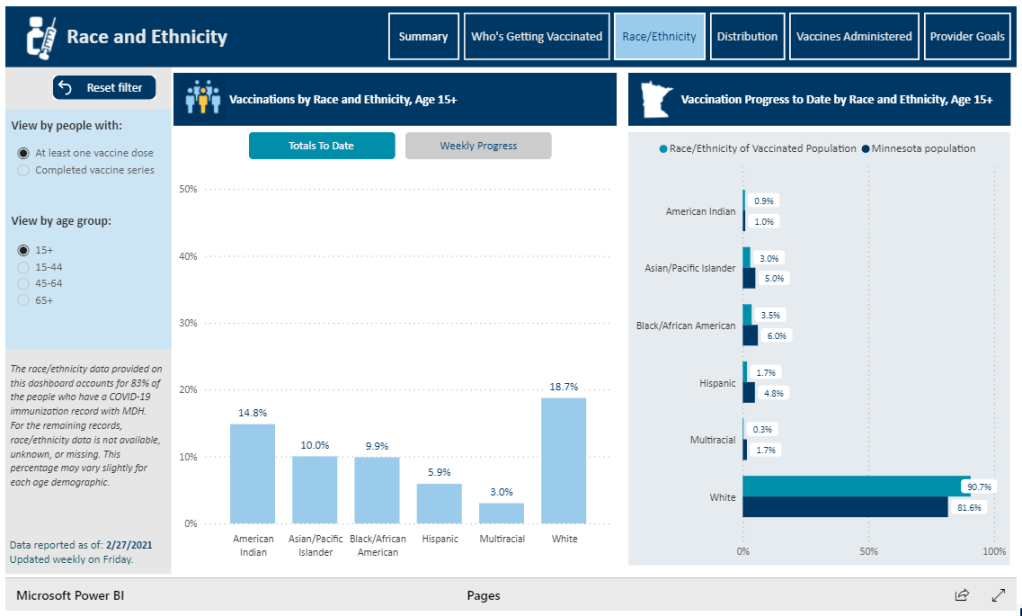
One of the newest states to start reporting race/ethnicity vaccination data is Minnesota. At a glance, the Race/Ethnicity tab of the state’s vaccine data dashboard looks comprehensive: it includes demographic data stratified by age, as well as a bar chart that compares the population that’s been vaccinated to Minnesota’s population overall.
Race/Ethnicity tab on Minnesota’s vaccine dashboard, showing percent comparisons.
But a closer examination shows that the age groups reported on this Race/Ethnicity tab (15-44, 45-64, 65+) don’t match the age groups used to report vaccinations by age on a different tab (16-17, 18-49, 50-64, 65+). So if a journalist or researcher were trying to analyze Minnesota’s vaccine demographics, they wouldn’t be able to derive whole numbers from these percentages.
This is one small example of a common issue across state vaccine demographic reporting—and demographic reporting in general. When categories don’t match, it’s difficult to make comparisons, and age brackets are particularly heinous. We need the CDC to start providing vaccine demographics by state, like, last December.
Coronavirus variant data from USA TODAY: The CDC doesn’t publish a time series of its counts of COVID-19 cases caused by variants. So, USA TODAY journalists have set up a program to scrape these data whenever the CDC publishes an update and store the data in a CSV, including variant counts for every U.S. state. The time series goes back to early January.
Documenting COVID-19: This repository is one of several great resources brought to my attention during this past week’s NICAR conference. It’s a database of documents related to the pandemic, obtained through state open-records laws and the Freedom of Information Act (FOIA). 246 records are available as of February 26.
VaccinateCA API: California readers, this one’s for you. The community-driven project VaccinateCA, aimed at helping Californians get vaccinated, has made its underlying data available for researchers. The API includes data on vaccination sites and their availability across the state.
Our final Diving into COVID-19 data workshop happened this week!
Ann Choi and Will Welch, two data reporters at THE CITY (a local, nonprofit newsroom in NYC) discussed making COVID-19 numbers accessible and meaningful for New Yorkers. Júlia Ledur, a graphics reporter at the Washington Post and former data visualization lead at the COVID Tracking Project, walked us through several visualization projects. And Christie Aschwanden, a freelance science journalist, discussed communicating uncertainty in COVID-19 reporting. Thank you to everyone who attended!
For those who couldn’t make it live, you can watch the recording of the session below. You can also check out the slides here. I’m also sharing a brief recap of the workshop below.
Making NYC data accessible
Ann Choi and Will Welch shared a few strategies they used to communicate COVID-19 data for a NYC audience.
First, Ann Choi walked through a few examples of THE CITY’s written articles, going from early uncertainty during a time of limited government guidance to a present focus on who is getting vaccinated.
One early story compares two socioeconomically similar neighborhoods in Queens, Flushing and Corona, which had different pandemic responses. For example, Flushing residents, many of whom are East Asian immigrants, did not need to be told to wear masks because they had past experience with these public health measures. Choi said she was inspired to do this comparison by thinking about how New York City measures up against Seoul, South Korea, where she has relatives. The cities have similarly-sized populations, though Seoul is much more dense; yet NYC has had over 29,000 COVID-19 deaths while Seoul has had fewer than 400.
A January story on vaccination rates emphasizes the “if”s by extrapolating out from NYC’s data. “If city residents were getting vaccinated at the statewide average,” Choi and Welch wrote, over 100,000 more city residents would already have gotten a shot. This tangible comparison emphasizes how the city is lagging behind.
A story on the Washington Heights Armory drew attention to vaccination disparities in the city. THE CITY reporter Josefa Velasquez went to this site and did what Choi called “very old-school data reporting,” talking to a sample of people waiting in line. Despite the vaccination site being touted by the governor as an example of a vaccination site in a predominantly Hispanic/Latino neighborhood, the majority of those Velasquez spoke to were white suburbanites. After this story was published, appointments at the Armory were restricted to prioritize NYC residents.
Other vaccination stories Choi’s worked on have drawn further distinctions between which neighborhoods were most impacted by the pandemic—and which neighborhoods are getting the most shots. ZIP code data released by the city allowed her to drill down into local patterns and find both examples of inequity and examples of how communities fought against it.
Will Welch then discussed THE CITY’s COVID-19 tracker, Coronavirus in New York City. It’s updated on a daily basis through a combination of scraping and hand data collection; the tracker includes data on cases, deaths, test positivity, vaccinations, and more.
“Our first iteration of this tracker was taking the data from the city and trying to put it into a more accessible format,” Welch said. City Hall emailed data out to reporters starting in mid-March, before developing a public dashboard.
Later in the spring, NYC began publishing data on a public GitHub, allowing Welch and Choi to evolve their tracker beyond simply making numbers easier to find. One example of complexity built into the tracker: NYC was one of the first jurisdictions to distinguish “confirmed” deaths (associated with positive tests) and “probable” deaths (associated with death certificates). At first, daily updates of these numbers led to confusion as probable deaths would sometimes be reassigned as “confirmed.” But when the city published a full time series on deaths, THE CITY was able to make their own time series graphic, showing the long-term arc of the pandemic.
Informed by watching this time series, Welch put together a graphic to show how early counts of COVID-19 fatalities in NYC by date of death are often incomplete. Deaths may be retroactively assigned to an earlier date of death after they were reported, which put some summer dates that Governor Cuomo bragged had seen “no new deaths” into a different light.
Welch additionally discussed how the tracker switched, in the summer, from relying on city data to relying on state data for testing numbers. State data were being used to calculate reopening indicators, and THE CITY wanted their tracker to display the information that was having the greatest impact on people’s lives. The publication also fought for the release of ZIP code level data, which were used for specific local policy restrictions starting in the fall.
Pandemic impact on New Yorkers’ lives has been an enduring theme for THE CITY’s coverage over the past year. This ranges from mapping the test positivity numbers behind restrictions to highlighting the share of NYC residents that have gotten at least one dose of a vaccine. But one particularly notable project is Missing Them, a searchable memorial of New Yorkers whose lives have been lost to COVID-19. The memorial has compiled nearly 1,000 names so far, though this is less than 5% of the total number of lives lost.
“Behind every number, behind every case, there is a vulnerable person whose life was cut short,” Choi said. She expressed hope that reporters will take lessons from covering COVID-19 to other public health crises, and remember to tell the stories behind each data point.
Visualizing COVID-19 data
Júlia Ledur talked through several of her COVID-19 visualizations projects, including both graphics at the COVID Tracking Project and the Washington Post. She shared how her approach to visualizing these data has changed as the data have become increasingly complicated, now that we’re contending with many test types, vaccinations, and more.
Early COVID Tracking Project data, collected and visualized in March 2020.
A few examples:
An early graphic (above) from March 2020, calling attention to data gaps in the CDC’s reporting. The agency had reported far fewer COVID-19 tests than the COVID Tracking Project had compiled from states at that time.
A scrollytelling explainer that calls attention to just how complicated test positivity can get, by showing how this metric gets calculated.
Another test positivity post, this one focusing on inconsistencies between the state. This post uses a fictional character called Bob to show how Bob’s testing experience might be counted in three different ways.
Graphics explaining test per positive, another metric which may be used to show complications in COVID-19 testing—though, as Ledur said, this metric did not end up taking off in the same way that test positivity did.
Trading cards and other graphics exploring different test types, to accompany an explainer on how the tests compare. Ledur worked with CTP Science Communication lead Jessica Malaty Rivera to ensure her graphics were accurately representing the science of each test while keeping readers engaged.
Ledur also shared a few of her best practices for visualizing COVID-19 data:
Be clear about what you’re showing and what you’re not showing. Include clear labels, methodology, and specific notes on what you aren’t including.
Don’t avoid uncertainty. Instead, highlight it. Tell your audience what’s going on.
Add notes and/or annotations with caveats explaining data anomalies.
Put the data in context. Show how one point in time compares to others, or how one place compares to others.
Check your science. Work with those who have the right expertise to make sure your work is correctly reflecting the issue.
Have empathy. Put yourself in the shoes of your reader; think about what questions you might have, how you can answer them, and where you can’t answer them.
“You have an idea of what it’s like to be affected by this, because you certainly are,” Ledur said. Leaning into this experience as you communicate data, remembering how the numbers make you feel, will make your reporting better.
Addressing uncertainty
“This pandemic has been a time when the process of science has been on public display,” Christie Aschwanden said to start her talk. She called this period an incredible, but overwhelming opportunity to convey the process of science in an accurate way.
And forefront in the process of science is the idea of uncertainty. We might think numbers are neutral, Aschwanden said—“we measured this and therefore it’s true”—but in fact, they are subject to biases which must be communicated along with the numbers.
These biases are why political statements such as “we follow the science” may be harmful. “Science is a method of understanding, it’s not an answer,” Aschwanden said; we should prepare people to see how a number or a conclusion may change, so that when it inevitably does change, they don’t feel betrayed.
One high-profile example of this trend is mask-wearing. Public health experts such as Dr. Anthony Fauci said in early spring 2020 that masks were not necessary for the general public. This statement reflected scientific knowledge at the time—but when this knowledge changed as the virus’ tendency to spread through air became better understood, many Americans held up the change as evidence of a conspiracy.
This trend also occurs with medical treatments. Convalescent plasma, one COVID-19 treatment, held promise early on but has not seen benefits in more recent randomized control trials. It’s important to communicate the uncertainties and shortcomings of provisional studies, so that people don’t put all their hopes into a treatment that later is shown to be less viable.
“We need to get from this magic wand idea about science,” Aschwanden said. Science is not a singular path towards truth; it’s a “process of uncertainty reduction.” Pointing out and discussing the uncertainty, whether that’s through annotations on a chart or caveats in a news story, will help readers understand how decisions may change based on new evidence.
Here are Aschwanden’s tips for discussing scientific data with the public:
Emphasize that uncertainty is okay (a feature, not a bug)
Explain that knowledge is provisional
Promote openness to new evidence, even as we become more certain
Beware motivated reasoning and cognitive biases
Convey that data aren’t neutral
One article that effectively follows these guidelines is a story Aschwanden wrote in the fall for Scientific American. She walks readers through the data on COVID-19 deaths in order to debunk the rumor that death counts are inflated by doctors. The story uses three lines of evidence to explain that there’s a lot of uncertainty about the precise number of COVID-19 deaths, but that there’s not much uncertainty about the magnitude of these deaths. Aschwanden encourages any reporters working on COVID-19 coverage to join a free listserv run by the National Association of Science Writers, which she moderates. To join the list, send an email to nasw-COVID19mods@nasw.org with your name, email, and publication(s) that you are covering COVID-19 for, either on staff or freelance.
Last week, we included Global.health in our featured sources section. The initiative aims to document 10 million plus cases in one source. Instead of just listing numbers of positive cases and deaths, they collect individual cases and gather information about said case. What was their age range? Gender? When did symptoms develop? The dataset has room for more than 40 variables aside from just “tested positive.” While there are lots of dashboards and tracking sources, none collect detailed data about (anonymized!) individual cases.
Collecting data like this is critical for understanding how epidemics spread, and an open repository could help researchers determine what the actual infection rate is or divine more information about lasting immunity. The set has been available to researchers for a while, but now it’s been released to the public. It might seem strange to release it now as it looks like cases are finally sustainably declining, but we’re still going to have to track COVID-19 even as everyone gets vaccinated. As one of the founders, Samuel Scarpino says, “COVID-19 is gonna become rare. It will fall back into the milieu of things that cause respiratory illness. As a result, we’re going to need higher-fidelity systems that are capturing lots of information and informing rapid public health response, identifying new variants and capturing information on their spread.”
Since the data are now public,let’s take a look at what’s possible with this source.
The first thing I discovered is that, predictably, the full dataset is just too big for Excel to open. I recently switched computers and I’m pretty sure this file was the death knell for my old one. You’re gonna need to either stick with their website or use something like Python or R to really sink your teeth in. Even just the website slowed down my new computer a lot, so beware. Elderly computers should probably be spared.
Still, the website is very well designed and easy to navigate. You can have your data two ways: as a table with, at time of writing, more than 200,000 pages, or as a map where you can click on the country or region you want to look at, which will then direct you to a much smaller table. (All roads lead to tables, but the map function does make it a lot easier to navigate.)
The country map is fairly self-explanatory—a deeper shade of blue means more cases— but the regional map also just looks very cool:
Regional map.
You can of course zoom in to your region of choice. My one quibble with the display is that I wish you could rotate your field of view, as sometimes the region behind a particularly tall spike can literally be overshadowed and thus be a little harder to access.
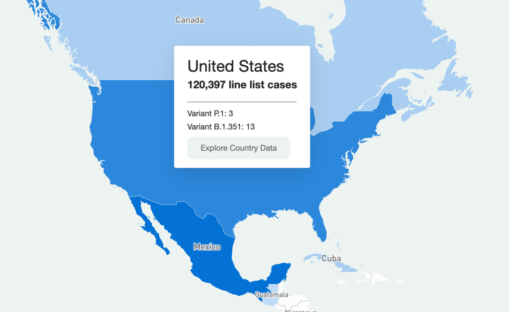
Going through every part of this giant resource would take days, so I’m going to be focusing on the United States data. Here’s what I got when I clicked on it on the map:
U.S. map.
It should be understood that this is a sample of the U.S. data (same presumably goes for data in other countries.) Because this is line-list data, it’s supposed to be very granular—recent travel history, when a case became symptomatic, and so on. Data at this level of detail just aren’t available or possible to get for every case in the country (and even less so for the rest of the world.) So that should be remembered when working with this dataset. It’s extremely comprehensive, but not all-encompassing. (That being said, it is strange that there are P.1 cases recorded, but no B.1.1.7, which is much more common here.)
So how granular are the data? When you’re directed to the table for that country, the table on the website has columns for:
Case Identification Number
Confirmation date (I assume this is confirmation that yes, this person is infected)
“Admin 1, Admin 2, and Admin 3” (short for “administrative areas” – for example, for a U.S. patient, 1 would be country, 2 would be state, and 3 would be county)
Country
Latitude and longitude (I assume of the hospital or of the lab where the case was identified)
Age
Gender
Outcome
Hospitalization date/period
Symptom onset
URL for the source
Which is indeed pretty granular! It should be noted, however, that there are a lot of blank spots in the database. It has the capacity to be extremely comprehensive, but don’t go in expecting every single line item to have every detail. I’m not sure if this is going to improve as records are updated, but I suppose we’ll see.
What can you do with these data? I loaded the full dataset into R to mess around with the data a bit. The disclaimer here is that I am by no means an R wizard. Another fair warning is that R will take a hot second to load everything up, but when you load up the full dataset there are a ton more columns for more data categories, like preexisting conditions. (That one seems important, why is it not on the more accessible website?)
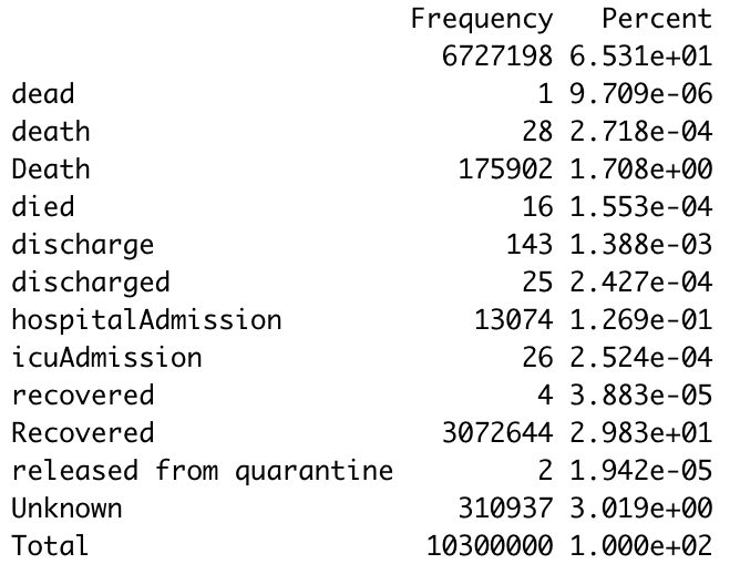
I found that making some frequency tables was a good way to assess just how complete the data was for certain variables. Here’s a frequency table I made with the outcome values:
Frequency table.
The first thing I notice is just how many lines have a blank value for the outcome. (65% of them.) Again, a lot of these data are incomplete. The second thing is that there are a ton of synonyms for the same thing. A capitalization change will shunt a number to a completely different category, making it a little annoying to compile results, so you’ll have to tinker with it a little bit to make a clear graphic/graph/etc. The bar graph R spit out for this was unreadable because of all the categories.
I tried another one for the gender demographics and the bar graph was actually readable this time. As expected, the percentage of lines with no data available was lower this time (19%) but still sizable.
Bar graph showing gender availability.
As I should have expected, I got a gigantic table when I tried it for ethnicity. But 75.49% of the lines were blank. 99.6568% were blank for occupation, which I was inspired to look at because occupational data are similarly barren for vaccination data as well. Somewhat predictably, and just as a check, cases by country had much fewer blank cells.Overall this is a really interesting resource, but there are a lot of blank spots that keep it from being the god of all datasets. I think asking any source to be 100% complete is a tall order given the circumstances, and this is still the only source out there of its kind and of its scale. I look forward to checking in again and seeing if those blank cells drop in number.
The COVID Tracking Project’s homepage on March 7, 2021.
A couple of hours after I send today’s newsletter, I will do my final shift of data entry work on the COVID Tracking Project’s Testing and Outcomes dataset. Then, later in the evening, I will do my final shift on the COVID Racial Data Tracker. And then I will probably spend another hour or two bothering my fellow volunteers on Slack because I don’t want it to be over quite yet.
In case you aren’t fully embroiled in the COVID-19 data world, here’s some context. Last spring, a few journalists and other data-watchers realized that the U.S.’s national public health agencies weren’t doing a very good job of reporting COVID-19 tests. Alexis Madrigal and Rob Meyer (of The Atlantic) compiled their own count from state public health agencies. Jeff Hammerbacher (of Related Sciences) had independently compiled his own count, also from state agencies. And, as the About page on the website goes: “The two efforts came together March 7 and made a call for volunteers, our managing editor, Erin Kissane joined up, and the COVID Tracking Project was born.”
Now, one year after that formal beginning of the Project’s test-counting efforts, the team is ending data collection work. Erin Kissane and Alexis Madrigal provided some background for that decision in a blog published on February 1. I recommend reading the piece in full, if you haven’t yet, but the TL;DR is that a. this data collection work should be done by federal public health agencies, not a motley group of researchers and volunteers, and b. the federal agencies have greatly improved their own data collection and reporting efforts in recent months.
The Project’s core Testing and Outcomes dataset formally ceases updates today, along with the Racial Data Tracker and Long-Term Care Data Tracker. But the Project has provided a lot of documentation and guidance for data users who want to keep tracking the pandemic, along with analysis that will be useful for months (if not years) to come. The rest of this post shares the highlights from those resources, along with a few personal reflections.
Where to find your COVID-19 data now
So, you’re a journalist who’s relied on the COVID Tracking Project’s tweets to illuminate pandemic trends for the past year. Or you’re a researcher who’s linked the Project’s API to your own tracking dashboard. Or you’re a concerned reader who’s checked up on your state regularly, watching the time series charts and annotations. Where do you go for your data now?
Through a series of analysis posts and webinars over the past few weeks, Project staff have made their recommendation clear: go to the federal government. In recent months, the CDC and the HHS have built up data collection practices and public dashboards that make these data easier to work with.
Here are a few highlights:
For daily updates at all geographic levels, use the Community Profile Reports. After months of private updates sent from the White House COVID-19 task force to governors, the data behind these in-depth reports were made public in December. The PDF reports themselves were made public in January, after Biden took office. The reports include detailed data on cases, deaths, tests, and hospitalizations for states, counties, and metropolitan areas. I’ve written more about the reports here.
For weekly updates, use the COVID Data Tracker Weekly Review. As I mentioned in a National Numbers post two weeks ago: the CDC is doing weekly updates now! These updates include reports on the national trends for cases, deaths, hospitalizations, vaccinations, and SARS-CoV-2 variants. They may be drier than CTP blog posts, but they’re full of data. You can also sign up to receive the updates as a newsletter, sent every Friday afternoon—the CDC has really moved into the 21st-century media landscape.
For state-specific updates, use the State Profile Reports. Similarly to the Community Profile Reports, these documents provide many major state-level metrics in one place, along with local data and color-coding to show areas of concern. They’re released weekly, and can be downloaded either state-by-state or in one massive federal doc.
For case and deaths data, use the CDC’s state-by-state dataset. This dataset compiles figures reported by states, territories, and other jurisdictions. It matches up pretty closely to CTP’s data, though there are some differences due to definitions that don’t match and other discrepancies; here’s an analysis post on cases, and here’s a post on deaths. You can also see these data in the CDC’s COVID Data Tracker and reports.
For testing data, use the HHS PCR testing time series. This dataset includes results of PCR tests from over 1,000 labs, hospitals, and other testing locations. Unlike CTP, the federal government can mandate how states report their tests, so this dataset is standardized in a way that the Project’s couldn’t be. Kara Schechtman has written more about where federal testing data come from and how to use them here. The HHS isn’t (yet) publishing comprehensive data on antibody or antigen tests, as these test types are even more difficult to standardize.
For hospitalization data, use the HHS hospitalization dataset. I’ve reported extensively on this dataset, as has CTP. After a rocky start in the summer, the HHS has shown that it can compile a lot of data points from a lot of hospitals, get them standardized, and make them public. HHS data for current hospitalizations are “usually within a few percentage points” of corresponding data reported by states themselves, says a recent CTP post on the subject. Find the state-level time series here and the facility-level dataset here.
For long-term care data, use the CMS nursing home dataset. The Centers for Medicare & Medicaid Services are responsible for overseeing all federally-funded nursing homes. Since last spring, this responsibility has included tracking COVID-19 in those nursing homes—including cases and deaths among residents and staff, along with equipment, testing availability, and other information. The CMS dataset accounts for fewer overall cases than CTP’s long-term care dataset because nursing homes only account for one type of long-term care facility. But, like any federal dataset, it’s more standardized and more detailed. Here’s an analysis post with more info.
For race and ethnicity data, there are a couple of options. The CDC’s COVID Data Tracker includes national figures on total cases and deaths by race and ethnicity—at least, for the 52% of cases and 74% of cases where demographic information is available. More detailed information (such as state-by-state data) is available on deaths by race and ethnicity via the CDC’s National Center for Health Statistics. A blog post with more information on substitutes for the COVID Racial Data Tracker is forthcoming.
The COVID Tracking Project’s federal data webinars concluded this past Thursday with a session on race and ethnicity and long-term care facilities. Slides and recordings from these sessions haven’t been publicly posted yet, but you can look out for them on the Project’s website. Also, for the more technical data nerds among you: COVID Act Now has written up a Covid Tracking Migration Guide for users of the CTP API, and the Johns Hopkins Coronavirus Resource Center announced that it will begin providing state testing data.
Analysis and update posts to re-read
It took a lot of self control for me to not just link every single CTP article in here. But I’ll give you just a few of my favorites, listed in no particular order.
Test Positivity in the US Is a Mess (Oct. 8): This piece was one of my “20 best COVID-19 data stories of 2020.” To repeat what I wrote then: “Out of the many informative blog posts produced by the COVID Tracking Project since last spring, this is the one I’ve shared most widely. Project Lead Erin Kissane and Science Communication Lead Jessica Malaty Rivera clearly explain how COVID-19 test positivity—what should be a simple metric, the share of tests conducted in a given region that return a positive result—can be calculated in several different ways.”
Daily COVID-19 Data Is About to Get Weird (Nov. 24): I probably linked to this piece in newsletters once a week from the end of November until early January. Erin Kissane clearly explains the patterns around holiday data and how to interpret them—an explanation that continues to prove useful, as we saw a kind-of holiday reporting pattern take place after winter storms hit the South.
The “Good” Metric Is Pretty Bad: Why It’s Hard to Count the People Who Have Recovered from COVID-19 (Jan. 13): The “recovered” number that many states publish is even more inconsistent than other metrics. Some states use hospital discharges to calculate this number, while others simply re-categorize cases as “recovered” if a worse outcome hasn’t occurred in a designated timeframe. All definitions exclude long haulers, who face symptoms months after getting sick.
Counting COVID-19 Tests: How States Do It, How We Do It, and What’s Changing (Aug. 13): You know how the federal testing dataset is more standardized than what CTP can do? This is because there are three (3!) different units for COVID-19 test reporting, and every state does something slightly different. Kara Schechtman gets into all of the weeds here.
What We’ve Learned About the HHS’s Hospitalization Data (Dec. 4): I love this post because it says, in no uncertain terms, look, we did all this analysis, and we’re telling you, you can trust the HHS hospitalization data now. It’s an early indication of CTP recognizing increased transparency from the federal agency, weeks before the facility-level dataset would be released.
Florida’s COVID-19 Data: What We Know, What’s Wrong, and What’s Missing (July 8): This one is essentially a feature-length, detailed, clearly written callout post for the state of Florida. Many of the issues described in this post have now been resolved, but one of the most important developments occurred just days after it was published: Florida started publishing a count of current COVID-19 patients.
The State of State Antigen Test Reporting (Oct. 19): I co-wrote this one with Quang Nguyen. The post explains what we know about antigen tests, those useful-for-surveillance-but-pesky-for-data rapid tests, and calls attention to potential underreporting.
I joined the COVID Tracking Project as a volunteer in early April, 2020. I actually searched back through my calendar to find exactly when I did a data entry training—it was Thursday, April 2.
At the time, I wanted to better understand the numbers I kept seeing, in tweets and news stories and Cuomo’s powerpoints. But more than that, I wanted to do something. I sat, cooped up in my little Brooklyn apartment, listening to the endless sirens screaming by. I ran to the park and wanted to yell at every person I saw walking without a mask. I donated to mutual aid funds, but even that felt empty, almost impersonal.
The Project put out a call for volunteers, and I thought, okay, data entry. I can do data entry. I can do spreadsheets. I know spreadsheets.
Well, I know spreadsheets much better now, almost a year later. I know how to navigate through a state dashboard, find all its data definitions, and puzzle through its update time. But beyond all the technical stuff, volunteering for CTP gave me a sense of purpose and community. No matter how tired or angry the world made me feel, I knew that, for a few hours a week, I’d be contributing to something bigger than myself. My work played a small part in making data accessible, bringing information to a wider audience.
Much ink has been spilled about how mutual aid groups have helped neighbors find each other, especially during that period of spring 2020 when everything seemed so bleak. I have seen the Project as another form of mutual aid. I’ve given countless hours to CTP over the past year in the form of data entry shifts, analysis, writing, and custom emojis—but those hours have also been given back to me, in everything from Tableau tricks to playlist recommendations. My fellow volunteers, the vast majority of whom I’ve never met in person, are my neighbors. We live in the same spreadsheets and Slack channels; we see the world in the same way.
I am beginning to understand how journalism, or something like journalism, can work when it is led by a community. By community, I mean: a group of people united in one mission. And by mission, I mean: bringing information to the public. Accessibility and accountability are common buzzwords right now, I think, but CTP approaches the truth of these principles, whether it’s by doing shifts through Christmas or by writing out detailed process notes on how to navigate Wyoming’s dashboard(s).
I know why the Project’s data collection efforts are ending. The federal government can compile—and is compiling—data on a far more detailed and standardized level than a group of researchers and volunteers ever could. But I am grateful to have been part of this beautiful thing, so much bigger than myself. It is the bar by which I will measure every organization I join from here on out.
If you’ve ever read the About page on the COVID-19 Data Dispatch website, you may have noticed a disclaimer stating that, while I volunteer for CTP, this publication is an entirely separate project that reflects my own reporting and explanations. This is true; I’m careful to keep this project distinct. But of course, the COVID-19 Data Dispatch has been influenced by what I’ve learned volunteering for CTP. I have attempted to carry forward those values, accessibility and accountability. I’ll keep carrying them forward. Feedback is always welcome.
To all my neighbors in the CTP Slack: thank you. And to everyone who has followed the data: there is work still to be done.
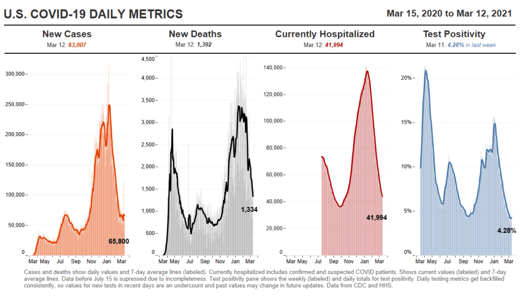
In the past week (February 28 through March 6), the U.S. reported about 417,000 new cases, according to the COVID Tracking Project. This amounts to:
An average of 60,000 new cases each day—comparable to the seven-day average for daily cases in early August
127 total new cases for every 100,000 Americans
1 in 786 Americans getting diagnosed with COVID-19 in the past week
Nationwide COVID-19 metrics published in the COVID Tracking Project’s daily update on March 6. This will be the final week we use Project data for these updates.
Last week, America also saw:
41,400 people now hospitalized with COVID-19 (13 for every 100,000 people)
12,100 new COVID-19 deaths (3.7 for every 100,000 people)
An average of 2.2 million vaccinations per day (per Bloomberg)
The U.S. recorded fewer new daily cases this week than last week, finally dropping to a level lower than the summer surge. We saw fewer hospitalized COVID-19 patients and deaths from the disease this week as well. But the possibility of a plateau—or even a variant-driven fourth surge—is worrying some experts. CDC Director Dr. Rochelle Walensky has cited this concern in press briefings over the past week, encouraging that Americans “double down on prevention measures.”
Dr. Walensky’s assertion is backed up by a new CDC report that links mask mandates and dining restrictions to reduced community spread. (We knew this already, of course, but it’s always nice to have a CDC report you can cite.)
Variants, meanwhile, continue to spread. We’re up to 2,600 reported B.1.1.7 cases, though this and other variant counts are likely significantly underreported. Nature’s Ewen Callaway calls attention to variant reporting issues in a recent story: despite national efforts to ramp up sequencing, the practice is still heavily decentralized in the U.S., with heavily-resourced states like New York and California sequencing thousands of genomes while other states collect far fewer. And “homegrown” variants of concern, such as the variant reportedly spreading through New York City, don’t even appear on the CDC’s dashboard yet.
But vaccinations give us one place to be optimistic. More than two million Americans are now getting a dose each day, per Bloomberg, with the first Johnson & Johnson shots landing on the market this week. After the announcement of a cross-pharma partnership (Merck giving J&J a manufacturing boost), President Biden said that the U.S. will have enough COVID-19 vaccine doses for every adult by the end of May. How quickly—and how equitably—those doses get administered will be another battle.
Finally, a sad acknowledgment: with the COVID Tracking Project concluding data collection today, I will be switching my source for these updates starting next week. I plan to use CDC and HHS data, relying heavily on the CDC’s new COVID Data Tracker Weekly Reviews. More on filling the CTP-shaped hole in your data in the next section.
One of those 42 states is Oklahoma. Oklahoma wasn’t listed as reporting any demographic data in our annotations until yesterday—but in fact, this state has been reporting vaccinations by race, ethnicity, age, and gender since January. I missed this information in previous weeks because the state has been reporting these data in its Weekly Epidemiology and Surveillance Reports, rather than on its main COVID-19 dashboard where the totals are reported.
So, this week, the COVID source shout-out section is also a public apology to the good state of Oklahoma. I’m sorry I missed your vaccination demographics. You’re doing great.
We’re sneaking a few more federal updates into the source section this week.
CDC changed their methodology for state vaccination counts: Last Saturday, February 20, the CDC made two major changes to how it reports vaccination data. First, instead of simply reporting doses administered by federal agencies (the Department of Defense, Indian Health Services, etc.) as fully separate counts, the agency started reporting these doses in the states where they were administered. Second, the CDC started reporting vaccinations in the state where someone is counted as a resident, rather than where they received the shot. Both of these changes make state-reported counts and CDC-reported counts less directly comparable, since states typically don’t track federal agency doses and count doses based on where they were administered. You can read more about these changes on Bloomberg’s vaccine tracker methodology and analysis blog; Bloomberg is now using CDC data only to update its U.S. data.
VaccineFinder is open for COVID-19 vaccines: As of Wednesday, Americans can use this national tool to find COVID-19 vaccine appointments. Just put in your ZIP code and select a radius (1 mile, 10 miles, 50 miles, etc.), and the tool will show you providers nearby. For each provider, the tool provides contact information—and, crucially, whether this location actually has vaccines in stock. Unlike many other federal dashboards, VaccineFinder isn’t a new tool; it was developed during the H1N1 flu outbreak in 2009. STAT’s Katie Palmer provides more history and context on the site here.
Government Accountability Office may push for more data centralization: The Government Accountability Office (or GAO), a watchdog agency that does auditing and evaluations for Congress, has been investigating the federal government’s COVID-19 data collection—and is finding this collection “inconsistent and confusing,” according to a report by POLITICO’s Erin Banco. While the GAO’s report won’t be finalized and made public until March, the agency is expected to recommend that data should be more standardized. It could call for the CDC to make changes to its data collection on cases, deaths, and vaccines similar to how the HHS revamped collection for testing and hospitalization data in summer 2020. CDC officials are wary of these potential changes; it’ll definitely be a big data story to follow this spring.
Global.health is ready for research: Back in January, I wrote about Global.health, a data science initiative aiming to bring anonymized case data to researchers on a global scale. The initiative’s COVID-19 dataset is now online, including over 10 million individual case records from dozens of countries. 10 million case records! Including demographic and outcomes data! If you’d like to better understand why this dataset is a pretty big deal, read this article in Nature or this one in STAT. I plan on digging into the dataset next week, and may devote more space to it in a future issue.
NIH COVID-19 treatment guidelines: In one of the White House COVID-19 press briefings this week, Dr. Fauci referenced this National Institutes of Health (NIH) website intended to provide both physicians and researchers with the latest guidance on how to treat COVID-19 patients. The website acts as a living medical document, featuring an interactive table of contents and a text search tool. Follow @NIHCOVIDTxGuide on Twitter for updates.
Burbio’s K-12 School Opening Tracker: Burbio, a digital platform for community events, is actively monitoring over 1,200 school districts to determine which schools are currently using virtual, in-person, and hybrid models. The sample size includes the 200 largest districts in the U.S. and other districts with a mix of sizes and geographies, in order to reflect local decision-making across the U.S. See more methodology details here.
COVID-19’s impact on LGBTQ+ communities:The Journalist’s Resource at Harvard Kennedy School has compiled a list of recent research on how the coronavirus pandemic impacted LGBTQ+ Americans. In many cases, the pandemic furthered disproportionate poverty and poor health outcomes in this community; they shouldn’t be ignored in COVID-19 coverage.
Liz Essley Whyte, an investigative reporter at the Center for Public Integrity, discussed her work bringing White House COVID-19 reports to the public before they were officially released. Erica Hensley, an independent health and data journalist based in Jackson, Mississippi, provided advice for navigating relationships with local public health officials based on her work reporting on COVID-19 in Mississippi. And Tom Meagher, a senior editor at The Marshall Project, described the communication and coordination work behind his newsroom’s yearlong tracker of COVID-19 in the U.S. prison system. Thank you to everyone who attended!
For those who couldn’t make it live, you can watch the recording of the session below. You can also check out the slides here. I’m also sharing a brief recap of the workshop in today’s issue.
The final workshop in our series, Communicating COVID-19 data, is coming up this coming Wednesday, March 3, from 4:30 to 6 PM ET. This session will feature freelance reporter Christie Aschwanden, The Washington Post’s Júlia Ledur, and THE CITY’s Ann Choi, and Will Welch discussing strategies for both written reporting and data visualization. If you aren’t registered for the series yet, you can sign up here.
Finding and navigating government data
Liz Essley Whyte started her talk by providing backstory on the White House COVID-19 reports.
In the middle of the summer, she said, a source gave her access to documents that the White House Coronavirus Task Force was sending out to governors—but wasn’t publishing publicly. The documents included detailed data on states, counties, and metro areas, along with recommendations for governors on how to mitigate the spread. Whyte published the documents to which she’d obtained access, marking the start of a months-long campaign from her and other journalists to get the reports posted on a government portal.
“Despite weeks of me asking the White House, why aren’t these public, they were never made public for a while,” Whyte said. She continued collecting the reports and publishing them; the historical reports are all available in DocumentCloud.
If you need to find some government data—such as private White House reports—there are a few basic questions that Whyte recommended you start with:
Who collects the data?
Who uses it?
Who has access to it?
Has anyone else found it or published it before?
What do you really want to find out? If you can’t get the data you really need, are there other datasets that could illuminate the situation?
While journalists often like to find fully original scoops, Whyte said, sometimes your best source for data could be another reporter. “There’s some really great datasets out there, especially in the health space, that people have maybe written one or two stories, but they have hundreds of stories in them.” So get creative and look for collaborators when there’s a source you really want to find.
She provided a few other ideas for obtaining government data: besides getting a leak from a source (which can be hard to do), you can scour government websites, ask public information officers what data are available behind their public website, contact other officials (such as those mentioned in a one-off legislative report), or file a FOIA. Third-party sources such as the COVID Tracking Project or The Accountability Project also may have useful repositories of public information, or could help you navigate to what you need. Even for-profit data collecting companies might let journalists use their work for free.
Once you have the data, talk to your contact person for the dataset and “make sure you fully understand it,” Whyte said. Ask: Who collected the data and how? How is it being used? What’s the update schedule? How complete is it? And other similar questions, until you’re sure you know how to best use the dataset. If a data dictionary is available, make sure to comb through it and ask all your term and methodology questions.
In some cases this year, Whyte has looked at document information and contacted people who are listed as a document’s author or modifier. These are often great sources, she said, who can provide context on data even if they aren’t able to speak on the record.
The White House COVID-19 reports that Whyte spent so much time chasing down this past summer are now public. The Trump’s administration started publishing the data behind these reports in December, and Biden’s administration has now started publishing the PDF reports themselves—albeit minus the recommendations to governors that previous iterations contained. Whyte provided a run-down of the reports on Twitter, which should be required reading for any local journalist who wants to get more in-depth with their pandemic coverage.
“I think they’re really great for local reporting because they break down all kinds of different metrics by state, county, and metro area,” she said. The reports notably make it easy for us to compare across jurisdictions, since the federal government has standardized all the data. And you can find story ideas in the data notes, such as seeing where a state or region had a data error. The CDD also wrote about these reports when they were first published.
Working with local gatekeepers to find data
Erica Hensley discussed a few lessons she learned from covering COVID-19 in Mississippi, where data availability has lagged some other states.
Local reporting, she said, provides journalists with a unique situation in which they’re directly relying on one local agency for news and data. She stressed the importance of building a relationship with agency representatives, helping them understand exactly what you’re looking for and why you need it.
“They’re [Mississippi’s public health agency] an under-resourced agency that was strapped for time to even address my request,” she said. Understanding on her part and a lot of back-and-forth helped her to eventually get those requests met.
Hensley also described how she worked to fill data gaps by doing her own analysis at Mississippi Today, a local nonprofit newsroom, then showed her work to the public health agency. For example, she used the total case numbers published by the state to calculate daily and weekly figures, and presented the data in a percent change map. This project helped Mississippi residents see where COVID-19 spread was progressing most intensely—but it also showed the state that this information was needed. She similarly calculated a test positivity rate; to this day, she said, state public health officials go to Mississippi Today’s website to see positivity rates, as these rates are not included on the state’s COVID-19 site.
When you can do some calculations yourself, Hensley said, do those—and focus your FOIA time on those data that are less readily available, such as names of schools and long-term care facilities that have faced outbreaks. Long-term care has been a big focus for her, as residents in these facilities tend to be more vulnerable.
Since Mississippi wasn’t releasing state long-term care data, she used federal data from the Centers for Medicare and Medicaid Services (CMS) and ProPublica to investigate the facilities. Matching up sites with high COVID-19 case counts and sites that had completed infection control training, Hensley found that the majority of long-term care facilities in the state had failed to adequately prepare for outbreaks. Her reporting revealed serious issues in the state.
Hensley advocates for local reporters to dig into long-term care stories; the CMS dataset has a lot of rich data, down to the individual facility level, that can be a springboard to stories about how facilities are (or aren’t) keeping their residents safe.
While Hensley stressed the importance of earning a local health department’s trust, she also said that health reporters need to be trusted by their colleagues. “A big part of my job early on, on top of collecting the data, was helping the newsroom understand how this applies to other local beats,” she explained. Reporters who serve as resources to each other will produce more interdisciplinary stores, and reporters who team up to request data will get the information out faster.
Building a massive system to track COVID-19 in prisons
Reporters at The Marshall Project have spent the past year tracking COVID-19 cases in U.S. prisons. Tom Meagher discussed how they did it, including a lot of external and internal communication.
After the newsroom went on lockdown, Meagher said, “Once of the first things we thought of was, prisons—being congregate living facilities—were going to be seriously affected by this pandemic.” But at first, the data they wanted simply didn’t exist.
To compile those data on COVID-19 in prisons, The Marshall Project’s team had to manage relationships with agencies in every state and D.C. They divided up all the states among their newsroom, and later worked with The Associated Press as well. At first, the reporters called every state and simply asked for numbers with no intention to publish them, in order to see if a compilation would be possible. This was easier said than done: “Prisons are not always the most transparent agencies to deal with,” Meagher said.
TMP reporters asked each agency three carefully-worded questions: How many people have been tested for the coronavirus? How many have tested positive? And how many have died? They wanted to get those numbers for both prison inmates and staff. Meagher and his colleague Katie Park had to do a lot of work to clean and standardize the numbers, which are often inconsistent across states.
The team made it clear to prison agencies that this wasn’t just a one-off ask—they came back with the same questions every week. Within a month, a lot of state agencies started setting up websites, which made data collection easier; but reporters still call and email every week in order to clarify data issues and fill in gaps. Meagher uses Google Sheets and Mail Merge to coordinate much of the data collection, cleaning, and outreach back to states with lingering questions.
The newsroom also uses a tool called Klaxon to monitor prison websites for changes and record screenshots, often useful for historical analysis. In one instance, TMP’s screenshots revealed that Texas’ justice system removed seven names from its list of prison deaths; they were able to use this evidence to advocate for names to be returned.
TMP’s data collection system is manual—or, primarily done by humans, not web scrapers. They opted for this route because prison data, like a lot of COVID-19 data, are messy and inconsistent. You might find that an agency switches its test units from people to specimens without warning, Meagher said, or fixes a historical error by removing a few cases from its total count. In these instances, a human reporter can quickly notice the problem and send a question out to the state agency.
“If we’ve learned anything from all of this, it’s that there’s a lot of different ways data can go wrong,” Meagher said. Even when public health officials are well-intentioned and questions are clearly asked, misunderstandings can still happen that lead to data errors down the line.
The goal of this dataset is really to give people insight into what’s happening—for prison inmates, for their families, and for advocates. Even agencies themselves, he said, are “eager to see how they’re doing compared to other states.” Since a similar dataset doesn’t exist on a federal level, states are using TMP’s to track their own progress, creating an incentive for them to report more accurately to begin with. These data are freely available online, including case and death numbers for every week since March. If you have questions, Meagher and his colleagues may serve as a resource for other reporters hoping to report on COVID-19 in the prison system.