Our final Diving into COVID-19 data workshop happened this week!
Ann Choi and Will Welch, two data reporters at THE CITY (a local, nonprofit newsroom in NYC) discussed making COVID-19 numbers accessible and meaningful for New Yorkers. Júlia Ledur, a graphics reporter at the Washington Post and former data visualization lead at the COVID Tracking Project, walked us through several visualization projects. And Christie Aschwanden, a freelance science journalist, discussed communicating uncertainty in COVID-19 reporting. Thank you to everyone who attended!
For those who couldn’t make it live, you can watch the recording of the session below. You can also check out the slides here. I’m also sharing a brief recap of the workshop below.
Making NYC data accessible
Ann Choi and Will Welch shared a few strategies they used to communicate COVID-19 data for a NYC audience.
First, Ann Choi walked through a few examples of THE CITY’s written articles, going from early uncertainty during a time of limited government guidance to a present focus on who is getting vaccinated.
- One early story compares two socioeconomically similar neighborhoods in Queens, Flushing and Corona, which had different pandemic responses. For example, Flushing residents, many of whom are East Asian immigrants, did not need to be told to wear masks because they had past experience with these public health measures. Choi said she was inspired to do this comparison by thinking about how New York City measures up against Seoul, South Korea, where she has relatives. The cities have similarly-sized populations, though Seoul is much more dense; yet NYC has had over 29,000 COVID-19 deaths while Seoul has had fewer than 400.
- A January story on vaccination rates emphasizes the “if”s by extrapolating out from NYC’s data. “If city residents were getting vaccinated at the statewide average,” Choi and Welch wrote, over 100,000 more city residents would already have gotten a shot. This tangible comparison emphasizes how the city is lagging behind.
- A story on the Washington Heights Armory drew attention to vaccination disparities in the city. THE CITY reporter Josefa Velasquez went to this site and did what Choi called “very old-school data reporting,” talking to a sample of people waiting in line. Despite the vaccination site being touted by the governor as an example of a vaccination site in a predominantly Hispanic/Latino neighborhood, the majority of those Velasquez spoke to were white suburbanites. After this story was published, appointments at the Armory were restricted to prioritize NYC residents.
- Other vaccination stories Choi’s worked on have drawn further distinctions between which neighborhoods were most impacted by the pandemic—and which neighborhoods are getting the most shots. ZIP code data released by the city allowed her to drill down into local patterns and find both examples of inequity and examples of how communities fought against it.
In assessing socioeconomic traits of a neighborhood, Choi recommends using the Census Reporter website or the tidycensus package in R.
Will Welch then discussed THE CITY’s COVID-19 tracker, Coronavirus in New York City. It’s updated on a daily basis through a combination of scraping and hand data collection; the tracker includes data on cases, deaths, test positivity, vaccinations, and more.
“Our first iteration of this tracker was taking the data from the city and trying to put it into a more accessible format,” Welch said. City Hall emailed data out to reporters starting in mid-March, before developing a public dashboard.
Later in the spring, NYC began publishing data on a public GitHub, allowing Welch and Choi to evolve their tracker beyond simply making numbers easier to find. One example of complexity built into the tracker: NYC was one of the first jurisdictions to distinguish “confirmed” deaths (associated with positive tests) and “probable” deaths (associated with death certificates). At first, daily updates of these numbers led to confusion as probable deaths would sometimes be reassigned as “confirmed.” But when the city published a full time series on deaths, THE CITY was able to make their own time series graphic, showing the long-term arc of the pandemic.
Informed by watching this time series, Welch put together a graphic to show how early counts of COVID-19 fatalities in NYC by date of death are often incomplete. Deaths may be retroactively assigned to an earlier date of death after they were reported, which put some summer dates that Governor Cuomo bragged had seen “no new deaths” into a different light.
Welch additionally discussed how the tracker switched, in the summer, from relying on city data to relying on state data for testing numbers. State data were being used to calculate reopening indicators, and THE CITY wanted their tracker to display the information that was having the greatest impact on people’s lives. The publication also fought for the release of ZIP code level data, which were used for specific local policy restrictions starting in the fall.
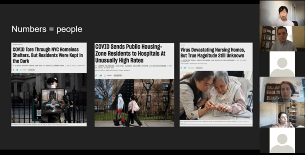
Pandemic impact on New Yorkers’ lives has been an enduring theme for THE CITY’s coverage over the past year. This ranges from mapping the test positivity numbers behind restrictions to highlighting the share of NYC residents that have gotten at least one dose of a vaccine. But one particularly notable project is Missing Them, a searchable memorial of New Yorkers whose lives have been lost to COVID-19. The memorial has compiled nearly 1,000 names so far, though this is less than 5% of the total number of lives lost.
“Behind every number, behind every case, there is a vulnerable person whose life was cut short,” Choi said. She expressed hope that reporters will take lessons from covering COVID-19 to other public health crises, and remember to tell the stories behind each data point.
Visualizing COVID-19 data
Júlia Ledur talked through several of her COVID-19 visualizations projects, including both graphics at the COVID Tracking Project and the Washington Post. She shared how her approach to visualizing these data has changed as the data have become increasingly complicated, now that we’re contending with many test types, vaccinations, and more.

A few examples:
- An early graphic (above) from March 2020, calling attention to data gaps in the CDC’s reporting. The agency had reported far fewer COVID-19 tests than the COVID Tracking Project had compiled from states at that time.
- A scrollytelling explainer that calls attention to just how complicated test positivity can get, by showing how this metric gets calculated.
- Another test positivity post, this one focusing on inconsistencies between the state. This post uses a fictional character called Bob to show how Bob’s testing experience might be counted in three different ways.
- Graphics explaining test per positive, another metric which may be used to show complications in COVID-19 testing—though, as Ledur said, this metric did not end up taking off in the same way that test positivity did.
- Trading cards and other graphics exploring different test types, to accompany an explainer on how the tests compare. Ledur worked with CTP Science Communication lead Jessica Malaty Rivera to ensure her graphics were accurately representing the science of each test while keeping readers engaged.
- Two Washington Post stories on Manaus, a city in the Amazon Rainforest that faced major supply challenges during a COVID-19 surge driven by a new variant.
Ledur also shared a few of her best practices for visualizing COVID-19 data:
- Be clear about what you’re showing and what you’re not showing. Include clear labels, methodology, and specific notes on what you aren’t including.
- Don’t avoid uncertainty. Instead, highlight it. Tell your audience what’s going on.
- Add notes and/or annotations with caveats explaining data anomalies.
- Put the data in context. Show how one point in time compares to others, or how one place compares to others.
- Check your science. Work with those who have the right expertise to make sure your work is correctly reflecting the issue.
- Have empathy. Put yourself in the shoes of your reader; think about what questions you might have, how you can answer them, and where you can’t answer them.
“You have an idea of what it’s like to be affected by this, because you certainly are,” Ledur said. Leaning into this experience as you communicate data, remembering how the numbers make you feel, will make your reporting better.
Addressing uncertainty
“This pandemic has been a time when the process of science has been on public display,” Christie Aschwanden said to start her talk. She called this period an incredible, but overwhelming opportunity to convey the process of science in an accurate way.
And forefront in the process of science is the idea of uncertainty. We might think numbers are neutral, Aschwanden said—“we measured this and therefore it’s true”—but in fact, they are subject to biases which must be communicated along with the numbers.
These biases are why political statements such as “we follow the science” may be harmful. “Science is a method of understanding, it’s not an answer,” Aschwanden said; we should prepare people to see how a number or a conclusion may change, so that when it inevitably does change, they don’t feel betrayed.
One high-profile example of this trend is mask-wearing. Public health experts such as Dr. Anthony Fauci said in early spring 2020 that masks were not necessary for the general public. This statement reflected scientific knowledge at the time—but when this knowledge changed as the virus’ tendency to spread through air became better understood, many Americans held up the change as evidence of a conspiracy.
This trend also occurs with medical treatments. Convalescent plasma, one COVID-19 treatment, held promise early on but has not seen benefits in more recent randomized control trials. It’s important to communicate the uncertainties and shortcomings of provisional studies, so that people don’t put all their hopes into a treatment that later is shown to be less viable.
“We need to get from this magic wand idea about science,” Aschwanden said. Science is not a singular path towards truth; it’s a “process of uncertainty reduction.” Pointing out and discussing the uncertainty, whether that’s through annotations on a chart or caveats in a news story, will help readers understand how decisions may change based on new evidence.
Here are Aschwanden’s tips for discussing scientific data with the public:
- Emphasize that uncertainty is okay (a feature, not a bug)
- Explain that knowledge is provisional
- Promote openness to new evidence, even as we become more certain
- Beware motivated reasoning and cognitive biases
- Convey that data aren’t neutral
One article that effectively follows these guidelines is a story Aschwanden wrote in the fall for Scientific American. She walks readers through the data on COVID-19 deaths in order to debunk the rumor that death counts are inflated by doctors. The story uses three lines of evidence to explain that there’s a lot of uncertainty about the precise number of COVID-19 deaths, but that there’s not much uncertainty about the magnitude of these deaths.
Aschwanden encourages any reporters working on COVID-19 coverage to join a free listserv run by the National Association of Science Writers, which she moderates. To join the list, send an email to nasw-COVID19mods@nasw.org with your name, email, and publication(s) that you are covering COVID-19 for, either on staff or freelance.

Leave a comment