Blog

  • What the hell is going on with the Oxford-AstraZeneca vaccine?

    What the hell is going on with the Oxford-AstraZeneca vaccine?

    The problem child of COVID-19 vaccines was back in the news this week. After South Africa suspended the Oxford-AstraZeneca vaccine’s use when it failed to slow the spread of the predominant B.1.351 variant, vaccination using this vaccine has been suspended and then resumed in many European countries following reports of blood clots in some people who received it. 

    According to a release from AstraZeneca, there have been 15 cases of deep vein thrombosis and 22 cases of pulmonary embolism in people who have gotten the vaccine, as of March 8. These are serious complications—seven of those people died. Countries that suspended the vaccine’s use include Spain, Italy, France, and Germany, among others. (Europe tends to act as more of a bloc than North America when it comes to vaccines. Consider: Canada has authorized use of the AstraZeneca vaccine while the US has literal fridges full of the stuff just sitting there waiting for approval.)

    Since the initial suspension, investigations have been launched and apparently concluded that there is no causative relationship between the vaccine and these symptoms. According to Emer Cooke, the executive director of the European Medicines Agency (EMA), in a press conference on March 18: “The committee… concluded that the vaccine is not associated with an increase in the overall risk of thromboembolic events or blood clots.”

    And, according to the WHO on March 17: “At this time, WHO considers that the benefits of the AstraZeneca vaccine outweigh its risks and recommends that vaccinations continue.” Europe has since started to resume vaccinating with the Oxford-AstraZeneca vaccine, starting with France, Germany, and Italy. (Except not in Finland, where they just suspended it again after two people got similar blood clots.)

    So all’s well that ends well right? Well, not necessarily. Besides that Finland wrinkle, some scientists and officials are concerned that this entire rigmarole could undermine public trust in the AstraZeneca vaccine. It’s worth noting that a tiny population experienced these effects out of the millions of people who have already gotten the vaccine. And blood clots are fairly common in the population; you’re going to expect some people to develop them just by sheer chance. But it’s also worth noting that these complications are serious, and rare among the age group that they were reported in. Not slowing down could have the same fear-inducing effect. As Shobita Parthasarathy says in her Slate column, “[T]his crisis isn’t about science at all. It’s about public trust, and scared citizens cannot be easily convinced by expertise that feels remote. Our solutions need to reflect that.”

    We’ll see if anything else happens. But in the meantime, the US has since promised to share its stockpile of the Oxford-AstraZeneca vaccine with Canada and Mexico, so it looks like it’s at least medium-steam ahead for now. 

    In summation:

    More vaccine posts

    • Sources and updates, November 12
      Sources and updates for the week of November 12 include new vaccination data, a rapid test receiving FDA approval, treatment guidelines, and more.
    • How is the CDC tracking the latest round of COVID-19 vaccines?
      Following the end of the federal public health emergency in May, the CDC has lost its authority to collect vaccination data from all state and local health agencies that keep immunization records. As a result, the CDC is no longer providing comprehensive vaccination numbers on its COVID-19 dashboards. But we still have some information about this year’s vaccination campaign, thanks to continued CDC efforts as well as reporting by other health agencies and research organizations.
    • Sources and updates, October 8
      Sources and updates for the week of October 8 include new papers about booster shot uptake, at-home tests, and Long COVID symptoms.
    • COVID source shout-out: Novavax’s booster is now available
      This week, the FDA authorized Novavax’s updated COVID-19 vaccine. Here’s why some people are excited to get Novavax’s vaccine this fall, as opposed to Pfizer’s or Moderna’s.
  • New CDC page on variants still leaves gaps

    New CDC page on variants still leaves gaps

    This week, the CDC published a new data page about the coronavirus variants now circulating in the U.S. The page provides estimates of how many new cases in the country may be attributed to different SARS-CoV-2 lineages, including both more familiar, wild-type variants (B.1. and B.1.2) and newer variants of concern.

    This new page is a welcome addition to the CDC’s library, as their “Cases Caused by Variants” page only provides numbers of variant cases reported to the agency—which, as we have repeatedly stated at the CDD, represent huge undercounts.

    However, the page still has three big problems:

    First, the data are old. The CDC is currently reporting data for four two-week periods, the most recent of which ends February 27. That’s a full three weeks ago—a pretty significant lag when several “variants of concern” are concerning precisely because they are more infectious, meaning they can spread through the population more quickly.

    The CDC’s B.1.1.7 estimate (about 9% as of Feb. 27) particularly sticks out. CoVariants, a variant tracker run by independent researcher Emma Hodcroft, also puts B.1.1.7 prevalence in the U.S. at about 10% in late February… but estimates this variant accounts for 22% of sequences as of March 8. These estimates indicate that B.1.1.7 may have doubled its case counts in the two weeks after the CDC’s data stop.

    Second, the CDC data reveal geographic gaps in our current sequencing strategy. The CDC is providing state-by-state prevalence estimates for 19 select states—or, those states that are doing a lot of genomic sequencing. Of course, this includes big states such as California and New York, but excludes much of the Midwest and other smaller, less scientifically-endowed states.

    Michigan, that state currently facing a concerning surge, is not represented—even though the state has one of the highest raw counts of B.1.1.7 cases, as of this week. We can gather from a footnote that Michigan did not submit at least 300 sequences to the CDC between January 13 and February 13; still, this exclusion poses a challenge for researchers watching that surge.

    And finally, the data are presented in a confusing manner. When I shared this page with a couple of COVID Tracking Project friends on Friday, it took the group a lot of close-reading and back-and-forth to unpack those first two problems. And we’re all used to puzzling through confusing data portals! The CDC claims this page is an up-to-date tracker, “used to inform national and state public health actions related to variants,” but its data are weeks old and represent less than half of the country.

    The CDC needs to improve its communication of data gaps, lags, and uncertainties, especially on such an alarming topic as variants. And, of course, we need better variant data to begin with. The U.S. is aiming to sequence 25,000 samples per week, but that’s still far from the 5% of new cases we would need to sequence in order to develop an accurate picture of variant spread in the U.S.

    On that note: you may notice that we now have a new category for variant posts on the CDD website. I expect that this will continue to be a major topic for us going forward.

    Related posts

    • How one biostatistics team modeled COVID-19 on campus

      How one biostatistics team modeled COVID-19 on campus

      Screenshot of a modeling dashboard Goyal worked on, aimed at showing UC San Diego students the impact of different testing procedures and safety compliance.

      When the University of California at San Diego started planning out their campus reopening strategy last spring, a research team at the school enlisted Ravi Goyal to help determine the most crucial mitigation measures. Goyal is a statistician at the policy research organization Mathematica (no, not the software system). I spoke to Goyal this week about the challenges of modeling COVID-19, the patterns he saw at UC San Diego, and how this pandemic may impact the future of infectious disease modeling.

      Several of the questions I asked Goyal were informed by my Science News feature discussing COVID-19 on campus. Last month, I published one of my interviews from that feature: a conversation with Pardis Sabeti, a computational geneticist who worked on COVID-19 mitigation strategies for higher education. If you missed that piece, you can find it here.

      In our interview, Goyal focused on the uncertainty inherent in pandemic modeling. Unlike his previous work modeling HIV outbreaks, he says, he found COVID-19 patterns incredibly difficult to predict because we have so little historical data on the virus—and what data we do have are deeply flawed. (For context on those data problems, read Rob Meyer and Alexis Madrigal in The Atlantic.)

      Paradoxically, this discussion of uncertainty made me value his work more. I’ve said before that one of the most trustworthy markers of a dataset is a public acknowledgment of the data’s flaws; similarly, one of the most trustworthy markers of a scientific expert is their ability to admit where they don’t know something.

      The interview below has been lightly edited and condensed for clarity.


      Betsy Ladyzhets: I’d love to hear how the partnership happened between the university and Mathematica, and what the background is on putting this model together, and then putting it into practice there.

      Ravi Goyal: Yeah, I can give a little bit of background on the partnership. When I did my PhD, it was actually with Victor De Gruttola [co-author on the paper]. We started using agent-based models back in 2008 to sort of understand and design studies around HIV.  And in particular in Botswana, for the Botswana Combination Prevention Project, which is a large random cluster study in Botswana.

      So we started using these kinds of [models] to understand, what’s the effect of the interventions? How big of a study has to be rolled out to answer epidemiological questions? Because, as you would imagine, HIV programs are very expensive to roll out, and you want to make sure that they answer questions.

      I’ve been working with [De Gruttola] on different kinds of HIV interventions for the last decade, plus. And he has a joint appointment at Harvard University, where I did my studies, and at the University of California in San Diego. And so when the pandemic happened, he thought some of the approaches and some of the stuff that we’ve worked on would be very applicable to helping think about how San Diego can open. He connected me with Natasha Martin, who is also on the paper and who is part of UC San Diego’s Return to Learn program, on coming up with a holistic way of operating procedures there. She’s obviously part of a larger team there, but that’s sort of where the partnership came about.

      BL. Nice. What would you say were the most important conclusions that you brought from that past HIV research into now doing COVID modeling?

      RG: Two things. One is uncertainty. There’s a lot of things that we don’t know. And it’s very hard to get that information when you’re looking at infectious diseases—in HIV, in particular, what was very difficult is getting really good data on contacts. In that setting, it’s going to be sexual contacts. And what I have understood is that people do not love revealing that information. When you do surveys where you get that [sexual contact] information, there’s a lot of biases that creep in, and there’s a lot of missing data.

      Moving that to the COVID context, that is now different. Different kinds of uncertainty. Biases may be recall biases, people don’t always know how many people they have interacted with. We don’t have a good mechanism to sort of understand, how many people do interact in a given day? What does that look like?

      And then, maybe some of these that can creep in when you’re looking at this, is that people may not be completely honest in their different risks. How well are they wearing masks? How well are they adhering to some of those distancing protocols? I think there’s some stigma to adhering or not to adhering. Those are biases that people bring in [to a survey].

      BL: Yeah, that is actually something I was going to ask you about, because I know one of the big challenges with COVID and modeling is that the underlying data are so challenging and can be very unreliable, whether that’s, you know, you’re missing asymptomatic cases or it’s matching up the dates from case numbers to test numbers, or whatever the case may be. They’re just a lot of possible pitfalls there. How did you address that in your work with the University of California?

      RG: At least with the modeling, it makes it a little more difficult in the timeframe that we were modeling and looking at opening, both for our work on K-12 and for UCSD. We kicked it off back in April, and May, thinking about opening in the fall. So, the issue there is, what does it look like in the fall? And we can’t really rely on—like, the university was shut down. There’s not data on who’s contacting who, or how many cases are happening. There were a lot of things that were just completely unknown, we’re living in a little bit of a changing landscape.

      I’m sure other people have much more nuance [on this issue], but I’m going to just broadly stroke where this COVID research was different than HIV. For HIV, people might not radically change the number of partnerships that they’re having. When we’re thinking about a study in Botswana, we can say, what did it look like in terms of incidents four years prior? And make sure we’re making our modeling represents that state of how many infections we think are happening.

      Here [with COVID], when we’re thinking about making decisions in September or October. You don’t have that, like, oh, let’s match it to historical data option because there was no historical data to pin it to. So it was pooling across a lot—getting the estimates to run to the model, getting those is, you’re taking a study from some country X, and then you’re taking another different study from country Y, and trying to get everything to work and then hopefully when things open up, you sort-of re-look at the numbers and then iteratively go, what numbers did I get wrong? Now in the setting where things are open, what did we get wrong and what do we need to tweak?

      BL: I noticed that the opening kind-of happened in stages, starting with people who were already on campus in the spring and then expanding. So, how did you adjust the model as you were going through those different progressions?

      RG: Some assumptions were incorrect in the beginning. For example, how many people were going to live off campus, that was correct. But how many people, of those off-campus people, were ever going to come to campus, was not there. A lot of people decided not to return to San Diego. They were off-campus remote, but they never entered campus. Should they have been part of that model? No. So once we had those numbers, we actually adjusted.

      Just this past week, we’ve sort of started redoing some of the simulations to look towards the next terms. Our past miscalculation or misinformation, what we thought about how many people would be on campus, now we adjusted from looking at the data. 

      And some of the things that we thought were going to be higher risk, at least originally, ended up being a little bit lower risk than anticipated. One thing is around classrooms. There have been—at least, from my understanding, there have been very few transmissions that are classroom-related. And we thought that was going to be a more of a higher transmission environment in the model, wasn’t what we saw when we actually had cases. So now we’re adjusting some of those numbers to get it right to their particular situation. It’s a bit iterative as things unroll.

      BL: Where did you find that most transmissions were happening? If it’s not in the classroom, was it community spread coming into the university?

      RG: They [the university] have a really nice dashboard, where it does give some of those numbers, and a lot of the spread is coming from the community coming on to campus, and less actual transmissions that are happening within. I think that’s where the bulk is. I think the rates on campus were lower than the outside.

      BL: Yeah, that kind-of lines up with what I’ve seen from other schools that I’ve researched that, you know, as much as you might think a college is an environment where a lot of spread’s gonna happen, it also allows for more control, as opposed to just a city where people might be coming in and out.

      Although one thing, another thing I wanted to ask you about, is this idea that colleges, when they’re doing testing or other mitigation methods, they need to be engaging with the community. Like UC Davis, there’s been some press about how they offer testing and quarantine housing for everybody. Not just people who are students and staff. I was wondering if this is something accounted for in your model, and sort of the level of community transmission or the level of community testing that might be tied to the university and how that impacts the progression of things on campus.

      RG: The model does incorporate these infections coming in for this community rate, and that was actually based off of a different model modeling group, which includes Natasha, that is forecasting for the county [around UC San Diego]. Once again, you have to think about all the biases on who gets tested. False positives, all of those kinds of caveats. They built a model around that, which fed into the agent-based modeling that we use. We do this kind-of forecasting on how many infections do we think are going to be coming in from people who live off-campus, or staff, or family—what’s their risk?

      That’s where that kind of information was. In terms of quarantining my understanding is, I don’t think they were quarantining people who weren’t associated [with the school] in the quarantine housing.

      BL: Right. Another thing I wanted to ask about, I noticed one of the results was that the frequency of testing doesn’t make a huge difference in mitigation compared to other strategies as long as you do have some frequency. But I was wondering how the test type plays in. Say, if you’re using PCR tests as opposed to antigen tests or another rapid test. How can that impact the success of the surveillance mechanism?

      RG: Yeah, we looked a little bit in degrading the sensitivity from a PCR test to antigen. The conclusion was that it’s better to more frequently test, even with a worse-performing test than it is to just do monthly on the PCR.

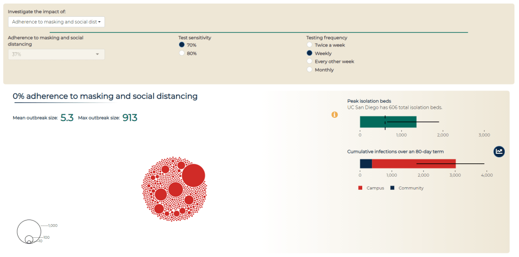
      We put it on the dashboard. This is the modeling dashboard… It has a couple of different purposes. So first, there was obviously when the campus was opening, a lot of particular anxiety on what may happen come September, October, and some of that [incentive behind the dashboard] was to be transparent. Like, here’s the decisions being made, and here is some of the modeling work… Everything that we know or have is available to everyone.

      And the second piece was to have a communication that safety on campus is the responsibility of everyone. That’s where the social distancing and adherence to masking comes in, why you’re allowed to change that [on the dashboard], is supposed to hopefully indicate that, you know, this really matters. Here’s where the students and faculty and staff roles are on keeping campus open. That was the two points, at least on my end, in putting together a dashboard and that kind of communication.

      BL (looking at the modeling dashboard): It’s useful that you can look at the impacts of different strategies and say, okay, if we all wear masks versus if only some of us wear masks, how does that change campus safety?

      Another question: we know that university dorms, in particular, are communal living facilities—a lot of people living together. And so I was wondering what applications this work might have for other communal living facilities, like prisons, detention centers, nursing homes. Although I know nursing homes are less of a concern now that a lot of folks are vaccinated there. But there are other places that might not have the resources to do this kind of modeling, but may still share some similarities.

      RG: Yeah, I think that’s a really interesting question. I sit here in Colorado. The state here runs some nursing homes. So we originally looked at some of those [modeling] questions, thinking about, can we model [disease spread in nursing homes]?

      I think there’s some complexities there, thinking about human behavior, which may be a little bit easier in a dorm. The dorm has a sort-of structure of having people in this suite, and then within the dorm—who resides there, who visits there, has some structure. It’s a little bit harder in terms of nursing homes, or probably it’s the same with detention centers, in that you might have faculty or staff moving across a lot of that facility, and how that movement is a constantly-evolving process. It wasn’t like a stationary state, having a structure, if that makes sense?

      BL: Yeah. Did you have success in modeling that [nursing homes]?

      RG: Not really so much with [a long-term model], it was more, we had a couple of meetings early on, providing guidance. My wife works for the state with their COVID response, so that was an informal kind-of work. They were trying to set up things and think about it, so I met with them to share some lessons learned that we have.

      BL: That makes sense. What were the main lessons? And I think that is a question, returning to your university work, as well—for my readers who have not read through your paper, what would you say the main takeaways are?

      RG: I think I would probably take away two things that are a little bit competing. One is, based on both some of the university work and the K-12 work, that we have the ability to open. We have a lot of the tools there, and some things can open up safely given that these protocols that we have in place, particularly around masking and stuff like that, can be very effective. Even in settings that I would have originally thought were very high risk. Areas that could have a very rapid spread, for example college campuses.

      Some campuses, clearly, in the news, [did have rapid spread]. But it’s possible to open safely. And I think some of the positive numbers around UC San Diego showed that. Their case counts were very manageable for us. It was possible to open up safely, and same with the K-12. That requires having a first grader wear a mask all day, and I wasn’t sure it would work! But it seems like some of that takeaway is that these mitigation strategies can work. They can work in these very areas that we would have not thought they would have been successful.

      So that’s one takeaway, that they can work. And the competing side is that there’s a lot of uncertainty. Even if you do everything right, there is a good amount of uncertainty that can happen. There’s a lot of luck of the draw, in terms of, if you’re a K-12 school, are you going to have just a couple people coming in that could cause an outbreak? That doesn’t mean that you did anything wrong. [There’s not any strategy] that’s 100% guaranteed that, if you run the course, you won’t get any outbreaks.

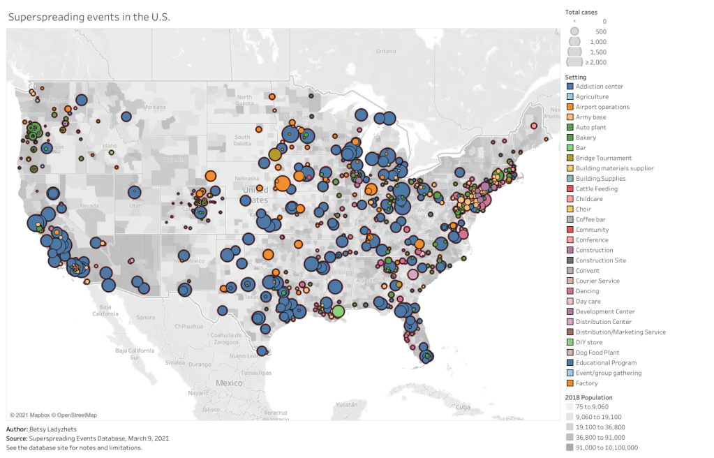
      BL: I did notice that the paper talks about superspreading events a little bit, and how that’s something that’s really difficult to account for.

      RG: Human behavior is the worst. It’s tough to account for, like, are there going to be off-campus parties? How do you think about that? Or is that, will the community and their communication structure going to hamper that and effectively convince people that these safety measures are there for a reason? That’s a tricky thing.

      BL: Did you see any aspect of disciplinary measures whether that is, like, students who had a party and then they had to have some consequence for that, or more of a positive affirmation thing? One thing that I saw a couple of schools I’ve looked at is, instituting a student ambassador program, where you have kids who are public health mini-experts for their communities, and they tell everyone, make sure you’re wearing your masks! and all that stuff. I was wondering if you saw anything like that and how that might have an impact.

      RG: The two things that I know about… I know there were alerts that went out, like, oh, you’re supposed to be tested every week. I don’t know about any disciplinary actions, that’s definitely out of my purview. But talking to grad students as well, I knew that if they didn’t get tested in time, they would get an alert.

      And the other thing that I will say in terms of the planning process—I got to be a fly on the wall in UC San Diego’s planning process on opening up. And what I thought was very nice, and I didn’t see this in other settings, is that they actually had a student representative there, hearing all the information, hearing the presentations. I had no idea who all of these people are on all these meetings, but I know there was a student who voiced a lot of concerns, and who everyone seemed to very much listen to and engage with. It was a good way to make sure the students aren’t getting pushed under—a representative was at the table.

      BL: Yeah, absolutely. From the student perspective, it’s easier to agree to something when you know that some kind of representative of your interest has been there, as opposed to the administrators just saying, we decided this, here’s what you need to do now.

      My last question is, if you’ve seen any significant changes for this current semester or their next one. And how vaccines play into that, if at all.

      RG: That’s the actual next set of questions that we’re looking into. If weekly testing continues, does the testing need change as people get vaccinated? The other thing that they have implemented is wastewater testing and alerts. They’re sampling all the dorms. And how does that impact individual testing, as well? Does that—can you rely on [wastewater] and do less individual testing? That’s some of the current work that we’re looking into.

      BL: That was all my questions. Is there anything else that you’d want to share about the work?

      RG: I will say, on [UC San Diego’s] end… I think you can use models for two things. You can use them to make decisions—or not make them, but help guide potential decisions. Or you can use them to backdate the decisions that you wanted to make. You can always tweak it. And I would say, in the work I’ve done, it’s been the former on the part of the school.

      The other thing is, thinking about the role of modeling in general as we move forward, because I think there’s definitely been an explosion there.

      BL: Oh, yeah.

      RG: I think it brought to light the importance of thinking about… A lot of our statistical models, for example, are very much individual-based. Like, your outcome doesn’t impact others. And I can see these ideas, coming from COVID—this idea that what happens to you impacts me, it’s going to be a powerful concept going forward.

    • National Numbers, March 21

      National Numbers, March 21

      In the past week (March 13 through 19), the U.S. reported about 372,000 new cases, according to the CDC. This amounts to:

      • An average of 53,000 new cases each day
      • 113 total new cases for every 100,000 Americans
      • 1 in 881 Americans getting diagnosed with COVID-19 in the past week
      • Only 10,000 fewer new cases than last week (March 6-12)
      Nationwide COVID-19 metrics as of March 19, sourcing data from the CDC and HHS. Posted on Twitter by Conor Kelly.

      Last week, America also saw:

      • 32,900 new COVID-19 patients admitted to hospitals (10 for every 100,000 people)
      • 7,200 new COVID-19 deaths (2.2 for every 100,000 people)
      • An average of 2.3 million vaccinations per day (per Bloomberg)

      Three months into his presidency, Joe Biden has already met one of his biggest goals: 100 million vaccinations in 100 days. This includes 79 million people who have received at least one dose, and 43 million who are now fully vaccinated. Two-thirds of Americans age 65 and older have received at least their first dose.

      Our current phase of the pandemic may be described as a race between vaccinations and the spread of variants. Right now, it’s not clear who’s winning. Despite our current vaccination pace, the U.S. reported only 10,000 fewer new cases this week than in the week prior—and rates in some states are rising.

      Michigan is one particular area of concern: COVID Tracking Project data watchers devoted an analysis post to the state this week, writing, “the Detroit area now ranks fourth for percent change in COVID-19 hospital admissions from previous week—and first in increasing cases and test positivity.” Hospitalization rates in New York and New Jersey are also in a plateau.

      These concerning patterns may be tied to coronavirus variants. Michigan has the second-highest reported count of B.1.1.7 cases, after Florida, and New York City is currently facing its own variant. The CDC’s national B.1.1.7 count passed 5,000 this week—more than double the count from late February.

      As genomic surveillance in the U.S. improves, the picture we can paint of our variant prevalence becomes increasingly concerning. But that picture is still fuzzy—more on that later in this issue. 

    • COVID source callout: CDC race/ethnicity data

      COVID source callout: CDC race/ethnicity data

      In the White House COVID-19 briefing this past Monday, equity task force director Dr. Marcella Nunez-Smith showed, for one fleeting minute, a slide on completeness of state-by-state data on vaccinations by race and ethnicity. The slide pointed out that racial/ethnic data was only available for 53% of vaccinations, and most states report these data for fewer than 80% of records.

      Still, though, this slide demonstrated that the CDC does have access to these crucial data. As we’ve discussed in past issues, while many states (45 plus DC) are now reporting vaccinations by race/ethnicity, huge inconsistencies in state reporting practices make these data difficult to compare. It is properly the job of the CDC to standardize these data and make them public.

      The CDC is actually under scrutiny right now from the HHS inspector general for failing to collect and report complete COVID-19 race/ethnicity data. You can read POLITICO for more detail here; suffice it to say, I’m excited to see the results of this investigation.

      Also, while we’re at it, let’s publicly shame the five states that are not yet reporting vaccinations by race/ethnicity on their own dashboards. Get it together, Hawaii, Montana, New Hampshire, South Dakota, and Wyoming!

    • Featured sources, March 14

      • Helix COVID-19 Surveillance Dashboard: Helix, a population genomics company, is one of the leading private partners in the CDC’s effort to ramp up SARS-CoV-2 sequencing efforts in the U.S. The company is reporting B.1.1.7 cases identified in select states, along with data on a mutation called S gene target failure (or SGTF) that scientists have found to be a major identification point in distinguishing B.1.1.7 from other strains.
      • COVID-19 related deaths by occupation, England and Wales: This is another source that I used for my Pop Sci story. The U.S. doesn’t publish any data connecting COVID-19 cases or deaths to occupations, but the U.K. data falls along similar lines to what we’d expect to see here: essential workers have been hit hardest. Men in “elementary occupations,” a class of jobs that require some physical labor, and women in service and leisure occupations have the highest death rates.
      • The Impact of the COVID-19 Pandemic on LGBT People: This brief from the Kaiser Family Foundation addresses a key data gap in the U.S.; the national public health agencies and most states do not publish any data on how the pandemic has specifically hit the LGBTQ+ community. KFF surveys found that a larger share of LGBTQ+ adults have experienced job loss and negative health impacts in the past year, compared to non-LGBTQ+ adults.

    • NYC variant looks like bad news

      In a press conference on Wednesday, NYC mayor Bill de Blasio confirmed that the recently identified NYC variant (since christened B-1526) is outpacing the original strain in spreading speed, and his senior advisor for Public Health, Dr. Jay Varma, said that these two variants combined account for 51% of all cases in the city.  This is coming from a preliminary analysis, and so far, they have not found that B-1526 is more deadly or that it may evade vaccine efficacy. However, it’s still worrying.

      It’s probably contributing to the relatively slower pace of decline in cases in NY versus the rest of the country: 

      And this comes when NYC is increasing indoor dining capacity to 50%, and when NY is going to scrap its rule on people from out of state having to quarantine on April 1. De Blasio has told New Yorkers to stay the course, but the people in charge (Andrew Cuomo) don’t seem to want to follow that advice.

    • Novavax releases optimistic trial results

      More good vaccine news this week: Novavax, the current candidate using a recombinant protein method, released results from trials in the United Kingdom and South Africa, and they look good. Here’s the breakdown:

      • 100% effective against hospitalization and death across all regions tested
      • 96.4% effective against symptomatic disease in the “original strain”
      • 86.3% effective against symptomatic B.1.1.7
      • 48.6% effective against symptomatic Covid-19 in South Africa (where B.1.351 is the predominant strain)

      It should be noted that the UK trial was a full phase 3, while the South African trial was a smaller phase 2b trial—so we have less information for South Africa. There’s also currently a 30,000-person trial happening in the United States and Mexico which should shed more light on what this vaccine can do. But for now, these results are super encouraging.

    • Teachers can get vaccinated in every state, but we don’t know how many are

      As of this past Monday, K-12 teachers in every state are now eligible for vaccination. Teachers were already prioritized in most of the country, but Biden directed the remaining states to adjust their priority lists last week. The federal government also pulled teachers into the federal pharmacy program, previously used for long-term care facilities.

      This is great news, of course—teachers should get vaccinated ASAP so that they can safely return to their classrooms, allowing schools to reopen in person with much lower risk. Vaccinations have become a stipulation for reopening, in fact, in some states like Oregon, even though the CDC has said this should not be a requirement.

      But there’s one big problem: we have no idea how many teachers have actually been inoculated. Sarah wrote about why we need occupational data on vaccinations a few weeks ago:

      For example, NYC has included “in-person college instructors” in eligibility for the vaccine since January 11. Wouldn’t it be nice to know just how many in-person professors have gotten vaccinated? It’d sure be helpful if Barnard ever decides to do in-person classes again. Or what about taxi drivers? Again in NYC, because that’s where I live, they became eligible for vaccination on February 2. From a personal standpoint, I’d like to know if I could send my taxi driver to the hospital if my mask slips.

      The data situation hasn’t improved since February. New York’s report of vaccine coverage among state hospital workers is still the closest thing we have to occupation reporting. A recent article from EdWeek sheds some light on the issue, citing privacy concerns and a lack of data from vaccine administration sites themselves:

      Some state agencies and districts have said privacy concerns prevent them from tracking or publishing teacher vaccination data. Others say vaccine administration sites are not tracking recipients’ occupations and they are not in position to survey employees themselves.

      It appears that state and local public health departments were even less prepared to track occupations of vaccine patients than they were to track those patients’ race and ethnicity. But without these numbers, it may take even longer for students to return to classrooms, as evidenced by this quote from Megan Collins, co-director of the Johns Hopkins Consortium for School-Based Health Solutions:

      “We’re seeing a substantial disconnect. There are states not prioritizing teachers for vaccine that are fully open for in-person instruction, and others that are prioritizing teachers for vaccines, but aren’t open at all,” Collins said. “If states are going to use teacher vaccinations as a part of the process for safely returning to classrooms, it’s very important then to be able to communicate that information so people know that teachers are actually getting vaccines.”

      Biden’s administration has also given schools more money for testing, allocating $650 million in grants to help public schools get access to tests, testing supplies, and logistical assistance. But of course, school testing isn’t being tracked either. New York continues to be the only state that reports detailed data in this area; see our K-12 school data annotations for more info.

      Related posts

      • COVID-19 school data remain sporadic
        On November 18, New York City mayor Bill de Blasio announced that the city’s schools would close until further notice. The NYC schools discrepancy is indicative of an American education system that is still not collecting adequate data on how COVID-19 is impacting classrooms—much less using these data in a consistent manner.
    • Where are we most likely to catch COVID-19?

      Where are we most likely to catch COVID-19?

      This week, I wrote a story for Popular Science that goes over what we know (and don’t know) about the most common settings for COVID-19 infection.

      Most of the main points will probably be familiar to CDD readers, but it’s still useful to compile this info in one concise article. Here are the main points: Outside events are always safer. Surfaces are not a common transmission source. Communal living facilities and factories tend to be hotspots. Indoor dining and similar settings carry a lot of risk. Essential workers are called essential for a reason. And don’t rule out small gatherings, even though such events are safer for those of us who’ve been vaccinated.

      This story gave me an excuse to revisit one of my favorite COVID-19 datasets: the Superspreading Events Database, a project that compiles superspreading events from media reports, scientific papers, and public health dashboards. I interviewed Koen Swinkels, the project’s lead, for the CDD back in November.

      At that time, the database had about 1,600 events; now, it includes over 2,000. All of the patterns I wrote about in November still hold true now, though. Notably, no event in the database took place solely outside (though Swinkels told me he’s seen some events with both an indoor and outdoor component). And the vast majority of events in the database took place in the U.S.

      For those U.S. events, most common superspreading settings are prisons (166,000 cases), nursing homes (30,000 cases), rehabilitation/medical centers (24,000 cases), and meat processing plants (13,000 cases). By this database’s definition, a superspreading event may comprise a sustained outbreak at one location over a long period of time—and prisons have been continuous hotspots since last spring. 

      You can check out the U.S. superspreading events in the database below. I made this visualization in November and updated it this past week.

      One of the reasons why I like the Superspreading Events Database is that Swinkels and his collaborators are extremely clear on the project’s limitations. If you load the database’s public Google sheet, you’ll see a prominent note at the top reading, “Note that the database is NOT a representative sample of superspreading events. Please read this article for more information about the limitations of the database.” The article, a post on Swinkels’ Medium blog, goes in-depth on the biases associated with the database. It’s easier to identify superspreading events in institutional settings, for example, since many of them employ frequent testing. Still, I think that—when carefully caveated—this database is an incredibly useful resource for identifying patterns in COVID-19 spread.

      Swinkels additionally pointed me to another great source for exposure data: the state of Colorado publishes outbreak data in weekly reports. A few other states publish similar info, but Colorado’s data are highly detailed and complete. In this past week’s report, released on March 10, the state says that 6,900 out of a total 28,000 cases in active outbreaks are linked to state prisons. 3,900 more cases are linked to jails.

      I’ve visualized the March 10 Colorado outbreak data below. As you may notice, the next-biggest outbreak setting after prisons and jails is higher education—colleges and universities represent 6,700 active outbreak cases. Colorado’s dataset does not specify how many of those cases are linked to the mask-less University of Colorado party that drew wide criticism last weekend… but we can assume that party was no small player.

      Finally, this PopSci story also gave me an excuse to revisit one of my favorite COVID-19 data gripes: the lack of contact tracing info we have in the U.S. I’ve written about this issue in the CDD before; I surveyed state dashboards in October, and drew connections from the Capitol invasion in January. But it was still disheartening to find that now, in March, we continue to be largely in the dark about how many contact tracers are actively employed in most states and how many people they’re reaching.

      Here’s a clip from the story:

      In the US, though, the practice is done unevenly, if at all. Most states and local jurisdictions, struggling from years of underfunded public health departments leading up to the pandemic, have not been able to hire and train the contact tracers needed to keep tabs on every case.

      Many states have attempted to supplement their limited contact tracing workforces with exposure notification apps, which are theoretically able to notify users when they’ve come into contact with someone who tested positive. Though these apps became more widespread in the US this past winter, they’re still not used widely enough to provide useful information. New Jersey, one state that provides data on its app use, reports that about 574,000 state residents have downloaded the app as of March 6—out of a population of 8.9 million.

      This situation is not likely to improve much in the coming months as Americans aren’t about to change their perspectives on privacy any time soon. But if you have the opportunity to download an exposure notification app for your state, do it! The more data we have on where people are getting exposed to COVID-19, the better we can understand this virus.

      Related posts

      • We need better contact tracing data
        The majority of states do not collect or report detailed information on how their residents became infected with COVID-19. This type of information would come from contact tracing, in which public health workers call up COVID-19 patients to ask about their activities and close contacts. Contact tracing has been notoriously lacking in the U.S. due to limited resources and cultural pushback.