This week, I wrote a story for Popular Science that goes over what we know (and don’t know) about the most common settings for COVID-19 infection.
Most of the main points will probably be familiar to CDD readers, but it’s still useful to compile this info in one concise article. Here are the main points: Outside events are always safer. Surfaces are not a common transmission source. Communal living facilities and factories tend to be hotspots. Indoor dining and similar settings carry a lot of risk. Essential workers are called essential for a reason. And don’t rule out small gatherings, even though such events are safer for those of us who’ve been vaccinated.
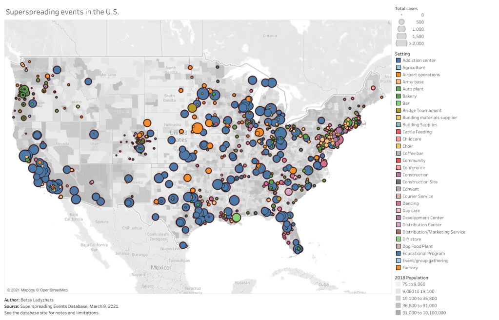
This story gave me an excuse to revisit one of my favorite COVID-19 datasets: the Superspreading Events Database, a project that compiles superspreading events from media reports, scientific papers, and public health dashboards. I interviewed Koen Swinkels, the project’s lead, for the CDD back in November.
At that time, the database had about 1,600 events; now, it includes over 2,000. All of the patterns I wrote about in November still hold true now, though. Notably, no event in the database took place solely outside (though Swinkels told me he’s seen some events with both an indoor and outdoor component). And the vast majority of events in the database took place in the U.S.
For those U.S. events, most common superspreading settings are prisons (166,000 cases), nursing homes (30,000 cases), rehabilitation/medical centers (24,000 cases), and meat processing plants (13,000 cases). By this database’s definition, a superspreading event may comprise a sustained outbreak at one location over a long period of time—and prisons have been continuous hotspots since last spring.
You can check out the U.S. superspreading events in the database below. I made this visualization in November and updated it this past week.
One of the reasons why I like the Superspreading Events Database is that Swinkels and his collaborators are extremely clear on the project’s limitations. If you load the database’s public Google sheet, you’ll see a prominent note at the top reading, “Note that the database is NOT a representative sample of superspreading events. Please read this article for more information about the limitations of the database.” The article, a post on Swinkels’ Medium blog, goes in-depth on the biases associated with the database. It’s easier to identify superspreading events in institutional settings, for example, since many of them employ frequent testing. Still, I think that—when carefully caveated—this database is an incredibly useful resource for identifying patterns in COVID-19 spread.
Swinkels additionally pointed me to another great source for exposure data: the state of Colorado publishes outbreak data in weekly reports. A few other states publish similar info, but Colorado’s data are highly detailed and complete. In this past week’s report, released on March 10, the state says that 6,900 out of a total 28,000 cases in active outbreaks are linked to state prisons. 3,900 more cases are linked to jails.
I’ve visualized the March 10 Colorado outbreak data below. As you may notice, the next-biggest outbreak setting after prisons and jails is higher education—colleges and universities represent 6,700 active outbreak cases. Colorado’s dataset does not specify how many of those cases are linked to the mask-less University of Colorado party that drew wide criticism last weekend… but we can assume that party was no small player.
Finally, this PopSci story also gave me an excuse to revisit one of my favorite COVID-19 data gripes: the lack of contact tracing info we have in the U.S. I’ve written about this issue in the CDD before; I surveyed state dashboards in October, and drew connections from the Capitol invasion in January. But it was still disheartening to find that now, in March, we continue to be largely in the dark about how many contact tracers are actively employed in most states and how many people they’re reaching.
Here’s a clip from the story:
In the US, though, the practice is done unevenly, if at all. Most states and local jurisdictions, struggling from years of underfunded public health departments leading up to the pandemic, have not been able to hire and train the contact tracers needed to keep tabs on every case.
Many states have attempted to supplement their limited contact tracing workforces with exposure notification apps, which are theoretically able to notify users when they’ve come into contact with someone who tested positive. Though these apps became more widespread in the US this past winter, they’re still not used widely enough to provide useful information. New Jersey, one state that provides data on its app use, reports that about 574,000 state residents have downloaded the app as of March 6—out of a population of 8.9 million.
This situation is not likely to improve much in the coming months as Americans aren’t about to change their perspectives on privacy any time soon. But if you have the opportunity to download an exposure notification app for your state, do it! The more data we have on where people are getting exposed to COVID-19, the better we can understand this virus.
Related posts
- We need better contact tracing dataThe majority of states do not collect or report detailed information on how their residents became infected with COVID-19. This type of information would come from contact tracing, in which public health workers call up COVID-19 patients to ask about their activities and close contacts. Contact tracing has been notoriously lacking in the U.S. due to limited resources and cultural pushback.

Leave a comment