Blog

  • The short-term future of COVID-19 testing

    The short-term future of COVID-19 testing

    Antigen test kit image via Dronepicr // Wikimedia Commons.

    This week, I had a story on COVID-19 testing published in Slate’s Future Tense vertical. The piece explores how testing will change in the next few months as more Americans become vaccinated and rapid tests become more widely available, with a practical focus: how should you interpret the test numbers on your local COVID-19 dashboard?

    Overall, I found, we will need to keep getting tested even post-vaccination. But the purpose of testing may shift, for many of us in the U.S., from diagnostic testing—a test to figure out if you are currently sick with COVID-19—to more screening and surveillance testing—tests to identify case trends and stomp out outbreaks in a broader community. This shift may be aided by the rise of rapid, at-home tests, which are becoming much more widely available thanks to investment from the federal government. Just this week, USA Today reported that at-home tests will soon be sold at national pharmacies CVS, Walgreens, and Walmart.

    In the CDD today, I’m excited to share one of the interviews I conducted for the piece, with Dan Larremore, a statistician at the University of Colorado and long-time advocate for the potential of rapid tests. We talked on April 2, just days after two major developments in the testing space: the FDA gave Emergency Use Authorization to several rapid tests for over-the-counter use, and the CDC and NIH announced a massive study to investigate how well these tests work for population-level screening. (One more piece of context: when we talked, case numbers were rising at a more concerning rate than they are now.)

    Larremore and I talked about his reaction to the rapid test news, how to interpret testing numbers, other new test types that may come on the market, and more.

    The interview below has been lightly edited and condensed for clarity.


    Betsy Ladyzhets: First question is, since a lot of this piece is meant to be about the numbers of testing, what would you consider the most useful metric or metrics right now to how successful testing is, whether that’s test positivity or other things?

    Dan Larremore: I think about testing for three different reasons. One reason is information about the trajectory of the pandemic, which is things like test positivity rates, number of new cases. We test to kind-of get our bearings in the movement of the pandemic. The second reason that we test is more at the individual level, but it’s still that [same] information. And that is, I would test because I want to know, am I sick? Might I give the disease to somebody else? Or, can my current symptoms be explained by being infected? So the first two are informational.

    The third reason that we might test is specifically just to break transmission chains, which is more like testing as an answer, not as a question. And so, for at-home testing, for serial testing, for the regular kind of testing that we have to do to be on campus here [at the University of Colorado]… To me, that’s much more about an intervention to slow down transmission than it is about gaining information.

    So, that’s a roundabout way of answering your question. But I think, in terms of what numbers to look at, it really matters what the intention of the testing is. So if people continue to take the pandemic seriously, and continue to, like, get tested regularly, or get tested when they feel sick, then those sort of daily case numbers will remain useful and interesting. And therefore the test positivity rate information will continue to tell us something about the trajectory of the pandemic. Does that answer your question?

    BL: Yeah, I think that does answer my question. Because I think that was one of the big kind of questions I had going into this story is like, is test positivity still useful if maybe, as people get vaccinated, they stopped thinking they need to get tested or as other dynamics change. But yeah, I had another person who I’ve interviewed for this story also had kind of a hierarchy description [of testing], so that definitely is a useful thing to think about.

    DL: Knowing why people come in to get tested just gives you so much more interpretability of like, what the numbers mean. Here on campus, if I want to be here on campus, I need to get tested weekly. I’ve been vaccinated, one dose, dose number two soon. But nevertheless, I still need to spit in the tube every week, and they test it. So, the test positivity rates here on campus are minuscule. Because with high compliance, everybody gets tested, so the denominator in that positivity rate is huge. At a drive up site, or at a doctor’s office, where people are coming in because they feel sick, the test positivity rates are going to be a lot higher.

    And I think, as people get more and more vaccinated—regardless of the case counts—as the pandemic feels like it’s winding down, I think people may be less likely to get tested. And so you can imagine test positivity rate being driven by, not just what the virus is doing, but a lot of the human behavior as well… I guess, the way that you can put it is, that you can see changes in the test positivity that are driven entirely by human behavior with respect to getting tested at all. And not so much about changes in the virus.

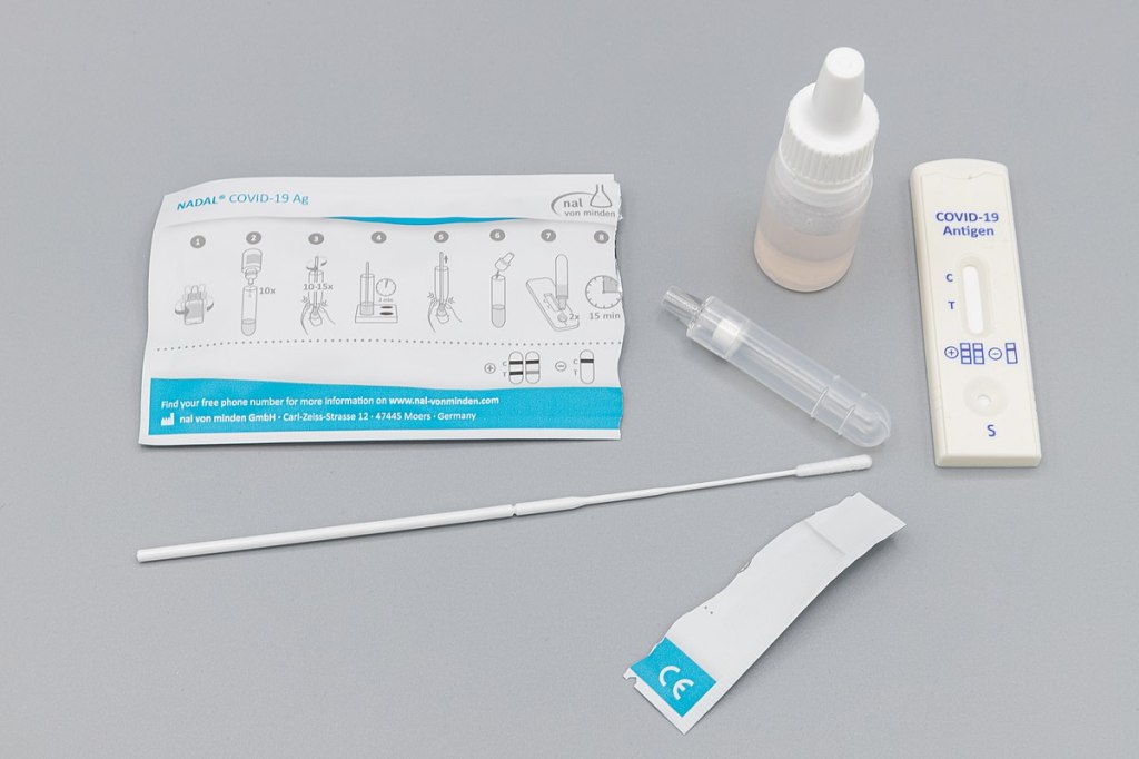
    BL: That makes sense. And I think it’s also about access, right? Are people able to go and get tested if they feel sick? Or if you’re thinking about schools and workplaces, is their employer having everyone get tested once a week? Is that something we’re going to see more of now that we have—like, literally earlier this week, the FDA gave EUA to a bunch of antigen tests, right?

    DL: Yeah, for at-home use.

    BL: Right. Do you think we’re gonna finally see that massive use of rapid tests that experts have wanted to see since, like, the summer?

    DL: A lot of people, myself included, have been excited about the possibility of at-home repeated antigen testing, as a way to really take community transmission levels and push them down. Because we know that asymptomatic transmission occurs, we know that getting people results rapidly is absolutely critical. Because four-day-old information is totally useless if you have infected people in those four days.

    I don’t know how useful those test kits are going to be right away, like, right now, given that we just now have an EUA for that kind of at home use that we’ve been hoping for for a long time. But at the same time, cases are shooting up due to these new variants around the U.S. and more importantly, around the world. So, I think these tools are still going to be useful, especially this fall, as we get a lot more kids in school. And we start bringing people together, temperatures starting to cool off, more people are indoors. I think that having the rapid test as a screening tool will still be valuable, particularly if we see limited uptake of the vaccine.

    BL: That makes sense… Another question around rapid tests is, that I know in the U.S., it’s really hard to get comprehensive data on them. I volunteered at the COVID Tracking Project, and I wrote [a blog post] about the problem of antigen test data. So I was curious as to how we will know how well the tests are working. And if there are any specific studies that you’re watching or data sources that you recommend, in terms of, like, knowing if people are actually using these at home tests.

    DL: I am excited about… On the 30th, there was a press release about the NIH and CDC rolling out at-home testing to two cities.

    BL: I saw that, yeah!

    DL: The work that Michael Mina and I did last year was showing that, at the individual level, the trade off between test sensitivity and turnaround time, should really tell us that turnaround time is critical. Like, theoretically, at the individual person level, the rapid test idea is really, really good. What we’ve not yet seen—outside of Slovakia—is the ability to flood the zone with tests, as Fauci put it, and just catch as many positives as possible and drive the epi curve downward, just because of the rapid tests.

    My feeling is that, really, the proof is in the pudding. If people can, at a community level, use a boatload of rapid tests regularly for a few weeks, and we can watch the new cases spike as we find those positives and then crash as we break all the transmission chains. That’s the key thing. That’s the key thing that I’m looking out for in these new trials.

    The Slovakia folks showed some of the limitations of this [strategy]. There’s a paper in Science where they wrote up their results. And basically what they found was the rapid testing worked really well, but the problem was on the isolation side. [Not everyone who tests positive can truly and effectively isolate.] In the short term, while they still had the supplies, these three waves of everybody in the country getting tested, worked like they were supposed to work, worked like the theory said. However, once you stop testing, you take your foot off the brakes, things re-accelerate. The second thing is that a lot of folks in particularly rural areas were like, okay, well, I’m positive, but I live with my family. How am I going to isolate? So unlike on a college campus here, where when somebody tests positive, we have a separate dorm set up for them for two weeks—in real life, that isolation stuff is going to be harder.

    BL: So it’s kind-of like, you need to pair it with the social services aspect, or some other way to help people out. I know, in New York, there’s a hotel room program, where if you test positive, you can contact the City Department of Health, and they’ll like, put you up in a hotel for two weeks. I don’t know how much it gets used, but it definitely seems like something that should be around in more places.

    DL: I mean, even if it’s just supporting people, by telling them like, this is gonna be awkward, but wear your mask at home, and don’t hang out with your family. Go watch TV in the basement, or, you know, otherwise keep distance from people. Whatever these interventions are, they can help. And we know that what we call the secondary attack rate is actually not that high. So, even among people who live in the same household, even among spouses, if one person is sick, that doesn’t mean that the other person definitely gets it. It’s only [around 20%] chance that they do. We looked at pairs of roommates here on campus, and studied [transmission between] them. And even among roommates, the secondary attack rate is not that high [20-28%].

    BL: Well, that brings me to another question I wanted to ask you, which is how public health communication around testing either is changing or should be changing in order to express like, okay, maybe you’ve been vaccinated, but you still need to get tested, or what needs to be communicated about these at home tests, or any other messages that you think are important to be conveying.

    DL: One thing that’s important is that we know that we need to keep our eye on the variants. And evidence is emerging… that there are some breakthrough variants, they are less well handled by the vaccine, even though the vaccine works really well… So, testing is going to remain important, even as, more broadly, the vaccine protects people from the most severe disease.

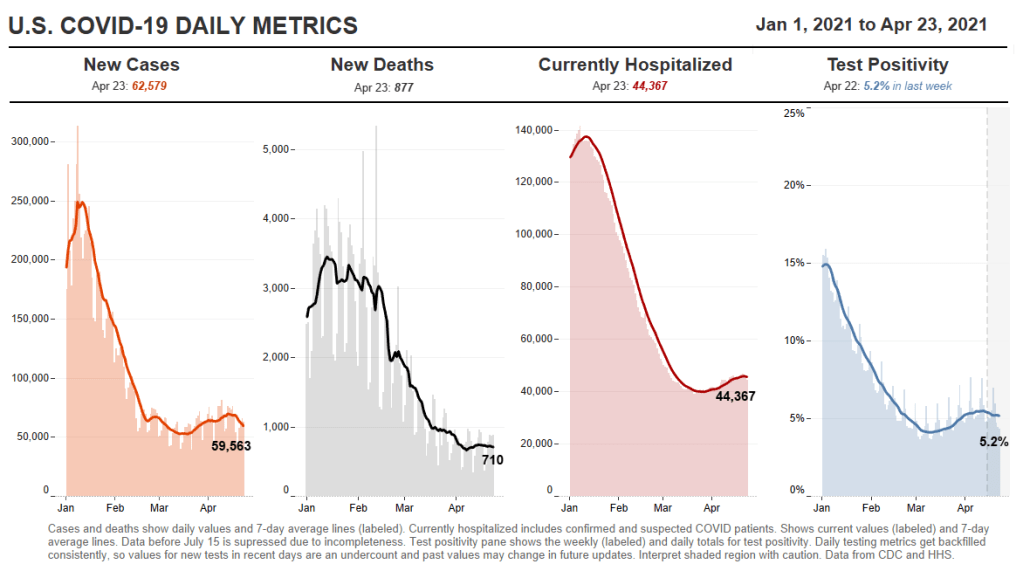
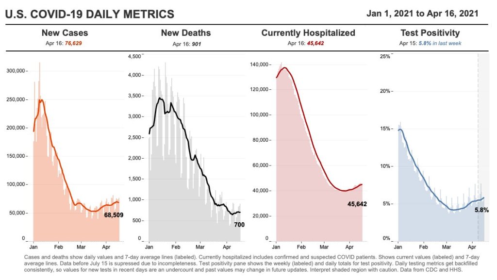
    We’re seeing a really interesting split right now, right? Where like, cases are going up, and we expect hospitalizations to then go up, and then mortality to go up. But I wonder if we’re gonna see that in the U.S. this time. Like, week on week, mortality continues to go down. And the question is, are we gonna get it again?

    BL: Is it gonna go up again?

    DL: Or did we vaccinate enough of the high-risk people that the mortality stays flat even while cases go up?

    BL: I definitely think there’s going to be kind-of a demographic aspect of it. Like,I’ve seen charts where people do, with the HHS hospitalization data, they publish it by age. So, you can see that hospitalizations are going way up in people ages, like, 18 to 30, but not so much in seniors. Although, kind-of tangentially, one data gap that I get annoyed by is that there’s very little demographic data for testing. Like, if you look at race data, for example, there are maybe five states that publish testing data by race and ethnicity. And there’s not a lot of it by age. So it’s kind-of hard to track patterns there.

    DL: I mean, I don’t know what the right messaging is around testing, other than, [if you feel like you’re sick], if you have the symptoms, you’ve got to go get tested. It doesn’t matter if you’re vaccinated or not. If you feel sick, you should go get tested. If you are going to be around somebody who you know is really vulnerable, if testing is available, go get tested.

    I still think it’s a valuable intervention, especially in places where vaccine uptake is low or vaccine availability is low. But I think the question is, like, really, how long is—what’s the expiration date on recommendations about testing? If 70% of the US is vaccinated by July, let’s say, does it still make sense to recommend a huge amount of testing? And I don’t know the answer to that. What I would like to see is people equipped for this fall, if there are spikes in cases, or if there are variants that are circulating even among vaccinated people, it would be amazing if, like, a local public health authority could tell everybody, this Sunday, I want everybody to use your rapid at-home test. Report your results anonymously to this number. And, if you test positive, take it seriously, take precautions. Measures like that could preserve privacy, while still collecting that key surveillance data and crashing the epidemic curve.

    BL: Right, that would be really cool to see. Are there any other types of COVID tests or surveillance methods that you think might become more useful and more prevalent in the next few months or heading into the fall?

    DL: Yeah, there are two kinds. So, one key point about at-home tests is that privacy-preserving aspect. Like, I trust local public health here. But I tend to vote left of center and generally trust the government. I live in Colorado, and not everybody feels that way. There’s definitely a strong libertarian independent streak. And I feel like one of the key advantages of at-home tests is that they appeal to that kind of person. They empower a person and their family to make health decisions, and they give you the information. But they don’t necessarily get recorded by something like COVID Tracking Project or HHS.

    BL: Yeah.

    DL: There’s less visibility for authorities, but for some folks who want information that they can act on to protect themselves and others, then that’s going to be fine. And so, as much as I would like to know exactly what is happening with the pandemic, if the trade-off for lower cases is that we don’t know about a lot of cases among folks who would rather not report their data, I think that’s a fair trade-off.

    BL: Yeah, that makes sense.

    DL: But it’s sort of like uncomfortable for me, who likes the data to say that. You know what I mean?

    BL: It reminds me of the conversation around exposure notification apps. I talked to someone who works on those apps recently, and she kind-of said the same thing, that she would rather have everyone using the app than really good data from a tiny subset of the population that’s okay with their privacy being violated.

    DL: A big thing to me is that, we know that the pandemic has been political. And I don’t see any reason why we can’t have solutions that work for the person who votes left of center, the person who votes in the middle, and the person who votes right of center.

    But the other kind of tests that I’m excited about, only because they’re extremely cheap and really easy, are anosmia screens. We know that loss of sense of smell is highly specific to COVID. If you don’t have a stuffy nose, and you [suddenly] can’t smell things, you probably have COVID. So, there are companies that produce, like, a little card with a scratch-and-sniff quiz. You don’t know what’s behind the panel, but you scratch, pull up a smartphone app, and then say what you think the smell is from a multiple choice test.

    One of the cool things is that anosmia only occurs in around 40% of people [with COVID] if you ask them to self-report. But if you give them one of these objective quizzes, the prevalence of anosmia as a symptom goes up to [around 75 or 80%], depending on which study you look at. The important thing is that those cards cost 25 cents apiece, and multiple people can use the same card. It’s literally a scratch-and-sniff with an online quiz.

    BL: That’s incredible. Do you know if there are tests like that that are up for EUA?

    DL: Yeah. Roy Parker, Michael Mina, and I collaborated with a great team to write this paper last year on typical COVID testing [PCR, LAMP, and antigen testing], test sensitivity and frequency and turnaround time. Then, Roy and I teamed up with Derek Toomre at Yale School of Medicine, and took the same idea and said, well, what if we use frequent, repeated anosmia screening tests?

    One of the things that I like about those is that they’re cheap. But another thing that I like about them is that nobody thinks that [a smell test is] the same thing as a proper COVID test. You can’t get them confused. [This is important because one of the questions with rapid tests is how people may interpret a negative test—they might be infected, but the virus is at a low level. So if they get a negative rapid test and then go to the gym, the test could actually have an unintended effect. But if an anosmia test tells you that you still have your sense of smell… People understand that just because you still have your sense of smell doesn’t mean that you’re COVID-free. There’s lower risk of unintended consequences.]

    Anyway, I think the messaging around those [anosmia] tests is easy. They’re easy to use, you can do them at home. And they can print them for, like, a quarter apiece. So the modeling suggests that they could be pretty effective and really cheap. You could literally mail somebody a stack of 10 of these things to everybody in the U.S.

    BL: And do it once a week!

    DL: Yeah, do it once a week. So, that’s another kind of test that I would like to see out there. The company that Derek started, that makes those [tests], just won one of the XPRIZEs for COVID testing. So, I think that’s cool. It’s a more creative kind of test, and it’s inexpensive.

    BL: Sweet. So, that was all the questions that I had. Is there anything you think is important on this topic that I should know for this article?

    DL: I just think it’s really important to keep a global perspective… As with vaccines, we know there are inequities within the U.S. But there are definitely global inequities. And while we might feel like we’re on a glide path to herd immunity through vaccination here in the States, things look very different in the rest of the world. And so, the use of these tests may become more important this fall, we may get more variants globally, even as the U.S. cases go down. I think it’s an ongoing story, even if hospitalizations and deaths continue to drop here in the States.

    BL: And those tests you’re talking about that are cheaper and easier to use are useful in many places, not just here.

    DL: Yeah, that’s the hope… I feel generally optimistic about [the state of the pandemic], but like, hesitant.

    BL: I feel you. It’s definitely weird to see everyone getting very excited about the summer when I’m kind-of sitting here in my COVID reporting bubble, like, ahhh, not there yet.

    DL: Well, one of the hardest parts, I think, for public health officials is going to be, if cases are going up, but mortality and hospitalizations are flat or going down. If COVID is only making people sick, but it’s not hospitalizing and killing them. Then, like, do we just reopen everything? Do we open up the schools? That’s tough when we’ve been acclimated to keep our foot on the brakes as much as possible.

  • National numbers, April 25

    National numbers, April 25

    In the past week (April 17 through 23), the U.S. reported about 438,000 new cases, according to the CDC. This amounts to:

    • An average of 63,000 new cases each day
    • 133 total new cases for every 100,000 Americans
    • 1 in 749 Americans getting diagnosed with COVID-19 in the past week
    • 10% fewer new cases than last week (April 10-16)
    Nationwide COVID-19 metrics as of April 16, sourcing data from the CDC and HHS. Posted on Twitter by Conor Kelly.

    Last week, America also saw:

    • 39,400 new COVID-19 patients admitted to hospitals (12 for every 100,000 people)
    • 4,800 new COVID-19 deaths (1.5 for every 100,000 people)
    • 44.7% of new cases in the country now B.1.1.7-caused (as of March 27)
    • An average of 2.9 million vaccinations per day (per Bloomberg)

    After several weeks of rising cases, the federal numbers dropped this week by about 10%. Michigan’s case rates fell below 500 new cases per 100,000 people and its positivity rate is trending downward, leading public health experts to hope that this state’s worrying outbreak may have peaked.

    As always, though, we can’t get too excited about a single-week trend—and 60,000 new cases each day is still a concerning level at which to plateau. Over 5,000 Americans are being admitted to hospitals with COVID-19 each day, and more of these patients are now younger as this age group is the last to become eligible for vaccination. COVID-19 is becoming more of a “young person’s disease,” as Sarah Zhang wrote in The Atlantic last week.

    Variants are still a concern, too—but I have no updates on variant numbers because the CDC has not updated its Variant Proportions data since our last issue. According to revised figures (still as of March 27), B.1.1.7 is causing about 45% of cases in the U.S., and the California (B.1.427/B.1.429) and New York City (B.1.526) variants are causing about 10% of cases each. Good news on the NYC variant, though: recent studies have suggested that the Pfizer and Moderna vaccines will effectively protect New Yorkers against this variant, per the New York Times.

    While the U.S. met President Biden’s 200 million dose goal last week, the pace of vaccinations is now slowing. We’re seeing about 2.9 million doses administered each day, compared to over 3 million a week ago. While this may be due in part to the Johnson & Johnson pause (more on that later), a bigger culprit is likely that vaccine supply is starting to eclipse demand. In other words, everyone who was desperate to get vaccinated has now gotten their shot, leaving those who are less confident or may have a harder time accessing an appointment. A new Kaiser Family Foundation report suggests that the U.S. is now vaccinating people in the “wait and see” group, and likely will have reached everyone in that group within a couple more weeks.

    It’s heartening to see case numbers drop, but we aren’t out of the woods yet. It will take coordinated communication and lifting of access barriers to reach a “vaccinated summer” here in the U.S… to say nothing of the rest of the world.

  • COVID source shout-out: NIH COVID-19 Treatment Guidelines

    COVID source shout-out: NIH COVID-19 Treatment Guidelines

    Last spring, the National Institutes of Health (NIH) set up a special website compiling guidance on how to treat COVID-19 patients, intended as a resource for physicians and researchers. We featured this source in an issue a couple of months ago, but I wanted to revisit it today because the site’s one-year anniversary is coming up this week!

    According to Dr. Fauci, who gave the site a shout-out at the White House COVID-19 press briefing this past Friday, the website has seen 3.8 million American users and 2.6 international users since its launch on April 21, 2020. There have also been 23 updates to the guidelines themselves.

    It’s pretty universally acknowledged in the science/health world that the U.S. federal public health agencies abdicated a lot of responsibility in 2020. But the NIH was one part of the infrastructure that kept chugging along, both through its support of vaccine development and its leadership in the global medical community. This website is a small part of those efforts.

    Happy birthday, COVID-19 Treatment Guidelines! I hope your usage rate goes down through the rest of 2021.

  • Featured sources, April 18

    • Two important CDC MMWRs: This week, the CDC published Morbidity and Mortality Weekly Reports on racial and ethnic disparities in COVID-19 hospitalizations and emergency department visits. The reports continue to hammer home this pandemic’s disproportionate impact on non-white Americans. In all major regions of the country, Hispanic/Latino COVID-19 patients were more likely to be hospitalized than those of other ethnicities; and in 13 states with ED visit data, Hispanic/Latino, Black, and Indigenous patients experienced the highest rates of hospital visits for the disease.
    • Searching for COVID-19: This interactive series of data visualizations allows users to explore top COVID-19-related Google search queries since January 20, 2020. The charts focus on “How to __” and “What is/are __” questions, such as, “how to make hand sanitizer?” You can also sort by country and U.S. state. The project is a collaboration between research and design firm Schema Design, Google News, and Axios.
    • CDD vaccination data annotations: This is your friendly reminder that we maintain a set of annotations on U.S. national and state COVID-19 vaccination data sources, updated weekly on Saturdays. Montana and Wyoming continue to be our last two holdout states not yet reporting demographic data for their vaccinated residents.

  • How to talk about breakthrough cases

    How to talk about breakthrough cases

    This week, The Hill posted an article with a rather misleading headline: “CDC finds less than 1 percent of fully vaccinated people got COVID-19.” If you actually click into the piece, you’ll find that the precise number is less than 0.008%. Less than 0.0005% have been hospitalized and less than 0.0001% have died.

    This headline reflects a common issue with vaccine reporting that I’ve seen in the past few weeks. A lot of journalists, especially those who aren’t familiar with the science/health beat, may be inclined to publish news of breakthrough cases as surprising or monumental. In fact, these cases—referring to a COVID-19 infection that occurs after someone has been fully vaccinated—are entirely normal, yet incredibly rare.

    No vaccine is perfect. Even the Pfizer and Moderna vaccines, which both demonstrated 95% efficacy in their late-stage clinical trials and over 90% effectiveness in the real world, are not perfect. Scientists still expect a few COVID-19 infections to slip through the immune system defenses built up by these vaccines and cause illness in a small number of patients.

    And it really is a small number: 129 million Americans have received at least one dose of a COVID-19 vaccine as of yesterday, per the CDC, and 82 million have been fully vaccinated. The agency has only documented 5,800 breakthrough cases. Less than 0.008% of those people who have been fully vaccinated. That’s the equivalent of one-quarter of a seat in Queens’ Citi Field baseball stadium (which seats about 42,000).

    So, if you’re a journalist reporting on this issue—whether it’s nationally or in your community—it’s important to stress that denominator. 82 million fully vaccinated, 5,800 breakthrough cases. Emphasizing the difference in magnitude between these numbers can show readers that, while they should still maintain some caution after getting vaccinated, the vaccines are overwhelmingly safe and effective.

    Small as the breakthrough case numbers are, though, it is important that we still talk about them. A new article by ProPublica’s Caroline Chen discusses how a failure to collect data on breakthrough cases is making it harder for COVID-19 researchers to understand what causes them. Specifically: we should be sequencing the genomes of the coronavirus strains that caused these cases, and by and large, we aren’t.

    Chen describes how many state health departments aren’t getting breakthrough case samples to sequence, whether that’s due to testing labs failing to store the test samples or cases being identified through rapid tests, which do not have established pipelines. Plus, in some cases, we aren’t even recording whether the patients went to the hospital or died—key data points in the U.S.’s continued vaccine monitoring.

    I definitely recommend you read the full piece, but here’s a section that will give you the big idea:

    In many instances, patients’ samples are not sequenced to find out if a variant might have been involved; some labs are throwing out test samples before an analysis can be done; hospitals and clinics aren’t always collecting new samples to analyze them. That means that for so many people, nobody will ever know if a variant was involved, leaving public health officials without data to be able to examine the extent to which variants are contributing to breakthrough cases.

    “It’s alarming that we can’t sequence more of the virus than we’re able to now — that’s something we need to resolve,” said Brian Castrucci, chief executive officer at the de Beaumont Foundation, a health philanthropy. “The more we know, the better we can react. We want to know the information so that we can make the right policy and health decisions.”

    While the CDC has an info page on breakthrough cases, no data on these cases are available on the agency’s COVID-19 dashboard. Reporters need to walk a delicate line on this issue: pursue the data, but report it in a careful, conscientious way that appropriately puts the tiny breakthrough case numbers in context.

    More vaccine news

    • Sources and updates, November 12
      Sources and updates for the week of November 12 include new vaccination data, a rapid test receiving FDA approval, treatment guidelines, and more.
    • How is the CDC tracking the latest round of COVID-19 vaccines?
      Following the end of the federal public health emergency in May, the CDC has lost its authority to collect vaccination data from all state and local health agencies that keep immunization records. As a result, the CDC is no longer providing comprehensive vaccination numbers on its COVID-19 dashboards. But we still have some information about this year’s vaccination campaign, thanks to continued CDC efforts as well as reporting by other health agencies and research organizations.
    • Sources and updates, October 8
      Sources and updates for the week of October 8 include new papers about booster shot uptake, at-home tests, and Long COVID symptoms.
    • COVID source shout-out: Novavax’s booster is now available
      This week, the FDA authorized Novavax’s updated COVID-19 vaccine. Here’s why some people are excited to get Novavax’s vaccine this fall, as opposed to Pfizer’s or Moderna’s.
  • Did you know that you, a plebeian, can search through VAERS?

    Did you know that you, a plebeian, can search through VAERS?

    You’ve probably heard about the Johnson & Johnson debacle by now. (Here’s an explainer on NYT’s The Daily and another one with more scientific background from Roxanne Khamsi at The Atlantic if you’re still confused.)

    If you attended or read about the April 14 emergency ACIP (Advisory Committee on Immunization Practices) meeting discussing the pause, you probably heard “VAERS” a lot. VAERS stands for “Vaccine Adverse Event Reporting System.” It’s used as a “national early warning system to detect possible safety problems in U.S.-licensed vaccines,” it’s been around for much longer than the COVID-19 vaccines or even COVID-19, and it’s how regulators are examining the data about possible complications related to the Johnson & Johnson COVID-19 vaccine. And as the cherry on top, the data is open to the public through the WONDER search engine. So what’s there?

    The search procedure is VERY customizable, and there’s even a video teaching you how to do it. You can narrow your search by symptoms, vaccine type, vaccine products, date that the event was reported, and more. For my cursory search, I, like a lot of people, was curious about the results for the Johnson & Johnson COVID-19 vaccine, so I just narrowed my search to “COVID-19 Vaccine Janssen.” 

    Here are my results, sorted by most common symptoms:

    These are the most common results, but the list keeps going after that with rarer side effects as you go down. It quickly became clear that this is not a perfect system, with some slightly nonsensical reports and strange distinctions. I was certainly left wondering how “SARS-COV-2 test negative” ended up as an adverse effect. (Seems like that’s what you want? Either way, there were 59 of these reported. Good for those 59 people—or that one person with a very sore nose.)

    Also notable were “Feeling abnormal” (213 reports), “Irritability” (10 reports) and my personal favorite, “No adverse event” (58 reports). It’s fairly obvious that not all of these adverse events were directly caused by the vaccine. Indeed, while the list can be fun to poke through and somewhat illuminating in what keeps popping up (headache, chills, pain, pyrexia/fever), finding the most common symptoms seems to be its main use.

    J&J distribution is paused right now because there were 6 cases of cerebral venous sinus thrombosis (CVST) combined with low platelets in a group where that is not common, and symptoms manifested between 6 and 13 days after vaccination. However, you can’t see that from this dataset. It doesn’t even seem like this dataset is fully updated—right now, there’s only one case of CVST recorded. (It was last updated on April 10.) The dataset also doesn’t actually say when the person got vaccinated and when the event was reported—just frequency. 

    In the April 14 emergency ACIP meeting, Dr. Tom Shimabukuro of the CDC COVID-19 Vaccine Task Force cited the 6 reports as of April 12, so it looks like the public dataset hasn’t been updated while the people actually making decisions are working with updated data. It doesn’t mean that this dataset isn’t useful, it just means that one should act with caution before using it to draw any conclusions. 

    The CDC clearly agrees with me, as they make you check a box stating that you’ve read the disclaimers like “reports may include incomplete, inaccurate, coincidental and unverified information” and “the number of reports alone cannot be interpreted or used to reach conclusions about the existence, severity, frequency, or rates of problems associated with vaccines” before they show you the goods in WONDER.

    There’s also a 17-page “VAERS Data Use Guide” which of course I found when I was almost done writing this up. Despite the limitations of the actual public dataset, I was extremely impressed by how much guidance that’s provided. I haven’t had my hand held this much while sifting through data in ages (I was very much on my own while going through the Global.Health database) and it really shows how much they want this data to be used with care. So I give serious props for solid and effective guidance on how to communicate this data—I just wish there was more data to communicate. 

    But WONDER isn’t the only way to sift through all the data. You can also download CSV files of every event reported (supposedly) back until 1990. That’d be a bit much for one post, but next week we might see what’s there.

    More vaccine news

    • Sources and updates, November 12
      Sources and updates for the week of November 12 include new vaccination data, a rapid test receiving FDA approval, treatment guidelines, and more.
    • How is the CDC tracking the latest round of COVID-19 vaccines?
      Following the end of the federal public health emergency in May, the CDC has lost its authority to collect vaccination data from all state and local health agencies that keep immunization records. As a result, the CDC is no longer providing comprehensive vaccination numbers on its COVID-19 dashboards. But we still have some information about this year’s vaccination campaign, thanks to continued CDC efforts as well as reporting by other health agencies and research organizations.
    • Sources and updates, October 8
      Sources and updates for the week of October 8 include new papers about booster shot uptake, at-home tests, and Long COVID symptoms.
    • COVID source shout-out: Novavax’s booster is now available
      This week, the FDA authorized Novavax’s updated COVID-19 vaccine. Here’s why some people are excited to get Novavax’s vaccine this fall, as opposed to Pfizer’s or Moderna’s.
  • Some personal news

    Some personal news

    Shout-out to my friend Raquel for both taking this picture and giving me a pre-photo haircut.

    This will be my final week at my day job, the data journalism publication Stacker. I do not have another staff job lined up. Instead, I’ll be freelancing and working on the COVID-19 Data Dispatch full-time.

    Why this move

    I’ve worked at Stacker for over three years now. I started as an intern in January 2018, then was hired on as a data journalist when I graduated college. The job taught me so much of what I now know about data reporting, from VLOOKUPs and pivot tables to the mindset I needed to really interrogate a dataset and figure out what stories may be told.

    I’m incredibly grateful to my colleagues at Stacker—especially Sam Gross, who has been my supervisor and mentor since I started. He supported me as I got up to speed on data reporting, built a science and health vertical, and managed our COVID-19 coverage. I’m also grateful to have had the flexibility to pursue freelance projects and start the CDD while working full-time there.

    But I’m committed to the COVID-19 beat—and beyond that, the wider public health beat—and it’s become clear to me that, to continue on this path, I need the time and bandwidth to pursue more stories outside of Stacker’s capacity.

    Also, I have to be honest here: I’ve come really close to burnout in the last few months.  Stacker, running the CDD, volunteering at the COVID Tracking Project, additional freelance projects on top of that… It’s a lot.  I’ve been working 40 hours a week at my day job, then spending all my nights and weekends working more. Reading, writing, analyzing, visualizing. Immersing myself in COVID-19 data. I’ve had little time for other creative writing, movie nights with my girlfriend, or basically anything else that would be a real break—and when I did take a night off, I’d feel guilty for not working. I haven’t had a break longer than, like, four days since February 2020.

    This shit isn’t sustainable! I spent a few weeks earlier in 2021 looking for another staff job; but after a few interviews, I realized that even with a full-time gig that aligned more closely with my desired beat, I’d still take time out of my “non-working hours” to work more. Another staff job would just drive me deeper into burnout.

    My choice to go independent will, I hope, enable me to spend my time more intentionally. I want to actually work 40-hour weeks, instead of 60+ hour weeks. In addition to seeking out new projects and opportunities for the CDD, I’m aiming to spend time learning Python and other coding languages, developing my data viz skills, and reporting on new topics in the public health realm. (Also, NYC friends, you may see me out on the streets more.)

    All this said, in the interest of transparency, I want to acknowledge the privilege I have that allows me to make this move. My parents paid for a large part of my college tuition; while I did take out a student loan, I paid my debt within a year of graduating. I am 24, young enough to stay on my mom’s health insurance for two more years. And I’ve been able to save up from Stacker and past freelance projects—nothing major, but enough to provide me with a sufficient cushion during this transition. Many young journalists would not be able to do what I am doing this spring.

    I hope to give back to my early-career community in the coming months by offering a (paid) platform to other journalists whose voices may add to the CDD. Readers, you can support that goal by becoming a member… more on that option below.

    What’s next

    My last day at Stacker is this Thursday, April 22. Starting in May, I’ll be officially open for freelance work.

    For the potential future clients reading this: Hi! Here’s some of the work I can do for you:

    • Data journalism stories on science and health topics, both short-form/news and long-form/features
    • Data analysis and visualizations (Tableau, Flourish, Datawrapper, etc.)
    • Content writing for science/health nonprofits
    • Webinar planning/virtual event management

    If you’d like to work with me, hit me up at betsy@coviddatadispatch.com, or schedule a meeting on my Calendly page. This also goes for anyone who would like to collaborate with the COVID-19 Data Dispatch on anything pandemic data-related.

    Meanwhile! My new independence will allow me to spend time implementing a lot of the CDD ideas I’ve failed to act on (or half-assed) in recent months. Current members, expect some Slack revamping and one-on-one reach-outs. Everyone, expect more reader surveys, data resources, events, and more.

    If you have any ideas for CDD projects or other ways you think I should be spending my time, please reply to this email!

    And, if you’d like to support me during this exciting and terrifying career move, here are three things you can do:

    • Share the CDD with a friend whom you think might find it useful. Help me grow the community of data nerds (and data novices) around this publication! It’s as simple as forwarding this issue—or any issue you’ve loved in the past few weeks. 
    • Become a member. Your regular contribution (suggested $10/month, or pay-what-you-will starting at $2/month) will help me devote more time and resources to the CDD by making this project more financially sustainable. You can find the publication’s current costs here, but in the coming months I hope to hire a regular editor, solicit pitches from outside writers, produce further events, and more.
    • Buy me a coffee. If you’d like to contribute to the CDD but can’t commit to membership right now, I get it! These are, by all definitions, unprecedented times. But every dollar helps, and I’m deeply appreciative of those who have donated through my Ko-fi page.

    As vaccinations increase in the U.S. but outbreaks surge elsewhere in the world, it will be a challenging time to remain on the COVID-19 beat—and I intend to. I’ll be relying on you, loyal readers, to ask me questions and shape my coverage in the months to come.

    Also, you may expect to see more posts here that supplement my freelance work: behind-the-scenes reporting notes, interviews with sources, data visualizations, commentary, and more. If there’s anything that particularly interests you about a COVID-19 story I do, don’t hesitate to reach out!

    Starting a sustainable media business has been a goal of mine since college. The CDD might be that business, or it might lead me into something bigger. But with this move, I’m done pursuing that goal halfway during my nights and weekends. I’m diving in headfirst. And I’m grateful to have all of you along for the ride.

    And a P.S.

    Stacker is hiring right now! If you’re a budding data journalist with an eye for research and an immense curiosity for new topics, my soon-to-be old job might be a good fit for you. Here’s the job posting, reach out if you have questions.

  • National numbers, April 18

    National numbers, April 18

    In the past week (April 10 through 16), the U.S. reported about 487,000 new cases, according to the CDC. This amounts to:

    • An average of 70,000 new cases each day
    • 148 total new cases for every 100,000 Americans
    • 1 in 674 Americans getting diagnosed with COVID-19 in the past week
    • 8.5% more new cases than last week (April 3-9)
    Nationwide COVID-19 metrics as of April 16, sourcing data from the CDC and HHS. Posted on Twitter by Conor Kelly.

    Last week, America also saw:

    • 38,500 new COVID-19 patients admitted to hospitals (11.7 for every 100,000 people)
    • 5,000 new COVID-19 deaths (1.5 for every 100,000 people)
    • 44.1% of new cases in the country now B.1.1.7-caused (as of March 27)
    • An average of 3.2 million vaccinations per day (per Bloomberg)

    I am really worried about Michigan. The state comprises a full 11% of new U.S. cases in the past week—and Michigan only makes up 3% of the national population. On any COVID-19 chart right now, Michigan sticks out like a sore thumb. Over 500 new cases per 100,000 people in a week, 4,200 new COVID-19 patients in a week, 15% positivity rate… none of the signs are good.

    B.1.1.7 seems to have truly taken hold in Michigan. Combine that with a resistance to safety restrictions, and the state may serve as a warning of what other parts of the country may experience soon if we don’t keep up the pace on vaccinations. For more reporting on the state, I recommend Jonathan Cohn’s recent story in HuffPost.

    B.1.1.7 has taken hold elsewhere, too. The variant is now causing at least 44% of the new cases in the country, as of the CDC’s most recent data (March 27). As that figure is now over two weeks old, the true prevalence is most likely much higher. Meanwhile, the NYC variant (B.1.526) and California variants (B.1.427/B.1.427) are each accounting for 10% of cases nationally, troubling figures on their own.

    On the optimistic front, though, the daily average for vaccinations is now up at 3.2 million. The last few states that haven’t yet opened up eligibility to their entire adult populations will do so tomorrow, meeting President Biden’s deadline. We’ve also reached 200 million doses administered, ahead of Biden’s (revised) goal for his first 100 days in office.

    Will these vaccinations be enough to break the tide of variant cases? I hope so. The vaccines at least appear to be protecting our most vulnerable neighbors so far, though; the death rate has remained below 1,000 per day despite several weeks of rising cases and hospitalizations.

  • COVID source shout-out: I’ve never wanted to be an “NIH-er” this bad

    COVID source shout-out: I’ve never wanted to be an “NIH-er” this bad

    George Harrison who? Paul McCartney WHO?! NIH Director Dr. Francis Collins is coming for your wigs. 

    On Friday, Collins posted a video of a “COVIDized” “Here Comes The Sun” to his NIH Director’s blog, in which he thanked “NIH-ers” and promised a way out of the “long, dark, COVID winter.” It’s best if you see for yourself:

    The song was great of course but I loved the cat (her name is Zoe!) cameo the most. 

    Indeed, while numbers are looking a little worrying now, it’s pretty certain that we’re riding out the tail end, at least in the U.S.

  • Featured sources, April 11

    • Lost on the frontline: This database from Kaiser Health News and The Guardian honors American healthcare workers who died during the COVID-19 pandemic. We featured this source when it was launched back in August 2020. At that time, 167 workers were included in the interactive database; now, you can read the profiles of hundreds more. 3,607 deaths have been recorded in total. KHN and The Guardian closed their joint investigation this week, and public health leaders and policymakers are now calling on the federal government to continue this crucial work.
    • State COVID-19 Hospitalization Data Annotations, by the COVID Tracking Project: This week, the COVID Tracking Project released a snapshot of extensive research into how U.S. states are reporting their currently hospitalized COVID-19 patients. The research has informed comparisons between Project data and federal data which demonstrated the quality of the HHS hospitalization dataset. You can access these annotations, along with information on cases, tests, and deaths, at the Project’s Data Annotations page.
    • Food Insecurity in the United States: Nonprofit hunger relief organization Feeding America has compiled and mapped data showing how the pandemic has impacted food insecurity in the U.S. You can search for a specific state, county, or local food bank to see food-insecure population estimates, average meal costs, food stamp program eligibility, and more.