In case you missed it amidst the mask discourse: Pfizer was already the “vaccine for cool people,” but this week, it formally became the vaccine for teens. The FDA announced on Monday that it was expanding the Emergency Use Authorization for this vaccine to include children ages 12 to 15, and the CDC followed this up with an official recommendation on Wednesday.
As Sarah Braner reported when the Pfizer adolescent trial results were released: “In the trial, no participants who received the vaccine contracted symptomatic COVID-19 out of a total of 2,260 participants, marking an efficacy rate of 100%.” So, this formal endorsement was a pretty foregone conclusion, but it’s still good news for the 17 million children ages 12 to 15 in the country.
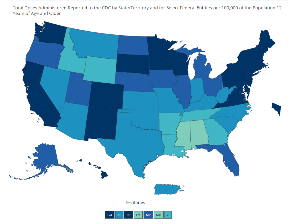
And speaking of adolescent data: on Friday, the CDC diversified its vaccine tracker. In addition to state-by-state views of vaccination coverage for the overall population, adult population, and senior population, the Tracker will now show you vaccination coverage for each state’s population over age 12. Nationwide, 56% of this group has had at least one dose and 44% is fully vaccinated.
The Vaccinations County View page will show you coverage over age 12 by county, but these data aren’t yet available for easy download in the Community Profile Reports.
The CDC’s demographic vaccination data, meanwhile, groups adolescents in with (already eligible) 16 to 18-year olds in an under 18 category—so we aren’t yet able to see precisely how many children in this age group are getting vaccinated. This may become a concerning data gap as schools may seek to use 12-15 vaccination rates as an indicator for reopening next fall.
Following the end of the federal public health emergency in May, the CDC has lost its authority to collect vaccination data from all state and local health agencies that keep immunization records. As a result, the CDC is no longer providing comprehensive vaccination numbers on its COVID-19 dashboards. But we still have some information about this year’s vaccination campaign, thanks to continued CDC efforts as well as reporting by other health agencies and research organizations.
This week, the FDA authorized Novavax’s updated COVID-19 vaccine. Here’s why some people are excited to get Novavax’s vaccine this fall, as opposed to Pfizer’s or Moderna’s.
This past Thursday, the CDC announced that, if you are fully vaccinated, the pandemic is basically over for you.
The announcement surprised everyone—from my parents to COVID-19 scientists—because it appeared to come out of nowhere. Before this week, the CDC’s most recent guidance revisions included an acknowledgment that surface transmission of the coronavirus is very rare and a recommendation that masks might not be necessary outside; both of these conclusions were already well-known in the scientific community. In fact, STAT published an article last week in which Nicholas Florko suggests that the CDC’s COVID-19 messaging has been “overly cautious” and perhaps even “irrelevant for most Americans.”
So, what led to the announcement on Thursday? The rest of this post will go over the CDC’s evidence for its guidance, taking the epidemiological perspective. Also, as two-thirds of Americans aren’t yet fully vaccinated, I’ll touch on another COVID-19 truism that has garnered some confusion lately: yes, you are significantly safer outside than you are inside.
Our first category of evidence: the mRNA vaccines work really well. It’s no surprise that the Pfizer and Moderna vaccines are both exceptionally capable of protecting people against the coronavirus, but a couple of recent studies really hammer this home:
In this recent study from Israel, the Pfizer vaccine demonstrated 97% effectiveness against symptomatic cases and 86% effectiveness against asymptomatic cases among about 6,700 healthcare workers who were regularly tested for COVID-19.
According to this MMWR report from the CDC, the Pfizer and Moderna vaccines were 94% effective in preventing COVID-19 hospitalization for fully vaccinated seniors (over age 65), demonstrating how well the vaccines protect against severe disease. Plus, the vaccines were 64% effective in preventing hospitalization for partially vaccinated seniors.
Another MMWR report, released this past Friday, demonstrates that the mRNA vaccines were 94% effective at preventing symptomatic COVID-19 in U.S. healthcare workers. A single shot of Pfizer or Moderna ws 82% effective at preventing symptomatic COVID-19.
A study from the Cleveland Clinic, a medical research center based in Cleveland, Ohio, studied COVID-19 cases among its caregivers after vaccines were made available; the Clinic found that a whopping 99.7% of those workers who tested positive for COVID-19 had not been fully vaccinated. Only 0.3% were breakthrough cases. Meanwhile, 99.75% of COVID-19 patients that the Clinic treated during the study’s time frame were not fully vaccinated.
According to the CDC’s breakthrough case data, out of about 122 million fully vaccinated Americans, less than 1,400 people have been hospitalized or have died due to COVID-19. That’s 0.001%. (The CDC’s breakthrough reporting focuses on severe outcomes rather than cases, as these cases may be difficult to systematically identify outside of studies.)
Second evidence category: the vaccines work against variants.
It’s important to note here that, when I say “vaccines work,” it’s not an all or nothing situation. A vaccine might protect you against severe COVID-19 disease or death (the primary goal), but not against an asymptomatic case that allows you to transmit the virus to someone else.
All the COVID-19 vaccines currently on the market protect us against severe COVID-19 disease and death—whether you’re infected with an older version of the coronavirus or with a variant.
For a couple of the variants, that protection might not be quite as secure. Studies on B.1.351 (the variant first identified in South Africa), P.1 (identified in Brazil), and B.1.617 (identified in India) have all demonstrated lower vaccine effectiveness. But again, lower effectiveness here still means protection for the majority of people who get vaccinated.
And one big advantage of mRNA vaccine technology is, the Pfizer and Moderna vaccines may easily be adjusted to protect against particularly concerning variants. Moderna recently reported promising data for two booster shots designed to protect specifically against B.1.351 and P.1.
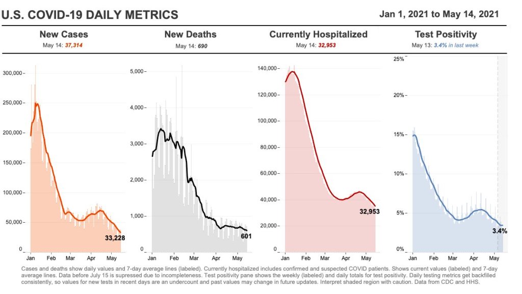
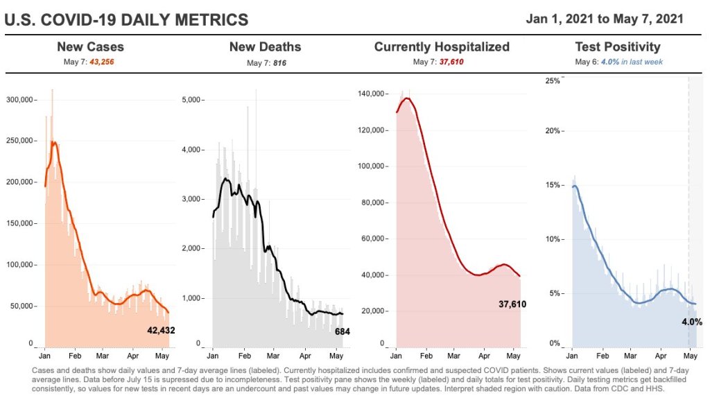
As I noted in today’s National Numbers post: cases have dropped by 50% in the last month. And beyond that, cases have dropped from a peak of 250,000 new cases per day in January to under 40,000 new cases per day now.
During this time frame, most states did not impose lockdowns or other restrictions on the level of what we saw in spring 2020. So, these drops can primarily be attributed to the vaccines.
Still, the massive case drops—occurring even as B.1.1.7 and other more contagious variants spread through the country—indicate that the vaccines must be doing some work to stall coronavirus spread from one person to another. This supports the CDC’s argument that vaccinated Americans can take off their masks in public without worrying about spreading a latent coronavirus to someone else.
Fourth evidence category: outdoor transmission is incredibly low.
Earlier this week, the New York Times’ David Leonhardt provided a compelling argument for why, though the CDC said “less than 10%” of COVID-19 transmission occurs outside, the true number is actually much lower. In fact, fewer than 1% (and possibly even fewer than 0.1%) of COVID-19 cases happen due to someone getting infected outside.
As I’ve previously reported, there is not a single recorded superspreading event that took place solely outside. This includes the large Black Lives Matter protests last summer. (A few superspreading events have both outdoor and indoor components.)
A new study from researchers at Drexel University specifically examined COVID-19 transmission in parks, and found no correlation between the number of people using a park and the number of COVID-19 cases in the surrounding ZIP code. The research suggests that you should feel safe at your local park, even if it seems a bit more crowded and less mask-adherent than it did a few months ago. I spoke to Franco Montalto and Bita Alizadehtazi, two authors on this study, who emphasized that “it’s important to get outside,” take advantage of the green infrastructure in your neighborhood, and feel safe while doing so.
2. Vaccination protects you; more vaccinations protect everyone.
Speaking just for myself: I am fully vaccinated, but I fully intend to keep wearing a mask in stores, on the subway, and even outside when I’m in a large crowd of people. This is partially because my state still has a mask mandate in place, but also because there are still a lot of people in my community who aren’t yet vaccinated—and I don’t want to pose a risk to them, no matter how small that risk may be. (In Brooklyn, where I live, 41% of the population has had at least one dose and 33% are fully vaccinated, according to city data.)
Suffice it to say, the CDC makes recommendations about COVID-19 safety. It doesn’t issue requirements. I made a personal masking decision for myself, based on the community where I live; I hope this article helped you understand the science behind the guidance change so that you can do the same. And if you have questions—my inbox is always open.
Following the end of the federal public health emergency in May, the CDC has lost its authority to collect vaccination data from all state and local health agencies that keep immunization records. As a result, the CDC is no longer providing comprehensive vaccination numbers on its COVID-19 dashboards. But we still have some information about this year’s vaccination campaign, thanks to continued CDC efforts as well as reporting by other health agencies and research organizations.
This week, the FDA authorized Novavax’s updated COVID-19 vaccine. Here’s why some people are excited to get Novavax’s vaccine this fall, as opposed to Pfizer’s or Moderna’s.
Last week, I asked you, COVID-19 Data Dispatch readers, to send me your stories of challenges you experienced when trying to get this fall’s COVID-19 vaccines. I received 35 responses from readers across the country, demonstrating issues with insurance coverage, pharmacy logistics, and more.
28,300 new COVID-19 patients admitted to hospitals (8.6 for every 100,000 people)
4,100 new COVID-19 deaths (1.3 for every 100,000 people)
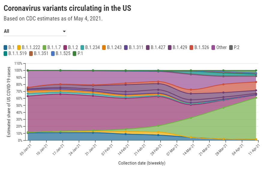
66% of new cases in the country now B.1.1.7-caused (as of April 24)
An average of 1.9 million vaccinations per day (per Bloomberg)
COVID-19 case numbers continue to drop this week: the current U.S. average is about 35,000 new cases a day, a 50% drop from where we were a month ago. (We saw 70,000 new daily cases in the week ending April 16.) Daily cases have not been this low since early September, between the summer and fall/winter surges.
From the great work @CovidActNow. Today for the first time in their current risk level framework, no state is red (or dark red). In January no states were yellow. Another marker of the improvement in the Covid-19 situation across the country. Let’s continue to make progress! pic.twitter.com/whViMkq8ta
— Dr. Cyrus Shahpar Archived (@cyrusshahpar46) May 14, 2021
Hospitalizations are also down: about 4,000 new COVID-19 patients were admitted each day this week, compared to about 5,500 a month ago. While this drop is not as dramatic as the drop in cases, it may actually be an indicator that hospitals are admitting and caring for patients with less severe illness—who may not have been admitted in, say, January. Regardless, the more beds a hospital has to spare, the better care it can provide. All states have inpatient bed occupancy rates at 80% or below except for Massachusetss and Rhode Island.
The CDC updated its variant data this week with figures as of April 24. B.1.1.7 is causing two out of every three COVID-19 cases in the country, according to these data. After B.1.1.7, the most prevalent variant is B.1.526 (14%); this variant, first discovered in NYC, is still classified as a “variant of interest,” so state-by-state data are not available. P.1 also gaining ground: it now causes 5% of U.S. cases, with much higher values in some states (20% of Illinois cases, 11% of Massachusetts cases).
Though these variants may be worrying, our continued case drop shows that the vaccines are beating them—more on that later. 37% of the overall U.S. population is now fully vaccinated, and 47% has had at least one dose.
But some states are doing much better than others. Only 26% of Mississippi’s population is fully vaccinated, compared to almost 50% in Connecticut and Maine. Racial inequities persist as well: Bloomberg reports that only 10 states have vaccinated at least a third of their Black and Hispanic populations, while over 30 states have vaccinated this share of their White and Asian populations.
As the pace of vaccinations continues to slow (1.9 million per day, as of yesterday), these disparities must be addressed.
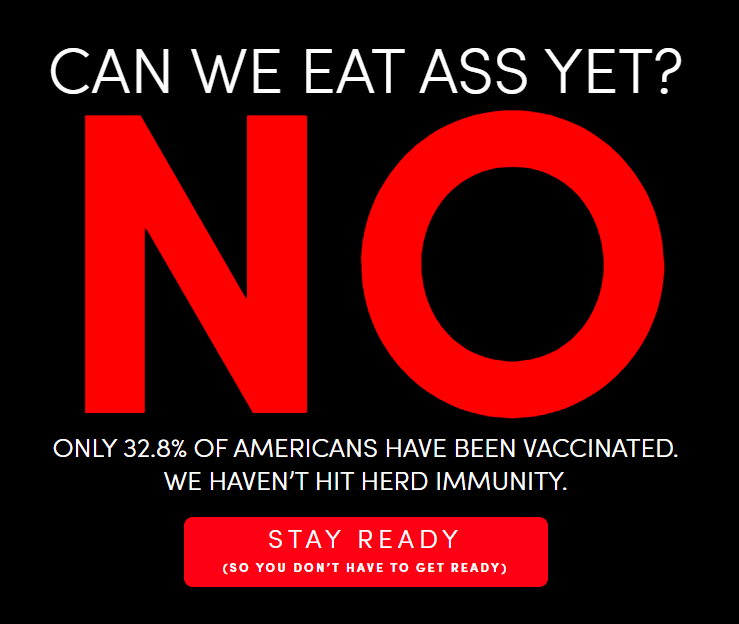
TUSHY is a bidet company. It’s gotten a lot of traction during the pandemic, as Americans suddenly working from home decided to upgrade their bathroom experiences. (This group includes me and my roommates.)
Now, you might ask: Betsy, why are you featuring a bidet company as a COVID-19 data source? Because a special page on TUSHY’s website is reporting the share of Americans who have been fully vaccinated, with a (NSFW) framing: “Can We Eat Ass Yet?”
The current answer is no—only 33% of the U.S. population has been fully vaccinated, according to this page. TUSHY staff are updating the page every weekday using CDC data.
“The idea for “CanWeEatAssYet.com was born when COVID was blowing up in NYC,” says TUSHY’s founder Miki Agrawal. “NYC government sent out a message to all New Yorkers to not eat ass because it could spread COVID… and we wanted to create a funny site a la “IsMercuryInRetrograde.com” with a YES / NO answer specifically for eating ass, because with TUSHY bidet, we support clean ass and wanted to let people know when it was safe to partake in the activity.”
That bright red “NO” may be switched to “YES” when 70% of the U.S. population has been fully vaccinated, but Agrawal says the team will “keep checking with the CDC regularly” to determine the perfect “ass-eating immunity” threshold. Now that’s creative science communication.
Editor’s note: This is not sponsored content, I just think the page is really funny—and TUSHY’s marketing team was kind enough to reply to my email on short notice. Also, H/T Garbage Day.
No new COVID-19 data sources caught my eye this week, so I dug into the archives for a couple of old favorites.
Household Pulse Survey by the U.S. Census(featured on 8/16/20): Starting at the end of April 2020, the U.S. Census has run a survey program to collect data on how the COVID-19 pandemic impacted the lives of American residents. The survey results include questions on education, employment, food security, health, and housing. The Census has now conducted three phases of this survey, going through April 2021.
Searchable database of federal COVID-19 purchases(featured on 12/13/20): Since March 2020, ProPublica has tracked where federal government spending on the pandemic is going. The database represents $38 billion, 17,734 government contracts, and 8,070 individual vendors as of May 7. Data can be sorted by spending categories, vendor types, and contract sizes.
COVID-19 diverse sources(featured on 3/28/21): NPR journalists from the organization’s Source of the Week project have compiled this database of COVID-19 experts from diverse backgrounds. The database is divided into 13 major categories, including virology, disease origin, health policy, racial/ethnic health disparities, and more.
HHS celebrity tracker(featured on 11/1/20): In late October, POLITICO’s Dan Diamond released an HHS document called the “PSA Celebrity Tracker,” which health officials were using to determine which of America’s favorite people may be useful in an ad campaign encouraging the nation to be less negative about COVID-19. (Here’s more context from POLITICO on the tracker.)
I couldn’t decide which of these news items to focus on for a short post this week, so I wrote blurbs for all five. This title and format are inspired by Rob Meyer’s Weekly Planet newsletter.
HHS added vaccinations to its facility-level hospitalization dataset: Last week, I discussed the HHS’s addition of COVID-19 patient admissions by age to its state-level hospitalization dataset. This week, the HHS followed that up with new fields in its facility-level dataset, reflecting vaccinations among hospital staff and patients. You can find the dataset here and read more about the new fields in the FAQ here (starting on page 14). It’s crucial to note that these are optional fields, meaning hospitals can submit their other COVID-19 numbers without any vaccination reporting. Only about 3,200 of the total 5,000 facilities in the HHS dataset have opted in—so don’t sum these numbers to draw conclusions about your state or county. Still, this is the most detailed occupational data I’ve seen for the U.S. thus far.
A new IHME analysis suggests the global COVID-19 death toll may be double reported counts: 3.3 million people have died from COVID-19 worldwide as of May 8, according to the World Health Organization. But a new modeling study from the University of Washington’s Institute for Health Metrics and Evaluation (IHME) suggests that the actual death number is 6.9 million. Under-testing and overburdened healthcare systems may contribute to reporting systems missing COVID-19 deaths, though the reasons—and the undercount’s magnitude—are different in each country. In the U.S., IHME estimates about 900,000 deaths, while the CDC counts 562,000. Read STAT’s Helen Branswell for more context on this study.
The NYT published a dangerous misrepresentation of vaccine hesitancy (then quietly corrected it): A New York Times story on herd immunity garnered a lot of attention (and Twitter debate) earlier this week. One specific aspect of the story stuck out to some COVID-19 data experts, though: a U.S. map entitled, “Uneven Willingness to Get Vaccinated Could Affect Herd Immunity.” The map, based on HHS estimates, claims to display vaccine confidence at the county level. But the estimates are really more reflective of state averages, and moreover, the NYT originally double-counted the people who are strongly opposed to vaccines, leading to a map that made the U.S. look much more hesitant than it actually is. Biologist Carl Bergstrom has a thread detailing the issue, including original and corrected versions of the map.
We still need better demographic data: A poignant article in The Atlantic from Ibram Kendi calls attention to gaps in COVID-19 data collection that continue to loom large, more than a year into the pandemic. The story primarily discusses race and ethnicity data, citing the COVID Racial Data Tracker (which I worked on), but Kendi also highlights other underreported populations. For example: “The only available COVID-19 data on undocumented immigrants come from Immigration and Customs Enforcement detention centers.”
NIH college student trial is having a hard time recruiting: If you, like me, have been curious about how that big NIH trial to study vaccine effectiveness in college students has progressed since it was announced last March, I recommend this story from U.S. News reporter Chelsea Cirruzzo. The study aimed to recruit 12,000 students at a select number of colleges, but because the vaccine rollout has progressed faster than expected, researchers are having a hard time finding not-yet-vaccinated students to enroll. (1,000 are enrolled so far.) Now, students at all higher ed institutions can join.
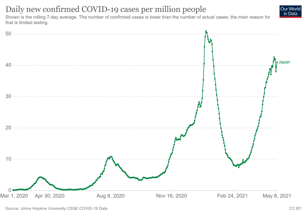
Japan’s new COVID-19 cases per million, as of May 8. Chart via Our World in Data.
They’re definitely not ready now. The Japanese government just announced it would extend an already-standing state of emergency through May 31 following a large spike in COVID-19 cases. After “Golden Week,” a sequence of Japanese Holidays lasting from late April to early May, Tokyo reported 907 new cases for the week. (New York City reported 985 cases just on May 7, for comparison.) A variant called N501Y has caused recent surges in cases, like in Osaka where hospitals struggled to treat the influx. N501Y is more infectious, and it has been correlated with more serious cases.
This surge comes as Japan struggles to roll out vaccinations. According to Our World in Data, as of May 6, 2.44% of the country’s population has received at least one dose of the vaccine. (In the United States, around 57% of the population has received at least one dose as of May 8.) So far, Japan has only approved the Pfizer-BioNTech vaccine for use, though it may approve the Moderna and AstraZeneca vaccines by May 20. Pfizer has also announced that the company will donate vaccines to athletes and staff, and the International Olympic Committee has said, “It is expected that a significant proportion of Games participants will have been vaccinated before arriving in Japan.”
An online campaign called Stop Tokyo Olympics has gained more than 200,000 signatures to an online petition, per Reuters. A Japanese poll in January showed that 80% of respondents said the games should be postponed or cancelled, and this trend has held true since.
Japan has been extremely successful in controlling the pandemic so far, but that has also led to a lack in urgency in vaccinating the population, and again, surges have happened. The Olympics are very difficult to do in an NBA-like bubble. The scale of the Olympics is much larger, and with case counts across the world as high as they are, it’s hard to imagine that someone won’t come down with COVID-19 during the games. As the New York Times points out, the chances of a COVID-19 free Olympics are slim—instead, the priority will be controlling cases as they come up.
Officials have repeatedly insisted that the games will go on as planned, and there is no sign that they will be cancelled or postponed. Will this current state of emergency crush the curve enough? We won’t know until July.
It takes three to four weeks for data on a variant COVID-19 case to be made public. I have been quietly stressing out about this fact for about a month, since I learned it from Will Lee, VP of science at the genomics company Helix.
I talked to Lee for a recent Science News piece on the drivers and demographic patterns of the U.S.’s April rise in COVID-19 cases. During our conversation, he shared many details of Helix’s coronavirus sequencing process; most of this information was too technical for me to include in my Science News story, but in the COVID-19 Data Dispatch, I can get as technical as I want.
Here’s an excerpt from our interview, following my question: What is the turnaround time for sequencing? How does it compare to getting a PCR test result?
It is much, much slower. The median time from collection to [PCR] results, it’s varied quite a bit over time, but I think right now, for many labs, it’s less than 48 hours. And so what we do is, after the test result is done—we’re only picking from positive tests, obviously, for sequencing—so we would select the sample, probably somewhere on the order of two to three days after the sample is collected, after the test result is reported. From then, I’d say there’s probably seven to ten days before the sequencing result is available…
What happens is, we do the [PCR] test result, we send it out for sequencing. The turnaround time for sequencing—I’d say in a good case, it’s in the seven to eight day timeframe, sometimes it’s longer than that. There’s an additional holdback on the data before we make it publicly available, because the CDC wants to make sure that public health agencies have time to act on the information first, if it turns out [the case is] someone in their jurisdiction who’s identified to have a variant of concern. That’s potentially another week, depending on how fast they [the local public health agency] act.
And then there’s additionally a lag for when you submit to somewhere like GISAID, and however long it takes them to do their review process and publish it. You add it all together, and you end up with something like 3-4 weeks [from test sample collection to sequence publication].
So, let’s recap. Here’s what it takes to sequence and report a coronavirus variant case:
PCR test: 1-2 days
The testing company selects the positive test sample for sequencing: 1-2 days
Genomic sequencing takes place: 7-10 days
Local public health department gets notified, uses the sequencing results for contact tracing: Up to one week
Sequence is submitted to a public repository: Possibly another 1-2 weeks
When you add all this up, it’s no surprise that the most recent variant data on the CDC’s COVID Data Tracker are as of April 10, almost four weeks ago. I’m focusing on this process today because I believe the data lag is worth emphasizing. When you see a news report about B.1.1.7 or another variant, remember that the data took several weeks to get from test sample to newspaper.
In other words, when the CDC tells us that B.1.1.7 now makes up about 60% of new cases in the U.S., remember that this number is a snapshot from a month ago. The true number as of today, May 9, is likely far higher.
My interview with Will Lee inspired me to look at lag times for other common variant data sources. Let’s compare:
CDC’s Variant Proportions page,data from the national genomic surveillance program: Lag of 2-4 weeks, depending on how far away one is from an update when checking the page. (The CDC updates this page every two weeks.)
Helix’s Surveillance Dashboard, data from the company’s testing sites: Lag of 3-4 weeks. As of May 8, Helix is reporting B.1.1.7 sequence data as of April 15 and SGTF data as of late April. (SGTF, or S gene target failure, is a coronavirus mutation which usually indicates that a case is B.1.1.7-caused.)
Nextstrain dashboard, data from GISAID: Lag of 1-2 weeks. When I looked at Nextstrain’s coronavirus page yesterday, the most recent available sample sequences were collected on May 1 and the global variant frequencies chart ended at April 27.
CoVariants dashboard, data from Nextstrain/GISAID: Lag of 2-4 weeks, depending on the country. As of May 8, CoVariants reports data from the week of April 19 for some countries with more robust sequencing programs (U.S., U.K., etc.) and data from the week of April 5 for others.
Nextstrain and CoVariants, both of which are powered by the public sequence repository GISAID, have more recent data than the CDC—likely because academic labs can submit sequences to GISAID without waiting on public health departments. Helix has a lag similar to the CDC’s because its partnerships require the company to submit sequences to public health departments before releasing the information publicly. Some state public health departments report variant data of their own, but this is often done in press releases rather than regular dashboard updates.
Now, bearing in mind that the variant data are all weeks old, what are the most recent variant numbers for the U.S.? And why should we be worried about these variants?
Here’s a status check on the major variants I’m watching:
B.1.1.7 (first identified in the U.K.): Causing about 60% of cases nationwide as of April 10. Among the states where the CDC reports variant data, it’s most prevalent in Tennessee (74%), Michigan (71%), Minnesota (68%), Georgia (65%), and Florida (63%). This variant is concerning because it spreads a lot more easily than older coronavirus variants; estimates range from 40% to 70% more transmissible.
B.1.526 (first identified in New York City): Causing about 12% of cases nationwide as of April 10. This variant is also likely more transmissible, but a recent CDC report suggests that it does not lead to more severe disease or increased risk for vaccine breakthrough cases. B.1.526 has yet to be classified nationally as a variant of concern, so the CDC isn’t publishing state-by-state data for it. (But if you live in NYC, check out this Gothamist article for ZIP code-level prevalence data.)
B.1.427/B.1.429 (first identified in California): Causing about 6% of cases nationwide as of April 10. I suspect the pair may be getting outcompeted by B.1.1.7, as it was representing closer to 10% of cases in a previous CDC reporting period—it’s more transmissible than the wildtype coronavirus, but not as transmissible as B.1.1.7 . This variant pair is most prevalent in California (38%), Arizona (28%), and Colorado (24%).
P.1 (first identified in Brazil): Causing about 4% of cases nationwide as of April 10. This variant has been tied to surges in Brazil and other South American countries; it’s more transmissible, associated with a higher death rate, and can reinfect patients who already recovered from COVID-19. While it currently represents a fairly small share of U.S. cases, computational biologist Trevor Bedford recently pointed out that P.1. “has been undergoing more rapid logistic growth in frequency” compared to other variants.
B.1.351 (first identified in South Africa): Causing about 1% of cases nationwide as of April 10. Soon after it was identified last December, the COVID-19 vaccines were shown to be less effective against this variant. But “less effective,” for the mRNA vaccines, is still pretty damn effective, as this recent study from Qatar demonstrates.
B.1.617 (first identified in India): Not yet represented in CDC data, but it’s been identified in several U.S. states over the course of April and May. This variant is strongly tied to India’s recent surge. While you may see it called a “double variant” because it has mutations at two key coding sequences, B.1.617 doesn’t actually have double the transmission bump or double the severity of older coronavirus variants, as explained here by epidemiologist Katelyn Jetelina.
It’s also worth emphasizing that genomic sequencing is still not conducted evenly across the country. The CDC releases state-by-state variant prevalence data for states which have submitted more than 300 coronavirus sequences in a four-week period. As of April 10, only half of the states have met this benchmark; many states in the Midwest and South still aren’t represented in the CDC’s data.
I am considering adding a variant data annotations page to the CDD website, in order to more consistently keep track of all the different info sources on these lineages. Would you use this page? What information would you like to see there? Shoot me an email (betsy@coviddatadispatch.com) or leave a comment here on the website to let me know.
32,500 new COVID-19 patients admitted to hospitals (10 for every 100,000 people)
4,600 new COVID-19 deaths (1.4 for every 100,000 people)
59.6% of new cases in the country now B.1.1.7-caused (as of April 10)
An average of 2.0 million vaccinations per day (per Bloomberg)
The rate of new cases continues to drop: this is the first time we’ve seen an average under 50,000 daily cases since early October, 2020. Nationally, fewer than one in one thousand Americans was diagnosed with COVID-19 last week. Still, even after a couple of weeks of declines, case rates in Michigan and other Northeastern and Midwestern states remain at a concerning level: over 100 new cases per 100,000 people.
Hospitalization and death numbers have remained fairly constant for the last month. Between 4,000 and 5,000 new COVID-19 patients are admitted to the hospital each day; as I discussed in this recent story for Science News, younger patients (under age 50) are making up a larger share of those hospitalized than this age group did in earlier periods of the pandemic.
The demographic change is, of course, thanks to vaccination. While about 43% of American adults are now fully vaccinated, an impressive 71% of seniors (over age 65) are fully vaccinated—and 84% of seniors have received at least one dose, as of May 8. Still, we have many shots in arms to go before reaching President Biden’s new goal: one dose for at least 70% of Americans by July 4.
A recent update to the Kaiser Family Foundation’s COVID-19 Vaccine Monitor shows how vaccine supply/demand tension is playing out across the country. Some states in the South and West with lower vaccinated shares of their populations are also administering new first doses at lower rates. In Mississippi, for example, only 41% of the population has received a first dose and the state is administering new first doses at a daily rate of 136 per 100,000. Overall, the U.S. is administering 2 million doses per day, way down from last month’s 3+ million peak.
This past Wednesday, the Biden administration announced its support of waiving intellectual property rights for COVID-19 vaccines. The announcement garnered a lot of enthusiasm in the public health community, especially as cases continue to surge in India, other parts of Asia, and South America. But a lot of negotiations remain until vaccine technology can actually be shared with the world; if you’re looking for a detailed rundown, I recommend this issue of Geneva Health Files, a newsletter run by my former CUNY classmate Priti Patnaik.
Most states report some variation on the same COVID-19 vaccination metrics: doses allocated, doses administered, state residents who’ve been partially and fully vaccinated, and so on. But some states go beyond those basics.
This week, I’m showing some appreciation for:
Washington D.C.: Reports numbers of District residents who have stuck to their second dose appointments. The dashboard’s “Adherence” tab includes those who are fully vaccinated, waiting on their second dose appointment, or more than a week overdue for that second dose appointment—both District-wide and by ward.
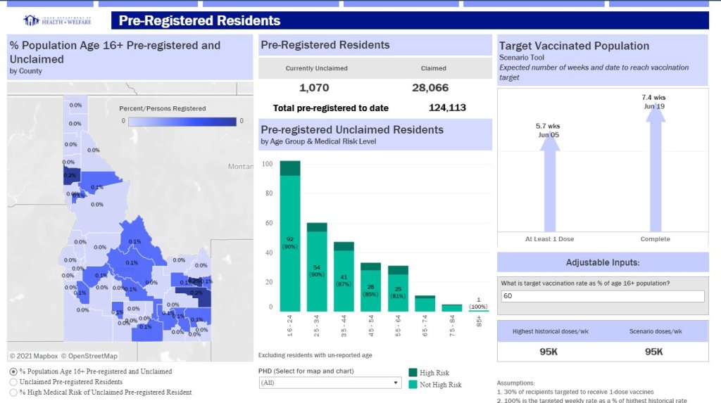
Idaho: Reports detailed data on state residents who have pre-registered for appointments. On the “Pre-registered residents” tab, you can see how many people have claimed their pre-registered appointments, as well as breakdowns of the pre-registered residents by county, age, and medical risk level.
Illinois: Reports both a count of unusable vaccine doses and information on vaccine breakthrough cases. The “unusable” vaccine doses count includes doses that have been discarded, dropped, or had some other issue in the storage and handling process. For vaccine breakthroughs, Illinois reports total patients hospitalized and died due to COVID-19 after vaccination.
New Hampshire: Reports counts of vaccine doses distributed and administered by individual vaccination sites, such as hospitals and public health networks. (New Hampshire includes vaccination data once a week in its COVID-19 news reports, usually on Thursdays. The state figures differ significantly from CDC-reported numbers, for as-yet-undetermined reasons.)