The Florida public health agency is stalling daily updates to its COVID-19 dashboard, cases, and vaccine reports. Instead, the department will post weekly reports on Fridays, the Miami Herald reports.
The new reports will only include Florida residents, discounting any non-residents who become infected in the state. Florida is also no longer publishing reports on COVID-19 in schools, long-term care facilities, and prisons. Instead, the weekly reports will include more vaccination data.
When asked about the reason for this change, the Miami Herald reports, the health department cited high vaccination numbers for Florida residents and a low test positivity rate. But that doesn’t mean the pandemic is over—especially for the state’s minority residents, who have been vaccinated at a lower rate than white Floridians.
I will be watching with trepidation to see if any other states follow Florida’s lead in the coming weeks.
COVID-19 Vaccine Incentives: So many companies are now offering rewards to inspire vaccinations in their customers and employees, it might be hard to keep track. Luckily, the federal government is keeping track for you; this page on Vaccines.gov provides a comprehensive list. (I am particularly excited about the United Airlines “Your Shot to Fly” Sweepstakes.) (H/T Chelsea Cirruzzo.)
Health Equity Data (from the CDC): The CDC has reorganized its COVID Data Tracker to include a new dashboard section specifically focused on health equity. The section includes demographic trends for cases, deaths, and vaccinations, with breakdowns for race and ethnicity, urban/rural status, disabilities, incarcerated people, and more.
Community health center vaccinations (from KFF): A new brief from the Kaiser Family Foundation demonstrates the value of community health centers in vaccinating vulnerable populations. From January through May, people of color made up nearly two-thirds of those receiving their first doses at these centers, KFF reports.
Dr. Fauci’s emails: This week, the federal government put out one of its most vital information releases of the pandemic thus far: a trove of Dr. Anthony Fauci’s emails. The emails, requested by journalists at BuzzFeed and the Washington Post via public records requests, cover hundreds of messages sent to or from the esteemed infectious disease expert in the early months of the pandemic. BuzzFeed has published about 3,200 emails in raw, unfiltered form, and you can read recaps of the emails at both BuzzFeed and WaPo.
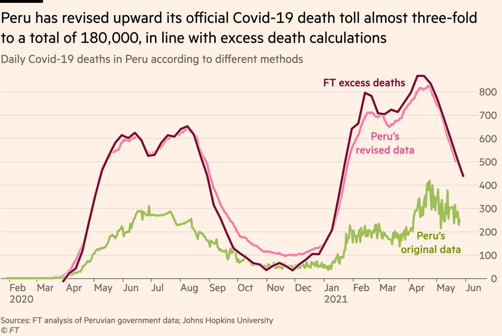
Peru’s revision led the country’s official death count to match its estimated excess deaths. Source: Financial Times..
Excess deaths are those deaths that occur above a region’s past baseline. Data scientists calculate the metric by determining the average deaths for a country or region over a period of several years—then comparing this past average to the deaths that occured in the current year.
The deaths occurring in the current year above that past average are the excess deaths. In New York City during the spring 2020 surge, for example, about four times more people were dying each week compared to the same time period in previous years.
During the pandemic, excess deaths have become a useful way for scientists to estimate the true toll of COVID-19. Especially during the earlier months of 2020, limited access to testing meant that many people who became infected with the coronavirus were not able to get the positive test required for their illness (or death) to actually be counted as a case. (In the U.S., this recording gap is currently causing issues for families who lost loved ones to COVID-19 early in the pandemic and are now seeking federal aid.)
Plus, the pandemic caused hospital systems to shut down and inspired widespread hesitancy for anyone seeking medical care for a non-COVID reason. The death of someone who had a heart attack and couldn’t get a hospital bed because of COVID-19, for example, is not a COVID-19 death but was undoubtedly caused by the pandemic.
Excess deaths, as a metric, allow researchers to see how the pandemic has impacted a country or region—above the official COVID-19 death counts. And a recent audit from Peru provides new evidence for this metric’s value.
The country essentially audited its COVID-19 deaths data to address undercounting. Government officials checked thousands of death certificates from 2020, and added any COVID-related deaths to past totals—which previously only included those Peruvians who had positive PCR tests.
After the audit was complete, Peru’s COVID-19 death toll rose by almost three times—to 180,000 deaths. The country now has the highest official death rate in the world: one in every 177 people.
When plotted over time, Peru’s revised death data match closely with its excess deaths, as calculated by the Financial Times data team. This audit—and its match with excess deaths—shows that excess deaths do, in fact, show the true toll of COVID-19 in a country.
It’s also notable as the first time a country has done such an audit on a wide scale. Some states (such as Washington) have added COVID-19 deaths to their official counts periodically, as they process death certificate backlogs, but none have done anything on Peru’s level.
Future death certificate audits and excess death analyses may help us understand the true toll COVID-19 has taken on the U.S. and the world.
B.1.1.7. B.1.351. P1. B.1.671.2. It’s exhausting trying to keep up with emerging SARS-CoV-2 variants with names as inscrutable as these.
But thankfully, we finally have a straightforward naming system: on May 31, the WHO announced a system using letters of the Greek alphabet. B.1.1.7 (first identified in the U.K. is now Alpha, B.1.351 (first identified in South Africa) is now Beta, and so on. You can find the complete list (so far) here. While there are an innumerable amount of SARS-CoV-2 variants, so far the WHO naming system only applies to “variants of concern” and “variants of interest.”
While there have been non-place-related names for these variants for a while, colloquially they have been called things like “the U.K. variant” and “the South African variant” because most people won’t just toss “B.1.1.7” around in conversation. (I tried, and no one knew what I was talking about.) However, this is problematic for a few reasons. First, we don’t know for sure that B.1.1.7. originated in the United Kingdom — that’s just where they found it first. And for other countries, naming a coronavirus variant after them associates a dangerous stigma with that country (like how nicknaming the coronavirus “the China virus” earlier in the pandemic contributed to a rise in anti-Asian hate). According to WHO coronavirus lead Maria Van Kerkhove in an interview with STAT News, a country will be more likely to report a variant if the name of the variant will not be associated with the country name.
The WHO naming system is nice for now, but it’s not clear if it’ll catch on and become the norm or if it’ll just be yet another naming system in a crowded patchwork. It’s also unclear what will happen if we run out of Greek letters, but we certainly hope it doesn’t come to that. (Making this yet another reason to vaccinate the world.)
In the reader survey I sent out a few weeks ago, I asked, “What is one question you have about COVID-19 in the U.S. right now?” One reader responded with an inquiry into vaccine equity: “What will it look like when the U.S. is ‘open’ and vaccinated and many other parts of the world are not?”
That question feels especially relevant this week. On Thursday, the Biden administration made a big (and long-awaited) announcement: the federal government is sending 25 million vaccine doses from America’s stockpile to other countries. The administration has previously promised to send at least 80 million doses abroad by the end of June, but this week’s announcement included more details—such as countries that will receive these initial doses and other logistics.
Out of the 25 million, about 19 million doses are going to COVAX. COVAX, a global effort run by the World Health Organization and other international government bodies and philanthropic organizations, brings vaccines to low-income nations at no cost. The COVAX doses will go to India, other parts of Asia, Central and South America, and Africa, Bloomberg’s Josh Wingrove reports.
The remaining 6 million doses will be sent directly to countries, including Ukraine, Kosovo, Haiti, Georgia, Egypt, Jordan and Iraq. Some doses are going directly to India as well—while the worst of this nation’s surge may be over, it’s still facing high case counts, full hospitals, and a terrifying “black fungus” linked with the Delta variant (B.1.617).
At first glance, this might seem like a noble move on the Biden administration’s part. The U.S. is seeing low case numbers and widespread reopenings, so we can share some supplies to “help the pandemic around the globe,” as COVID-19 response coordinator Jeff Zients said at a briefing on Thursday.
But 25 million doses—or even the 80 million doses that the administration has promised by the end of this month—is a drop in the bucket compared to actual international needs. For example: COVAX needs 1.8 billiondoses to vaccinate about half the adult population in low-income countries. COVAX has specifically prioritized 92 low-income nations, representing a total population of 3.8 billion.
That 1.8 billion dose number is a highlight of a major report released last week by the Rockefeller Foundation, a global charitable foundation, discussing what it would take to vaccinate the world. I covered the report for Science News. According to this report, Gavi (the Vaccine Alliance), an international public-private body that runs COVAX, needs to raise $9.3 billion in order to pay for those 1.8 billion doses. Gavi has been working to raise this money from countries and independent donors at a global health summit this past week.
While $9.3 billion might seem like a massive price tag, the cost of failing to provide these vaccines would actually be far greater. The global economy may lose up to $9.2 trillion if richer nations fail to support equitable vaccine distribution, according to an estimate from the International Chamber of Commerce.
So far, the U.S. has administered about 300 million vaccine doses (as of yesterday), covering over half the total population. In a number of low-income countries, less than one percent of the population has received a dose. Tedros Adhanom Ghebreyesus, Director General of the WHO, said at a recent assembly that, if all doses administered globally had been sent out equitably, the doses would have covered “all health workers and older people.” Instead, high-income nations are largely protected while low-income nations are vulnerable to future surges and highly-transmissible variants.
Through this lens, the 25 million dose shipment announced this week is far from impressive. It’s a useful start, certainly, but it’s not going to end the pandemic anywhere. Even the 80 million doses promised by the end of June is a tiny number—about 4% of the doses COVAX is hoping to obtain. It’s also only 11% of the doses that vaccine makers have pledged to deliver to the U.S. by the end of July, according to Bloomberg.
That larger June shipment has also been held up because the Biden administration is planning to send AstraZeneca vaccines—which are under review from the FDA because they were produced at the Emergent factory that infamously wasted millions of Johnson & Johnson doses. The AstraZeneca vaccine is not authorized for use in the U.S., so of course it will make up the majority of the doses we send abroad this summer.
Speaking of unused doses: the Biden administration may also start sending unused doses from states to other countries, POLITICO reported this week. The administration wants to get thousands of Pfizer, Moderna, and J&J doses—on the verge of expiring—to countries that would actually use them. While this possible policy hasn’t yet been realized, it hammers home a clear message: the U.S. will donate “unwanted” vaccine doses only when we are absolutely certain that we don’t need them here.
Now, let’s return to our reader’s question. What happens when the U.S. is safely vaccinated, but other parts of the world aren’t?
From a health standpoint, the U.S. will probably be okay. The vaccines are very effective, even against variants—likely protecting the country from another major surge. We will need careful surveillance to guard against future variants that may evolve beyond the vaccines (see: last week’s issue), and it’s possible that overly zealous reopening this summer will lead to outbreaks next fall and winter. But seniors and other vulnerable people would be more protected than they have been in past surges, and booster shots (for the variants) will likely be on their way soon. In short, America’s wealth will protect us.
Around the world, however, outbreaks will continue. Every time a new person gets infected with the coronavirus, the virus has a new opportunity to mutate. And with every mutation, the virus learns to spread faster, to evade common treatments, even to evade vaccines. Thanks to globalization, as long as the virus is a threat anywhere, it continues to be a threat everywhere.
Plus, as low-income nations suffer from continued outbreaks, the global economy will continue to suffer. Out of that $9.2 trillion cost estimated by the International Chamber of Commerce, the majority will likely fall on wealthier nations (like the U.S.) that rely on other countries for products and labor.
“The pandemic itself has gone beyond a health crisis — it has now gone into an economic crisis,” Christy Feig, the Rockefeller Foundation’s director of communications and advocacy, told me when I spoke to her for Science News. “The only way to unchoke the economy is by getting the vaccines to as many countries as possible, so that we can stop the spread of the disease before more variants come.”
In the past week (May 29 through June 4), the U.S. reported about 100,000 new cases, according to the CDC. This amounts to:
An average of 14,000 new cases each day
31 total new cases for every 100,000 Americans
35% fewer new cases than last week (May 22-28)
Last week, America also saw:
18,000 new COVID-19 patients admitted to hospitals (5.5 for every 100,000 people)
2,300 new COVID-19 deaths (0.7 for every 100,000 people)
70% of new cases in the country now B.1.1.7-caused (as of May 8)
An average of 1 million vaccinations per day (per Bloomberg)
Cases continued to fall this week, with a seven-day average now under 20,000 new cases a day. This is basically the lowest number we’ve seen in the U.S. since spring 2020—though it’s important to note that the U.S. was doing minimal testing at that time, so the true case numbers in March 2020 were likely much higher than what was reported.
Also, last weekend’s holiday—like past holidays—likely resulted in fewer cases being reported early this week. Many testing sites and public health departments close for holidays, and it’s hard to imagine who might want to go get a nose swab on Memorial Day. Fewer than 10,000 new cases were reported last Monday and Tuesday, according to the CDC, followed by double that number each day for the rest of the week.
Despite such low overall case numbers, infection rates remain high for the unvaccinated. A recent Washington Post analysis adjusted COVID-19 infection rates by subtracting vaccinated residents from state populations. In Washington state, for example, the case rate among unvaccinated residents is “as high as it was in late January.”
Also, as policy researcher Julia Raifman pointed out on Twitter, fewer than half of the lowest income workers with kids are vaccinated—likely because of vaccine accessibility issues. Workers in this income bracket are also more likely to report that they had to miss work due to a COVID-19 infection, compared to higher-income Americans.
Nationwide, about half of the U.S. population has had at least one dose, including 63% of adults and 86% of seniors. The rate of vaccinations has slowed this past week (now only one million doses administered a day)—though this may in part be a holiday reporting lag as well. Biden’s administration continues throwing incentives at the problem in the hopes of meeting his July 4 goal.
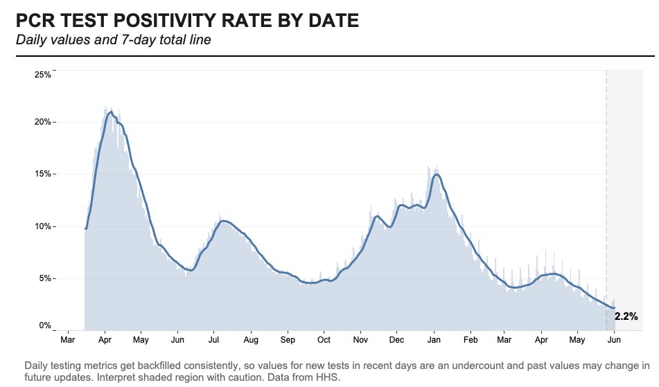
Testing numbers have also fallen in recent weeks, likely because vaccinated Americans have few reasons to need a test. Data watcher (and former COVID Tracking Project volunteer) Conor Kelly noted that we’re averaging under 1 million tests a day for the first time since fall 2020. At the same time, though, the national positivity rate for PCR tests is lower than ever—it hit 2.2% on June 1.
Despite the drop in tests, the positive rate is at an all-time low, reaching a 7-day total of 2.2% through 6/1 according to HHS data
Things are looking pretty good here in the U.S., though some experts say a summer or fall surge could still be possible if we relax restrictions too much. Other countries without vaccine access are not nearly so lucky.
I am not usually a dog person, but I have to make an exception for Babydog. Her owner, West Virginia Governor Jim Justice, has made her the mascot of his state’s vaccine lottery.
“If you won’t do it for your family, you have to get vaccinated for Babydog,” he said at a press conference. “She wants you vaccinated so badly.”
If I weren’t already vaccinated, I would do it for Babydog. Just look at that face!
Cases and deaths among healthcare workers: A new addition to the CDC COVID Data Tracker this week: a tab reporting cases and deaths in doctors, nurses, and other healthcare personnel. The CDC is reporting both totals and new cases/deaths by week, though the data here likely represent only a fraction of the true counts of healthcare workers infected during the pandemic. Notably, the total death toll is only about 1,600—less than half of the healthcare worker deaths reported by The Guardian and KHN’s “Lost on the Frontline” project.
Health Equity Tracker: When the COVID Tracking Project (including the COVID Racial Data Tracker) ceased data collection in March, it became much more difficult to compare COVID-19 case counts by race and ethnicity across states. A new project from the Morehouse School of Medicine fills that gap—and does much more. The Tracker incorporates data from the CDC, the Census, and other sources to provide comprehensive information on which communities have been hardest hit by the COVID-19 pandemic. Read more about it in this STAT article.
Coronavirus variant lineages: I came across this source a few days ago while researching variant lineages, prompted by a question on Twitter. Phylogenetic Assignment of Named Global Outbreak Lineages (or PANGO Lineages, for short) is a software tool developed by a lab in the U.K. that allows users to submit and analyze coronavirus sequences. The specific page I’ve linked here provides a comprehensive, searchable list of all the coronavirus variants that scientists have identified. Very useful if you need to search up an older or less-well-known variant.
Unemployment Insurance Data Explorer: This tool from progressive think tank The Century Foundation allows users to explore, visualize, and download data on unemployment insurance distributed during the pandemic. The tool includes data broken out by state and goes back in time to 1971—valuable for historical analysis.
Earlier this week, New York City mayor Bill de Blasio made a big announcement: all the city’s schoolchildren are going back to the classroom this fall. There will no longer be a remote option.
NYC was one of the first big cities to open with a hybrid model last fall, but it came with challenges—ranging from teachers protesting unsafe conditions, to in-person students doing “Zoom school” in the library, to closures dictated by confusing test positivity rates. The city’s choice to eliminate a remote option indicates a commitment to simple, unified policies for all students and teachers. It also suggests that many other districts may follow NYC’s lead—as the New York Times reported, a few districts already have.
Vaccine options for children ages 12 and older (now Pfizer, soon Moderna) make in-person education a safe bet for a lot of families. But younger students will likely have to wait much longer for their shots. As a result, regular testing will continue to be a key safety strategy, aided by American Rescue Plan funding dedicated specifically to school surveillance programs. Beyond identifying COVID-19 cases before they turn into outbreaks, testing can help parents and teachers feel safer about reopening plans.
But, as we have covered extensively here at the COVID-19 Data Dispatch, school testing data are incredibly hard to come by. New York continues to be the only state that reports any data on COVID-19 tests conducted in schools, and some states fail to even report COVID-19 school case counts.
Since Biden took office, more schools have returned to hybrid and in-person classes, but it remains unclear what percentage of school districts across the country are regularly screening students and teachers for Covid-19. An Education Department spokesperson said the department is “not tracking that level of detail.” A Centers for Disease Control and Prevention spokesperson said that “most states have offered or implemented testing programs in schools during the 2020-2021 school year,” adding that a survey conducted by the publication EdWeek in February found that just 16 percent of school district leaders said they were testing students.
Education and health groups — including the Association of State and Territorial Health Officials, the Rockefeller Foundation and American Federation of Teachers — also said they do not have comprehensive nationwide data on how many districts have testing programs in place.
This continued lack of data makes it difficult to evaluate how well school testing programs actually work. A lot of schools may be flying blind going into the fall 2021 semester, or they may choose not to set up regular testing at all.
I plan to do more reporting on this topic over the summer, including detailed investigations of individual school districts. If you have any burning questions, send them my way (betsy@coviddatadispatch.com).
On November 18, New York City mayor Bill de Blasio announced that the city’s schools would close until further notice. The NYC schools discrepancy is indicative of an American education system that is still not collecting adequate data on how COVID-19 is impacting classrooms—much less using these data in a consistent manner.
Good news for kids hoping for jabs in arms (which used to sound like an oxymoron before this spring): Moderna has announced promising results for its trial in adolescent-aged children. In around 4,000 adolescents, the vaccine proved to be 94.1% effective in preventing disease. No cases in the vaccinated group were found two weeks after the second shot, while 4 cases were found in the unvaccinated control group.
On Tuesday, May 25, Moderna showed in a clinical trial that its mRNA vaccine is safe and effective in people ages 12 to 17. The company will apply for FDA emergency use authorization in June. This follows the semi-recent authorization of the Pfizer-Biontech vaccine for the same age group, which happened at the end of March.
While children tend to have less severe complications from COVID-19 on the whole, serious illness is still quite possible. And even though rates across the country are falling due to more widespread vaccination, it’s still important that kids get vaccinated as herd immunity is not quite in our grasp yet.
The availability of another vaccine may help more people in this age group get protected; however, the rest of the world has nowhere near the access to vaccines that U.S. citizens over age 12 do right now. In April, health policy experts estimated that the United States might have an excess of up to 300,000 extra vaccines.
That being said, adolescents should still get vaccinated if it is available to them. This problem isn’t the fault of citizens wanting to get protection; it’s about the failures of governments and systems to provide vaccine equity.
Following the end of the federal public health emergency in May, the CDC has lost its authority to collect vaccination data from all state and local health agencies that keep immunization records. As a result, the CDC is no longer providing comprehensive vaccination numbers on its COVID-19 dashboards. But we still have some information about this year’s vaccination campaign, thanks to continued CDC efforts as well as reporting by other health agencies and research organizations.
This week, the FDA authorized Novavax’s updated COVID-19 vaccine. Here’s why some people are excited to get Novavax’s vaccine this fall, as opposed to Pfizer’s or Moderna’s.
Last week, I asked you, COVID-19 Data Dispatch readers, to send me your stories of challenges you experienced when trying to get this fall’s COVID-19 vaccines. I received 35 responses from readers across the country, demonstrating issues with insurance coverage, pharmacy logistics, and more.