If you went to check Biobot’s COVID-19 wastewater dashboard this week, you may have noticed that the company hasn’t updated its data since September 14.
Biobot’s website doesn’t provide an explanation for the lack of updates, but you can find one on another source: the wastewater data page run by the Massachusetts Water Resources Authority (MWRA), covering the greater Boston area. As Biobot was founded in Boston (by scientists at the Massachusetts Institute of Technology), the city is one of Biobot’s longest-running COVID-19 sampling sites.
As of September 25, a note on the MWRA page reads: “Biobot will be closing their lab next week for a company retreat. We don’t expect any data updates between 9/18/2022 and 9/25/2022. They expect to catch up to the normal posting schedule by 9/27/2022.”
It seems logical to assume this lab closure also applies to the company’s national dashboard.
Now, to be clear, I have nothing against Biobot for taking a company retreat; anyone working in public health deserves a break sometimes, and I hope the retreat is productive for the company’s staff. But when a private company represents the best source for a crucial pandemic-tracking metric—as Biobot is able to provide unified, national and regional estimates better than the CDC can—even a week-long break can be a problem for people who rely on these data.
Ideally, there should be enough public health funding going around that everyone working in wastewater surveillance can take all the breaks they need without disrupting data systems. This is just a small example of a much bigger issue.
COVID-19 is still a public health emergency. At the moment, this is true according to both the general definition of this term and official declarations by the federal government. But the latter could change in the coming months, likely leading to more fragmentation in U.S. COVID-19 data.
A reader recently asked me about the federal government’s ability to compile and report COVID-19 data, using our new anonymous Google form. They asked: “Will the CDC at some point stop reporting COVID data even though it may still be circulating, or is it a required, reportable disease?”
It’s difficult to predict what the CDC will do, as we’ve seen in the agency’s many twists and turns throughout the pandemic. That said, my best guess here is that the CDC will always provide COVID-19 data in some form; but the agency could be severely limited in data collection and reporting based on the disease’s federal status.
The CDC’s authority
One crucial thing to understand here is that the CDC does not actually have much power over state and local public health departments. It can issue guidance, request data, distribute funding, and so forth, but it isn’t able to require data collection in many circumstances.
Outside of a public health emergency, CDC has no authority to require states to share data. And even in an emergency, for example, if you look on the COVID Data Tracker, there are systems that have half the states or some of the states. That’s because those were the ones that were willing to share. And that is a very big handicap of doing good modeling and good tracking… Everything you’re trying to measure, for any decision, is better if you measure it in all the states.
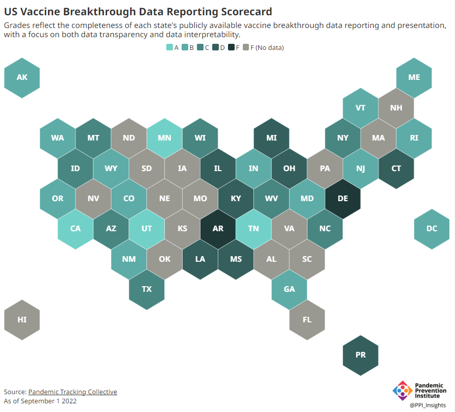
Consider breakthrough cases as one example. According to the Pandemic Prevention Institute’s scorecard for breakthrough data reporting, about half of U.S. states have D or F grades, meaning that they are reporting zero or very limited data on post-vaccination COVID-19 cases. The number of states with failing grades has increased in recent months, as states reduce their COVID-19 data resources. As a result, federal agencies have an incomplete picture of vaccine effectiveness.
Wastewater data is another example. While the CDC is able to compile data from all state and local public health departments with their own wastewater surveillance systems—and can pay Biobot to expand the surveillance network—the agency has no ability to actually require states to track COVID-19 through sewage. This lack of authority contributes to the CDC’s wastewater map still showing many empty spaces in states like Alabama and North Dakota.
During the COVID-19 pandemic, the federal emergency was specifically used to require data collection from state health departments and individual hospitals, POLITICO reported in May. According to POLITICO, the required data includes sources that have become key to our country’s ability to track the pandemic, such as:
PCR test results from state and local health departments;
Hospital capacity information from individual healthcare facilities;
COVID-19 patients admitted to hospitals;
COVID-19 cases, deaths, and vaccination status in nursing homes.
The federal COVID-19 public health emergency is formally controlled by HHS Secretary Xavier Becerra. Becerra most recently renewed the emergency in July, with an expiration date in October. Health experts anticipate that it will be renewed again in October, because HHS has promised to give states a 60-day warning before the emergency expires and there’s been no warning for this fall. That leaves us with a new potential expiration date in January 2023.
CDC officials are seeking to permanently expand the agency’s authority to include this data collection—with a particular priority on hospitalization data. But that hasn’t happened yet, to the best of my knowledge. So, what might happen to our data when the federal emergency ends?
Most likely, metrics that the CDC currently requires from states will become voluntary. As we see right now with breakthrough cases and wastewater data, some states will probably continue reporting while others will not. Our federal data will become much more piecemeal, a patchwork of reporting for important sources such as hospitalizations and lab test results.
It’s important to note here that many states have already ended their own public health emergencies, following a trend that I covered back in February. Many of these states are now devoting fewer resources to free tests, contact tracing, case investigations, public data dashboards, and other data-related efforts than they were in prior phases of the pandemic. New York was the latest state to make such a declaration, with Governor Kathy Hochul letting her emergency powers expire last week.
How the flu gets tracked
COVID-minimizing officials and pundits love to compare “endemic” COVID-19 to the flu. This isn’t a great comparison for many reasons, but I do think it’s helpful to look at how flu is currently tracked in the U.S. in order to get a sense of how COVID-19 may be tracked in the future.
The U.S. does not count every flu case; that kind of precise tracking on a large scale was actually a new innovation for COVID-19. Instead, the CDC relies on surveillance networks that estimate national flu cases based on targeted tracking.
There are about 400 labs nationwide (including public health labs in all 50 states) participating in flu surveillance via the World Health Organization’s global program, processing flu tests and sequencing cases to track viral variants. Meanwhile, about 3,000 outpatient healthcare providers in the U.S. Outpatient Influenza-like Illness Surveillance Network provide the CDC with flu-related electronic health records. You can read more about both surveillance programs here.
The CDC reports data from these surveillance programs on a dashboard called FluView. As you can see, the CDC provides estimates about flu activity by state and by different demographic groups, but the data may not be very granular (eg. no estimates by county or metro area) and are provided with significant time delays.
Other diseases are tracked similarly. For example, the CDC will track new outbreaks of foodborne illnesses like E. coli when they arise but does not attempt to log every infection. When researchers seek to understand the burden of different diseases, they often use hospital or insurance records rather than government data.
One metric that I’d expect to remain unchanged when the COVID-19 emergency ends is deaths: the CDC’s National Center for Health Statistics (NCHS) comprehensively tracks all deaths through its death certificate system. But even provisional data from NCHS are reported with a delay of several weeks, with complete data unavailable for at least a year.
Epidemiologists I’ve interviewed say that we should be inspired by COVID-19 to improve surveillance for other diseases, rather than allowing COVID-19 to fall into the flu model. Wastewater data could help with this; a lot of wastewater researchers (including those at Biobot) are already working on tracking flu and other diseases. But to truly improve surveillance, we need more sustained investment in public health at all levels—and more data collection authority for the CDC and HHS.
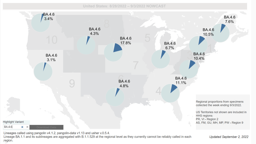
Omicron BA.4.6, a newer version of BA.4, is currently more prevalent in the Midwest than other regions of the country. Chart via the CDC, retrieved September 4.
Slow rise of BA.4.6 is worth watching: As I mentioned in today’s National Numbers post, a newer subvariant labeled BA.4.6 is gaining ground over other versions of Omicron in the U.S. BA.4.6 evolved from BA.4, and has an additional mutation in the virus’ spike protein that enables it to bypass protection from prior infections. It’s unclear whether BA.4.6 will be able to fully outcompete BA.5, which is currently causing the vast majority of U.S. COVID-19 cases—these two strains are similar enough that the competition may go slowly. So far, the subvariant has been more prevalent in the Midwest than other regions of the country, according to CDC data. Also worth watching: BA.2.75, a subvariant that is dominating some European countries but hasn’t shown up significantly in the U.S. yet.
Up to 4 million people may be out of work due to Long COVID: Last week, policy research organization the Brookings Institute published a new report discussing the massive impacts Long COVID is having on America’s labor force. The report utilizes recent data from the Household Pulse Survey (released in June) estimating Long COVID prevalence, in conjunction with research on how many long-haulers might be out of work due to their condition. The results: between two and four million Americans potentially lost their jobs (or are working significantly less) due to Long COVID, costing at least $170 billion a year in lost wages. Even the low ends of these estimates are staggering.
U.S. life expectancy declined again in 2021: Americans born in 2021 may expect to live for 76 years on average, according to the CDC’s National Vital Statistics System. This is the lowest life expectancy has been since 1996. CDC researchers attribute the sharp decline in the last two years to the pandemic and drug overdose deaths. Disparities in life expectancy have also increased: Native Americans born in 2021 may expect to live only 65 years on average and Black Americans may expect to live 71 years, compared to 76 years for white Americans.
Biobot expands wastewater surveillance for opioid tracking: In the last couple of months, we’ve seen wastewater used to track monkeypox and polio, in addition to COVID-19—suggesting the technology’s capacity for broader public health surveillance. This week, leading wastewater company Biobot announced a new initiative to track opioid use and other high-risk substance use through a similar platform to its current COVID-19 efforts. Tracking the opioid crisis was actually the original focus for Biobot’s founders pre-pandemic, so it’s notable to see the company expanding in this direction now.
As official COVID-19 case data become less and less reliable, wastewater surveillance can help provide a picture of where and how much the virus is spreading. This week, I put together a new COVID-19 Data Dispatch resource page that outlines major national, state, and local wastewater dashboards across the U.S.
Of course, wastewater surveillance is not capable of completely replacing clinical data. Wastewater testing is still pretty spotty across the country (though almost all states are now represented on the CDC’s dashboard), while scientists and public health officials are still working to determine how best to interpret and use these data; see my April FiveThirtyEight article for more on these challenges. There are also equity concerns around which communities have access to wastewater surveillance, as discussed in this recent paper from Colleen Naughton et al.
Still, if you live in a place where wastewater data are publicly available, I highly recommend keeping an eye on these numbers. Trends in wastewater data tend to closely match—or preempt—trends in case data, and wastewater testing includes everyone in a sewershed regardless of their access to (or interest in) getting a PCR test. This is one of the best COVID-19 indicators we have right now.
In the U.S., there are currently two main national wastewater dashboards:
CDC’s National Wastewater Surveillance System (NWSS) dashboard: This dashboard presents data from about 800 sewershed sites across the country, including both those managed by state and local health departments and those tested through the CDC’s contract with Biobot. Different data providers have different testing and analysis methods, which can make it difficult to interpret the information here on a national scale. But, if your state or county is represented on the dashboard, you can click into an individual site to see coronavirus trends. Historical data are available for download here.
Biobot Network dashboard: In addition to the company’s contract with the CDC, Biobot also tests wastewater at hundreds of sites across the country though its free Biobot Network, as well as through paid contracts with individual health departments and wastewater treatment plants. Biobot presents data from these non-CDC sites on its dashboard, updated weekly. One advantage of the Biobot dashboard over the CDC’s is that all Biobot sites are tested and analyzed with a uniform methodology, making the data easier to interpret. Data are available for download here.
My resource page also links out to COVIDPoops19, a dashboard summarizing wastewater monitoring efforts around the world. Run by researchers at the University of California Merced, this project links out to almost 150 public and academic wastewater sites. If you’re looking for wastewater surveillance in your area, this dashboard may be a good place to check.
At the smaller level, my page includes 17 statewide wastewater dashboards, seven at the local level (dedicated to a specific city or metropolitan area), and four at the regional level (representing multiple counties in a state).
While many more states are doing wastewater surveillance, the majority of state health departments have not yet developed their own dashboards—redirecting residents to the CDC NWSS site. Personally, I think some state-specific dashboards are much easier to navigate and interpret than the CDC’s, and would like to see more states produce their own. But I understand the resource limitations here.
Here are a few state and local dashboards I’d like to highlight:
Boston, Massachusetts: The Massachusetts Water Resources Authority’s dashboard is one of the oldest in the U.S., launched in spring 2020 through a partnership with Biobot. It’s fairly simple (presenting static images, not interactive dashboards), and easy to interpret, with charts showing long-term and short-term trends.
Colorado: Colorado’s dashboard follows a common format for presenting wastewater surveillance data: users are presented with a map of wastewater service areas, and can click into a specific area to see coronavirus trends for that sewershed. This state is also planning to expand wastewater testing to schools and other specific buildings, according to local reporting.
Maine: Maine’s wastewater “dashboard” is really a collection of PDF reports, posted for individual counties at regular intervals. The PDFs come directly from Biobot, which is running the state’s surveillance through a contract with the Maine CDC; I find it interesting to see the report format Biobot is using for its clients.
New York State: Researchers at Syracuse University, the State University of New York (SUNY), state departments of health and environmental conservation, and others collaborate on this wastewater surveillance project, which includes 54 counties and 90 treatment plants. Notably, the project does not include the five boroughs of New York City; the city has its own wastewater surveillance effort, but does not have its own dashboard. (NYC sites haven’t been updated on the CDC dashboard since April.)
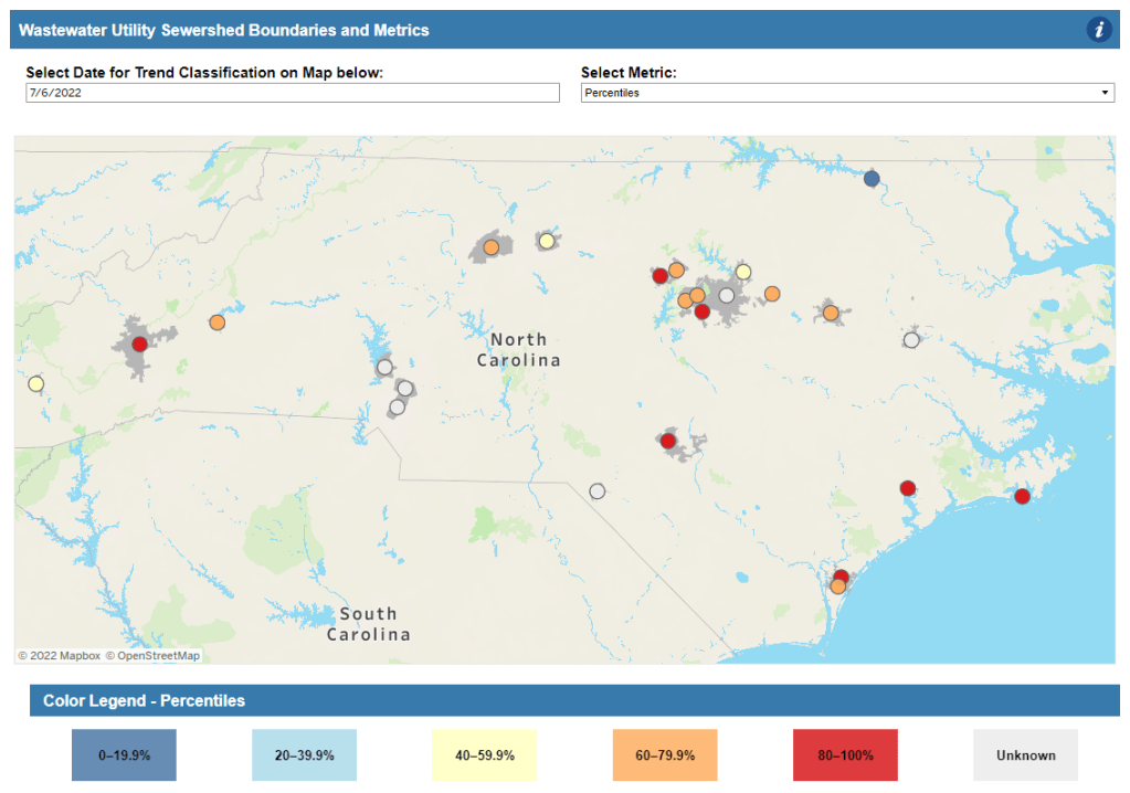
North Carolina: Similarly to Colorado’s, North Carolina’s wastewater dashboard allows users to click into specific sites for coronavirus trends. This dashboard also provides reported case trends for comparison and information about concentration percentiles, similar to the metrics used by the CDC. It also gives users a lot of information about where the data come from—good for transparency!
Twin Cities, Minnesota: The Metropolitan Council, a local agency in the Twin Cities, Minnesota metro area, has monitored COVID-19 in wastewater since early in the pandemic; I shared an interview with a lead scientist there in April. Recently, the Met Council added variant information to its dashboard, showing which versions of the virus are currently driving spread (BA.5 is taking the lead right now).
I know (from looking at the COVIDPoops19 dashboard) that my new resource page includes a small sample of academic and local wastewater sites; I chose to focus on those at the state level and for larger metro areas due to my own capacity. But if there’s another dashboard that you’d like to see added to the page, please reach out and let me know! I’ll try to keep it updated on a monthly cadence.
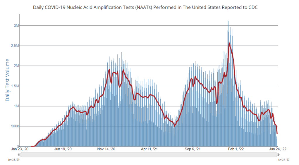
PCR testing has greatly declined in recent months; we need new data sources to help replace the information we got from it. Chart via the CDC.
Last week, I received a question from my grandmother. She had just read my TIME story about BA.4 and BA.5, and was feeling pessimistic about the future. “Do you think we’ll ever get control of this pandemic?” she asked.
This is a complicated question. And it’s one that I’ve been reflecting on as well, as I approach the two-year anniversary of the COVID-19 Data Dispatch and consider how this publication might shift to meet the current phase of the pandemic. I am not an infectious disease or public health expert, but I wanted to share a few thoughts on this; to stay in my data lane, I’m focusing on data that could help the U.S. better manage COVID-19.
The coronavirus is going to continue mutating, evolving past immune system defenses built by prior infection and vaccination. Scientists will need to continue updating vaccines and treatments to match the virus, or we’ll need a next-generation vaccine that can protect against all coronavirus variants.
Candidates for such a vaccine, called a “pan-coronavirus vaccine,” are under development by the U.S. Army and at several other academic labs and pharmaceutical companies. But until a pan-coronavirus vaccine becomes available, we’ll need to continue tracking new variants and the surges they produce. We also need to better track Long COVID, a condition that our current vaccines do not protect well against.
Eventually, COVID-19 will likely be just another respiratory virus that we watch out for during colder months and large indoor gatherings, broadly considered “endemic” by scientists. But it’s important to note—as Dr. Ellie Murray did in her excellent Twitter thread about how pandemics end—that endemicity does not mean we stop tracking COVID-19. In fact, thousands of people work to monitor and respond to another endemic virus, the flu.
Every time I tweet about this I get people in mentions saying “but we don’t take precautions for the flu!”
Those people are 100% WRONG!
Thousands of people work daily to monitor, prepare for, & respond to fluctuations in flu number and in the flu virus itself! It’s a HUGE task!
With that in mind, here are nine categories of data that could help manage the pandemic:
More comprehensive wastewater surveillance: As I’ve written here and at FiveThirtyEight, sewers can offer a lot of COVID-19 information through a pipeline that’s unbiased and does not depend on testing access. But wastewater monitoring continues to be spotty across the country, as the surveillance can be challenging to set up—and more challenging for public health officials to act on. Also, current monitoring methods exclude those 21 million households that are not connected to public sewers. As wastewater surveillance expands, we will better be able to pinpoint new surges right as they’re starting.
Variant surveillance from wastewater: Most of the U.S.’s data on circulating variants currently comes from a selection of PCR test samples that are run through genomic sequencing tests. But this process is expensive, and the pool of samples is dwindling as more people use at-home rapid tests rather than PCR. It could be cheaper and more comprehensive to sequence samples from wastewater instead, Marc Johnson explained to me recently. This is another important aspect of expanding our wastewater monitoring.
Testing random samples: Another way to make up for the data lost by less popular PCR testing is conducting surveillance tests on random samples of people, either in the U.S. overall or in specific cities and states. This type of testing would provide us with more information on who is getting sick, allowing public health departments to respond accordingly. The U.K.’s Office for National Statistics conducts regular surveys like this, which could serve as a model for the U.S.
More demographic data: Related to random sample testing: the U.S. COVID-19 response still needs more information on who is most impacted by the pandemic, as well as who needs better access to vaccines and treatments. Random sampling and surveys, as well as demographic data connected to distributions of treatments like Paxlovid, could help address this need.
Vaccine effectiveness data: I have written a lot about how the U.S. does not have good data on how well our COVID-19 vaccines work, thanks to our fractured public health system. This lack of data makes it difficult for us to identify when vaccines need to be updated, or who needs another round of booster shots. Connecting more vaccination databases to data recording cases, hospitalizations, and Long COVID would better inform decision-making about boosters.
Air quality monitoring: Another type of data collection to better inform decision-making is tracking carbon dioxide and other pollutants in the air. These metrics can show how well-ventilated (or poorly-ventilated) a space is, providing information about whether further upgrades or layers of safety measures are needed. For example, I’ve seen experts bring air monitors on planes, citing poor-quality air as a reason to continue wearing a mask. Similarly, the Boston public school district has installed air monitors throughout its buildings and publishes the data on a public dashboard.
Tracking animal reservoirs: One potential source for new coronavirus variants is that the virus can jump from humans into animals, mutate in an animal population, and then jump back into humans. This has happened in the U.S. at least once: a strain from minks infected people in Michigan last year. But the U.S. is not requiring testing or any mandatory tracking of COVID-19 cases in animals that we know are susceptible to COVID-19. Better surveillance in this area could help us catch variants.
Better Long COVID surveillance: For me personally, knowledge of Long COVID is a big reason why I remain as cautious about COVID-19 as I am. Long COVID patients and advocates often say that if more people understood the ramifications of this long-term condition, they might be more motivated to take precautions; I think better prevalence data would help a lot with this. (The Census and CDC just made great strides in this area; more on that later in the issue.) Similarly, better data on how the condition impacts people would help in developing treatments—which will be crucial for getting the pandemic under control.
More accurate death certificates: The true toll of the pandemic goes beyond official COVID-19 deaths, as the Documenting COVID-19 project has discussed at length in our Uncounted investigation. If we had a better accounting of everyone whose deaths were tied to COVID-19, directly or indirectly, that could be another motivator for people to continue taking safety precautions and protecting their communities.
If you are working to improve data collection in any of these areas—or if you know a project that is—please reach out! These are all topics that I would love to report on further in the coming months.
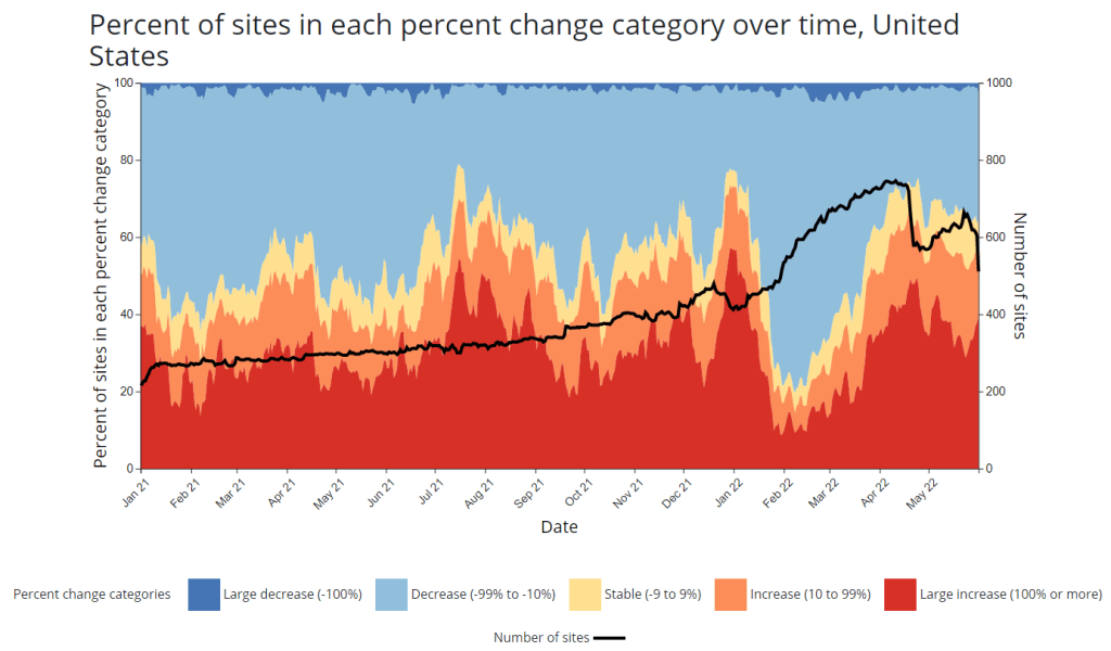
CDC adds new chart to wastewater dashboard: This week, the CDC updated its National Wastewater Surveillance System (NWSS) dashboard with a new chart that aims to summarize the overall picture of coronavirus trends in the country’s sewers. The chart shows the percentage of NWSS sites that have reported their coronavirus concentrations decreasing, staying stable, and increasing over two-week periods; it also shows the overall number of sites with recent data. (This number dropped when NWSS switched contractors, though it has ticked back up in recent weeks as Biobot onboards sites.) Of course, the sites included in NWSS represent a small fraction of the U.S. population, and different locations are using different analysis methods which may be difficult to summarize. But the new chart is still a helpful way to see national trends from the surveillance network.
Preprint suggests 30x scale of case underreporting: Last week, researchers from the City University of New York (CUNY) shared striking results from a study in which they’d surveyed about 1,000 New York City residents about their COVID-19 status during two weeks of the BA.2/BA.2.12.1 surge. The sample was designed to represent the broader city population, and residents could self-report positive test results on both PCR and at-home rapid tests as well as possible symptoms and contact with infected people. About 22% of the survey respondents had a coronavirus infection during the study period (April 23 to May 8), the researchers found. The study hasn’t been peer-reviewed and should be interpreted with caution, but still: it could indicate that one in five New Yorkers got COVID-19 within two weeks. Official case counts were 30 times lower, the researchers found, reflecting massive underreporting; and NYC has more access to PCR testing than many other places.
1. In our new (not yet peer reviewed) pre-print on NYC's BA.2/BA.2.12.1 surge, in a population-representative sample, we estimated SARS-CoV-2 prevalence to be 22.1% during April 23-May 8 (about 1.8M adults). About 31 times the official case count. https://t.co/Vr7PUWsWd7
CDC study demonstrates disproportionate COVID-19 impact on Native Americans: One study from the CDC’s Morbidity and Mortality Weekly Report (MMWR) that caught my attention this week: researchers in Alaska (at the state’s health agency and tribal health institutions) examined COVID-19 rates for the state’s indigenous population. They found that the age-adjusted COVID-19 case rate among Native Americans/Alaska Natives was about twice as high as the rate among white people living in Alaska, and the death rate was about three times higher. Many indigenous people in Alaska live in rural, remote areas, some inaccessible by car, which heightens the challenges of accessing healthcare.
Native American life expectancy fell during the pandemic: Another related preprint: researchers at Virginia Commonwealth University, the University of Colorado Boulder, and the Urban Institute have produced multiple studies examining how life expectancy changed during the pandemic. In general, COVID-19 led to massive decreases in life expectancy across the board; but the latest update from this group showed that Native Americans were particularly hard-hit. Native American life expectancy dropped by 4.7 years, compared to a 2.1 drop for the white American population. Steven Woolf, corresponding author, discussed the study in a Q&A with Virginia Commonwealth University. (H/t Andrew Stokes.)
Higher burden of COVID-19 in developing countries: And one more notable new study, published this week in BMJ Global Health: a group of researchers at institutions in the U.S., Australia, Brazil, and other countries conducted an in-depth review of global COVID-19 serology data to estimate the disease’s true infection and fatality rates across the world. The researchers found that infection fatality rates (i.e. the share of infected people who die of COVID-19) were much higher in developing/low-income countries than in developed/high-income countries, in some cases up to three times higher. “The results are, in a word, depressing,” lead author Gideon Meyerowitz-Katz wrote in a Twitter thread discussing the study.
New job posting at CDC forecasting center: The CDC’s new Center for Forecasting and Outbreak Analytics, formally launched in April, has posted a job opening for (at least one?) data scientist. Considering that the center plans to hire 100 scientists and science communicators, this singular posting is likely just one of many more opportunities to come.
In this post, I hypothesized that the gap was likely a result of a shift for NWSS, as the CDC has switched from a contract with testing company LuminUltra to a contract with Biobot. In both cases, the outside company had been hired to conduct wastewater sampling and analysis for sites that don’t have capacity to do this themselves; as NWSS transitioned between testing providers, some sites were left without recent data.
This week, I’m excited to share an update on the situation, courtesy of Becca Malizia, Biobot’s science communication manager, who reached out after seeing last week’s post. Below, you’ll find more details on the recent data gaps and Biobot’s new relationship with the CDC.
Malizia confirmed that the transition between LuminUltra and Biobot has led to delays in wastewater data availability for some sites in the NWSS network. She pointed me to a footnote on the CDC dashboard, labeled “May 2022 Coverage Limitations”:
Beginning April 15, 2022, approximately 150 wastewater sites in 29 states began transitioning to a new wastewater testing provider. During this transition, these sites will not have recent data displayed and will be colored gray on the map. It will take several weeks for enough data to be collected to calculate the metrics displayed on this page. Results for these sites are expected to be available again between mid-May and June 2022.
Now, if the CDC was going for full transparency and ease of dashboard interpretation here, the agency should have placed this important note somewhere more obvious to the average user—not buried at the bottom of the page. But I’m glad to see this public information, including the estimate of when results for the transitioning sites will be available.
Biobot also acknowledged the data gap in a Tweet on May 19, explaining that the company has experienced issues in distributing testing kits to participating sites:
📣Some locations may be noticing data delays due to a severe distribution issue we're having w/ our kitting vendor. We're setting up an emergency in-house kitting operation to get kits shipped ASAP. For further questions (or interest in helping) please email us: support@biobot.io
— Biobot Analytics (@BiobotAnalytics) May 19, 2022
Further contributing to data delays, the sewershed sites for which Biobot is now in charge of sampling require a “minimum number of samples” before key metrics on the CDC NWSS dashboard can be calculated, Malizia said. The calculations for these metrics change from one lab to another, so Biobot needs to use data from its protocols rather than data from the prior LuminUltra contract.
“Sites in the process of switching over from the previous contract may have some lag until there is enough data to do the calculations for the CDC metrics,” Malizia wrote. She also pointed to several other reasons why a sewershed site might collect wastewater data, but not have its data appear on the CDC dashboard, such as: a sewershed serving under 3,000 people, a sewershed serving a specific institution (like a college campus), and a sewershed where local leaders have elected not to send data to the CDC.
Biobot has already onboarded more than 200 wastewater treatment plants, Malizia said; this includes sites that were previously included in the NWSS contract with LuminUltra, though a full list of those sites is not publicly available. By mid-July, Biobot aims to have 500 sites participating in its CDC program. The company works with state and local health departments to select wastewater sampling sites and coordinate with treatment plants.
Now, it’s important to note that, outside of its CDC NWSS contract, Biobot coordinates wastewater testing and analysis for hundreds of sewershed sites through a program called the Biobot Network. This program is a public service offering from Biobot: the company does testing and analysis at no cost to sewersheds. But Biobot also does not send individual, sewershed-level data back to the participants. “Rather, the data is aggregated at the county level on our public dashboard (biobot.io/data) for the benefit of policymakers and the general public,” Malizia explained.
(The free Biobot Network includes two sampling sites in Hillsborough, Florida which used to be paid Biobot customers in 2021, Malizia said, in comments responding to the Tampa Bay Times article I quoted last week. The final reports those sites received when they were paying customers were in August and October of last year. “Individual wastewater treatment plants can choose whether or not to share these reports with local government agencies,” Malizia said.)
Before it became a CDC contractor, Biobot was not able to submit wastewater data to the agency. Only state government agencies have access to the CDC NWSS platform used for data reporting, Malizia said; the CDC has made an exception for Biobot under the new contract. To me, this helps explain why there’s not a lot of overlap between Biobot Network sites and CDC NWSS sites, as well as why some other wastewater sampling (done by universities, research institutions, etc.) does not appear on the CDC dashboard.
But, now that Biobot is a CDC contractor, will the company provide Biobot Network data to the agency? I asked Malizia this question, to which she responded:
The Biobot Network will remain separate from the NWSS, however sites enrolled for the CDC NWSS Program will also be given the option to opt into the Biobot dashboard.
In summary: Biobot is working hard to restore data from sites already in the CDC NWSS network and expand that network to more sites that don’t have capacity for wastewater sampling on their own. However, thanks to a combination of CDC bureaucracy and complex public and private data systems, it seems unlikely that we will get a singular dashboard including all wastewater testing sites in the country anytime soon.
Also, Biobot’s current contract is only for nine months. Are we going to see another round of data gaps next winter, if the CDC decides to switch wastewater testing companies again?
Update, May 22, 2022: After this post was published, Becca Malizia, Biobot’s science communication manager, reached out to provide some clarification on the current state of wastewater data in the U.S., as well as on Biobot’s relationship with the CDC. See this follow-up post for more details.
As I mentioned last week: something strange is going on with the CDC’s National Wastewater Surveillance System (NWSS) data.
Hundreds of sites on the CDC NWSS dashboard have been labeled as showing “no recent data” for a couple of weeks. As a New Yorker, I pay special attention to the New York City sites; twelve sites in the city were actually removed from the dashboard, then re-added as “new sites,” even though researchers in the city have been testing wastewater for the coronavirus since 2020.
I have yet to do dedicated reporting on this topic, but I wanted to share a bit of information on why I think this is happening. (Please take this with a grain of salt!)
Last winter, as part of CDC NWSS’ efforts to enable more states and counties across the country to test their wastewater for the coronavirus, the agency contracted with LuminUltra, a biological testing company that has become one of the leading wastewater testers during the pandemic. LuminUltra, in conjunction with NWSS and the Water Environment Federation, was responsible for testing and analyzing wastewater for state and local health departments that wanted to set up this monitoring, but didn’t have internal capacity to do so themselves.
LuminUltra’s contract expired last month. In its place, CDC NWSS has set up a new contract with Biobot, another leading wastewater contractor, the company announced this week. Biobot will be responsible for collecting and analyzing wastewater data at 500 sites across the country; it’s unclear from the press release how many of these sites were also part of the old LuminUltra contract, but I’m guessing there’s a lot of overlap.
Here’s the problem, though: LuminUltra stopped testing wastewater at hundreds of NWSS sites last month, but Biobot hasn’t yet resumed testing, data analysis, reporting to the CDC, etc. at all of these locations. As a result, the CDC NWSS dashboard currently includes a number of sites labeled as “new” or “no recent data,” making it difficult to actually use this federal source for evaluating wastewater trends.
Considering that we’re facing a surge and U.S. case data are less reliable than ever, this is not exactly a great time to have a gap in our wastewater data! (Also, I think that something else may be going on with the New York City sites, but that’s a topic for another post.)
As I said above, I haven’t done much reporting on this myself yet, but I wanted to share a relevant section from a recent Tampa Bay Times investigation about wastewater surveillance in Florida:
One of the largest players in the private testing market is Biobot Analytics, an MIT start-up that wants to market the technology.
Last year the company raised $20 million. It already has contracts with more than 700 municipalities in all 50 states, according to the Boston Globe, including Hillsborough County. But Biobot does not report that data to the CDC. Instead the company shares the data on its website, using its methodology.
Biobot, which collects data from six Florida counties, said it’s up to local governments to share COVID-19 data with the CDC.
The company started collecting Hillsborough’s data in June 2021. A county spokesperson said they haven’t received any reports from Biobot.
The amount of coronavirus detected in Hillsborough’s wastewater has doubled in the past month, according to Biobot’s website. It’s an estimate based on the county’s Northwest Regional Water Reclamation Facility and the city of Tampa’s Howard F. Curren facility.
It’s unclear if Biobot’s data-sharing policy will affect the nation’s wastewater surveillance program. The company took over the federal program on April 15, when it was awarded a $10.2 million contract to oversee the next year of testing.
That contract covers 500 utility providers across the country, according to the CDC. But Biobot and the CDC say the company won’t share COVID-19 data from the 700 utilities not covered by the contract.
I’m elevating this because, first of all, everyone should read the Tampa Bay Times piece—it is excellent local reporting on this issue. And second of all: does this mean that, even as Biobot takes over sampling and analysis for sites in the CDC NWSS network, the Biobot and CDC data systems will not be fully integrated?
This seems like a major challenge for a data network that is already quite fragmented, and I would love to see more transparency from the CDC on the whole situation. If anyone else is reporting on this or has additional information, please reach out!
Anyone who’s pulled up the CDC’s National Wastewater Surveillance System (NWSS) dashboard in the last week or two has likely noticed this trend: hundreds of sewershed sites are currently marked as “no recent data.” I keep a particularly close eye on the sites in New York City, which have been reporting “no recent data” for at least two weeks.
According to the CDC, a site marked as “no recent data” has reported findings from fewer than two wastewater samples in the last 15 days. In practice, it could either indicate that a site actually isn’t sampling its wastewater frequently enough for the CDC’s standards, or it could indicate a lack of capacity to process those samples. Probably, both things are happening at a lot of these sites.
From corresponding with press officers at NWSS, I know that the team is working with state and local health agencies, as well as with individual sewershed sites, to ensure accurate data and standardize reporting. This is a massive task, considering that wastewater surveillance started as a grassroots effort in labs with many different sampling and analytical methods, and I appreciate the NWSS team’s efforts.
But I think they could increase transparency about the sites where recent data isn’t available—either on the dashboard itself or in other public communications. I shouldn’t have to hunt through Twitter replies to find the most basic info about wastewater data updates! Especially when this source is becoming increasingly important in the wake of less reliable case data.
Yes. @amylizk said they have been having some staffing issues. They are looking into it.
For my recent wastewater data story, I’ve been looking at a lot of wastewater surveillance dashboards from different health agencies and research groups.
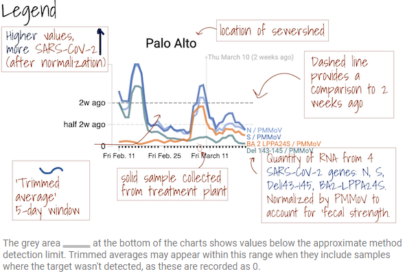
One of my favorites is from Sewer Coronavirus Alert Network (SCAN), a project based out of Stanford University. The project started with sewershed sites in California but is now expanding to other parts of the country, I learned from Marlene Wolfe, an environmental scientist at Emory University who works on the project (and whom I interviewed for the story).
The SCAN dashboard includes a detailed legend instructing users on how to view wastewater data.
I like this dashboard because it does a good job of explaining exactly what users are looking at. On the top of the page, you see a legend walking you through the charts that appear below, along with a map showing the regions covered by these sewersheds.
The charts themselves have built-in context for users seeking to interpret recent trends: you can see how current coronavirus levels compare to levels from two weeks ago. And you have the option to toggle between different timescales: four weeks, six weeks, 12 weeks, six months, a year, and all surveillance since fall 2020. Other parts of the dashboard allow users to look at data that have been smoothed and normalized, showing how interpretations of coronavirus levels in wastewater may change depending on the analysis method.