Category: Wastewater

  • NYC’s wastewater program models the challenges facing local public health agencies

    NYC’s wastewater program models the challenges facing local public health agencies

    In 2022, wastewater data in NYC have more accurately reflected COVID-19 spread in the city than case data. See the full story (on MuckRock or Gothamist) for the interactive chart; links are below.

    My second big story this week is a detailed report about New York City’s wastewater surveillance program, highlighting its lack of transparency. You can read the story on Gothamist and/or on MuckRock. I’m particularly excited to share this one with NYC-based readers, as it uncovers a public program that’s been running under our feet for nearly three years.

    Longtime readers might remember that, back in April, I noticed that NYC wastewater data had disappeared from the CDC’s national dashboard. And the city’s data stayed unavailable even when other locations (which were similarly interrupted by the CDC’s switch between wastewater contractors) resumed reporting to the dashboard.

    That observation piqued my curiosity about how, exactly, NYC agencies are testing our wastewater—and what they’re doing with the data. So, I started investigating, with the support of MuckRock and Gothamist/WNYC. My project eventually revealed the answers to my questions: while NYC has set up an impressive, novel program to test all 14 city wastewater treatment plants for COVID-19, the health department doesn’t appear to be taking advantage of these results.

    In a joint statement, NYC’s health and environmental protection agencies said that they still see wastewater surveillance as a “developing field” and are skeptical about its utility for public health. Even though NYC’s program has been running since early 2020 and cost over $1 million. And even though other wastewater programs across the U.S. and internationally have demonstrated the potential of this type of data.

    Here are the story’s main findings, as drafted for MuckRock’s version of the article:

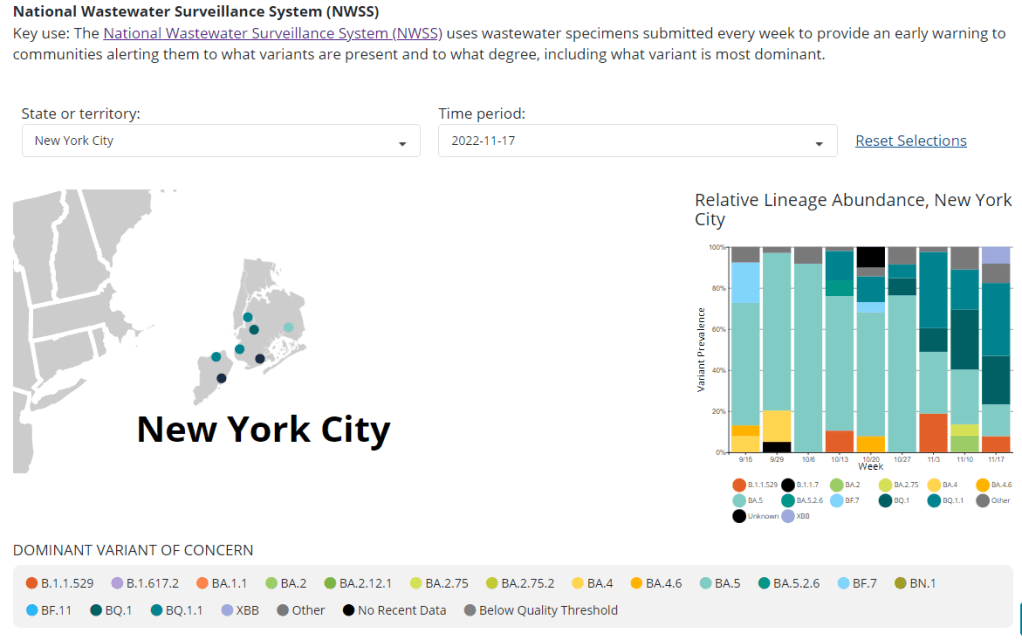
    • New York City’s Department of Environmental Protection created a brand-new program to test city wastewater for COVID-19 in 2020, working with limited lab equipment and personnel to sample from 14 sewage treatment plants across the city. In doing so, the city brushed off assistance offered from “multitudes of academics” and private sector researchers, and set up its program in-house. It has cost more than $1 million over the past three years.
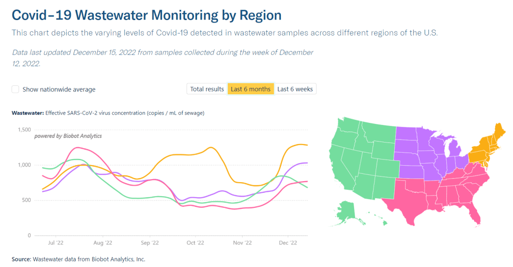
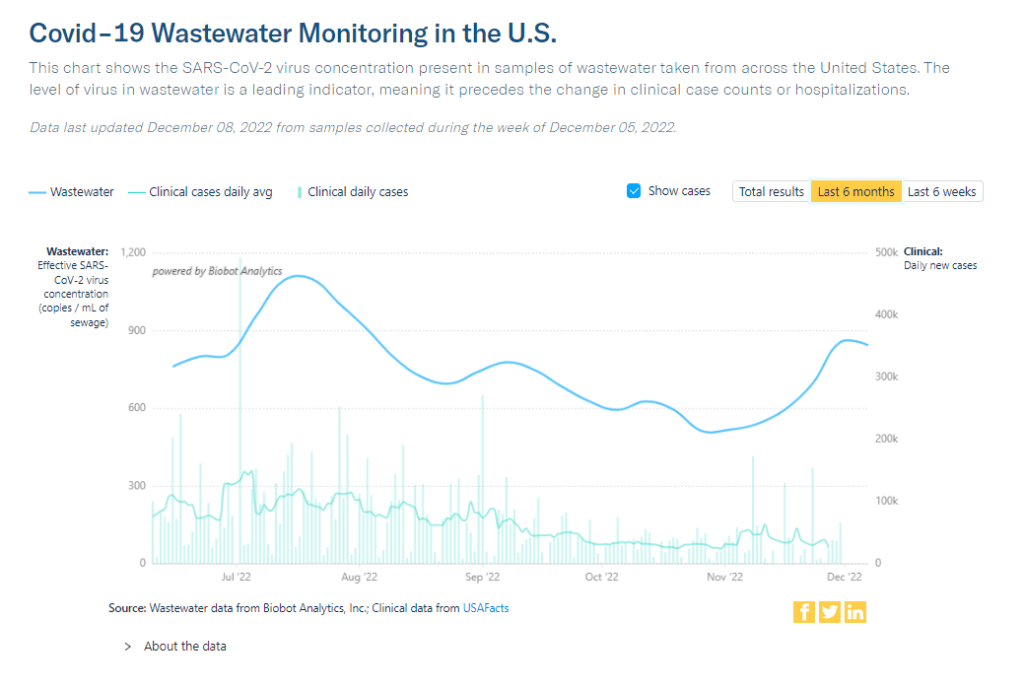
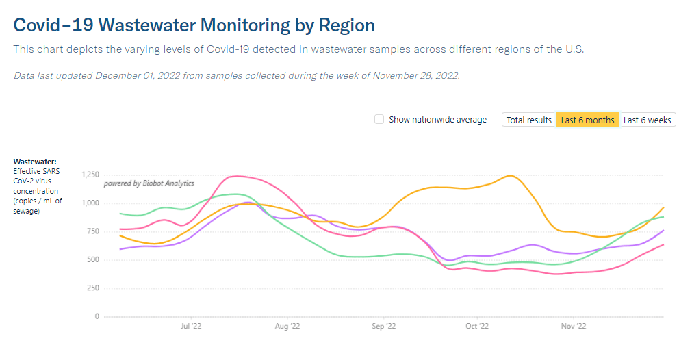
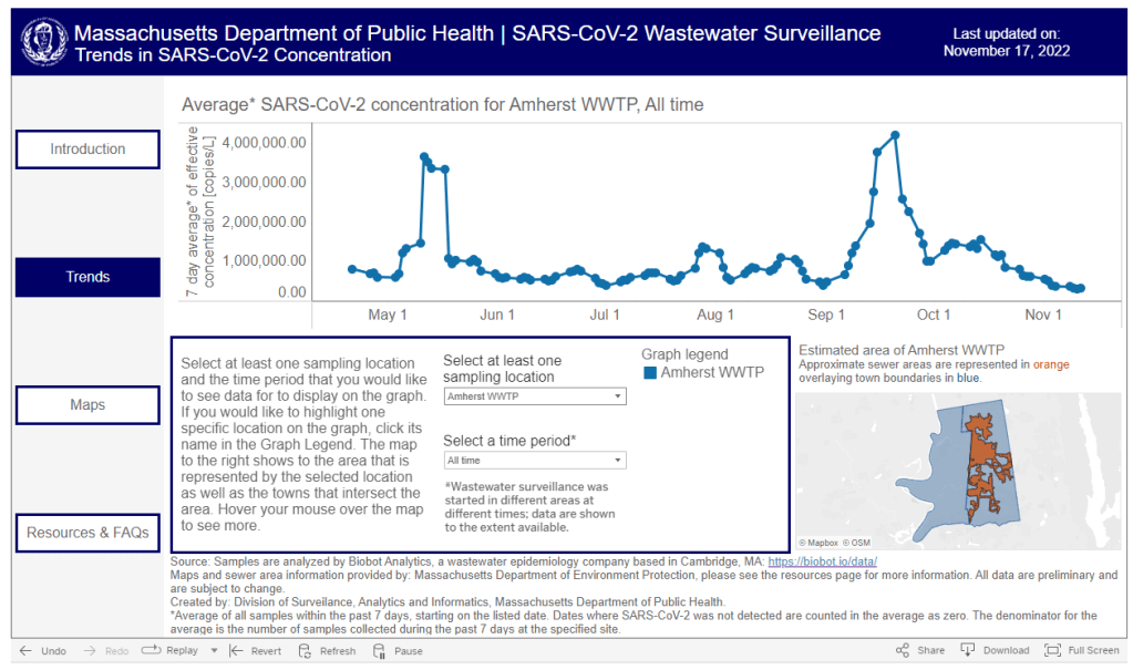
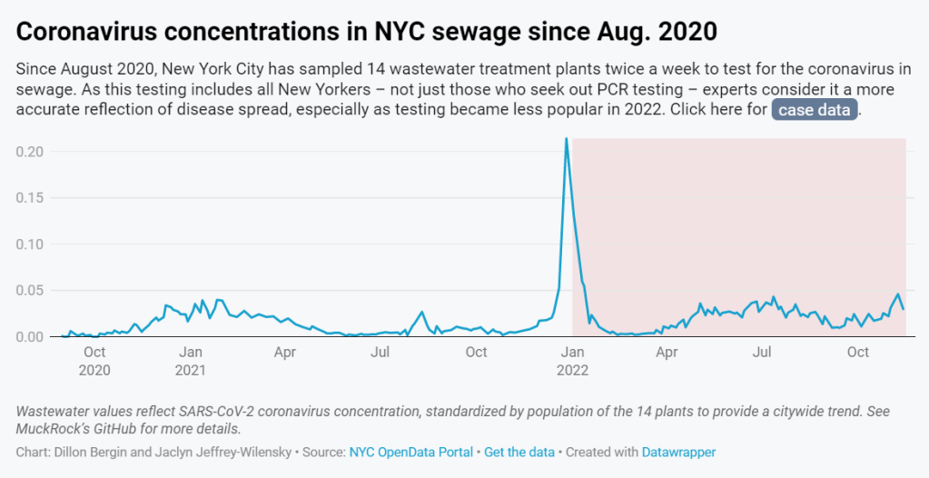
    • But the city didn’t publicly post any wastewater data until January 2022, almost two years after testing started. Unlike other large cities, such as Boston, New York City lacks a public dashboard for wastewater data. The city’s data available on dashboards run by the Centers for Disease Control and Prevention and New York State are often delayed by a week or more, making it less useful for New Yorkers seeking advanced warning about potential new surges.
    • In other parts of the U.S. — and at Columbia University in uptown Manhattan — wastewater surveillance is used for public health strategies, such as encouraging people to get PCR tests or sending extra resources to hospitals before a surge. However, New York City’s health and environmental agencies say they still consider wastewater research a “developing field” and aren’t using it for policy decisions.
    • In response to our questions, city health and environment agency officials argued that wastewater results “do not generally provide a complete picture” of how COVID-19 is spreading and said, unlike in other parts of the country, trends in city wastewater data tend to align with case counts rather than predicting them. But wastewater has shown a higher level of COVID-19 spread than PCR testing, as the latter became less available in 2022, according to Gothamist and MuckRock analyses. This pattern suggests that the sewage numbers may more accurately reflect actual disease patterns.
    • A bill introduced to the New York City Council in August would make the wastewater surveillance program permanent, expand it to other public health threats as needed, and require the health department to report data on a public dashboard.

    For readers outside NYC, I think this story provides an informative case study of the hurdles that wastewater surveillance for COVID-19 (and other diseases) will need to clear.

    First, you have the resource challenges. If the NYC Department of Environmental Protection, which oversees the largest municipal water network in the country, had a hard time getting equipment and personnel for testing—imagine the challenges facing small, rural public health departments.

    Next, after testing is set up, you have to interpret the data. NYC’s health department seems to be somewhat stuck on this step, with no public dashboard and its insistence that city residents should look at clinical case data—which we know are a significant undercount of true infections—rather than wastewater data. To be fair, wastewater data are new terrain for public health experts, with a lot of analytical issues. (See my MuckRock/FiveThirtyEight story from the spring for more details on this.)

    And finally, you have to communicate the data. How do you share wastewater results with the public in a way that is clear, real-time, local—and acknowledging necessary caveats? This is a tough challenge that health agencies across the U.S. are just starting to tackle, in tandem with the private companies that work on wastewater analysis.

    As I said in the radio story accompanying my piece, I hope that, someday, we can get wastewater surveillance updates as easily and regularly as we get weather updates. That future feels a long way off right now, but I intend to keep reporting on the journey in 2023.

    If you live somewhere with a thriving (or faltering) wastewater surveillance program, reach out and tell me about it!

    More on wastewater data

  • National numbers, December 18

    National numbers, December 18

    Biobot’s wastewater surveillance data suggest that COVID-19 spread is trending down in the West coast and plateauing in other regions. Data as of December 15.

    In the past week (December 8 through 14), the U.S. reported about 460,000 new COVID-19 cases, according to the CDC. This amounts to:

    • An average of 65,000 new cases each day
    • 139 total new cases for every 100,000 Americans
    • 3% fewer new cases than last week (December 1-7)

    In the past week, the U.S. also reported about 35,000 new COVID-19 patients admitted to hospitals. This amounts to:

    • An average of 5,000 new admissions each day
    • 10.7 total admissions for every 100,000 Americans
    • 2% more new admissions than last week

    Additionally, the U.S. reported:

    • 2,700 new COVID-19 deaths (390 per day)
    • 69% of new cases are caused by Omicron BQ.1 and BQ.1.1; 5% by BF.7; 7% by XBB (as of December 17)
    • An average of 250,000 vaccinations per day (CDC link)

    After a significant post-Thanksgiving spike, COVID-19 transmission in the U.S. appears to be in a high plateau, according to trends in cases and wastewater. Official case counts stayed fairly steady this week compared to the week following the holiday, according to the CDC, while wastewater data from Biobot show coronavirus concentrations leveling out.

    COVID-19 hospital admissions are similarly at a high plateau: about 5,000 new people with COVID-19 were admitted to hospitals every day last week, per the CDC. That’s a 2% increase from last week.

    Going beyond the national trends, though, we see that some places are experiencing dips in COVID-19 spread while others are spiking. In Boston, for example, wastewater data suggest that COVID-19 is at its most prevalent since the surge in early summer. Across the country in Los Angeles, coronavirus levels in wastewater are trending down after increasing through November.

    New York and New Jersey had the highest official COVID-19 case rates in the last week, according to the latest Community Profile Report, followed by Illinois, California, and Rhode Island. But these data may be more a product of which states still have somewhat-available PCR testing than actual case comparisons.

    And even in places where COVID-19 is declining, the combined threat of this virus, flu, and RSV is still putting a lot of strain on healthcare systems. Take Los Angeles: while it might not be seeing record COVID-19 cases, the city currently has fewer free hospital beds available than at any other point in the pandemic, per reporting by the Los Angeles Times.

    Flu might be peaking in some parts of the country, Helen Branswell wrote in STAT on Friday, based on CDC data. But it’s still early in the typical flu season, and hard to tell how COVID-19 and the flu (and RSV) might impact each other.

    As we gear up for another week of holiday travel and gatherings—and as highly contagious Omicron subvariants, the BQs and XBB, continue to outcompete other versions of the virus—this is an important time to take all possible safety precautions.

    That includes getting your flu shot and the new Omicron-specific COVID-19 booster, which further CDC studies have shown is highly effective at preventing hospitalization. And it includes masking, testing before and after events, and gathering outdoors (or otherwise improving ventilation) to reduce your risk of spreading all kinds of viruses.

  • Answering reader questions about data interpretation, good masking

    Answering reader questions about data interpretation, good masking

    As this chart from Biobot shows, trends in wastewater and case data often look a bit different. But how do you compare wastewater numbers to true infection numbers?

    This week, I’m sharing answers to three questions from readers that came in recently, through emails and the COVID-19 Data Dispatch Google form. The questions discuss interpreting wastewater and case data, and an interesting masking conundrum.

    Q1: Comparing wastewater trends to case trends

    I would love to know if there is any data on what levels of COVID in wastewater equals what risk level—are there any guidelines that could be used to turn masking policies on or off, for example? We know going up is bad and that the data is noisy but, if there’s any information on what concentrations in sewage corresponds to what level of cases I would love to know.

    I would love to be able to point you to specific guidelines about matching wastewater levels to cases, but unfortunately this isn’t really available right now. And if it were available, you would likely need to tailor the analysis pretty closely to where you live.

    An ongoing challenge with using wastewater surveillance data, as I wrote about for FiveThirtyEight and MuckRock in the spring, is that this type of environmental information is categorically pretty different from traditional case data. When a public health agency provides case numbers, they are adding up results from tests done in hospitals, doctors’ offices, and other healthcare settings. Each test result generally represents one person and can be interpreted with that framework.

    But with wastewater data, figuring out exactly what your test results represent can be more complicated. The data generally include people sick with COVID-19 who shed the coronavirus in their waste, but different people might shed different amounts of virus depending on what stage of illness they’re at, the severity of their symptoms, and possibly other factors that scientists are still working to figure out. Environmental factors like a big rainstorm or runoff from nearby agriculture could also interfere with the data. Population shifts, like college students returning to their campus after a break, can cause noise, too.

    As a result, public health experts who interpret wastewater data generally need a lot of data—like, a year or more of testing’s worth of data—from a specific location in order to analyze how wastewater trends correlate with case trends. And the data has to be consistent; if your wastewater collection team switches their sample processing methods halfway through the year, that might interrupt the analysis.

    A few institutions have figured out the wastewater-to-cases correlation for their communities. For examples, see the section on San Diego in this story and this paper by researchers in Gainesville, Florida. But for most research groups and health departments, it’s still a work in progress.

    All of that said, I don’t think this complexity should stop individuals or organizations from using wastewater data to recommend turning mask policies (or other policies) on or off. This surveillance might be less precise, but a sustained increase in coronavirus concentrations in the sewer is still certainly cause for concern and can be used to inform public health guidance.

    Q2: Estimating case underreporting

    How do you estimate how undercounted COVID testing is? Asking because I work for Whentotest.org—our COVID Risk Quiz assumes that COVID testing is undercounted by 7x, but I believe I’ve seen you estimate that it could be undercounted by as much as 20x. Wondering how you get to that number—we want to keep our Quiz as up to date as possible, and that number is a moving target.

    It is definitely a moving target, since COVID-19 testing (especially the lab-based PCR testing that generally contributes to official case numbers) can go up or down depending on people’s access to tests, perceptions of how much transmission is going on, and so many other factors.

    That said, I would personally put undercounting in the 10 times to 20 times range for this fall, likely with different levels of undercounting for different locations. I have two sources for the 20 times number: the first is an estimate from the Institute for Health Metrics and Evaluation made in September, suggesting that 4% to 5% of infections in the U.S. were reported at that time. (If 5% of infections are reported, case counts are 20 times higher than reported cases.)

    My second source is a paper from epidemiologist Denis Nash and his team at the City University of New York, released as a preprint earlier this fall. The researchers surveyed a representative sample of 3,000 U.S. adults, finding that about 17% of the respondents had Omicron during a two-week period in the summer BA.5 surge. Extrapolating from the survey findings, the researchers estimated that about 44 million people across the country had COVID-19 in this timeframe—compared to 1.8 million reported cases. This estimate suggests reported cases were undercounted by a factor of 24.

    Unfortunately, I have to use months-old estimates here because the U.S. does not have a regular data source comparing cases to true infections. The Census and CDC’s Household Pulse Survey comes close to this, as it includes questions about whether survey respondents have recently received a COVID-19 diagnosis; but it doesn’t ask about rapid tests, recent exposure, or other factors needed to determine the true infection rate, so the numbers here are also underestimates.

    Personally, I keep a close eye out for survey studies like those done by Nash and his team at CUNY and use those results to inform how I interpret national case data. I’ll make sure to flag any future studies like this for readers.

    Q3: Nose-only masking

    I follow some masking subs on Reddit and folks periodically suggest to others or refer to hacking masks that only cover their nose (KN95, N95s, etc.) for dental appointments or unavoidable indoor eating scenarios. Assuming they’re successful in creating a proper seal for these “half masks,” would there actually be any scientific backing this is helpful in minimizing risk?

    I wasn’t sure how to answer this question, so I shared it on Twitter, tagging a couple of masking and ventilation experts I know.

    Overall, the consensus that emerged from my replies is that it could be helpful to wear a mask over one’s nose for short periods of time, but it’s hard to say for sure due to a lack of rigorous research in this area. Behavior also plays a big role in how effective such a mask might be in alleviating risk.

    One expert, Devabhaktuni Srikrishna, pointed out that having a sealed filter over one’s nose could reduce the amount of virus that gets inhaled, if the coronavirus is present in the space. (This “inhalation dose” might correlate with one’s chances of infection and/or severity of symptoms if infected, though research is still ongoing on these questions.)

    Achieving a sealed filter over the nose is easier said than done, though. You can’t just use a standard mask, since that’s designed for the nose and mouth. One commenter shared a system that he uses, an elastomeric nose mask held in place with a headband. Another suggested using nasal filters designed to block allergens. As far as I know, there hasn’t been any research showing what might be most successful—unlike the extensive research that has gone into showing the value of high-quality face-masks and respirators.

    In addition to the discussion of designing a nose-only mask, this reader’s question led to some discussion about the careful behavior needed to use it successfully. One commenter pointed out that, if you’re eating alone, it’s easier to stay focused on breathing patterns than if you’re eating in a group and engaged in conversation. I also appreciated this reply from a Louisiana-based behavioral scientist:

    So, to summarize, I’d say that a nose filter could be helpful for situations like a dentist appointment and could be helpful (but trickier) for indoor dining—but it’s hard to say for sure. A much easier conclusion: avoid indoor dining as much as possible during COVID-19 surges like the one we’re in right now.

    More reader responses

  • COVID source shout-out: Variant data from wastewater

    COVID source shout-out: Variant data from wastewater

    New York City is one of a few jurisdictions contributing variant sequencing data from wastewater to CDC NWSS.

    I recently learned that the CDC is publishing a limited amount of variant surveillance data from its National Wastewater Surveillance System (NWSS).

    While NWSS is mostly focused on tracking coronavirus concentrations in wastewater as a proxy for transmission patterns, about 100 sites in the national network are also sequencing their wastewater samples and providing variant data. These data are available on the “Variant Summary” page of the CDC’s COVID Data Tracker, along with data from the CDC’s clinical specimen and traveler surveillance systems.

    The NWSS variant data is not very representative of the entire country (as a relatively small number of jurisdictions are sending the CDC this information), but this is still a helpful starting point for expanding wastewater surveillance to include sequencing. I hope to see this program expand in the coming months.

  • National numbers, December 4

    National numbers, December 4

    All four major regions of the country are reporting increased coronavirus levels in their wastewater, per Biobot. Data as of November 28.

    In the past week (November 24 through 30), the U.S. reported about 303,000 new COVID-19 cases, according to the CDC. This amounts to:

    • An average of 43,000 new cases each day
    • 92 total new cases for every 100,000 Americans
    • 1% fewer new cases than last week (November 17-23)

    In the past week, the U.S. also reported about 29,000 new COVID-19 patients admitted to hospitals. This amounts to:

    • An average of 4,200 new admissions each day
    • 9.0 total admissions for every 100,000 Americans
    • 18% more new admissions than last week

    Additionally, the U.S. reported:

    • 1,800 new COVID-19 deaths (250 per day)
    • 63% of new cases are caused by Omicron BQ.1 and BQ.1.1; 6% by BF.7; 5% by BN.1;  6% by XBB (as of December 3)
    • An average of 200,000 vaccinations per day

    If the U.S. wasn’t at the start of a COVID-19 surge before Thanksgiving, we’re certainly in one now. While official case counts have stagnated, wastewater surveillance indicates that the country is seeing about 1.5 times the coronavirus transmission that we had three weeks ago, according to data from Biobot.

    All four major regions of the country are experiencing clear upward trends in COVID-19 spread, per Biobot, with no sign of peaking; this is the first time there’s been a unified national increase since mid-summer. Individual metropolitan areas from Boston, to the Twin Cities in Minnesota, to Los Angeles, are reporting major upticks.

    The current difference between wastewater surveillance trends and case trends further confirms what I’ve been saying for months: case data simply are no longer that helpful for seeing early warnings of surges, as few people seek out PCR testing compared to earlier points in the pandemic. If you don’t already have a good place to see wastewater data for your community, put some pressure on your local officials to make this information available.

    The U.S.’s new increase in transmission can likely be attributed to travel and gatherings over the Thanksgiving holiday, combined with newer, more-transmissible versions of Omicron. Lineages BQ.1 and BQ.1.1 caused almost two-thirds of new cases in the week ending December 3, according to CDC estimates, while XBB caused about 6% of new cases.

    XBB has been spreading intensely in some Asian countries, and experts are watching to see how it competes with the alphabet soup of subvariants already circulating in the U.S. So far, it is most prevalent in the Northeast, per the CDC.

    In addition to wastewater trends, new hospital admissions for COVID-19 went up this week: about 18% more patients were admitted to hospitals around the country in the week ending November 30 compared to the prior week. These patients are entering a hospital system already overwhelmed by flu, RSV, and other respiratory viruses.

    As epidemiologist Caitlin Rivers noted in her newsletter last week: “The cumulative hospitalization rate for influenza is already on par with where we would expect to be in December or January.” And that virus continues to spread further, with most of the country experiencing high or very high levels of influenza-like activity.

    COVID-19 and these other viruses might not seem like a big deal thanks to vaccines and treatments, but they can still have very severe consequences. For example, New York City just reported that three children died of COVID-19 in recent weeks. And the risk of Long COVID remains, too.

  • Where to find wastewater data for your community

    Where to find wastewater data for your community

    The Massachusetts Department of Public Health is one of the latest state agencies to set up a public wastewater dashboard.

    As we head into the holidays with limited COVID-19 testing and undercounted case numbers, wastewater surveillance is the best way to evaluate how much the virus is spreading in your region. And it’s now available in more places than ever, thanks to the many research groups and public health agencies setting up sewage testing.

    To help you find wastewater surveillance in your area, I recently updated my COVID-19 Data Dispatch resource page about U.S. wastewater dashboards. The page includes links to and notes about national, state, and a few local dashboards.

    Let’s review the options. First, there are now three national dashboards with U.S. wastewater data, each covering a different set of locations.

    • The CDC’s National Wastewater Surveillance System is the biggest, including more than 1,000 sites from almost every state, though some states have far better coverage than others. Click on an individual site to see coronavirus trends for that location.
    • Biobot Analytics is the biggest private company doing wastewater surveillance; it provides analysis for hundreds of sites in the CDC NWSS network as well as its own, separate network. Biobot’s national and regional data (which include NWSS sites) are particularly helpful for large-scale trends.
    • WastewaterSCAN is a project that started from an academic partnership between Stanford University, Emory University, the University of Michigan, and communities in California. It’s since expanded to include sites in about 20 states, and participating sewersheds are tested for monkeypox, flu, and RSV in addition to the coronavirus.

    Second, 21 states currently have their own wastewater dashboards or reporting systems. If this is available in your area, I highly recommend looking at your local dashboard in addition to the national options. State and local dashboards tend to include more detailed and/or more frequently updated data, and are often tailored to their community’s needs more closely.

    These are the states with wastewater dashboards; see the resource page for links and more info:

    • California, Colorado, Georgia, Hawaii, Idaho, Indiana, Maine, Maryland, Massachusetts, Michigan, Minnesota, Missouri, Nebraska, New York State, North Carolina, Ohio, Oklahoma, Oregon, Utah, West Virginia, Wisconsin.

    Wastewater trends do not correspond directly to infection trends, because people sick with COVID-19 might shed the virus at different rates (based on where they are in their infection, variants, and other factors). Some researchers are working to better understand the correlation between wastewater trends and cases, but for now, the sewage data are best understood as a broad indicator of risk—not a precise estimate of how many people in your community are sick.

    For tips on interpreting wastewater data, I recommend looking at past COVID-19 Data Dispatch posts on this topic, as well as this FAQ from the People’s CDC.

    More wastewater data

  • COVID source shout-out: New York wastewater dashboard

    COVID source shout-out: New York wastewater dashboard

    The New York State wastewater dashboard is one of my favorite local data sources. Screenshot taken on November 6.

    I look at a lot of wastewater surveillance dashboards these days—sometimes reporting on this type of COVID-19 data, sometimes trying to gauge my own risk level. The New York State Wastewater Surveillance Network’s dashboard is one of my favorites, both because I like how it’s set up and because of location bias (i.e. I live in New York).

    The New York State network is a collaboration between state agencies and researchers at Syracuse University, the State University of New York, and others. It covers every single county in the state; most wastewater treatment plants included work directly with the researchers, with the exception of New York City (which does its own sampling and sends data to the state team).

    On the dashboard, you can see the coronavirus detection levels and recent trends for every county. Then, upon clicking on a specific wastewater treatment plant, you can see time series of both coronavirus concentration in wastewater and reported COVID-19 cases. Seeing the time series is pretty important because it provides broader context on how current coronavirus levels compare to past trends.

    NYC used to not be included on this dashboard, but the NYC sites were added in recent weeks. To me, this is a pretty big deal because the city doesn’t have its own wastewater dashboard (yet). For now, I’m adding the state dashboard to my regular rotation of local data sources.

  • Interpreting COVID-19 data as the CDC goes weekly and a fall surge approaches

    Interpreting COVID-19 data as the CDC goes weekly and a fall surge approaches

    As of this week, the CDC has switched to reporting COVID-19 cases and deaths on a weekly basis.

    As of this Thursday, the CDC is updating COVID-19 case and death data every week instead of every day. Here are some thoughts on interpreting COVID-19 data in the wake of this change, citing an article I recently wrote for The Atlantic.

    To me, the CDC’s shift to weekly updates feels like the end of an era for tracking COVID-19. While I understand the change, considering both our less-complete case information and other data analysis needs for the agency, I can’t help but wish we had a national public health agency with enough resources to continue providing us with frequent, reliable information on this ongoing pandemic. After all, shouldn’t that be the CDC’s job?

    The CDC has clearly deprioritized two major metrics (cases and deaths) that used to be the first places people looked to see the pandemic’s impact on their communities. Instead, the agency now points us to hospitalization metrics, variant surveillance, and wastewater—all metrics that are certainly useful, but may be harder for the average user to interpret.

    And even the case data we do have are quite unreliable at this point, as PCR tests become less and less accessible compared to rapid tests. Case numbers may be underreported by twenty times or more; it’s difficult to even get a good estimate of how far off the numbers are. Public communications like the CDC’s “Weekly Review” report fail to acknowledge this problem, and the agency does not appear to be making any effort to determine the true infection rates right now. 

    Through its current data communication choices, the CDC seems to be saying, “If you still care about keeping track of COVID-19, you’re on your own.” Even though we are likely heading for a fall surge and many people need to keep track of this disease in order to keep their communities safe.

    In absence of useful information from our public health leaders, it falls on us to survey the best available data sources and help others interpret them. My article in The Atlantic takes on this question, focusing on wastewater surveillance and population surveys as particularly useful sources we should consider right now.

    Interpreting wastewater data

    Wastewater data, unlike case data, don’t require people to actively go out and get tested: if their public sewer system is getting sampled for COVID-19, they will automatically be included in the data. You can look for wastewater surveillance in your area on Biobot’s dashboard, the CDC’s dashboard, or other state and local dashboards, depending on where you live. (I have a list of state dashboards here.)

    But interpreting wastewater data can be pretty different from interpreting case data. Here are a couple of key tips for approaching this source, based on my interview with Biobot president and cofounder Newsha Ghaeli:

    • Look at “directionality” and “magnitude.” “Directionality” means whether viral levels are going up or down, and “magnitude” means how they compare with earlier points in the pandemic. To quote from the story: “A 10 percent uptick when levels are low is less concerning than a 10 percent uptick when the virus is already spreading widely.”
    • If you do not have public wastewater data for your county, data from a neighboring county still provides useful info. When we talked, Ghaeli gave the example of a New York City resident looking at data from New Jersey or Connecticut counties neighboring the city: as people from these areas commute into NYC, a surge in one place could quickly drive a surge in the other.
    • Wastewater data are not a perfect proxy for infections. Scientists are still learning about how to best use this newer surveillance tool. Unlike clinical metrics (like cases), wastewater data can differ based on local environmental factors, and it often takes a long time for researchers to build useful interpretations of their communities. (See my past FiveThirtyEight story for more detail on this.)
    • These data can’t tell you who is getting sick. To comprehensively answer demographic questions, we need to actively survey people in our communities and ask them about their experiences with COVID-19. (See the story for more about how this works.)

    Other interpretation tips

    Beyond looking at wastewater data, here are a couple of tips I received from experts for readers seeking to watch their local COVID-19 numbers this fall:

    • “Look as local as you can,” said Pandemic Prevention Initiative expert Sam Scarpino. In other words, if you can find data for your individual county or even ZIP code, go there. 
    • Check multiple sources, and try to “triangulate” between them, said City University of New York epidemiologist Denis Nash. (I’ve provided similar advice in past posts like this one.)
    • Consider local events and behavior, Scarpino said. Quoting from the story: “If a popular community event or holiday happened recently, low case numbers might need to be taken with a grain of salt.”

    I also wanted to give a quick shout-out here to the People’s CDC, a volunteer science communication and advocacy organization. If you’re looking for more thoughtful analysis of national COVID-19 data, their weekly “weather reports” are a really helpful and accessible source. The organization also provides resources to help people push for more COVID-19 safety measures in their communities. 

    “People do want layers of protection, they do want to keep themselves in each other safe from COVID,” said Mary Jirmanus Saba, a geographer and volunteer with the People’s CDC whom I interviewed (with a couple of other volunteers) for my story. The weather reports and other similar initiatives help the organization’s followers “see that we really are there for each other,” she said.

    More wastewater reporting

  • Sources and updates, October 2

    • Johns Hopkins dashboard creator wins public service award: Lauren Gardner, an engineering professor at Johns Hopkins University, was recently awarded the 2022 Lasker-Bloomberg Public Service Award (a major prize in biomedical research) in recognition of her work on JHU’s global COVID-19 dashboard. This dashboard was one of the world’s first and most popular sources for tracking how the pandemic spread. Unlike many other projects, it has continued fairly consistently since early 2020, and continues to be a great resource for national and international data. Congratulations to Gardner and the other folks at JHU!
    • CDC releases updated chronic disease and risk factor data: This week, the CDC published a new iteration of its Behavioral Risk Factor Surveillance System (BRFSS), a major data source providing information on chronic conditions, health behaviors, access to healthcare, and more. The surveillance system uses surveys of over 400,000 American adults, conducted annually in all 50 states and several territories. While these aren’t COVID-specific data, the datasets can be a really helpful source for examining populations more vulnerable to COVID-19 in different parts of the country.
    • Increased respiratory illnesses in children: Another CDC update: researchers from the agency published a new study in the Morbidity and Mortality Weekly Report reporting increased cases of respiratory illness in kids this past summer. Strains of rhinovirus and enterovirus that haven’t circulated much in the last two years are back in 2022 and could cause problems this fall—especially as schools continue to operate in-person with relatively few public health measures—the CDC report suggests. For more context, see this recent newsletter by Katelyn Jetelina and Caitlin Rivers.
    • Biobot and CDC expand wastewater tracking to monkeypox: Biobot, the leading COVID-19 wastewater surveillance company, is expanding its work with the CDC to include monkeypox surveillance. As part of the CDC’s National Wastewater Surveillance System (NWSS), Biobot will coordinate data collection and analysis for both COVID-19 and monkeypox through at least January 2023. “We hope this can demonstrate the flexibility and versatility of this technology for governments across the country,” Biobot president and cofounder Newsha Ghaeli said in a press release.
    • Launch of the Data Liberation Project: This is not COVID- or even health-specific, but I wanted to give a quick shout-out to the Data Liberation Project, a new effort by Jeremy Singer-Vine (widely known in data journalism circles as the author of the Data Is Plural newsletter). The new project is “an initiative to identify, obtain, reformat, clean, document, publish, and disseminate government datasets of public interest.” I hope to see some COVID-19 datasets liberated through this project!

  • National numbers, October 2

    National numbers, October 2

    Coronavirus levels in Boston, Mass. wastewater spiked intensely last week. Chart via MWRA/Biobot.

    In the past week (September 24 through 30), the U.S. reported about 330,000 new COVID-19 cases, according to the CDC. This amounts to:

    • An average of 47,000 new cases each day
    • 100 total new cases for every 100,000 Americans
    • 13% fewer new cases than last week (September 17-23)

    In the past week, the U.S. also reported about 26,000 new COVID-19 patients admitted to hospitals. This amounts to:

    • An average of 3,800 new admissions each day
    • 8.0 total admissions for every 100,000 Americans
    • 6% fewer new admissions than last week

    Additionally, the U.S. reported:

    • 2,400 new COVID-19 deaths (350 per day)
    • 81% of new cases are caused by Omicron BA.5; 13% by BA.4.6; 3% by BF.7;  1% by BA.2.75 (as of October 1)
    • An average of 400,000 vaccinations per day

    Official COVID-19 numbers continue to drop nationwide, with case counts down 13% and new hospital admissions down 6% this week compared to the prior week. Still, signals from wastewater suggest this is no time to let our guard down, especially if you live in the Northeast.

    Biobot’s wastewater surveillance dashboard is back this week (after a one-week hiatus). Nationally, this surveillance suggests coronavirus transmission is at a high plateau close to what we saw during early fall of last year, before Omicron hit. The Northeast is driving that recent trend, with an overall coronavirus concentration twice as high as the concentrations reported in other regions.

    This region remains a hotspot for Omicron BF.7, the subvariant of BA.5 that could be the U.S.’s next dominant lineage. Nationwide, BF.7 is slowly competing with BA.5: it’s grown from causing about 1% of new cases to 3.4% over the last month, according to CDC estimates. BA.4.6 also continues to grow, while BA.2.75 has remained relatively constant.

    Within the Northeast region, Boston stands out: the city’s wastewater surveillance program (run by Biobot) reported a major spike last week. And by major spike, I mean an increase of more than 100% week-over-week, according to the city’s public health department. “This spike in our wastewater concentration is of great concern and another reminder that the pandemic is far from over,” said Dr. Bisola Ojikutu, Boston’s public health commissioner, in a press release.

    Wastewater spikes typically precede case spikes by a couple of weeks, though we’ll have to see whether the significant drop in PCR testing in recent months changes this pattern. Either way, this is a good time to get a booster shot (more on boosters below), stock up on masks and rapid tests, and start planning safety measures for the holidays.

    Boston is running vaccine clinics in response to this potential new surge, and the city public health department “recommends” masking indoors. But any further mitigations are likely out of the question, even though they could have a huge impact.