Long-term readers might remember that I devoted an issue to antigen testing back in August. Antigen tests are rapid, diagnostic COVID-19 tests that can be used much more quickly and cheaply than their polymerase chain reaction (PCR) counterparts. They don’t require samples to be sent out to laboratories, and some of these tests don’t even require specialized equipment; Abbott’s antigen test only takes a swab, a testing card, and a reagent, and results are available in 15 minutes.
But these tests have lower sensitivity than PCR tests, meaning that they may miss identifying people who are actually infected with COVID-19 (what epidemiologists call false negatives). They’re also less accurate for asymptomatic patients. In order to carefully examine the potential applications of antigen testing, we need both clear public messaging on how the tests should be used, and accessible public data on how the tests are being used already. Right now, I’m not seeing much of either.
When I first covered antigen testing in this newsletter, only three states were publishing antigen test data. Now, we’re up past ten states with clear antigen test totals, with more states reporting antigen positives or otherwise talking about these tests in their press releases and documentation. Pennsylvania, for example, announced that the governor’s office began distributing 250,000 antigen test kits on October 14.
Meanwhile, antigen tests have become a major part of the national testing strategy. Six tests have received Emergency Use Authorization from the FDA. After Abbott’s antigen test was given this okay-to-distribute in late August, the White House quickly purchased 150 million tests and made plans to distribute them across the country. Context: the U.S. has done about 131 million total tests since the pandemic began, according to the COVID Tracking Project’s most recent count.
Clearly, antigen testing is here—and beginning to scale up. But most states are ill-prepared to report the antigen tests going on in their jurisdictions, and federal public health agencies are barely reporting them at all.
I’ve been closely investigating antigen test reporting for the past few weeks, along with my fellow COVID Tracking Project volunteers Quang Nguyen, Kara Schechtman, and others on the Data Quality team. Our analysis was published this past Monday. I highly recommend you give it a read—or, if you are a local reporter, I highly recommend that you use it to investigate antigen test reporting in your state.
But if you just want a summary, you can check out this Twitter thread:
today, @COVID19Tracking published an analysis of antigen testing by me and @quangpmnguyen, featuring annotations by @karaschechtman. we asked: how are states reporting their antigen tests? the answer is: largely, they aren't. https://t.co/2plOKfaehy (1/11)
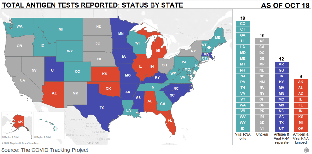
First: state antigen test reporting is even less standardized than PCR test reporting. While twelve states and territories do report antigen test totals, nine are combining their antigen test counts with PCR test counts, which makes it difficult to analyze the use of either test type or accurately calculate test positivity rates. The reporting practices in sixteen other states are unclear. And even among those states with antigen test totals, many relegate their totals to obscure parts of their dashboards, fail to publish time series, report misleading test positivity rates, and engage in other practices which make the data difficult for the average dashboard user to interpret.
Second: antigen tests reported by states likely represent significant undercounts. Data reporting inconsistences between the county and state levels in Texas, as well as a lack of test reporting from nursing homes, suggest that antigen tests confuse data pipelines. While on-site test processing is great for patients, it cuts out a lab provider which is set up to report all COVID-19 tests to a local health department. Antigen tests may thus be conducted quickly, then not reported. The most damning evidence for underreporting comes from data reported by test maker Quidel. Here’s how the post explains this:
Data shared with Carnegie Mellon University by test maker Quidel revealed that between May 26 and October 9, 2020, more than 3 million of the company’s antigen tests were used in the United States. During that same period, US states reported less than half a million antigen tests in total. In Texas alone, Quidel reported 932,000 of its tests had been used, but the state reported only 143,000 antigen tests during that same period.
Given that Quidel’s antigen test is one of six in use, the true number of antigen tests performed in the United States between late May and the end of September was likely much, much higher, meaning that only a small fraction are being reported by states.
Again: this is for one of six tests in use. America’s current public health data network can’t even account for three million antigen tests—how will it account for 150 million?
This week, for the first time since I was peer-pressured into watching the Bachelor franchise two-ish years ago, I listened to a recap podcast.
To be clear, this was not your typical Bachelor franchise recap podcast. The hosts did not judge contestants on their attractiveness, nor did they speculate about the significance of the First Impression Rose. Instead, it was POLITICO’s Dan Diamond and Jeremy Siegel, discussing COVID-19 safety precautions and public health messaging as seen on The Bachelorette. They were inspired by this tweet, which apparently garnered more attention than Diamond had anticipated:
This episode of Bachelorette has already
– shown contestants getting COVID tests – demonstrated how to self-isolate til you get results – featured discussion of the mental health burdens from this year
They also talked about the NBA’s championship bubble. It was a pretty fun episode—highly recommend. But the episode got me thinking: neither this podcast nor the Bachelorette season premiere itself mentioned what kind of COVID-19 tests the contestants were taking, how often they were tested during the show, or any data from the show’s filming.
As I explained last week, differentiation between the various COVID-19 tests now available is a major gap in American public health messaging. Everyone from White House staffers to the patients at my neighborhood clinic wants to be tested with the fastest option available, and they want to do it without going onto the FDA’s website and reading through every test’s Emergency Use Authorization (EUA). It’s crucial for anyone publicly talking about testing to get specific about what kind of tests they’re using and why—this type of messaging will help people make their own educated decisions.
The Bachelorette had an opportunity to not only show average Americans the COVID-19 testing experience, but to also explain which tests are more useful for particular situations, and, yes, explain how to interpret some COVID-19 data. In interviews with Variety and The Hollywood Reporter, producers on the show described how contestants went through regular testing with the “full nasal test” and undertook quarantine measures. But first of all: the “full nasal test” could refer to one of about 40 nucleic acid and antigen tests which have received EUA, and second of all, talking in general terms about your show’s testing protocol makes it hard for a journalist like me, much less for an actual public health expert, to evaluate what you did. And, most importantly, it only gives the TV show’s millions of viewers a general idea of the options available to them when they need to get tested themselves.
The best thing I could find on Bachelorette testing, through some pretty targeted Google searches, was a headline from the Nashville Scene reading: “The Bachelorette Recap: Testing Positive for Love.” Which, honestly? I’m glad someone used that joke.
What I’m saying is, I want a Bachelorette COVID-19 dashboard. I want numbers of all the tests conducted, I want to know their manufacturers, I want a timeline of when the tests happened, and I want to know all of the test results. If anyone reading this has a contact at ABC… hook me up.
The county-level testing dataset published by CMS has become a regular topic for this newsletter since it was released in early September. As a refresher for newer readers: CMS publishes both total PCR tests and test positivity rates for every county in the country; the dataset is intended as a resource for nursing home administrators, who are required to test their residents and staff at regular intervals based on the status of their county.
This past Monday, October 5, I was pleasantly surprised to find a new update posted on CMS’ COVID-19 data page. I say “surprised” because I had been led to believe, both by past dataset updates and by reporting when the dataset was first published, that this source would be updated once every two weeks. And yet, here was a new update, with only one week’s delay (the last update before this was on Monday, September 28). CMS is also now posting weekly updates on an Archive page which goes back to August 19; some of these updates are older, while others were posted or edited in the past week.
I always appreciate more frequent data, even when the data provider in question is not particularly transparent about their update strategy. Frequent updates are particularly useful for testing data; the nursing home administrators monitoring testing in their counties will be able to see information that better reflects the level of COVID-19 risk around them.
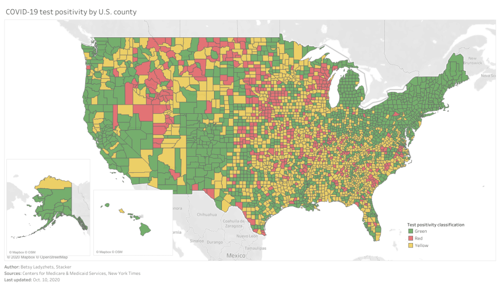
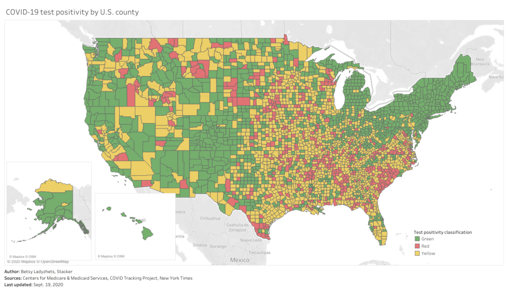
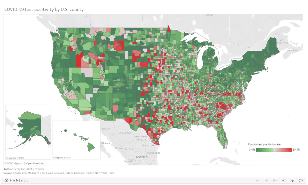
As you can see, the majority of the Northeast and much of the West Coast continues to be in the green (positivity rates under 5%), while areas in the South and Midwest are not faring so well. Twelve counties have extremely high positivity rates (over 30%), eleven of which are in Midwestern states. This table allows you to rank and sort the test positivity rates by state.
Also, a note on my methodology for this dashboard: in earlier iterations, I used state-level data from the COVID Tracking Project to calculate state test positivity rates for the same time period as the CMS has provided county-level rates. I then compared the county-level rates against state-level rates; this was the source of the “[x]% above state positivity rate” tooltips on the dashboard. After reading a new COVID Tracking Project blog post about the challenges of calculating and standardizing positivity rates, however, I realized that combining positivity rates from two different sources might misrepresent the COVID-19 status in those counties. So, I switched my method: the county-to-state comparisons are now based on averages of all the CMS-reported county-level positivity rates in each state.
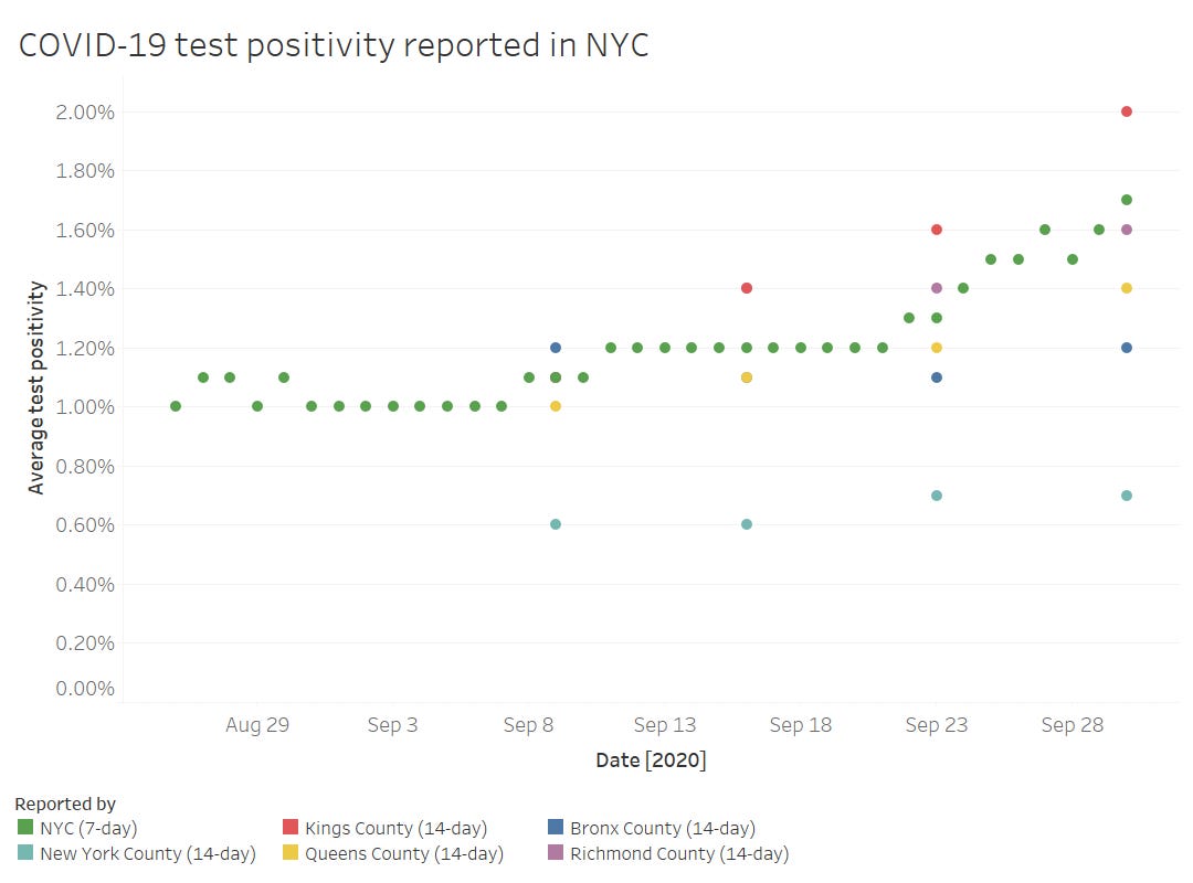
Finally, out of curiosity (and to practice my Tableau skills), I compared the CMS-reported test positivity rates for the five counties of New York City to the city-level rate reported by the NYC Department of Health.
The positivity rates reported by the two sources follow the same general direction, but it’s interesting to see how the rates diverge when the five counties split up. Manhattan remaining far below 1% while Brooklyn surges up to 2%? Not surprising.
Meanwhile, CMS is cracking down on COVID-19 reporting from hospitals: NPR reported this week that hospitals which fail to report complete, daily data to HHS can lose money from Medicare and Medicaid, starting this coming January.
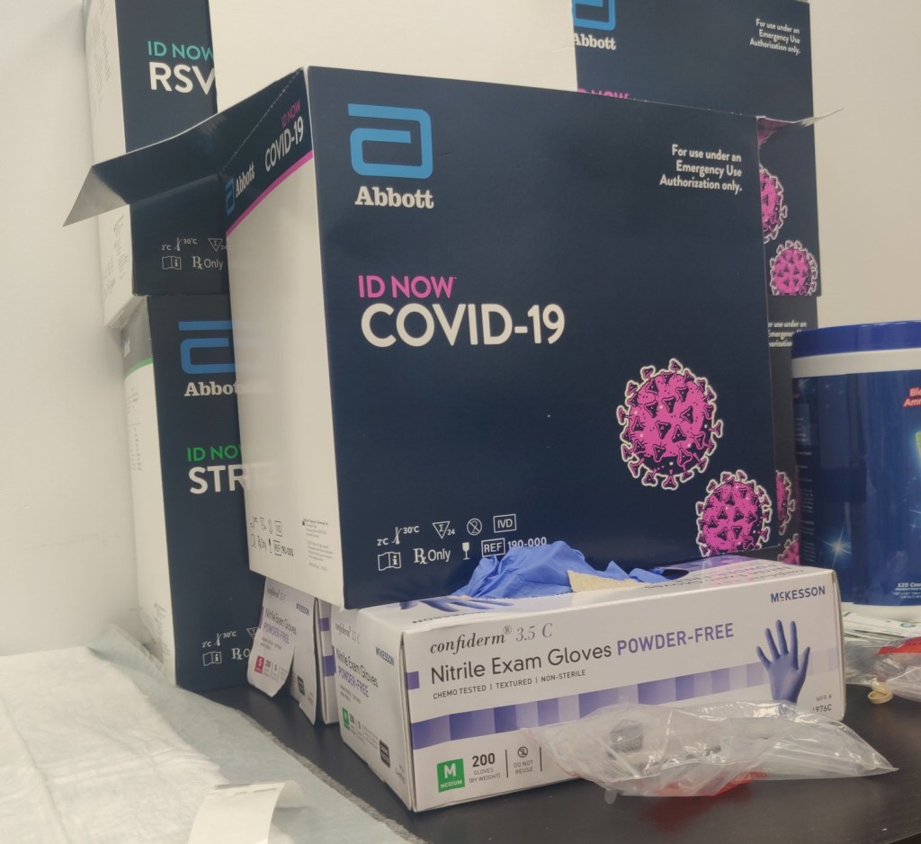
Abbott ID NOW tests, pictured at a health clinic in Williamsburg (my photo).
Two weeks ago, I went to my COVID-19 testing site of choice for a post-Maine trip screening. I walked the now-familiar ten blocks to the site, a private clinic in Williamsburg, and waited at the now-familiar counter for one of the receptionists to be available to check me in.
“Do you want a rapid test?” the receptionist asked.
“No, PCR, please,” I replied.
I had assumed that the “rapid test” she offered was an antigen test. Antigen tests, as I’ve described in this newsletter before, have a low sensitivity, meaning that they may miss identifying people who are actually infected with the novel coronavirus. (These missed cases are called false negatives.) Evidence also suggests that antigen tests will return more false negatives for patients who are asymptomatic. As I was not exhibiting COVID-19 symptoms, and rather wanted to get tested because I had recently traveled out of the state, I was interested in receiving a more accurate test.
But confusion quickly ensued: the rapid test that my clinic offered, as it turned out, was not an antigen test. It was a nucleic acid amplification test—a model manufactured by Abbott called the ID NOW. Like PCR (polymerase chain reaction) tests, this test uses gene amplification to identify genetic material associated with the novel coronavirus in a patient’s mucus sample. But unlike PCR tests, the ID NOW test does not require clinics to send samples out to faraway labs for processing. This test is distributed with small, in-house DNA amplification machines that can provide patients with their results in 15 minutes. I got the result of my ID NOW test later that same afternoon. (And then I got the results of a second test, this one a PCR test which I had asked the clinic to request at a lab, several days later. Both tests were negative.)
I hadn’t heard of Abbott ID NOW tests before last week. But they’re in the news now, connected to what has become America’s most infamous COVID-19 outbreak: President Trump’s White House relied on Abbott ID NOW tests. And they used these tests incorrectly.
No test type specification in molecular testing data
Rapid testing has been the White House’s defense against critiques of COVID-19 carelessness, explains Slate reporter Daniel Politi. Each day, staffers would get tested with Abbott ID NOW tests. Upon receiving negative results, staffers would be cleared to take off their mask and act without consideration for social distancing. Boxes of the ID NOW tests used for this screening have been pictured at the White House since March.
But how accurate are those negative results? If you’re asymptomatic: not very. The ID NOW test is only authorized for use in people with symptoms. A guidance from the Food and Drug Administration (FDA), updated on September 17, specifies:
The ID NOW COVID-19 is authorized for use with respiratory specimens collected from individuals who are suspected of COVID-19 by their healthcare provider within the first seven days of the onset of symptoms.
The majority of White House staffers who were tested with these tests had not been coughing and wheezing, nor had they been suspected of COVID-19 by a healthcare provider. In asymptomatic patients like these, as many as one-third of negatives returned by the ID NOW test may be false negatives. It’s no surprise, then, that the virus spread quickly through an indoor environment where staffers were using rapid tests—but doing little else.
White House staff are not the only people who used the wrong type of test to check their COVID-19 status. I shouldn’t have gotten an Abbott ID NOW test either. But when a nurse at my local clinic, which I saw as a site of trusted health expertise, offered one to me, I didn’t ask too many questions. It’s PCR, I thought. It’ll be accurate.
But first of all: the Abbott ID NOW test is not a PCR test. It’s in the same family as PCR tests (molecular-based, DNA amplification), but it operates on a different paradigm. And second of all, the health care workers at my clinic gave me no indication of how accurate this rapid test was, especially for my asymptomatic self. (Note: I have no hard feelings toward this clinic or any of the workers there. I’m simply using my own experience as an example of how poorly information about test types is conveyed to the public in general.)
What if my PCR test, sent out to a lab, had returned a positive result? I would have traversed Brooklyn, gotten groceries, grabbed coffee at a neighborhood cafe, and attended a protest in Queens that weekend, buoyed by a negative result yet unknowingly spreading the coronavirus to my fellow New Yorkers. And both of my tests would have been accounted for on New York’s testing dashboard in one single tick mark. New York reports tests in encounters, so my two specimens would have been deduplicated as simply “one person tested on September 30.”
I say “would have been” because I am not, in fact, sure that my Abbott ID NOW test made it into the New York Public Health Department’s database at all.
Here’s a line from the press release that Abbott put out on October 2, the day that Trump tested positive:
While we don’t know the details on who was tested and on which devices, we know that more than 11 million Americans have taken the ID NOW test, helping to stop the spread of the virus.
11 million is a pretty big number: if these tests were all included in the national count reported by the COVID Tracking Project, they would make up about 10% of the total. But are the ID NOW tests included in the COVID Tracking Project’s count? It is difficult to say. The majority of state public health departments, the sources for the COVID Tracking Project’s data, simply report total counts of nucleic acid-based tests, if they specify their test type at all.
State COVID-19 dashboards fail to separate out test counts by method or manufacturer. Some states, such as Maine and Illinois, acknowledge that their test counts include all “nucleic acid-based tests,” not only the PCR tests which fall into this category. Other states, such as Oklahoma and Florida, report detailed data about the testing capacity of individual labs and point-of-care facilities, but fail to supply the testing models used at each location. South Carolina acknowledges a small number of “unknown” tests, for which the public health department is investigating possible categorizations. The Department of Health and Human Services, meanwhile, only reports PCR tests, absent counts of any other molecular test type.
And, returning to Abbott’s press release: the manufacturer admits that they “don’t know the details on who was tested and on which devices.” This leaves a lot of open questions about how rapid testing data are being collected; Abbott seems to imply that even the manufacturer itself does not have access to specific information about where and how their tests are in use. If I had to guess, I’d say that 11 million figure comes from bulk test orders sent out by facilities like my local clinic.
It’s great for healthcare responses that Abbott tests can be processed quickly on-site, in facilities like a healthcare clinic or a major political site. But public health departments don’t have relationships with clinics—they have relationships with testing laboratories. When tests aren’t sent out to a lab, it’s easy for them to fall through gaps in a data pipeline which relies on complex electronic reporting systems. (This is also a problem for antigen tests.)
So, the problem stands: Abbott ID NOW tests are in use across the country. 11 million of them have been distributed since March. But where are the tests being used, how many of them have returned positive results, and are they being used correctly—to quickly diagnose patients with COVID-19 symptoms? Without these data, it is difficult to determine whether Abbott’s test should be part of America’s testing strategy going forward.
Conflating antigen and PCR tests
I can’t discuss the data pitfalls of rapid COVID-19 testing without devoting a few paragraphs to antigen tests.
Five days before his positive COVID-19 test was made public, President Trump announced a plan to deploy 150 million antigen tests across the country. 100 million tests will go to state and territory public health departments, while the remaining 50 million will go to facilities supporting vulnerable populations such as nursing homes, hospice care facilities, and historically Black colleges. Trump discussed how useful antigen tests could be for screening, suggesting that teachers could be tested regularly.
The tests Trump praised are rapid antigen tests manufactured by Abbott, which received FDA Emergency Use Authorization at the end of August. Abbott’s antigen tests are cheap—each one costs $5. And, like the ID NOW tests, they’re fast—patients receive results in 15 minutes. But, also like the ID NOW tests, antigen tests are more effective for symptomatic people.
Here is how Alexis Madrigal and Rob Meyer explain it, in an article for The Atlantic published this past week:
If distributed en masse and used to screen asymptomatic people, these antigen tests will deliver hundreds of thousands—if not millions—of false results, they say. False negatives could lead to reckless behavior by people who don’t know they’re sick. False positives can also put people at risk: If a virus-free nursing-home resident with a false positive is placed in a COVID-19 ward, that person could become infected.
This is not to say that antigen tests are useless; their utility is still being debated in epidemiological and public health circles. The advantages of these cheap, fast tests may outweigh the dangers of their low sensitivity. But to truly understand this problem, we need access to better antigen test data—not just 60 tests from Nevada nursing homes (the sample size upon which that state’s decision was made).
If 11 million Abbott ID NOW tests are a data concern, 150 million Abbott antigen tests are a data minefield. For the past month, I’ve been working on an analysis for the COVID Tracking Project which covers how states are reporting—and failing to report—antigen test results. This analysis is set to be released in the next week, in all its detailed glory. But I can tell you now that the majority of states are not reporting antigen tests in separate counts from DNA-based tests, just as the majority of states are not reporting other types of DNA-based tests as separate from PCR tests. In fact, several states now specifically report that their testing counts combine PCR and antigen tests in one figure.
When two different test types are conflated in a single total figure, it is difficult to analyze the progression of how either test is being used. I can’t tell you how many antigen tests are being put to use across the country, or how effective they are at containing COVID-19 in a given community, if these test numbers are lumped in with another test type. Test lumping also presents a(nother) challenge for test positivity calculations, as antigen and PCR tests have very different sensitivity levels.
And even the few separate antigen test counts that states do report are likely significant undercounts of the actual scale of antigen testing going on in the U.S. As I mentioned earlier, no data reporting pipelines are set up for tests that occur rapidly in point-of-care settings. The Center for Medicare & Medicaid Services (CMS) does not report the number of antigen tests that have occurred in nursing homes, for example.
So far, it appears that state and federal public health agencies alike are unprepared to report the results of antigen tests. Before the White House deploys its 150 million Abbott antigen tests, I hope to see that change.
This past Monday, September 28, the Centers for Medicare & Medicaid Services (CMS) updated the county-level testing dataset which the agency is publishing as a resource for nursing home administrators.
I’ve discussed this dataset in detail in two past issues: after it was published in early September, and when it was first updated two weeks ago. The most recent update includes data from September 10 to September 23; CMS is continuing to analyze two weeks’ worth of testing data at a time, in order to improve the stability of these values. And this update came on a Monday, rather than a Thursday, decreasing the data lag from one week to five days.
A CMS press release from this past Tuesday describes one update to how CMS assigns test positivity categories, which nursing home administrators look at to determine how often they are required to test their patients and staff:
Counties with 20 or fewer tests over 14 days will now move to “green” in the color-coded system of assessing COVID-19 community prevalence. Counties with both fewer than 500 tests and fewer than 2,000 tests per 100,000 residents, and greater than 10 percent positivity over 14 days – which would have been “red” under the previous methodology – will move to “yellow.”
This change intends to address the concerns of rural states which are not doing much testing due to their small populations.
I’ve updated my Tableau visualization with the most recent county data. The majority of the Northeast continues to be in the green, while areas in the South and Midwest pose higher concerns.
I spent the bulk of last week’s issue unpacking a new testing dataset released by the Centers for Medicare & Medicaid Services which provides test positivity rates for U.S. counties. At that point, I had some unanswered questions, such as “When will the dataset next be updated?” and “Why didn’t CMS publicize these data?”
The dataset was updated this past week—on Thursday, September 17, to be precise. So far, it appears that CMS is operating on a two-week update schedule (the dataset was first published on Thursday, September 3). The data themselves, however, lag this update by a week: the spreadsheet’s documentation states that these data are as of September 9.
CMS has also changed their methodology since the dataset’s first publication. Rather than publishing 7-day average positivity rates for each county, the dataset now presents 14-day average positivity rates. I assume that the 14 days in question are August 27 through September 9, though this is not clearly stated in the documentation.
This choice was reportedly made “in order to use a greater amount of data to calculate percent test positivity and improve the stability of values.” But does it come at the cost of more up-to-date data? If CMS’s future updates continue to include one-week-old data, this practice would be antithetical to the actual purpose of the dataset: letting nursing home administrators know what the current testing situation is in their county so that they can plan testing at their facility accordingly.
Additional documentation and methodology updates include:
The dataset now includes raw testing totals for each county (aggregated over 14 days) and 14-day test rates per 100,000 population. Still, without total positive tests for the same time period, it is impossible to replicate the CMS’s positivity calculations.
As these data now reflect a 14-day period, counties with under 20 tests in the past 14 days are now classified as Green and do not have reported positivity rates.
Counties with low testing volume, but high positivity rates (over 10%), are now sometimes reassigned to Yellow or Green tiers based on “additional criteria.” CMS does not specify what these “additional criteria” may be.
This chart is color-coded according to CMS’s test positivity classifications. As you can see, New England is entirely in the green, while parts of the South, Midwest, and West Coast are spottier.
Finally: CMS has a long way to go on data accessibility. A friend who works as a web developer responded to last week’s newsletter explaining how unspecific hyperlinks can make life harder for blind users and other people who use screenreaders. Screenreaders can be set to read all the links on a page as a list, rather than reading them in-text, to give users an idea of their navigation options. But when all the links are attached to the same text, users won’t know what their options are. The CMS page that links to this test positivity dataset is a major offender: I counted seven links that are simply attached to the word “here.”
This practice is challenging for sighted users as well—imagine skimming through a page, looking for links, and having to read the same paragraph four times because you see the words “click here” over and over. (This is my experience every time I check for updates to the test positivity dataset.)
“This is literally a test item in our editor training, that’s how important it is,” my friend said. “And yet people still get it wrong. ALL THE TIME.”
One would think an agency dedicated to Medicare and Medicaid services would be better at web accessibility. And yet.
On September 3, 2020, the Center for Medicare & Medicaid Services (CMS) posted a county-level testing dataset. The dataset specifically provides test positivity rates for every U.S. county, for the week of August 27 to September 2.
This is huge. It’s, like, I had to lie down after I saw it, huge. No federal health agency has posted county-level testing data since the pandemic started. Before September 3, if a journalist wanted to analyze testing data at any level more local than states, they would need to aggregate values from state and county public health departments and standardize them as best they could. The New York Times did just that for a dashboard on school reopening, as I discussed in a previous issue, but even the NYT’s data team was not able to find county-level values in some states. Now, with this new release, researchers and reporters can easily compare rates across the county and identify hotspot areas which need more testing support.
So Betsy, you might ask, why are you reporting on this new dataset now? It’s been over a week since the county-level data were published. Well, as is common with federal COVID-19 data releases, this dataset was so poorly publicized that almost nobody noticed it.
The dataset’s release was, instead, brought to my attention thanks to a tweet by investigative reporter Liz Essley Whyte of the Center for Public Integrity:
🚨 Coronavirus data nerds: @CMSGov has started posting county-level test positivity data
Here are the top 20 counties for test positivity according to their data
In today’s issue, I’ll share my analysis of these data and answer, to the best of my ability, a couple of the questions that have come up about the dataset for me and my colleagues in the past few days.
Analyzing the data
Last week, I put together two Stacker stories based on these data. The first includes two county-level Tableau visualizations; these dashboards allow you to scroll into the region or state of your choice and see county test positivity rates, how those county rates compare to overall state positivity rates (calculated based on COVID Tracking Project data for the same time period, August 27 to September 2), and recent case and death counts in each county, sourced from the New York Times’ COVID-19 data repository. You can also explore the dashboards directly here.
The second story takes a more traditional Stacker format: it organizes county test positivity rates by state, providing information on the five counties with the highest positivity rates in each. The story also includes overall state testing, case, and outcomes data from the COVId Tracking Project.
As a reminder, a test positivity rate refers to the percent of COVID-19 tests for a given population which have returned a positive result over a specific period of time. Here’s how I explained the metric for Stacker:
These positivity rates are typically reported for a short period of time, either one day or one week, and are used to reflect a region’s testing capacity over time. If a region has a higher positivity rate, that likely means either many people there have COVID-19, the region does not have enough testing available to accurately measure its outbreak, or both. If a region has a lower positivity rate, on the other hand, that likely means a large share of the population has access to testing, and the region is diagnosing a more accurate share of its infected residents.
Test positivity rates are often used as a key indicator of how well a particular region is controlling its COVID-19 outbreak. The World Health Organization (WHO) recommends a test positivity rate of 5% or lower. This figure, and a more lenient benchmark of 10%, have been adopted by school districts looking to reopen and states looking to restrict out-of-state visitors as a key threshold that must be met.
Which counties are faring the worst, according to this benchmark? Let’s take a look:
This screenshot includes the 33 U.S. counties with the highest positivity rates. I picked the top 33 to highlight here because their rates are over 30%—six times the WHO’s recommended rate. The overall average positivity rate across the U.S. is 7.7%, but some of these extremely high-rate counties are likely driving up that average. Note that two counties, one in South Dakota and one in Virginia, have positivity rates of almost 90%.
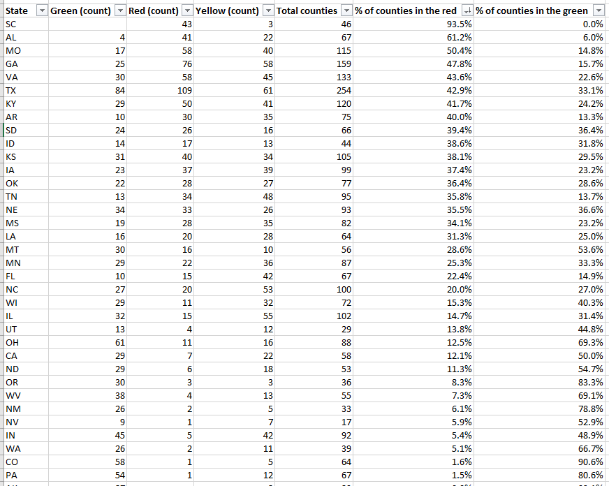
Overall, 1,259 counties are in what CMS refers to as the “Green” zone: their positivity rates are under 5%, or they have conducted fewer than 10 tests in the seven-day period represented by this dataset. 874 counties are in the “Yellow” zone, with positivity rates between 5% and 10%. 991 counties are in the “Red” zone, with positivity rates over 10%. South Carolina, Alabama, and Missouri have the highest shares of counties in the red, with 93.5%, 61.2%, and 50.4%, respectively:
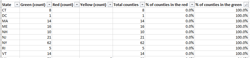
Meanwhile, eight states and the District of Columbia, largely in the northeast, have all of their counties in the green:
My Tableau visualizations of these data also include an interactive table, which you can use to examine the values for a particular state. The dashboards are set up so that any viewers can easily download the underlying data, and I am, as always, happy to share my cleaned dataset and/or answer questions from any reporters who would like to use these data in their own stories. The visualizations and methodology are also open for syndication through Stacker’s RSS feed—I can share more details on this if anyone is interested.
Answering questions about the data
Why is the CMS publishing this dataset? Why not the CDC or HHS overall?
These test positivity rates were published as a reference for nursing home administrators, who are required to test their staff regularly based on the prevalence of COVID-19 in a facility’s area. A new guidance for nursing homes dated August 26 explains the minimum testing requirement: nursing homes in green counties must test all staff at least once a month, those in yellow counties must test at least once a week, and those in red counties must test at least twice a week.
It is important to note that facilities are only required to test staff, not residents. In fact, the guidance states that “routine testing of asymptomatic residents is not recommended,” though administrators may consider testing those residents who leave their facilities often.
Where did the data come from?
The CMS website does not clearly state a source for these data. Digging into the downloadable spreadsheet itself, however, reveals that the testing source is a “unified testing data set,” which is clarified in the sheet’s Documentation field as data reported by both state health departments and HHS:
COVID-19 Electronic Lab Reporting (CELR) state health department-reported data are used to describe county-level viral COVID-19 laboratory test (RT-PCR) result totals when information is available on patients’ county of residence or healthcare providers’ practice location. HHS Protect laboratory data (provided directly to Federal Government from public health labs, hospital labs, and commercial labs) are used otherwise.
What are the units?
As I discussed at length in last week’s newsletter, no testing data can be appropriately contextualized without knowing the underlying test type and units. This dataset reports positivity rates for PCR tests, in units of specimens (or, as the documentation calls them, “tests performed.”) HHS’s public PCR testing dataset similarly reports in units of specimens.
How are tests assigned to a county?
As is typical for federal datasets, not every field is exactly what it claims to be. The dataset’s documentation elaborates that test results may be assigned to the county where a. a patient lives, b. the patient’s healthcare provider facility is located, c. the provider that ordered the test is located, or d. the lab that performed the test is located. Most likely, the patient’s address is used preferentially, with these other options used in absence of such information. But the disparate possiblities lead me to recommend proceeding with caution in using this dataset for geographical comparisons—I would expect the positivity rates reported here to differ from the county-level positivity rates reported by a state or county health department, which might have a different documentation procedure.
How often will this dataset be updated?
Neither the CMS page nor the dataset’s documentation itself indicate an update schedule. A report from the American Health Care Association suggests that the file will be updated on the first and third Mondays of each month—so, maybe it will be updated on the 21st, or maybe it will be updated tomorrow. Or maybe it won’t be updated until October. I will simply have to keep checking the spreadsheet and see what happens.
Why won’t the dataset be updated every week, when nursing homes in yellow- and red-level counties are expected to test their staff at least once a week? Why is more public information about an update schedule not readily available? These are important questions which I cannot yet answer.
Why wasn’t this dataset publicized?
I really wish I could concretely answer this one. I tried submitting press requests and calling the CMS’ press line this past week; their mailbox, when I called on Friday, was full.
But here’s my best guess: this dataset is intended as a tool for nursing home facilities. In that intention, it serves a very practical purpose, letting administrators know how often they should test their staff. If CMS or HHS put out a major press release, and if an article was published in POLITICO or the Wall Street Journal, the public scrutiny and politically-driven conspiracy theorists which hounded HHS during the hospitalization data switch would return in full force. Nursing home administrators and staff have more pressing issues to worry about than becoming part of a national political story—namely, testing all of their staff and residents for the novel coronavirus.
Still, even for the sake of nursing homes, more information about this dataset is necessary to hold accountable both facilities and the federal agency that oversees them. How were nursing home administrators, the intended users of this dataset, notified of its existence? Will the CMS put out further notices to facilities when the data are updated? Is the CMS or HHS standing by to answer questions from nursing home staff about how to interpret testing data and set up a plan for regular screening tests?
For full accountability, it is important for journalists like myself to be able to access not only data, but also the methods and processes around its collection and use.
This past Tuesday, the Florida Department of Health (DOH) announced that the department would stop working with Quest Diagnostics. Quest is one of the biggest COVID-19 test providers in the nation, with test centers and labs set up in many states. The company claimed in a statement to the Tampa Bay Times that it has “provided more COVID-19 testing on behalf of the citizens of Florida than any other laboratory.”
So, why is Florida’s DOH cutting ties? Quest Diagnostics failed to report the results of 75,000 tests to the state department in a timely manner. Most of these results were at least two weeks old, and some were as old as April. As all the old results were logged at once on Monday night, Florida’s test and case counts both shot up: nearly 4,000 of those tests were positive.
Such a reporting delay skews analysis of Florida’s testing capacity over time, especially as many of the backlogged tests were reportedly conducted during the peak of the state’s outbreak in June and July. This delay also likely means that, while the people tested with this batch of tests still received their results in a timely manner (according to Quest), contact tracers and other public health workers were unable to track or trace the nearly 4,000 Floridians who were diagnosed. Such an error may have led to many more cases.
According to Florida Governor Ron DeSantis, such an error is tantamount to violating state law:
“To drop this much unusable and stale data is irresponsible,” DeSantis said in a statement Tuesday. “I believe that Quest has abdicated their ability to perform a testing function in Florida that the people can be confident in. As such I am directing all executive agencies to sever their COVID-19 testing relationships with Quest effective immediately.”
But is cutting all ties with Quest the correct response? Florida’s testing capacity already is below recommended levels. According to the Harvard Global Health Institute, the state has conducted 124 tests per 100,000 people over the past week (August 30 to September 5), with a positivity rate of 13.2%. This per capita rate is far below the state’s suggested mitigation target of 662 tests per 100,000 people, and this test positivity rate is far above the recommended World Health Organization rate of 5%.
Florida will be able to send many of its tests to state-supported, public testing sites, the Tampa Bay Times reports. Still, this switch will take time and cause additional logistical hurdles at a time when Florida should not be putting the breaks on testing.
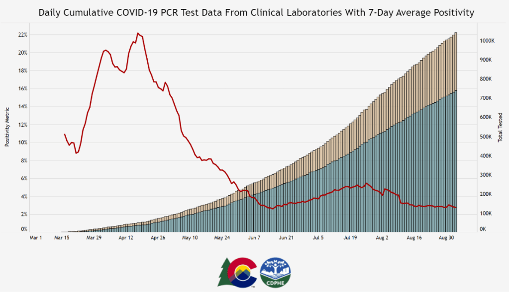
Colorado is one of six states currently reporting its testing in “test encounters,” a new metric that has appeared in recent weeks. Screenshot of Colorado’s dashboard taken on September 5.
A few weeks ago, one of my coworkers at Stacker asked me: how many people in the U.S. have been tested for COVID-19?
This should be a simple question. We should have a national dataset, run by a national public health department, which tracks testing in a standardized manner and makes regular reports to the public. The Department of Health and Human Services (HHS) does run a national testing dataset, but this dataset only includes diagnostic, polymerase chain reaction (PCR) test results, is not deduplicated—a concept I’ll go into more later—and is not widely publicized or cited.
Meanwhile, 50 state public health departments report their local testing results in 50 different ways. Different departments have different practices for collecting and cleaning their test results, and beyond that, they report these results using different units, or the definitive magnitudes used to describe values.
You might remember how, in a high school science class, you’d get a point off your quiz for putting “feet” instead of “meters” next to an answer. Trying to keep track of units for COVID-19 data in the U.S. is like that, except every student in the class of 50 is putting down a slightly different unit, no teacher is grading the answers, and there’s a mob of angry observers right outside the classroom shouting about conspiracy theories.
Naturally, the COVID Tracking Project is keeping track anyway. In this issue, I’ll cite the Project’s work to explain the three major units that states are using to report their test results, including the benefits and drawbacks of each.
(Disclaimer: Although I volunteer for the COVID Tracking Project and have contributed to data quality work, this newsletter reflects only my own reporting and explanations based on public Project blog posts and documentation. I am not communicating on behalf of the Project in any way.)
Specimens versus people
Last spring, when the COVID Tracking Project’s data quality work started, state testing units fell into two main categories: specimens and people.
When a state reports its tests in specimens, their count describes the number of vials of human material, taken from a nose swab or saliva test, which are sent off to a lab and tested for the novel coronavirus. Counts in this unit reflect pure testing capacity: knowing the number of specimens tested can tell researchers and public health officials how many testing supplies and personnel are available. “Specimens tested” counts may thus be more precise on a day-to-day basis, which I would consider more useful for calculating a jurisdiction’s test positivity rate, that “positive tests divided by total tests” value which has become a crucial factor in determining where interstate travelers can go and which schools can reopen.
But “specimens tested” counts are difficult to translate into numbers of people. A person who got tested five times would be included in their state’s “specimens tested” count each time—and may even be included six, seven, or more times, as multiple specimens may be collected from the same person during one round of testing. For example, the nurse at CityMD might swab both sides of your nose. Including these double specimens as unique counts may artificially inflate a state’s testing numbers.
When a state reports its tests in people, on the other hand, their count describes the number of unique human beings who have been tested in that state. This type of count is useful for measuring demographic metrics, such as what share of the state’s population has been tested. In most cases, when states report population breakdowns of their testing counts, they do so in units of people; this is true for at least four of the six states which report testing by race and ethnicity, for example.
Reporting tests in units of people requires public health departments to do a process called deduplication: taking duplicate results out of the dataset. If a teacher in Wisconsin (one of the “people tested” states) got tested once back in April, once in June, and once this past week, the official compiling test results would delete those second two testing instances, and the state’s dataset would count that teacher only once.
The problem with such a reporting method is that, as tests become more widely available and many states ramp up their surveillance testing to prepare for school reopening, we want to know how many people are being tested now. As recent COVID Tracking Project weekly updates have noted, testing seems to be plateauing across the country. But in the states which report “people tested” rather than “specimens tested,” it is difficult to say whether fewer tests are actually taking place or the same people are getting tested multiple times, leading them to not be counted in recent weeks’ testing numbers.
Test encounters
So, COVID-19 testing counts need to reflect the numbers of people tested, to provide an accurate picture of who has access to testing and avoid double-counting when two specimens are taken from one person. But these counts also need to reflect test capacity over time, by allowing for accurate test positivity calculations to be made on a daily or weekly basis.
To solve this problem, the COVID Tracking Project is suggesting that states use a new unit: test encounters. The Project defines this unit as the number of people tested per day. As Kara Schechtman’s blog post explains, though this term may be new, it’s actually rather intuitive:
Although the phrase “testing encounters” is unfamiliar, its definition just describes the way we talk about how many times people have been “tested for COVID-19” in everyday life. If an individual had been tested once a week for a month, she would likely say she had been tested four times, even if she had been swabbed seven times (counted as seven tests if we count in specimens), and even though she is just one person (counted as one test if we count in unique people). In this case, that commonsense understanding is also best for the data.
To arrive at a “testing encounters” count, state public health departments would need to deduplicate multiple specimens from the same person, but only if those multiple specimens were taken on the same day. “Testing encounters” counts over time would accurately reflect a state’s testing capacity, without any artificial inflation of numbers. And, as a bonus, such counts would align with public understanding of what it’s like to get tested for COVID-19—making them easier for journalists like myself to explain to our readers.
What is your state doing?
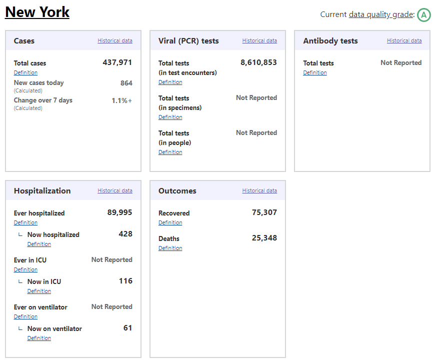
The COVID Tracking Project currently reports total test encounters for five states—Colorado, Rhode Island, Virginia, New York, and Washington—along with the District of Columbia. Other states may report similar metrics, but have not yet been verified to match the Project’s definition.
You can find up-to-date information about which units are reported for each state on a new website page conveniently titled, “How We Report Total Tests.” The page notes that the Project prioritizes testing capacity in choosing which state counts to foreground in its public dataset:
Where we must choose a unit for total tests reporting, we are prioritizing units of test encounters and specimens above people—a change which we believe will provide the most useful measure of each jurisdiction’s testing capacity.
Also, if you’ve visited the COVID Tracking Project’s website recently, you might have noticed that the state data pages have seen a bit of a redesign, in order to make it clear exactly which units each state is using. Each state’s data presentation now includes all three units, with easy-to-click definition popups for each one:
Screenshot of the COVID Tracking Project page for New York.
I recommend checking out your state’s page to see which units your public health department is using for COVID-19 tests, as well as any notes on major reporting changes (outlined below the state’s data boxes). You can read more about the site redesign here.
When my coworker asked me how many people in the U.S. have been tested for COVID-19, I wasn’t able to give him a precise answer. The lack of standards around testing units and deduplication methods, as well as the federal government’s failure to be a leader in this work, have made it difficult to comprehensively report on testing in America. But if people—and I mean readers like you, not just data nerds like me—make testing units part of their regular COVID-19 conversations, we can help raise awareness on this issue. We can push our local public health departments to standardize with each other, or at least get better about telling us exactly what they’re doing to give us the numbers they put up on dashboards every day.
The COVID Tracking Project published a blog post this week in which three of our resident Texas experts, Conor Kelly, Judith Oppenheim, and Pat Kelly, describe a dramatic shift in Texas testing numbers which has taken place in the past two weeks.
On August 2, the number of tests reported by Texas’s Department of State Health Services (DSHS) began to plummet. The state went from a reported 60,000 tests per day at the end of July to about half that number by August 12. Conor, Judith, and Pat explain that this overall drop coincides with a drop in tests that DSHS classifies as “pending assessment,” meaning they have not yet been assigned to a county. Total tests reported by individual Texas counties, meanwhile, have continued to rise.
Although about 85,000 “pending assessment” tests were logged on August 13 to fill Texas’s backlog, this number does not fully add up to the total drop. For full transparency in Texas, DSHS needs to explain exactly how they define “pending assessment” tests, how tests are reclassified from “pending” to being logged in a particular county, and, if tests are ever removed from the “pending” category without reclassification, when and why that happens. As I mentioned in last week’s issue, DSHS has been known to remove Texans with positive antigen tests from their case count; they could be similarly removing antigen and antibody tests reported by counties from their test count.
If you live in Texas, have friends and family there, or are simply interested in data issues in one of the country’s biggest outbreak states, I highly recommend giving the full post a read. For more Texas test reporting, check out recent articles from Politico and the Texas Tribune.