Category: Source spotlight

  • COVID source call-out: CDC’s county vaccination map

    COVID source call-out: CDC’s county vaccination map

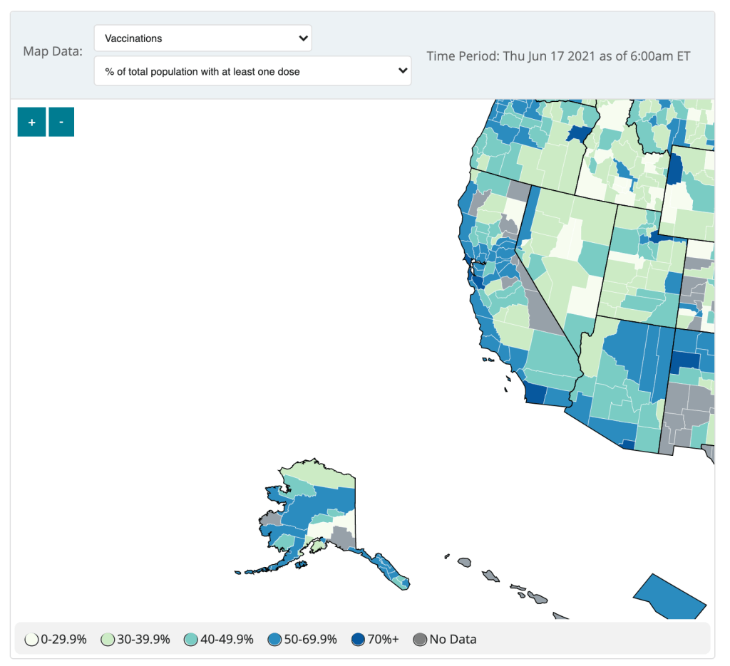
    The CDC updated the County View page of its COVID Data Tracker this week, now allowing users to see vaccination coverage maps reflecting the population that has received at least one dose. (Previously, only fully vaccinated coverage maps were available.)

    The map does paint a stark picture of vaccination disparities in the U.S., with the Northeast and West coast notably darker blue than parts of the South and Midwest. However, the CDC’s UI leaves much to be desired.

    Try hitting the plus icon to zoom in, for example. You’ll land somewhere in the Pacific Ocean, with no way of dragging the map to an actual populated area. Then, when you zoom out, you stay in the Pacific, and the U.S. map gets even smaller.

    The best way to actually zoom in, I’ve found, is by clicking on an individual county or selecting a region with the drop-down menus above the map. Not exactly intuitive, CDC!

    (Thank you to my friend/CDD reader Charlotte for suggesting this callout.)

  • COVID source shout-out: The CDD vaccinations page

    Since early January, the COVID-19 Data Dispatch has maintained a page of detailed annotations on all the major sources for vaccination data in the U.S. This includes government sources (the CDC, all 50 states, and D.C.), along with a few notable news publications and independent dashboards. I’ve updated the page weekly, usually checking every data source on Saturday or Sunday to look for any changes or additions.

    When I started maintaining these annotations, I saw major changes each week. States were bringing new dashboards online, adding more local geographies, adding more demographic data. I enjoyed watching the development and looking out for new features—almost a year of COVID Tracking Project data entry shifts had trained me for this nerdy practice. 

    Now, however, most U.S. vaccination dashboards (and many international ones) are relatively stable. All the states and independent vaccine trackers have figured out what they’re doing, and they’re not really making changes. I rarely see new features, and when I do, they’re usually minor adjustments to a dashboard’s organization or terminology.

    As a result, I’m adjusting my schedule. The CDD vaccinations page will now update every other week instead of weekly. I will be doing an update later today after sending this issue, then the following update will come in two weeks, on June 27.

    I’m still going to look out for demographic vaccine data from the last two states not providing this information (Montana and Wyoming) and for any states that cut back their updating schedule (as Florida did last week). But I am expecting these biweekly updates to be more cursory than exciting going forward.

  • COVID source callout: Florida’s schedule change

    The Florida public health agency is stalling daily updates to its COVID-19 dashboard, cases, and vaccine reports. Instead, the department will post weekly reports on Fridays, the Miami Herald reports.

    The new reports will only include Florida residents, discounting any non-residents who become infected in the state. Florida is also no longer publishing reports on COVID-19 in schools, long-term care facilities, and prisons. Instead, the weekly reports will include more vaccination data.

    When asked about the reason for this change, the Miami Herald reports, the health department cited high vaccination numbers for Florida residents and a low test positivity rate. But that doesn’t mean the pandemic is over—especially for the state’s minority residents, who have been vaccinated at a lower rate than white Floridians.

    I will be watching with trepidation to see if any other states follow Florida’s lead in the coming weeks.

  • COVID source shout-out: Babydog

    COVID source shout-out: Babydog

    I am not usually a dog person, but I have to make an exception for Babydog. Her owner, West Virginia Governor Jim Justice, has made her the mascot of his state’s vaccine lottery.

    “If you won’t do it for your family, you have to get vaccinated for Babydog,” he said at a press conference. “She wants you vaccinated so badly.”

    If I weren’t already vaccinated, I would do it for Babydog. Just look at that face!

  • COVID source callout: CDC’s vaccinations by age data

    COVID source callout: CDC’s vaccinations by age data

    Screenshot of the CDC’s vaccine dashboard, showing about 65,000 first dose vaccinations for children under age 12.

    When I sent out last week’s issue, the CDC’s Vaccination Demographics page was grouping newly eligible 12 to 15-year-olds in with 16 to 17-year-olds. Now, the agency’s age reporting has diversified a bit: you can find separate vaccination numbers for children ages 16 to 17, 12 to 15, and under 12.

    Wait… under 12?

    That’s right. The CDC reports that about 65,000 children under age 12 have received at least one vaccine dose as of May 22, even though this age group is not yet eligible for any of the vaccines on the market.

    Where did this number come from? The CDC’s page doesn’t offer any explanations, but possibilities may include:

    • Pfizer and Moderna are currently running clinical trials for the under-12 population, and children in these trials may have been entered into vaccination records.
    • Errors in the data pipeline—maybe some kids in the 12 to 15 age group were logged as under 12 instead, or some birthdays were input incorrectly.

    But the Pfizer and Moderna trials have enrolled only 12,000 under-12 participants total. That leaves over 50,000 vaccinations that we can’t explain—it’s a pretty big number to attribute to data errors.

    If anyone from the CDC is reading this and can tell me what’s up… my email is betsy@coviddatadispatch.com.

  • COVID source shout-out: Goodnight Turbovax

    COVID source shout-out: Goodnight Turbovax

    So long, farewell, I hope we never have to meet again: the sun is setting for the incredibly hardworking bot Turbovax.info. (As of May 15 it is still operational, and it is not clear when the bot will be retired for good.) New York City has opened more walk-in vaccine centers and as more people get vaccinated, and the bot’s creator, Huge Ma, tweeted that “It’s been a real honor to serve all of you but the need for TurboVax has come and gone.” The site has seen decreasing traffic since at least mid-April, as Ma tweeted on April 15 that there had been a 70% drop in bot traffic from the week before.

    The bot (and its creator) became somewhat of a local legend when vaccine appointments in NYC were harder to find than an under-$900k Brooklyn brownstone. They drew attention from outlets ranging from The Guardian to The New York Times to a particularly notable profile of Ma in The Cut—making “Vax Daddy” (or “Vaddy”) a household name for many engrossed in COVID-19 news. Mayoral candidate Andrew Yang has even courted Ma’s endorsement. (To date, he has not endorsed a candidate, though he has endorsed more protected bike lanes.)

    Ma has used his platform to advocate for AAPI folks and to denounce anti-Asian racism. On February 27, he suspended the bot as a form of protest as anti-Asian hate crimes rose across the country. (It was restored on March 1.) His continuing advocacy and fundraising for Welcome to Chinatown, a nonprofit providing resources for small businesses in the Chinatown area of Manhattan, has raised $200,000, according to his Twitter.

    We here at the CDD salute Ma’s incredible work, and personally, I’m particularly grateful for Turbovax for getting one of my friends vaccinated, posting really cute pictures of his cat MaoMao, and getting Bowen Yang back on Twitter for a brief spell. And amidst the sentimentality, there’s a smidge of good news: while the actual bot is being retired, Ma will still be tweeting from the @Turbovax account “bc it’s fun.”

  • COVID source shout-out: TUSHY

    COVID source shout-out: TUSHY

    TUSHY is a bidet company. It’s gotten a lot of traction during the pandemic, as Americans suddenly working from home decided to upgrade their bathroom experiences. (This group includes me and my roommates.)

    Now, you might ask: Betsy, why are you featuring a bidet company as a COVID-19 data source? Because a special page on TUSHY’s website is reporting the share of Americans who have been fully vaccinated, with a (NSFW) framing: “Can We Eat Ass Yet?”

    The current answer is no—only 33% of the U.S. population has been fully vaccinated, according to this page. TUSHY staff are updating the page every weekday using CDC data.

    “The idea for “CanWeEatAssYet.com was born when COVID was blowing up in NYC,” says TUSHY’s founder Miki Agrawal. “NYC government sent out a message to all New Yorkers to not eat ass because it could spread COVID… and we wanted to create a funny site a la “IsMercuryInRetrograde.com” with a YES / NO answer specifically for eating ass, because with TUSHY bidet, we support clean ass and wanted to let people know when it was safe to partake in the activity.”

    That bright red “NO” may be switched to “YES” when 70% of the U.S. population has been fully vaccinated, but Agrawal says the team will “keep checking with the CDC regularly” to determine the perfect “ass-eating immunity” threshold. Now that’s creative science communication.

    Editor’s note: This is not sponsored content, I just think the page is really funny—and TUSHY’s marketing team was kind enough to reply to my email on short notice. Also, H/T Garbage Day.

  • COVID source shoutout: Unique vaccine metrics

    COVID source shoutout: Unique vaccine metrics

    Most states report some variation on the same COVID-19 vaccination metrics: doses allocated, doses administered, state residents who’ve been partially and fully vaccinated, and so on. But some states go beyond those basics.

    This week, I’m showing some appreciation for:

    • Washington D.C.: Reports numbers of District residents who have stuck to their second dose appointments. The dashboard’s “Adherence” tab includes those who are fully vaccinated, waiting on their second dose appointment, or more than a week overdue for that second dose appointment—both District-wide and by ward.
    • Idaho: Reports detailed data on state residents who have pre-registered for appointments. On the “Pre-registered residents” tab, you can see how many people have claimed their pre-registered appointments, as well as breakdowns of the pre-registered residents by county, age, and medical risk level.
    • Illinois: Reports both a count of unusable vaccine doses and information on vaccine breakthrough cases. The “unusable” vaccine doses count includes doses that have been discarded, dropped, or had some other issue in the storage and handling process. For vaccine breakthroughs, Illinois reports total patients hospitalized and died due to COVID-19 after vaccination.
    • New Hampshire: Reports counts of vaccine doses distributed and administered by individual vaccination sites, such as hospitals and public health networks. (New Hampshire includes vaccination data once a week in its COVID-19 news reports, usually on Thursdays. The state figures differ significantly from CDC-reported numbers, for as-yet-undetermined reasons.)

    As always, you can find the CDD’s full set of annotations on national and state vaccine data sources here.

  • COVID source shout-out: CDC’s vaccine blue

    COVID source shout-out: CDC’s vaccine blue

    As anyone who follows me on Twitter could likely tell you, I love to make fun of the CDC’s vaccination dashboard. The agency uses the color blue like it’s going out of style, with heatmap-style charts that range from teal to a dark, indigo shade for states that have administered the most vaccine doses relative to their populations.

    I have no problem with the color blue. But the CDC doesn’t always update its color categories in time with increasing vaccination rates, which can lead to charts like this:

    Or this:

    This week, the agency’s dedication to blue got even more intense, with this graphic shared in the White House COVID-19 briefing on Friday:

    Much as I love to make fun, though, I have to admit that I do love the vaccine blue. Or, more accurately, I love what the blue represents: a darker shade means more people getting vaccinated, more people protecting themselves and their communities from the coronavirus.

    Dr. Walensky tapped into this sentiment during Friday’s briefing, when she said: “Now that everyone is eligible to receive a vaccine, please help turn your county toward more protection and a darker shade of blue. The healthier our families are, the healthier we will be as a nation.”

    Dark blue! More vaccines! Let’s go! (Now, can we send some of our extra doses to India, please?)

  • COVID source shout-out: NIH COVID-19 Treatment Guidelines

    COVID source shout-out: NIH COVID-19 Treatment Guidelines

    Last spring, the National Institutes of Health (NIH) set up a special website compiling guidance on how to treat COVID-19 patients, intended as a resource for physicians and researchers. We featured this source in an issue a couple of months ago, but I wanted to revisit it today because the site’s one-year anniversary is coming up this week!

    According to Dr. Fauci, who gave the site a shout-out at the White House COVID-19 press briefing this past Friday, the website has seen 3.8 million American users and 2.6 international users since its launch on April 21, 2020. There have also been 23 updates to the guidelines themselves.

    It’s pretty universally acknowledged in the science/health world that the U.S. federal public health agencies abdicated a lot of responsibility in 2020. But the NIH was one part of the infrastructure that kept chugging along, both through its support of vaccine development and its leadership in the global medical community. This website is a small part of those efforts.

    Happy birthday, COVID-19 Treatment Guidelines! I hope your usage rate goes down through the rest of 2021.