The CDC is finally publishing wastewater data—but only ten states are well-represented

This week, the CDC added wastewater tracking to its COVID-19 data dashboard. Wastewater has been an important COVID-tracking tool throughout the pandemic, but it gained more public interest in recent months as Omicron’s rapid spread showed the utility of this early warning system. While the CDC’s new wastewater tracker offers a decent picture of national COVID-19 trends, it’s basically useless for local data in the majority of states.

Wastewater, as you might guess from the name, is water that returns to the public utility system after it’s been used for some everyday purpose: flushing a toilet, bathing, washing dishes, and so forth. In wastewater surveillance, scientists identify a collection point in the sewer system—either beneath a specific building or at a water treatment plant that handles sewage from a number of buildings. The scientists regularly collect wastewater samples from that designated point and test these samples for COVID-19 levels.

When someone is infected with the coronavirus, they are likely to shed its genetic material in their waste. This genetic signal shows up in wastewater regardless of people’s symptoms, so a wastewater sample may return a positive result for the coronavirus earlier than other screening tools like rapid antigen tests. And, because wastewater samples are typically collected from public sewer networks, this type of surveillance provides information for an entire community—there’s no bias based on who’s able to get a PCR or rapid test.

Scientists and organizations who utilize wastewater testing consider it an early warning system: trends in wastewater often precede trends in reported COVID-19 cases. For example, the coronavirus RNA levels identified in Boston’s wastewater shot up rapidly before Boston’s actual Omicron case numbers did, then also went down before case numbers did. Similarly, Missouri’s wastewater surveillance system—which includes genetic sequencing for variants—identified Delta cases last summer weeks before PCR testing did.

Wastewater surveillance is also a popular strategy for colleges and universities, which can set up collecting sites directly underneath student dormitories. Barnard College, where I went to undergrad, is one school that’s employed this strategy. At one point in the fall 2021 semester, the college instructed students living in the Plimpton residence hall (where I lived as a sophomore!) to get individual PCR COVID-19 tests because the wastewater surveillance program had found signals of the virus under their dorm.

Screenshot of the CDC’s new wastewater dashboard, retrieved on February 6.

The CDC has been coordinating wastewater surveillance efforts since September 2020, Dr. Amy Kirby, team lead for the National Wastewater Surveillance System, said during a CDC media briefing on Friday. “What started as a grassroots effort by academic researchers and wastewater utilities has quickly become a nationwide surveillance system with more than 34,000 samples collected representing approximately 53 million Americans,” Kirby said.

It’s a little unclear why it took the CDC so long to set up a dashboard with this wastewater data when surveillance efforts have been underway for a year and a half. Still, many researchers and reporters are glad to see the agency finally publishing this useful information. The dashboard represents wastewater collection sites as colored dots: blue dots indicate that coronavirus RNA levels have dropped at this site in the last two weeks; yellow, orange, and red dots indicate RNA levels have risen; and gray dots indicate no recent data. You can download data from a dropdown beneath the dashboard and on the CDC’s data portal site.

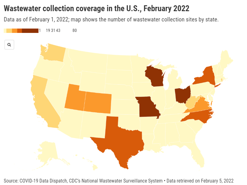
“More than 400 testing sites around the country have already begun their wastewater surveillance efforts,” Kirby said at the media briefing. But she failed to mention that, out of these sites—the actual total is 471, according to the CDC dashboard—more than 200 are located in just three states: Missouri, Ohio, and Wisconsin. Missouri, with 80 sites, has a long-established system to monitor wastewater, through a collaboration between state agencies and the University of Missouri. Ohio has 71 sites of its own, while Wisconsin has 61.

After these Midwest wastewater powerhouses, other states with a relatively high number of collection sites include North Carolina with 38, Texas with 35, New York with 32, Utah with 31, Virginia with 29, Colorado with 21, and California with 17. No other state has more than 10 wastewater collection sites, and 18 states do not have any wastewater collection sites at all.

So, the CDC dashboard is pretty useful if you live in one of these ten states with a high number of collection sites. Otherwise, you just have to… wait for more sites in your area to get added to the dashboard, I guess? (Kirby did say during the media briefing that several hundred more collection sites are in development.) Even within the states that are doing a lot of wastewater surveillance, though, reporting is uneven at more local levels; for instance, many New York sites are concentrated in New York City and surrounding suburbs.

In this way, biased wastewater surveillance coverage in the U.S. echoes biased genetic sequencing coverage, an issue I’ve written about many times before. (See the genetic surveillance section of this post, for example.) Some states, like California, New York, and others with high-tech laboratories set up for sequencing, have identified variants for a much higher share of their COVID-19 cases than states with fewer resources.

The CDC gives wastewater treatment plants, local health departments, and research laboratories the ability to join its national surveillance network. But again, this is much easier for institutions in some places than others. Consider the resources available for wastewater sampling in New York City compared to in rural parts of the Midwest and South.

In addition, for places that do have robust wastewater surveillance systems, there are some caveats to the data, the CDC expert told reporters. Data may be hard to interpret “in communities with minimal or no sewer infrastructure and in communities with transient populations, such as areas with high tourism,” she said. “Additionally, wastewater surveillance cannot be used to determine whether a community is free from infections.”

If you’re looking for more wastewater data beyond the CDC tracker, here are two sources to check out:

  • Biobot’s Nationwide Wastewater Monitoring Network, which I included in last week’s Featured Sources: This wastewater epidemiology company collects samples from water treatment facilities across the country; their dashboard includes both estimates of coronavirus levels in the U.S. overall and estimates for specific counties in which data are collected. Biobot’s data are available for download on Github. (Interestingly, it seems that some of the counties included in Biobot’s dashboard are not currently included in the CDC’s dashboard; I’ll be curious to see if that changes in the coming weeks.)
  • COVIDPoops19 dashboard: This dashboard, run by researchers at the University of California Merced, provides a global summary of wastewater surveillance efforts. It includes over 3,300 wastewater collection sites tied to universities, public health agencies, and other institutions; click on individual sites to see links to dashboards, align with related news articles and scientific papers.

More federal data

Comments

141 responses to “The CDC is finally publishing wastewater data—but only ten states are well-represented”

  1. […] Ladyzhets revealed in her publication Covid-19 Information Dispatch, virtually half of them are clustered in three states: Johnson’s Missouri community, plus Ohio and Wisconsin. One other seven states—California, […]

    Like

  2. […] analyst Betsy Ladyzhets revealed in her newsletter Covid-19 Data Dispatch, almost half of them are clustered in three states: Johnson’s Missouri network, plus Ohio and Wisconsin. Another seven states—California, […]

    Like

  3. […] analyst Betsy Ladyzhets revealed in her newsletter Covid-19 Data Dispatch, almost half of them are clustered in three states: Johnson’s Missouri network, plus Ohio and Wisconsin. Another seven states—California, […]

    Like

  4. […] analyst Betsy Ladyzhets revealed in her newsletter Covid-19 Data Dispatch, almost half of them are clustered in three states: Johnson’s Missouri network, plus Ohio and Wisconsin. Another seven states—California, […]

    Like

  5. […] Betsy Ladyzhets revealed in her publication Covid-19 Information Dispatch, nearly half of them are clustered in three states: Johnson’s Missouri community, plus Ohio and Wisconsin. One other seven states—California, […]

    Like

  6. […] analyst Betsy Ladyzhets revealed in her newsletter Covid-19 Data Dispatch, almost half of them are clustered in three states: Johnson’s Missouri network, plus Ohio and Wisconsin. Another seven states—California, […]

    Like

  7. […] as analyst Betsy Ladyzhets revealed in her newsletter Covid-19 Data Dispatchalmost half of them are clustered in three states: Johnson’s Missouri network, plus Ohio and Wisconsin. Another seven states — California, […]

    Like

  8. […] analyst Betsy Ladyzhets revealed in her newsletter Covid-19 Data Dispatch, almost half of them are clustered in three states: Johnson’s Missouri network, plus Ohio and Wisconsin. Another seven states—California, […]

    Like

  9. […] as analyst Betsy Ladyzhets revealed in her newsletter Covid-19 Data Dispatchalmost half of them are clustered in three states: Johnson’s Missouri network, plus Ohio and Wisconsin. Another seven states—California, […]

    Like

  10. […] analyst Betsy Ladyzhets revealed in her newsletter Covid-19 Data Dispatch, almost half of them are clustered in three states: Johnson’s Missouri network, plus Ohio and Wisconsin. Another seven states—California, […]

    Like

  11. […] analyst Betsy Ladyzhets revealed in her newsletter Covid-19 Data Dispatch, almost half of them are clustered in three states: Johnson’s Missouri network, plus Ohio and Wisconsin. Another seven states—California, […]

    Like

  12. […] Betsy Ladyzhets revealed in her e-newsletter Covid-19 Knowledge Dispatch, nearly half of them are clustered in three states: Johnson’s Missouri community, plus Ohio and Wisconsin. One other seven states—California, […]

    Like

  13. […] analyst Betsy Ladyzhets revealed in her newsletter Covid-19 Data Dispatch, almost half of them are clustered in three states: Johnson’s Missouri network, plus Ohio and Wisconsin. Another […]

    Like

  14. […] analyst Betsy Ladyzhets revealed in her newsletter Covid-19 Data Dispatch, almost half of them are clustered in three states: Johnson’s Missouri network, plus Ohio and Wisconsin. Another seven states—California, […]

    Like

  15. […] disclosed in her e-newsletter Covid-19 Information Dispatch, nearly fifty percent of them are clustered in three states: Johnson’s Missouri network, plus Ohio as well as Wisconsin. One more 7 states—The golden […]

    Like

  16. […] as analyst Betsy Ladyzhets revealed in her newsletter Covid-19 Data Dispatchalmost half of them are clustered in three states: Johnson’s Missouri network, plus Ohio and Wisconsin. Another seven states — California, […]

    Like

  17. […] analyst Betsy Ladyzhets revealed in her newsletter Covid-19 Data Dispatch, almost half of them are clustered in three states: Johnson’s Missouri network, plus Ohio and Wisconsin. Another seven states—California, […]

    Like

  18. […] analyst Betsy Ladyzhets revealed in her newsletter Covid-19 Data Dispatch, almost half of them are clustered in three states: Johnson’s Missouri network, plus Ohio and Wisconsin. Another seven states—California, […]

    Like

  19. […] analyst Betsy Ladyzhets revealed in her newsletter Covid-19 Data Dispatch, almost half of them are clustered in three states: Johnson’s Missouri network, plus Ohio and Wisconsin. Another seven states—California, […]

    Like

  20. […] analyst Betsy Ladyzhets revealed in her newsletter Covid-19 Data Dispatch, almost half of them are clustered in three states: Johnson’s Missouri network, plus Ohio and Wisconsin. Another seven states—California, […]

    Like

  21. […] Ladyzhets published in her publication Covid-19 Knowledge Dispatch, virtually part of them are clustered in three states: Johnson’s Missouri community, plus Ohio and Wisconsin. Any other seven states—California, […]

    Like

  22. […] oleh analis Betsy Ladyzhets dalam buletinnya Pengiriman Data Covid-19hampir setengahnya adalah berkerumun di tiga negara bagian: Jaringan Johnson’s Missouri, ditambah Ohio dan Wisconsin. Tujuh negara bagian […]

    Like

  23. […] analyst Betsy Ladyzhets revealed in her newsletter Covid-19 Data Dispatch, almost half of them are clustered in three states: Johnson’s Missouri network, plus Ohio and Wisconsin. Another seven states—California, […]

    Like

  24. […] analyst Betsy Ladyzhets revealed in her newsletter Covid-19 Data Dispatch, almost half of them are clustered in three states: Johnson’s Missouri network, plus Ohio and Wisconsin. Another seven states—California, […]

    Like

  25. […] analyst Betsy Ladyzhets revealed in her newsletter Covid-19 Data Dispatch, almost half of them are clustered in three states: Johnson’s Missouri network, plus Ohio and Wisconsin. Another seven states—California, […]

    Like

  26. […] analyst Betsy Ladyzhets revealed in her newsletter Covid-19 Data Dispatch, almost half of them are clustered in three states: Johnson’s Missouri network, plus Ohio and Wisconsin. Another seven states—California, […]

    Like

  27. […] analyst Betsy Ladyzhets revealed in her newsletter Covid-19 Data Dispatch, almost half of them are clustered in three states: Johnson’s Missouri network, plus Ohio and Wisconsin. Another seven states—California, […]

    Like

  28. […] analyst Betsy Ladyzhets revealed in her newsletter Covid-19 Data Dispatch, almost half of them are clustered in three states: Johnson’s Missouri network, plus Ohio and Wisconsin. Another seven states—California, […]

    Like

  29. […] as analyst Betsy Ladyzhets revealed in her newsletter Sending Covid-19 datanearly half of them are grouped in three states: Johnson’s Missouri network, plus Ohio and Wisconsin. Seven other states – California, […]

    Like

  30. […] analyst Betsy Ladyzhets revealed in her newsletter Covid-19 Data Dispatch, almost half of them are clustered in three states: Johnson’s Missouri network, plus Ohio and Wisconsin. Another seven states—California, […]

    Like

  31. […] analyst Betsy Ladyzhets revealed in her newsletter Covid-19 Data Dispatch, almost half of them are clustered in three states: Johnson’s Missouri network, plus Ohio and Wisconsin. Another seven states—California, […]

    Like

  32. […] Betsy Ladyzhets revealed in her publication Covid-19 Knowledge Dispatch, nearly half of them are clustered in three states: Johnson’s Missouri community, plus Ohio and Wisconsin. One other seven states—California, […]

    Like

  33. […] como dijo la analista Betsy Ladiets en su boletín Enviar datos de Covid-19casi la mitad de ellos agrupados en tres estados: la red de Johnson en Missouri, así como en Ohio y Wisconsin. Otros siete estados (California, […]

    Like

  34. […] reveló la analista Betsy Ladijec en su boletín Enviar datos de Covid-19casi la mitad de ellos son agrupados en tres estados: Red de Johnson en Missouri, además de Ohio y Wisconsin. Otros siete estados (California, […]

    Like

  35. […] as analyst Betsy Ladyzhets revealed in her newsletter Covid-19 Data Dispatchalmost half of them are clustered in three states: Johnson’s Missouri network, plus Ohio and Wisconsin. Another seven states — California, […]

    Like

  36. […] as analyst Betsy Ladyzhets revealed in her newsletter Covid-19 Data Dispatchalmost half of them are clustered in three states: Johnson’s Missouri network, plus Ohio and Wisconsin. Another seven states—California, […]

    Like

  37. […] as analyst Betsy Ladyzhets revealed in her newsletter Covid-19 Data Dispatchalmost half of them are clustered in three states: Johnson’s Missouri network, plus Ohio and Wisconsin. Another seven states — California, […]

    Like

  38. Why the CDC changed its masking guidance, and which metrics to follow right now - Federal data Avatar

    […] for COVID-19 that’s more reliable than cases. The problem here is, wastewater surveillance is not available in much of the country—just look at all the empty space on this map. To use wastewater for decisionmaking, a county or […]

    Like

  39. Pandemic preparedness: Improving our data surveillance and communication - Federal data Avatar

    […] wastewater surveillance: As I’ve written before, in the current national wastewater surveillance network, some states are very well-represented […]

    Like

  40. COVID source shout-out: CDC wastewater dashboard upgrades - Source spotlight Avatar

    […] the CDC released its National Wastewater Surveillance System (NWSS) dashboard in February, the agency faced some criticism from scientists, data reporters, and others who found […]

    Like

  41. […] bestaan, als we kijken naar: het afvalwaterdashboard van de CDC. Veel publiciteit over zijn aanvulling op de COVID Data Tracker van het bureau in februari, toonde het dashboard tot begin april slechts één statistiek: gekleurde stippen die een toename […]

    Like

  42. […] challenges exist when you look at it CDC’s wastewater dashboard. Much published on his addition to the agency’s COVID Data Tracker in February, the dashboard showed only one metric until early April: colored dots representing an increase or […]

    Like

  43. The National Fight Against COVID-19 Isn’t Ready To Go To The Sewers | FiveThirtyEight Avatar

    […] challenges exist, though, looking at the CDC’s wastewater dashboard. Highly publicized upon its addition to the agency’s COVID Data Tracker in February, the dashboard only showed one metric until early April: colored dots representing an increase or […]

    Like

  44. […] exist, though, looking at the CDC’s wastewater dashboard. Highly published upon its addition to the agency’s COVID Data Tracker in February, the dashboard only showed one metric until early April: colored dots representing an increase or […]

    Like

  45. […] challenges exist, though, looking at the CDC’s wastewater dashboard. Highly publicized upon its addition to the agency’s COVID Data Tracker in February, the dashboard only showed one metric until early April: colored dots representing an increase or […]

    Like

  46. […] challenges exist, though, looking at the CDC’s wastewater dashboard. Highly publicized upon its addition to the agency’s COVID Data Tracker in February, the dashboard only showed one metric until early April: colored dots representing an increase or […]

    Like

  47. […] array arrayarray arrayarray […]

    Like

  48. […] exist, though, looking at the CDC’s wastewater dashboard. Highly publicized upon its addition to the agency’s COVID Data Tracker in February, the dashboard only showed one metric until early April: colored dots representing an increase or […]

    Like

  49. […] exist, though, looking at the CDC’s wastewater dashboard. Highly publicized upon its addition to the agency’s COVID Data Tracker in February, the dashboard only showed one metric until early April: colored dots representing an increase or […]

    Like

  50. […] challenges exist, though, looking at the CDC’s wastewater dashboard. Highly publicized upon its addition to the agency’s COVID Data Tracker in February, the dashboard only showed one metric until early April: colored dots representing an increase or […]

    Like

Leave a reply to Sewage Sampling Already Tracks Covid. What Else Can It To find? » My Cyber Base || Billions of Free and paid data. Cancel reply